Red alert! Green for go. I’m feeling a little blue today…We have long associated colour with meaning and mood. Across the centuries artists and (relatively more recently) designers have used pigment and colour to connote and codify, imbuing their creations with a depth they would lack without them.
Our relationship with colour starts very early: people almost invariably have a favourite colour, which has remained the same since childhood. What’s yours? If you were to ask the writer Maggie Nelson this question, her answer would be a resounding “Blue!” In Bluets, her 2009 ode to Blue (it seems only right that I capitalise it here), she writes, “Suppose I were to begin by saying that I had fallen in love with a colour.”
“Flicking through its beautifully designed pages, you are introduced to a potted history of pigments”
Nelson references many others known for their association or deep engagement with the colour. One of these is the artist Yves Klein who, on a beach aged 19, declared the sky to be his first artwork. A decade later, Klein developed his signature colour, which he trademarked as International Klein Blue (IKB). Nelson, who writes of a visit to a Klein exhibition, reported that IKB “radiate[d] out so hotly that it seemed to be touching, perhaps even hurting, my eyeballs.” You can have too much of a good thing.
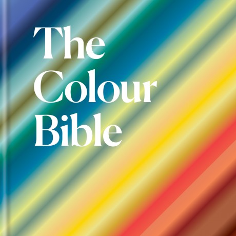
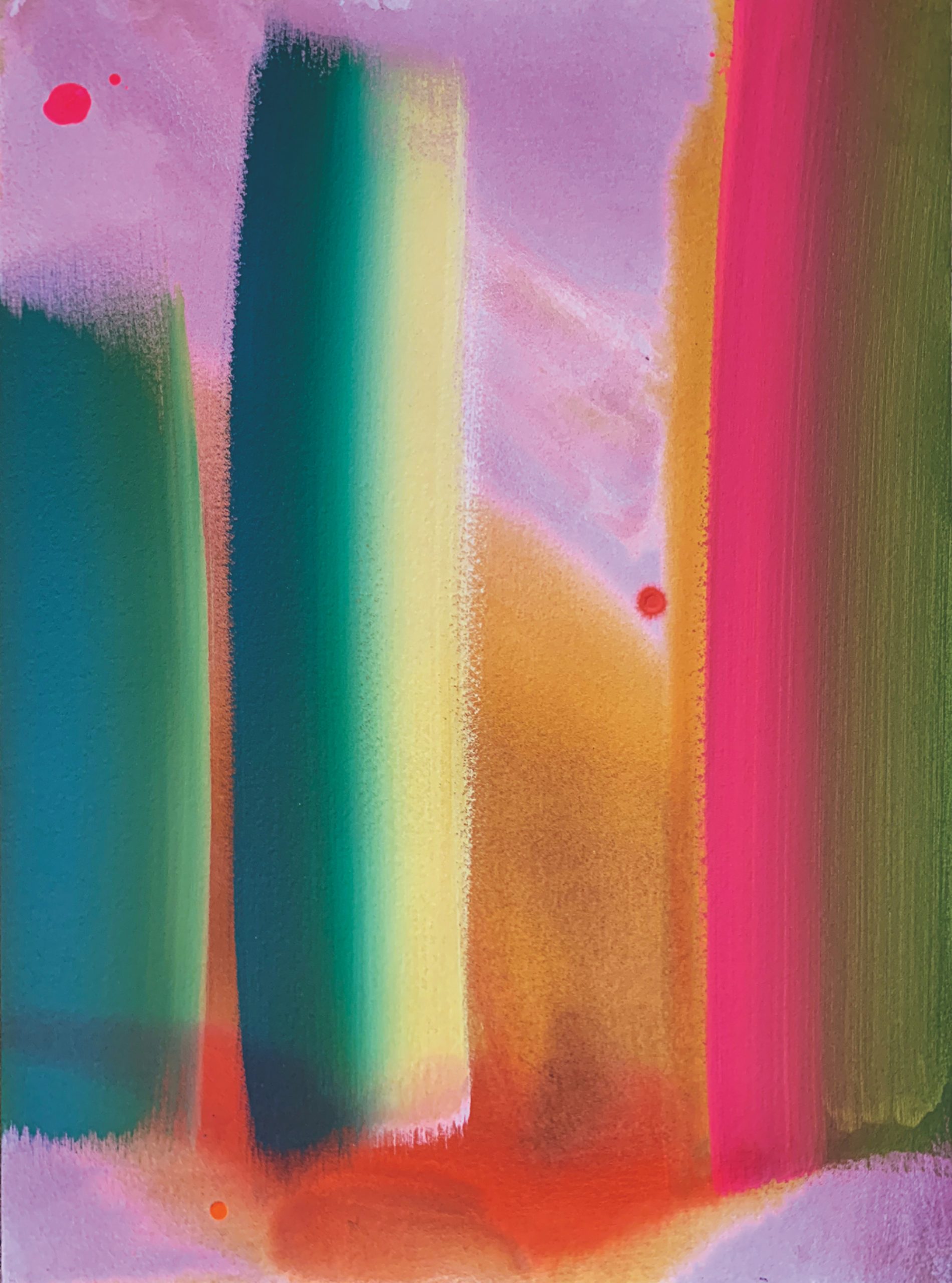
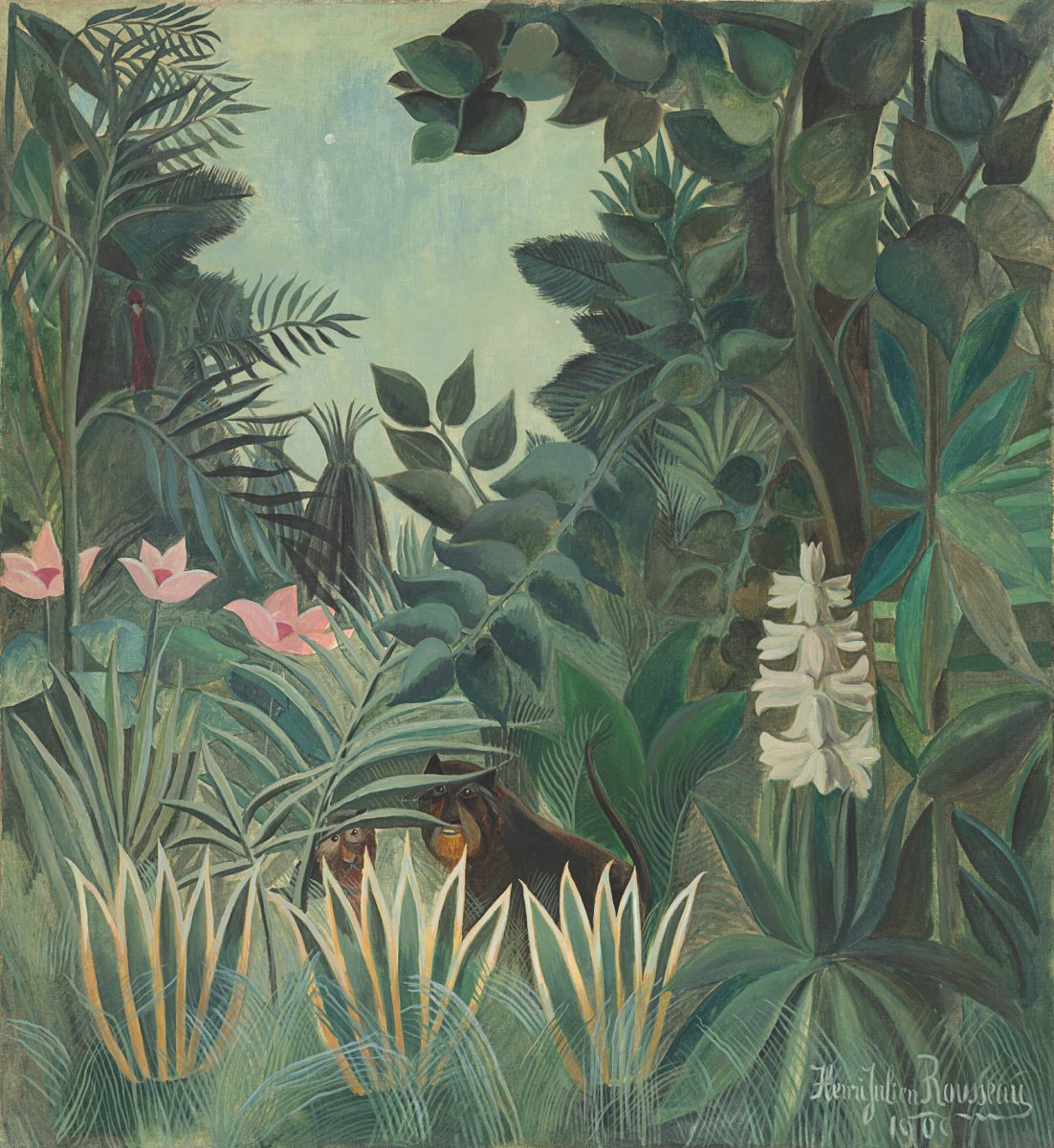
Colour, it is clear, is serious business. But how might we explain such visceral responses to, say, a particular shade of blue? It helps to turn to Laura Perryman’s new book, The Colour Bible (subtitled The definitive guide to colour in art and design), for its author understands that colour can promote a “psychological or even physiological effect.” Flicking through its beautifully designed pages, you are introduced to a potted history of pigments, their cultural significance and their use in art and design.

For starters, though, brush up on your knowledge with some great early pages on Colour Theory, and consult a timeline of its major figures: from Aristotle, credited with developing the first linear colour scale, to Olafur Eliasson, via Bauhaus masters Kandinsky, Klee, and Albers. Great wisdom can be gleaned throughout from those who talked the talk and walked the walk.
“Colour can dictate emotion. This research isn’t lost on Google and IKEA, who implement such ideas to shape consumer behaviour”
“Colour, as the most relative medium in art,” said Albers, “has innumerable faces or appearances. To study them in their respective interactions, in their interdependence, will enrich our ‘seeing,’ our world, and ourselves.” Such information can be found in many a similar book, but what often sets The Colour Bible apart is its engagement with different fields of research.
In clear, concise style, we learn that scientific advances have led to a better understanding of how we relate to colour and its application. A good section on psychology discusses how the impact of colour goes much deeper than the merely aesthetic, something artists have known all along, of course.
We are shown a chart of the effects we might expect certain colours and shades to elicit. Red is activating and stimulating, for example, while green calms and soothes. More advanced is the work of neuroscientist and artist Bevil Conway, which demonstrates that colour can dictate unique patterns of emotion. This research isn’t lost on the likes of Google and IKEA, who have begun to implement such ideas to shape consumer behaviour.
“This apparent simplicity and practicality belies the information Perryman squeezes into these entries”
The majority of the book, however, is given over to the colours themselves, beginning with humanity’s “long history with red” and on through Yellow, Pink, Grey & Dark, and so on. Each is broken down into tones and hues; then further still by the headings ‘Then’, ‘Now’ and ‘Use’, providing a grounding in the historical and cultural as well as suggestions for application. This apparent simplicity and practicality belies the information Perryman manages to squeeze into these entries.
Quotes are used to great effect throughout, as we hear from a plethora of those whose names verge on the synonymous with certain colours. “I have finally discovered the true colour of the atmosphere” declares Monet about violet. “When I eat a tomato, I look at it the way anyone else would. But when I paint a tomato, then I see it differently” observes Matisse.
Yves Klein, of course, has something to say about the colour of which he is practically the patron saint: “Blue has no dimensions, it is beyond dimensions… blue suggests at most the sea and sky, and they, after all, are in actual, visible nature what is most abstract.”
Although not a book everyone will read cover to cover, The Colour Bible is one to return to again and again. Whether it be for suggestions on boosting mood, challenging convention, or selecting and maximising colour pairings, there’s a whole rainbow squeezed into its 300-odd pages. And, as we settle into autumn and winter, who doesn’t want a bit more colour to enjoy as the days darken?
All images courtesy Octopus Books