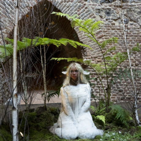
From the compulsive repetition of Warhol’s soup cans, which blurred the line between high art and popular culture, to the life-affirming colours of the Memphis group, postmodernism has long rebelled against the strict aesthetic code of modernism. Where form followed function in the utilitarian designs of twentieth-century modernism, postmodernism embraces ornamentation for ornamentation’s sake, along with a healthy dose of humour. In recent years, it has re-emerged as a trend in art and design. Its practitioners, who hail from all over the world, champion postmodernism not just as a visual style but an ideology that celebrates difference and diversity.
In philosophy, postmodernism is largely characterised as the rejection of universal objectivity. History is not split into that which is true or false, rather it depends on who is telling the story. If this philosophy is translated to art, it invites the natural disruption of an otherwise narrow canon of “good taste”. Postmodernism not only makes space for a wider range of voices and styles, it actively celebrates the textures, clashes and surprising combinations that can arise from a maximalist point of view, where nothing is out of bounds.
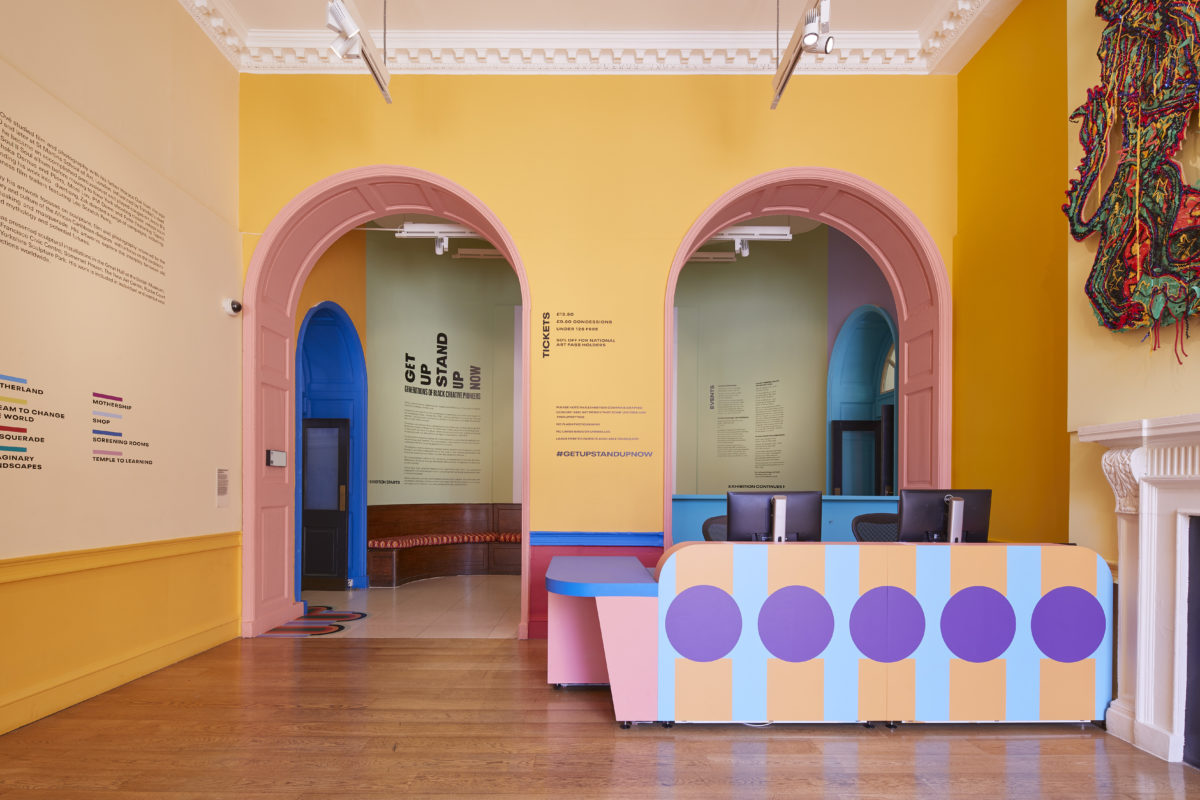
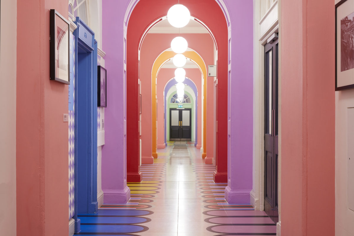
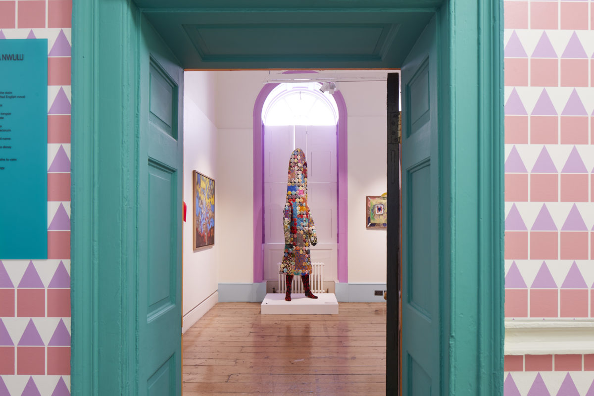
- Yinka Ilori, Design for Get Up Stand Up Now, 2019. Courtesy of Andy Stagg
“If this philosophy is translated to art, it invites the natural disruption of an otherwise narrow canon of ‘good taste’”
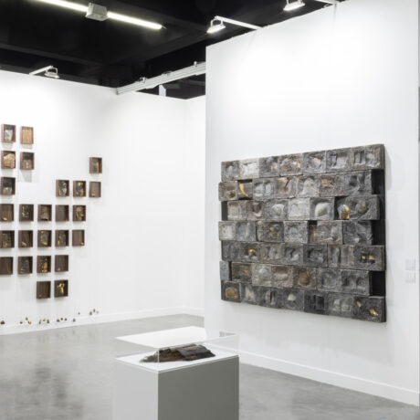
Today, the values of postmodernism are used to explore identity. The work of designer Yinka Ilori draws on his British-Nigerian heritage, fusing the cultures together, resulting in intricately patterned creations that pop with colour. Ilori’s design for Somerset House’s 2019 show Get Up Stand Up Now, chronicling 50 years of Black creativity, immersed the audience in a carefully constructed utopia of postmodern aesthetics.
A seemingly infinite array of pastel hues adorned the arches of the exhibition corridor, while triangles, squares and circles were paired together and multiplied into endless pattern. Even the seating area cushions were upholstered in West African fabrics. Ilori’s simple use of tone and shape pays homage to the geometric sensibilities of the Memphis group, while celebrating the joyous medley of pattern and colour that is indicative of Nigerian culture.
In an interview with the Guardian, Ilori explains how relationships with family have a huge impact on his work. “It was only when I visited Nigeria that I got it. I got it that respect is hugely important for my parents: the culture, the language. I get why my parents wear a lot of colour. I understand their journey, their graft.” This ethos manifests itself in Ilori’s furniture.
The scale of his chairs refers to the idea of hierarchy, referencing the huge economic divides he witnessed in Nigeria. Others seats would be made with certain stories in mind, based on people he’d “known at school who were headed for trouble, boys who had been abandoned by teachers, boys who didn’t fit in because English wasn’t their first language.” The expression of these narratives within his creations makes each piece of furniture feel like an old soul, steeped in mystery and wisdom.
- Camille Walala x White City Place
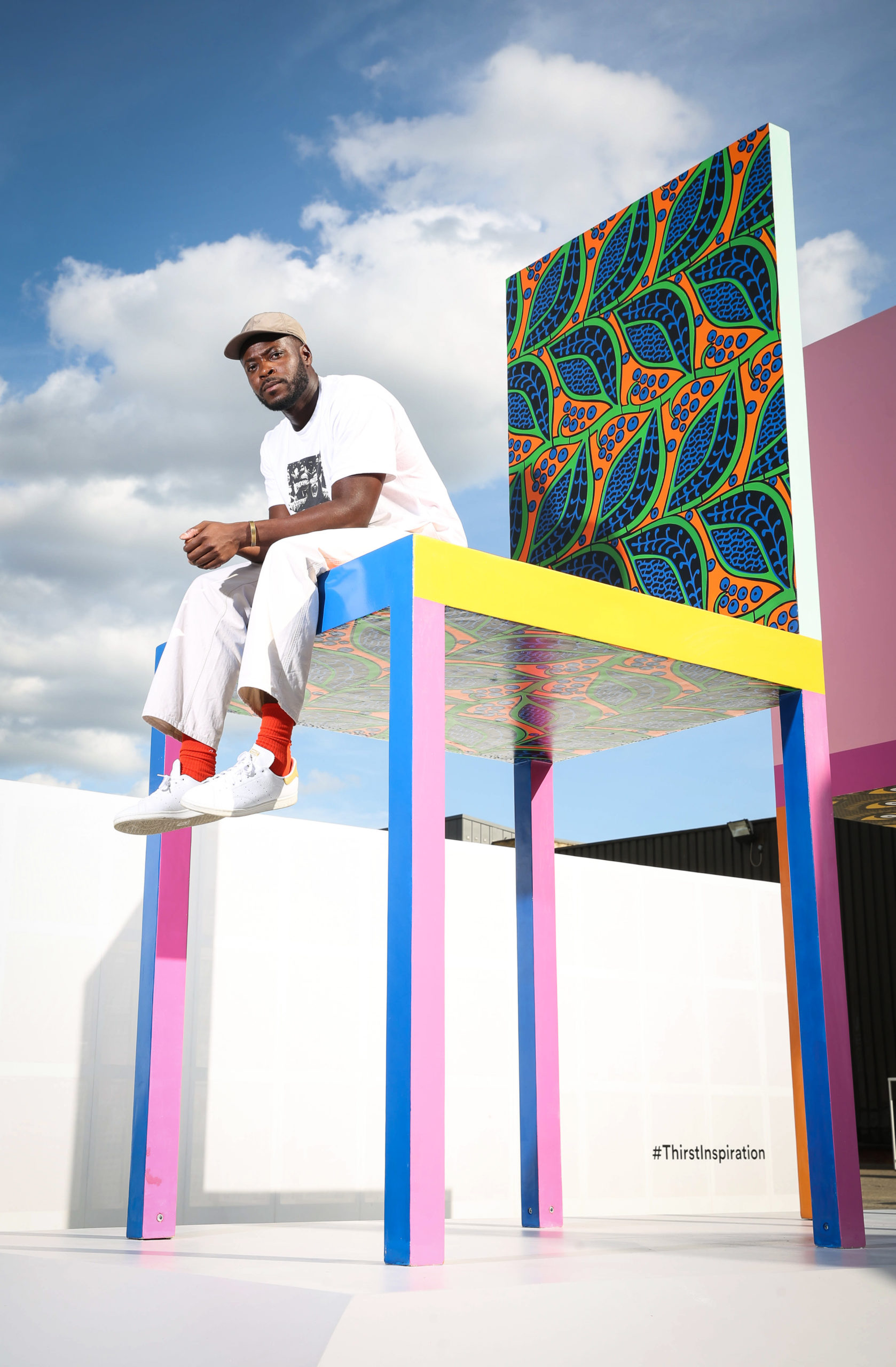
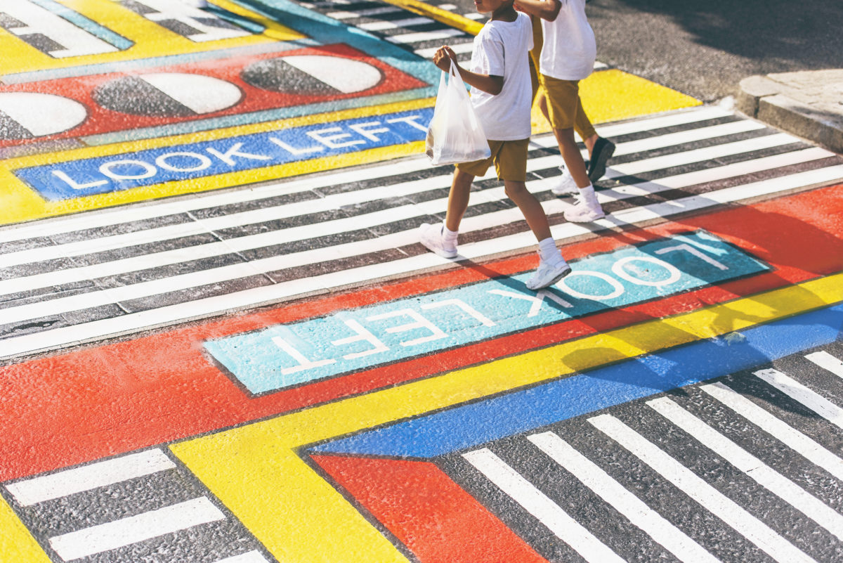
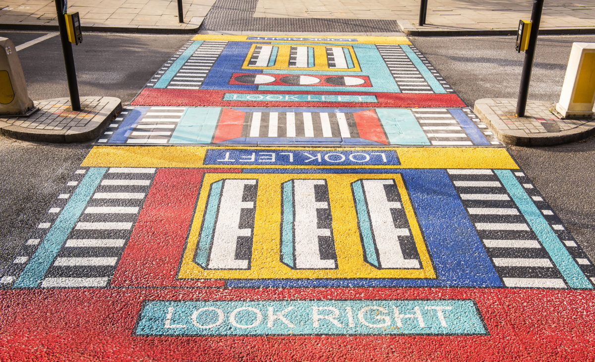
Camille Walala is a self professed purveyor of positivity, who harnesses “optimistic typography and exuberant geometries to create environments that stimulate the senses and inspire joy.” Similarly to Ilori, she evolved from her first medium, textile design, to create expansive installations which have sprawled all over London, from Old Street to White City. She cites inspirations ranging from the Ndebele tribe to the op-artist Victor Vasarely.
In apartheid South Africa, the vibrant visual languages of Ndebele wall paintings acted as signs, holding messages to be “read” by indigenous people passing by. Overlooked by white farmers who believed themselves to be culturally superior, the work was allowed to remain and thus became an expression of cultural resistance. The popularity of Walala’s work, particularly in cities such as London and New York, signifies a growing thirst for stories of other cultures.
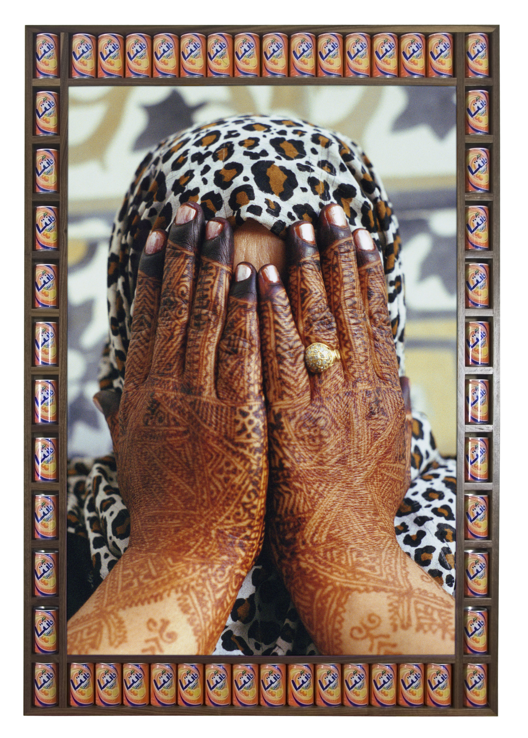
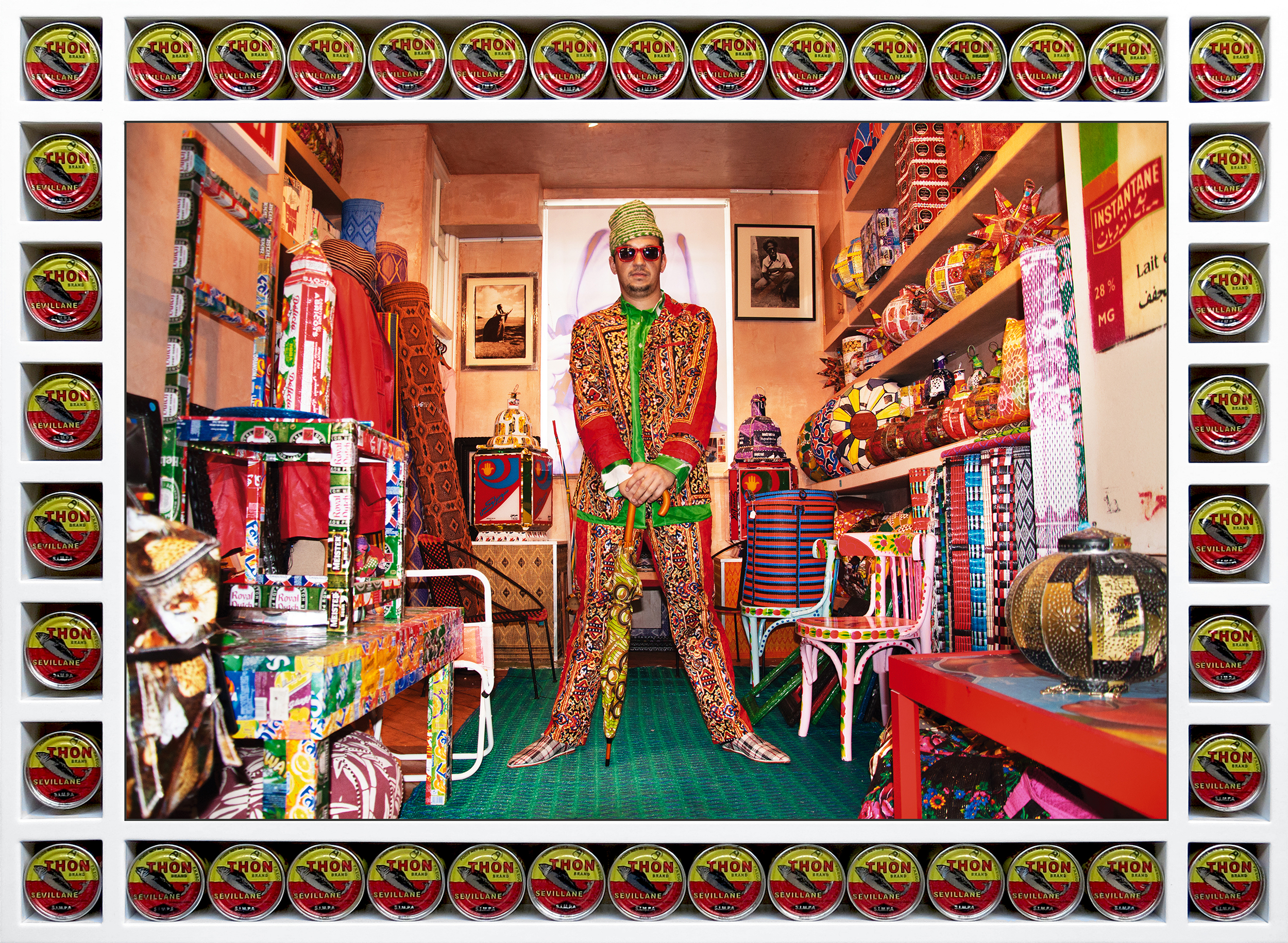
Photographer Hassan Hajjaj’s witty, pop-filled images certainly quench this desire. The New York Times claims that Hajjaj styles his subjects with a kind of “faux-orientalist swag”—a reclamation of stereotypes, one could assume. Cans of Moroccan coca-cola and Crespo olives border the compositions; a frame which urges the audience not to take the work too seriously.
Hajjaj tells the Times “I wanted to show my friends that we have something cool… and that I suppose is what started me entering the art world”. This intention is clear in the images which, often exhibited at life size, meld Moroccan culture into a kitsch-filled dream. Hajjaj redefines what high art can be, in a bid to embrace cultures which have often been looked upon with snobbery by Western society. Authenticity shines through the images, a reflection of Hajjaj’s personal relationships with the sitters, who are friends of friends and local workers from the Marrakech tourist economy.
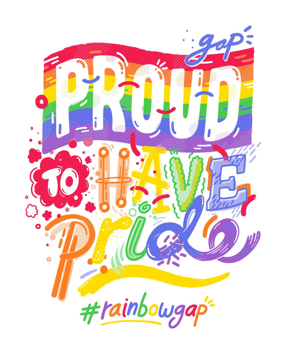
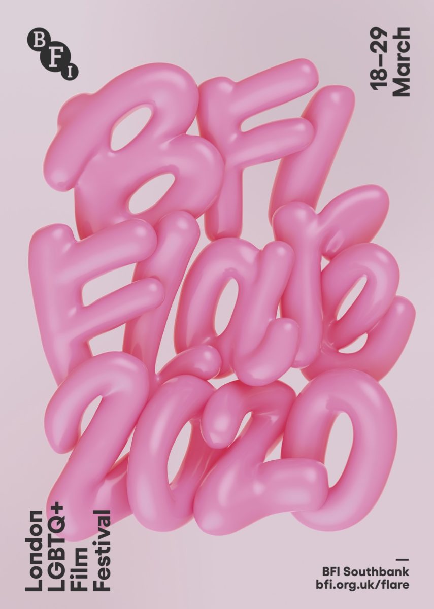
- Left: Kate Moross, in partnership with GAP for Tokyo Pride. Right: Kate Moross, BFI Flare branding
“Hajjaj redefines what high art can be, in a bid to embrace cultures which have often been looked upon with snobbery by Western society”
A common thread in postmodernism is a maximal use of colour. This is certainly true of the work of designer Kate Moross (who identifies as non-binary), with graphics that make use of a hefty portion of the rainbow. In their branding for the BFI Flare, which sees a three-dimensional rendering of bubble lettering, great gloops of pink spell out the festival’s name. A t-shirt design celebrating Pride for Gap Japan involves hand-lettering that showcases a multiplicity of styles, complete with illustrative flourishes. This harnessing of playful visuals, alongside a queering of typography, has established Moross as one of the most prolific designers of the millennial generation. They make space for graphic design that rejects the minimalism that has long dominated the industry.
Beyond their individual styles, these artists represent a new generation of creatives who are creating their own truths. Together, they advocate for a visual language that refuses to adhere to a single set of rules. Today’s postmodernism is undoubtedly political. It has come to represent a reclaiming of “otherness”, an exploration of identity and a pride in one’s own culture.