Patrick Savile’s work looks—to half-quote one of the louche types from that film Dig!—“like, so retro, but so the future”. Born in the west country but based in East London, Savile studied graphic design in the capital before moving more into posters and the illustrative side of things, having been the typical teen bedroom-based flyer designer long before such tasks looked possible as a career. He’s worked with clients including Pop Magazine, Warp Records, Tate, Nickelodeon and Amazon Kindle; and for a while doggedly pursued his own non-commissioned works on the side. Now, though, he’s in a nice position in which the two sides of his practice have fortuitously mingled. “Now, people are employing me just to do stuff that looks like my personal work,” he says. “The two have melded a lot, which has always been the aim.”
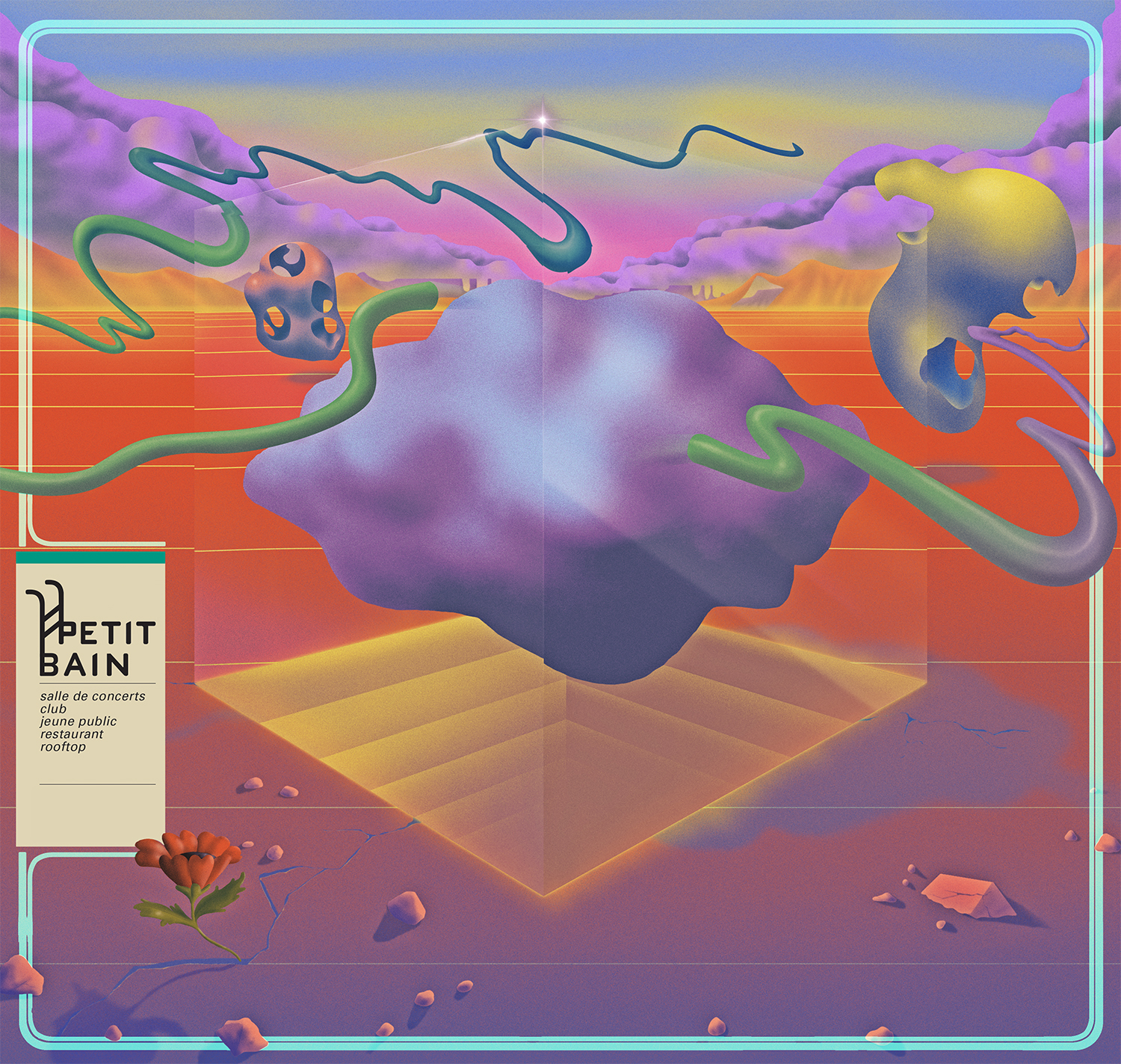
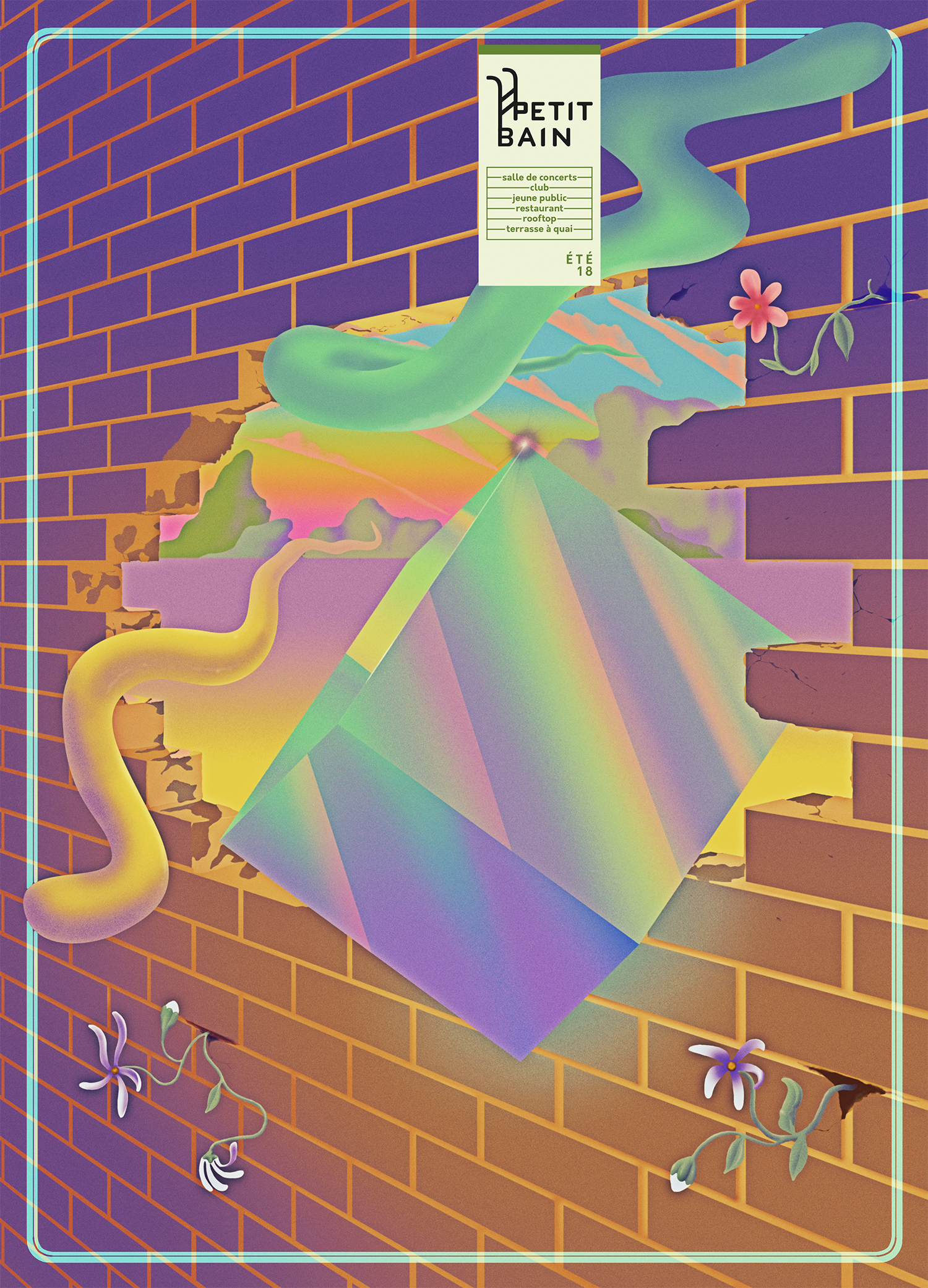
His work is woozy, strange, colourful and impactful; and throughout his career he’s heavily skewed towards working with music-based and cultural clients. As is made plain by Savile’s preoccupations with the esoteric and otherworldly, he’s heavily influenced by “weird seventies sci-fi and fantasy”, as he puts it, creating “worlds that hark back to the world of prog-rock album art and take leads from comics” with a tendency towards the abstract side of narrative graphic art. I spoke to him about his multidisciplinary practice, chaos magic, nepotism and why it isn’t “lame” to use computers.
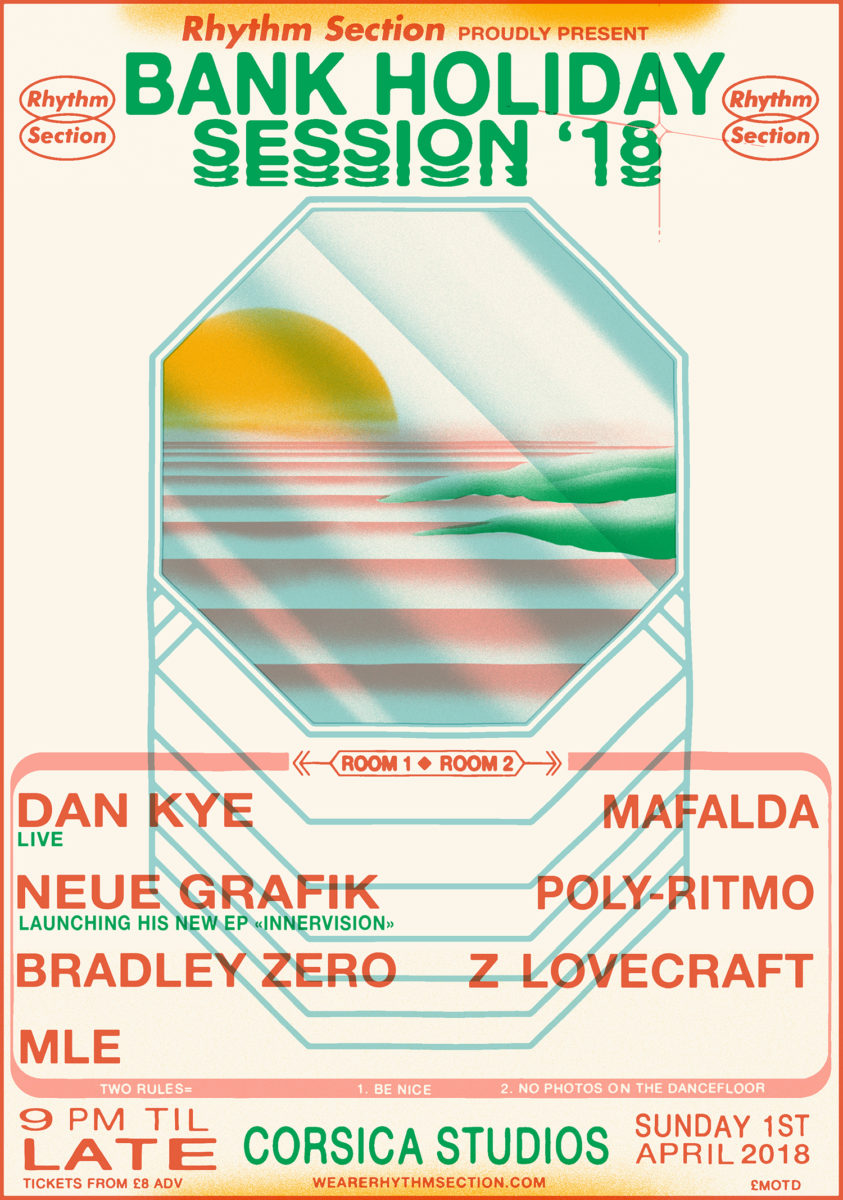
- Bank Holiday Dance poster
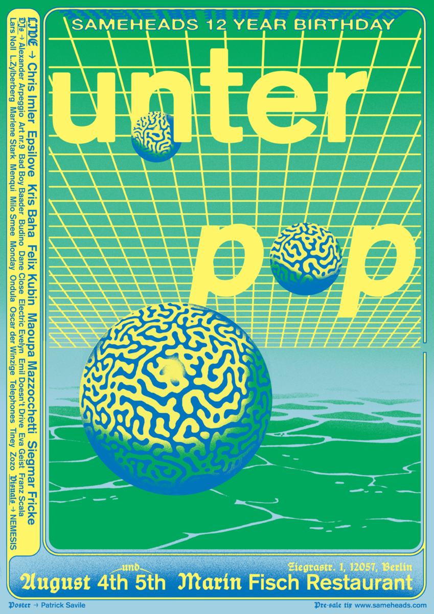
- Unter Pop poster
Do you see yourself as an artist, an illustrator, or a graphic designer? How far do you think those distinction matter?
I’m annoyingly in between worlds: I sort of position myself in illustration and graphic design and art I suppose, so it’s quite hard to pigeonhole myself. When I have been approached by agents they find it quite hard to sell me. Genre-izing is always hard but having I studied graphic design for three years, I was always making images using the computer, and I sort of thought computer = graphic design. But I’m quite a messy guy, I’m quite scribbly; so didn’t like laying out magazines and that side of it. But what you learn on a graphic design course is always worthwhile: some of my output is very typographical, and my love of typography was bolstered through my studies. So, what I do is illustration, but from a graphic design point of view. I have a few different styles in my repertoire, but I don’t think people have a problem with that, even though we’re taught at art school from day one to have a recognizable style.
Your work has a very tactile quality to it, can you tell me a little more about your process?
When I first graduated and started freelancing I eschewed the computer completely for a few years, thinking “They’re lame, everything should be hand done!” I lived with a sign painter and fine artists, who were using their hands all the time, so I did a lot of pen and ink stuff, watercolour and gouache, which was quite figurative—comic books were and still are a massive influence. But slowly I realized I could never get what’s in my head onto paper that way.
I haven’t touched my airbrush in a while as it takes so long compared to what you can do with a computer; if it’s client work, I don’t have time to do that. But everything I do starts off on paper, so I draw pretty much everything either centimetre by centimetre as a thumbnail or bigger, so I start small then enlarge it, but everything is finished on the computer.
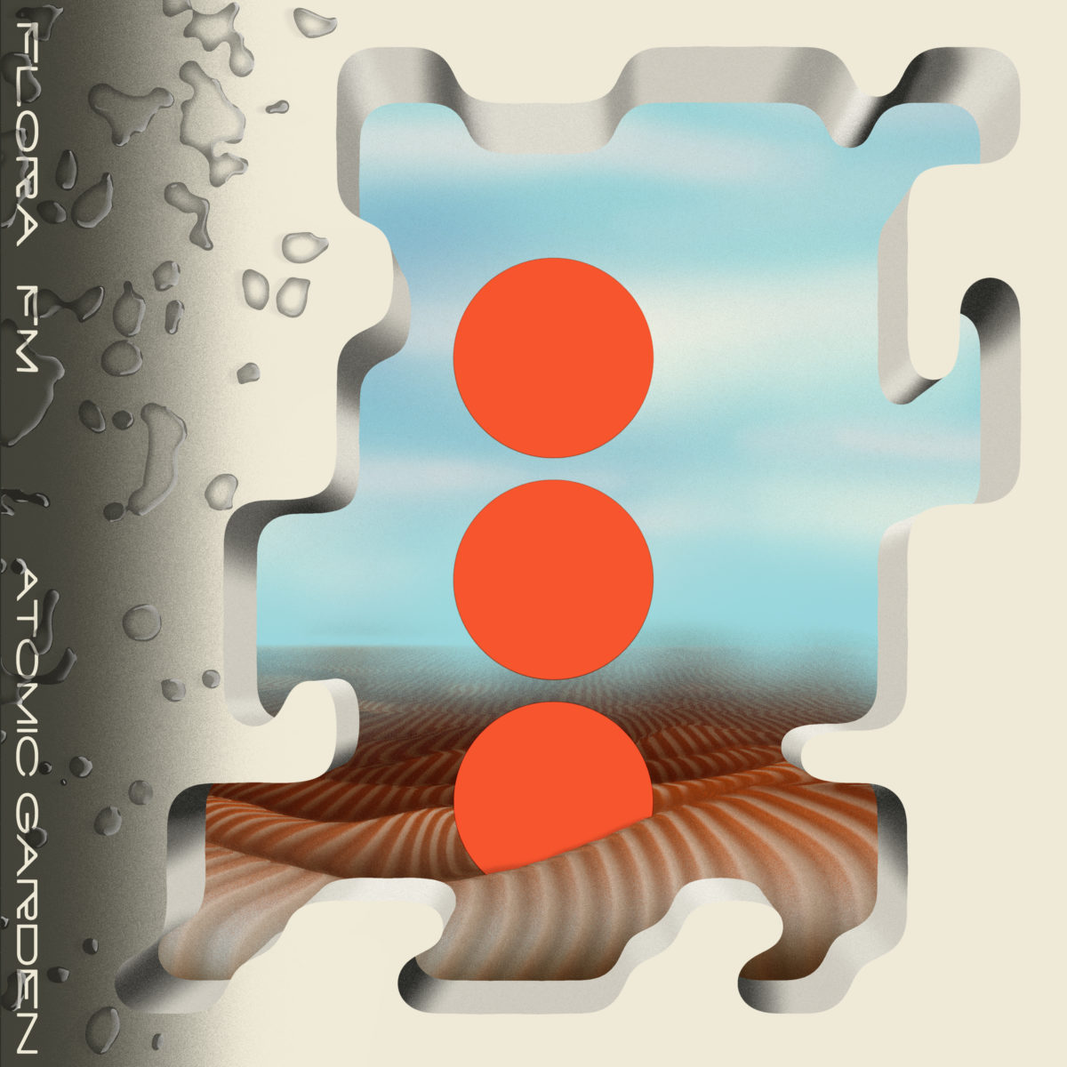
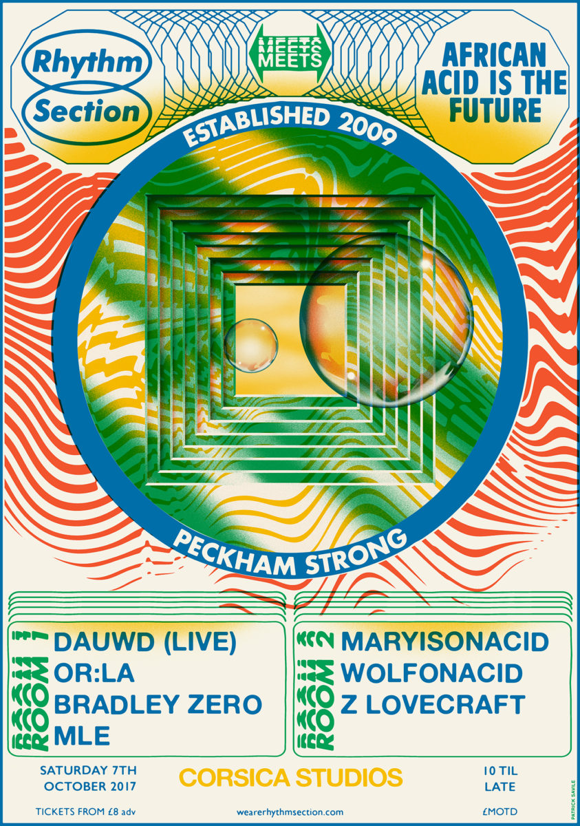
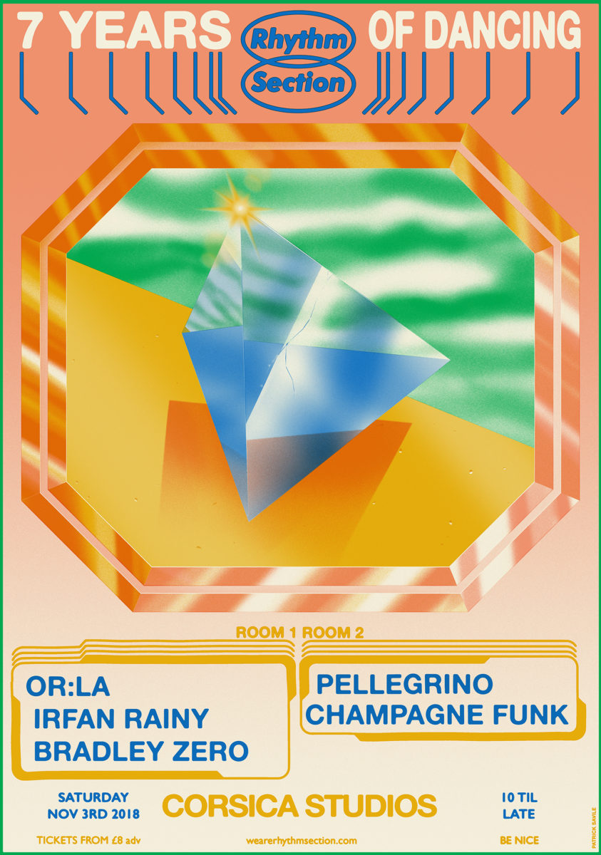
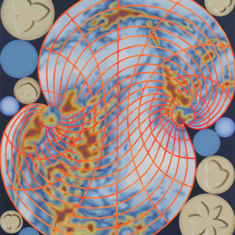
- Left: Designs for Flora FM Atomic Garden; Middle and right: Rhythm Section Poster
Your work often carries certain hidden symbols and images. What’s the influence of the esoteric side of things, and how does that manifest in what you do?
Ambiguity breeds imagination, and I think that’s really important—like the work of a lot of the surrealists, people like Hans Arp, and the illustrator Ken Price, who also does really mad pottery and his stuff is an endless inspiration. It’s very different from one page to the next and it’s really ambiguous—I don’t even know what I’m looking at, so it creates amazing imaginative landscapes. A while ago I’d been reading about chaos magic, it got a bit dense for me, but mainly I love esoteric worlds because of all the symbolism. I got into tarot not because of the sort of esoteric edge of it, but the visual side of it, and where they come from. They’re Italian playing cards and I loved how they look, which drew me into the symbolism of it all.
I did a show a while back at Jaguar Shoes all based on the shared cosmologies or creation myths of different cultures. I wanted to do a new project, but I always find it hard to create without some sort of impetus, so it all started with the word “egg”: there’s a cosmic egg concept and it’s very similar across loads of different cultures—Tibet, Africa, Australia all had the same cosmology—how is that even possible? I got really into all those creation myths and it fed into my love of ambiguity as all these symbols have so many meanings, and symbols are so huge in things like the Golden Dawn [the late nineteenth and early twentieth-century magical order, fully titled Hermetic Order of the Golden Dawn] and Aleistair Crowley. The word “gold” has endless meanings: it can mean loads of things, or one thing, or nothing.
It’s quite a human thing to look for meaning in everything; it binds us together, it’s interesting. With the tarot set I did, every image has symbols on it and there’s reasons for it, but I’m not going to straight-up explain it as that’s boring. I try and put that meaning in a lot of work I do, and maybe only I know; then it feels a lot more whole. Things like the work I’ve been doing lately with imagery of smoke, and organic liquid forms—that has a lot of symbolism in it.
You’ve always done a lot of work for music, why do you think there’s always such a strong crossover between music and graphics arts?
When I was at school I was constantly doing flyers for music nights that didn’t exist, then I used to run drum and bass nights and do the flyers for them. It’s a standard teenage boy thing that continued into my adult life, wanting to work with musicians. Then I realized there was zero money it in it; labels don’t have budgets like they used to.
Music is a world I feel very comfortable in. It plays to my sensibility—everything being a bit DIY and ramshackle—and there’s lots of conceptual briefs, especially in electronic music: people might say “I want this record to feel like you’re in a dungeon.” It really captures the imagination.
As a relatively young designer, you’ve worked with some big clients, like Cartoon Network, Amazon and Nickelodeon. How did you land those gigs, and what helps you get clients today?
With Cartoon Network that was partly nepotism as my girlfriend’s sister worked there! With Nickelodeon I was brought in to do illustration on their new office walls, which was an amazing job but it was quite high pressure. It was quite early on, before I got my head around what I was about and what we did was an amalgam of lots of different styles but through my own filter. That was quite a dream job. Those big early clients helped me get to where I am today; but I don’t aim for those any more unless they want my style.
Instagram has one hundred per cent helped me get clients since I embraced it however many years ago. I’ve pretty much got all my work from Instagram recently: clients send me screen grabs of work I’ve got on there. Some people very heavily curate their feeds, and I do to an extent with posters so that I present them in the same way, but I try to make it personable too. People know when they’re being sold to, and if it feels overly curated there’s a separation. If you put up something stupid once in a while, or a picture you on holiday, people find a connection and it feels more like a community.