Australian artist, Elizabeth Corkery founded Print Club Boston in 2013 and works with screen prints in her own practice — drawing inspiration from architecture, structural veneers and Michelangelo’s, The Laurentian Library. ‘Pictures of Pieces’, her first solo exhibition with Beers, London is open now, until July 25.
Where have you chosen to base yourself?
You’ve actually caught me between home bases at the moment! I have been living in Boston, MA for the past two years but this month my partner and I are actually moving to Providence, RI. The city is home to the renowned Rhode Island School of Design as well as Brown University and so in addition to being a culturally rich center there is a large amount of former industrial buildings in the area that have been turned into artist studios – affordable artist studios at that! I’ve been fortunate to have had a handful of residency opportunities over the previous 18 months and I’ve experienced that having a generous amount of studio space can only have positive outcomes for my work. The more expansive the work can be the more freedom you’re allowing yourself to explore the material and installation potential of a given idea.
Does your homeland have any influence on your work?
For the first few years of living and working in the United States I think I was a little negligent in my lack of reflection on the influence my homeland (Australia) was having on my work. It wasn’t until I was finishing graduate school that I really started to consider how that cultural background was feeding into my practice. Hailing from a country with both an enormously long history from an indigenous perspective, and very short history from a European perspective, my fascination with the historic and aesthetic traditions of Renaissance and Baroque periods seemed to also be unavoidably met with a sense of guilty pleasure. I grappled with why that was and why I felt that displays of opulence or decadence were somehow in bad taste. Why was I still so drawn to depicting them? Where did this tension come from?
About two years ago I finally watched the acclaimed Australian film, Picnic at Hanging Rock, for the first time and felt for me that a lot of these questions regarding ornament and decadence were being visually addressed. Set at the turn of the century, the majority of the film’s action is centered at “Appleyard College”, a prestigious girl’s boarding school in rural Victoria. The school building itself resembles a stately English manor and its interior furnishings are incredibly fussy and ill-suited to the very typically Australian bushland of its surrounds.
I began to think about this transitional period of Australian history (the film was set in 1900; Australia’s “Federation” or confirmation of nationhood was 1901) where British architecture and taste were imposed and clumsily translated to this new environment. The behavior, clothing, furnishings and even accents of the film’s characters seemed so foreign and bizarrely juxtaposed with the landscape I would otherwise be so familiar with. Decadence and ornament somehow seem out of place in Australia, it is not part of our own cultural heritage; it always seems borrowed. The fact that I would become so enchanted by the periods of European history that are ripe for this kind of visual excess is intriguing for me and tracing the origins of this enchantment has led to some significant personal revelations regarding my formative visual and cultural memory.
Who or what first turned you on to visual art?
I decided to go to art school while I was finishing up high school. I wouldn’t have considered myself a particularly talented draftsman or exceptionally creative teenager but it was during my final year of high school art studies that I finally understood that making art was as much about ideas as it was about having a specific set of drawing skills as an eighteen year old! The fact that I had two very creative parents – both working as Landscape Architects – who had absolutely no problem with my art school aspirations made the decision to pursue that career pretty easy. It’s everything that comes after studying that is the hard part!
Where did ‘Pictures of Pieces’ begin?
Pictures of Pieces has been roughly three years in the making and the timing of the show has been wonderful for initiating a reflection on the trajectory of my practice during that period.
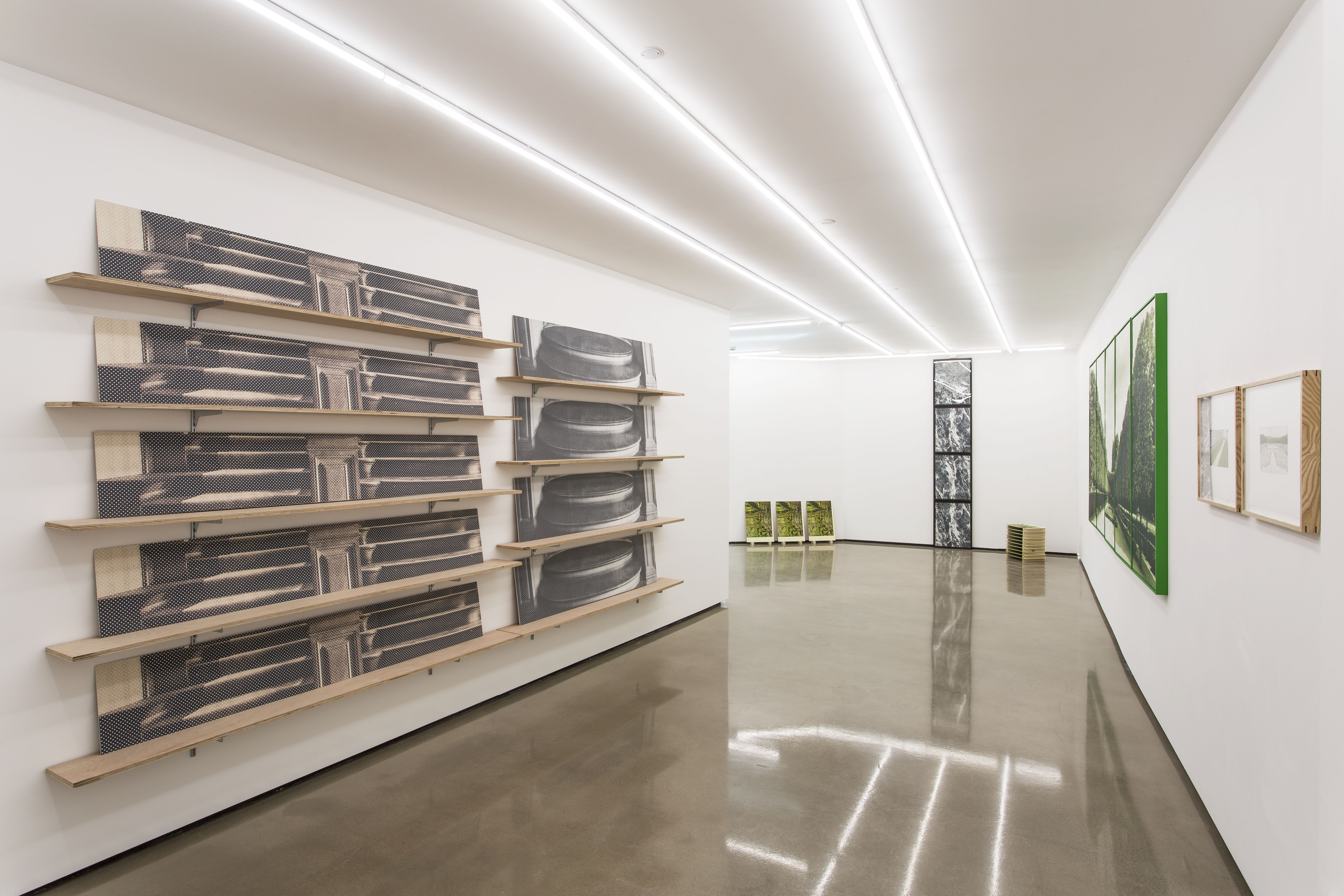
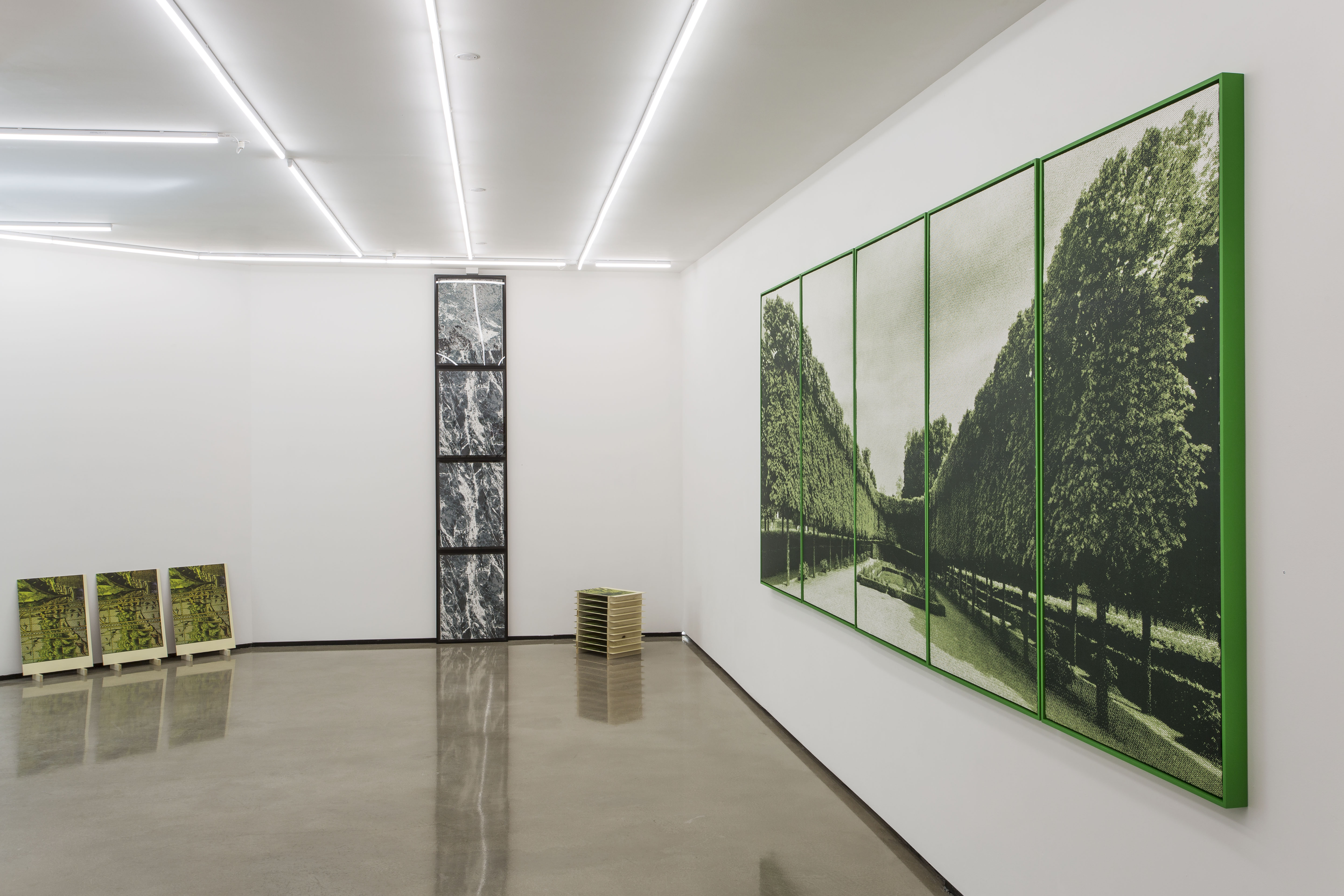
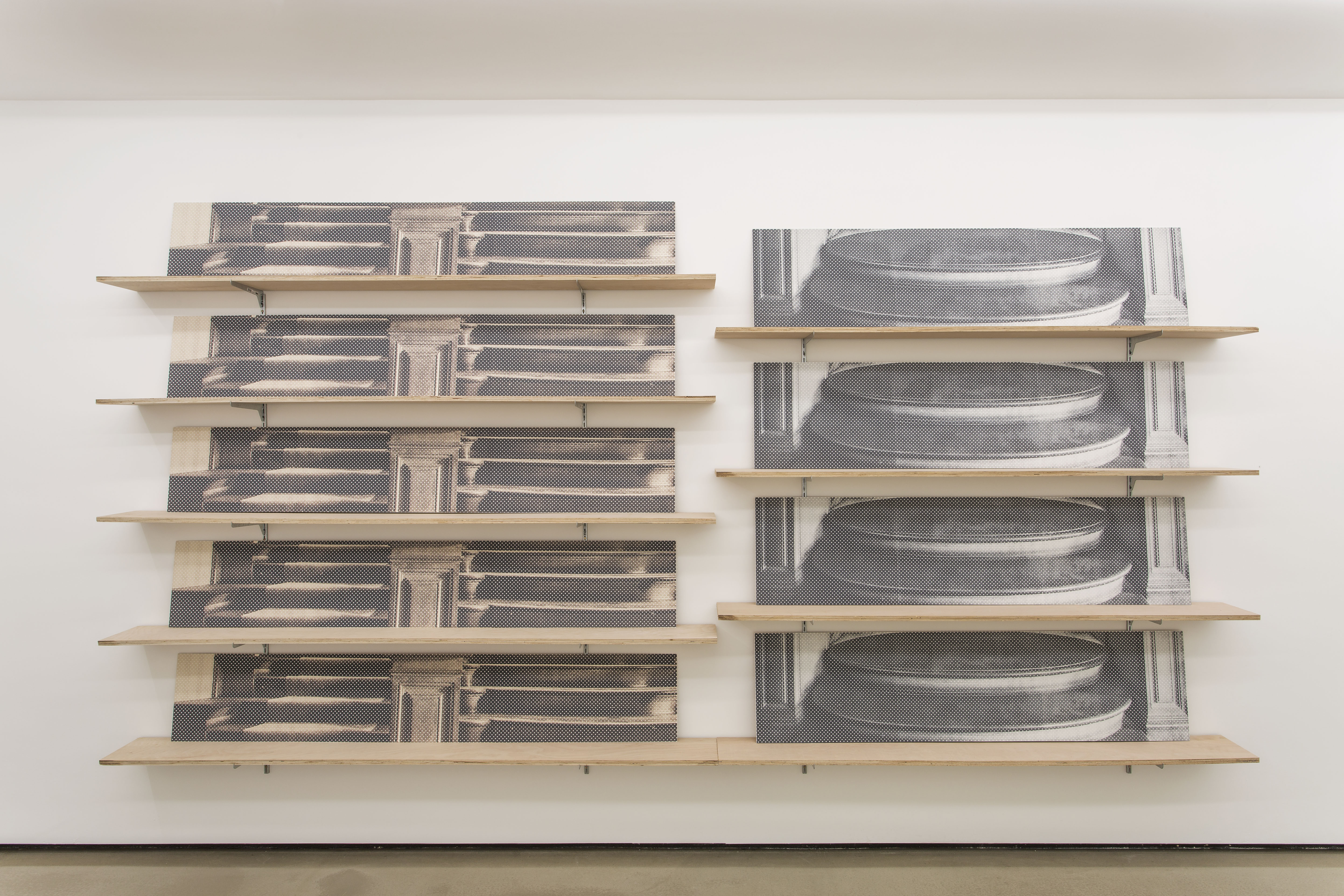
The earliest piece in the exhibition is Laurentian Repeat I and III (2012), a nine-panel screenprinted work that sits on a moveable plywood shelving system.
The prints take their visual cue from Michelangelo’s Renaissance masterpiece, The Laurentian Library. The design of the library was crucial for reimagining classical Roman architecture and the relationship between structure and ornament. Built during the 16th century to house the manuscripts and printed books of the Medici family, it is a most challenging and revelatory space. No more so than the staircase, which leads from the vestibule into the library reading room.
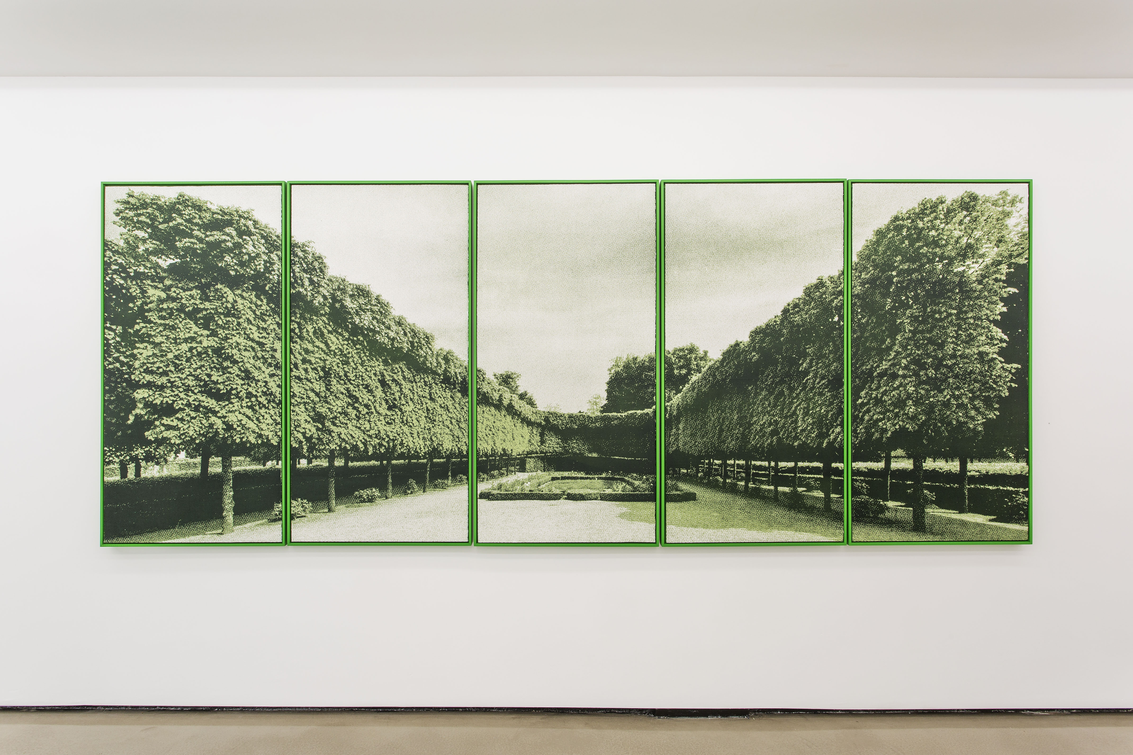
Sourced documentation of the staircase is cropped and screenprinted directly to thin MDF panels. Instead of presenting a pictorially convincing scene of receding space, the imagery’s flatness is heightened and the panels move up the wall in perfect repeat. The Laurentian Library was constructed at the height of the Italian Renaissance, a time when techniques for rendering three-dimensional space were being developed. This body of work aims to disrupt the system of single-point perspective, a structural logic that is lost when the repeat of the staircase architecture becomes instead a pictorial repeat.
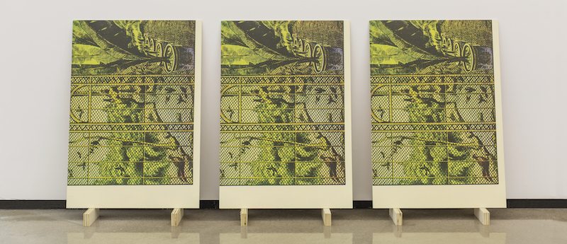
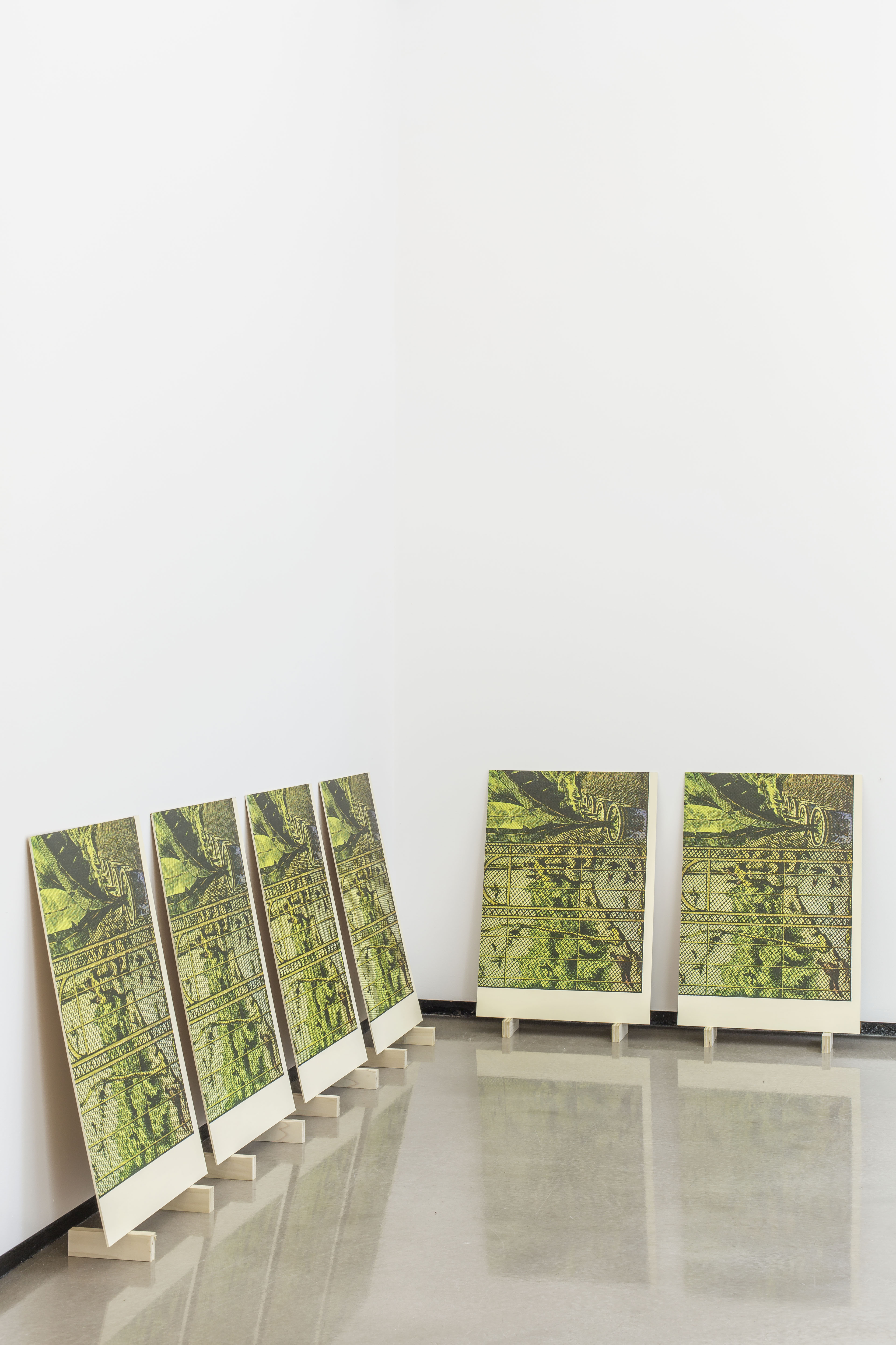
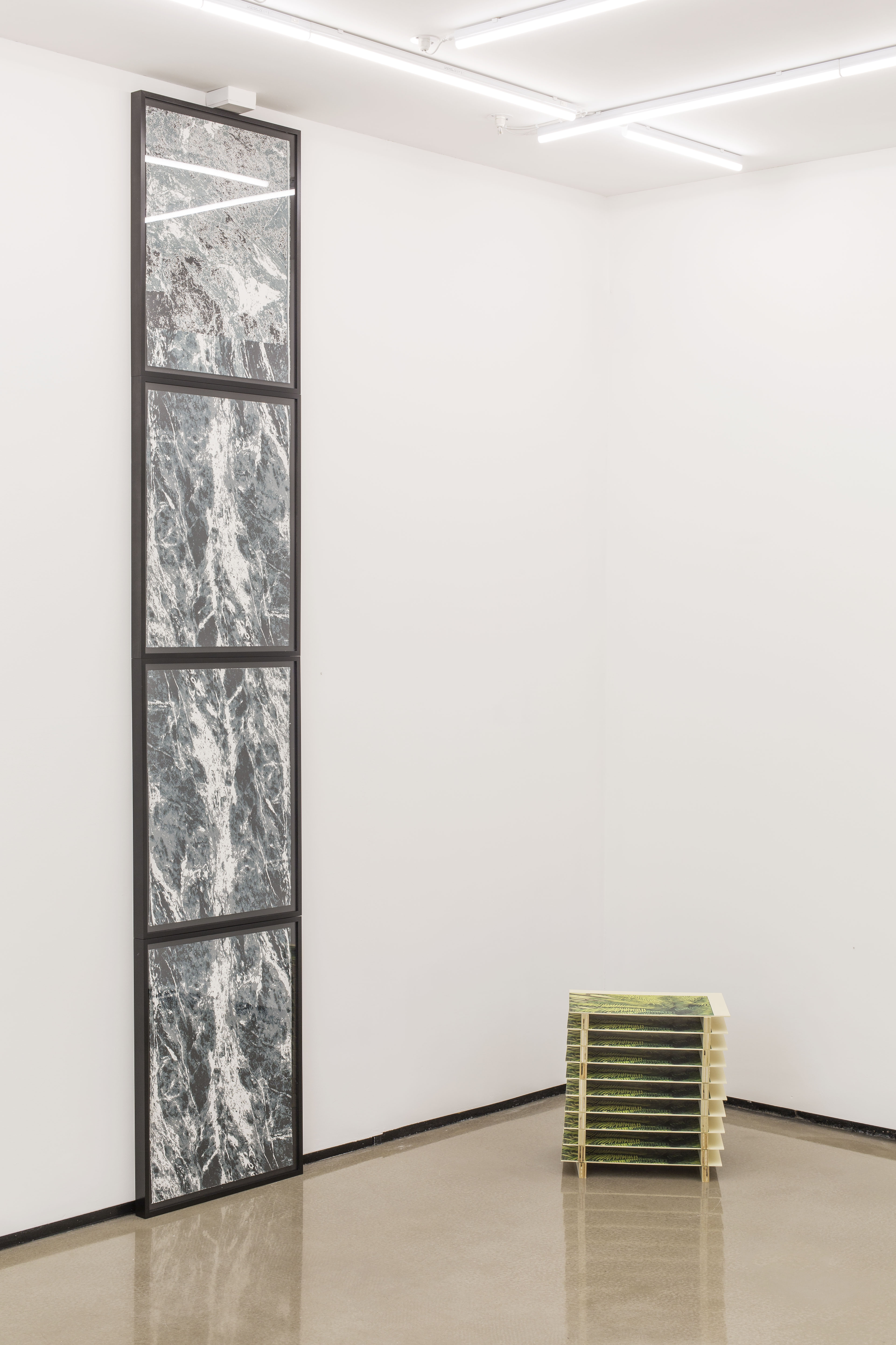
This idea of space and image continues to play out in my work, and forms the thematic foundation of Pictures of Pieces. The work in the show all similarly address the printed reproduction and the potentially fraught task of rendering three dimensions in two. Pieces are all either displayed as multiples or as multi-print series, and all acknowledge their role as reproduction, making reference to an original source, whether it be photographic or cinematic.
Which artwork (by another artist) has had the biggest impact on you?
This is probably cheating, as it’s an exhibition rather than a specific artwork, but Quentin Bajac and Didier Ottinger’s 2009 show at the Pompidou Centre, Dreamlands was hugely influential for me. I even contacted some of the catalog essayists directly to get English translations of their written pieces, as there was only a French edition! The title of the exhibition was a reference to “Dreamland”, which opened at Coney Island in New York at the beginning of the 20th century. The show itself was an exploration of both historic and contemporary leisure environments that confuse fiction and reality, structure and façade and that also dissolve the boundaries between “dreamlands” and our everyday lives. A lot of my current concerns surrounding surface veneers, spatial “fictions” and the tension between physical experience and photographic reproduction stem from my encounter with this exceptional show.