When Chris Kraus’ I Love Dick was published in the UK in 2015, it almost immediately became the default reference point for “things that might make some people feel uncomfortable reading on public transport.” The book itself of course isn’t, *really*, an ode to phallocentric worship. Instead, it’s a heartbreakingly brilliant, often hilarious, unnervingly pertinent story of obsession; relationships creaking and dying; the injustices of being a woman in the art world, and outside of it. Part fiction, part memoir, part, essay, part solipsistic “psychic vomiting”, the book certainly divided opinion. For the record, I loved it as much as its protagonist loved (or thought they loved) Dick—a hell of a lot.
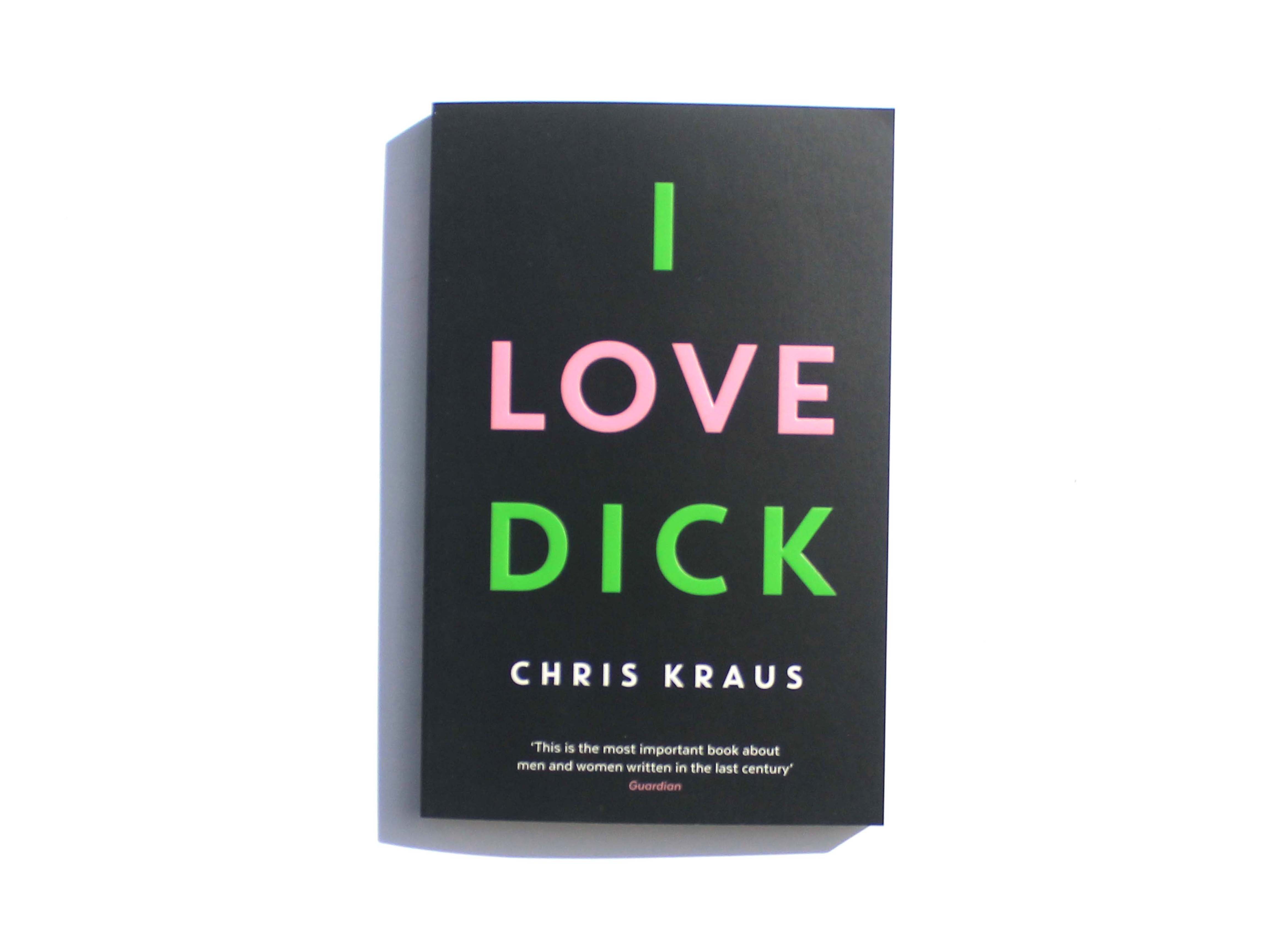
Designing the cover must have been something of a dichotomy: both a dream commission in terms of the potency of the title alone, and a conundrum in how to design around it. Peter Dyer, art director at the book’s publisher Profile’s Tuskar Rock imprint, got it spot on. Using a purely typographic approach, he simply placed the title, all-caps, across the front, one word per line, like a sort of provocative “I Love New York.” The author’s name is all caps, too, and (other than the quote which appears on the paperback version, released a year after the hardback, in 2016) that’s it. In a nice touch, the lettering is subtly embossed, but that’s it as far as bells and whistles are concerned.
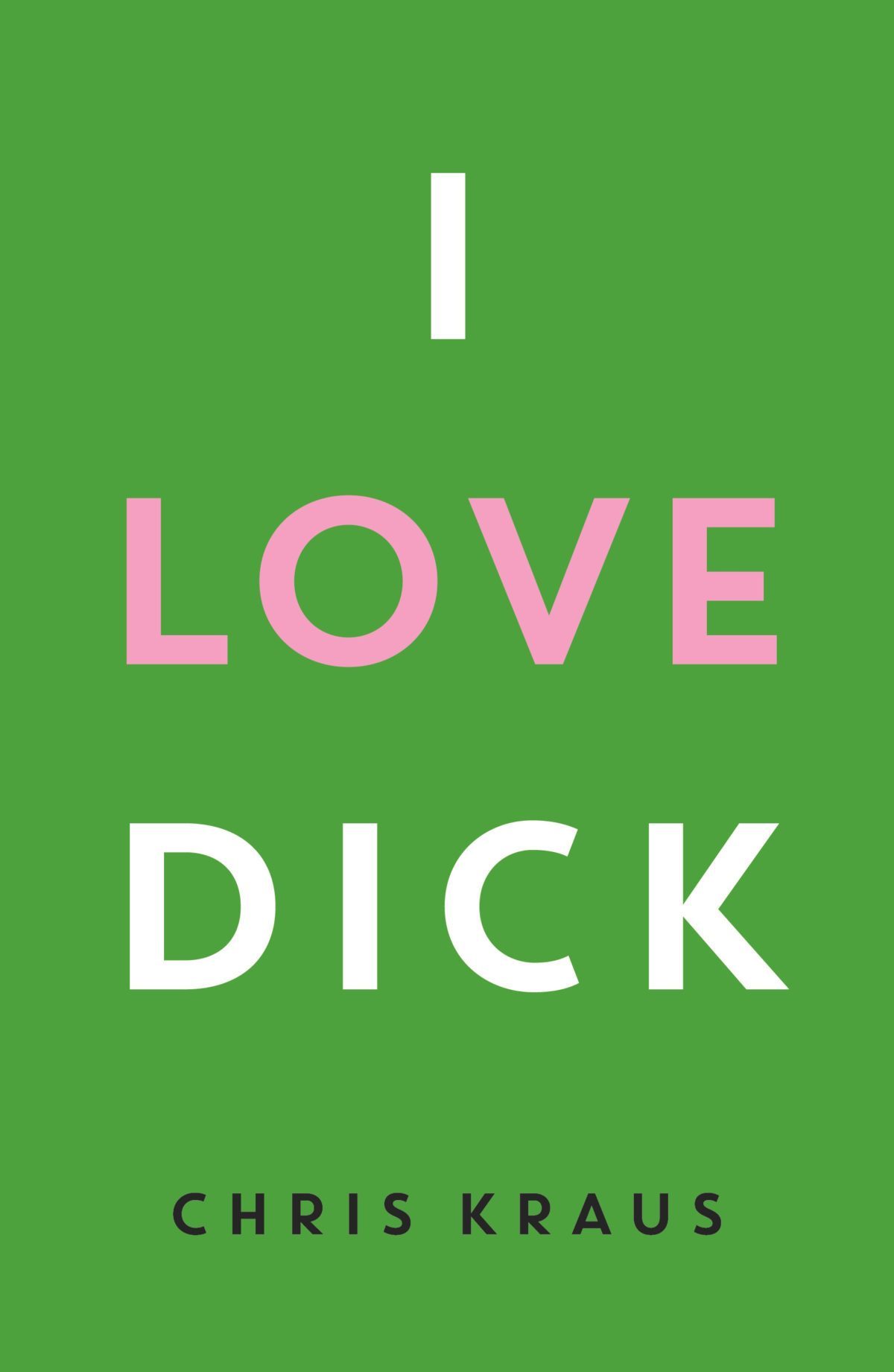
Where Dyer was also particularly smart is in his colour choices. For the 2015 hardback, the background is a lurid green—if the title wasn’t “look at me” enough, that hue certainly is—with “I” and “dick” in white, and love in pink (we suspect, something of a satirical move in light of the book’s themes, and Kraus’ own feminist viewpoints.)
When designing the 2016 paperback, Dyer opted to switch the colours around: our bright green becomes the “I” and “Dick” against black—to me, a far more striking, and appropriate configuration—while the “love” wryly remains a saccharine pink.The typeface is a no-nonsense, no-frills sans-serif. Dyer has previously described his style as “less is more”; and always aiming for “alluring and arresting”; and that seems crystal clear in his work on Kraus’s book.
It feels as though (at least to this Londoner) that it was only on the UK release with Dyer’s design that it suddenly felt like Dick was everywhere. Its initial 1997 publication in America was met with little fanfare, with many reviewers writing it off as too “gossipy” or daft in its placement of “real” Dick (art critic Dick Hebdige) as its hapless fulcrum. As The Guardian put it, “The patriarchy likes to take things personally; that way, it can single out particular women artists as troublemakers and crazies by claiming that they’ve slandered some man, when all they’ve done is describe the conditions of their own lives”.

Perhaps, though, the book was simply more noticeable. The initial cover design is far more restrained and unremarkable. Plus, unlike in the late 90s, by 2015 we had Instagram. And boy, does that cover (and title) look pretty great on there, whether it’s nestled on tasteful bookshelves with succulents, on tables with succulents; propped up on charming analogue audio equipment; held aloft against feminist posters; or sun-lit with cake, lamp-lit with biscuits; indeed, accompanying any baked goods at all.
It’s little surprise that the I Love Dick cover was among the winners of the annual Academy of British Cover Design awards in 2016 (albeit in the slightly ickily named Women’s Fiction category.) Its stark, minimal aesthetic felt so utterly relevant to the subject, yet so playful: all it’s begging you to do is read those three syllables that so succinctly underscore an entire novel: I. Love. Dick.


