While the art world, largely, is still happy with “beauty” as a standard of judgement—albeit one that might seem a little fusty, a hangover from the days of Sewell as critic—in the world of design, “beauty” has become, well, ugly. Designers no longer aspire to make things that their viewers see as beautiful: today, it’s more about wit, “surprise”, “delight”. Beauty, as the authors of a new book on the matter put it, has “fallen out of favour.”
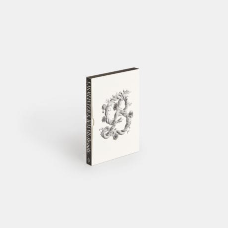
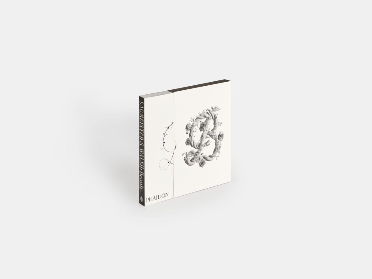
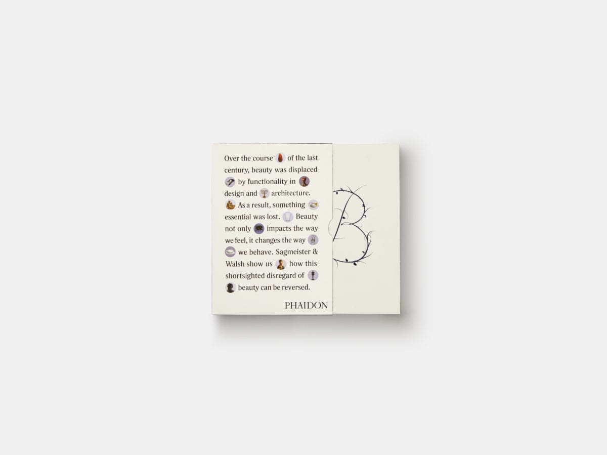
Stefan Sagmeister and Jessica Walsh (who work together as partners at the New York-based studio Sagmeister & Walsh) reckon that this modern day poo-pooing of beauty is all wrong, as their book titled—you guessed it, Beauty—makes plain (or indeed, makes ornate). “We believe this rejection of beauty is utterly stupid,” is the pair’s rallying cry.
With a few elements that will be familiar to those who’ve seen Sagmeister speak lately, the book uses a number of polls, comparative analyses, charts, data visualization, historical examples, essays and more that look to bolster the idea that actually, design that’s beautiful is more useful. It’s not just about things looking good, the authors tell us: beautiful design (i.e. that in which designers have scrutinised form) means more functional design.
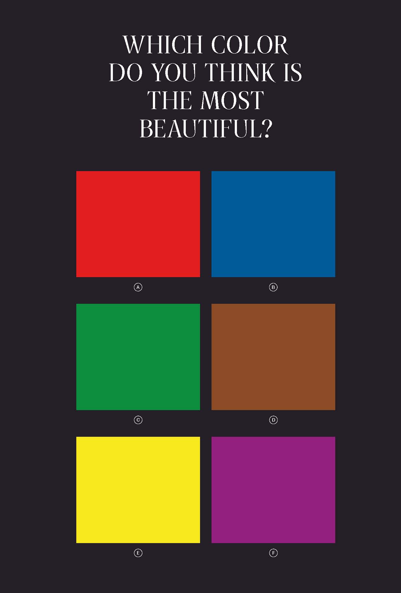
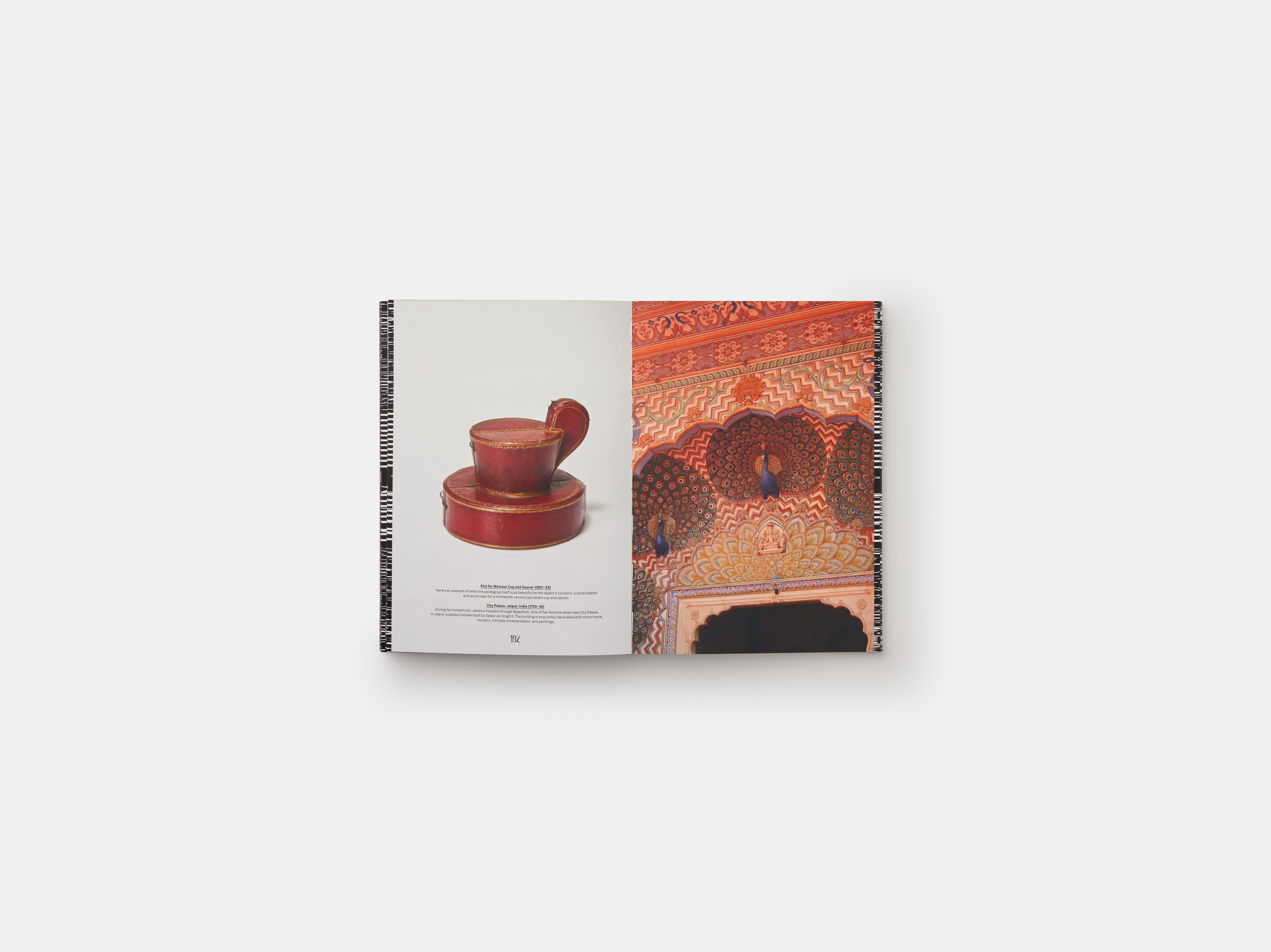
Thankfully, this means the book isn’t just a thinly veiled portfolio piece or a monogram of work; it’s a genuine insight into what beauty is, why in fact it is not actually in the eye of the beholder (turns out that there’s a significant consensus when it comes to what we see as beautiful), how beautiful design has the power to do good and an archive of beautiful art, architecture and design.
When they set their points out like this, it seems daft to think we ever gave the idea of beautiful design the side-eye in the first place. In public space, city planners that make an area more beautiful are considering the needs and happiness of the people using such spaces, and in many proven cases, reducing crime. Branding and packaging design that’s beautiful as well as, say, eye-catching or smart or clever or well written sells more (which is what that branding studio or packaging designer was ultimately commissioned to do in the first place).
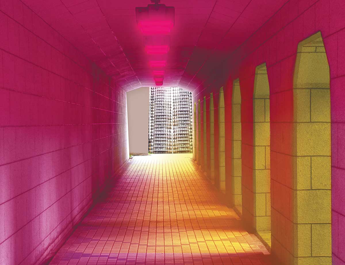
Of course, such broad judgements rely on a consensus of what “beauty”—often considered to be a slippery notion—actually is. The book offers a no-nonsense mathematical definition of beauty: M = O/C, where Beauty (M) is the ratio of Organization to Complexity. They explain this as beauty being “the sweet spot between order and chaos”. As such, the formality of Modernism, for the authors, can’t be beautiful since it bypasses anything “chaotic” or human; and those things in the natural world that fall within a certain dimension (basically, landscapes that adhere to the rule of thirds) will always be the most beautiful since they’re the easiest for the human brain to comprehend.
Perhaps the trend for “ugly” design today—all MS Paint, “hilarious” nineties colour gradients, stoner-boy clip-art and so on—indicates a wider move in design towards insincerity. We’re afraid to say what we mean, so we design and consume through a lens of irony. Beautiful design eschews such irony for sincerity—a far scarier approach. As Keats (and Socrates before him) put it (and as anyone who did English A Level will recall), “Beauty is truth, truth beauty.” So, then, beautiful design is truthful; and these authors aren’t wrong in saying we all need a little more of that in our lives today.
- Sagmeister and Walsh, Beauty
