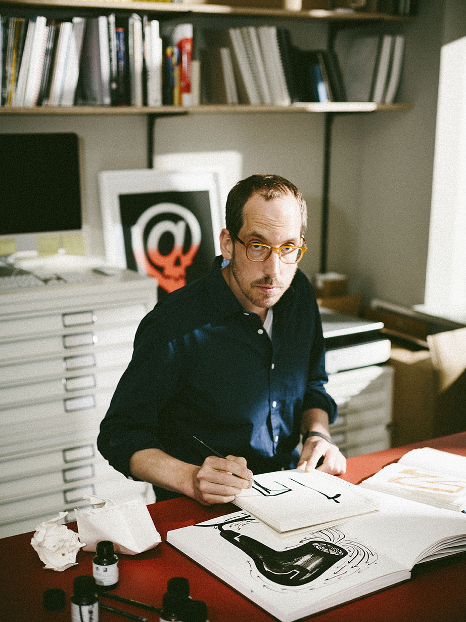
It may just be my imagination, but Christoph Niemann appears so tall that I worry that he’ll knock his head against the door frame as he enters the café. It’s a blustery afternoon in Brooklyn, just a few blocks from the artist’s former home, where carefully maintained brownstones and Callery pear trees sit dark and dripping after a heavy rain. In contrast to his height, Niemann is quiet, his German accent is soft rather than clipped. In conversation he is enthusiastic and precise.
He doesn’t just talk with his hands—he uses any object within reach. A Pellegrino bottle, a cellphone, a coffee cup are all quickly conscripted into a shadow play illustrating his creative process. It’s a bit like watching a cardsharp or a sleight-of-hand magician at work. Niemann is an illustrator, graphic designer and artist whose work has appeared on over twenty New Yorker covers and those of many other magazines. A consummate visual storyteller, Niemann works across media from print to digital ad back. He is the author of many books, as well as a columnist for the New York Times. His first iPhone app, an interactive storybook called Petting Zoo (in which animals perform silly and unexpected calisthenics in response to the user’s taps and swipes), has been downloaded over a million times.
“The more playful things look, the more gruesome the process is for me”
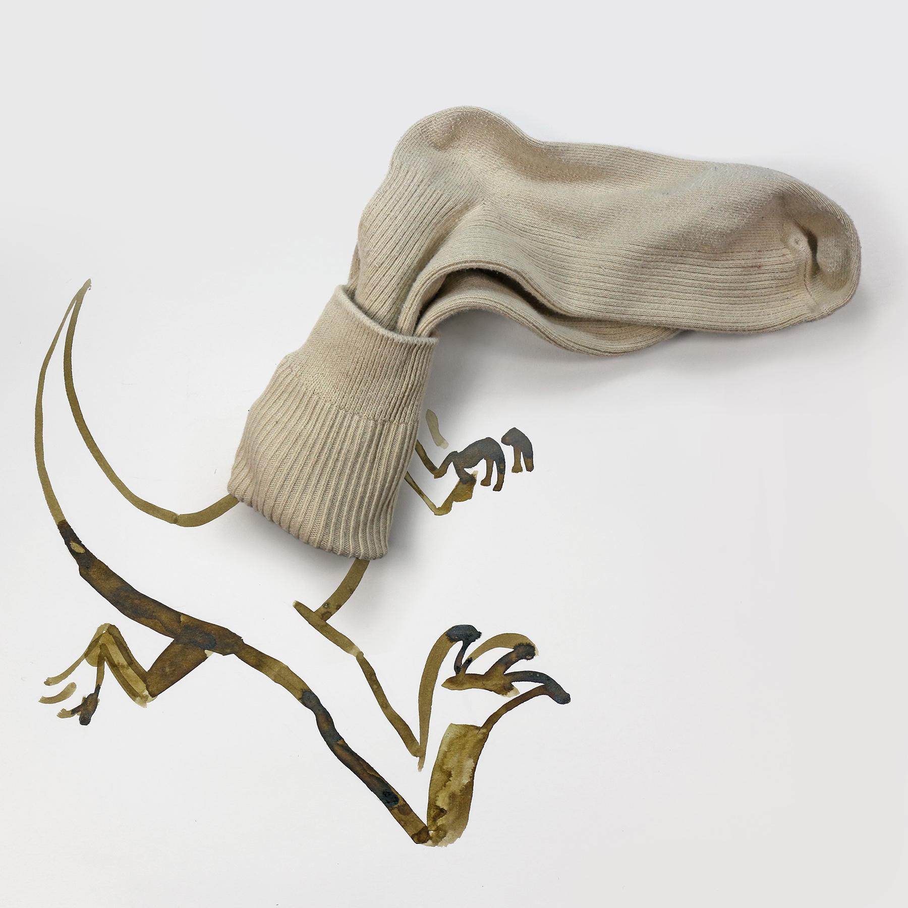
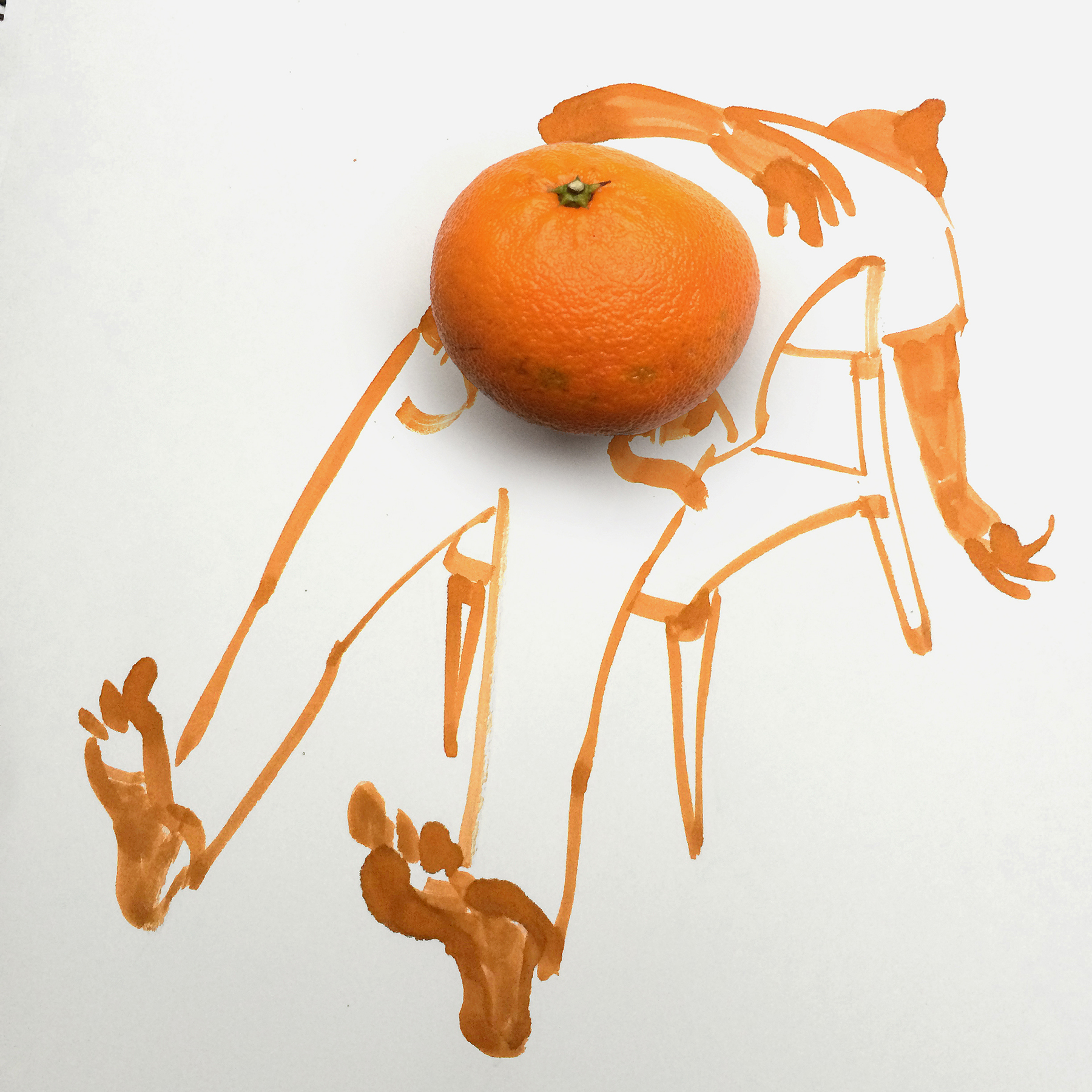
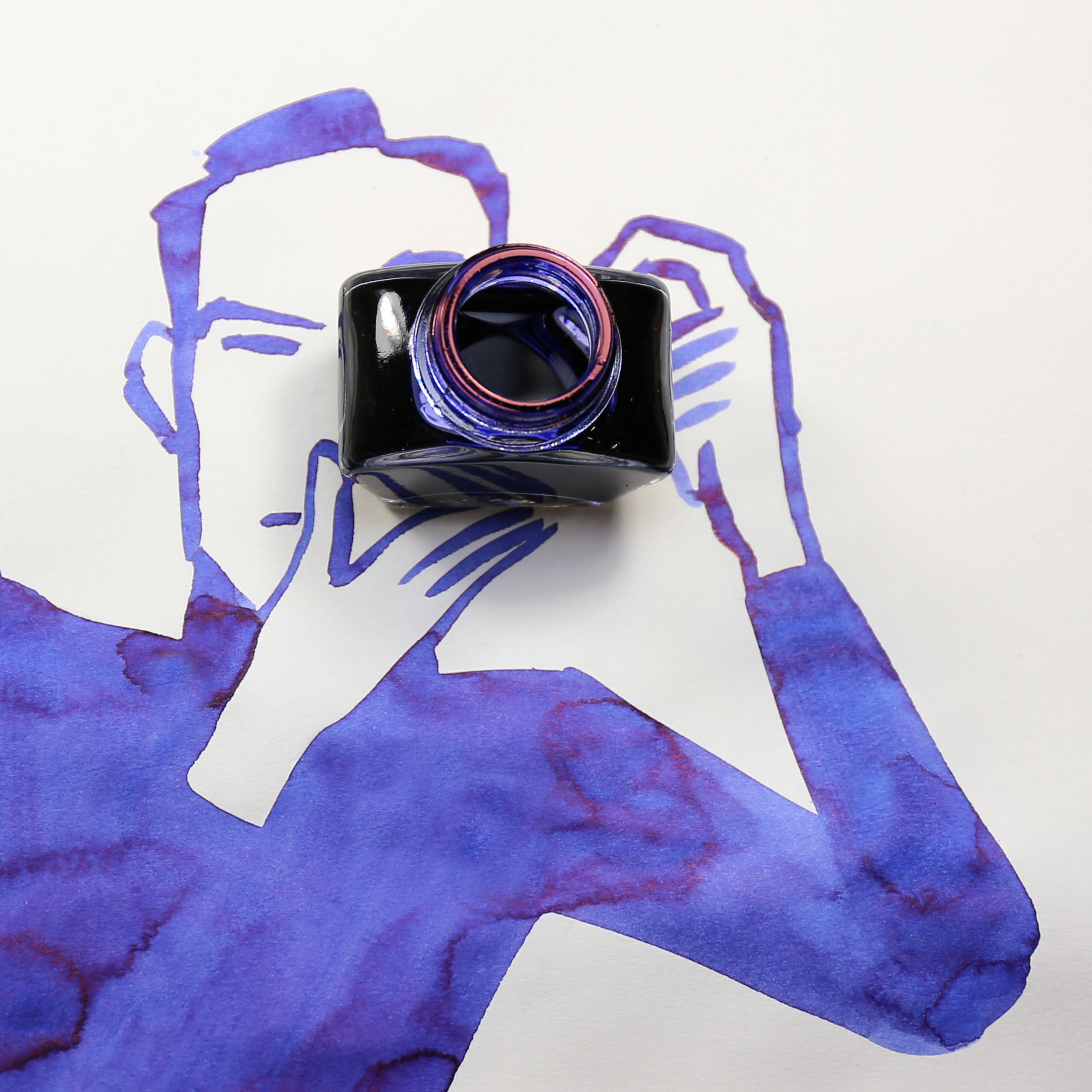
His Sunday Sketches series is an experiment in looking closely at ordinary objects and combining them with drawings in surprising and delightful ways. In his cover illustration for issue 21 of this magazine, an upturned red teapot becomes the head of an elephant, its spout serving as the trunk and its handle angled precisely to suggest a drooping ear. Although his work seems spontaneous and playful, I quickly learn that for Niemann, his process is anything but.
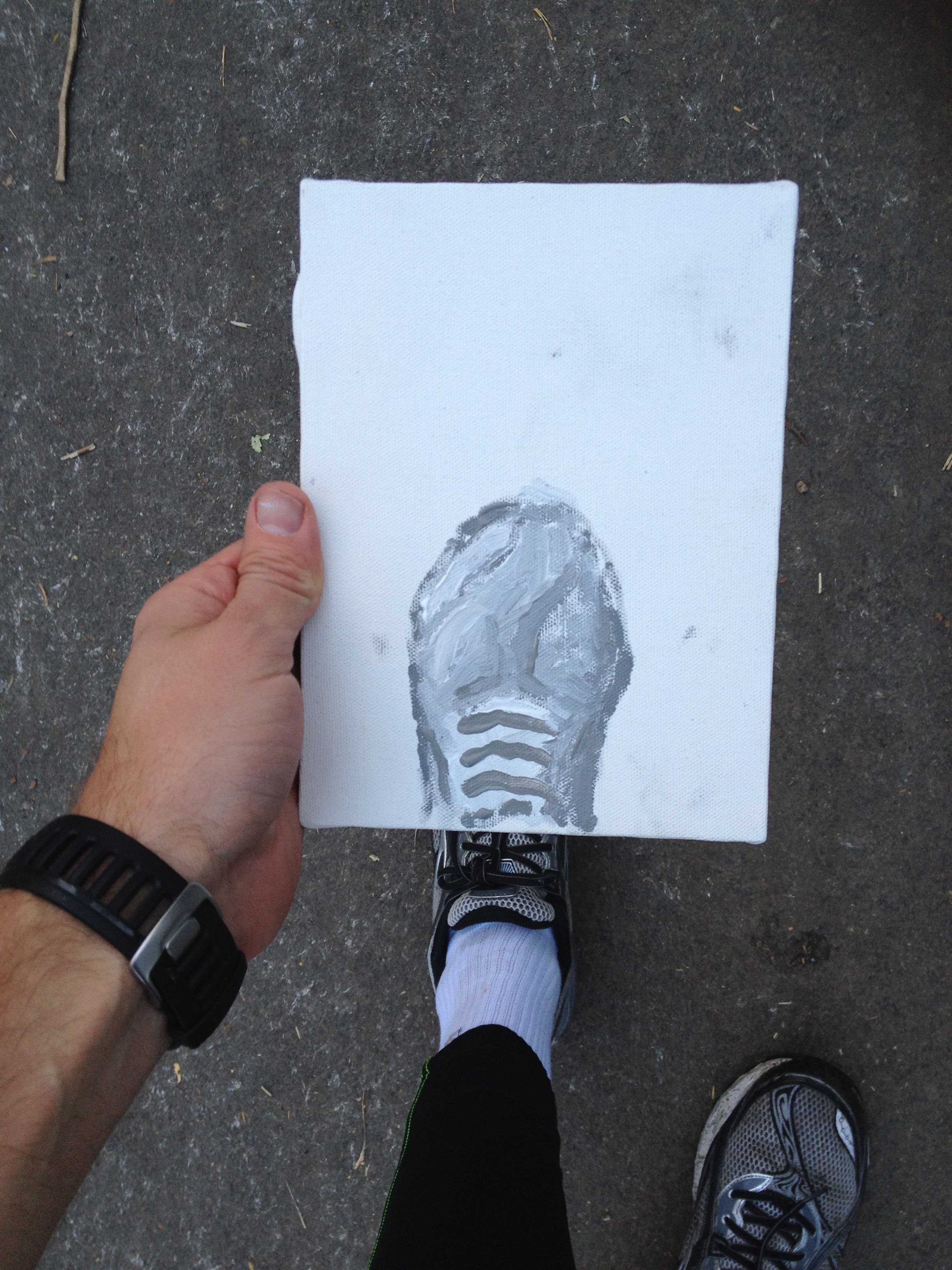
How does childhood, both your own and also the experience of raising children, influence your work?
Not at all.
Not at all? But your illustrations have such a sense of play!
Well, I can’t say not at all, but it’s not as if I play with my kids for a few hours and think: “Oh this is cute, why don’t I bring this in?” An idea never comes from a sense of play. The more playful things look, the more gruesome the process is for me. The creation of my work has nothing to do with play. It’s all about me designing these moments, so that the viewer gets it in a way that feels effortless. If it’s too easy it’s boring, but if it’s too hard it’s just frustrating. Hopefully it’s surprising, fun and doesn’t feel like being hit over the head with a hammer.
It’s all about structure?
Structure, patience and editing. Editing, editing, editing. I always want to make something so that at the end it feels like that was the only possible solution. Inevitability. [Gesturing to the café table top] You’re trying to create a path where at the end this bottle and this cap and that phone and that angle on the wooden table are such a perfect solution that you start laughing. But it never has to do with arranging the things, it’s about arranging the path.
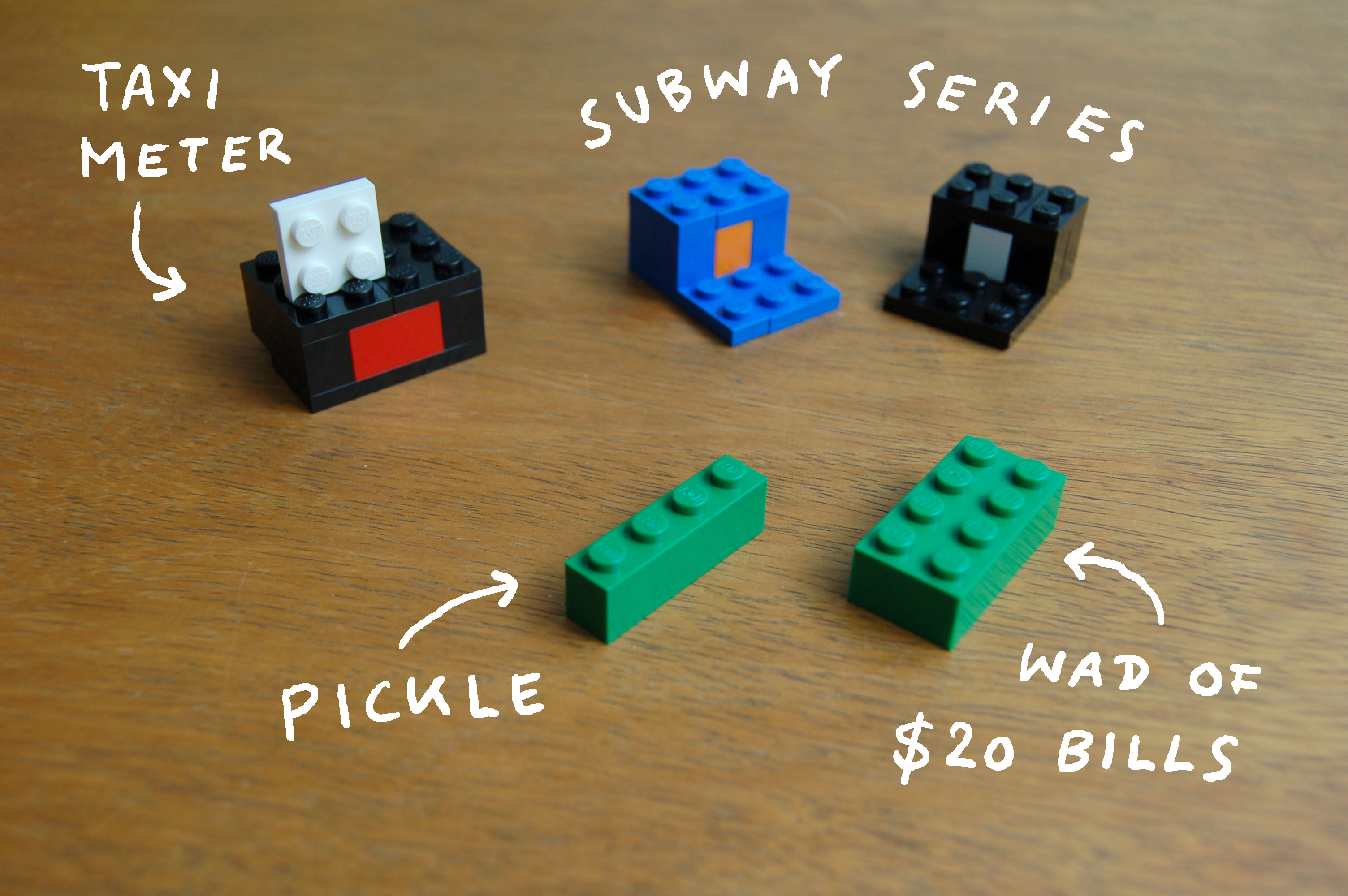
You talk about creating illustrations the way an author might talk about constructing a plot of a novel.
It’s totally like that. One of the most groundbreaking books I’ve read about this is Stephen King’s On Writing. I’ve never read a single Stephen King novel in my life, horror is not my thing, but On Writing is part autobiography, part writing instruction. He writes that when it comes to plot, you can either start with the end [in mind] and guide the reader there, or you can put your characters together in a room and then let them do their thing. You give the characters freedom to just go places, and I find that so scary. When I started doing the Sunday Sketches, that was the idea.
In 2011 you attempted to illustrate the New York City Marathon while running it. You’ve talked about how much careful planning you do, but live-drawing an event seems like the opposite approach.
That’s where this whole thing started. This idea of letting go and giving away control. I’ve tried a couple of things like that and often I’m just not happy with the results. Nobody likes an idea better because it was done live. You don’t get extra points for doing it while standing on one leg—if the drawing is bad it’s just bad. What worked with the marathon is it was actually live and you could follow me in real time, so there was a sense of urgency. If I had published it three weeks later I think it wouldn’t have worked. I’m very sceptical of these things.
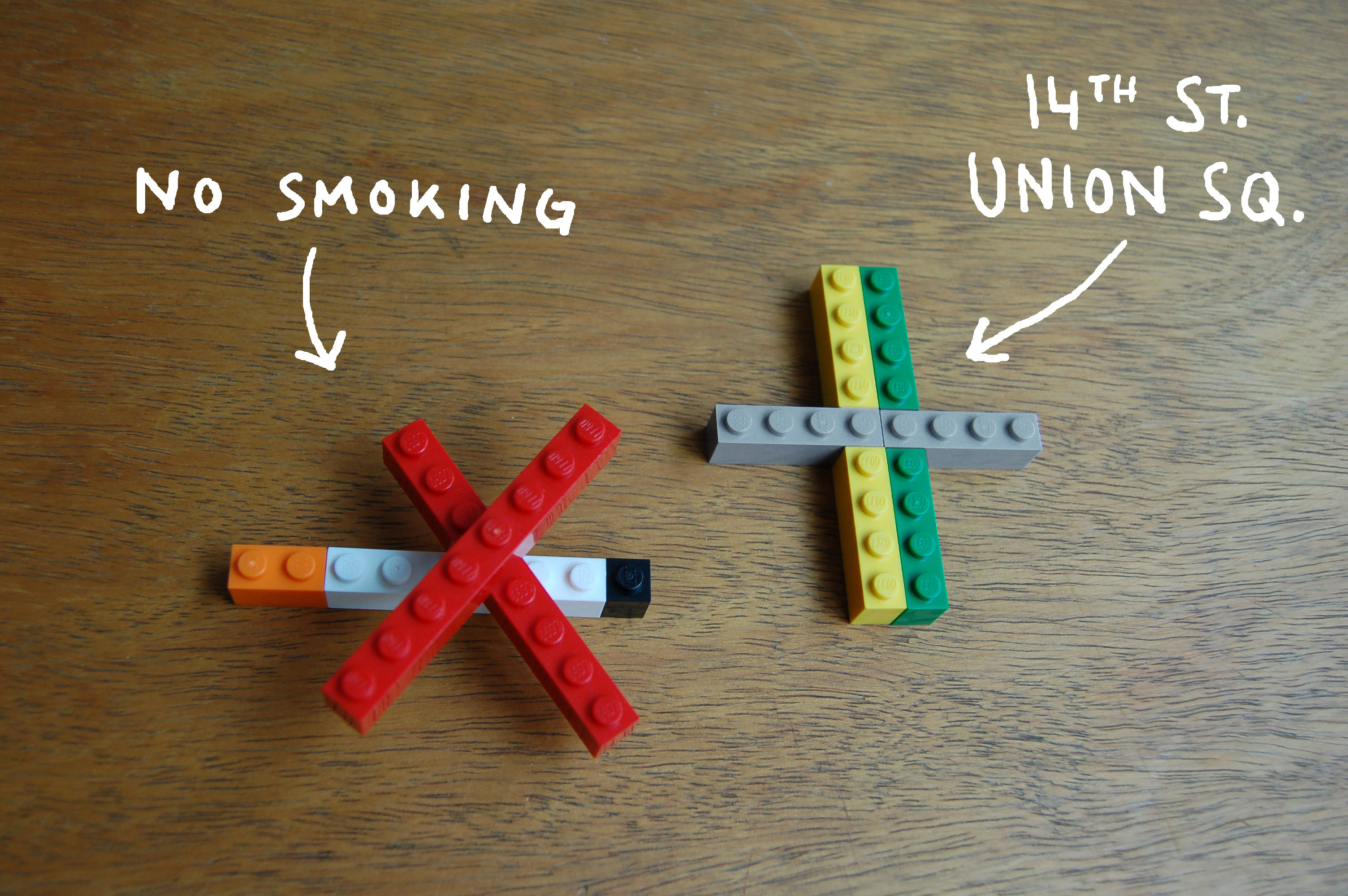
You said in an interview recently that James Turrell offered “the ideal art experience”. What’s the ideal art experience for you?
What he does is just a hole in the wall and light. There’s nothing there. It means nothing, represents nothing, touches on nothing historical, political or social. You don’t need any education to see it. You go there and it’s all in your head. It seems to be about love and drama, life and death, but there’s no blood, no nakedness. The amazing thing is the simplicity and abstraction of the art and what it does with you. Suddenly, you just think about colour and perspective and light, questioning the whole world just from looking at a purple square. I’ve never had these moments as clearly as I’ve had them while seeing Turrell’s work.
“I can’t take you to faraway places and show you dramatic stories. I’m always limited by our shared experience”
How has Turrell’s art influenced your own?
One thing I love about Turrell is that when I see one of his installations I feel like I am the only person who gets it. Not even he understands how meaningful it is. With art that’s kind of the holy grail—creating something that somebody looks at and feels that they always knew. It’s kind of a stupid aspiration because I can’t really plan to do it, I can just hope for it. It’s a guiding light for where I want to go.
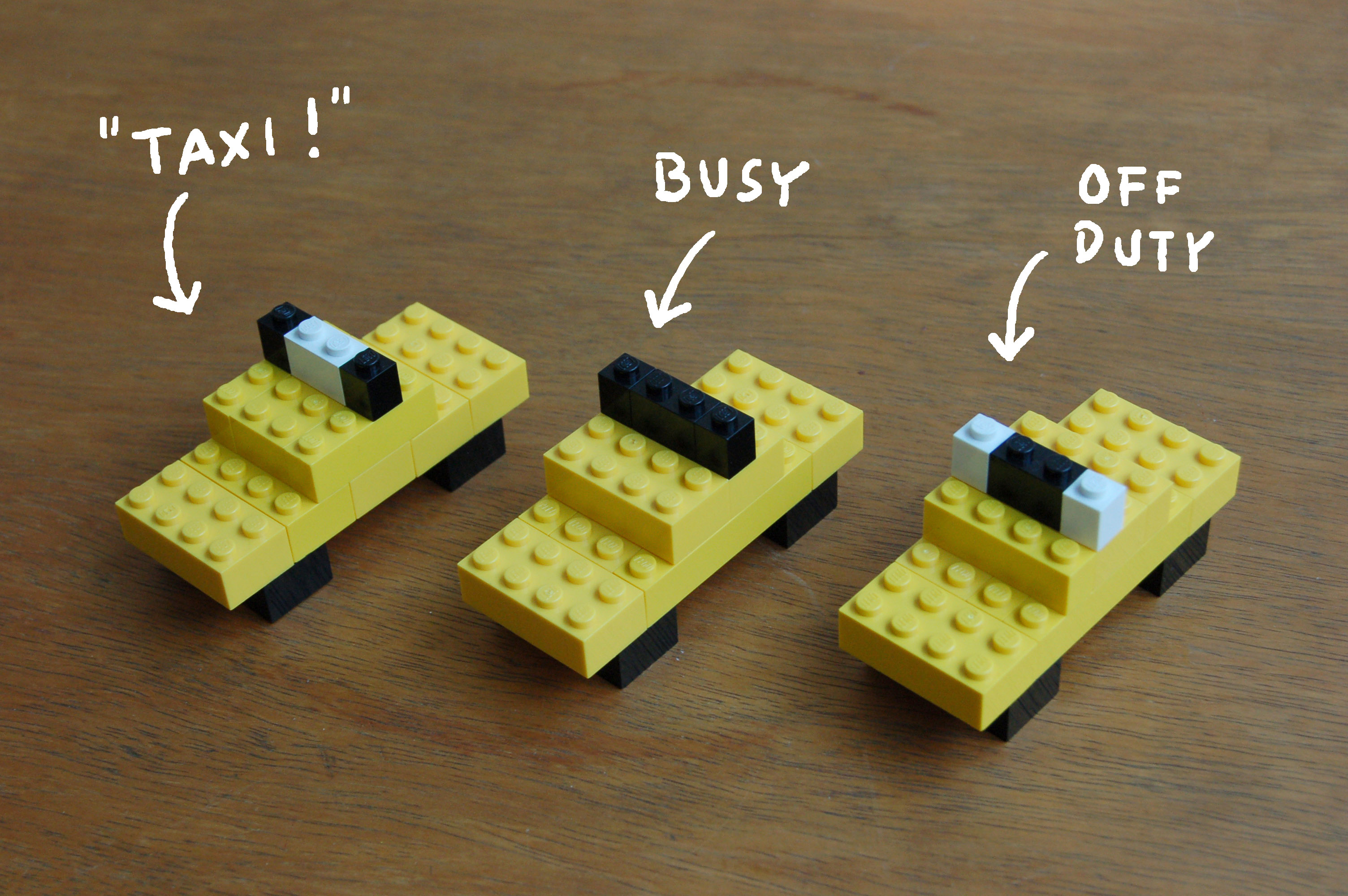
There are similarities between your illustrations’ style and tone and that of contemporary comics and graphic novels. Do you ever look to comics for inspiration?
I know some. I think Chris Ware is a genius and Adrian Tomine is a genius. What they do stylistically, what they do with storytelling, is just mind-boggling. What they do is letting go and creating a literary experience, which is something I’m still struggling with in a much shorter form. When I look at Chris Ware’s comics I enter his universe. There’s a door opening and I go through the door and I’m in this world. It’s a scary world, a fantastic world, but the moment I close the book I have to go back to my life. Instead what I try to do with my work is enter your space. Basically, I want you to stay where you are and give you things that redefine everything around you. I can’t take you to faraway places and show you dramatic stories. I’m always limited by our shared experience.
You recently illustrated a collection of Erich Kästner aphorisms. He’s such a popular writer in Germany, but virtually unknown in the us.
In Germany he’s probably best known for kids’ books like Emil and the Detectives and Lottie and Lisa. He’s the classic author that everybody knows. It started as a book project and there were a few challenges. One was that the writing is kind of perfect. I couldn’t add anything, especially since most of the aphorisms are very well known. If I tried to do my own take on it, it would make it smaller. It’s one of those books that should not be illustrated.
Right, because adding anything to it makes it less potent.
This is like my pet peeve. About thirty per cent of all thesis projects in illustration are kids illustrating Kafka’s Metamorphosis. There are some amazing drawings, but I’ve never seen one that made the book better than it is. You try to latch on to the greatness of the story and then you actually drag it down. The horror is that you wake up and you’re this bug—the moment you draw it, it becomes more tangible and more boring.
I started with a pencil drawing on a blank page of the book and realized that was the solution. When you get a play by Shakespeare from the library and write your thoughts in the margins, you’re not trying to make Shakespeare better, it’s more like: “Oh, this is what it means to me.” Your thoughts might be no less meaningful but you’re not trying to compete. I started thinking that pencil was right because it’s the ultimate subjective tool. The moment you have ink it’s for eternity. Pencil is always searching, it’s never done. When you get the book with my drawings, it’s really more like you go to the library and someone has doodled in the official Erich Kästner book. At the book party I had all the drawings in frames and my gallerist saw them and said: “Let’s make an exhibition with this.”
How do your drawings change when they move from the page to a gallery wall?
You can never approach a magazine drawing from twenty feet away. It’s only one size, one perspective. With a drawing on the wall you can create a mood, create order and narrative. I don’t want an art piece or drawing to be cryptic. I think it’s stupid to make it so that art is cryptic and deep and illustration is superficial. When I look at all the art that I like to have on my walls I want something that maybe releases the meaning a little slower. There are elements that maybe don’t quite add up. Not because they’re nonsensical, but because they describe the reflections of things more than they describe the things.
The exhibition was called Es Gibt Nicht Gutes (There Is No Good)—a truncated version of Kästner’s book title. I was surprised at the darkness of that title because your work is typically so funny and optimistic.
The overall feel of Kästner’s aphorisms is surprisingly positive when you consider the background—he wrote the book while he was banned from writing. Kästner is the only author, to my knowledge, who witnessed his own book burning in Berlin during World War II. These aphorisms, this is some stuff he worked on while he was not allowed to write books. When you consider the circumstances, some of them are extremely upbeat, but of course there’s a lot about the political gullibility of the people—in this context it seems amazing that he isn’t writing: “You’re all idiots.”
After living in New York for over a decade you recently moved to Berlin. How did that change or influence the way you work?
In New York everyone is so professional and so efficient. For me it’s extremely tough in those circumstances to be experimental. When everyone around me is just churning out books and movies I just don’t have the balls to say: “I need to spend the next few weeks experimenting.”
It sounds like the move was pretty liberating.
The biggest problem is that it’s the end of all excuses. In New York you can say: “Oh, I’ve always wanted to do big metal sculpture but it’s just too expensive.” In Berlin if you want to do metal sculptures you can do them. If you don’t the only person to blame is yourself.
All images © Christoph Niemann
This article originally appeared in issue 26
BUY NOW