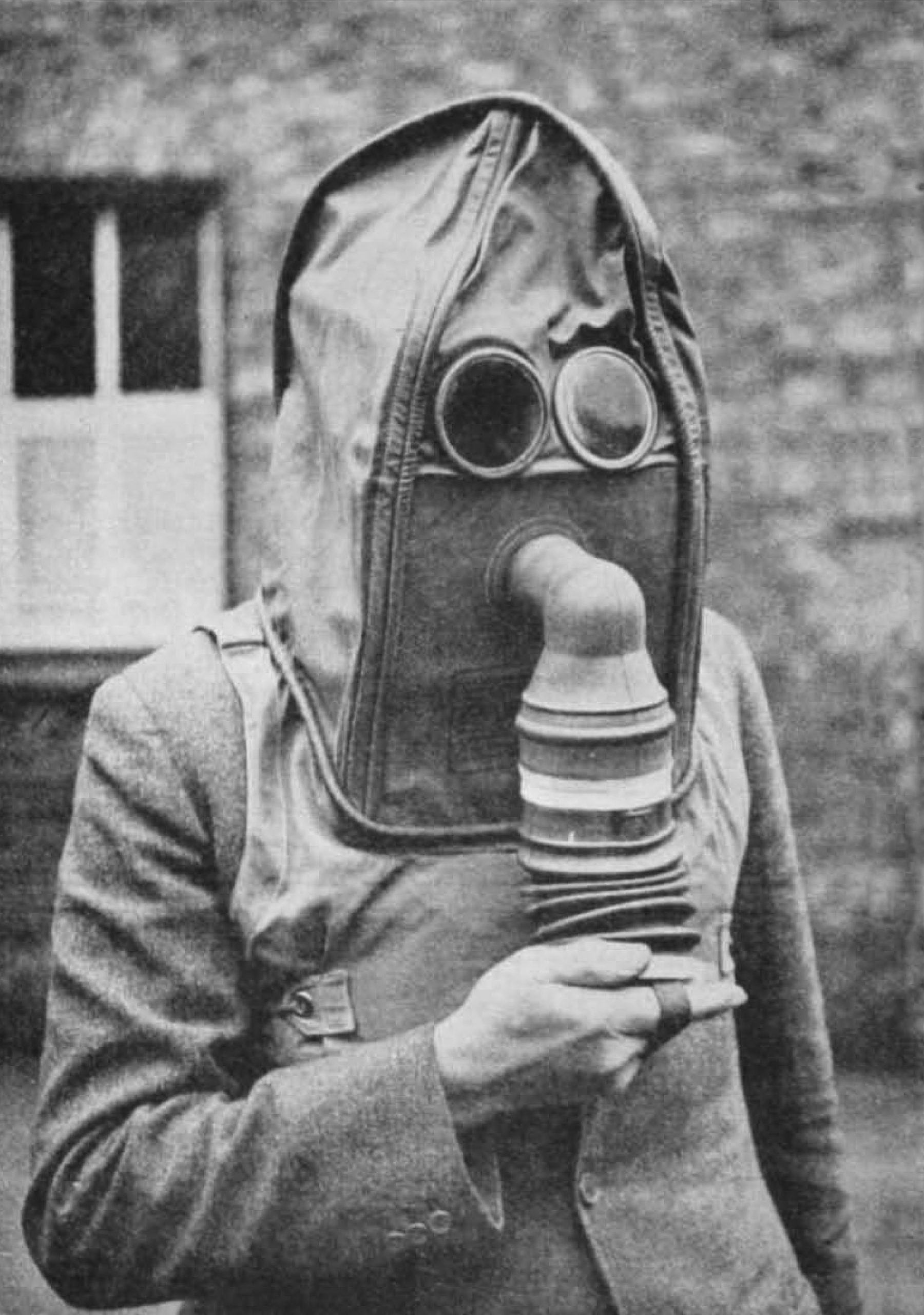
A strange form of cognitive dissonance takes hold of people during catastrophes. Instead of comprehending danger, humans often stand and gawp, or go about their lives in denial of what’s happening around them (the psychological term for this is “normalcy bias”). This is why people take out their phones when a tsunami hits, ignore the warnings of a hurricane, or drive their cars through deep flood waters.
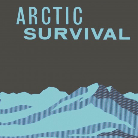
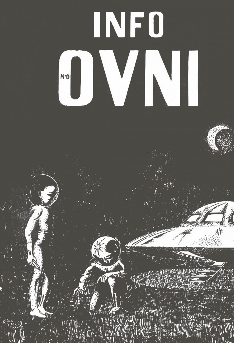
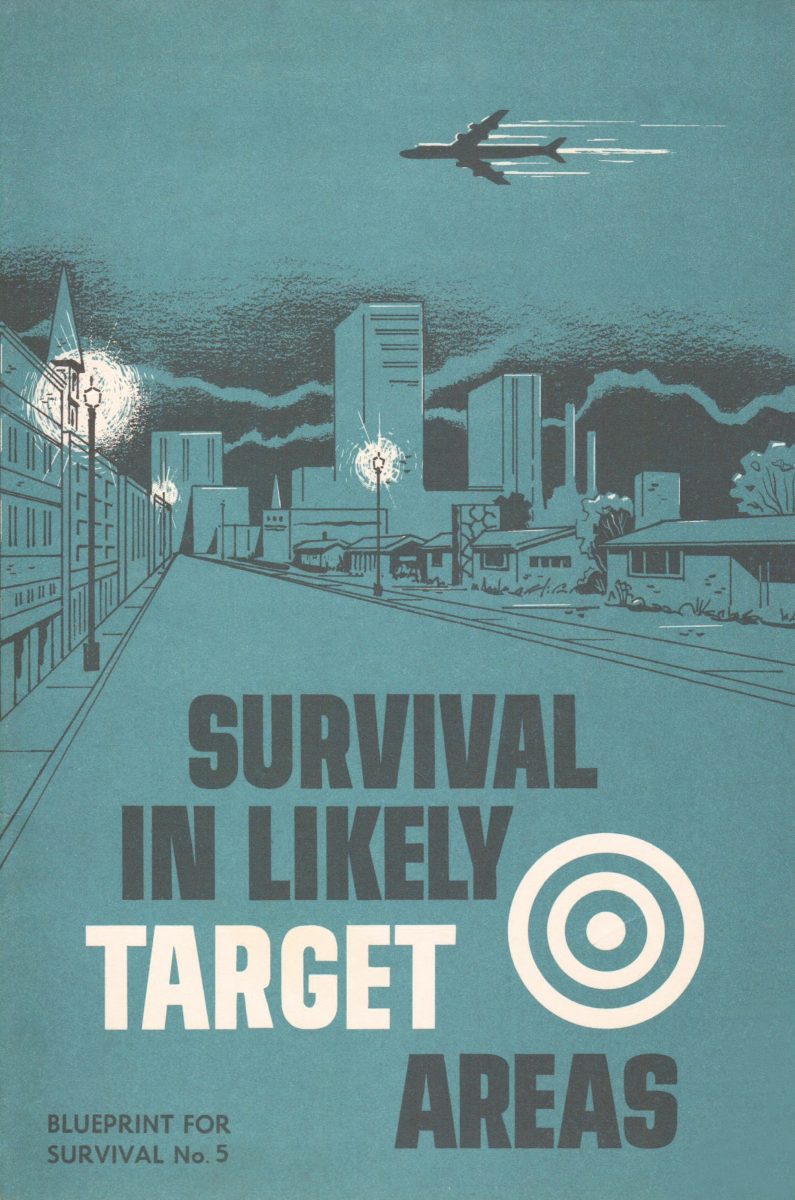
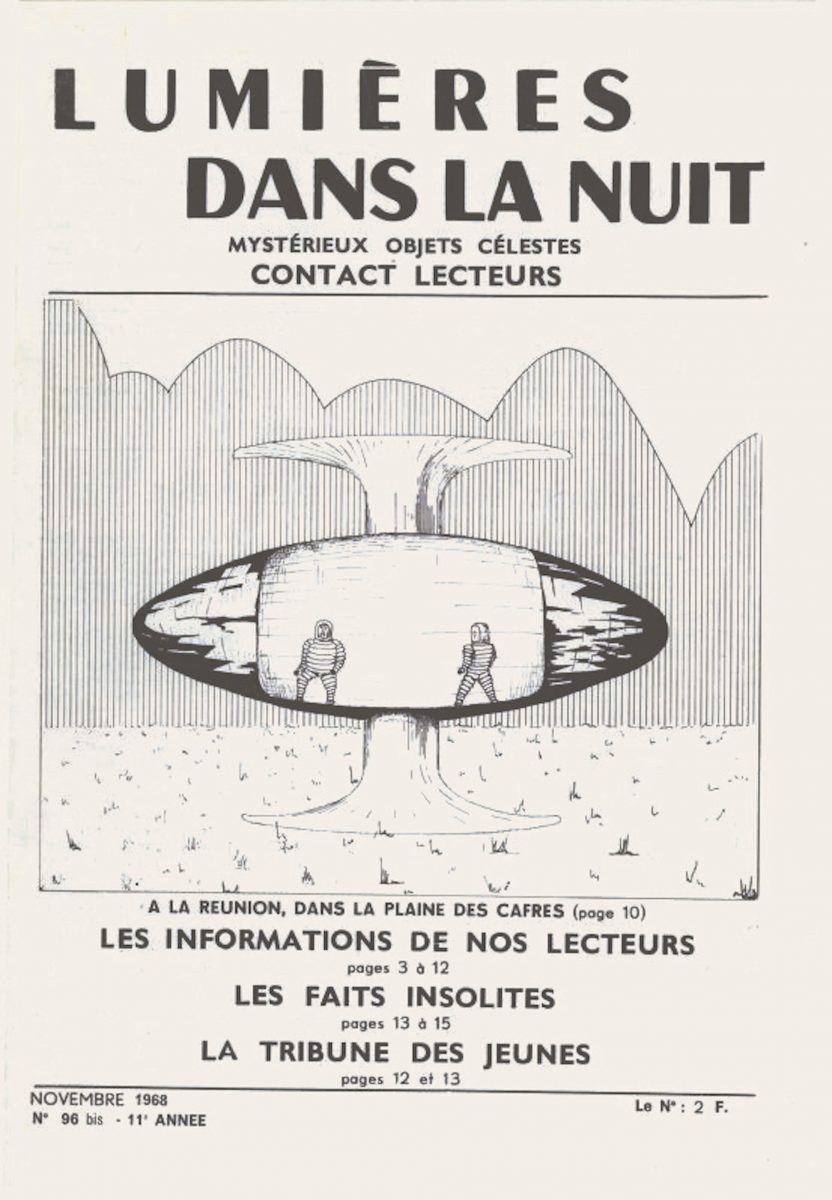
Over the last century, governments and designers have produced hundreds of posters and guides aimed at preventing panic and encouraging people to behave sensibly during disasters. In Taras Young’s Apocalypse Ready, the visual history of these campaigns is put on display, grouped by disaster types (pandemics, natural disasters, nuclear wars and so on).
Many are dated by the aesthetics of their period. The fluorescent pencil sketches in a book produced by the UK Home Office about the threat of the hydrogen bomb resemble what the future used to look like in 1957, when children still read comic strips about holidays on the moon. There are visual continuities across time and place: sans serif fonts indicate plain-speaking authority, and images of doctors and nurses suggest reassuring expertise. Bright combinations of two or three colours ensure material is eye-catching without appearing overwhelming.
“An advert produced in 1918 during the Spanish flu pictures a nurse whose nose and mouth are covered by a facemask. It feels remarkably current”
One advert that was produced in 1918, at the time of the Spanish flu, pictures a solitary American Red Cross nurse whose nose and mouth are covered by a facemask. Aside from the nurse’s matronly white cap, her black and white portrait feels remarkably current. It stares you directly in the eyes and takes up most of the frame, impressing the weight of her calm but firm advice: avoid those that cough and sneeze; don’t visit poorly ventilated places; cover your mouth; stay at home if you have a cold.
It’s a far clearer guide than the prosaically titled Alcohol hand rub hand hygiene technique poster, which appeared widely at the start of the Covid-19 pandemic in the UK. The NHS directive, reproduced here, is an illustration of the state’s waning confidence in its capacity to influence behaviour. While other European countries were enforcing lockdowns, UK ministers (following the guidance of behavioural scientists at the “Nudge Unit”) advised people to wash their hands, shown here in a minimally illustrated ceremony involving ten different rubbing motions.
All disaster advice makes political assumptions about its readers. During the pandemic, politicians often said that the UK was a “freedom-loving” country and could therefore never accept the restrictions of a lockdown (the opposite proved true). In civil defence guides produced by the Soviet Union in 1986, watercolour firemen rescue people from buildings and nurses run down the street holding stretchers, but there are no instructions for what to do inside your own home.
“In Soviet Union guides, nurses run down the street holding stretchers, but there are no instructions for what to do inside your own home”
Safety posters produced in China show smiling citizens united against an earthquake. Acknowledging (albeit in the rosey hues of Socialist Realist art) the truth of the Tangshan earthquake that took more than 242,000 lives in July 1976 was important for securing the future of Chinese communism (the “Gang of Four”, who were arrested and imprisoned in October 1976, were widely criticised for downplaying the disaster). In one poster, an elderly man carries a relief package, his enlightened face turned towards the sun. “Socialism is best”, it reads.
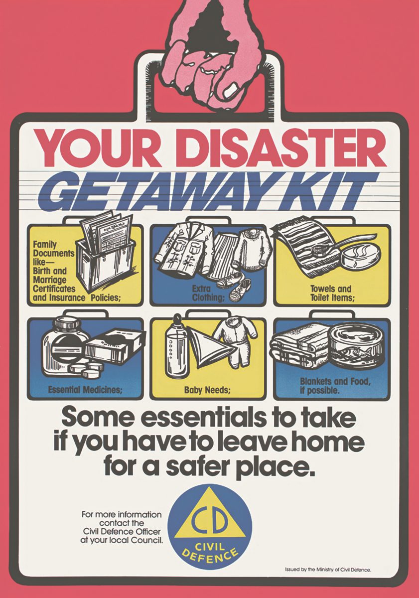
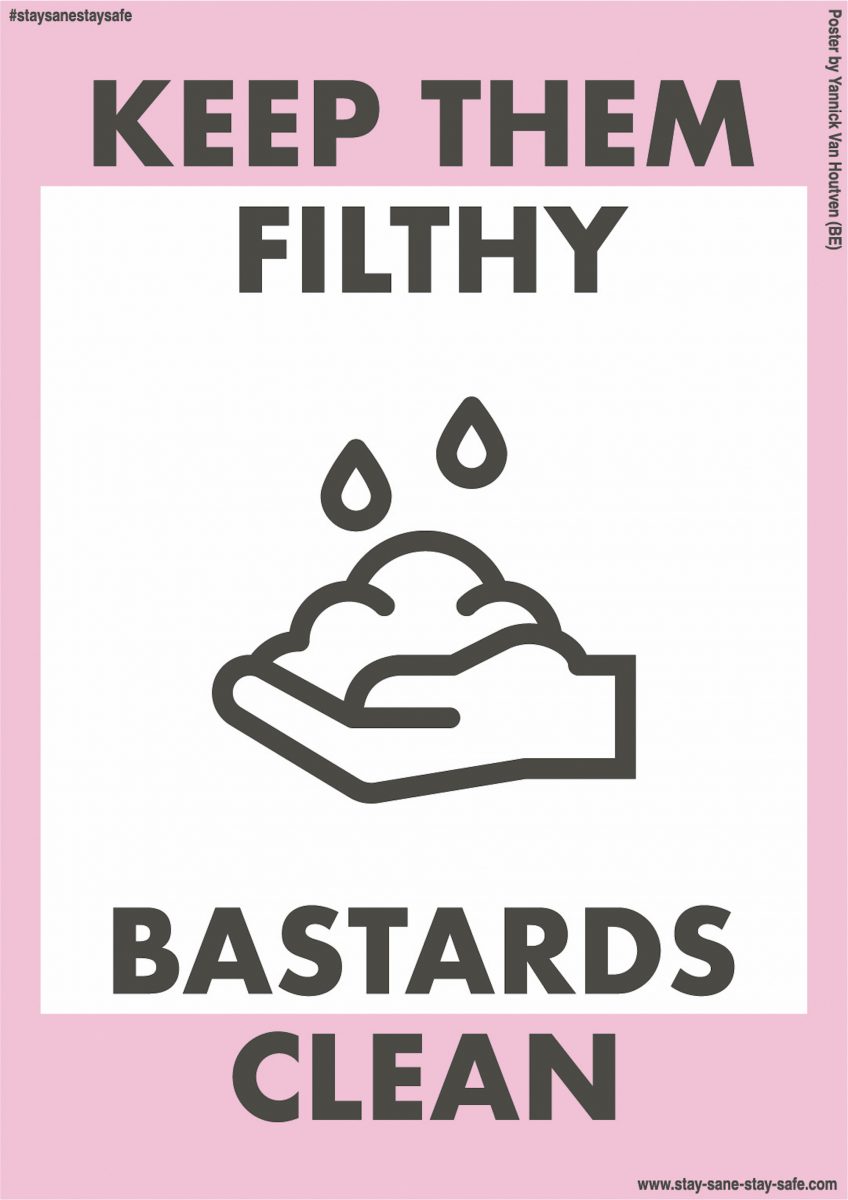
- Left: National Emergency Management Agency (NZ). Civil Defence poster campaign, Ministry of Civil Defence, New Zealand, 1980s. Right: Yannick Van Houtven. Stay Safe/Stay Sane online poster platform, worldwide, 2020–21: Keep Them Filthy Bastards Clean
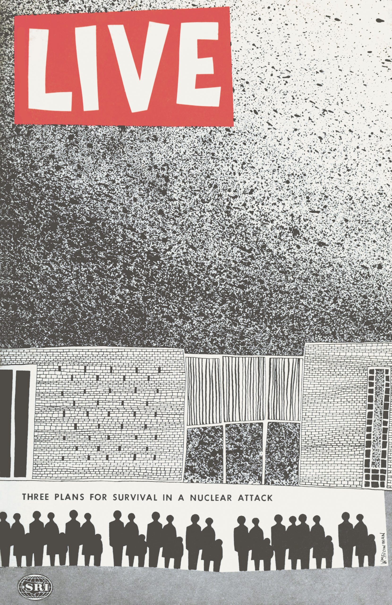
By contrast, the panic prevention guides produced in Western nations tended to foreground the family unit. One manual from the United States’ office of civil and defence mobilisation contains instructions for how to build a DIY “family fallout shelter”. A family earthquake safety guide produced by FEMA (the US Federal Emergency Management Agency) in 1986 informs readers in commando typography how to secure their homes in preparation for natural disasters.
“These diagrams seem less like an attempt to dispense sound advice than a grim distraction from reality”
Know to Live, a guide distributed by France’s civil protection service in 1960, is a prepper’s Argos catalogue, with a silhouetted flat lay showing everything you might need to survive the end of the world, from children’s toys and a bible, to a shovel, hammer, bunk beds and petrol. The visual field of these manuals is directed inwards, concern implicitly does not extend beyond the confines of the nuclear family bunker.
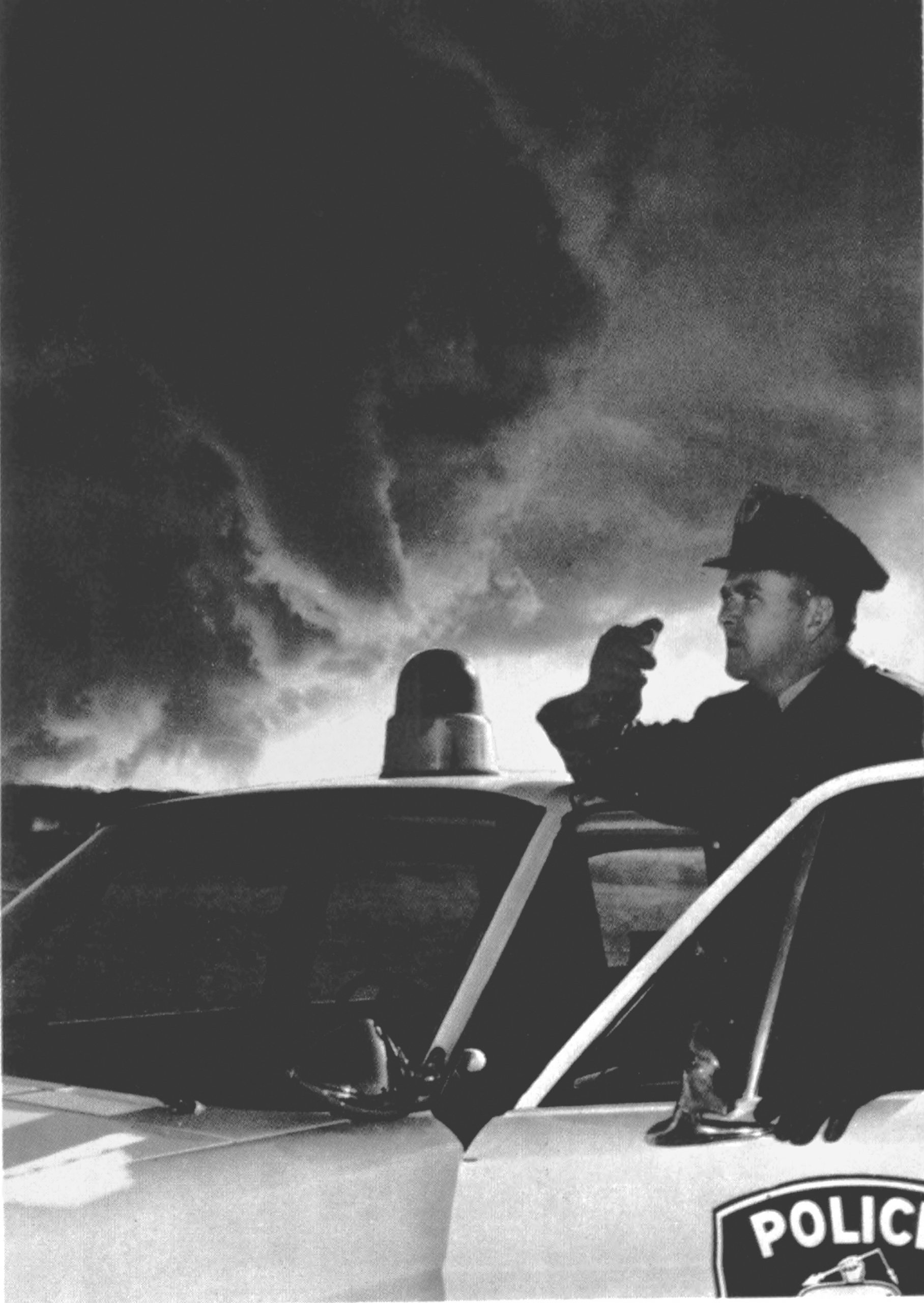
Tornado: US Department of Commerce (1973). A police officer reports a tornado by radio, as part of the SKYWARN warning system
These diagrams of sensible citizens responding calmly to catastrophes share a tidy aesthetic order that seems less like an attempt to dispense sound advice than a grim distraction from reality. Perhaps that’s the point: disaster preparation is more about being seen to be doing something than admitting that nothing can be done. In one guide distributed by the UK’s Home Office in 1963 to inform people what to do after a nuclear explosion, small black text is surrounded by a glow of red lines with an ominous yet practical instruction: “Do Not Look At The Flash”.
This feels like a comic understatement. Such attempts at reassurance can backfire: in 1980, the infamous Protect and Survive guidance prepared by Margaret Thatcher’s government was leaked to the press. The information campaign for what to do during a nuclear explosion was widely mocked by CND and other campaign groups as ludicrously inadequate. Its ulterior purpose was cynical: Protect and Survive was a distraction from the decision that no nuclear bunkers would be built in Britain. Better to have people believe that the state had it all under control, then have them know the truth.
Hettie O‘Brien is an assistant opinion editor at the Guardian
Apocalypse Ready by Taras Young is out on 28 April 2022 (Thames & Hudson)
