Artless, by Marc Valli and Amandas Ong, explores the work of 49 contemporary artists who all create using the most simple of tools; some are amusing, some pared-back, all keenly observed. Here, five artists discuss their practice and influences in an exclusive extract from the recently released hardback from Laurence King Publishing.
Subscribe to Elephant magazine here and receive a copy of Artless.
Sofie Grevelius
Born: 1981, Lund (Sweden)
Lives: London/Kungshamn (Sweden)
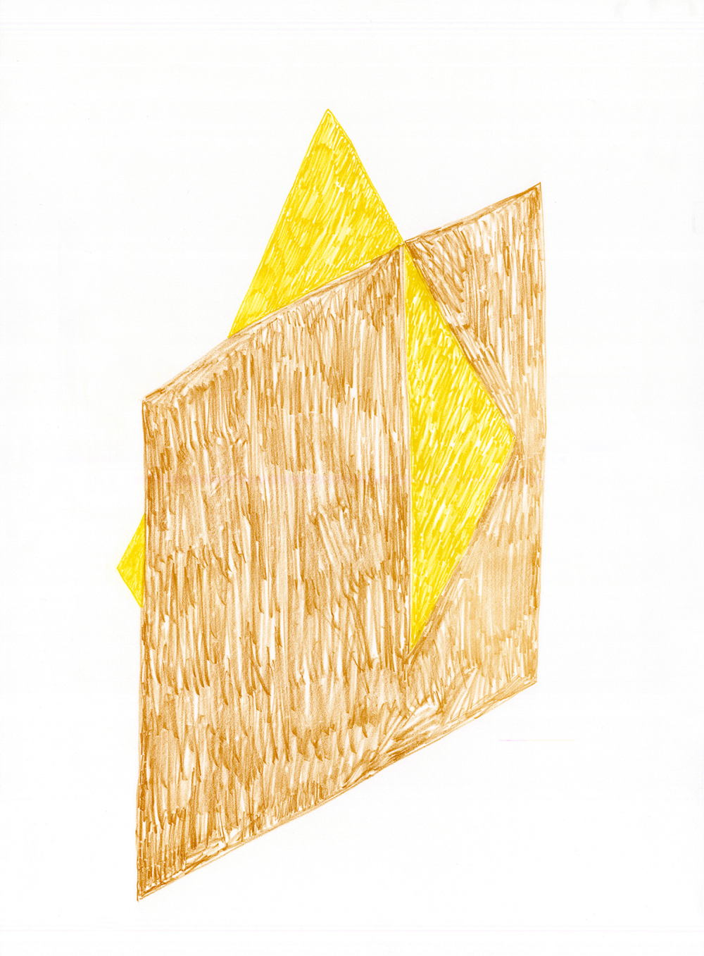
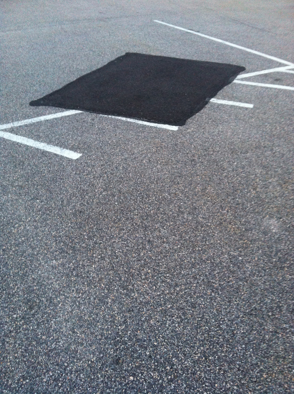
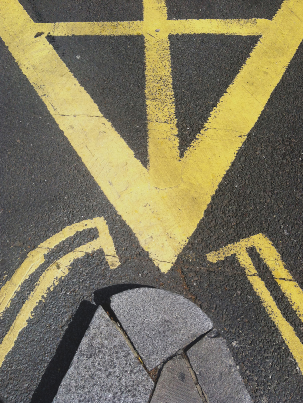
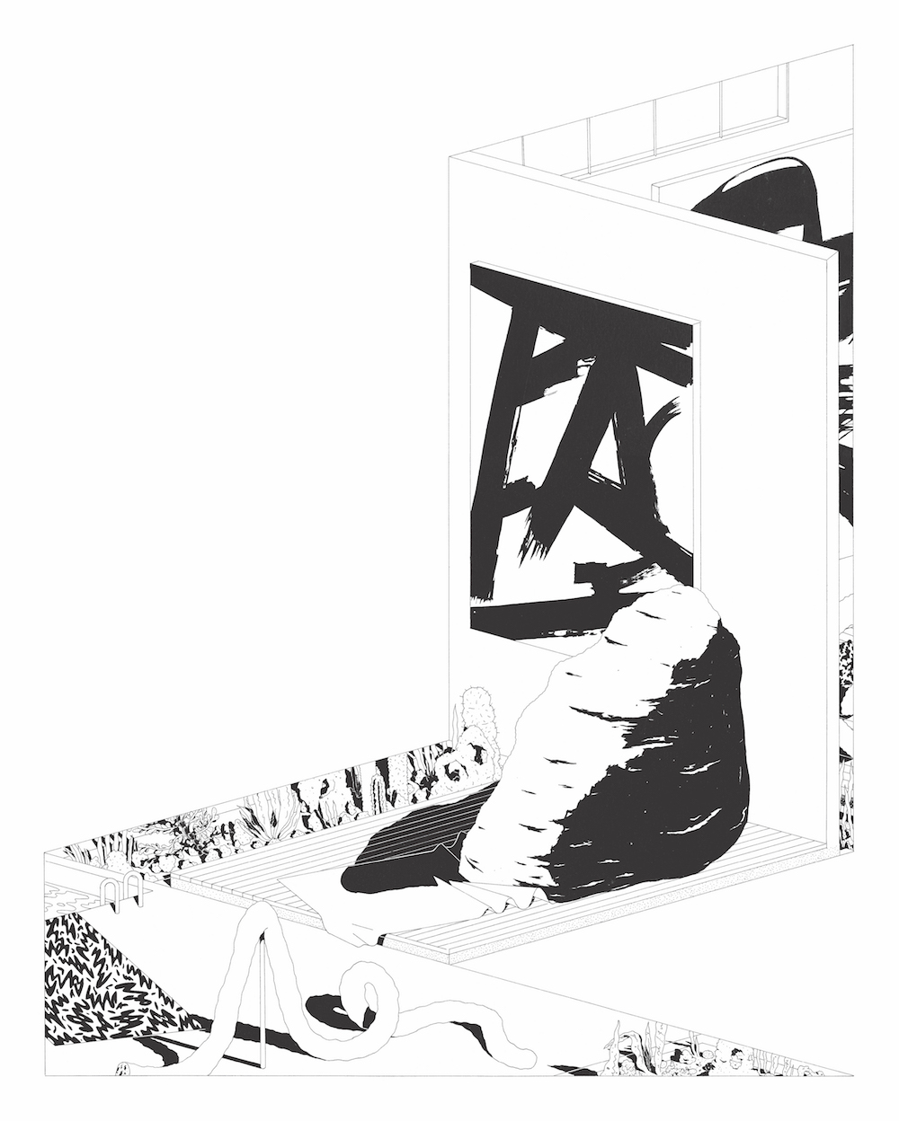
Sofie Grevelius’ work is inspired by the fortuitous landscapes that make up a city: road markings, scaffolding, building facades, ventilation systems, signage, pipes and physical fixtures such as railings and doors. Musing that ‘everything is passing, everyone is on the move, things overlap, layer, create shapes and unplanned meanings,’ she is interested in the relationship between the planned and manufactured versus the haphazard and ephemeral.
Philosophy: I am interested in mimicking everyday shapes and objects in an attempt to accentuate their presence in our lives. I try to understand their effect on us. The French twentieth-century philosopher Maurice Blanchot described the everyday as something we never see for a first time, but always see again. I would like my work to have a similar quality.
Process: Everything begins with everyday life, and the techniques I use are embedded therein. My camera phone has begun to act almost as a third eye. The photographs serve as an instruction manual to my practice. They become recurrent leitmotifs, a fascination with the chance encounter, playful sightings, the casual beauty of the everyday. However, it is through drawing that the first real translation of reality takes place. I break down what I have seen or captured with my camera phone, and turn it into a new visual expression. To me, drawing is thinking. The selection process, and the process of refining, begins in the run-up to a show. The space in which the work is shown plays a major part in it. It is like creating the frames for a new city, in parallel to the one just outside the gallery space, with its own rules and relationships, and its own beautiful and strange infrastructure.
Maria Luque
Born: 1983, Rosario (Argentina)
Lives: Rosario
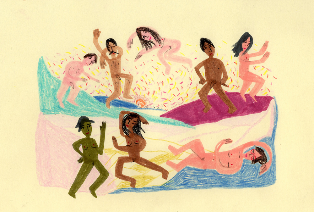
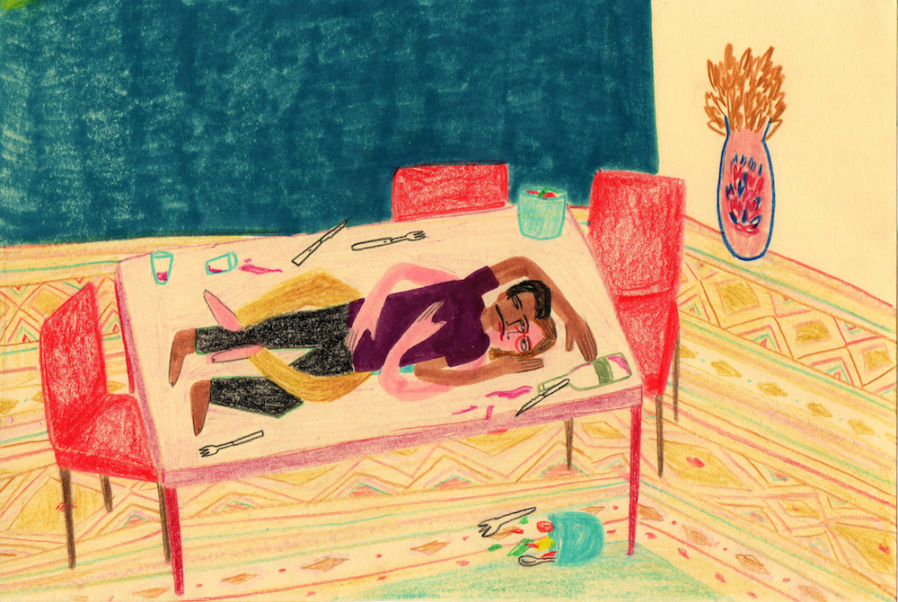
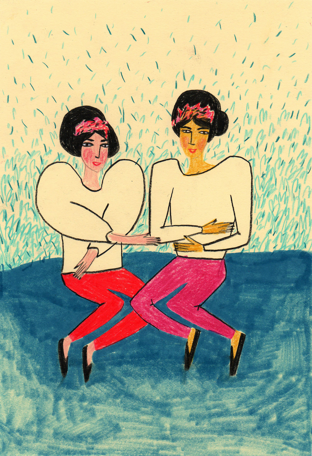
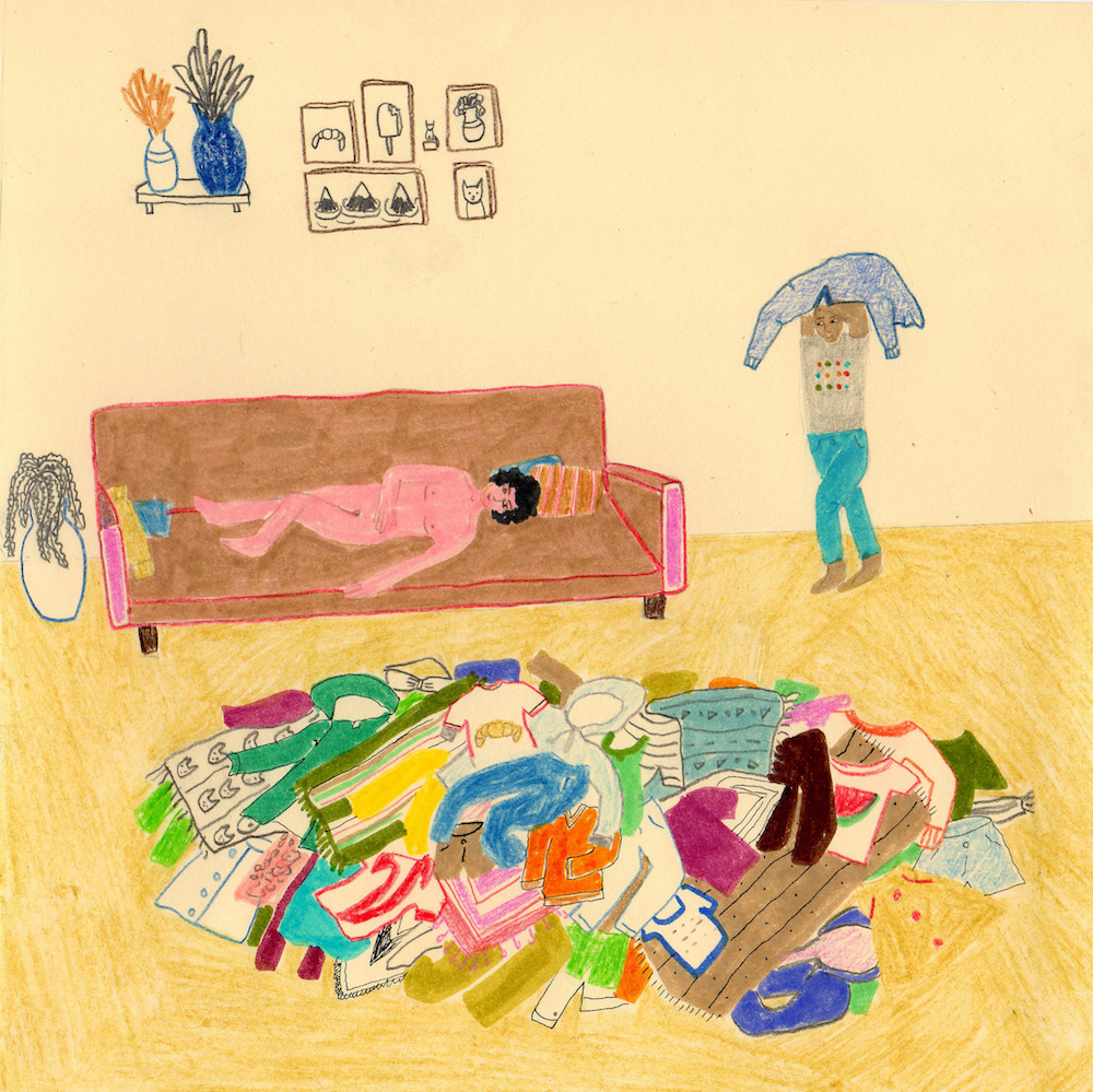
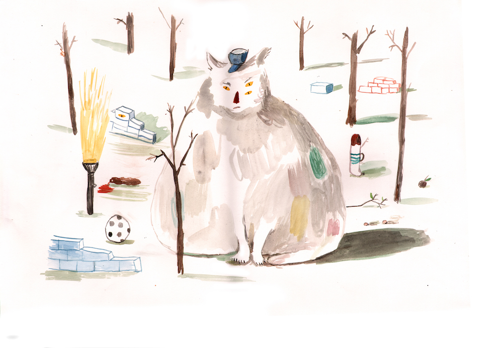
Maria Luque is quick to say that she is ‘not a very good illustrator’, but her body of work proves her wrong. Through her deceptively simple forms and bright colours, she brings a sense of the bizarre to the domestic scenes that she portrays in her drawings. Featuring things like lions sprawled across the floors of ornate living rooms, her works are meant to ‘make people laugh and think at the same time’.
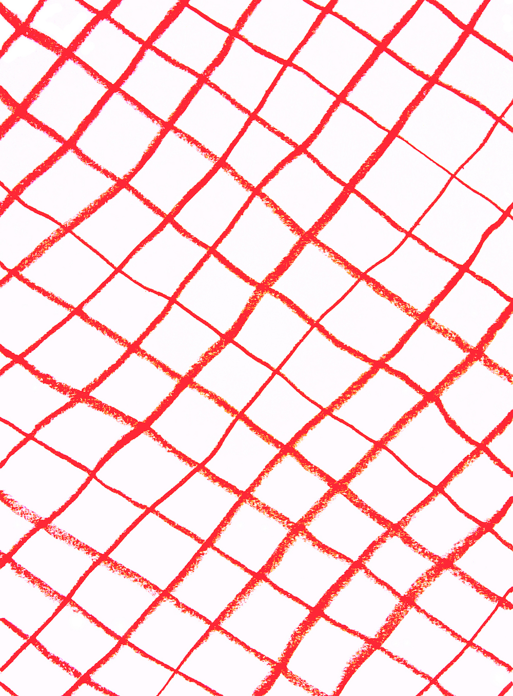
Materials: The materials I use most often are coloured pencils, markers, watercolours and acrylics. I use a lot of different materials, but I always use paper. You’ll also notice that I use a lot of red and yellow in my practice. I do this on purpose to emphasize the strangeness of the scenes I draw.
Process: When I draw, it is almost as though my hand is possessed and moving by itself. I don’t think at all. I’m also always on the lookout for things that have happened to my friends, or situations I spot on the street. I combine these, even if they don’t make any sense, into a scene that I can then depict in my work. I’ve done very few commissioned works because I really struggle to achieve something when I have to follow a brief. That’s why I prefer to call my drawings just drawings rather than illustrations.
Robert Nicol
Born: 1980, UK
Lives: Norfolk (UK)
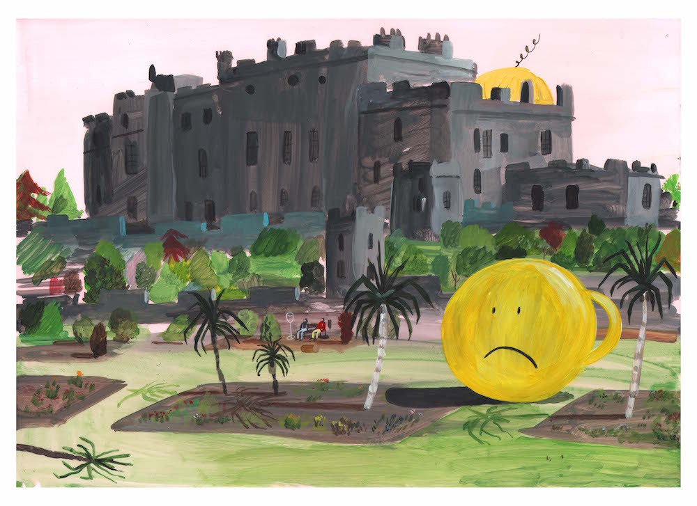
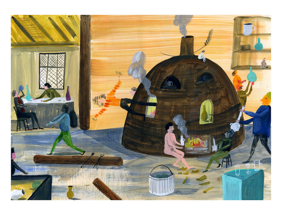
Filled with black humour and a riotous disorder that recalls the work of Hieronymus Bosch, Robert Nicol’s miniature paintings and ceramics are deliberately bereft of narrative, allowing viewers to speculate endlessly on the bizarre scenes depicted. Nicol says that his practice revolves around ‘sexuality, ritual, the existential struggle between the absurd and the surreal, and the presentation of a world that is a parody of our own’.
Artlessness: While the term ‘childlike’ is often bandied about pejoratively, I see it as a direct link to many positive things, including discovery, honesty, openness and directness. I am not sure if my main aim is to unsettle; what I would be content with, in this increasingly sophisticated and complex world, is for people to look at my art and reassess their life in relation to these images. Maybe people do lack, as life evolves, raw experiences, and I want to be able to evoke the latter through my work.
Process: The materials I use regularly are acrylics, watercolour, coloured pencils and ceramics. My relationship with computer work has developed over time – in my work as an illustrator I scan and alter images and often add digital textures, as well as make purely digital images for print projects. Pastel colours are also dominant in my work because I enjoy the process of colour mixing and matching. I work very quickly because I am a very impatient person: it takes me about two days to make each painting or drawing, while the ceramics take longer because of the firing and glazing process. I don’t tend to discard much of what I do, even if they’re ‘rudimentary’ sketches – I am more methodical than the image of the artist burning and binning work. I think most images you make have value; it just takes a little bit more time to find the good in some.
Influences: I have a range of reference points: these include naive and outsider art, design works from the Festival of Britain era, Thomas Bewick, graphic novels, landscape paintings and etchings by the Dutch Masters, Staffordshire pottery and Murano glass. I am also a lecturer at Camberwell and Central St Martins [in London], and have learned a lot from my students and their approach to art and design. Being an artist can make you feel jaded sometimes, and their enthusiasm reminds me of my love for the process of image-making.
Jeremy Piningre
Born: 1984, Paris
Lives: Paris
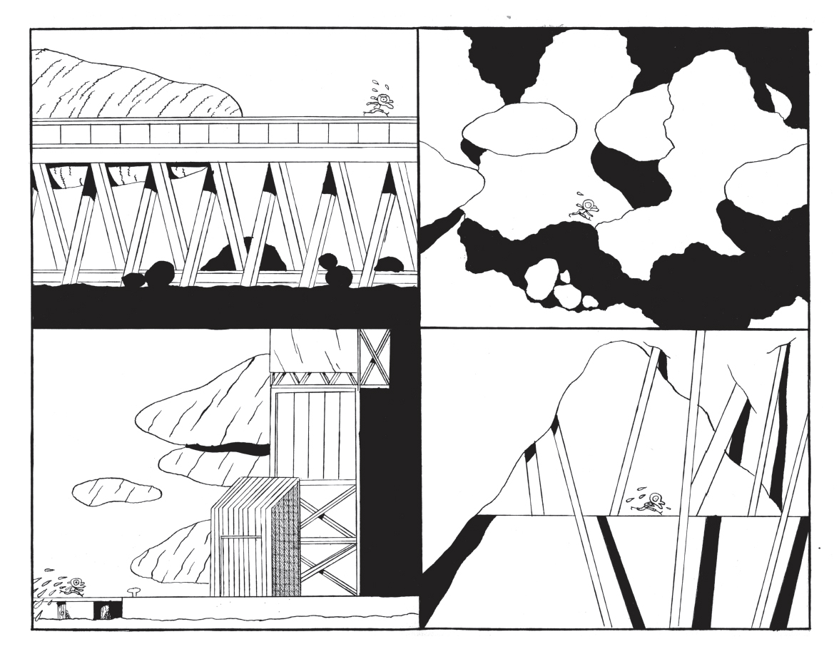
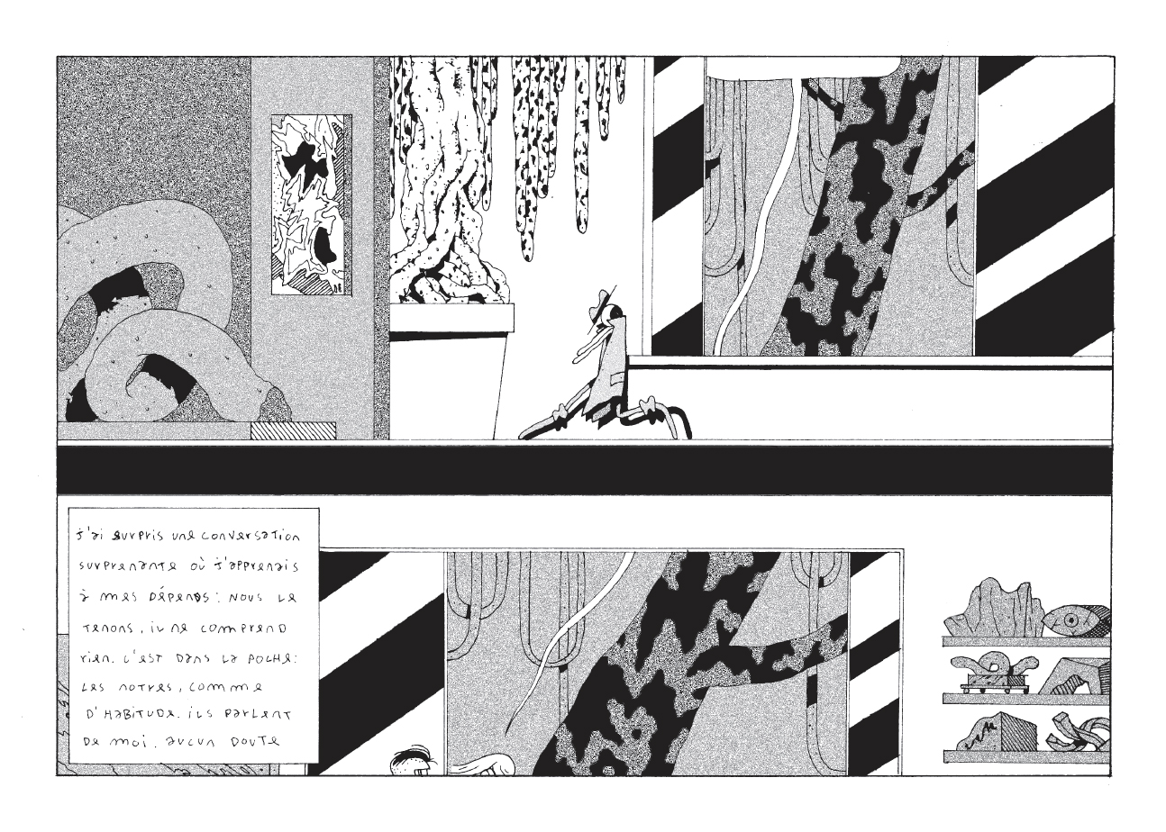
Jeremy Piningre started out with comics before his practice developed to reflect a more painterly style of graphic design. He believes his work to be a manifestation of his philosophy of ‘life as a broken mirror, with the fragments scattered all around. Through illustration, I relentlessly put these fragments back together.’
Education: I studied at the [École Supérieure des] Arts Décoratifs in Strasbourg. It gave me a lot of friends, sausages, and it taught me to demand a lot of myself.
Process: Even if I use other techniques, I still think primarily as an artist who draws. Most of the time I only use a 0.18 mm Rotring with Indian ink. Even to make paintbrush traces, I draw them with my beloved pencil. I work almost exclusively in black and white. It’s raw, simple, hard and without compromise. I sit like Rodin’s Le Penseur [Thinker]; I think like he does, and when I am really sure of what I have to draw, I start. Normally I fail at the start, but after that first crap drawing it is OK.
Inspiration: My main subject lies somewhere between the mass production of images and what we can do with that. I am also inspired by the emotional lyrics and stories of nightcore music, and the funny, depressed writings of Romain Gary.
Philippe Weisbecker
Born: 1942, Dakar (Senegal)
Lives: Paris
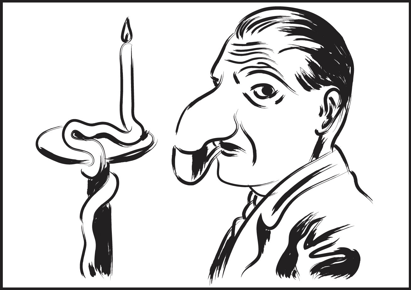
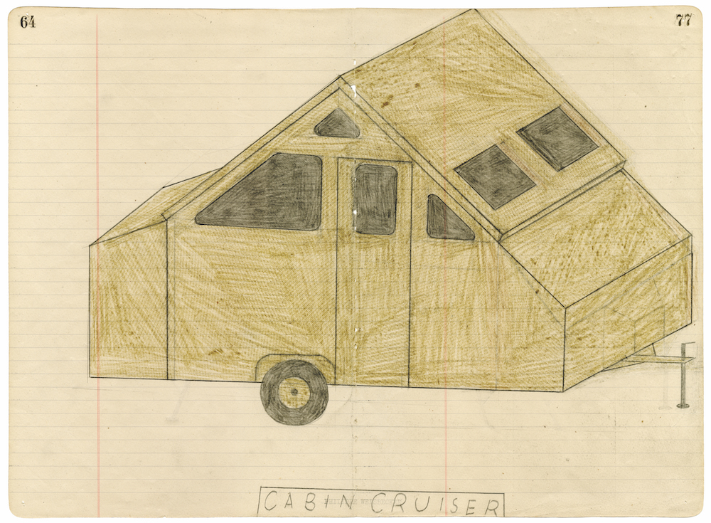
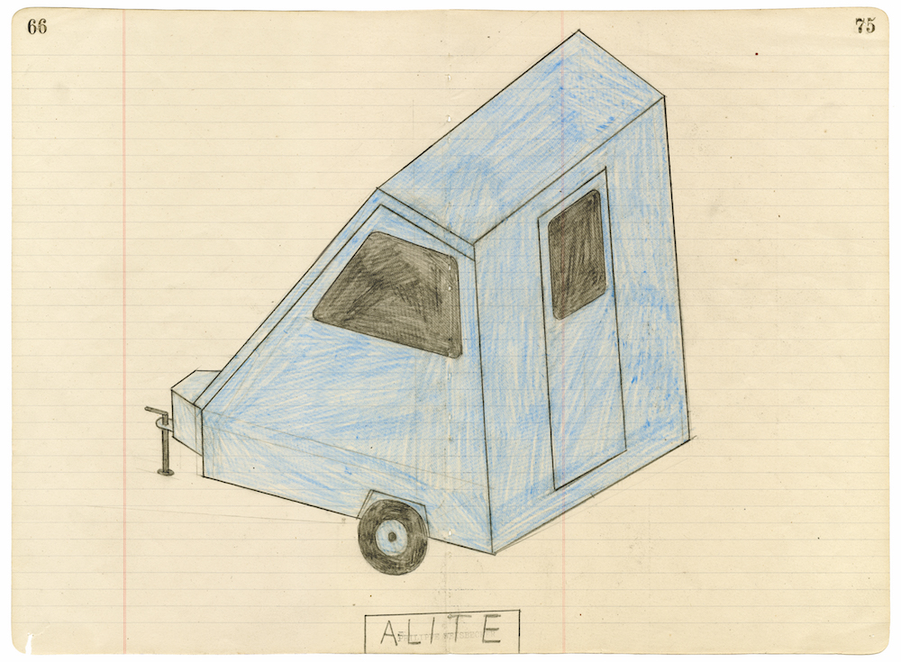
‘When I go to a new town, I don’t go to the art museum, I go to the hardware store’, Philippe Weisbecker tells us. He spent the last quarter of the twentieth century in the United States, where he regularly drew covers for The New Yorker and contributed to The New York Times op-ed page. But he mostly works on self-initiated projects these days, drawing increasingly simple objects. They invite him to envisage ‘a universe of ever more refined minimalism, a universe where the line is itself an object’.
Process: I like to destroy perspective because I like to flatten things. I use paper, which is flat, so I think drawing things flat is better. Every time I start on a new drawing, I can’t help but flatten the selected object on its support. I like the way that the object thus passes from three to two dimensions, the dimensions of the support. The object no longer has any protruding angles or sides to allow my mind to apprehend or examine it. In the space between its carapace, which offers itself to the viewer, and its support, from which it is now indissociable, resides all its mystery.
Style: My early illustration work really caught on – but not in the way I was hoping. I had the feeling that giving clients their money’s worth meant putting a great amount of physical effort into a drawing. It was a guilty feeling that held sway over me for many years. I was aware of style, but I wanted my style to disappear behind the image. Mine was ultimately an intellectual pursuit. The best of me wasn’t to come out until much later, when I could draw unself-consciously without being tied to the idea. [When I was 40] I decided to draw what was around me and, more important, I decided that everything I did was going to fit on one single sheet of paper, regardless of size – therefore I wouldn’t have any sense of proportion or scale in the drawing. I just wanted to record whatever there was in my vision area, in any way possible. I was amazed that the objects I drew didn’t have to conform exactly to reality as long as they could somehow be identified. That’s when I realized what drawing is for me. It’s not reproducing what I see, but what I can record. And whatever the manner – realistic or abstract – doesn’t matter, because it’s merely an image. Nobody sees what I see anyway, they just see the image I make. My whole life has been made up of new starts. Philip Guston only really discovered himself at the age of 60. Hokusai did his best work between the ages of 70 and 80. The opportunity for me hasn’t passed, then. What good fortune!
France versus America versus Japan: In France, they worry about influences. In America, they don’t. There, if you can use it, fine. In Japan they don’t distinguish between art and applied art, which is wonderful.
‘Artless: Art and Illustration by Simple Means’ by Marc Valli and Amandas Ong is out now with Laurence King Publishing. You can purchase the book here.
