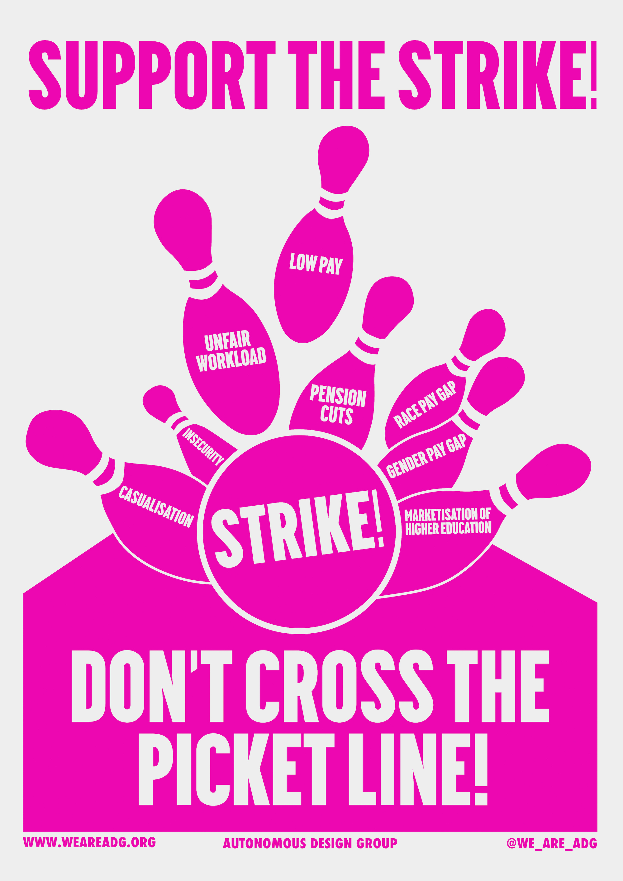
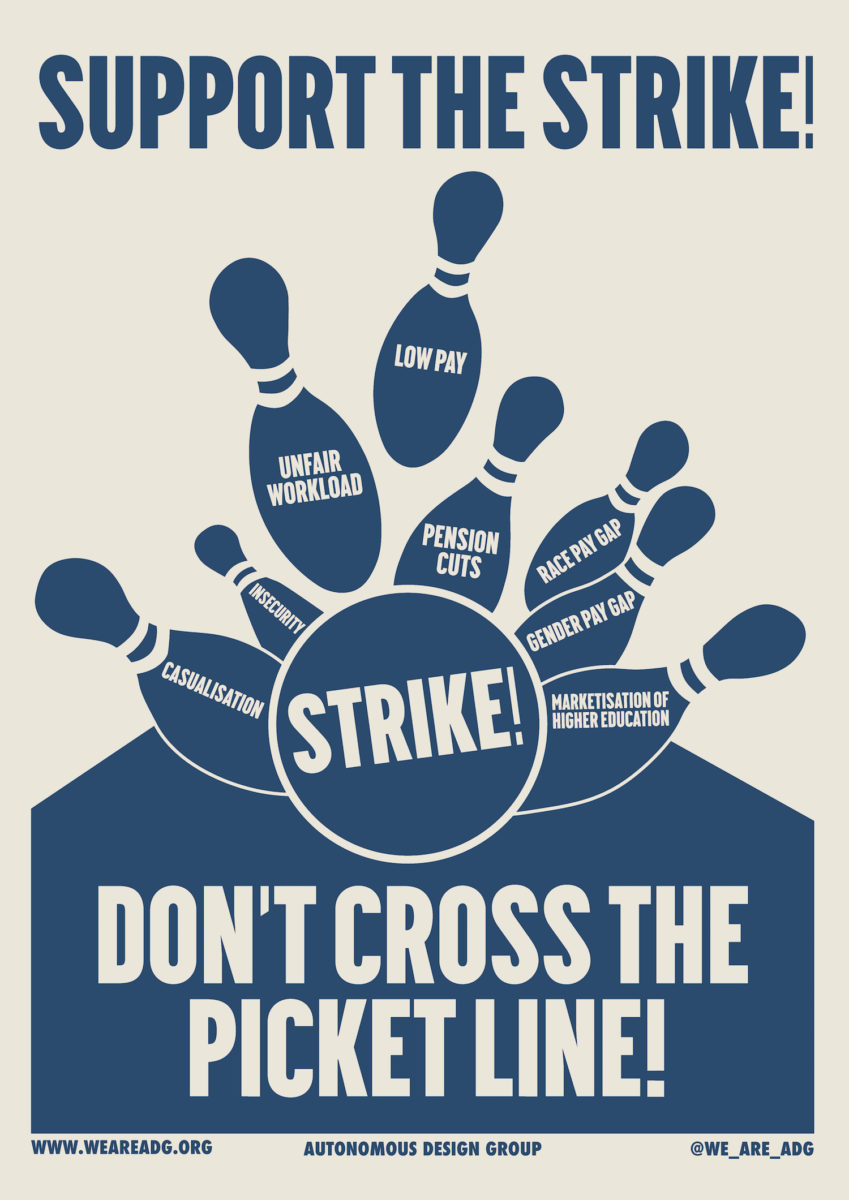
The bowling ball was the first poster I spotted, with pink skittles contrasted against an off-white paper. It was being carried by a young lecturer through Woburn Square in the heart of Bloomsbury, adjacent to the University College London campus. Look closer and you can make out key words on the poster, etched into each skittle as they are swept away: “Casualisation”; “Unfair workload”; “Low pay”; “Gender pay gap”, among others.
Since the beginning of February, strike action has been taking place at seventy-four universities across the UK, organised by UCU (the University and College Union). It is slated to continue until mid-March. These include art schools across the country, including the Slade, Royal College of Art, Glasgow School of Art, Goldsmiths and University of the Arts London.
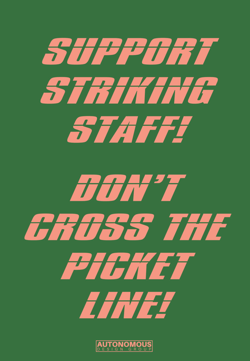
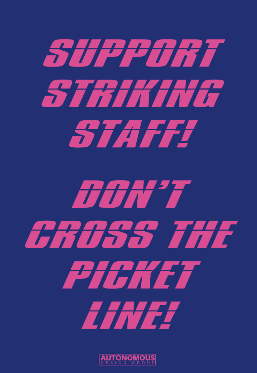
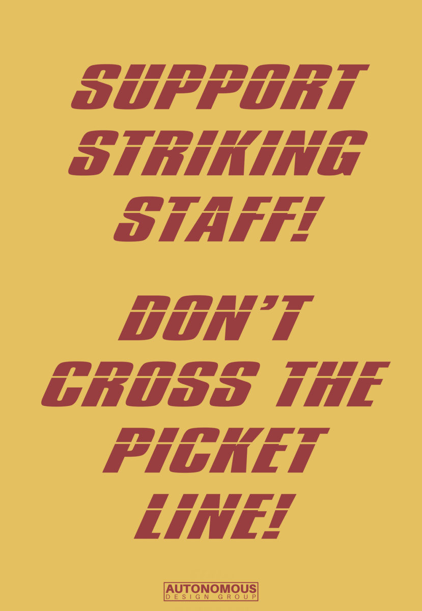
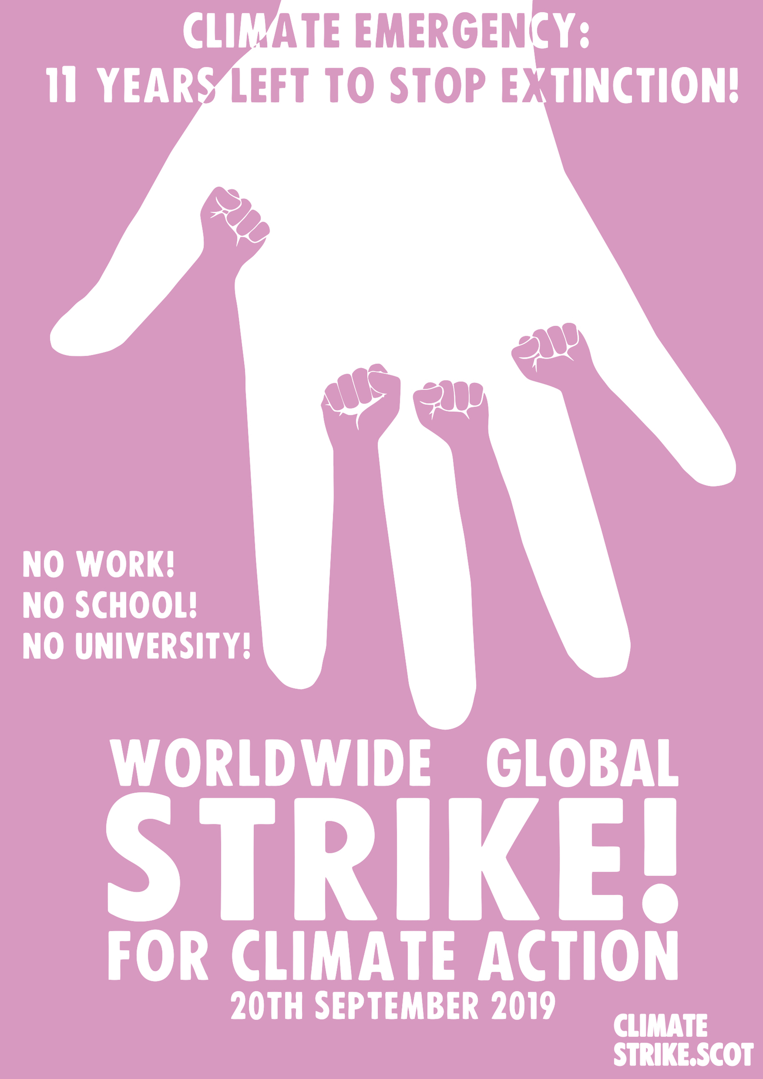
The poster that I saw on that winter’s afternoon in February was part of the campaign for the strikes and the fight against the marketization of higher education. Created by Autonomous Design Group, it looked different to the visuals that I have become more accustomed to seeing on picket lines and at protests over the years. Brightly coloured and with distinctive lettering, it sent its message loud and clear: “STRIKE!” I was curious to find out more about the group behind the design.
“It all started out in November last year” a representative of the group, who wish to collectively remain anonymous, tells me over the phone. “We just put out a launching announcement and asked if people wanted to join.” They currently have almost thirty members based all over the UK and, in one case, even further afield in France. The group organise using the online messaging service Slack.
“We’re trying to remove this idea of the individual artist, because there’s a lot of social capital that comes along with it”
“We’re very keen on breaking down informal hierarchies of power,” they explain. Many are graphic designers by profession, but others are not formally trained; some are artists, or students themselves. “We’re trying to remove this idea of the artist, because there’s a lot of social capital that comes along with being like, ‘This is my work, this is mine, look at what I did’,” they explain. “Our designs are produced collectively; maybe someone comes up with the concept, but then others will give feedback. By not releasing it under an individual’s name, it produces this much more collective work. It’s also about sharing our knowledge.”
Most members of the group have previously been involved in established leftist movements, and the group is united by their anti-authoritarian and anti-capitalist politics. “We’d been doing lots of design work for the left, but it relied on people who we knew individually. We realized we’d be able to help more people if we organised as a collective.” They have created poster designs for everything from the climate strikes to tenant and workers groups, as well as a grassroots radical trade union.
They have contributed two designs to the recent UCU strikes, as part of an emerging visual language of the left that moves away from the more typical usage of red and black. “Unfortunately, people make judgments based on the colours that you use. A lot of red and black creates a dated aesthetic that looks like it comes from the 1930s,” the group argue. “We think it really puts people off. These are urgent issues that we’re presenting, and we need people to listen.”
“A lot of red and black creates a dated aesthetic that looks like it comes from the 1930s. We think it really puts people off”
“The artistic movements that appeal to us more are the ones that use bold, contrasting colours, in a style that is very engaging and immediately obvious. The aesthetic of the left comes from this quite Soviet aesthetic, from the Constructivists after the Russian revolution, which is really interesting as an artistic movement but it’s no longer relevant in terms of design. Of course, it has really affected the aesthetics of social movements but we are attempting to break out of that.”
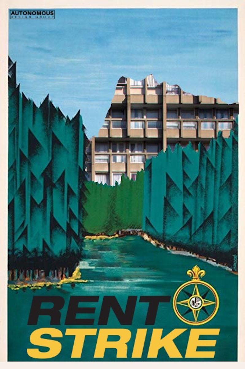
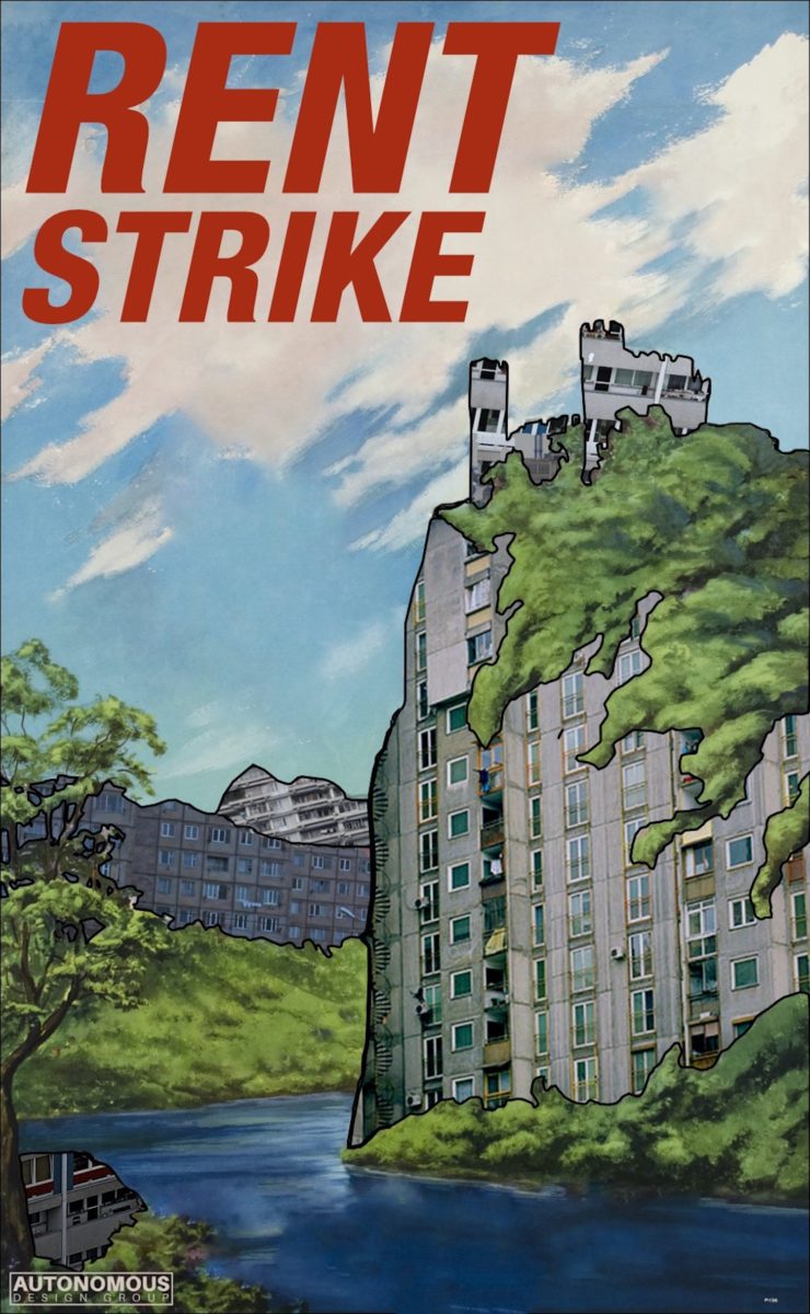
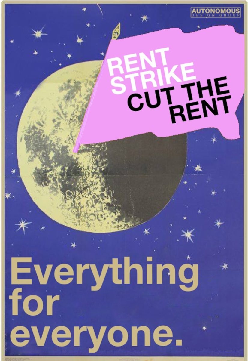
How would they describe their own aesthetic? “Joyful, bright colours, pop,” they say. “One of the people we were influenced by was Sister Corita Kent. Bold typography and solid lines, but breaking it down and making it approachable, which people want to engage with and are attracted to. It doesn’t fall into these established tropes.” They also namecheck Camden Poster Workshop and Atelier Populaire, with their distinctive use of colour and screen printing, as important influences. “We don’t follow in their aesthetic but in the way that they articulated their politics in this very fun way.”
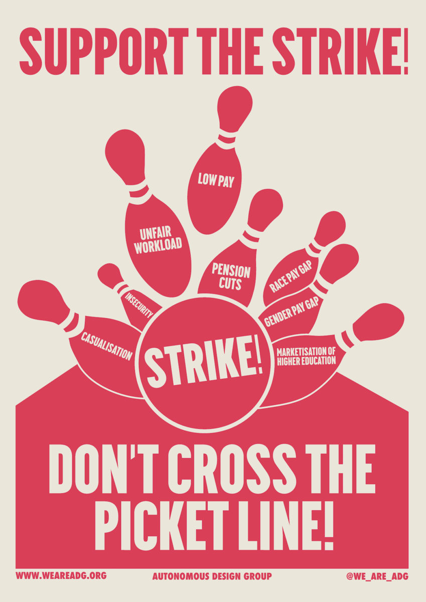
They are firm that they don’t just want to make “nice-looking art”, though. Their main focus is on making visuals that can be used for a purpose. “Art is great, but our particular focus is on the message.” In the group’s bowling ball poster, created for the UCU strikes, their aim was to communicate one simple message: support the strike. “We were keen on it being in single colours. Our impetus is for us or others to be able to very cheaply make these designs, so they can actually go out into the world and start influencing the geography of space,” they explain. “For the UCU poster it was quite important that it was in only one colour, as if you bring in even two colours in Riso or screen printing it doubles the price. It’s quite a practical question, but it feeds into what we’re about. We want to communicate.”
Is there the risk that these posters, available to download from the website of Autonomous Design Group, could simply circulate online? “We would really hope to get it out into the real world,” they say, emphatically. “We don’t want it to just circulate in this digital bubble. We want to start affecting people in everyday life. It goes along with our philosophy; there’s no point if only left-wing academics are sharing our posters online, or left-wing people on Twitter. It’s nice that they’re sharing, but our main focus would be on the real world.”
“We don’t want it to just circulate in this digital bubble. We want to get out of the online world and start affecting people in everyday life”
As the group points out, the majority of people in Britain do not share their politics, and they are clear that they need to go further in their distribution if they are to avoid just preaching to the converted. “There’s definitely value in seeing stickers on lampposts. Our approach is to really make as much as possible, because for every poster or sticker or leaflet, you’re affecting more people. Our goal is to use art as a method of political change. It’s sorely needed, and we want to focus on confronting people with politics in their day-to-day lives, in the street.”
The posters of Autonomous Design Group are currently displayed on university picket lines across the country, held up by lecturers who have been stretched to breaking point. Many of these members of staff are practising artists who have experienced their teaching at art schools, often an essential source of income, stripped away to its bare bones. It is a crucial moment; the strikes represent a final fight before the damage that has already been done can no longer be reversed. Already, forty-nine per cent of all academic teaching staff are on insecure contracts at universities across the UK. At the RCA, staff on insecure contracts amount to over ninety per cent of their workforce.
Autonomous Design Group lend their voice to the disempowered clamouring for change, and to those who have found themselves locked into a newly marketized system of education. Their collective message is boldly delivered and easy to understand. The bigger question is, will it be listened to?