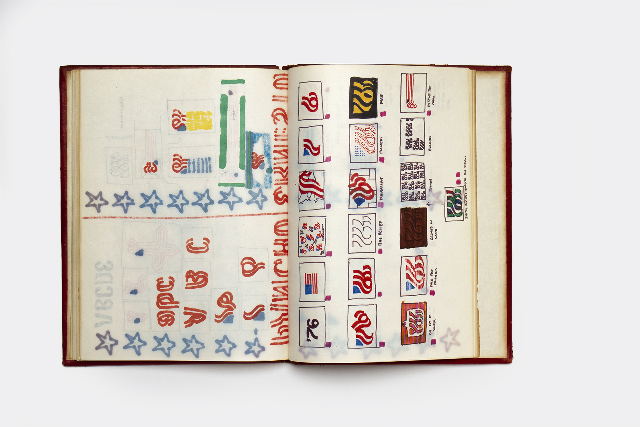
There is a lot that people lament about the “good old days” of graphic design: the craft! Hand-set type! Letraset! Draftsmanship! But something that’s interesting to consider post-digital revolution is how designers document their process; how “iterations” and mistakes build up to a final, shiny piece, ready to face the world. Now that everything is replaced with the touch of an Apple + command, and in a time where designers more often than not go first to screen rather than sketchbook, maybe we’re losing some of that all-important showing of our workings.
Thankfully for us, one of the brightest beacons of design’s “good old days”, Lance Wyman, meticulously documented his workings, and now we can all pore over it thanks to a new Unit Editions book, entitled Lance Wyman: Process, a Proposal for the 1976 USA Bicentennial Identity. The little tome, designed by Spin, is a “near facsimile” of Wyman’s original leather bound sketchbook, according to the publisher, in which he documented the creation of his logo design and identity proposal for the 1976 USA Bicentennial celebration of the USA as an independent republic.
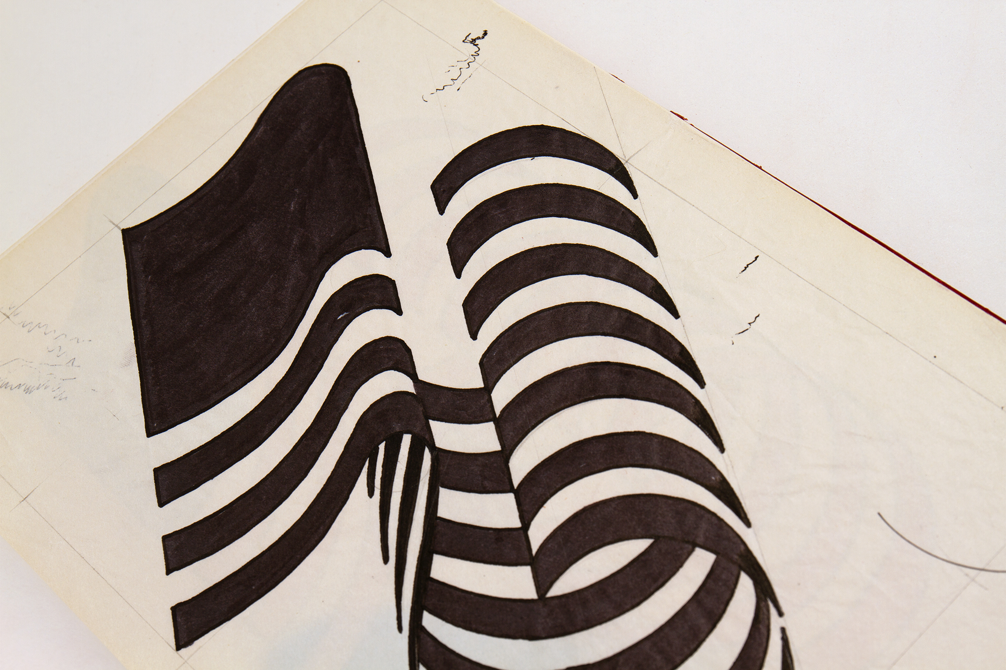
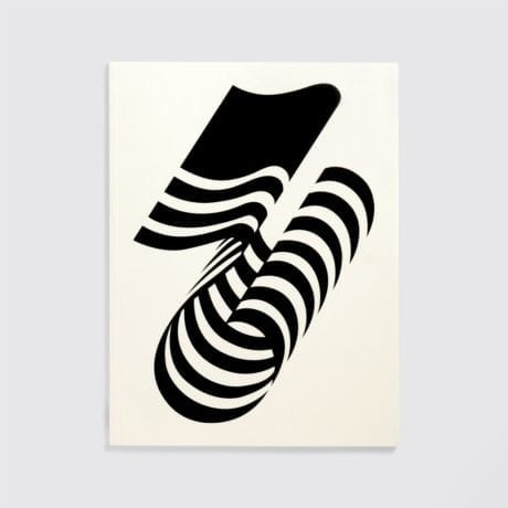
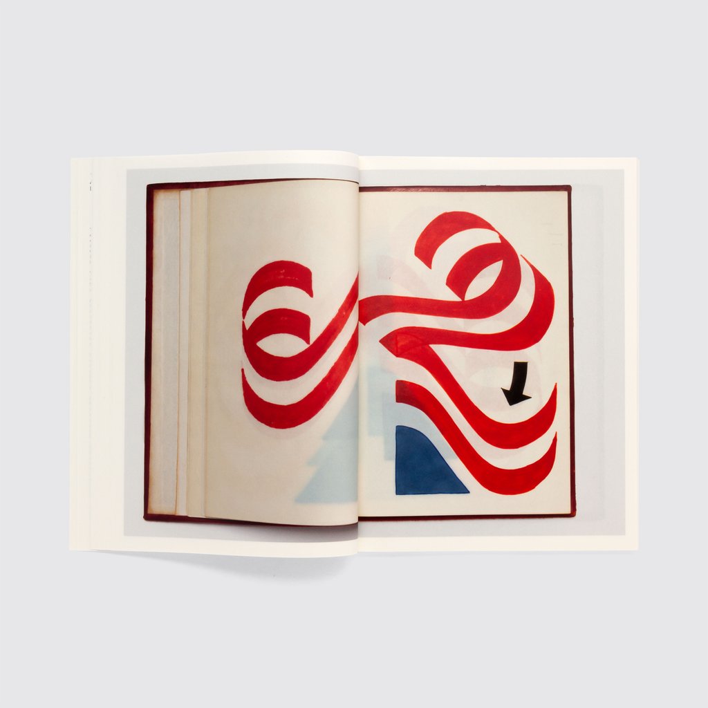
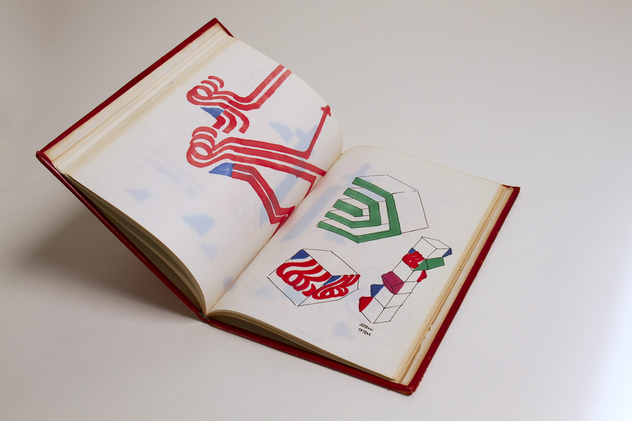
Wyman’s careful cataloguing of his work is a joy to see, and his skills in both image-making and graphic conceptual thought are enviable. The book showcases Wyman’s proposals for the Bicentennial symbol and how it could be translated into architecture; a proposal for a typeface; ideas for merchandise and concepts for various environmental applications. What’s almost as fascinating as seeing Wyman’s process laid bare is that for all the thoroughness and rigour of his proposal—and the fact it won the design competition—it all eventually came to naught.
Part of the whole thing falling apart was, according to Wyman, the “formality” of the process, which saw the commissioner request a letter from his banker to confirm his financial stability. “Although I won the competition, I didn’t end up doing the work because I didn’t have a US office with staff,” Wyman tells Unit Editions’ Adrian Shaughnessy in the book’s introduction.
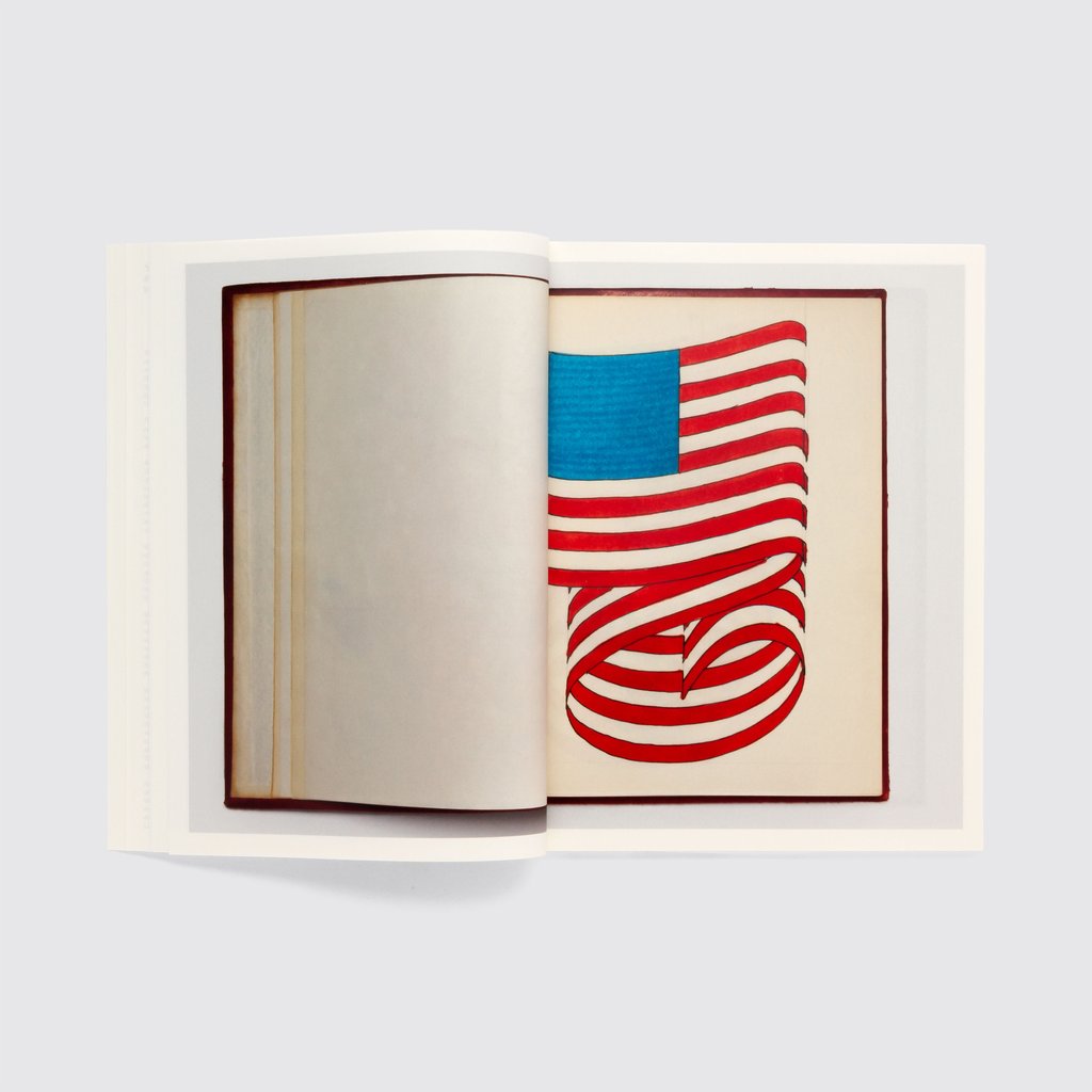
Eagle-eyed Wyman-nuts will surely notice the designs’ continuation of the aesthetic that first propelled the designer into the limelight: his graphics for the Mexico 1968 Olympics. Indeed, the proposals in this book were created in Mexico in 1970, shortly before the designer returned to the USA in 1971. They show a similar preoccupation with unusual optical trickery, deft use of line and pattern and an arresting approach to graphic identities that still feels entirely beguiling and fresh today, almost fifty years on.
While this book is, of course, a delicious piece of graphic design eye-candy, it also serves to remind designers young and old, jaded and less so, that great imagery doesn’t just arrive, it has to be worked on. Throughout the pages, Wyman’s designs are refined, chiselled and tinkered with both for the eye and the mind. “The hardest thing to teach is having a concept, a new idea that can become a good solution,” Wyman tells Shaughnessy. “With the computer there is a tendency to start with the final refined solution… I’ve found that if I keep my ideas in front of me, even if I’ve sabotaged some, I have the visual evidence of what had happened and I can rethink. So yes, there is a role for this book to show process, to show how a concept is the first step, and how it is refined over time.
“It’s a process. It’s not instant.”
Lance Wyman: Process, a Proposal for the 1976 USA Bicentennial Identity
Out now with Unit Editions
BUY NOW