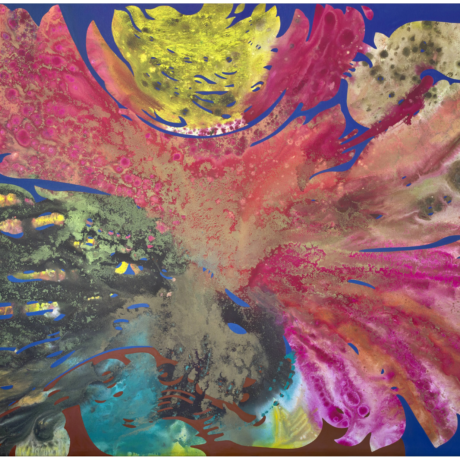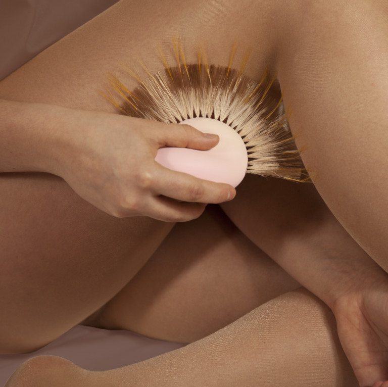
Fleur Hulleman, Porn for the Soul, 2017. Image courtesy the designer.
Entering a hazy darkroom of the Design Perron complex in Eindhoven’s Fuutlaan district (an oversized car park or the city’s hottest new design hub, depending on who you ask), I stumble upon what looks like a boot camp for alien abduction. Four figures sporting futuristic headsets splay out motionless on the ground, each enshrined by a neon-soaked laser beam of light. The glowing halos expand and contract in a slow shift through the color spectrum, a mediated live-update tracker of their current emotional states, while ambient electronica pumps in the background. If I didn’t know any better, this installation could easily pass for some new-age yoga retreat—all aboard the press bus back to Joshua Tree…
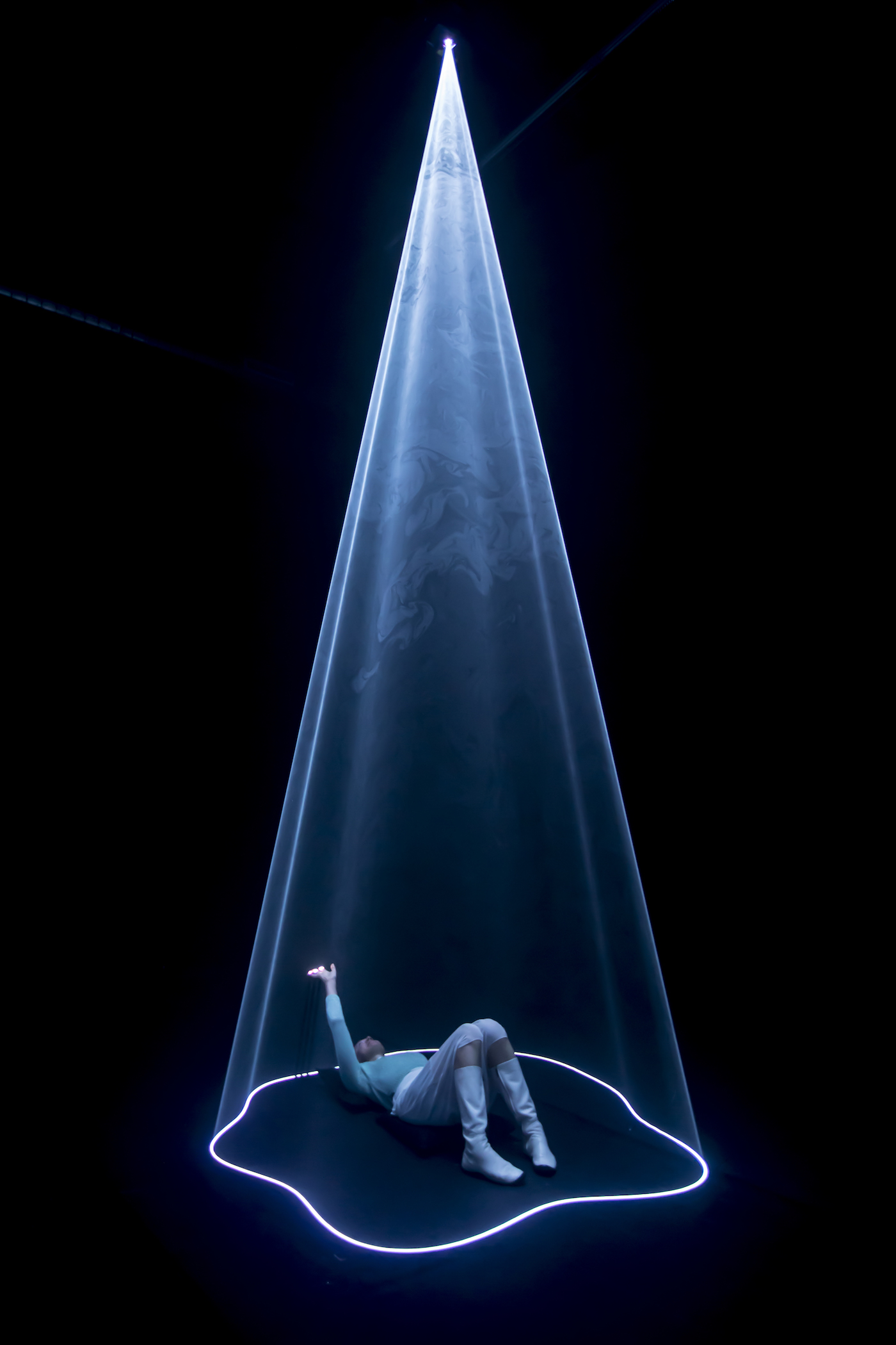
This is AURA: a savvy multimedia collaboration between Studio Nick Verstand and VPRO Media Lab, as part of the ‘We Know How You Feel’ exhibition that delves into the science of visualizing emotions. Like a mood-ring for the twenty-first century, Aura is the technicolor highlight of an overall incredibly futuristic Dutch Design Week, this year taking on the theme ‘stretch’. Clocking in as the second-largest design event after Milan’s in April, DDW is a magical time of the year, where experimental archistars like Rotterdam-based MVRDV bump elbows with the Berghain-bound design collective CORE Studio; a delightful free-for-all where the Design Academy’s freshest outtakes can pitch their ideas to the world and even institutional heavyweights like the Van Abben Museum can join in on the fun.
“Each year, some 300,000 visitors flock to the tiny design mecca”
Each year, some 300,000 visitors flock to the tiny design mecca that is Eindhoven: a tinkering industrial town turned futuristic city lab, as the Transformers-esque fusion of five smaller ‘hoods in the early twentieth century by the tech megacorp Philips to churn out wartime supplies. It’s a symbiotic relationship with a unique backstory that has resulted in one of the more tech-focused contemporary design scenes, and this year’s DDW is no different.
Backpedaling from the futuristic AURA, the adjacent exhibition by design collective Dutch Invertuals undoes the archive in a spectacular display of forty-five past collaborators’ secret inner worlds. Guest curated by Raw Color, Fundamentals peels back the design inspiration of the designers that Dutch Intervals has collaborated with over the past nine years: as told through over eight hundred objects, meticulously assembled on a radiating sheet of plywood: looking forward, you eagle-eye in on each studio’s cabinet of curiosities, meticulously laid out, while behind you sits one of their original works. Thoughtful and brilliantly simplistic, Fundamentals instantly impresses and is perhaps the most chilled-out intrigue in all of Eindhoven.
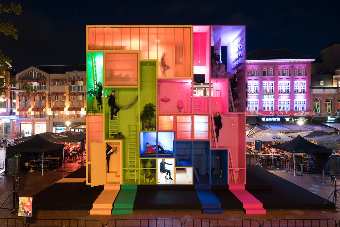
Back in the city center, the Dutch MVRDV’s (W)ego hits all the right notes, and not just because of the Ryan Gosling lookalike perched front and center on the colorful contraption, possibly hired by DDW for the occasion, who’s strumming out heart-meltingly twee folk tunes. Meanwhile, studio co-founder and DDW ambassador Winy Maas regales us with a delightfully frazzled Q+A (before hopping on his bike and racing away: how Dutch). Like a socialized Do Ho Suh that swaps out melancholia for multi-occupancy play, MVRDV’s Hotel (W)ego sits nine metres tall and three metres wide within central Eindhoven’s Market Square. Developed in collaboration with the Why Factory, the colourblock funhouse is intended for infinite re-assembly based on need and occasion: an idea popularized this past year as a potential living solution by Naked House in London, among others. Its nine rooms come in all shapes and sizes and a hidden staircase creates an inner world for potential spontaneous meetings for the non-claustrophobics in the audience (pass).
Not far from the rainbow jungle gym is a four-part exhibition hall stationed in the former V&D warehouse. Here, Embassies of Data and Robot Love collide with Future Realists: a sort of post-internet catwalk slash iridescent labyrinth that’s situated within in a constellation of high-tech, hyper-sensory expositionism. Little lovebots off the leash romp around the ex-warehouse, trailed by packs of wild Instagrammers and besotted toddlers; I retreat to the darkness of the Digital Realists’ labyrinthine catwalk, where every outfit looks better than I will this Halloween. RCA graduate Kira Goodey’s immaculately hand-cut bodysuit—like an Issey Miyake on steroids—instantly stands out from the crowd of blingy streetwear and ironic Vetements imposters. Part psychedelic mermaid princess and part Chewbacca, Goodey’s collection is a refreshing respite from the warehouse full of sensory overload that feels much more like tricks than treats.
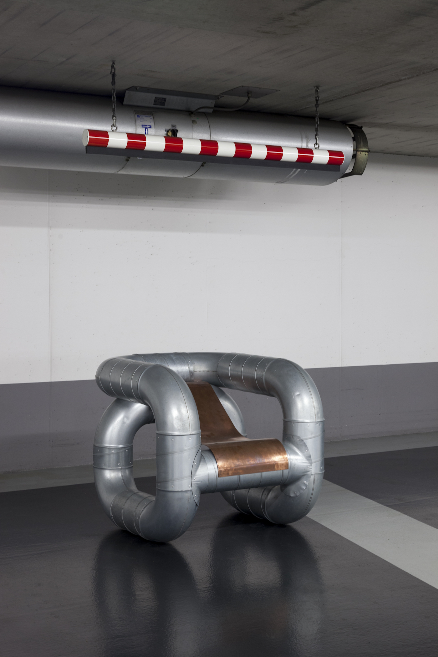
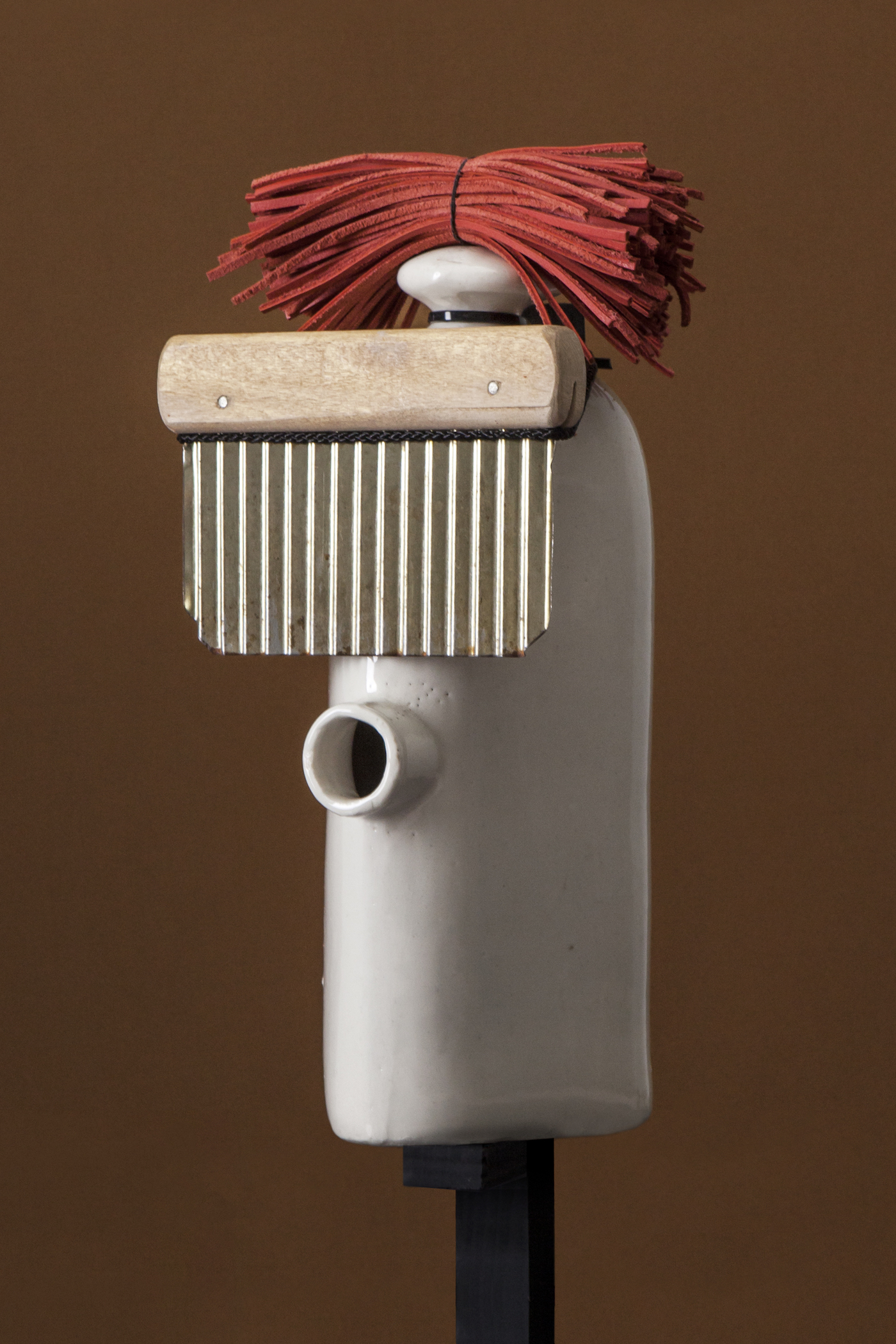
Lucas Munoz, 2017. Image courtesy the designer.
Eloping into the underground car park that forms the backdrop for Berliner design firm and trend consultancy Core Studio’s curated group exhibition HARDCORE, I get the distinct feeling that I’m crashing a post-Berghain house party. Exhausted by the V&D warehouse threesome, it’s tempting to take a seat on Lucazs Monroe’s giant chair, which exudes a cool decadence thanks to its metallic components: what the designer refers to as the “invisible materials of interstitial architecture”. Fabrien Briels’ hairy ottoman and Iwan Pol’s spongy sidewalk are equally enticing.
“I get the distinct feeling that I’m crashing a post-Berghain house party”
Collectively the works tout an ‘aesthetic of efficiency’ that positions itself as a ‘counter digital movement,’ but there’s definitely some irony of the post-digital (to be expected, with Core consciously selecting young designers for its eighteen-strong show). I get cozy in the exceptional craft of these motley and daring pared-back works which mesh unexpectedly well together, like an Addams family that went through an EDM phase. When a platform heel accidentally knocks over the speaker and the muffled techno ambiance cuts out, I take my leave into the Design Academy’s graduate show, which has asked this year’s outgoing students to consider the theme Mined.
The first knockout work is so brilliantly simple that you wonder why you hadn’t thought of it yourself; then, you’re fuming at every city planner who hasn’t heard of Milou Bergs yet. Her final (undergraduate!) project Align is an ultra-practical, super-sleek pop-up bike rack designed for smarter public space. Operated by gravity alone, the racks surface only when in use, otherwise remaining hidden beneath the pavement. This, in turn, frees up the public space normally consumed by rows of bike racks for other activities, such as markets, concerts, or other social events. For this trial run, she’s powder coated the lightweight aluminum in pale yellow: trend forecast for 2018?
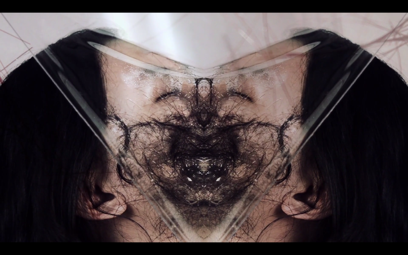
Upstairs, I get touch sensitive with Porn for the Soul. Fleur Hulleman has designed a series of irresistibly erotic sculptures for pleasure and play. Porn for the Soul wants to re-boot the sex toy industry with a “sensual consciousness”. The collection on display includes 5 unique pieces that their cues from human sex organs in a delightful material contrast: from Vulvaan’s oily finish and fluffy slit to Tietekaar’s springy silicone tip. The provocative attention to detail is highlighted by a short piece of prose that Hulleman has penned for each.
“Porn for the Soul wants to re-boot the sex toy industry with a ‘sensual consciousness’”.
Other student standout works that spoke to the theme of renewed resourcefulness include Jian Da Huang’s Garden of Odour: a trend forecast for the increasingly naturalized direction of the cosmetic industry (Glossier fans: listen up). Huang’s work is a process of harvesting the body’s natural scents from sweat, urine, hair, and skin, to wear as an ultra-personalized perfume that’s both ‘primitive and sexy’, for users to attract on instinct or mark their lovers. Then there’s Marjolein Stappers’ Oesterplat, which responds to the localized delicacy of oysters and their global trendiness to propose a use for the wasted shells. Sprinting around the city’s finest seafood establishments after dark, Stappers assembled a heavy load of binned treasures, which she has turned into a line of sleek marble countertops and concrete floors, infused with ground-up and polished down shells which show their mother-of-pearl shine as newborn fossils.
Stretch is a refreshingly bold reach into the future of design—a moment of creative free-fall where visitors and exhibitors alike are encouraged to shed their biases, preferences, and expectations of what design is, or means, or does. The hunger to break new ground, to push a bit harder on design’s speculative future—from the scientific to the social—is particularly emboldened this year, no doubt a ripple effect from the unprecedented uncertainty of our current political climate. For Eindhoven, too, it’s a particularly interesting moment: a barometer for the tech-emblazoned future city to come, and the design that’s taking it there.
Dutch Design Week Eindhoven
From 21-29 October
ddw.nl
