As part of Hayward Gallery’s touring exhibition series, Turner Prize winning artist Elizabeth Price has curated IN A DREAM YOU SAW A WAY TO SURVIVE AND YOU WERE FULL OF JOY. The show, currently in its first home at Manchester’s The Whitworth, focuses on the body in a reclining or horizontal state — with a few exceptions — and is split into four sections: Sleeping, Working, Mourning and Dancing.
Here, the artist discusses the exhibition and picks her five stand-out pieces.
How did you begin work on the show, and what are the key ideas behind it?
I was really excited to do it. In my videos I work with existing documents and artworks all the time, so it felt like I could work in a way that was very consistent with the way I normally do, but also that I could work, for the first time in a long time, outside of digital video. My videos come in some ways from sculpture, so I was interested to work with something that had weight again. I started thinking about artworks that had been very important to me with this idea in mind of the physical object as something I’d been missing. That’s why I focussed on the idea of the horizontal in art. The exhibition looks at the way that horizontal composition or formulation is used. The primary expression of it in each of the exhibition spaces is through the figure; so with sleeping, or the art of mourning you get lying figures. Also thinking about that is quite interesting in terms of development in the 20th century particularly; sculpture coming off the plinth and spreading out across the floor, the way objects are arranged, sculptures being created when objects aren’t attached to each other but rest on, or are adjacent to one another. There were lots of things I was able to think about through just starting out thinking about the horizontal.
So with the dancing section, where the body is often upright, is it more about seeing the body moving horizontally through space?
When I make my videos I always connect things by their form, there are always formal links attaching things. Then there are also narrative developments or associations and those things interweave and collide throughout the length of the film. I suppose I wanted to do the same thing in the exhibition, so from the sleeping body we end up with an animated body and the emphasis is on the gesture, the idea of the horizontal journey of the body spread wide across the floor but in the air also. This way I could move from sleep to frenzied ecstatic dance at the end. It also meant there was a narrative that built up over the show. So at the end there are a number of images that you wouldn’t think of in terms of horizontality, because a number are vertical. The horizontal has moved into another sort of space.
Obviously some works are joyful and some are sad or melancholy. Is there an emotional journey that’s been designed as viewers walk through the space?
The show is quite bleak and quite dark for a long while and then the final section is not straightforwardly joyful, but joy is a part of it. I thought about it as a dream, or the whole cycle being related to a day or a life. You might go back through it knowing what’s coming but you see different things. It was conceived as a loop might be with shock, despair, sadness and elation.
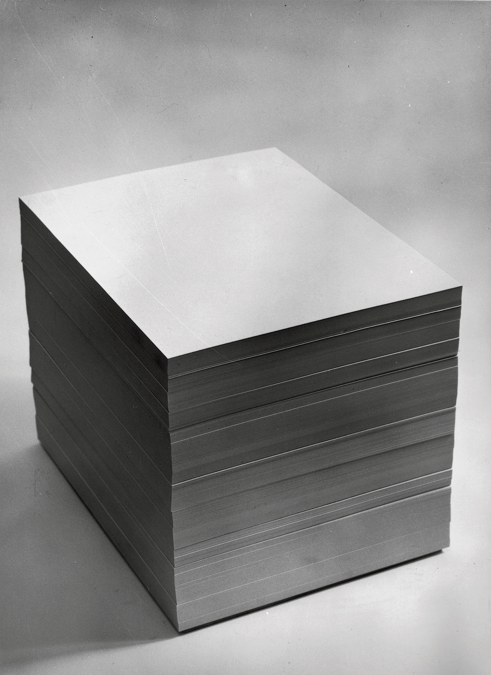
Giulio Paolini, Nécessaire, 1968 (Working)
It’s difficult to imagine a more simple sculpture. It creates a vertical form but it’s created through these lying sheets of paper, which are just material in one way, but they’re also objects that we know. We associate them with a number of different things; administrative work, maybe with creative process — the idea of the moment before an image is created or perhaps the piece of paper before a narrative is put down. Maybe the idea of paperwork or a legal document. In many ways it’s a simple sculpture, but it’s full of potential. One of the things I was interested in throughout was the uses of horizontality. You might think of this thing as lying down, passive, but in actual fact in a great deal of the art there is something about to happen. There’s this tension. It’s a piece of work I really love. I’ve tried for many years to make work that is this simple but also this complex.
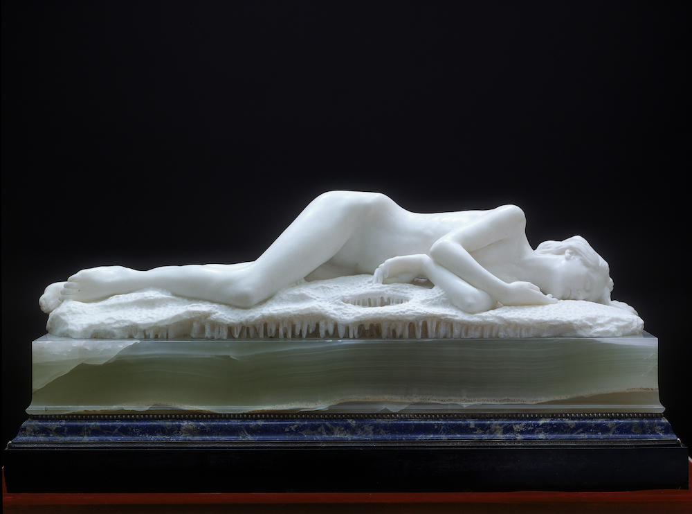
Edward Onslow Ford, Snowdrift, 1901 (Sleeping)
Snowdrift does something that sculptures often do, where one material stands in for another, but in a really complicated way. So here we have marble, and it stands in for skin; the power of skin in death. It’s a very macabre image. It’s cold, so it also stands for snow. You have this really complicated sculptural language going on. If it’s snow then you think she’s going to melt and the image is going to evaporate away and in a way we’re going to end up with something that looks like the Paolini, we’re going to end up with the slab. It was made in 1901 which was the same time of arctic exploration, so it was a time of great fascination with the Poles, but also it seems to prefigure what’s going to happen to the human image in sculpture — it’s going to go away and we’re going to be left with this very austere terrain.
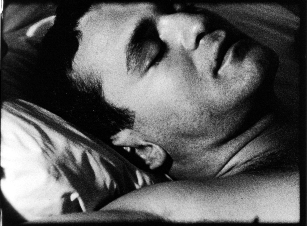
Rainer Werner Fassbinder, The American Soldier, 1970 (Mourning)
The American Soldier is a piece I started out the whole project with. It’s very austere and very stylish, very cold all the way through. You don’t feel that emotionally engaged, everyone in the film seems very remote with each other so you feel very remote from them, and then the final scene is this sobering death scene. This man, the American solider, is shot and his brother embraces him in this extraordinary horizontal dance, rolling around on the floor for several minutes to pop music. It’s erotic and funny and incredibly terribly terribly sad and moving all at the same time. I was interested in how in the art of mourning you having the lying bodies and slabs and all that but you also have things bowed or flowing. The bend or roll, the arabesque gesture that ends up in the horizontal in the art of mourning.
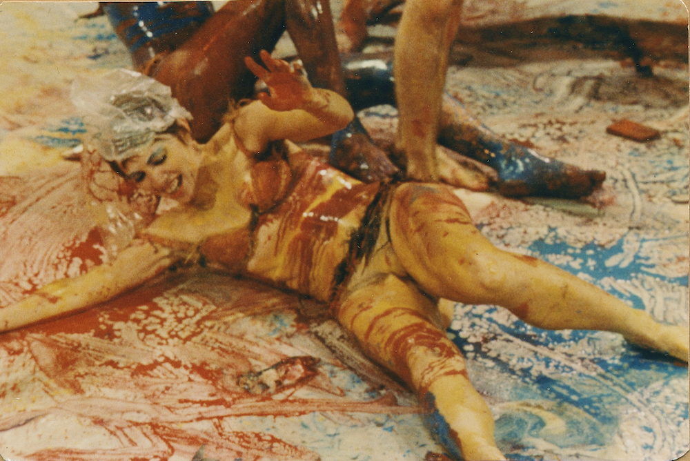
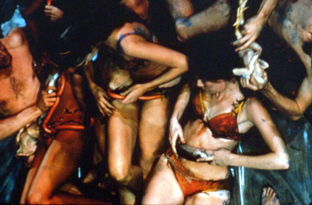
Carolee Schneemann, Meat Joy, 1964 (Dancing)
It was originally a performance but there was a rather beautiful film of it which is now converted to video and projected in the gallery. It’s comic and excessive, kind of sarcastic but maybe still quite ecstatic about the primal idea of consumption with these young people rolling around with paint and paper and chickens. There’s a guy wandering around with a chicken in his pants, so there are moments that are frankly stupid. It feels brilliantly positioned as an exploration of excessive consumption and how that includes elements of absurdity, of pleasure. Also this fence of exhaustion.
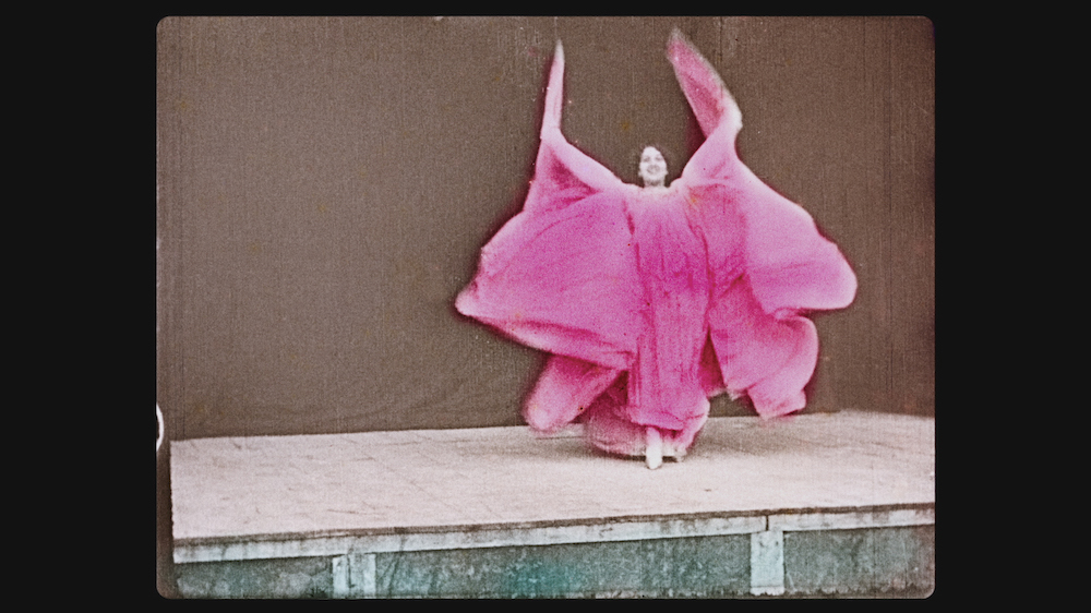
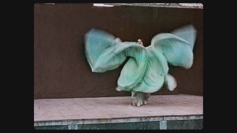
The Lumière Brothers, The Serpentine Dance, 1899 (Dancing)
The Serpentine Dance was made on film and is tinted frame by frame. It’s a film of another artwork, a performance by Loie Fuller in a big floaty dress. The body through this appendage, this prosthetic of a dress, becomes this electric, whirling dream. It’s fantastic. There is a lot of moving image in the film; from different types of performance, sculpture from film, and having gone through different technological processes. There’s also the strangeness of colour, as something added afterwards to the film. It’s beyond the descriptive realism that you associate with the indexical nature of film. You know it doesn’t really belong to the dress, you know it’s something that’s added afterwards and that makes it more strangely dreamlike.
‘Elizabeth Price Curates’ shows at The Whitworth until 31 October, De La Warr Pavillion from 28 January until 30 April 2017 and Glynn Vivian Art Gallery from 13 May until 28 August 2017
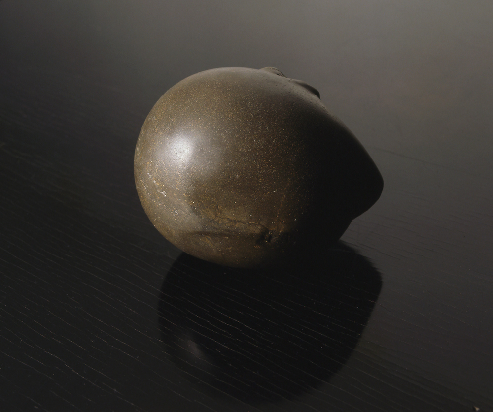
Constantin Brancusi Prometheus, 1912 Courtesy Kettle’s Yard, University of Cambridge © ADAGP, Paris and DACS, London 2016
