The stories of how Fitzcarraldo Editions publisher Jacques Testard chooses his titles have a certain novelistic quality of their own. In 2014—just three years after founding literary journal The White Review—Testard’s ambling around the Frankfurt Book Fair led him to Belarusian author Svetlana Alexievich. He acquired the English language rights to her set of oral histories Second-Hand Time, and before Fitzcarraldo could even release the work, Alexievich was awarded the 2015 Nobel Prize for Literature.
The following year, dismayed by the xenophobia surrounding Brexit, Testard sought a Polish author to add to Fitzcarraldo’s roster: “I felt I had a duty as a publisher to fight against a difficult cultural climate, that we needed more Polish voices, and an insight into Polish culture in Britain,” he said. A translator suggested Olga Tokarczuk and her novel Flights, a tale of anatomy and twenty-first century travel. Fitzcarraldo published it in 2017; a year later, Tokarczuk was also awarded the Nobel Prize.
“They’ve judged perfectly readers’ appetite for a kind of humble high-brow; crisp-looking but formally challenging texts”
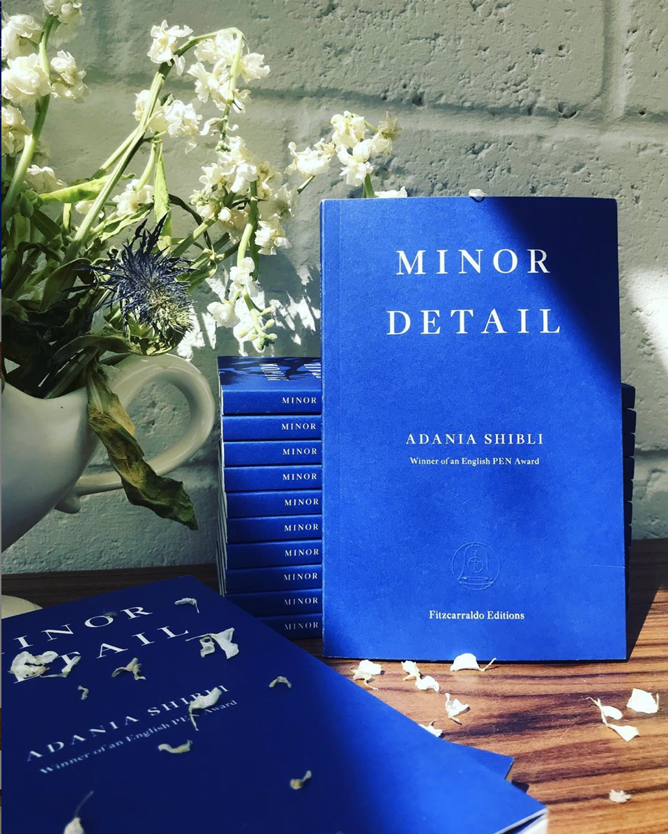
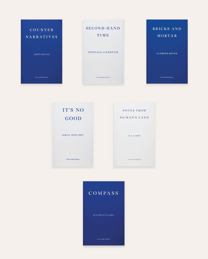
Testard’s Midas Touch aside, Fitzcarraldo has spent the last six years attracting plaudits not only for its carefully curated lists of experimental fiction and essays, but also for its distinct aesthetic. All of its titles are paperback only and bear the same deep blue (fiction) or pastel white (non-fiction) covers. Designer Ray O’Meara also created a custom serif typeface for the texts, drawing inspiration from Ulysses-era Bodley Head editions of the 1940s and 50s. “We wanted to design the books to make them visually striking and desirable as objects, because that’s how we believe books will survive in the new media age,” Testard said in 2015.
Now with over 50 titles, Fitzcarraldo are doing more than just surviving. They’ve judged perfectly readers’ appetite for a kind of humble high-brow; crisp-looking but formally challenging texts for intellectual, internationally-minded readers. O’Meara’s striking covers both contribute to and reflect this trend—coinciding with a re-emergence of minimalist aesthetics and the cult of decluttering which champions order and functionality. A book cover in the Marie Kondo-era should display nothing more than the title and the author’s name—and do so in a beautiful way.
But besides the design’s Instagram-friendliness, Fitzcarraldo’s covers also speak to its deeper purpose—to deliver works in translation which have struggled to find an audience in the Anglosphere. By creating instant visual recognition, Fitzcarraldo has been able to capitalise on the publicity that Nobel Prizes brought its authors early on. O’Meara’s designs equalise each title: instead of sickly puff quotes and image-heavy visuals, each cover becomes an emblem of Testard’s renowned eye for quality—flattening perceived differences in how translated texts and English language works are marketed in the UK. The Fitzcarraldo brand exists as a unifying artistic symbol in an industry dominated by powerful conglomerates; as such, it is often favoured by gallery bookshops seeking to champion the creative industries’ minnows.
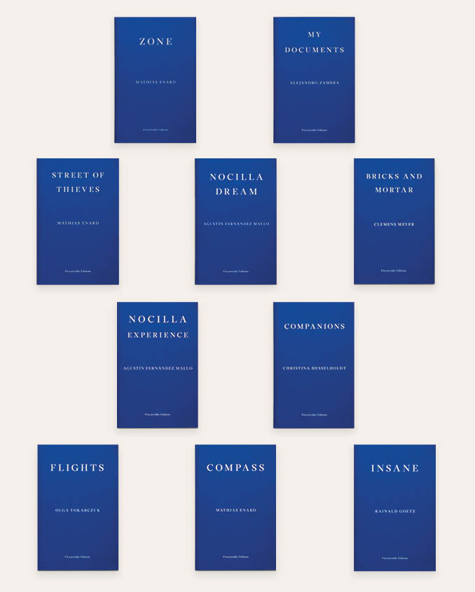
“O’Meara’s designs equalise: instead of sickly puff quotes and visuals, each cover becomes an emblem of Testard’s renowned eye for quality”
It also helps to keep costs down. In 2018, Fitzcarraldo made a profit of £1,100; there are only three full-time staff. Whereas the likes of Faber and Faber can commission original artwork for each title—think Jon Gray’s distinctive graphics for Sally Rooney’s Normal People, continually reworked for publicity purposes—Fitzcarraldo relies on a timeless design, ready-made for the books’ afterlife as household cultural signifiers. They are by no means alone. Debuted in 2015, Penguin’s Little Black Classics share Fitzcarraldo’s emphasis on collectability, though their nineteenth century (and overwhelmingly male) list including Swift, Darwin, Wilde, and Whitman is hardly in the same risk category as Fitzcarraldo’s.
For Testard, “variety—the quality or state of being different; the absence of uniformity or monotony” is essential to the publisher’s success. This may be what awaits readers turning the first page, but O’Meara’s design means that Fitzcarraldo is overcoming the most difficult challenge of all for independent publishers—convincing people to pick the books off the shelves.
All images courtesy Fitzcarraldo Editions