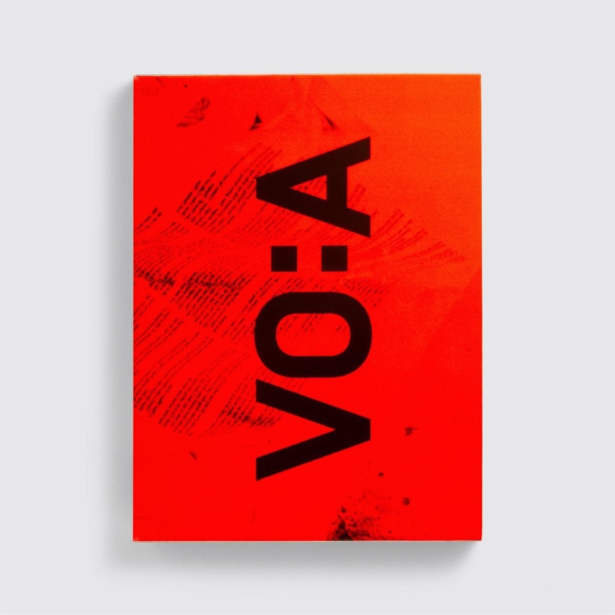
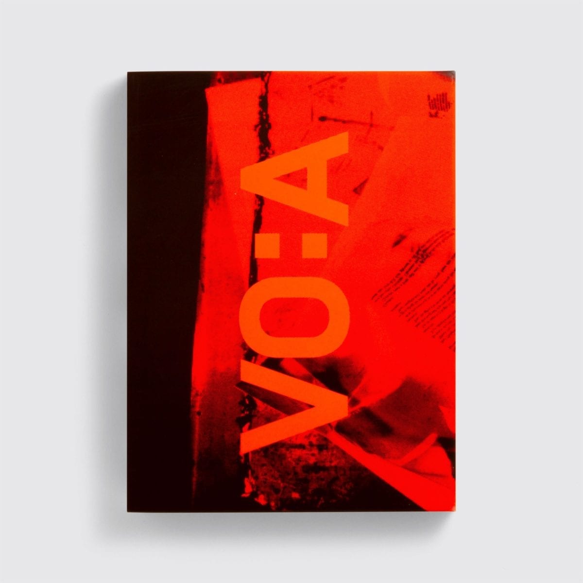
- Vaughan Oliver: Archive
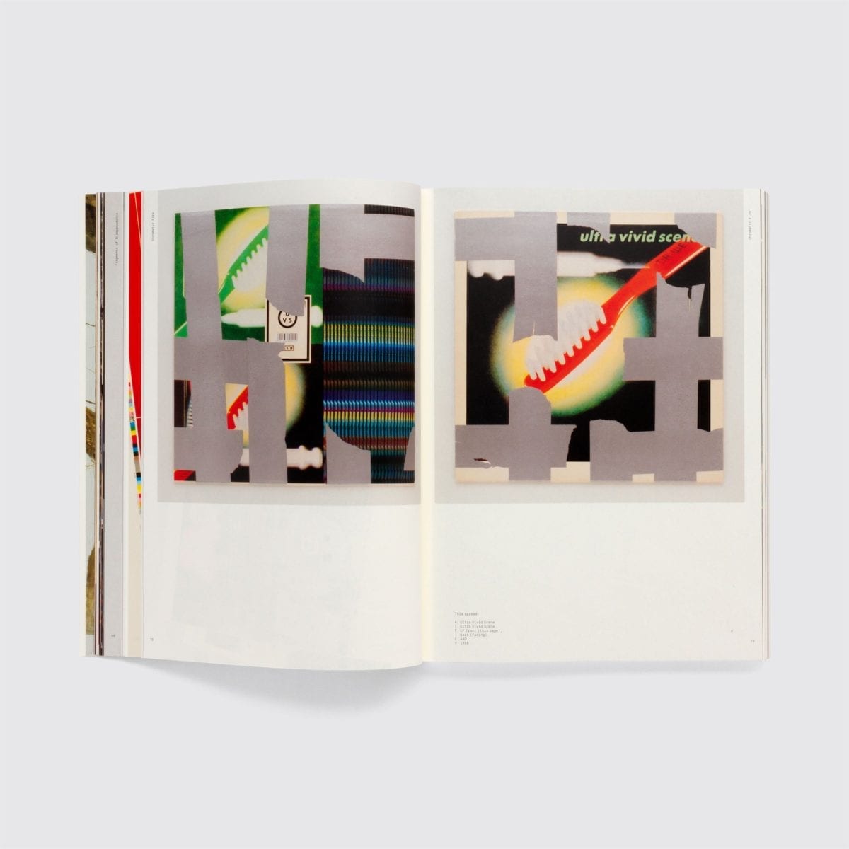
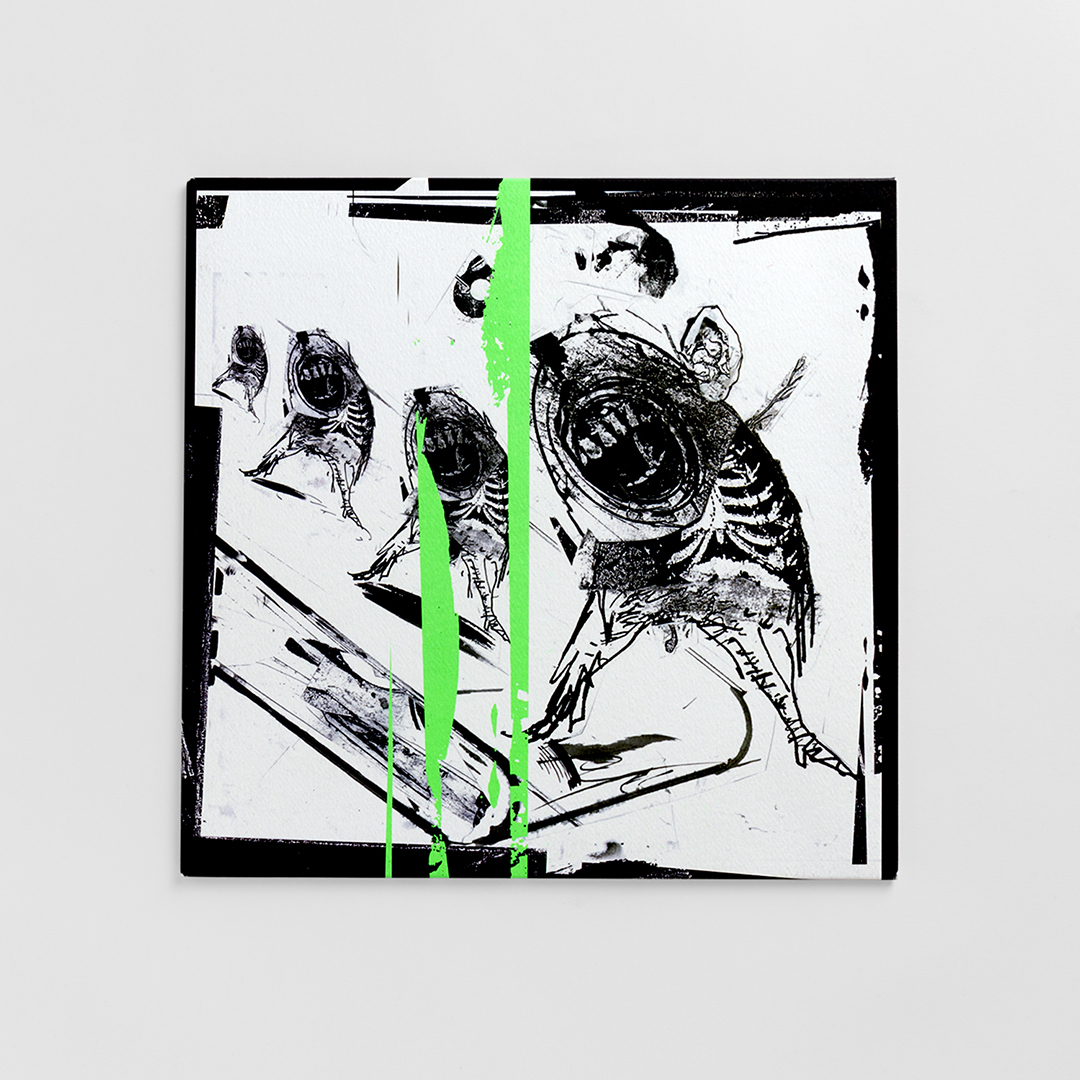
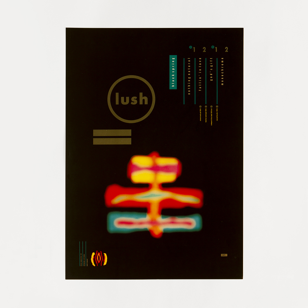
Even if you don’t think you know the work of Vaughan Oliver, it’s almost certain you’ve seen it time and again. The designer’s distinctly dark, goth-leaning aesthetic is about as nineties as they come (very much No Bad Thing), having graced record covers for some of the most iconic bands on the 4AD label’s stable—the likes of the Breeders, Pixies, Cocteau Twins and Throwing Muses. Indeed, with his partner at design studio 23 Envelope, Oliver created pretty much all the artwork for 4AD until 1987; though his relationship with the label has continued over the decades. The surreal, eerie leanings of his imagery—often characterized by a textural approach and disquieting layers of found imagery, letterforms and photographic snippets—and scratchy textures make it little surprise to learn that among the designer’s many admirers are David Lynch (there’s more than a touch of Eraserhead throughout Oliver’s oeuvre, and he designed the sleeve for Lynch’s rather brilliant electronic single Good Day Today / I Know) and spooky crooner Scott Walker.
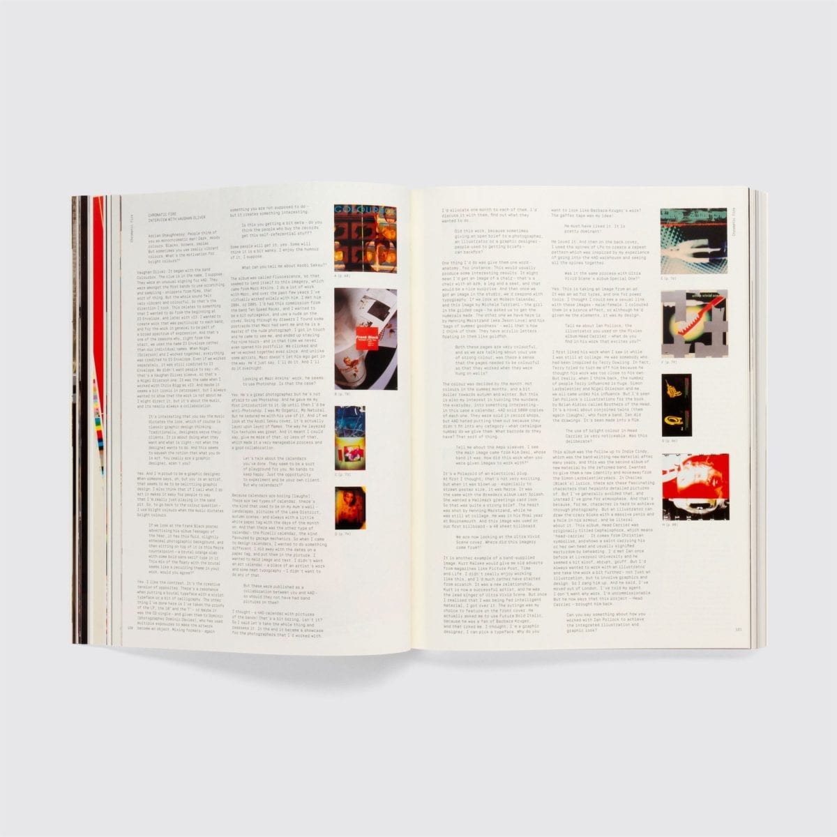
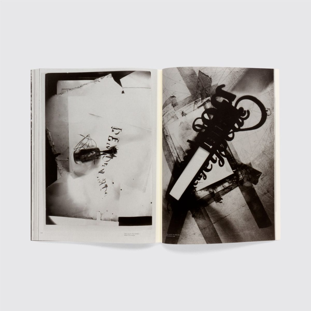
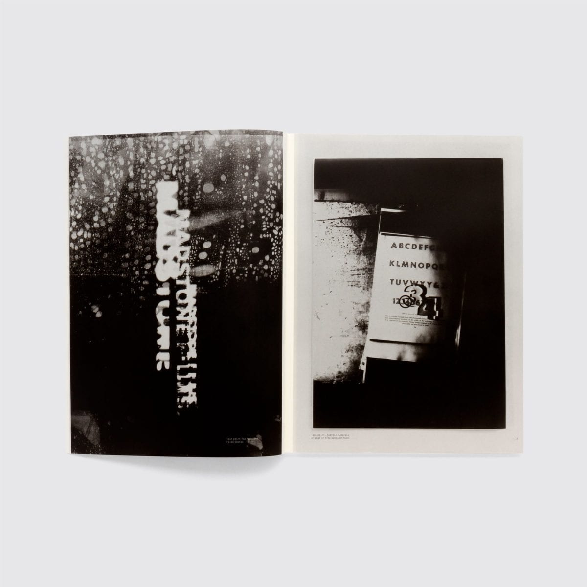
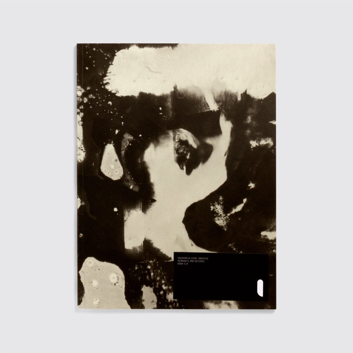
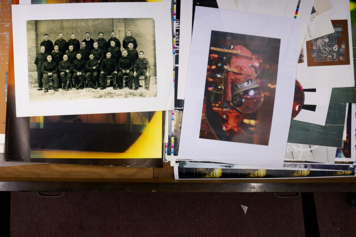
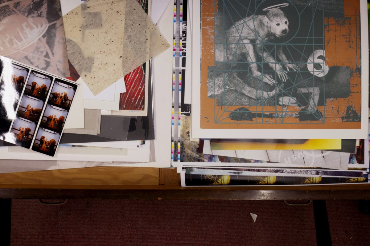
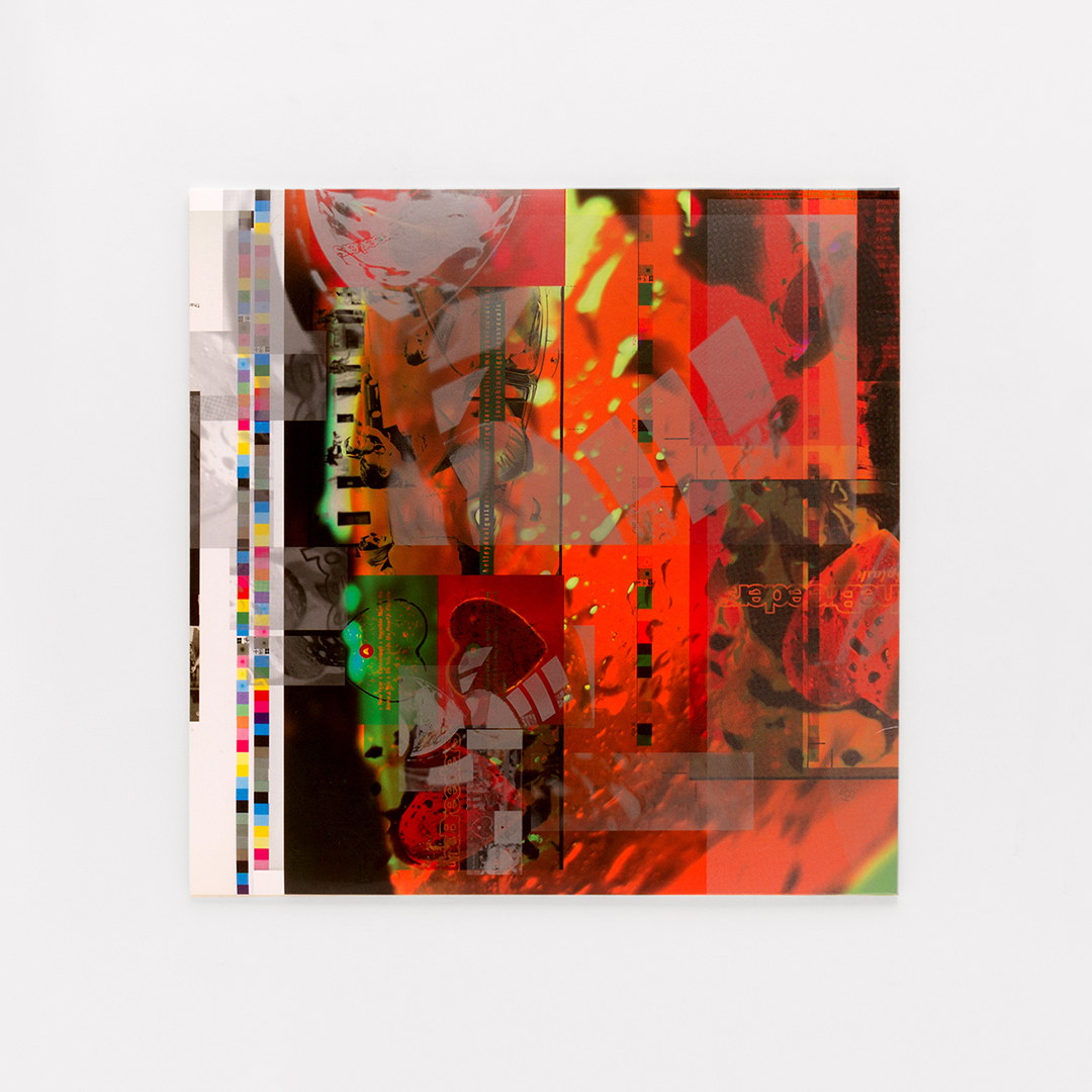
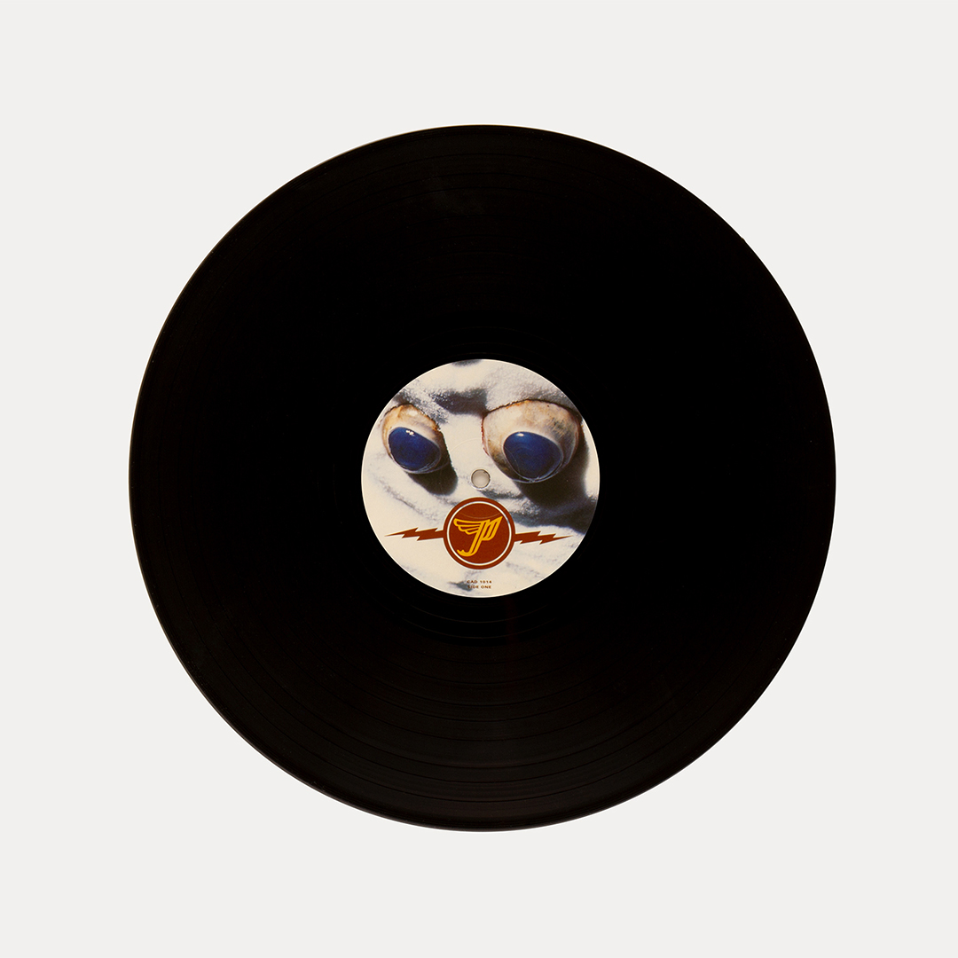
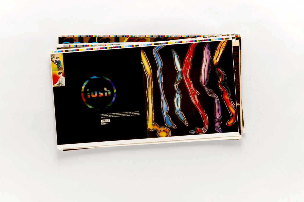
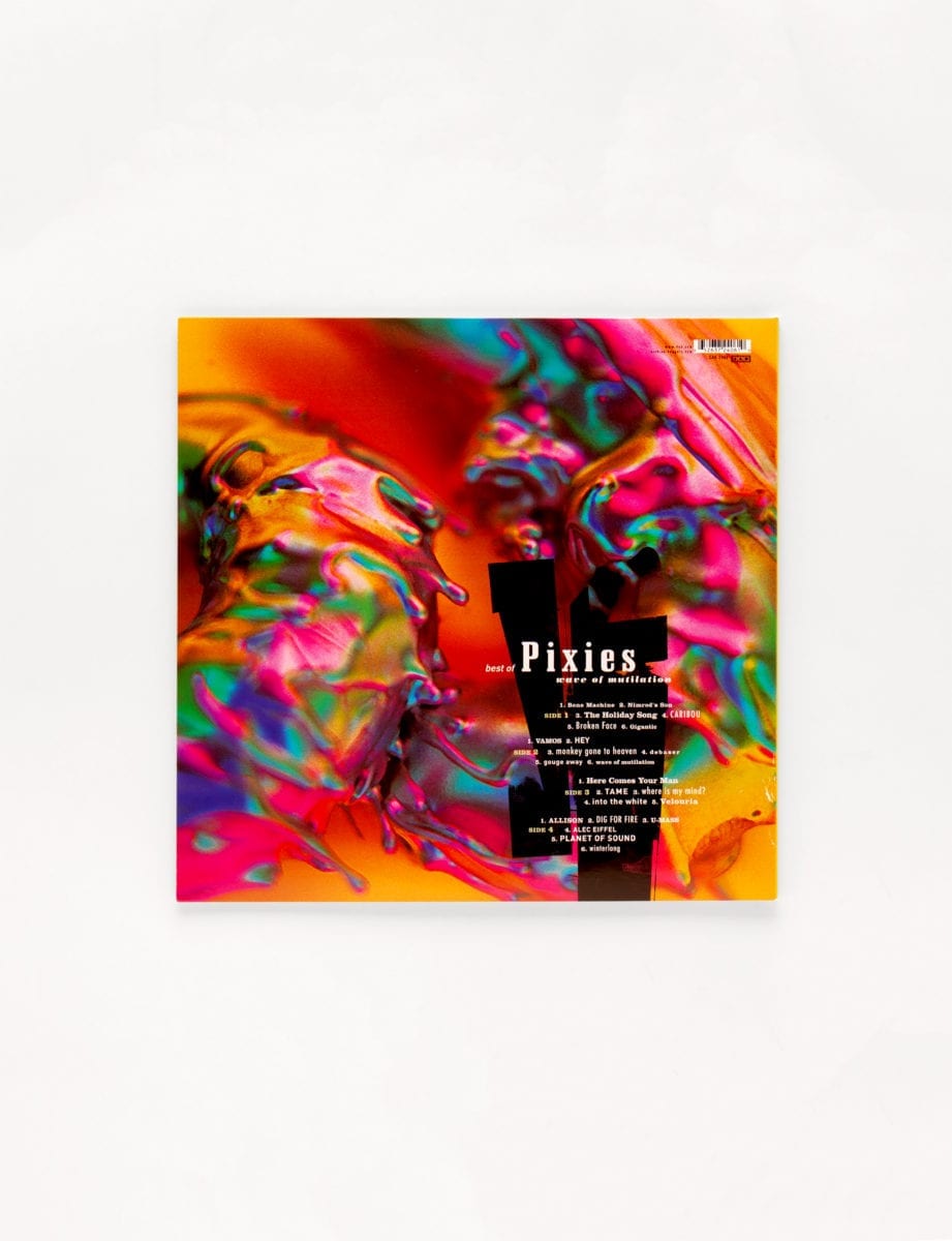
What’s interesting about Oliver’s design work is that it doesn’t really feel like graphic design, much of the time: his sensibility feels more aligned to an approach that deals in abstraction and mood as much as kerning or any notion of putting a band in the context of a “brand”. His unusual and superbly distinctive way of working becomes obvious when laid out in monograph form—or more precisely, in the form of the new two-volume Vaughan Oliver: Archive set, published by Unit Editions and designed by Spin. The books present not only Oliver’s own record design work, but the ephemera that informed and formed it, as well as proofs, running sheets, paper labels for vinyl records, videotape covers and the various other bits of printed matter that give the reader the sense that in opening these pages, you’re offered a paper conduit into Oliver’s smart, strange brain.
Materials and Fragments, Book One of the set, explores the components that make up Oliver’s work, examining his depictions of the body and use of colour and typography, alongside more abstruse themes such as mystery and melancholia. His work for seminal releases like the Breeders’ Pod and Pixies’ Monkey Gone to Heaven are here of course, augmented by a number of previously unpublished works and music press ads Oliver created that haven’t seen the light of day since their original publication. The second book, named Remnants and Desires, showcases the Photo-Mechanical Transfer prints (or PMTs, not to be confused with the very worst time of the month) Oliver based his designs on; including some test lettering for “an aborted Led Zeppelin project” that never made it out his studio.
- Vaughan Oliver's archive
“Projects completed in the 1980s have a freshness and singularity that prevents them from becoming relics of another time, like pictures of Spandex-wearing hair metal bands,” the books’ author Adrian Shaughnessy points out in an essay. “It is possible to look at Oliver’s best work and see his genius (and the genius of many of his collaborators) for a type of visual expression that transcends graphic design norms. There’s an emotional heft to his work that only appears in the output of a handful of graphic designers.” He’s suggesting—or almost suggesting—that this places Oliver’s work in the “art” camp. Oliver, however, is having none of it. “I don’t see myself as an artist,” he told Shaughnessy. “I work with artists and collaborate with them, but then it becomes graphic design. It’s not an art… I’m a graphic designer.”

