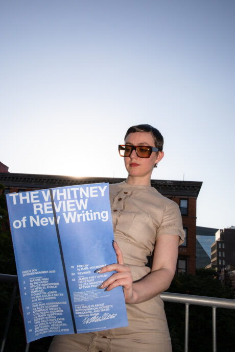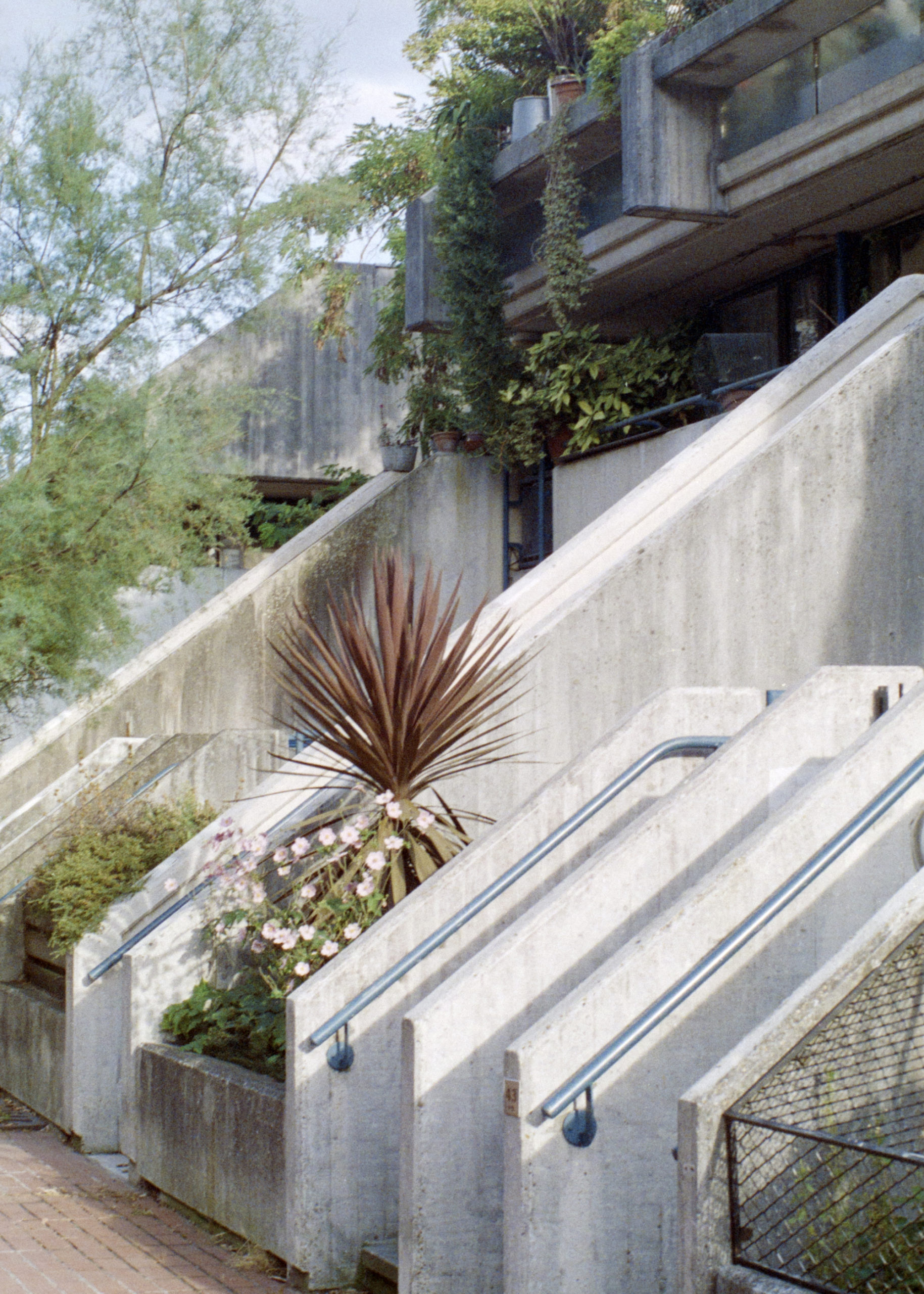
It started with a teak cabinet, minimally decorated with a vase of dried flowers and a hand-glazed mug. Next it was a sunlit flight of concrete stairs descending from a raised walkway. Then, a rosewood dining table surrounded by tubular steel chairs, a bowl of fresh fruit in the middle. Many will recognise these images in thrall to mid-century furniture and brutalist architecture, accented by the earthy elements of the natural world. Welcome to the new mode, that I call “middle class modernism”, where the aesthetics of restraint have replaced the flamboyant interior design made popular by home improvement shows such as Changing Rooms in the 90s.
This widely influential style of middle class modernism transverses the realms of architecture, design and art, and has become a broader visual trend that appears to celebrate humility—but in fact has become a compelling marketing strategy used to sell us a consumer lifestyle. As the late David Graeber wrote, “There is a reason why the ultimate bourgeois virtue is thrift, and the ultimate working-class virtue is solidarity.”
View this post on Instagram
“The original ideology of these modernist and brutalist objects and buildings remains at odds with their contemporary use”
Cornerstones of this middle class modernism are raw materials, such as linen, clay and stone, elevated to new status and returned to sale at a high price. Note the resurgence of British brands, once dowdy, now considered chic: Margaret Howell smocks (that can sell for up to £600); Aesop toiletries in pipette glass bottles; nostalgic HAY home accessories; vintage Ercol furniture. This language has been championed by popular publications such as Cereal and Kinfolk. It’s not all inaccessible: even Ikea now sells reworked versions of Alvar Aalto stools and Hans Wegner armchairs.
Understated design, with its unbranded garments and wares, is used as a signal of taste for those in-the-know. Arguably, this is a form of branding that fits within the contemporary tendency to digitally ‘curate’ our own lives into the carefully cropped squares of Instagram. But on the screen, as in life, it is often what is cropped out that reveals manifold contradictions.
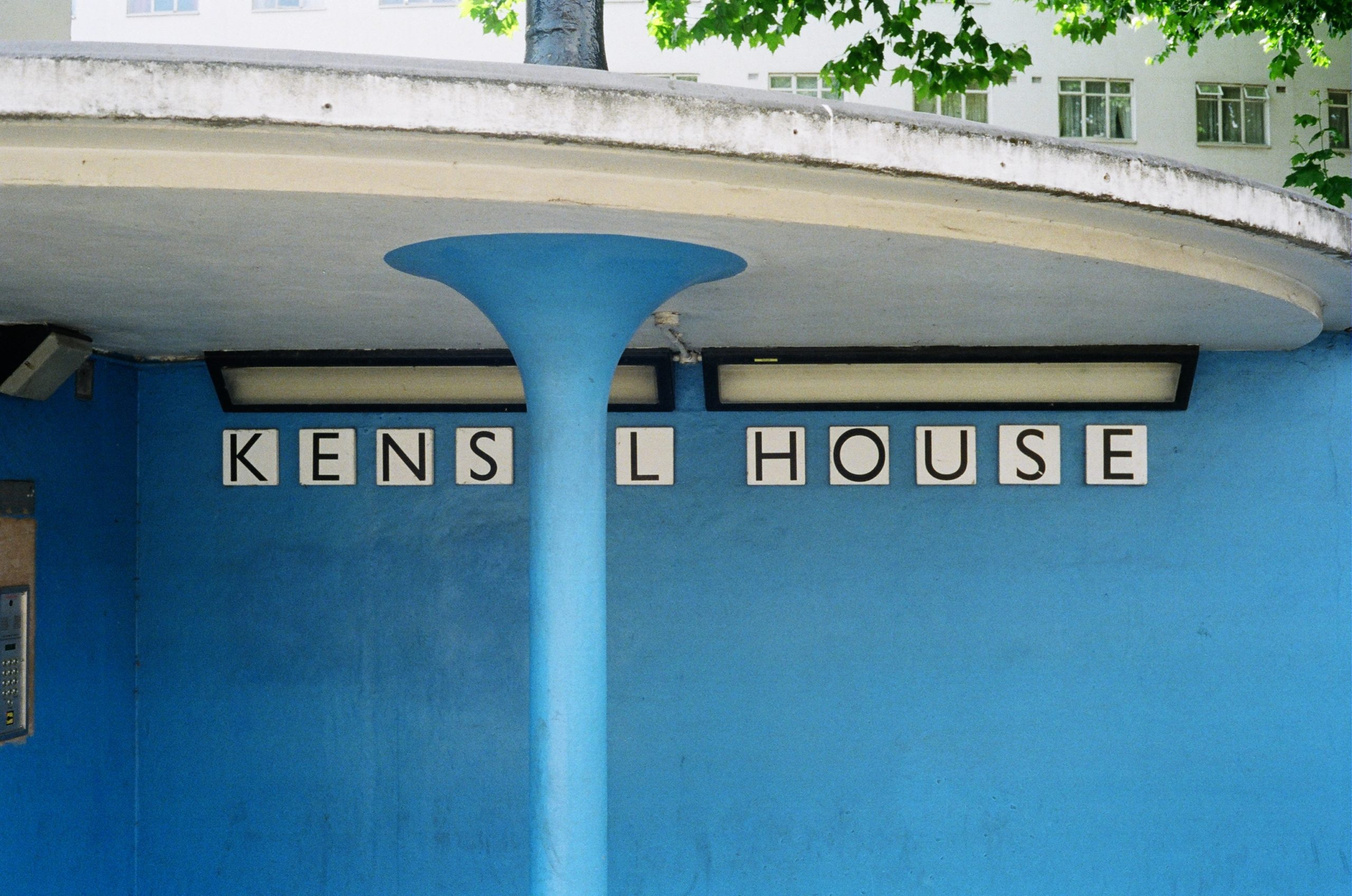
The original ideology of these modernist and brutalist objects and buildings remains at odds with their contemporary use. Many were designed in the wake of the destruction endured during the Second World War, a time of austerity and scarcity. It was the era of social housing, when local authorities invested in the idea of shared space and communal living.
Fast forward to today, and a house formerly designed for the London County Council can sell for more than a million pounds. Following the introduction of the Right to Buy scheme under Margaret Thatcher in 1980, much council-owned property moved swiftly from the state to the private market. These homes became divorced from the original utopian aims of improved housing for all, and their history reduced to little more than a footnote in a sales brochure.

One of the most successful purveyors of these modernist, rarefied spaces has been estate agency The Modern House, founded in 2005 by two school friends from Dorset. The pair saw a gap in the market for an agency that focused on the sale of mid-century modern properties, and a utilitarian aesthetic has remained at the core of what they do. They have sold homes primarily in London but also across the UK, designed by a host of modernists from Goldfinger to Lubetkin, with asking prices that range from £220,000 to more than £10 million.
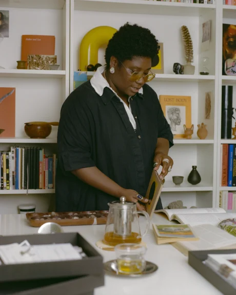
With a background in architecture and design magazines, the founders of The Modern House set themselves apart from their highstreet estate agent competitors through the careful editorialising of their sales. Homeowners are photographed as if they were appearing in the crisp pages of World of Interiors or Architectural Digest, typically posed coyly in the act of creative pursuit and rarely looking at the camera. So far, so humble.
View this post on Instagram
Choice detail shots hone in on the artfully arranged furnishings and objects that mark this out as a home refined by the subtle seduction of middle class modernism. While publishing aspirational interior photographs in an editorial context is nothing new, directly connecting such a clearly defined lifestyle to the sale of a property is largely unprecedented. The far-reaching influence of The Modern House suggests that this is an estate agency that appeals to a wider demographic not in spite of their explicit connection to commerce—but precisely because of it.
When else has an estate agency had so much influence on the loaded class politics of the contemporary visual realm? The Modern House aesthetic draws fastidiously from a Northern European notion of good taste, championing minimalism and austerity as something you can buy into, a commodity rather than the result of necessity or scarce means. With almost 300,000 Instagram followers hungry for inspiration, their appeal is largely to a millennial fanbase, who are of a generation young enough to embrace their modernist aesthetic free from its connotations of postwar hardship.
And there’s more to it. Unsurprisingly, the vast majority of those who feature in the photographs on The Modern House website are white, while the agency has come under fire for the lack of diversity on their own 25-strong team of sales representatives and appraisers.
“It draws fastidiously from a Northern European notion of good taste, championing minimalism and austerity as something you can buy into”
View this post on Instagram
Much like the reign of the millennial aesthetic (crowned the “tyranny of terrazzo” earlier this year by The Cut) middle class modernism isn’t going away. It continues to inform the stacking school chairs found in buzzy restaurants that describe their cuisine as “Modern British”, coffee table books on brutalism and Bauhaus arranged in hotel lobbies, and a Quaker-like reverence for Falcon enamel kitchenware. While giving an appearance of pious simplicity and ease, the cost of achieving this back-to-basics aesthetic is, in fact, an expensive pursuit.
Anyone, like me, who has succumbed to a cocktail served in a jam jar, or shopped for perfume in a shop that dubs itself an ‘apothecary’, will know how powerful this fantasy can be. Middle class modernism appeals to those who can afford to believe in quality over quantity, who feel less is more, that local is better. But the original status of these items and buildings has been long lost; utility has become commodity, with socialist and modernist ideals moulded to fit the goals of capitalism.
