It might be said that the pandemic has ushered a new visual language into the public sphere. More accurate is that existing codes of graphic communication have found a mass audience for the first time. Two fields stand out in particular: molecular biology and statistics (the latter includes applying data visualisation to epidemiology). Both are subject to similar challenges when expanded beyond their usual audiences; the public’s comprehension of their different terminology and idioms is said to be low. This can lead to misinterpretation and misreadings, which seeds mistrust and ultimately results in a breakdown of the language’s wider effectiveness.
There is also the question of intention: to inform or persuade. When the first is interpreted as the second by a suspicious audience, mistrust can again arise. When the second is dressed up as the first by those with authority, it can have lasting civil consequences. Graphics within biology and statistics each attempt to communicate something that words cannot (or cannot do well). With their fatigued new audiences now a year into the pandemic, how have they fared?

- A computer model of folded protein targets studied by the DeepMind scientists, 2020. Courtesy DeepMind
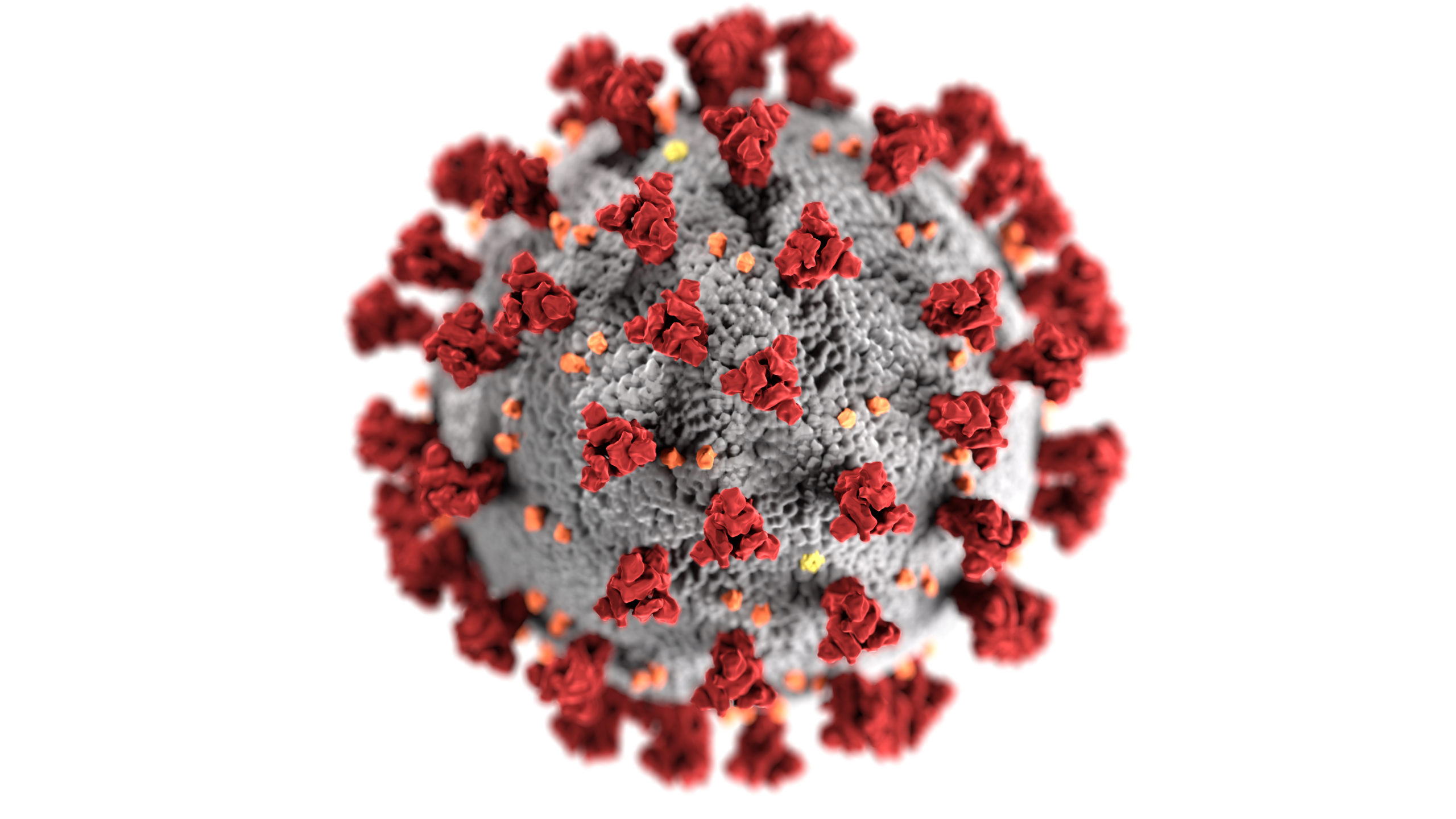
In microbiology, visuals have traditionally been used to supplement and authenticate research, says Katrina Gold, a portfolio manager in genetics and molecular sciences at the Wellcome Trust. Many academic papers now open with a ‘graphical abstract’, featuring a flowchart or particularly compelling image from a study. “When you’re dealing with microscopic elements of life, being able to describe them accurately can give you a real insight into how different proteins or viruses might be functioning,” she explains. Such is the case with the ‘spike’ structure of the SARS-CoV-2 virus, first visualised by digital simulations in March. “The conformation of the molecules in space—the spatial arrangement of the atoms—can tell you something about how the virus attaches to cells,” Gold explains; these insights are then essential for drug combination and design research.
“People have all the conceptual framework, it’s just the symbols we use—the literal numbers—are a foreign language”
Since 2016, the Human Cell Atlas
(HCA) project has been attempting to categorise each human cell type: “a collection of maps that will describe and define the cellular basis of health and disease.” When Covid-19 emerged, the project analysed its existing data and made them available to researchers working on clinical care. Anna Hupalowska, a data visualisation designer and illustrator at the Broad Institute of MIT and Harvard, has worked on the project over the past year. The combination of a graphic design BFA and biology doctorate allow her to design clear images without sacrificing accuracy. One infographic is a cross-tissue survey representing the level of ACE2 on cells, which act as receptors for SARS-CoV-2, in different parts of the body. The accompanying blue dots act as a key to the virus’s potential infection rate.
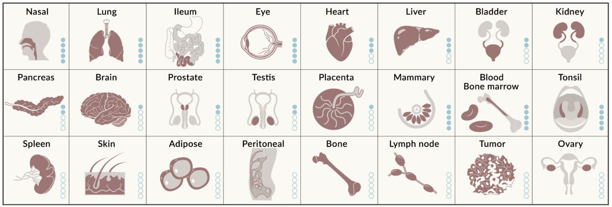
- Anna Hupalowska and Aviv Regev on behalf of Human Cell Atlas, 2020. Courtesy the artist
Hupalowska has also created visuals for public-facing initiatives during the pandemic. One was an instructive diagram for self-administering nasal swab tests to be sent across Massachusetts—requiring a different skill set to her work with HCA. The brief was complex but required a simple solution: a set of images that could be understood by those with no knowledge of medical processes, while also catering for the visually impaired and elderly. “Information is really short and has to be fast,” Hupalowska says. “Twitter, news—it’s all one sentence. And it’s exactly the same with how we need to communicate visually.”
View this post on Instagram
The new iconography created by the pandemic has stretched beyond public health settings. Gold compares the SARS-CoV-2 molecule to that of DNA’s double helix in terms of its instant recognition. Scientific images are always subject to editorialisation, which is only exacerbated by wider usage. The colours we apply to any graphics reveal these decisions, Gold says. The greens and reds used “are those of signalling germs; of invading microorganisms, but the scientific images are all greyscale”, she explains. “Any colour is being applied to highlight particular features.” Hupalowska names Critical Mass, an image created by Christoph Niemann for the New Yorker in March, as a favourite example of graphic designers engaging with the biology of Covid-19. Other covers riff on the disease’s spiked structure, its movement through space, or its multiplicity, while some attempt to convey its economic impact.
View this post on Instagram
Graphics can often be more intuitively understood than raw statistics, but scientists should be wary of overplaying the public’s numerical ignorance, says Alexandra Freeman, executive director at Cambridge university’s Winton Centre for Risk and Evidence Communication. “People have a grasp of the quantitative aspects: they have all the conceptual framework, it’s just the symbols we use—
the literal numbers—are a foreign language.” Since the pandemic began, journalists and public health experts have strived to explain the technicalities of data visualisation, especially around how cases, deaths and infection rates are plotted. Debates around rolling averages; linear or log scales; and per-capita death rates are compounded by disparities between Office for National Statistics and Public Health England data—and even changes to the very definition of dying from (or ‘with’) Covid-19.
“There is no neutral data representation,” says Giuseppe Sollazzo, head of AI Skunkworks & Deployment at NHSX. “Even if you want to be unbiased there is some bias, because with editorial choices you can represent the same thing in a variety of ways.” Despite masses of available data, determining the risk of dying from Covid-19 remains one of the most complex challenges. Variations in age and risk factors make averages “pretty pointless”, the Winton Centre’s chairman David Spiegelhalter said in November. People have a rough understanding of their own risk, but struggle to convey or respond to statistical assessments, Freeman explains.
Representing the information graphically can help. Freeman recounts that when her team asked people to assess their own risk of dying from Covid-19, few used numbers at all. Instead, “they had these visual mental models of different people”, she says, with older people with pre-existing conditions characterised as most at risk. These ‘personas’ therefore represented the perceived risk degrees the public had synthesised from a year’s worth of public health messaging, laid out from lowest to highest.
“The spatial arrangement of the atoms can tell you something about how the virus attaches to cells”
“If you can show where you are as an individual compared to some of these people you’ve got in your mind, then that’s really helpful,” Freeman says. Her team created a visual scale incorporating the risk ‘personas’ alongside actual percentages. Darkening the colour further up the scale works as an analogy, while being able to see a whole spectrum of risk gives crucial context that a single statistic cannot. Despite this method’s effectiveness, difficulty remains in communicating to the public that single graphics are imperfect ways of representing information. Using multiple formats—and sources—is always preferable. “Visualising flattens things,” Sollazzo warns. “We should be a bit more open in trying to make sure the public appreciates this is one potential way of seeing things, rather than the way that data is conveying meaning.”
This goes to the heart of the debate around persuasion versus information which, at this stage of the pandemic, is now being applied with increasing urgency to vaccine hesitancy. Diagrams like icon arrays, where viewers can see the denominator and information appears contextualised, can feel less loaded than line graphs or side-by-side comparisons. But the problem is as much about framing as it is format, epitomised by televised Covid-19 briefings featuring scientists appearing in impartial but simultaneously advisory roles alongside politicians.
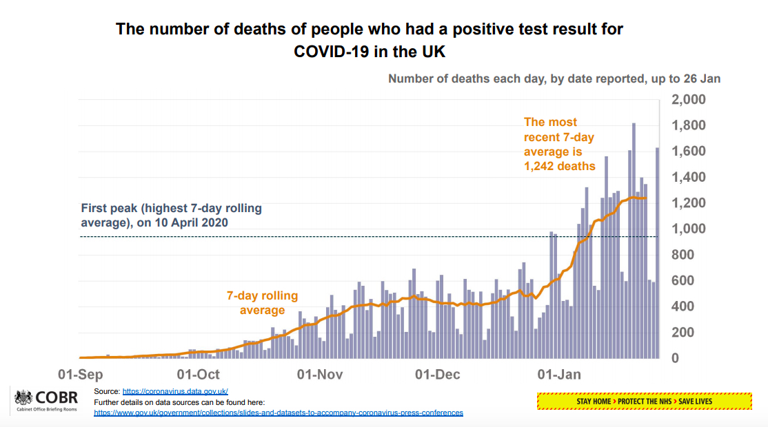
- A slide from the UK government's Covid-19 press conference, 26th January 2021. Courtesy Prime Minister's Office
“All of these issues come down to the trustworthiness of the organisation,” Freeman explains. “Have they behaved in a purely trustworthy fashion? We know that people judge that on the perceived motivations of that organisation. If they’re always trying to persuade you to do something, you might start asking yourself: ‘Why are they persuading me to do this, what are their motivations?’” Previous negative experiences with health services can implant these doubts, which can then be difficult to identify and dispel. She continues: “If institutions were to communicate in a more informative and a less persuasive fashion they could, in the long term, end up being more trusted.”
Graphics and data visualisation will continue to play a part in this mission, but the best option appears to be a holistic approach: statistics, visuals, language, demonstration, outreach. What Gold terms “the importance of being able to capture public attitudes and engage in dialogue”. This is less a concession of graphics’ inadequacy, more an acceptance of how unstable the public health situation—and therefore the available information—is. “How do you capture the uncertainty?” Sollazzo asks. “Not all types of uncertainty can be captured in a chart. Sometimes it’s something we should be talking about rather than trying to visualise.”