Q: I’m about to graduate from art school and I’m in the middle of making a website. To be honest, I don’t know what to put on it. How do I go about this, and what’s actually important to include?
Well done on making it through university! Congratulations. You’re going to be an Artist™, no more having to hyphenate it with “student”.
Before we get into the logistics of having a website for your shiny new art career, fingers crossed, I want to say something up top. Not all artists have websites. Not all artists want one. Sometimes people opt out of that kind of visibility, even staying off social media or keeping private on there.
It might suit you better to sidestep the hustle and grind, the 24/7 networking circus of the internet, and the general competition of the attention economy. A lot of artists just want to make art and everything else can be a distraction. Especially at the point you’re at right now.
Maybe the work you created for your degree show is only the beginning? Maybe you should get stuck into the studio and figure out what comes next before putting all of that and all of yourself online? Maybe not, though. And if not, let’s get thinking about what your website might look like.
“A lot of artists just want to make art and everything else can be a distraction. Especially at the point you’re at right now.”
Why make one? In the olden days, the art industry revolved around studio visits. That’s how curators, collectors and critics found artists. These days, I think everyone is too lazy, or perhaps there are just too many artists to get to see in person. Either way, people do the bulk of that searching online.
In my experience, these people (who can give artists opportunities to further their career) are now using Instagram as a primary point for learning about an artist’s work. But some of them still see social media as a platform that is only professional to a point, so they use social media accounts as a jumping off point before heading to the artist’s website to see the real goods.
There, an artist’s website is expected to stand in for the studio visit: it should introduces the artist, their whereabouts and contact details, it should introduce the artwork, and it might also lay out the concerns of the artist’s practice. Portfolio, bio, artist statement.
When it comes to each of those elements, here’s a little guide based on what I usually see but also what I appreciate.
Bio: Include your name, the city you’re based in, and make sure you put in the word “artist”! It sounds obvious but you want to be google-able. What if people are looking for artists in Leicester? Put those specific words on your page so you are search-engine optimised.
“People (who can give artists opportunities to further their career) are now using Instagram as a primary point for learning about an artist’s work”
Portfolio: Include good, clear, brightly lit images of your work. Make sure horizontals and verticals are aligned, and that the shots are well framed so that there’s nothing distracting attention away from the content of the work itself.
If you make moving image work, you can include the full work, an excerpt, or a few screenshots. If you make performance work, documentation can be handy and in whatever format you think best represents the work. Include title, medium, year made, dimension or duration (whichever applies). If you feel like context, a short few lines about what the work is about could be helpful, and I always like this.
If you’ve been in an exhibition, then feel free to mix up your shots of individual works with a cheeky installation snap of them in situ at the show.
Artist statement: There are one billion artists, or that’s what it feels like anyway, so a paragraph about what you do that makes you different from everyone else is very helpful and also probably sensible business-wise. What’s your Unique Selling Point, and so on.
What discourse do you want to align yourself with? What theoretical context does your work sit within? Is there a charming, personal or silly reason that you chose to make this specific kind of art? Some people write these in third person, some don’t. If a critic has mentioned your work, you could pull a quote from them and include it here.
“Remember, you’re an artist. Is there a way to do this with a bit more imagination, a way that actually reflects the art you make?”
Contact page: Plop an email address on there and link it if possible. Link your Instagram if you use it, so the person snooping can check what’s likely your most up-to-date content. And not just Instagram, if you’re active on anything else that’s relevant to your practice put it here. YouTube, Soundcloud, TikTok, whatever.
You could also add a CV. Curators and the like find it useful to know if you’ve got any shows already under your belt. This includes any self-organised shows, performance nights, screenings or extracurricular bits: whack them in so you don’t appear too fresh faced. If there’s something external that you can link to like a website, event page or install shots, then all the better. The CV is also the place to mention where you studied.
The thing is, you can do all of that and leave it there. But remember, you’re an artist. Is there a way to do this with a bit more imagination, a way that actually reflects the art you make? It’s nice to keep your website in style, where possible.
Remember: it’s all a stand-in for the personality you could have put across if people still did studio visits.
Culture Therapy: Let Art Solve Your Problems
As two critics who operate online instead of the usual print publications, we spend a lot of time thinking about how the Internet has changed the art industry. I think there’s a whole knot of issues, to be honest. It puts pressure on artists to create huge followings that they can then translate into real world, financial success. And even that doesn’t work sometimes.
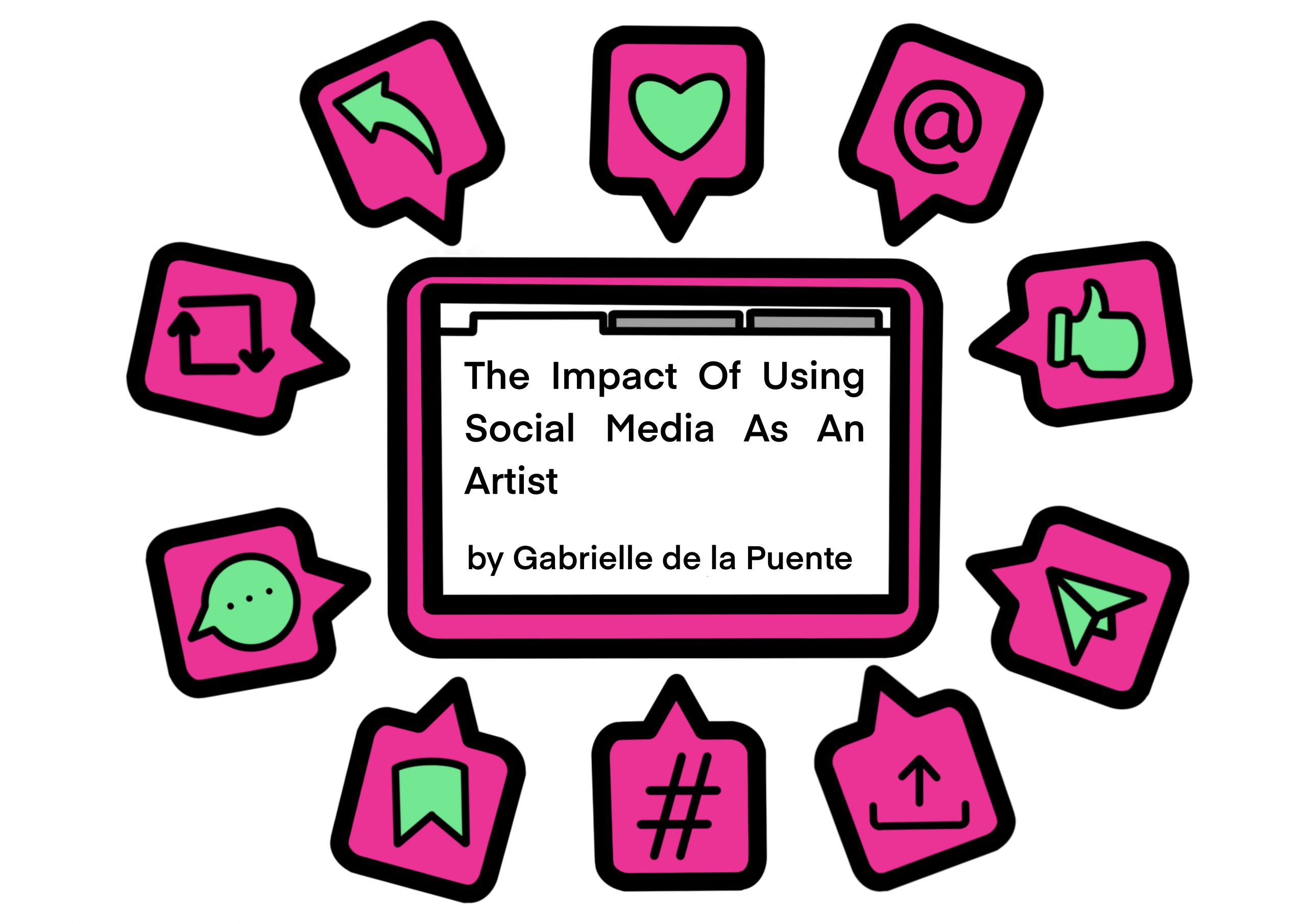
For today’s cultural prescription, I’m going to point you to a report I wrote last year called The Impact of Using Social Media As An Artist. I know this is an advice column about making a website, but artists increasingly just stick to Instagram pages over websites because it’s difficult to persuade that kind of foot traffic to leave social media platforms to view whole websites instead.
This report is a mix of things: I write about how artists use social media, I offer guidance on the best use of a few different sites, I offer a critique on how an organisation presented an art commission online, and I also advise institutions on how they can work with artists through these channels.
Have a question for The White Pube? Get in touch with Zarina and Gabrielle at info@thewhitepube.com
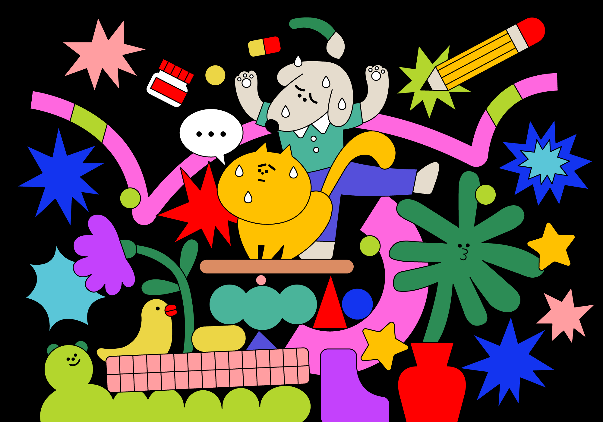
Illustration by Lucia Pham, an artist based in Hanoi
Advice Column
Got an art-world problem? Every month The White Pube set out to help a different Elephant reader…
READ MORE