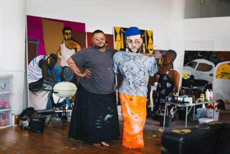
Leo Fitzmaurice has been quietly building a reputation for repurposing found items for over two decades: his landmarks include winning the Northern Art Prize
in 2011, showing at Frieze Sculpture Park in 2015 and featuring in a solo show in the fair itself with London’s The Sunday Painter. He trained in painting (in Liverpool and Manchester) but changed tack, frustrated by how “I was always trying to get things into a painting when I could have just worked with them directly.” That led transitionally to him painting a pair of souvenir clogs from a charity shop in typical 1930s Mondrian style: Holland (1995) returns Mondrian from the city-like grids of his mature style to the rural roots of his early landscapes, and reorients painting by wrapping it around a sculptural form. Soon he stopped using paint altogether in favour of editing and representing objects, so we see the familiar afresh.
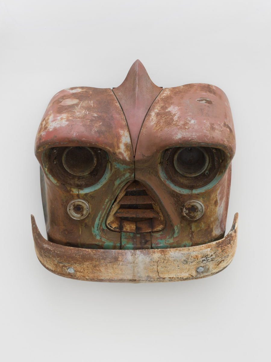
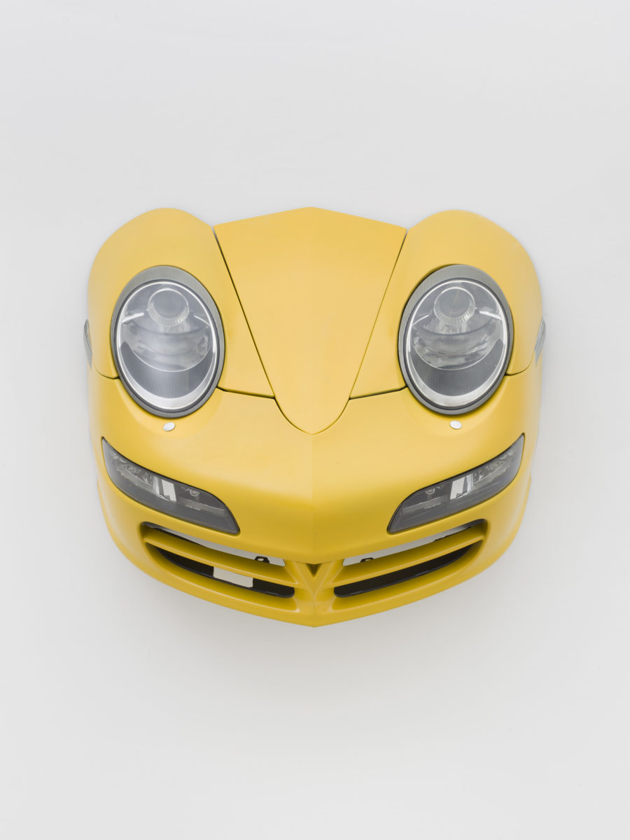
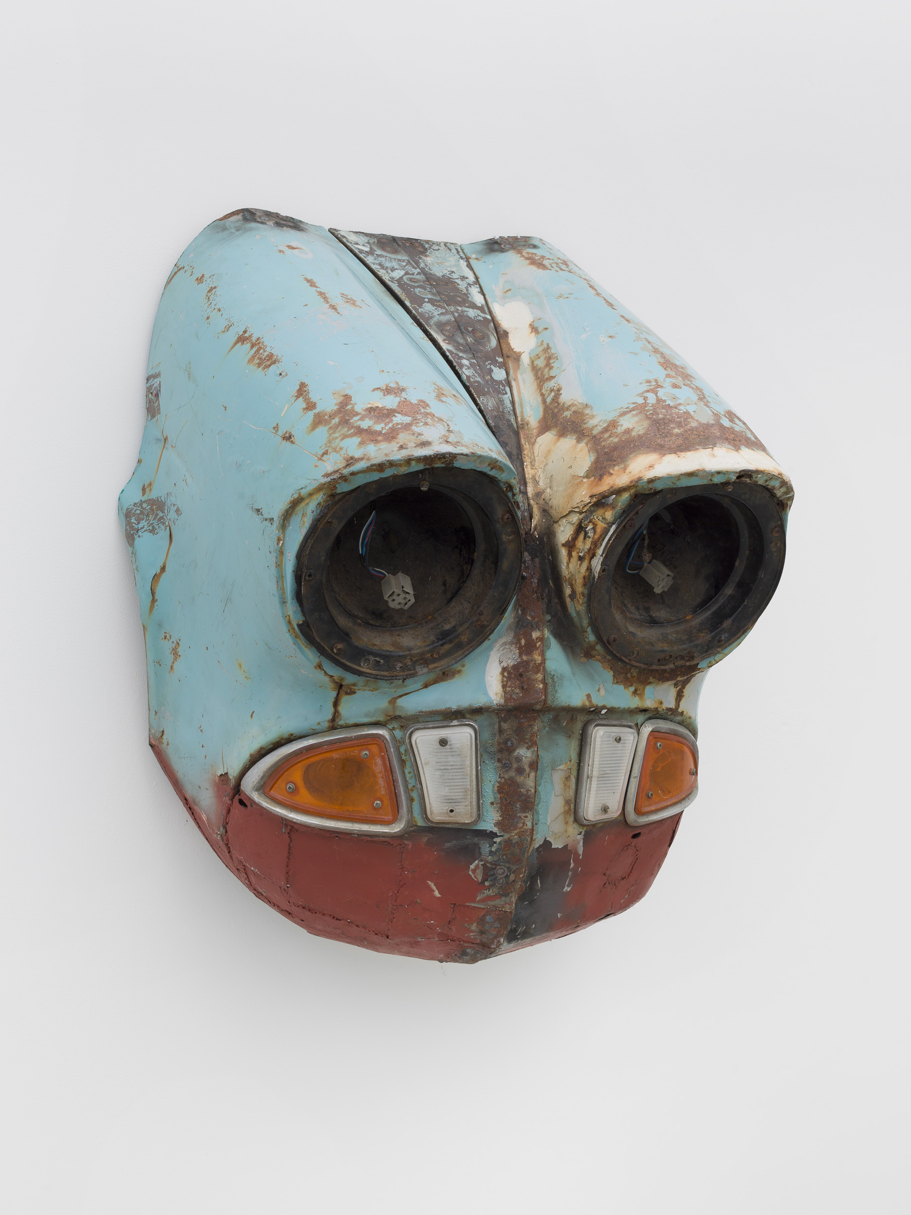
His current show, Autosuggestions at The Sunday Painter, consists of nine scrapyard cars from which he has removed a central section to expose the anthropomorphic tendencies which underlie their design. The middle of the car’s name is also excised to yield each work’s title. Shown here for example are Chevalir, a Chevrolet Bel Air from 1956 which looks its age to characterful effect; and Ciasso, a Citroen Picasso from 2001 with just a little of Pablo’s intense stare. Nine of them are ranged around the walls of The Sunday Painter as if they were paintings.
- Walker Art Gallery, 2018 © Rob Battersby
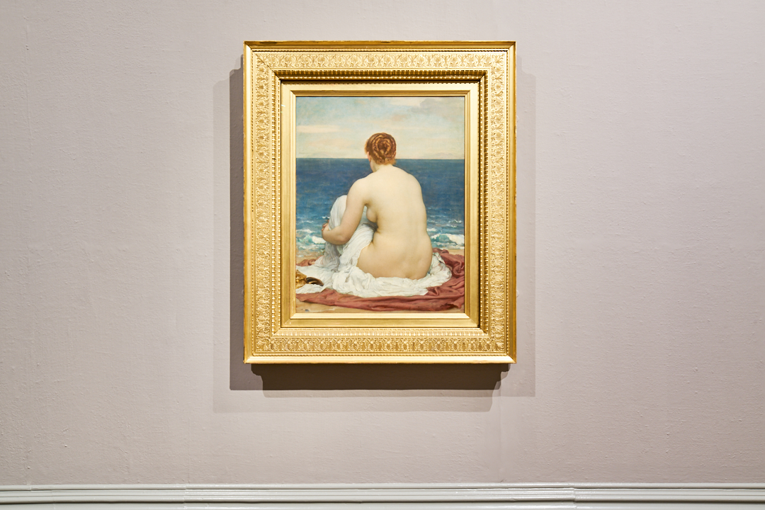
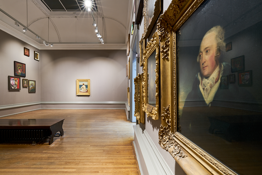
These works are “assisted ready-mades” which require so much intervention they’re hardly readymade at all. By contrast, when Leo showed thirty-three paintings at the Walker Art Gallery in Liverpool last year, he himself didn’t lift a brush. But he did make us look differently at the work of those who have. For this show Fitzmaurice’s ideal viewer would enter the spacious gallery with no particular expectations, and see many unlabelled portraits hung at various heights, with one wall occupied by the rear view of a nude woman looking out to sea (Lord Leighton’s Psamathe, 1879–80). What the visitor might then have noticed, was the alignment of the portraits: judging by the positioning of their eyes, all subjects in these portraits were looking towards the nude, though whether they were focusing on her, staring with her at the sea or lost in their own inner landscape, was a matter for conjecture.
“It’s easy to pass by portraits, but really it’s like meeting people you can connect with”
“It’s easy to pass by portraits, but really it’s like meeting people you can connect with,” Fitzmaurice says. The faces were arranged to reflect not just the leftward or rightward direction of their gazes, but also whether they appeared to be staring up or down, so that those looking down were highest on the walls, those looking up were set low. Consequently, the artist tells me, “the room becomes part of the work. It’s not a flat experience.”
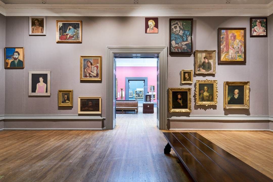
Fitzmaurice talks of his selection as “slicing through” the Arts Council Collection (from which 60 per cent of the portraits are taken) and National Museums Liverpool’s collection (the other 40 per cent) by selecting from their portrait holdings according to just the one criterion: direction of gaze. Fitzmaurice selects paintings rather as Christian Marclay chooses film clips for The Clock. By “riding roughshod over art history”, he says, styles and historical periods are more mixed than in a typical show, and he democratically foregrounds works which might not otherwise have gained attention. He says that about 75 per cent of portrait subjects looked directly at the viewer, so those were excluded, but otherwise he edited out only famous faces—Napoleon, Nelson—because they would have been a distraction.
The artist was particularly taken by how the little-known, self-taught William Daniels (1813–80) dealt with flesh tones, and I was pleased to discover the unusual Old Lady with Baton (1977) by Marie-Louise von Motesiczky. Thomas Burke’s The Student
(1938) proved particularly popular with visitors, who thought he could have been painted yesterday. Overall, the project can also be taken as a gentle institutional critique, as no artist or subject of colour appears in this “portrait” of the collections and, while ten of the subjects are women, only two of the painters are. The institutional history of racism and sexism is brought into the open. And the choice of Psamathe as the object of the portraits’ apparent gaze introduces the history of the nude in art, and of the male gaze.
- From Autosuggestions, 2020 at The Sunday Painter
So, was the cleverly relevant Between You and Me and Everything Else an artwork or a curated show? Or, given that neither the subject nor the quality of the paintings were selection criteria, might it be described as “anti-curation”? Fitzmaurice prefers to avoid those terms, calling it “an arrangement” or “an assembly”. The concept emerged from a long-running practice in which observation and knowledge have become Fitzmaurice’s principal tools.
“So many logos end up like a mouth shouting out the information of the brand”
Take Tesco’s “value” range. Fitzmaurice found that if the text and logos of the British supermarket’s packaging was removed, it resembled the modernist architecture from which the design may well have subconsciously emerged. The intervention exposes shared features: “The way blocks of texts are arranged on a page,” he says, “is the way buildings are resolved. And once you have the connection you can go both ways. It would be really nice to have a left-justified building so that all the windows and apertures were on one side!” Perhaps the next Serpentine pavilion is sorted…
The discovery of such commonalities often triggers Fitzmaurice’s interest in working with objects. More recently, he presented carrier bags folded so as to hide the text. That way, he says, “so many logos end up like a mouth shouting out the information of the brand”. That is part of a wider observation he makes: “We are beings whose orientation is always ‘going forward’, as opposed to just ‘being’. We have a very frontal view of the world, and design things as if they were another head, ready for a conversation.”
Fitzmaurice’s best-known work is probably Post Match, his repurposing of battered cigarette packets as football shirts. That stemmed from noticing how “when designers tackled the packet top as a visual problem they resolved it in relation to previous solutions for clothing”. The conceit is a rich one, bringing in national identity, changing perceptions of class (it’s a while since football and fags were the archetypal working man’s pairing) and the ironies of cigarette companies sponsoring the sporting activity which public health campaigners encourage. Having collected one thousand packets between 1996 and 2017, Fitzmaurice has declared the series finished—“it’s a bad habit”—but admits he found himself picking up a fine example recently (he assumes it’s of foreign origin, given that since 2016 British cigarettes are required to be covered in plain beige packaging).
Other materials Fitzmaurice has used include advertising leaflets, coke cans, dusters, signage and various parts of vehicles. As well as modifying car bonnets by bringing the headlights together to suggest masks, he has scavenged number plate holders from scrapped cars and vans for Form of Relief, 2018. That’s another case of removing information, but still speaking of the personal history in car ownership. The statutory indent formed for the display of the number plate is aestheticized by the marks left by fixative tape and screws, and comes complete with an in-built readymade lighting system.
- Litter III, 2015
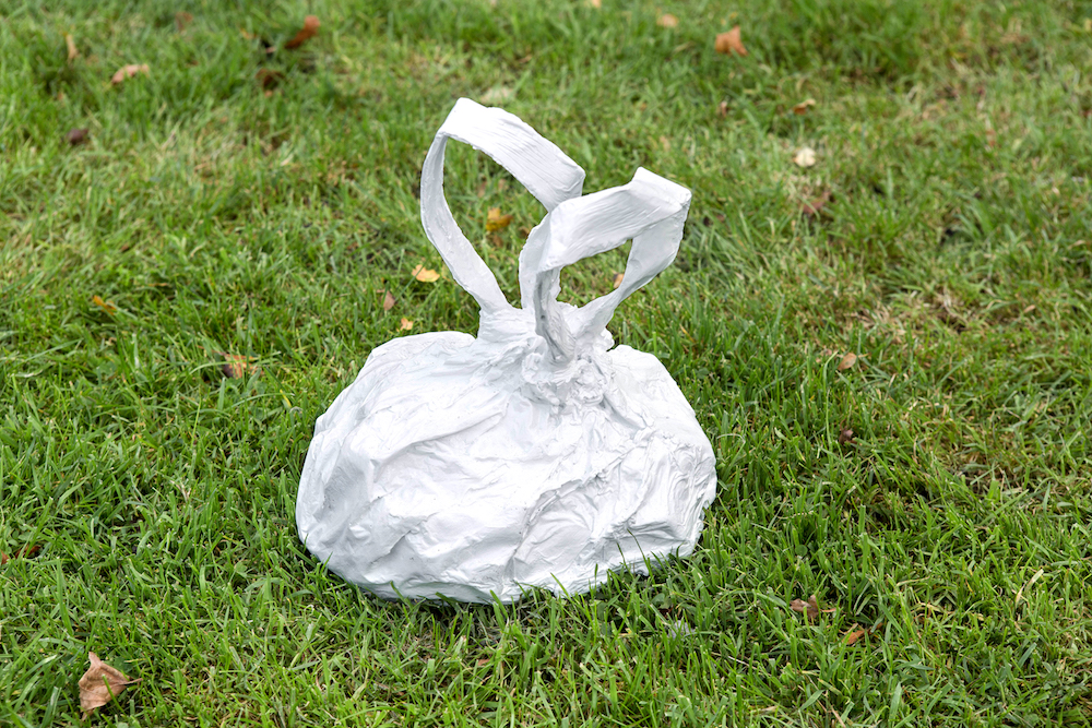
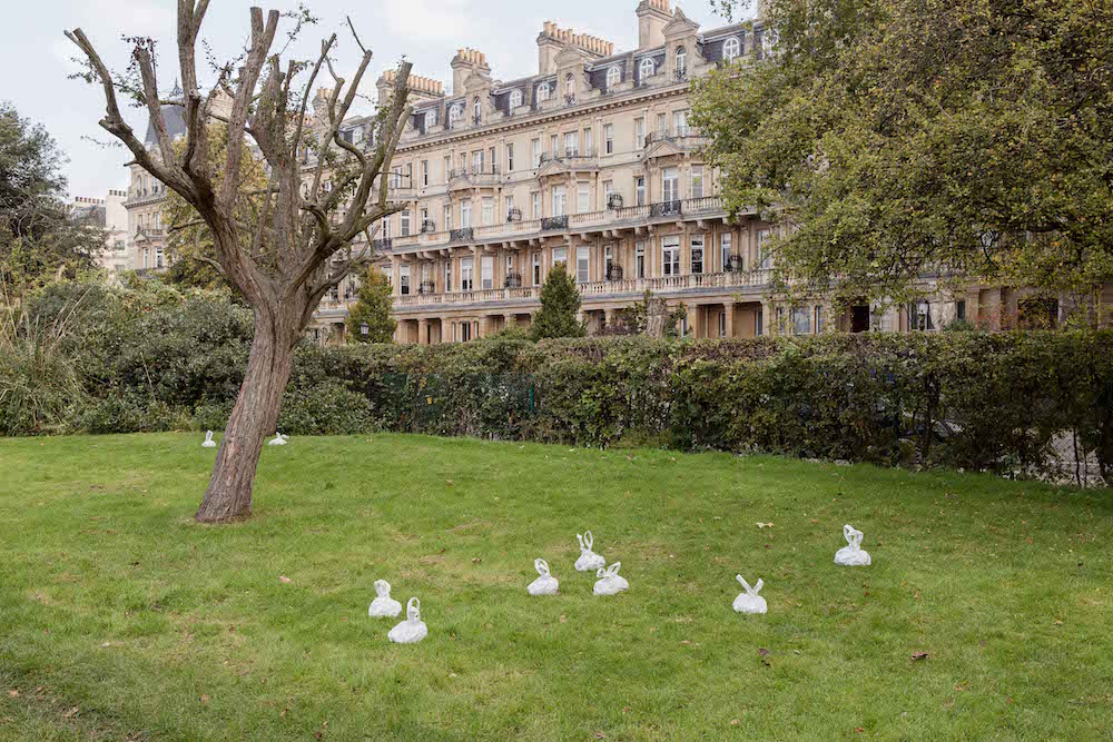
There is, I suggest, a definite wit to his work, most directly present in the photographic series The Way Things Appear. Fitzmaurice confirms that he is attracted to comedy and puzzles over how it operates: “The world is thrown up, and just for a fraction of a second you see it differently—maybe that’s why we laugh—and then it comes back down.” But he is looking for some substance behind any one liner. He recalls his surprise, driving along a motorway, to see a field of white rabbits out of the corner of his eye. Surely, he thought, white rabbits are only found in science labs and magicians’ hats? Doubling back, he found that they were actually carrier bags thrown away by travellers eating their lunch at a layby. Accordingly, Litter (2015) recreates the effect, but goes beyond the visual pun, and references the problem of plastic bags multiplying like rabbits. The bronze version of this work introduces the irony, says Fitzmaurice, that “plastic bags will be the bronzes of our time, as early plastics are not biodegradable and in landfill they will outlast most of our culture”.
“Plastic bags will be the bronzes of our time”
It’s easy to imagine how Fitzmaurice roams the streets. He has studio space in Liverpool but confesses to some guilt at how little time he spends there—“after an hour, I think, ‘The real world is outside, I’d better go back into it!’” It is in wandering around that he will light on the next idea, generally through his mind freewheeling. “It’s frustrating,” he says, “that when I’m trying to do something it tends not to work. You see things differently if you’re not looking for them.” Just recently, the interlinking arrows on the packaging for the Subway chain have caught his attention for how they’re folded over each other in different ways when the packaging is discarded. Is he likely to run out of inspiration? It seems not: the good news is that Fitzmaurice has notes—on bits of paper, his phone, as diagrams, in photographs—for “far more ideas” than he’ll ever have time to take forward.
