Ten years ago, two Dutchmen made a film about torturing a bunny. First, they rested a hot iron against its face. Next, they shone a UV light on it until its head became detached and rolled off, and then they melted its face off with a hairdryer. Melted, because the bunny was made of chocolate—the kind of crafted confectionery you might typically enjoy at Easter (personally, I prefer an egg). The 2 min 47 second film Chocolate Bunny
is still sadistic, certainly for chocolate lovers. It’s also characteristic of the kind of tomfoolery that Lernert Engleberts and Sander Plug get up to. As the Amsterdam-based filmmakers say of themselves: “In the ad world we’re artists, so we’re a bit more sexy for them, but in the art world we’re commercial whores.”
Looking at their creative endeavours (the line between commerce and art is especially slippery here) they don’t appear to be male-gaze sexy or whorish—more non-gender-specific and fetishistic, making ads for the non-cis, anti-consumer consumer. In their Campari ad, minimal perfection and a cerebral drinking game replace Salma Hayek’s boobs. In Fantastic Spin, a film made for Fantastic Man, a male ice-skater performs a perfect spin in slow motion and a leotard. To call these films offbeat or quirky would be to downplay their revolutionary approach to what advertising actually is and how it operates. It is not, you might imagine, easy to get clients that big to commission films so radically uncommercial. “In the commercial world once an idea is free it doesn’t want you to ask any questions, it just wants you to produce it,” Sander says when we speak over Skype. “But I think when we do our own work we ask a little bit more—why, why, why?—to the extent that sometimes even after a few weeks, nothing comes out of the studio.”
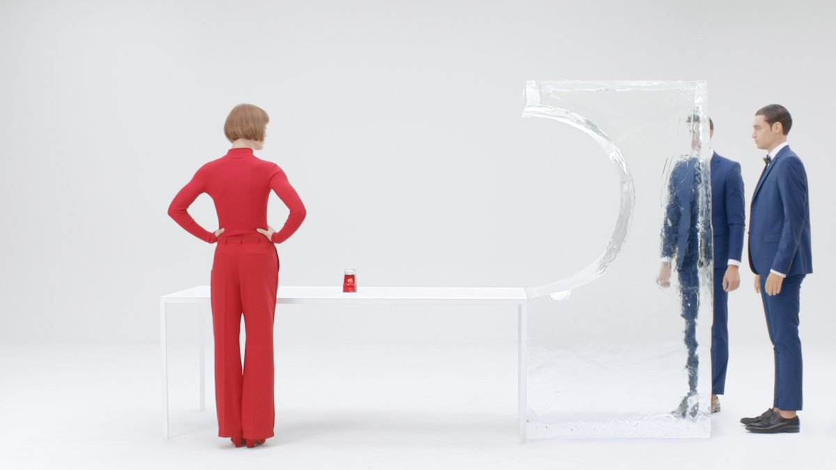
Lernert & Sander don’t follow trends, despite often working with fashion houses, instead sticking to a very strict visual language and a neat, minimal aesthetic, using very specific sets of Pantones and sets they build and shoot in the studio. It is the kind of hyperreal, self-reflexive perfection that chimes with today’s hipster culture in Europe, stretching idealism to its limits—until something has to give. “We create minimalist sets, so if they’re not perfect you see it—it’s almost like a magnifying glass,” the poised Sander explains. The animated Lernert adds: “But there always needs to be a little flaw, a detail, a grain—there’s a decision that we want to show that we made it for real and that it’s not computer-generated.”
The Lernert & Sander studio in Amsterdam, unsurprisingly, has nothing on its walls. They are not fans of mood boards, and they don’t talk about Pinterest either. “Sometimes agencies ask us to create reference material and we say, ‘Well, we can only reference our own work because that’s what we want to work with.’ Sometimes they say, ‘Well, do you have some other references?’ And we say no. For us it’s very healthy.”
“We want to experiment a bit by not knowing exactly what we’re doing when we go onto a set—that’s the heartbeat of the work.”
They recently made three new videos for COS, the ultra-minimal high-street fashion chain owned by H&M. One features a model wearing the brand’s iron-crisp clothes and hula-hooping, with the camera attached to the hoop. The simple ingenuity of the video is that it shows off the product (the clothes) without focusing on the product, using movement to project something more playful, bringing personality to the notoriously bland brand.
It is far from a conventional, serious fashion film—sexy models in a far-flung location. They refer to the video as “conditional design”: “You create the condition and see what comes out. We want to experiment a bit by not knowing exactly what we’re doing when we go onto a set—that’s the heartbeat of the work. Sometimes you want to do things in the moment, or improvise a bit more,” Sander reveals. “We don’t want to design in a way.” Instead, they use design elements to prompt subconscious responses, especially in the people who appear in the films. In another video for COS, designers play musical chairs. An earlier project invited artists to explain their works to their parents while sitting in a chair one centimetre lower than their elders’—something the subjects weren’t aware of but that subtly set a power dynamic.
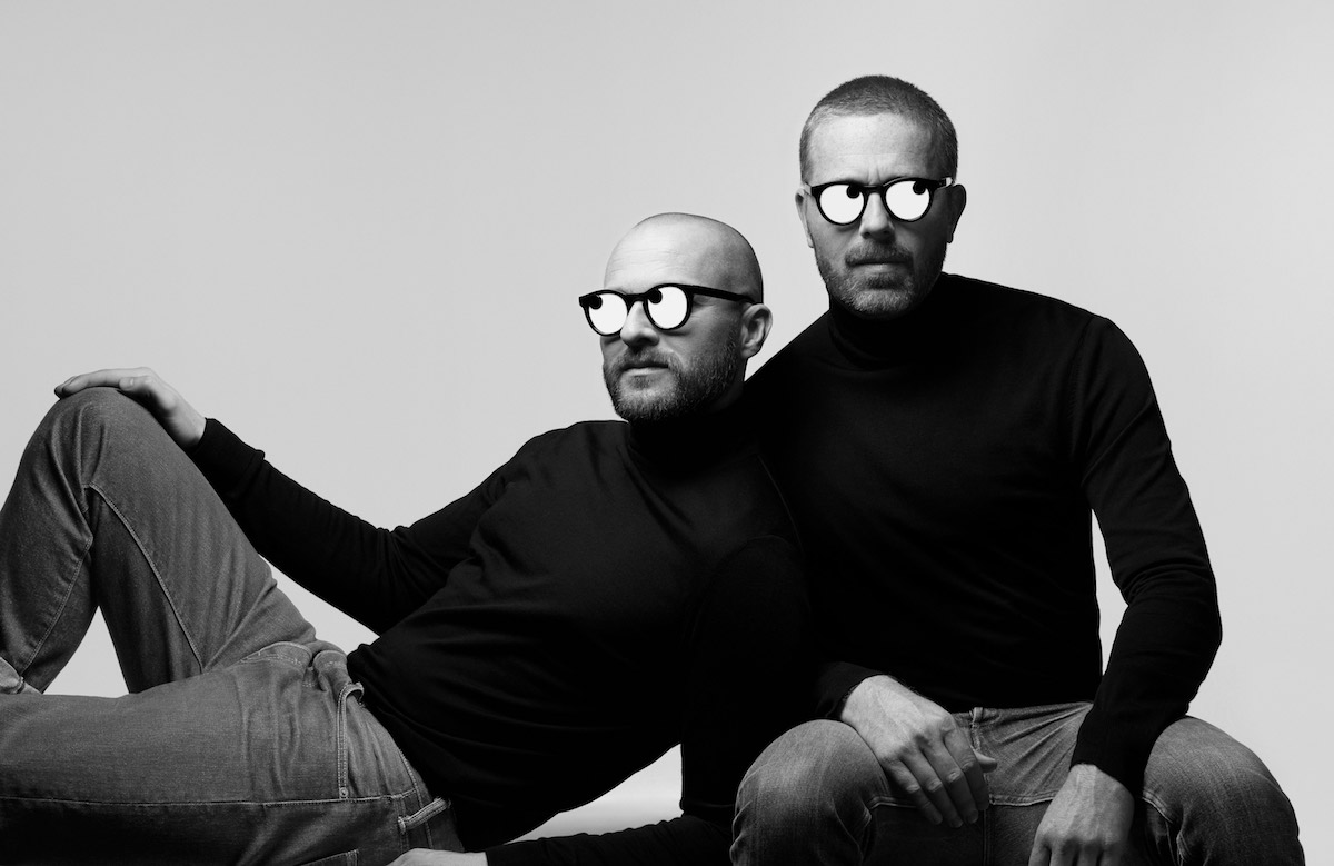
The pair build all their own sets, which contribute to the 3D feel of their 2D films, the only nod to flatness being in their use of colour. They have rarely ventured outside the studio to shoot, a notable exception being the documentary film I Love Alaska. “We were using it to say: Do you really want to go outside? Don’t go outside!” The studio offers certainty and the ideal conditions for their abstract, hyper-perfected rendering of reality. “It’s all about control, I think. In the studio we can control everything and make it perfect… We haven’t cracked the code how to maintain the same light outside. We know we’d have to render nature almost—we’d have to go outside and project our perfection onto nature.” I must have raised an eyebrow at that, and Lernert & Sander who don’t miss a thing. “You’re probably thinking: Are you serious? Why have you not gone outside because nature IS perfect!”
Lately, they have also ventured into product design, producing scarves, glasses, chairs and a bag—all of them as anti-covetable as it is possible to be for something that is still going to be sold. Irony is a Lernert & Sander staple, it seems. “We don’t feel we are very creative,” they muse. “We think it’s much cooler to not be super-creative!”
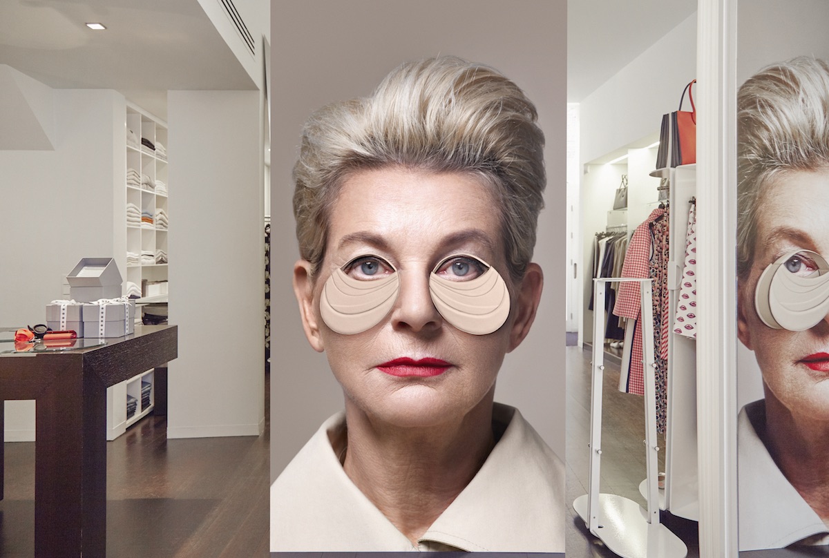
Bag Bag, 2017
But few non-creative people would come up with the idea of using a fortune-teller to do a portfolio presentation of their work to an audience of design-world people, which is what they did in June 2016 at the What Design Can Do conference. “She visualized our future, based on three projects. It was so hilarious, so off, especially in the design world where you have to be serious; it was a great attempt to feel something.” Other presentations have opened with photographs of the pair dressed in clothes they found in Amsterdam’s “dark rooms”: “And we don’t mean locations where you develop pictures but where you start personal relationships with other gay men. We open a lecture with these pictures of us and it sets the tone and opens up the intention of it—and of course the humour.”
Sometimes the things they propose in boardrooms are so absurd they can’t actually believe people say yes to them. And they then have to go and realize those propositions: a case in point being a circular website they suggested for fashion house Viktor & Rolf, The World Round Web. The circle is the new square, they declaimed, casually recasting the internet as they spoke. They’re certainly not afraid to speak their minds. At Design Indaba, they used the stage to talk about copying in the industry, offering examples of rip-offs of their work by major companies. Of course, they dressed up as gospel singers to do it.
“There always needs to be a little flaw, a detail, a grain”
“I love to lighten up things a little bit,” Lernert adds with the knowing smile of someone who likes to prod at people who take themselves too seriously, and has probably got in trouble more than once for doing so. “In the beginning people were a little bit afraid of us—it could be that we were a little too extreme…” Now, though, the brands come to them—Kenzo, Campari, Sony and Hermès are among their clients—and over the years they’ve learnt how to work on high-profile projects. “It’s a bit like dating. You don’t undress when you walk into the bar. But we used to undress straightaway, we took everything out and start dancing on the bar naked, totally. But now we don’t do that anymore.”
They’ve just returned to Holland after a month in LA working on a “very, very big project”. “It was interesting, let’s say that.” They worked, unusually, with a large team. “It really is a system. You can insert a question and they spit out answers immediately. It’s like this really wonderful, yeah, machine that just works, they don’t ask questions, they just do it,” Sander says of the experience. “But maybe it’s not the most designer approach to creating good work,” says Lernert, ever the antagonist. “It really is a machine that’s willing and able to do everything you want and it’s there the next day, it’s like a chocolate-factory machine. It’s like it spits it out and it’s there, and it’s perfect.” The LA kind of perfection, mass-manufactured and gleaming, is certainly very different from theirs.
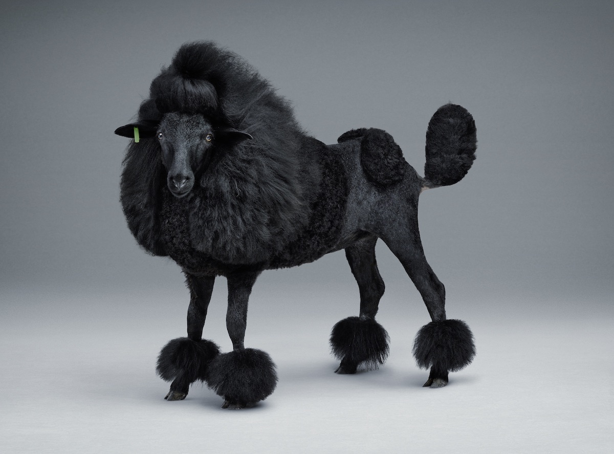
Blacker Sheep, 2012
Did people really get their work in LA? “No.” But then: “I think they get our aesthetics, they always want to work with us for that—but they don’t look at our content perhaps, they don’t see the style is just a part of an idea—to set the idea as best as possible. They just see it as a luring device, and that’s not how we see it, we see it as a way to get the focus on the concept. It’s like getting rid of all the things you don’t want to see and just make the idea shine. That’s why we always make our designs very simple.”
Also on the horizon is a possible museum exhibition in Holland, a retrospective of sorts that will survey their strange position in the contemporary visual landscape. “Intuitively we feel we should show nothing to do with art; only commercial work,” begins Lernert. “It’s not definite but it’s our gut feeling that it could be more exciting to show that… because…” At this point Sander steps in: “It’s something you don’t normally go to look at in a museum.” Quite.
This feature originally appeared in Issue 32
BUY NOW