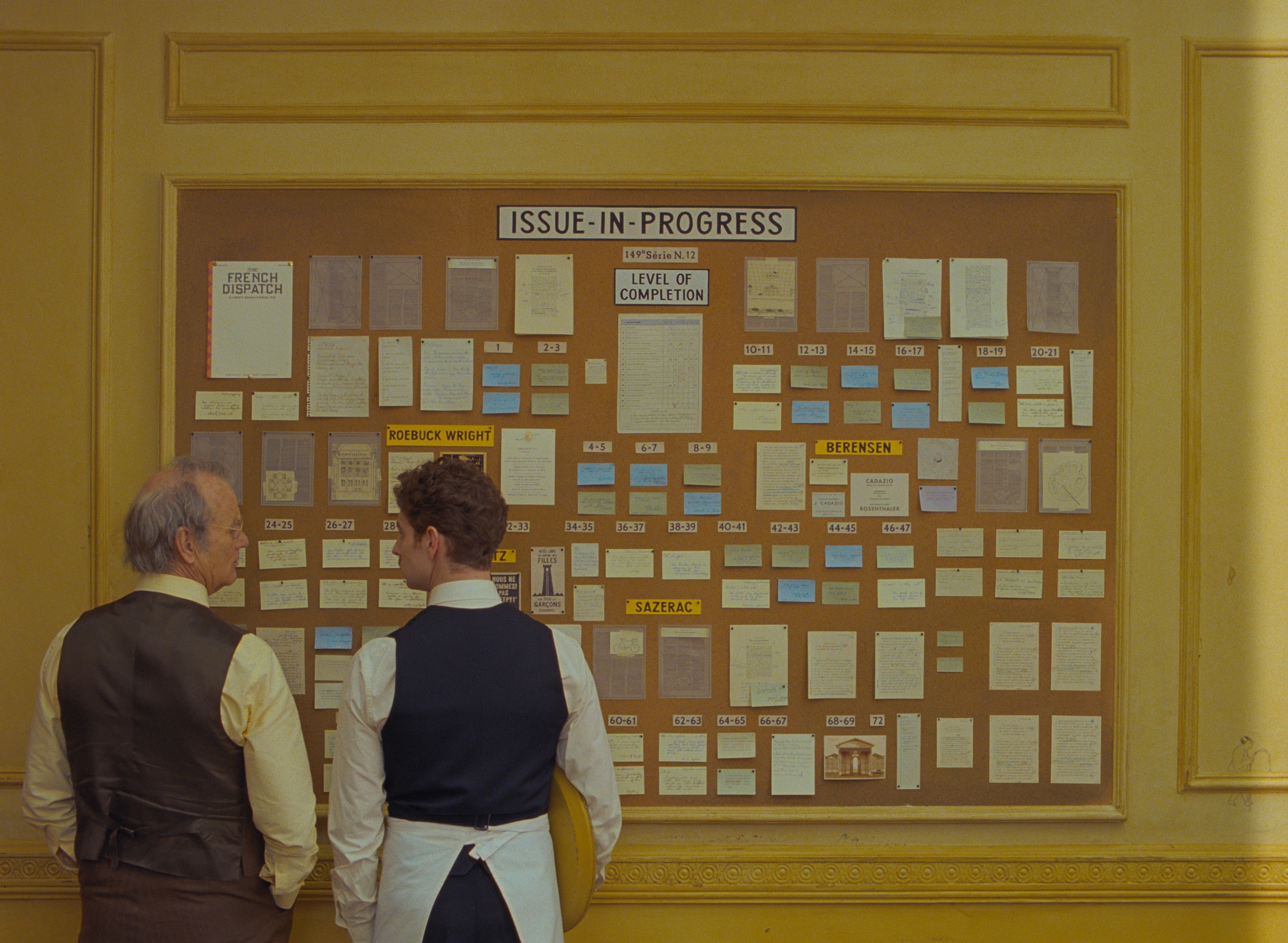
The creation of visual art is usually an exercise in personal expression. However for those artists who create work for the cinema on behalf of fictional characters, it is a masterclass in both empathy and storytelling as they paint through the eyes of another, a person whose thoughts, experiences and tastes are entirely imagined.
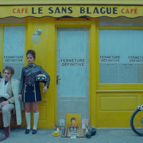
Wes Anderson’s new anthology film The French Dispatch derives stories from the pages of the titular fictional magazine and the journalists who write them. One story arc follows charismatic art critic JKL Berensen (Tilda Swinton), who takes her audience through the life and work of elusive incarcerated artist Moses Rosenthaler (Benicio Del Toro), and his prison guard-turned-muse Simone (Léa Seydoux).
“Developing the voice and style of Rosenthaler was very much finding by doing,” explains Sandro Kopp, the Scotland-based artist behind Rosenthaler’s evocative, figurative paintings of Simone. The motif of fire was one visual component he explored but later abandoned: “My assistants and I spent days blowtorching test panels, covering them in flaming shellac, or adding crystalline elements that might catch the light and look like flame, but in the end we decided to go with a more purely painted approach.”
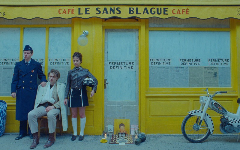
Kopp says Anderson was “always supportive, usually precise and occasionally quite esoteric in his instructions.” The sizes, primary colour schemes and subjects were set beforehand, but the style was honed over several months of conversation with Anderson, culminating in weeks spent testing ways of representing flesh and skin while on location in Angoulême, France.
The process was often as scrupulous as you would expect of a Wes Anderson project. “Wes said that first of all, I was to make a two-foot square sample of how the flesh would be painted,” explains Kopp. “When I had done this, he said ‘Good. Now do another one. This time make more marks of different sizes.’ And the following day: ‘Good. Now do another one. This time make them sharper and more detailed, with more violence.’ The next day: ‘Good. Now do another one. Make every mark in the same place ten times over.’”
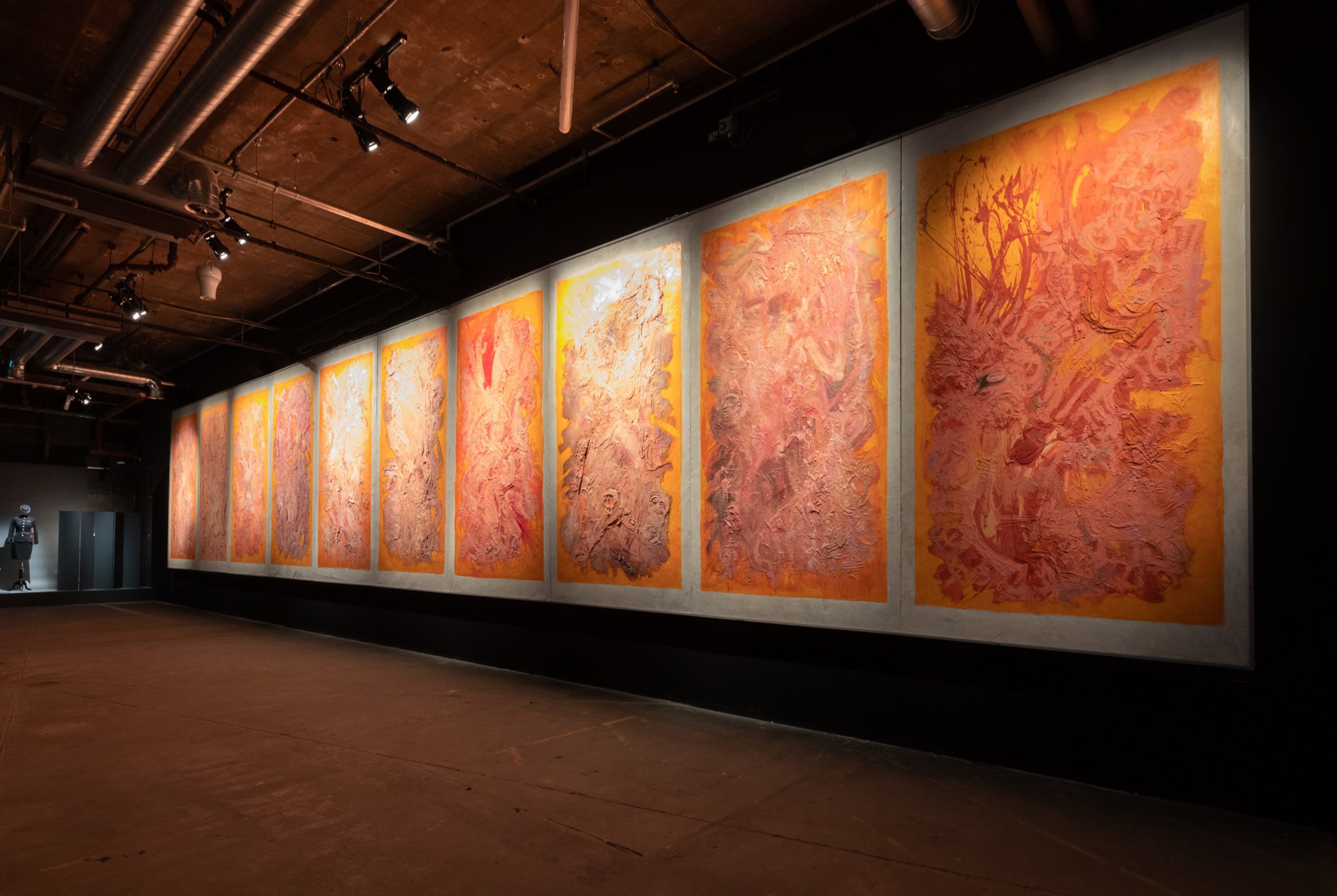
All in all Kopp had “three months to paint something that was supposed to look like a genius had worked on it for three years”.
Painting was a prominent feature of Anderson’s 2014 film The Grand Budapest Hotel, at the heart of which is the Northern Renaissance-inspired portrait, Boy With Apple, a prop created by British artist Michael Taylor. The paintings in The French Dispatch (abstracted interpretations of the human form) couldn’t be more stylistically different.
“Wes Anderson was always supportive, usually precise and occasionally quite esoteric in his instructions…”
“Wes and I looked at numerous references: Jenny Saville, Hermann Nitsch, Francis Bacon, Frank Auerbach and many more for inspiration but we were very clear that the paintings had to be able to stand alone and would not look too much like any one of those,” Kopp says. “The goal was to create something that was explosive and visceral and would theoretically not look out of place in a contemporary art museum.”
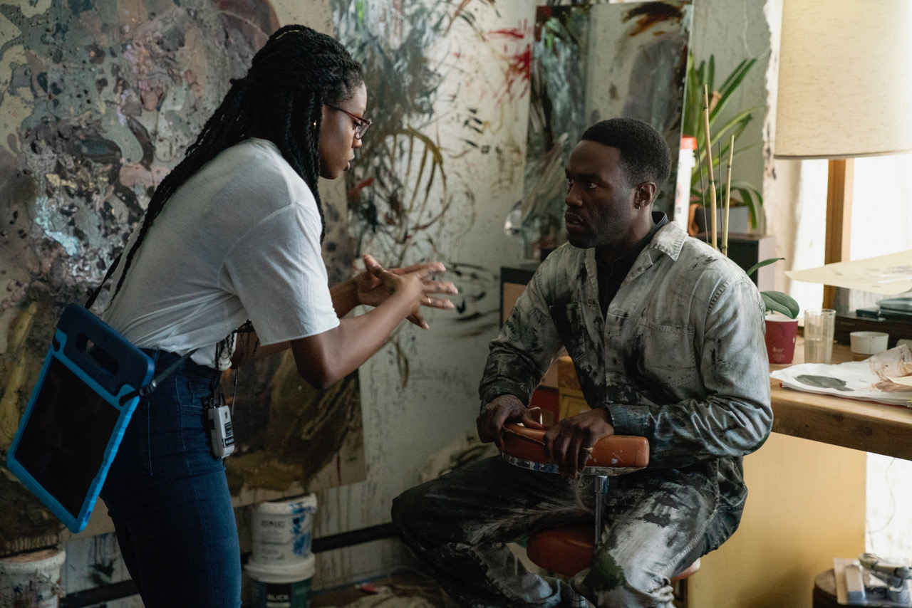
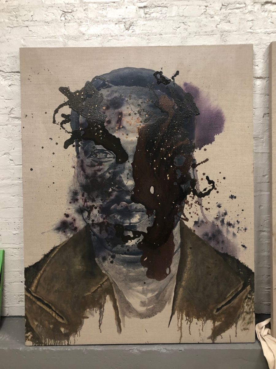
For the recent remake of Candyman, Chicago-based artist Sherwin Ovid was enlisted to create works by the fictional artist Anthony McCoy (played by Yahya Abdul-Mateen II), who becomes transfixed by the local legend of the Candyman in the film. Directed by Nia DaCosta, it is the “spiritual sequel” to the 1992 horror by Bernard Rose. With music by Philip Glass, the original has become a cult classic in recent years.
Ovid and fellow local artist Cameron Spratley were shortlisted for the job of creating Anthony’s artworks. They are “diametrically different from each other in style and content,” explains production designer Cara Brower, but in the end, both were hired in order to show the way that Anthony’s work transforms through the course of the narrative. “Cameron Spratley’s fresh style embodies Anthony’s early work, and Sherwin Ovid’s haunting portraits really capture the new work he creates once he becomes overcome by the lore of Candyman,” says Brower.
“The goal was to create something that would not look out of place in a contemporary art museum”
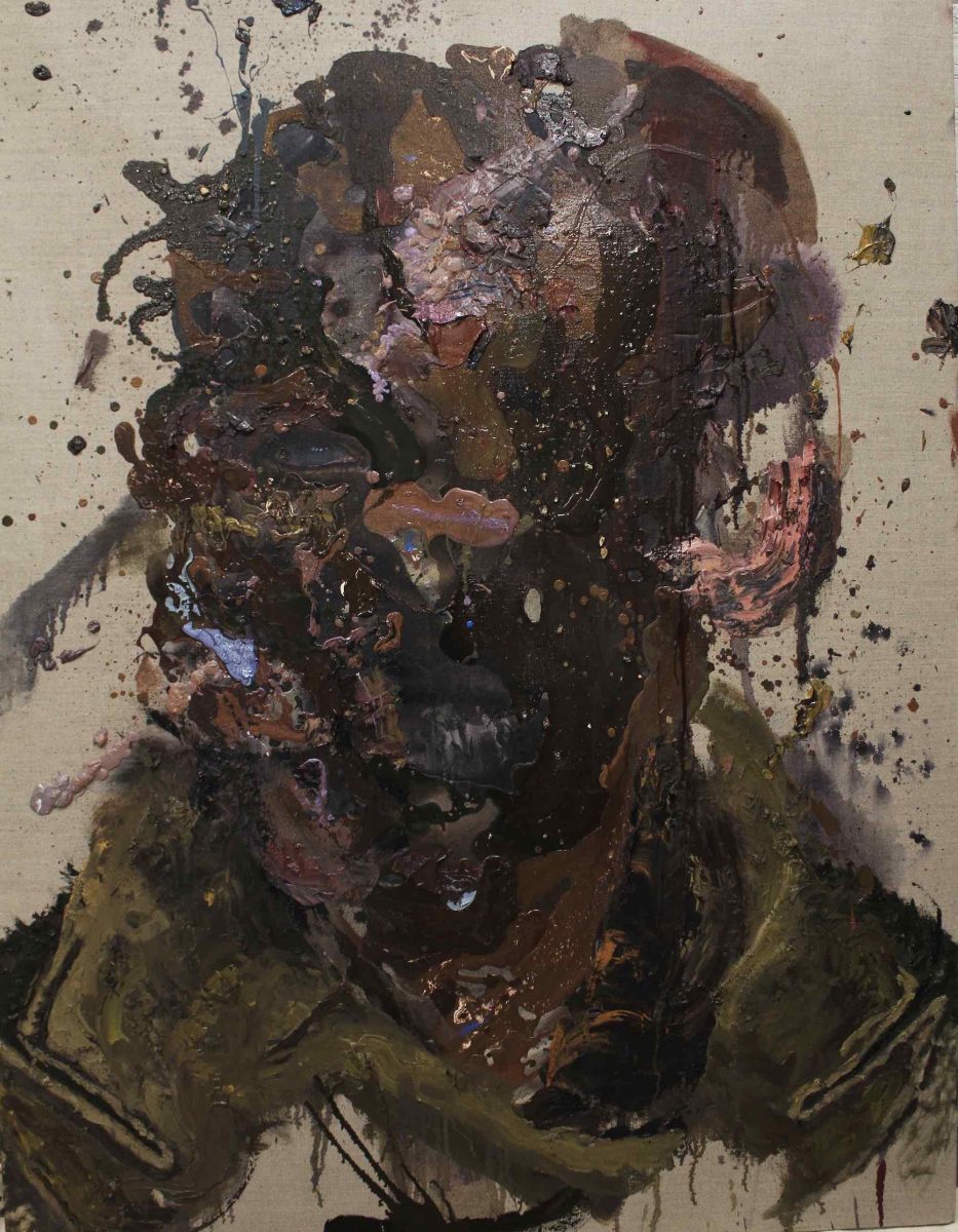
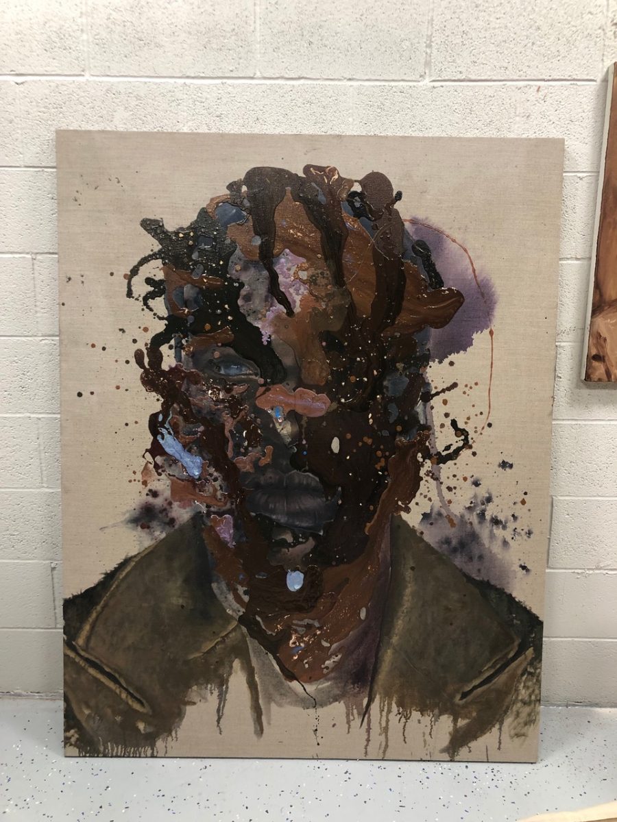
Ovid was approached about creating paintings that would become “progressively deconstructed as Anthony unravelled,” he explains. He worked with Abdul-Mateen in the studio to get into the character’s “headspace”, but says he is used to getting into the mindset of artists to understand their process, and therefore simply treated the fictional Anthony as he would any other artist.
Anthony’s self-portrait marks a turning point in his descent into chaos. Ovid used impasto techniques to build relief with layers of paint, resulting in a textured, shadowy representation of the character, in which his identity is disfigured. His contribution to the film didn’t end with the final portraits; Brower dressed Anthony’s art studio with Ovid’s early watercolour samples and his overalls even inspired the costume design for Anthony’s character.
Frank Auerbach and Francis Bacon crop up in the list of references given to the artists when working on Candyman. Also in the “lookbook” for the artwork in the film were the likes of David Bomberg, Maggi Hambling, Lynette Yiadom-Boakye, and impasto works by Antony Micallef. “I also wanted to bring artists into the fold who could take all of those ideas, but also bring in their own ideas and style and help create something unique to the film,” says Brower.
While contemporary stories have some flexibility when it comes to artistic style for props, period films involve more constraints. Such was the case for French artist Hélène Delmaire in making the paintings for Portrait of a Lady on Fire (2019). Set in 18th century Brittany, Céline Sciamma’s film follows the romance between Héloïse (Adèle Haenel), who is reluctantly awaiting her arranged marriage, and Marianne (Noémie Merlant), the artist hired to covertly paint Héloïse’s wedding portrait. Guided by Sciamma and the script, Delmaire’s task was to encapsulate the characters’ evolving relationship as Marianne falls in love with Héloïse as the painting takes shape.
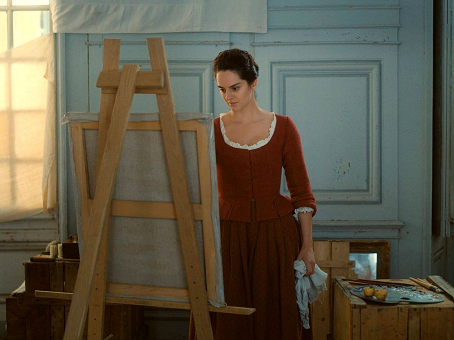
Sciamma sought a female artist of the same age as the character in order to strengthen the connection between painter and character. In order to get inside Marianne’s head, Delmaire tried to keep her circumstances firmly in mind. “Marianne is a professional commissioned to produce a formal portrait, and that she still is in a phase of her career where she needs to prove herself to an extent, so she’s not likely to stray from convention,” she observes. “The aim is to please the mother and the husband.”
“I had three months to paint something that was supposed to look like a genius had worked on it for three years”
The resulting portrait is lusciously detailed, conjuring the shadowy draped folds of Heloise’s heavy green dress in bold layers of oil paint and daringly visible brushstrokes, impressionistic and yet exacting. The style is rare for the period, but Delmaire managed to find some 18th century painters who worked in this way, citing Joshua Reynolds and Jean-Honoré Fragonard. Sciamma, meanwhile, looked to female artists of the period, such as Élisabeth Vigée Lebrun, Angelica Kauffman and Adélaïde Labille-Guiard.
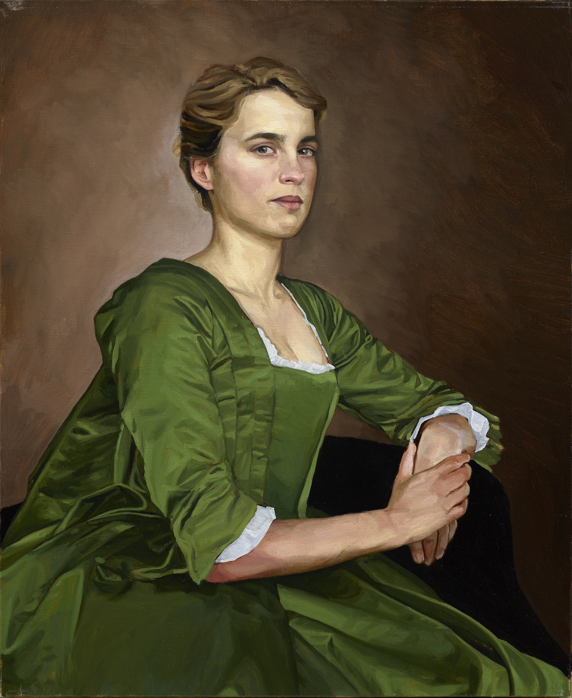
Some art historians might question the historical integrity of the artistic style used but Delmaire argues that this choice chimes with the film’s defiant tone. “I think Marianne is a bit ahead of her time,” she says. “Céline wanted someone who would give life to the paintings rather than total historical accuracy.”
It was originally planned for Delmaire to be filmed creating the pieces from start to finish, “but it turns out the cost of filming two hundred-hour paintings was prohibitive!” she says, so she made a new painting for each stage of the narrative depending on the shots required.
“Céline wanted someone who would give life to the paintings rather than total historical accuracy”
She experienced first-hand the complexity of working in cinema: “The dress took longer than expected to be made, so I had to start the portraits of Héloïse without the dress, then come back to take other photos of Adèle but the light was different,” Delmaire says.
Yet it seems appropriate to the film’s story and the challenges the fictional Marianne faces, having herself to rely on improvisation, guesswork and a short time frame. Since the paintings needed to be completed before shooting the scenes in which they appear, the portraits were only influenced by the script and photographs, rather than in response to the actors’ performance on-set. As Delmaire explains, “I never got to see the Héloïse that Marianne gets to know during the story.”
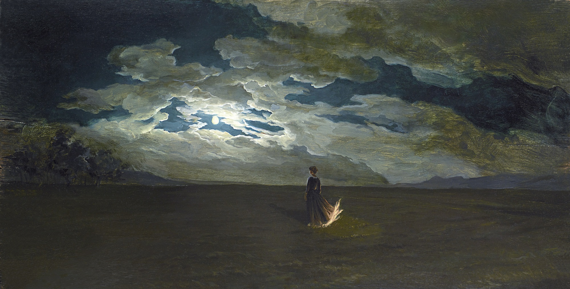
The film is an interrogation of gaze, subverting and refracting it in inspired ways, and that is evoked in the portraiture we see in the film, which sees Héloïse transform from chilly stranger to passionate lover.
“As they start falling in love Marianne still has this professional imperative yet Heloïse has challenged her artistic approach and it becomes more collaborative,” Delmaire explains. “She tries to capture more of her personality within the narrow scope she is allowed. Yet I’m not sure Marianne quite wants to share the Héloïse she has known intimately with the future husband who will be taking her away, so she keeps the portrait somewhat guarded still.
Though, as she concludes, “That’s just my own little story, of course.”
Megan Williams is a staff writer at Creative Review
The French Dispatch Exhibition
180 The Strand, London, until 14 November
The French Dispatch is in UK cinemas from October 22
VISIT WEBSITE