An exit through the gift shop has become part and parcel of a museum visit, but the real jewel of any gallery or museum is surely the café. In these hallowed halls, you’ll find salvation from the shuffling footsteps of exhibition rooms, respite from the highfalutin art criticism of strangers echoing through the corridors, and escape from the clusters of school kids sat on the floor scribbling pads of paper with smudgy pencils.
Of course there’s the occasional clatter of lids meeting teapots too quickly and spilt sugar sachets might crunch under your elbows, but the museum café has space for everyone. Regardless of who you are, what you’ve gone to see, whether you understood it, liked it or cared about it, there’s something unifying about standing in a queue, with your tray, making a choice between an egg and cress sandwich and a scone (always the scone).
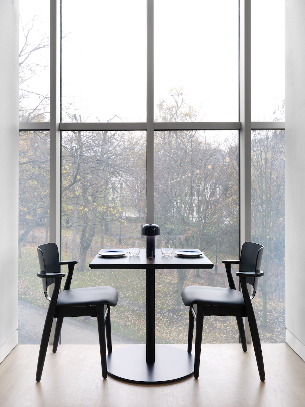
The gallery café now feels like an obvious addition to any institution, but these cultural canteens didn’t always exist. The concept of serving food in a museum was introduced two centuries ago by London’s Victoria and Albert Museum, which opened the world’s first museum café in 1856. Called the “Refreshment Room”, it served “tea and a bun or a hot meal”. However it wasn’t until the twentieth century that other cultural institutions caught up and began to invest in catering.
Nowadays, whether it’s a long lunch discussing art or a quick pitstop for sustenance, the café is an integral part of the museum experience as a whole. “The big switch came probably ten years ago when museums suddenly became forms of entertainment, they weren’t just educational,” says Ben Warner, founder of Benugo, which provides food options for thirteen UK cultural institutions including the V&A, Natural History Museum, British Museum and Science Museum. “Now you go to galleries for fun, to make a day out of it, and part of that is to be able to buy a great coffee or sandwich.”
“Nowadays, whether it’s a long lunch discussing art or a quick pitstop for sustenance, the café is an integral part of the museum experience as a whole”
In Peter de Vries’s 1977 book Madder Music, he wrote: “Murals in restaurants are on a par with the food in museums.” While the jury’s still out on café art, there’s a reason why the food in these cafés is often no nonsense, but there’s no denying the quality has improved since de Vries’s time. “People aren’t looking for gourmet food, they’re looking for delicious food, served quickly at a price point you can afford,” explains Warner. “The food has to be excellent but served simply and quickly […] the café should be an enhancer of the experience.”
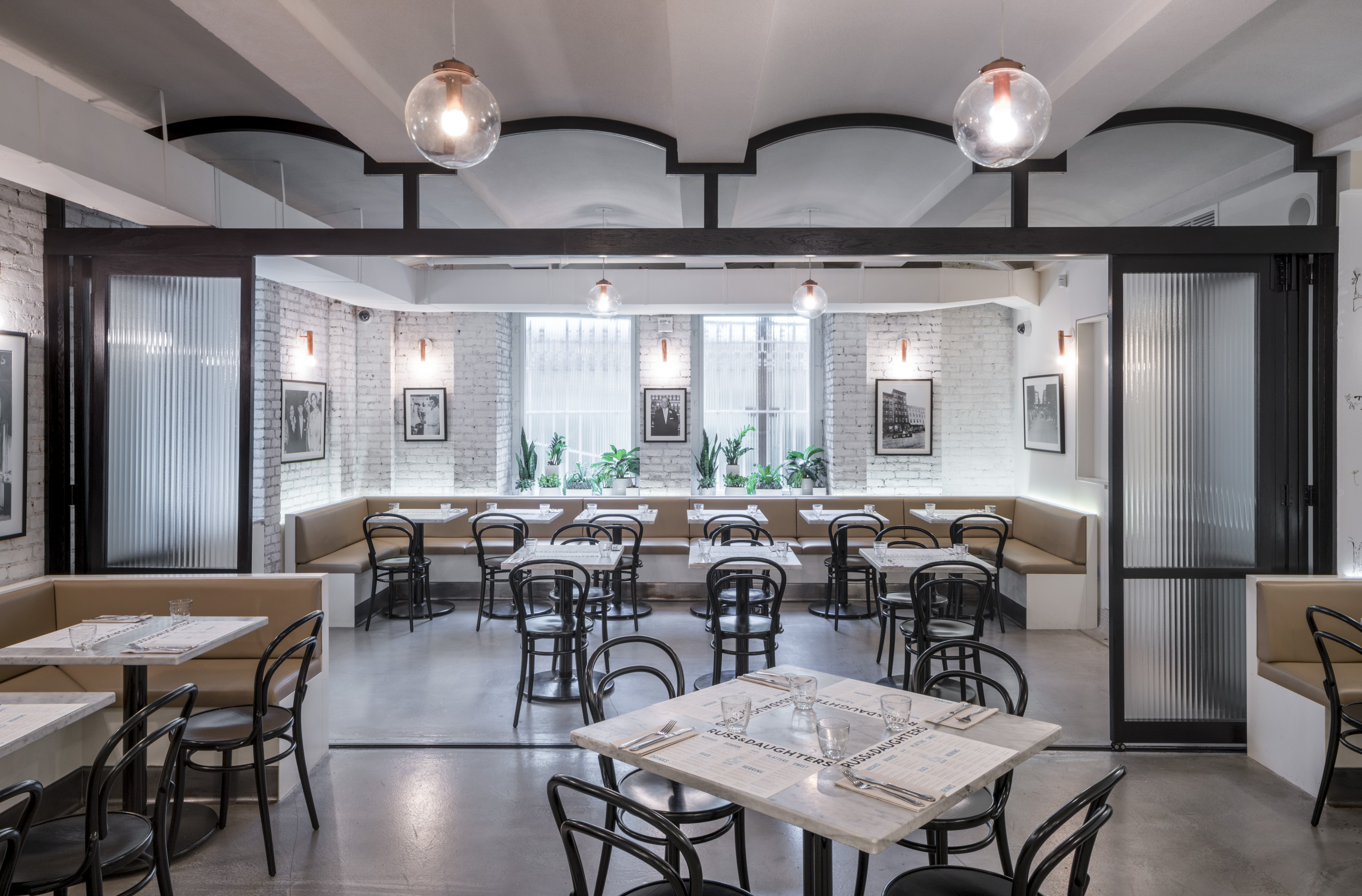
So what about the environment the food is served in? For New York-based Solomonoff Architecture Studio it’s about “connecting the experience of art with food”. The studio has created eating spaces for the café at Dia:Beacon in New York, collaborated with Larry Gagosian on the fine-dining restaurant Kappo Masa and most recently designed the Russ & Daughters space at The Jewish Museum on Fifth Avenue.
“Cafés and restaurants allow people to discuss ideas, to concentrate on each others’ thoughts while eating. It’s one of the few things we do with others,” explains the studio. “It is wonderful to walk through an exhibit on one’s own and then sit and discuss it with friends.”
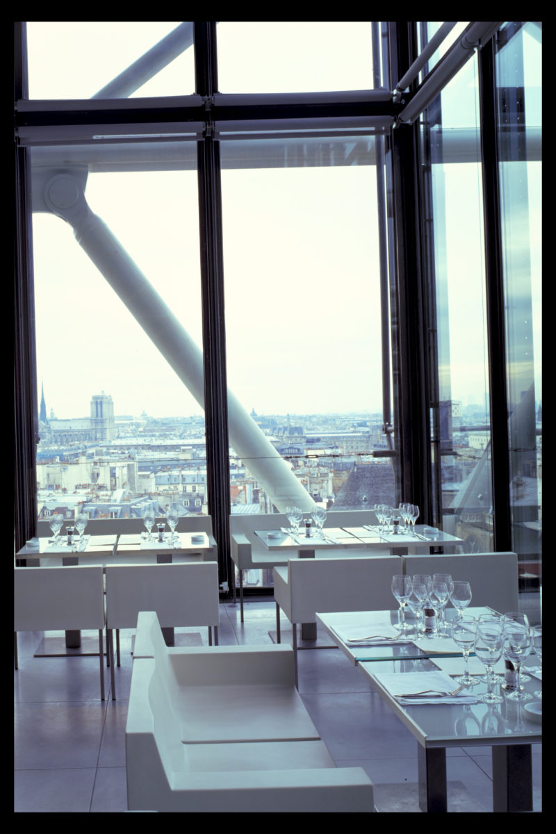
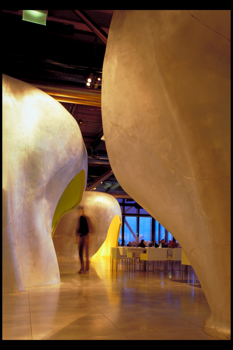
- Jacob + Macfarlane, Georges restaurant. Photo by Nicolas Borel
This idea of celebrating an institution through its café is a sentiment echoed by Paris-based architecture agency Jakob + Macfarlane, who designed the Georges Restaurant at the Pompidou Centre in Paris back in 2000. “[The café’s] role is to sensualize the institutional experience of sight, taste, smell, sound and atmosphere,” says the agency. When creating the rooftop restaurant, Jakob + Macfarlane took into consideration the context of the space. “From there we tried to create an atmosphere that responds to the environment. So with Georges, there is a playful atmosphere, but there is no predefined formula.”
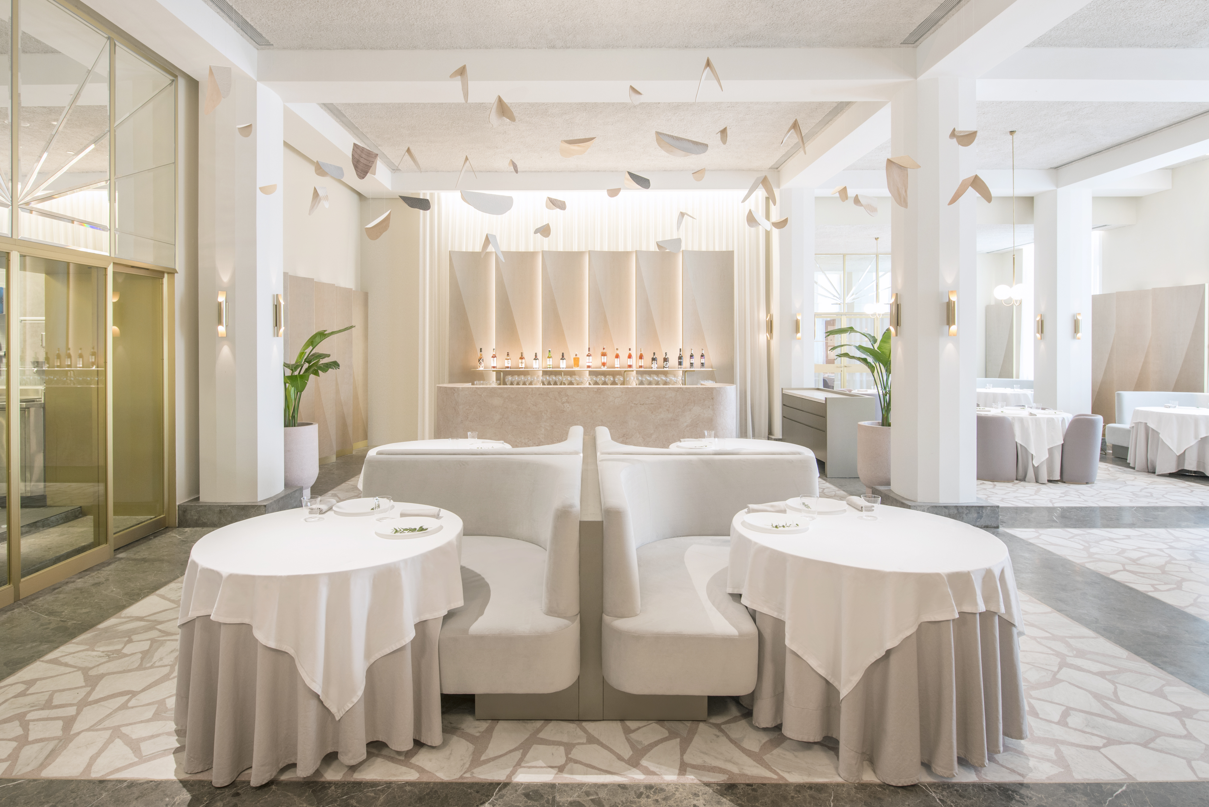
London-based practice Universal Design Studio adopts a similar approach in that they want the spaces they create to feel like an extension of the museum or gallery space, even when they operate as stand-alone offers. “After all, it’s the gallery context which adds to the uniqueness of their offer,” Hannah Carter Owers, the co-director of the studio, says.
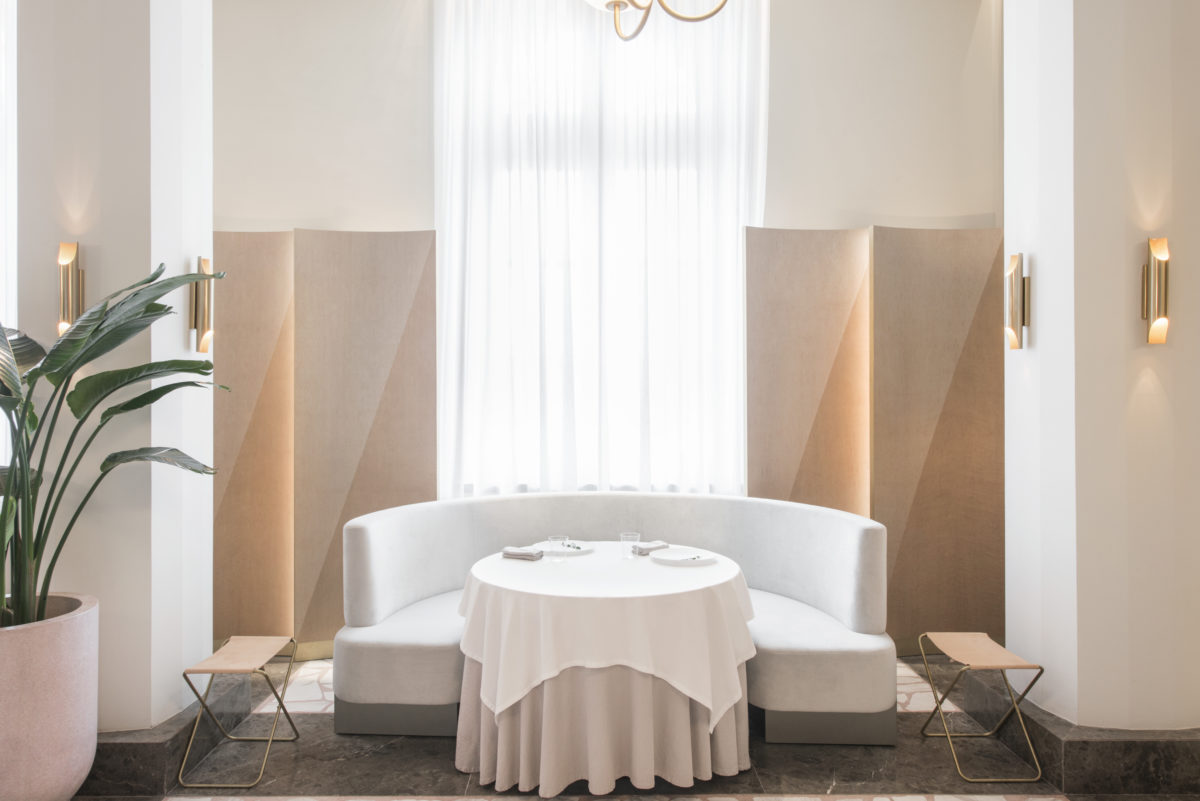
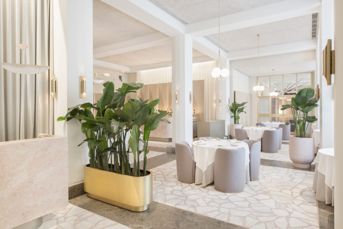
For the studio it’s important that every element is considered when creating an eatery in a cultural institution. “Context is an important driver for all of our projects and we’re keen our schemes respond and complement the museum. For instance at Parabola [which is now closed], we made the views of the museum atrium and parabolic roof above clearly visible from the dining area,” Owers explains. “At Odette, our scheme embraced the classical proportions and architectural structure of The National Gallery building.”
Creating these spaces can also be an opportunity to reach new audiences. “Museum and gallery cafés once rarely broke out of the refined ‘tea-room’ mode,” she says. “Now, they can provide culturally rich, vibrant and inspiring spaces for people to work, socialize and congregate in.”
- Odette, by Universal Design Studio. Photo by Jovian Lim
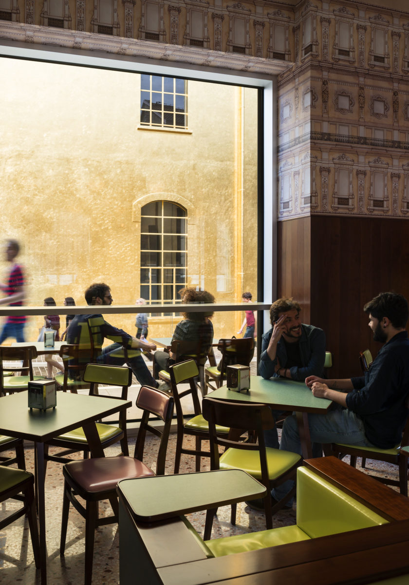
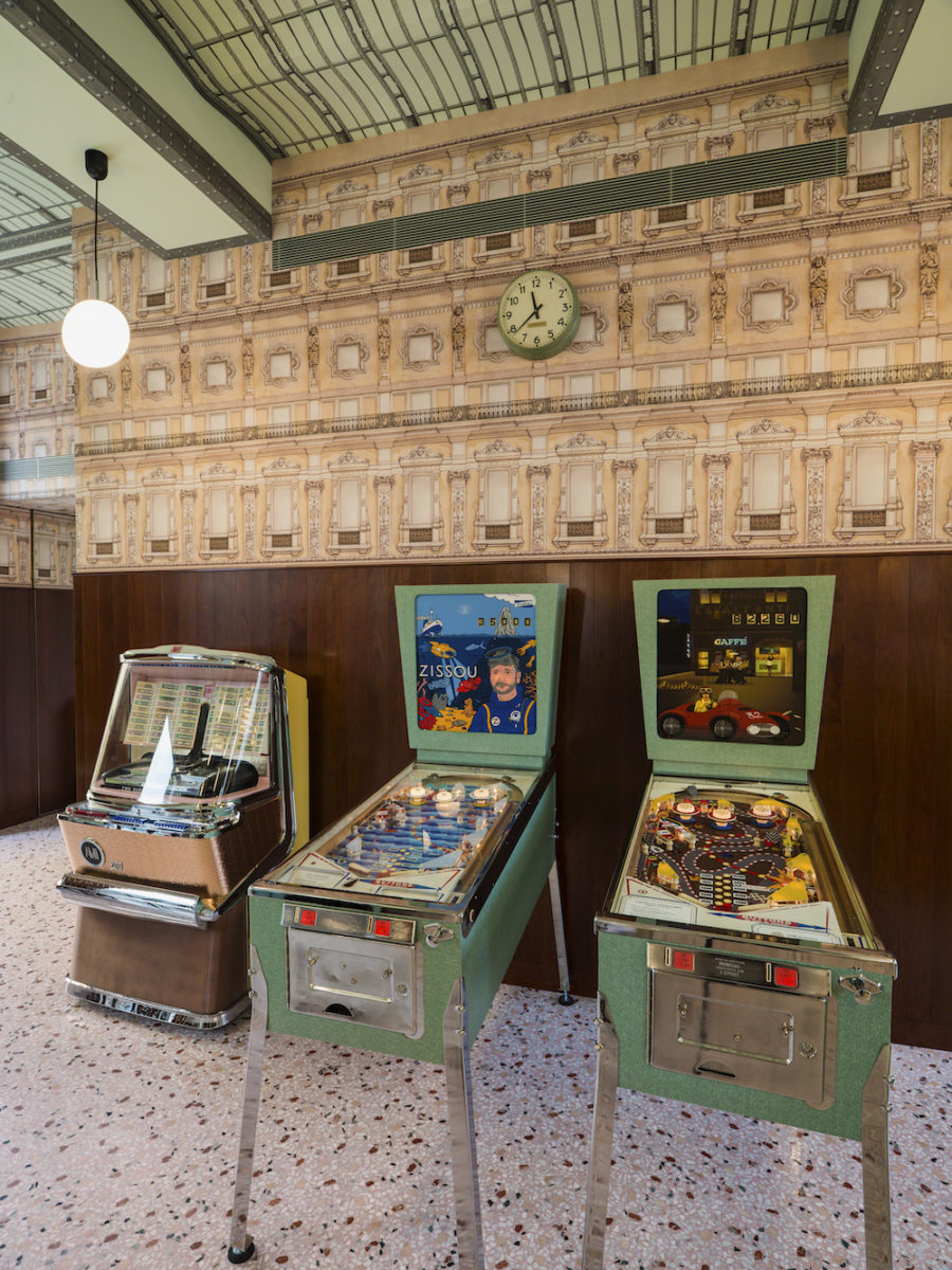
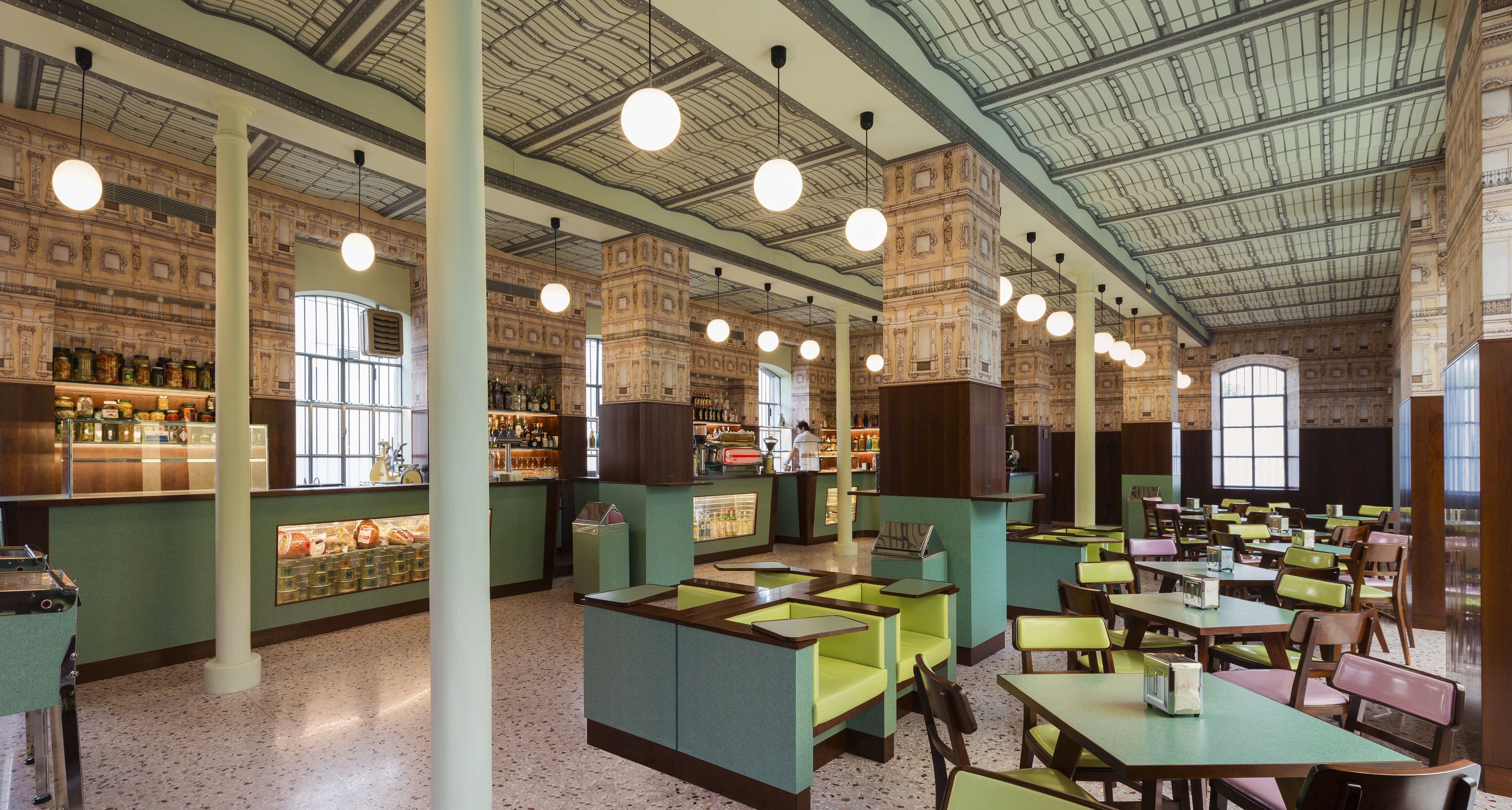
Taking that concept to the carefully-curated max is filmmaker Wes Anderson, who employed his distinctive visual style at Bar Luce in 2015—the beautiful drinking space situated in Milan’s Fondazione Prada. The space recreates the typical mood of old Milanese cafès with Anderson-esque hues of pistachio and rose. It’s an aesthetic reminiscent of 1950s and sixties Italy and echoes the vibe of the director’s 2013 short film, Castello Cavalcanti. But Bar Luce is no film set, rather the creative wants the space to be somewhere for people thrive and create in. “It is for real life, and ought to have numerous good spots for eating, drinking, talking, reading,” he said during the opening of the space. “While I do think it would make a pretty good movie set, I think it would be an even better place to write a movie. I tried to make it a bar I would want to spend my own non-fictional afternoons in.”
- Bar Luce, designed by Wes Anderson Fondazione Prada Milano 2015. Photo by Attilio Maranzano. Courtesy Fondazione Prada
Not all gallery cafés are as expertly crafted as this, they might look different or serve different food, but their function will still be the same: to provide a safe and comforting space to spark conversation, to reflect on your own thoughts or to simply have a sit down. And that’s the real beauty of these cafés, no they’re not always life changing but they provide breathing space, a welcome interlude from the weightiness of the institutions that house them.
