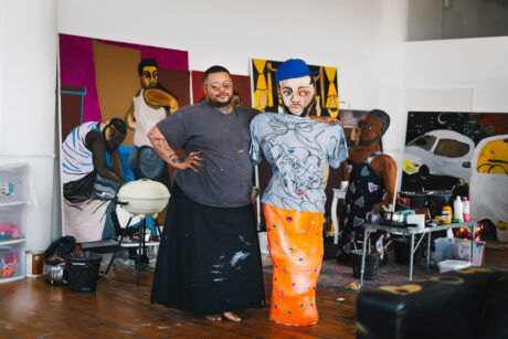
When I first saw Genevieve Gaignard‘s work, staged photographs she shot of herself in 2017, fresh out of Yale, I immediately identified. As biracial woman like Gaignard, my experiences growing up, too white within my family, too brown in my majority white school, I could relate to the pain of being projected onto, and never quite fitting in. Yet my experiences are quite different to hers, growing up in the south of the US, half black, half white, with red hair; listening to Billy Stewart and watching John Waters films. Music and drag have been major influences on her work, as well as her sense of family and femininity. America has always been louder, brasher and more confident than the UK when it comes to exploring race, for the good and the bad.
“I was thinking about red as Republican, red as fear, red as love, red as blood, red as a rose… and the list goes on”
Gaignard’s works (she’s just as deft at creating three-dimensional portraits as two) have a nostalgic feeling: the grandfather clock she presented at Yinka Shonibare’s Talisman in the Age of Difference, in 2018, for example, looked as familiar and fusty as the doilies she often employs, trinkets and ornaments you’d find among your grandmother’s belongings. But there is often violence and dominance contained in those objects, when you look closer: physical items can bring us together, but they can also keep us apart. Our surroundings shape us and our most coveted personal items, embedded in our domestic, daily lives, have rich psychological roots. Between real and remembered, fantasy and projection, Gaignard assembles portraits with humour and sentiment, whether it’s using everyday items or images cut out of magazines, reminding the viewer that identity is never one thing, but a sum of myriad parts, inherited, borrowed and created.
Can you tell me where you got the title for this show, and what those colours mean to you?
I don’t completely recalI how I ended up picking the colour red to be a running thread throughout the show, but I gathered a selection of wallpaper and each of them had the colour red present. I remembered this joke I learned when I was a kid, “What is black white and read/red all over?” Answer: “A newspaper!”
I started to think about this “joke” in terms of the American racial and political landscape we are in right now. Really thinking about what it is to be white in America versus what it is to be black in America. The colour red quickly became a major theme in the work. Red can represent so many different things depending on the context. I was thinking about red as Republican, red as fear, red as love, red as blood, red as a rose… and the list goes on.
I’d love to know more about the source material you used for the collage works that feature in the exhibition?
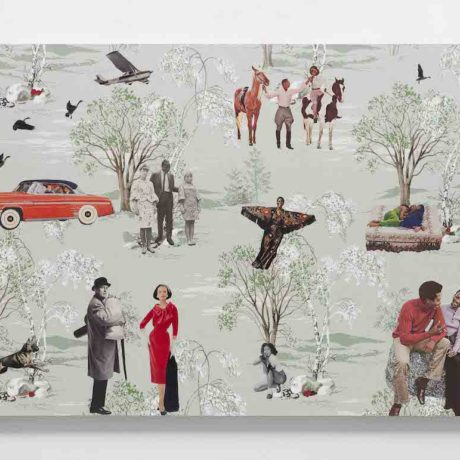
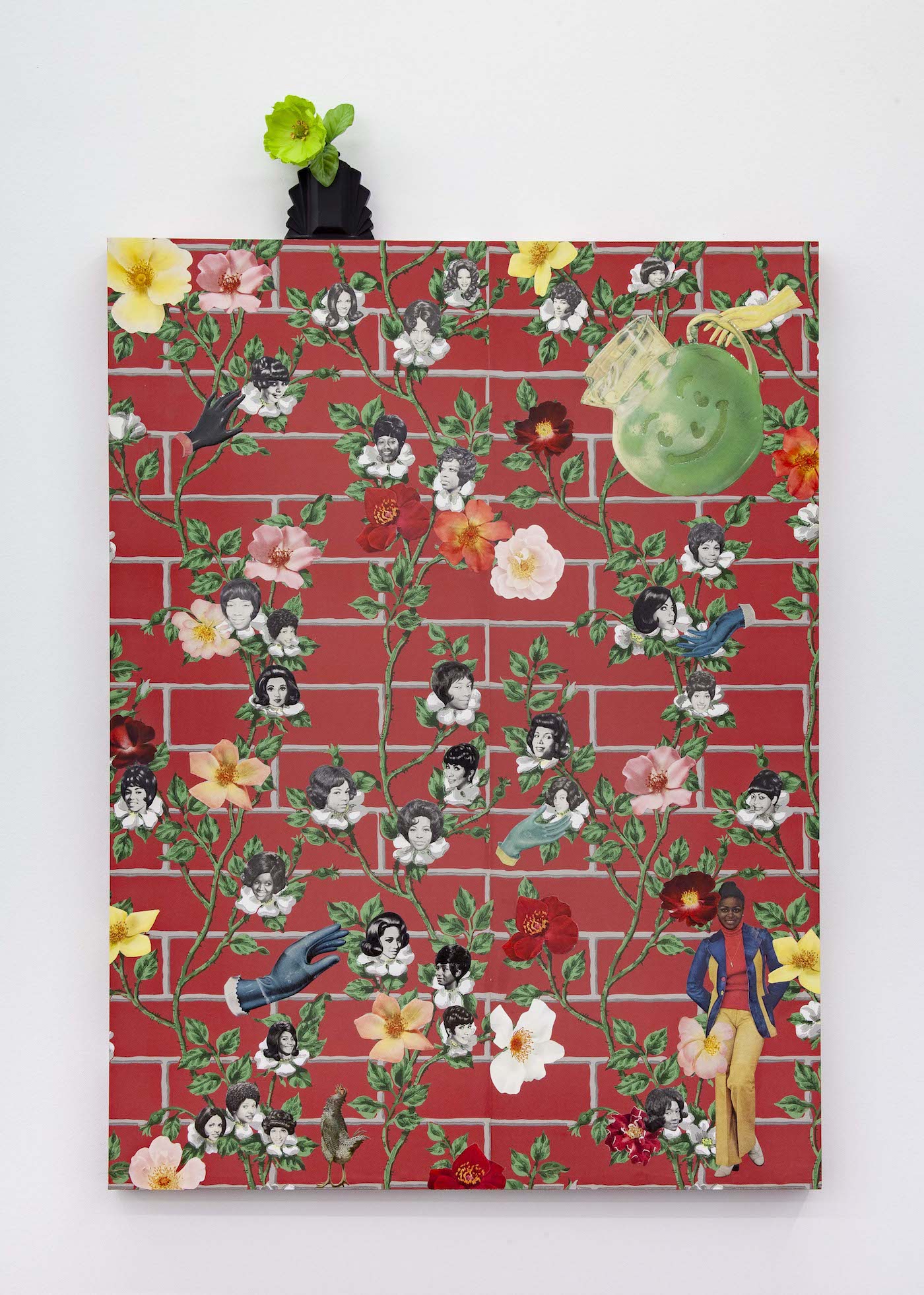
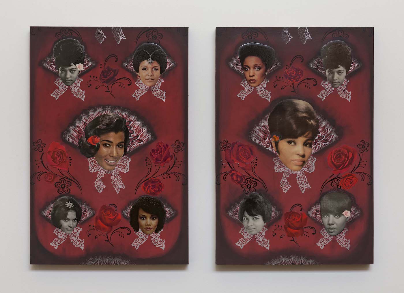
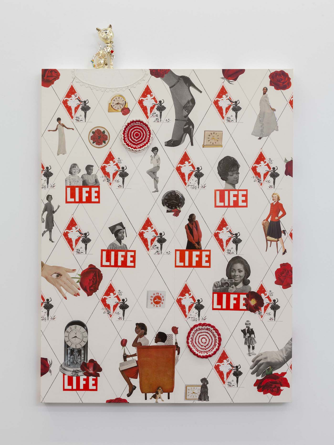
I source magazines from all over, ranging from the 1940s to 1980s. I’m interested in taking these found images from the past to talk about issues of today. Most white Americans think that we’ve come so far from our racist past. I’m making these works as a way to shine a light on the fact that things haven’t changed as much as people would like to think. I also cut out all of the images myself, so a lot of time goes into that. Many hours go into cutting out images, it’s very calming for me. As I’m cutting things out, I’m thinking of all the different ways I can flip how the image was seen in its original context. I start to envision how the different images will come together in their new context.
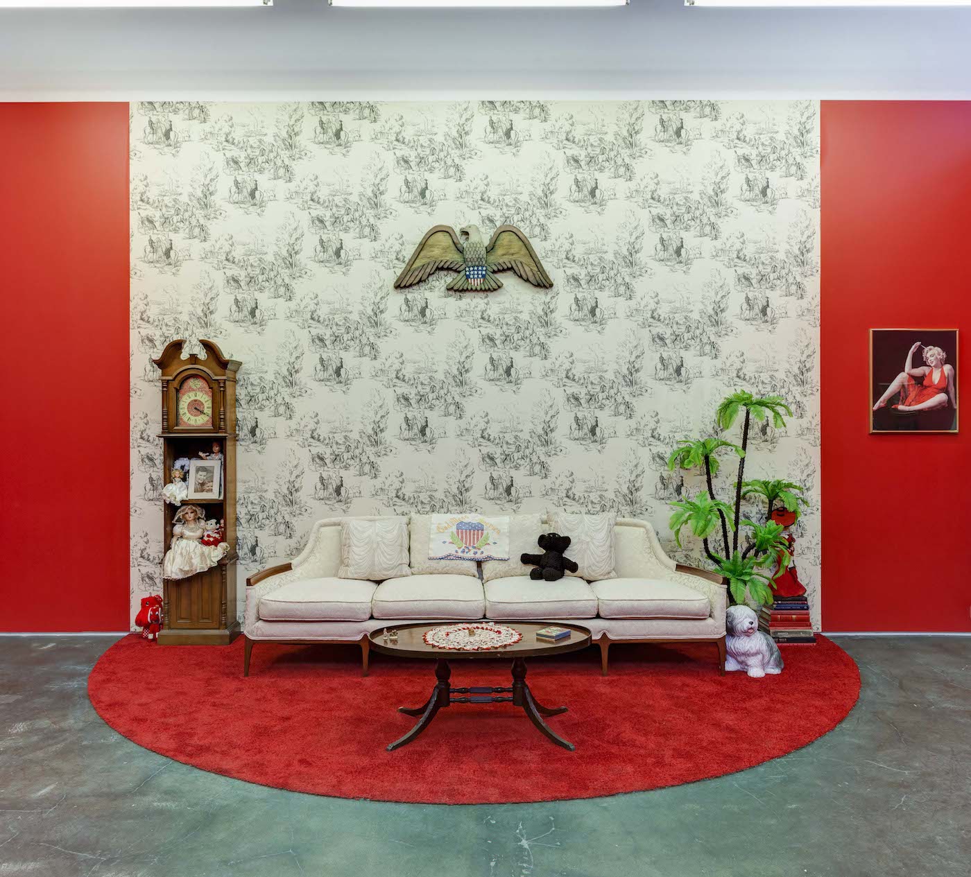
Black White and Red All Over, 2019. Photo by RCH Photography
Can you tell me a little about the vintage-inspired aesthetic of these works, what it is that appeals to you
about this feel?
I’m what you would call “an old soul” and I’ve always been drawn to a vintage aesthetic. I grew up with a mother who was really into thrifting and going to antique shops and vintage sales. My father is more likely to buy something new and my mother has always been into honouring what most would toss aside. My mom’s obsession with acquiring vintage books, magazines and other odds and ends has had a clear impact on me and the work I make.
“It’s quite shocking to flip through an entire magazine from the forties or fifties and not see a single person of colour”
Your last exhibition was more photo-based. Here we are seeing more collage and installation. Why do you choose to work with different media?
I’m an artist who works in various mediums (photography, installation, sculpture and collage) in order to address the topics of gender, class and racial injustice in America. In the same way we as humans like to make assumptions on people based on how they look or appear to look, it’s similar to the way the art world often views artists. If you are a photographer then you are expected to only make photographs, and if you’re a painter, only paintings. I, like many others, work in a variety of mediums. I wouldn’t say that I’m working in installation more, I just use the form that speaks to me most in order to get to a particular point. I try to work in a way that each medium is in conversation with one another. Together they tell a more complete story, but they also hold their own individual importance.
Can you tell me what your own relationship with magazines like Jet and Ebony has been?
I remember we had Jet and Ebony delivered to our house when I was growing up. My mother also held onto a lot of those magazines and had her own archive from years prior. Although I work with other magazines as well, such as Life, Women’s Day and McCall’s, it should be acknowledged that in those magazines, especially from the sixties and earlier, black people were not represented at all! It’s quite shocking to flip through an entire magazine from the forties or fifties and not see a single person of colour. It’s disturbing how white America refused to acknowledge an entire race of people. If black folks were present in all the magazines marketed to “Americans”, then I wouldn’t have had to make a point that I also source cut-outs from Jet and Ebony. My works aim to reflect a more inclusive view because that’s more like real life.
