He sits for all eternity on a vile, scorched throne, surrounded by the writhing masses of the punished. He’s desolately handsome – square jaw, firm chin, desolate gaze. But at least he knows how to accessorise. His right arm, toned from bicep curls (plus sufficient protein), plunges a barbed trident deep into the endless sulphuric mists. This complements the thorny crown resting on a head of unruly hair. His left fist rests on that steady jaw. His elbow nestles on a tasteful maroon cloak. Draped over his left thigh, it’s just suggestive of saucy NSFW delights beneath (he’s such a Scorpio). He’s troubled, but maybe you can change him.
Part of a triptych representing the realms of paradise, purgatory, and the sizzling other place, Friedrich Wilhelm von Schadow’s Hell (1848-52) presents Satan – the fiery one himself – as a moody, broody bad boy. He’s not as sexy as in other depictions from around this time: not as sensually sensitive as Alexandre Cabanel’s weeping emo Satan in The Fallen Angel (1847), nor as delicate as twinky indie sleaze Satan in L’Ange du mal (1842) by Joseph Geefs, nor as hunky as the swimwear model Satan that Joseph’s brother Guillaume came up with for The Genius of Evil (1848). Von Schadow does, indeed, give us an appropriately evil version of the devil. Here, the despicable prince of darkness is besieged by every blasted sinner who ever lived throughout human history; condemned to fry for the rest of time, they bite and fight each other, a miserable howling chorus engulfed by acrid brimstone swirls.
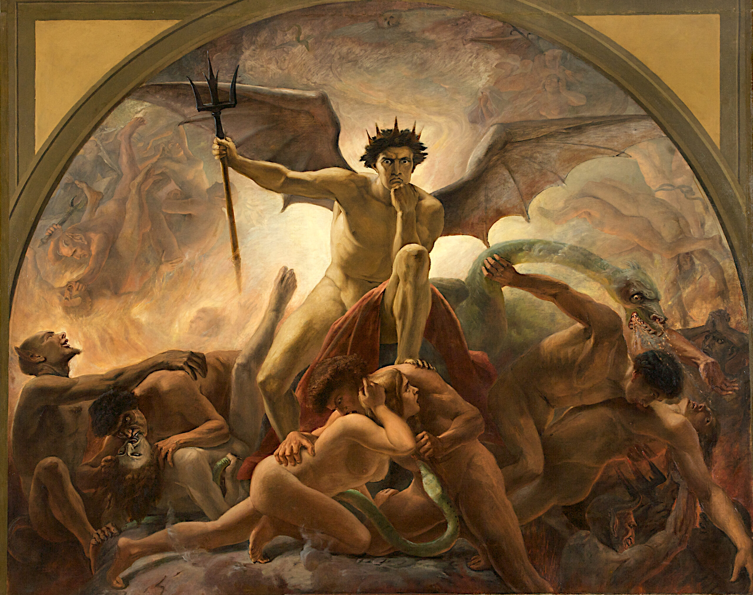
Hell is the first work visitors will have seen upon entering ‘Death and the Devil: The Fascination with Horror’ at Kunstpalast, Düsseldorf. The exhibition, which spends the rest of 2024 moving on to Darmstadt and Schweinfurt, traces how depictions of the devil have changed over the centuries, focussing on the grisly human fascination with devilish imagery and connecting it to the development of the horror genre. No Cabanel or Geef brothers here, sadly, but the von Schadow does appear as part of the exhibition’s first room, a ‘historical prologue’ including the painted wooden coffin of 16-year-old Ernestine Friderica von Stockhausen (1766) and Albrecht Dürer’s eerie copperplate engraving Knight, Death, and Devil (1513).
The texts and interviews in the exhibition catalogue support curator Westrey Page’s argument that satanic imagery has become ‘mainstream’. Stripped of its diabolism, it’s become a big seller, a sound choice for product designers who want to sell us things that are supposed to be edgy, and film producers who want to get frightened bums on faux suede seats. The problem is, however, that this historical argument doesn’t work if all imagery about death is equated to the devil. Jacopo Ligozzi’s oil painting Vanitas (1600-10), for example, shows us a withered skull with flapping scraps of rotting flesh, a hollowing nose, teeth bared and broken. It’s gruesome, but there’s nothing explicitly satanic about it.

The same is true of L’Inconnue de la Seine (Unknown Woman of the Seine) (circa 1900). This more recent white ceramic copy of the famous death mask, allegedly made by a Parisian morgue worker who was utterly taken with the beauty of the subject, a possible suicide case pulled out of the Seine at the Quai du Louvre sometime in the late 1880s. It’s romantically morbid in precisely the same way as Julius Schnorr von Carolsfeld’s The Leap from the Rock (1833), showing two porcelain-pretty young lovers throwing themselves into a ravine so they can be together in death as they could never be in life, while the spurned husband looks on. But, again, neither have very much to do with how art and culture processes the idea of devil, or even evil in any other sense. They do, rather, have much to do with the items from popular culture on display here, all of which are just as fascinated by death as the Dürer, the maker of the coffin, the death mask, or von Carolsfeld, but with a ‘fun’ tone: Mattel’s ‘Monster High’ series of toy dolls in gothy outfits, for instance, or numerous references to horror movies and metal music and its subcultures.
This prompts us to ask two overlapping, and subtler, questions, even if they can’t be entirely separated from one another in the context of Page’s curatorial concept or the works she has chosen. One has to do with how people – those who make culture and those who read, watch, or ‘consume’ it alike – continue to seek out feelings of terror and sublimity under very different social conditions than those found in the exhibition’s historical works. In an industrial society that has for the most part tamed nature, cured disease, lowered infant mortality, and raised life expectancy, death is much more easily postponed, ignored, or even forgotten.
The result is that our feelings about death can be very easily managed, boiled down to appear in highly stylised pieces of mass-produced kitsch and schlock: not just the Mattel dolls, but paperbacks, movies with big budgets and low artistic ambitions, the ever-proliferating number of heavy metal subgenres and their style traits, tattoos, Tarot cards, and ‘true crime’ series. The other question has to do with the history of secularisation in the West – not just how church and state have become legally separated, but what that does to us as people and our cultural expectations.
‘Death and the Devil’ can then be read not just in terms of how the devil has appeared in works of art and culture over the centuries. It must, rather, be about how these changes, while maybe suggesting something about Satan’s own infamous tricksiness, in fact reflect the waning of a certain version of macabre terror that was once backed up by traditional forms of Christian belief.
Now that professing to be a Christian is not the default setting that allows you access to civil society, but just one free ‘lifestyle’ choice we make among many others, it can’t continue to be the main factor shaping what art and culture gets made or what the viewer or receiver makes of it. Instead of fearing that we will go to the other place to sizzle and fry forever more, we get so much of a kick out of this imagery that we pay to see it in safe settings (television screens, bookstores, cinemas, gigs, clothing stores, toy stores).
Hence the sheer range of the items on display in ‘Death and the Devil’. They stretch, and are arranged chronologically, starting with medieval and early modern religious imagery. The historical prologue contains, for example, a grisly carved linden wood figurine of the flayed figure of St Bartholemew (c.1600) draped in a ghastly cloak made from his own shredded skin. The room with 19th century oil paintings in the ‘dark romantic’ mode contains the von Carolsfeld and one of the many versions of Eugen Bracht’s fantasy scene of a perilous mountain range whose valley is strewn with skulls in The Shores of Oblivion (1889).
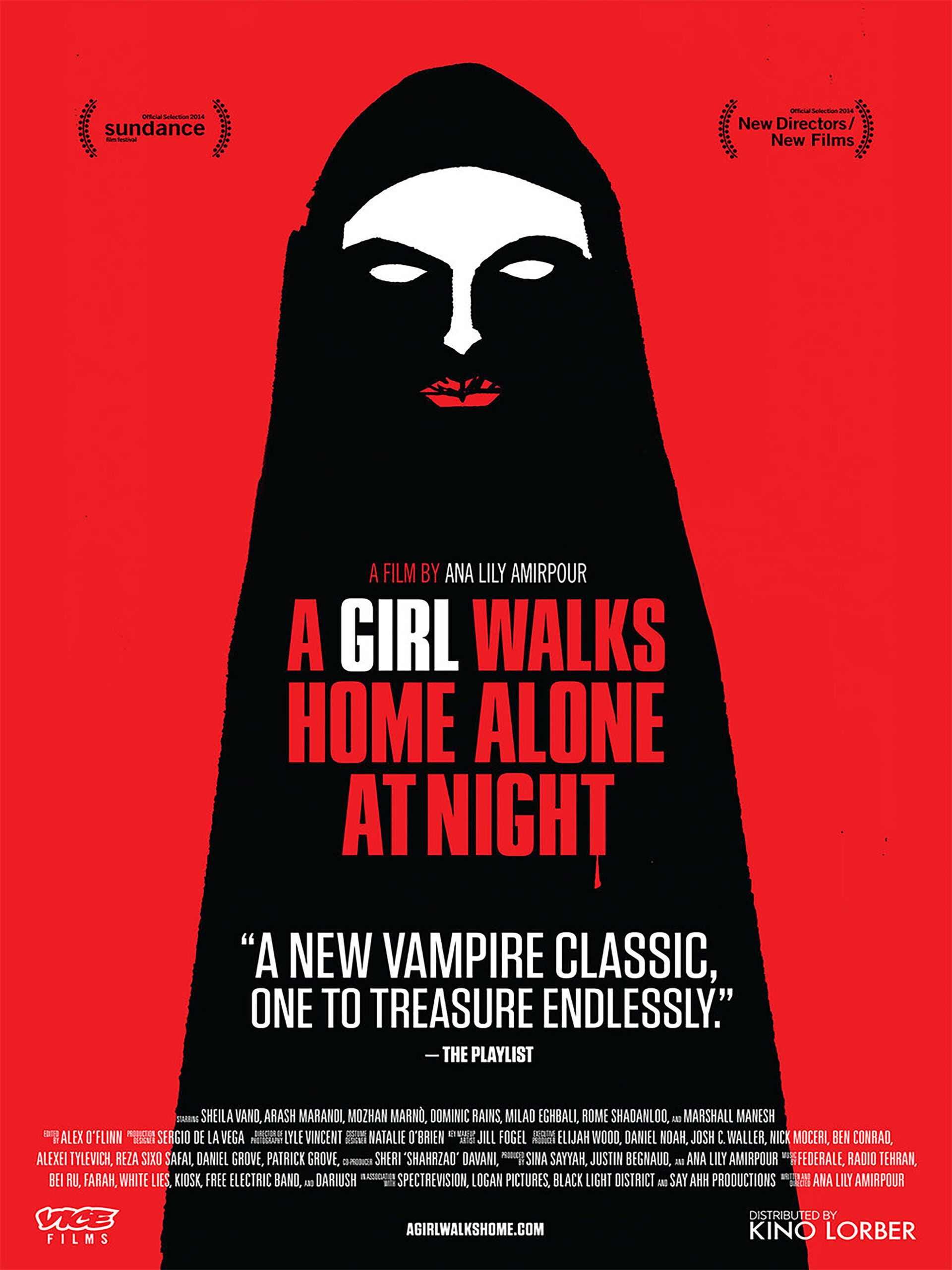
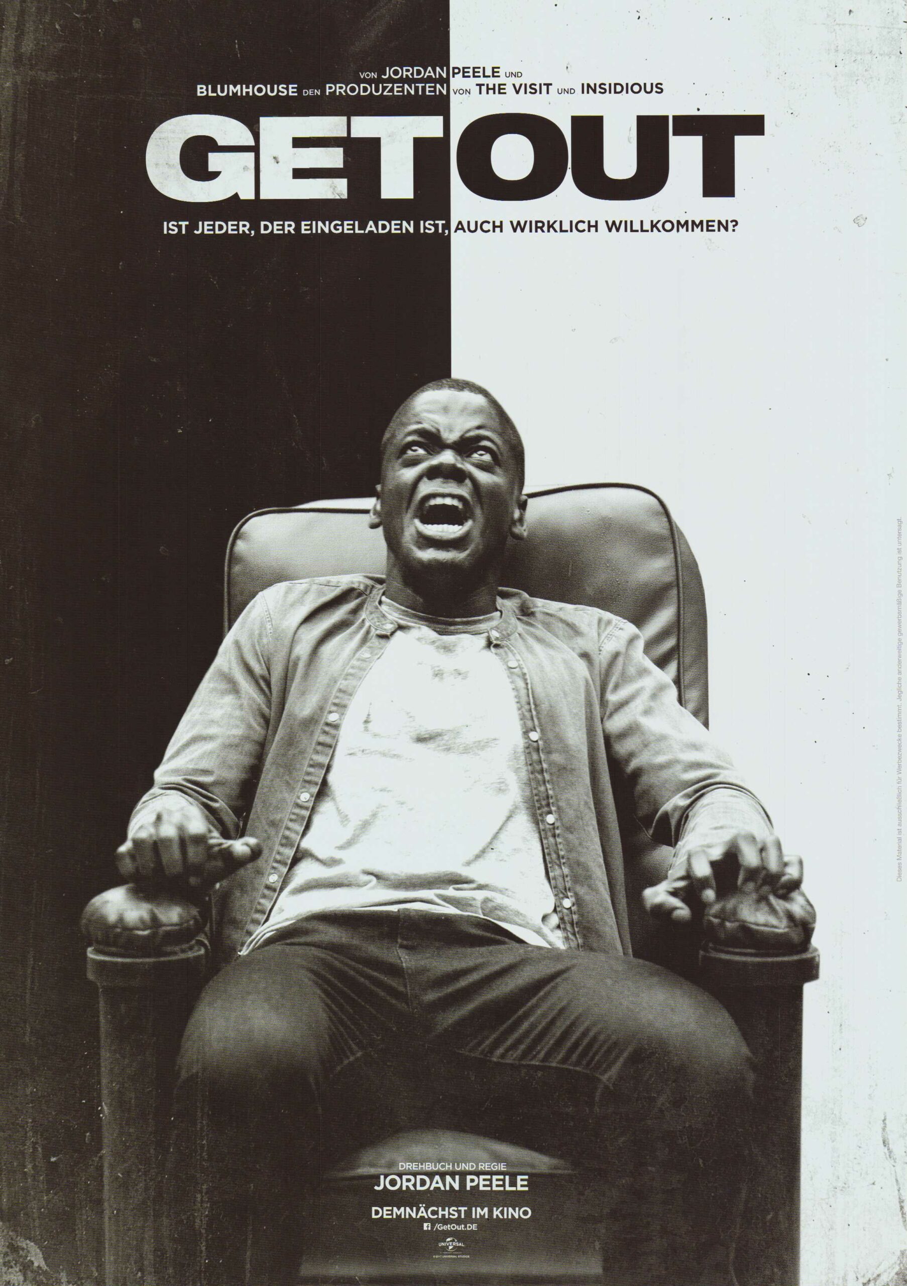
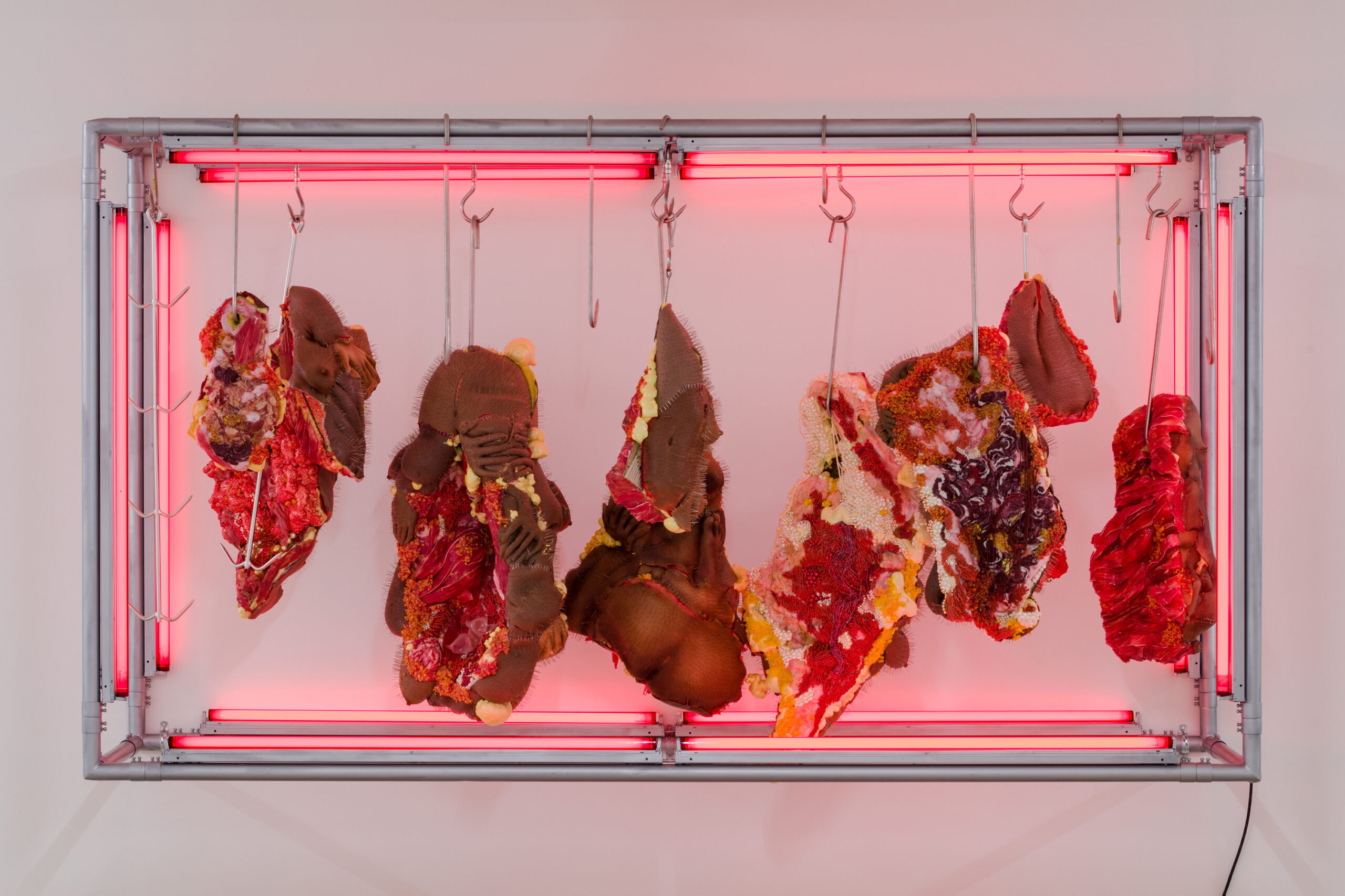
The other rooms are all about contemporary art and popular culture, but the movie and music references in the latter are more thematically revealing than the art. This is probably exactly how it should be, presenting an up-to-date version of Medieval and early modern concerns about death as the ‘great leveller’. Indeed, by emphasising the visual conventions of the horror genre (skulls, graves, fiery demons, assorted vile and unnameable demonic ghouls) in classic horror movie posters and the logos of metal bands, we get a clear sense that death and the devil are, more than anything else, now just two coupled styles.
They appear packaged as part of broad genre conventions that operate as a form of contract between the producers and consumers of culture. The producers want to make things that sell well. They must, therefore, please the product’s consumers, who at least think they know precisely what they want, and these days will complain on the Internet if they don’t get it. The forms and tropes (monsters, zombies, ghosts, aliens, serial killers, miscellaneous ghouls) can then be rationalised by becoming part of rigidly defined subgenres. Or, perhaps, they can be blended with each other to please overlapping constituencies (‘sulky teen vampire romance’, ‘vaguely erotic dark fantasy’, ‘chemically gory supernatural sci-fi’, etc). The devil plays a part in only some of this, and today can only trouble people with very socially conservative views.
And yet, despite all this, there is great joy to be found. Some of the movie posters – Psycho (1960), Night of the Living Dead (1968), and Jaws (1973), for example – are effective reflections of their era’s design conventions even if they don’t tell us much about the experience of seeing the films (this is especially the case with the poster for The Shining [1981]). Others, like The Blair Witch Project (1999) or the Hollywood remake of The Ring (2002), remind us of thrilling disappointments, films whose reputation preceded them so much that audiences were pre-emptively scared but unfulfilled in the moment.
And then there are some that are truly great for many different reasons at once. They’re great pieces of commercial design, for one thing, giving us a thrilling soupçon of mystery and danger, a promise of the savage secular dreads to come. This is intensified when the films they advertise are also great and serious pieces of art, not only comparable to some of the allegedly classic works of painting on display, but far superior to those on loan from provincial German museum collections. These are works that summon terrors from deep inside us: The Seventh Seal (1957), Rosemary’s Baby (1968), The Exorcist (1973), Melancholia (2011), Get Out (2017). This is also true of Psycho, Jaws, and The Shining, of course.
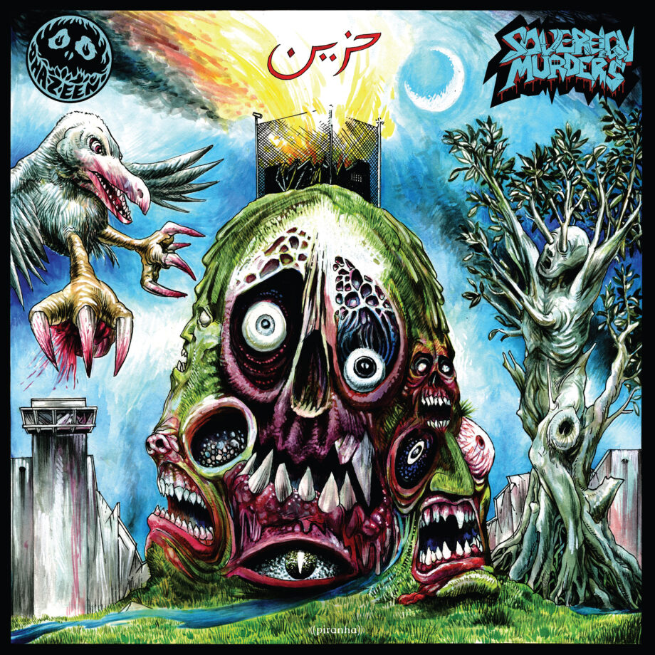
Of the album covers on display, some are very famous indeed, like the self-titled debuts by Black Sabbath (1970) and Slipknot (1999), and Metallica’s Master of Puppets (1986). There are, however, some fun new discoveries to be made too: the very dated sexy dark fantasy imagery of Triumph and Agony (1987) by female-led German heavy metal five-piece Warlock; the wackily surrealistic melting monster faces from Sovereign Murders (2022) by Sydney-based pioneers of ‘death metal Jihad’ Hazeen; the very welcome addition of Rakshak (2022) the debut album by New Delhi-based nu-metal trio Bloodywood, who sing in English, Hindi, and Punjabi, boasting a menacing figure ready to fight backed up by an enormous glowering elephant.
So, the dilemma in ‘Death and the Devil’ is that a secular culture blind to the Biblical reference and forms of allegory present in the exhibition’s historical works can only handle its own, entirely natural, fascination with horror in the modified form of popular kitsch. And this is most evident in the prominence of two figures here. One is Dmitry Smirnov’s photograph Zombie Boy (2011), a menacing portrait of Canadian artist, actor, model, sideshow and freak show performer, and musician Rick Genest, known for his full-body tattoo that made him look like a ‘living skeleton’, which graces the exhibition’s poster and catalogue. The other are the designs by Belgian-born, British-based illustrator Christophe Szpajdel, known for his gnarled, barbed logos for black metal bands.
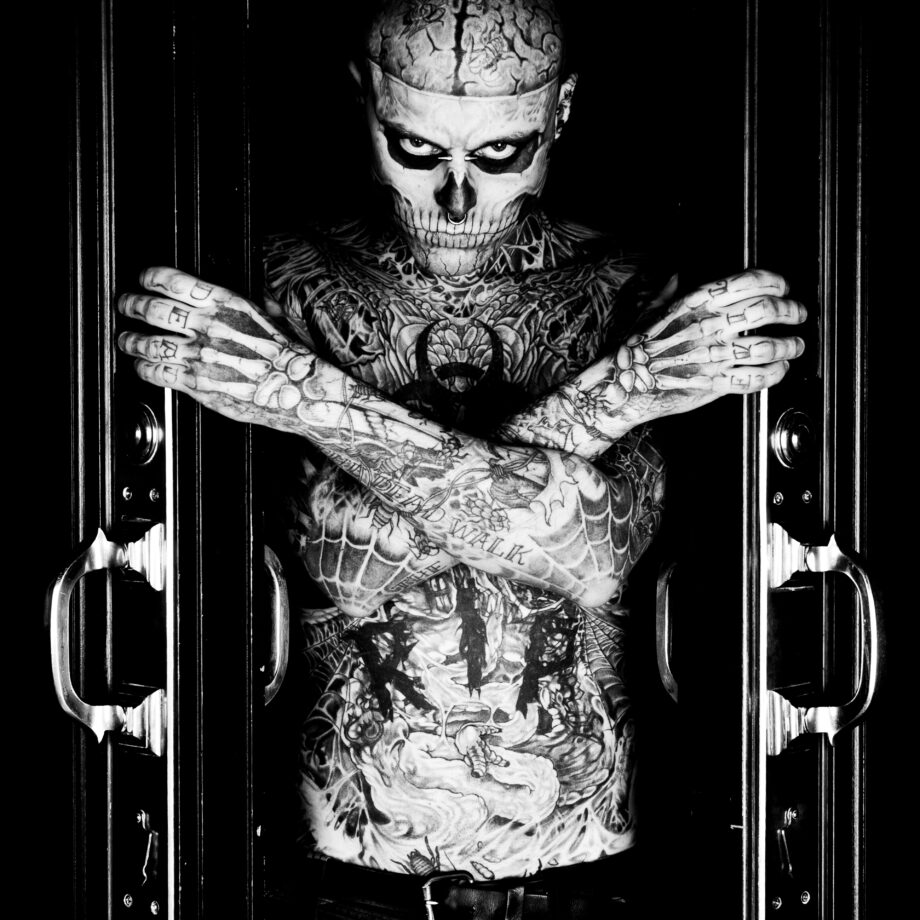
On the surface, the images of Genest are aesthetic cousins of the goths photographed by Erasmus Schröter – with their body modifications, extreme piercings, and BDSM-inflected style choices – and the haute couture designs by Gareth Pugh, Rick Owens, and Alexander McQueen. The difference is that Genest went from appearing in schlock horror TV movie Carny (2009) to featuring in Thierry Mugler’s Autumn/Winter men’s collection in 2011, to appearing in the music video for Lady Gaga’s ‘Born This Way’ (2011). He is, then, part of a process of ‘mainstreaming’ that perhaps aren’t as easily available for Schröter’s far less strikingly handsome subjects.
And something similar has happened to Szpajdel. After designing 14,000 band logos, Kunstpalast commissioned him to produce a mural of the name of the exhibition for its ‘historical prologue’ room. Thus, the first thing that visitors will have seen is not just von Schadow’s Hell, but its juxtaposition with the words ‘Tod und Teufel’ (‘Death and the Devil’) in a typeface that borrows from the typically ‘German gothic’ Fraktur script and 1970s heavy metal graphics. And yet, despite spending over 30 hours a week drawing, which eventually led him to design a black metal-inspired logo for Rihanna, whose machine-tooled ‘darkness’ is quite different from, say, Emperor or Wolves in the Throne Room, Szpajdel continues to work a day job as a shop assistant for the Co-Op in Exeter. Working in retail is, of course, a horror genre unto itself.
Written by Max L. Feldman
