What is Scenic Views?
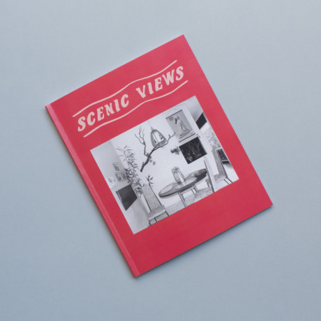
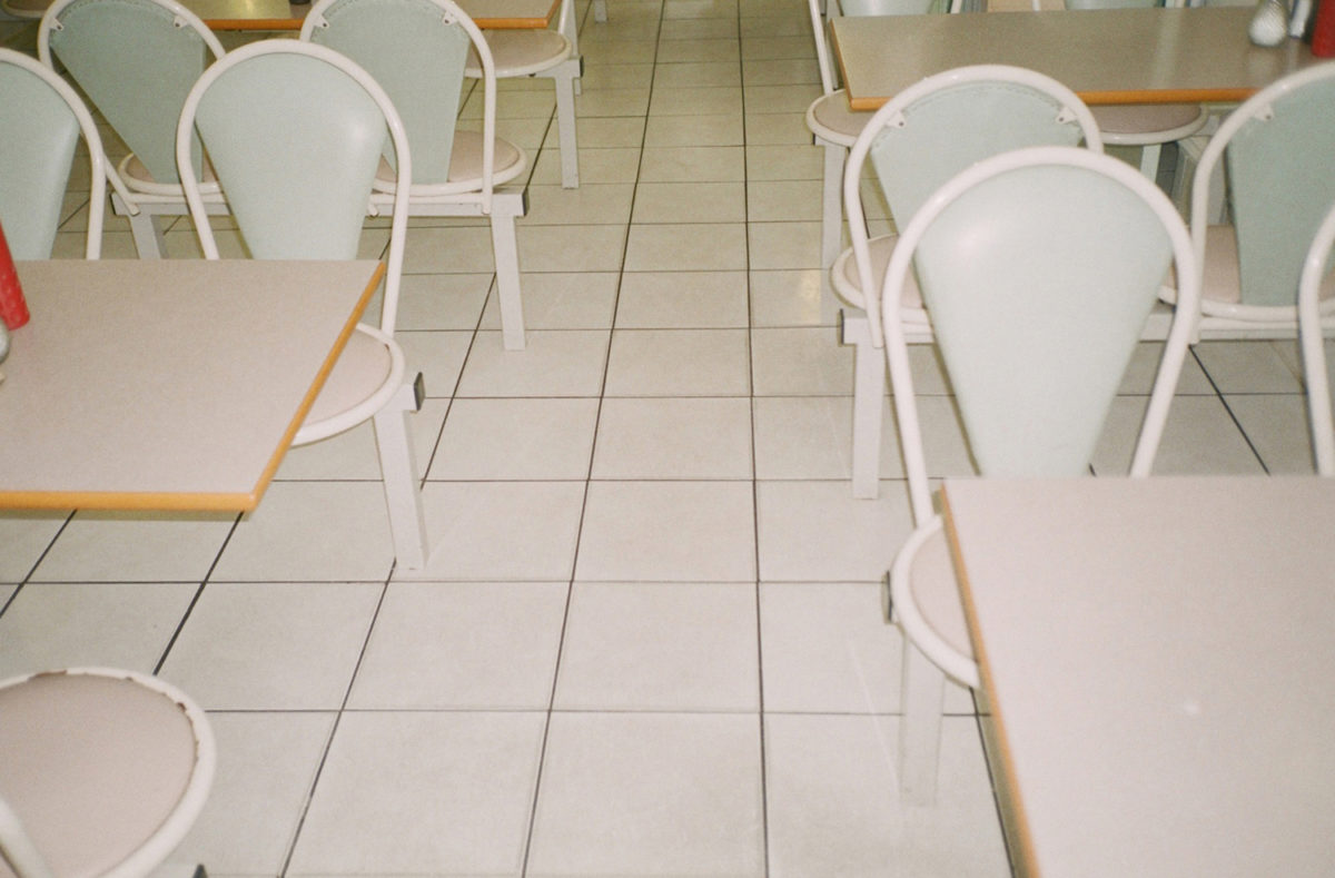
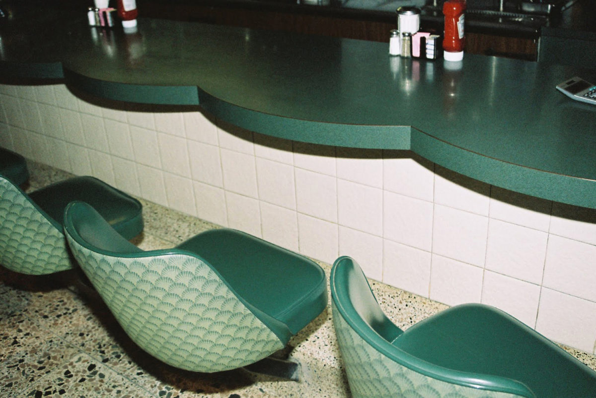
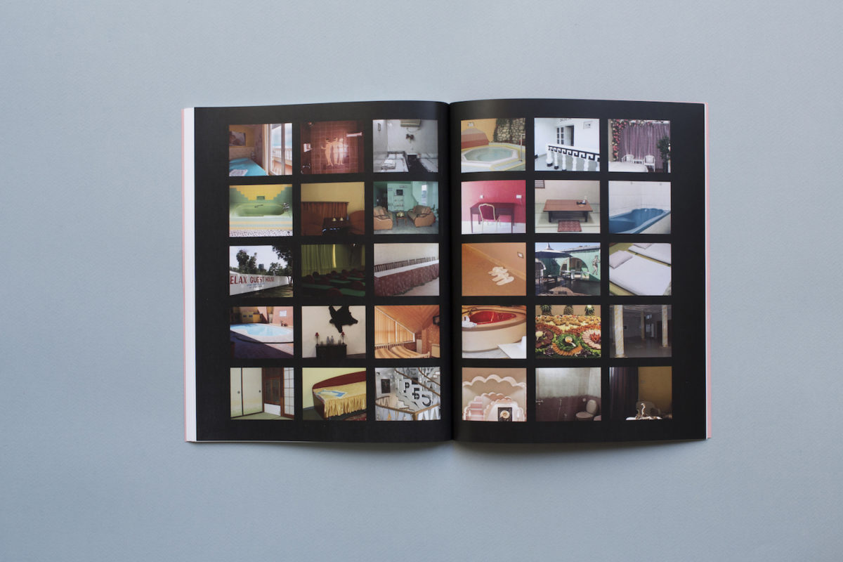
Eschewing the apparitional, glossy and largely exclusionary feel of traditional interiors or lifestyle magazines, Scenic Views is a celebration of those spaces we never really see—spaces rarely presented in magazine or gallery formats. But it’s not just about bars and cafes, hotels and private homes: underpinning the magazine’s ethos is what these places tell us about the people who inhabit or once inhabited them.
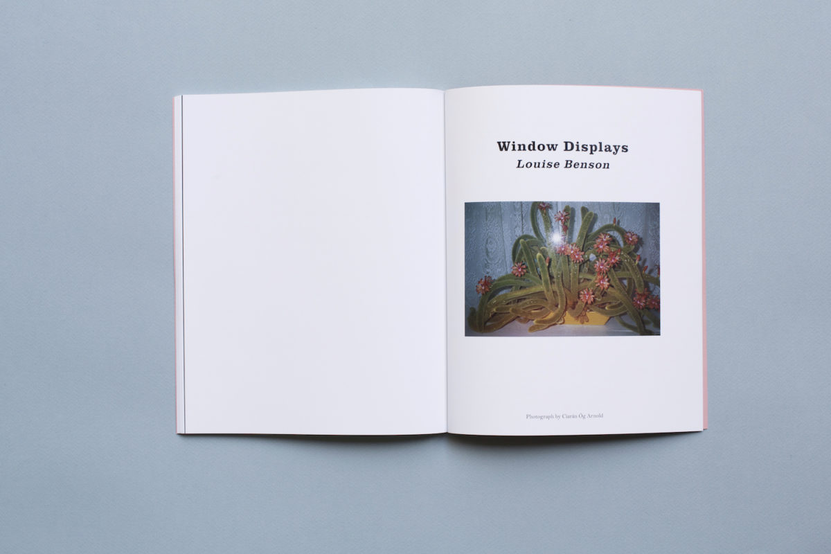
“It’s not about specific places, but everywhere. It could be the windowsill, or a corner shop where someone’s made a shrine on a counter—those things that people leave behind but that tell a story,” says the mag’s co-founder Louise Benson, who is also our very own deputy editor at Elephant. She sums up the focus as “wherever personal expression is let loose”, in an interiors context. The word kitsch is deliberately avoided, but Scenic Views turns its gaze to anything within “a realm that’s part of everyday life—vernacular art that we very genuinely celebrate and that brings us a lot of joy,” says Benson.
Who’s behind the magazine, and why have they made it?
Photographer Lorena Lohr, who’s based between London and New York, founded the mag with Benson. The pair have known each other for a decade, and the magazine evolved from a gradual realisation that they “had a lot of shared interests and tastes in spaces that were maybe a bit unpopular,” says Benson. Lohr’s photographic style for Scenic Views, she explains, is a continuation of what she normally does: “I’m always looking for an abstract, universal language that exists and is shared wherever you are in the world.” Among the photographer’s past projects, exploring similar terrain, include a series shot on America’s Greyhound buses. One of the “biggest shifts” from her usual work for Scenic Views was “searching for that type of language in other people’s work, not just inside your own head,” she says.
“The whole concept was born out of an anger that these spaces weren’t being discussed and were disappearing”
Initially, the duo had wanted to create a smaller one-off publication looking at airport waiting areas. This meant booking the cheapest one-way flight they could (for about £8, and resulting in a 3am wakeup call to get to Stansted airport). They set out to document the things we usually ignore in a fraught mess of baggage weight panics, security checks and wondering for the thousandth time if you’ve lost your passport—luggage, toilet queues, sinks and so on—in both photographs and interviews to create a visual and oral history.
Though that airport zine never saw the light of day, its successor Scenic Views, which has been two years in the planning, launched its first issue in October this year. The magazine takes the same idea as the airport concept, but broadens it: “The whole concept was born out of an anger that these spaces weren’t being discussed and were disappearing; and an anger that there wasn’t really anything that spoke about people living in the margins, which is where it really happens,” says Lohr.
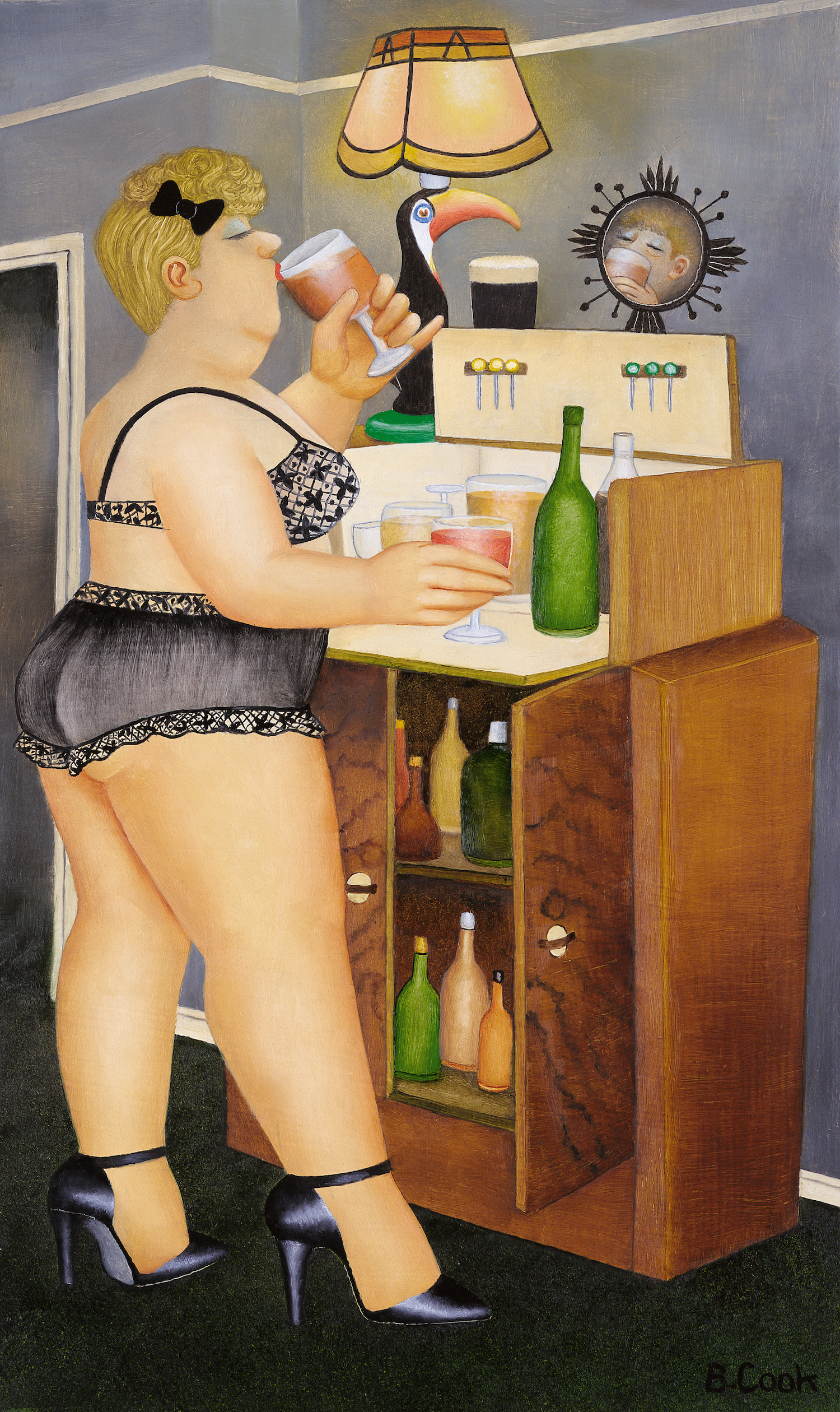
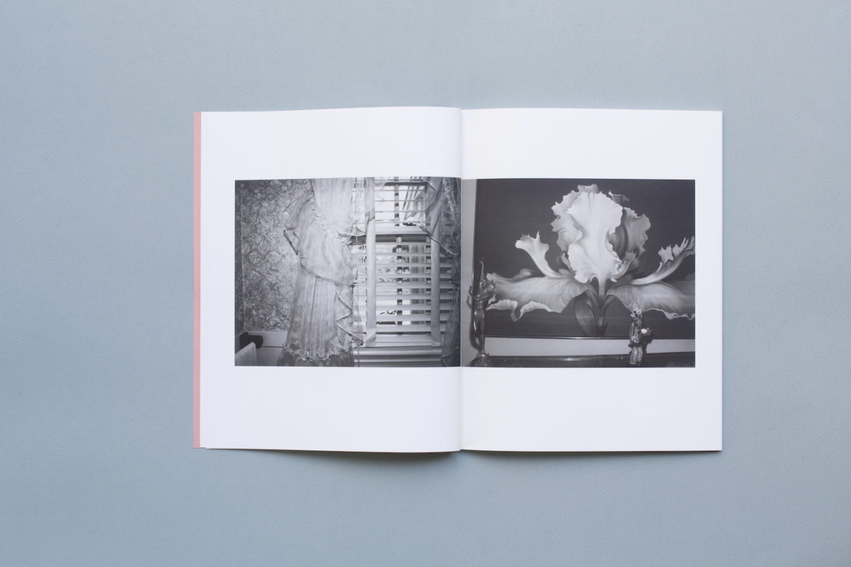
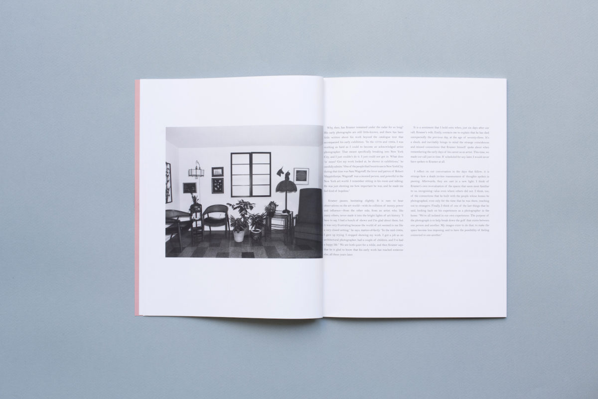
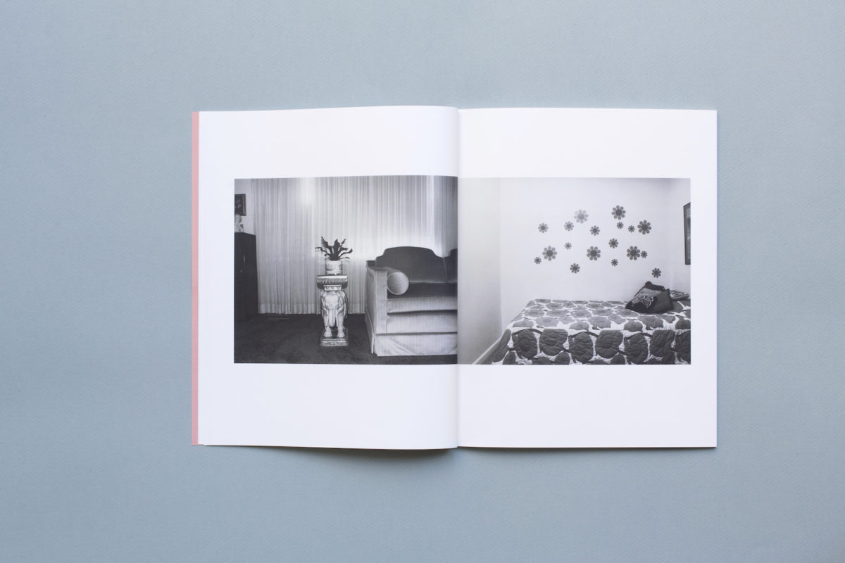
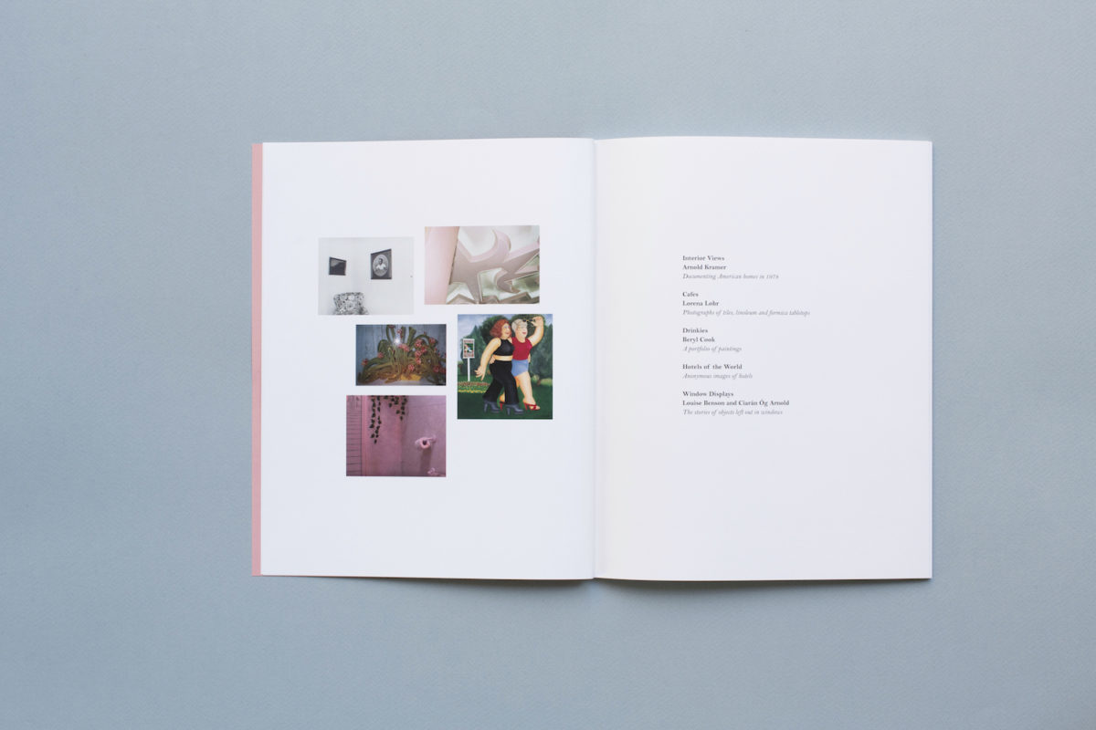
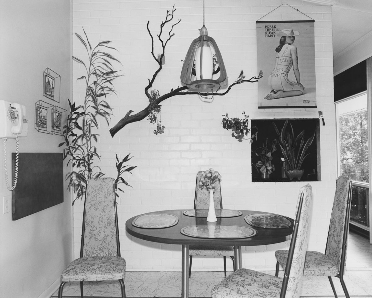
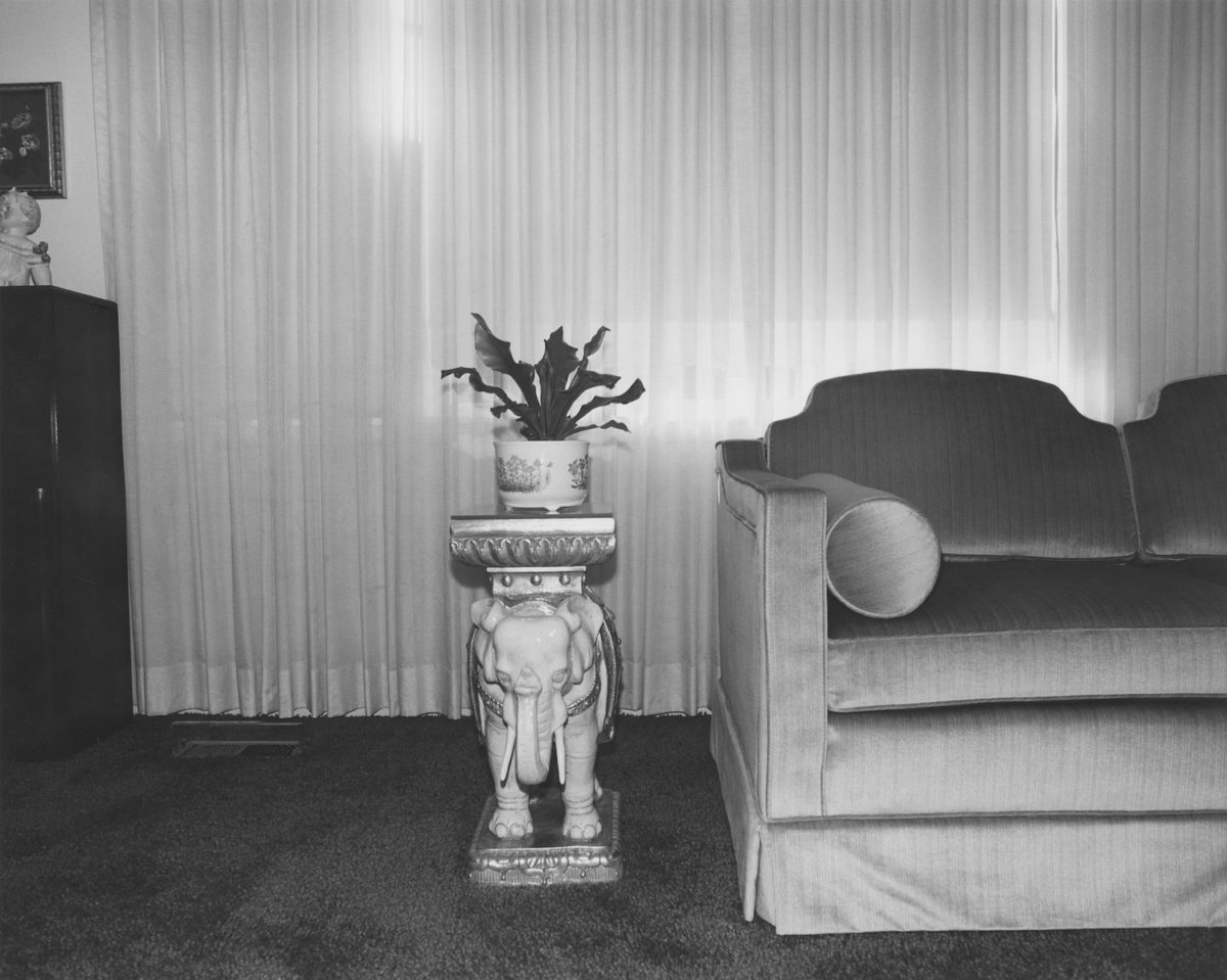
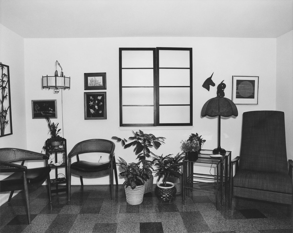
The artists and works that Scenic Views focuses on, Benson explains, are either emerging talent or those that haven’t been given the credit the founders feel they should have. Things that won’t ever be in big museum collections, but which are “a part of so many people’s visual culture” without them necessarily realising it. The debut issue features a little-known 1978 series of images of Washington-area homes by photographer Arnold Kramer, taken with a bare flashbulb, accompanied by an exclusive interview that turned out to be the last Kramer did in his lifetime.
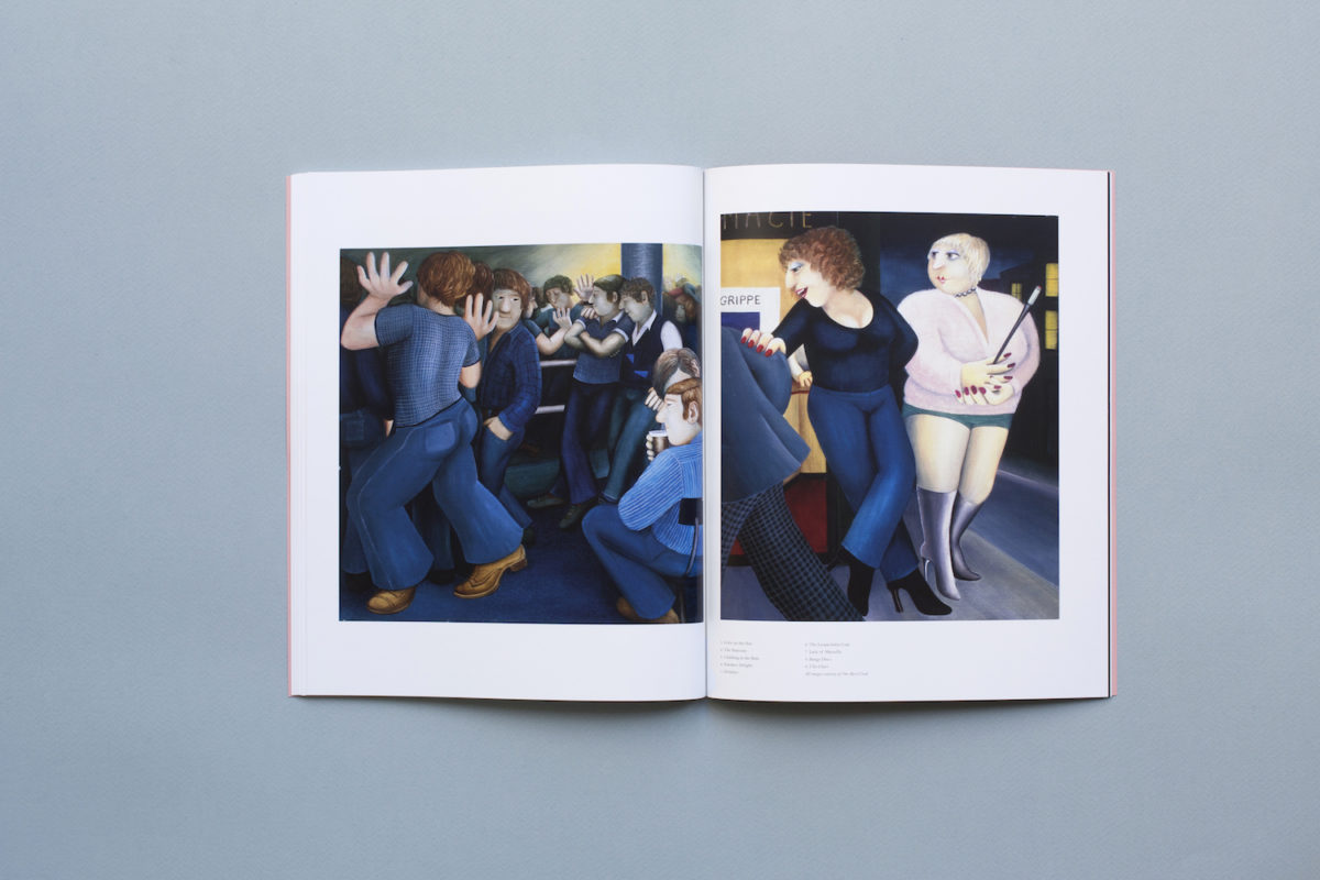
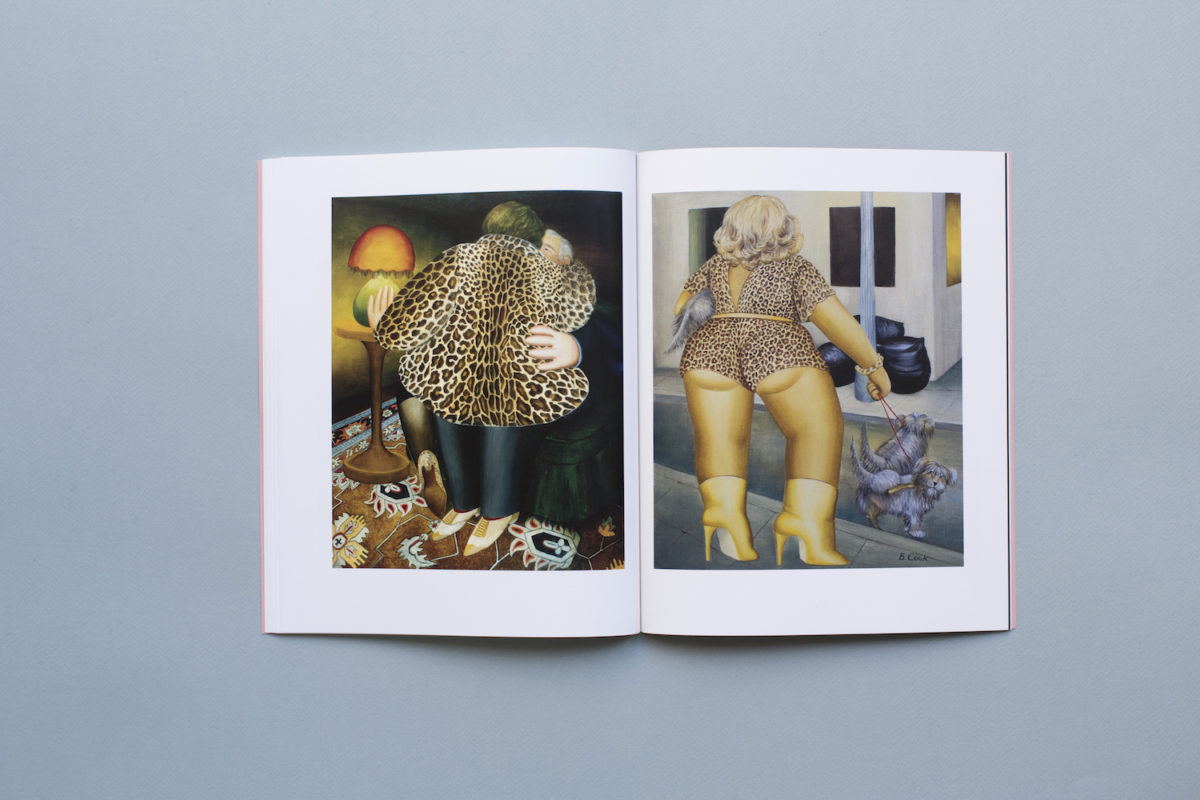
It also showcases the work of Beryl Cook—an artist often dismissed as “bad taste” postcard fodder—but viewed here with a curious, affectionate and thoroughly unironic stance. “We hate irony,” says Benson, acknowledging that some of the things the pair have chosen to feature in the mag might be seen as such (cocktail stirrers, ice cream menus, fridge magnets and gingham tablecloths are planned for future issues, for instance).
Why should you read it?
Scenic Views tells the stories of people and places you’re very unlikely to find anywhere else. It’s a deliberate stance against, and interrogation of the word “lifestyle” in a publishing context: “that word’s been co-opted to mean a specific type of life that’s enviable or very monied,” says Lohr, “it’s never about what you already have.” As such, Scenic Views aims to devote its pages to people from all different backgrounds, in the contexts of both private and public spaces—”expressing the pleasure in meeting strangers, and the importance of those kind of meeting places that we feel would benefit everyone,” as Benson puts it.
“The word ‘lifestyle’ has been co-opted to mean a specific type of life that’s enviable or very monied. It’s never about what you already have”
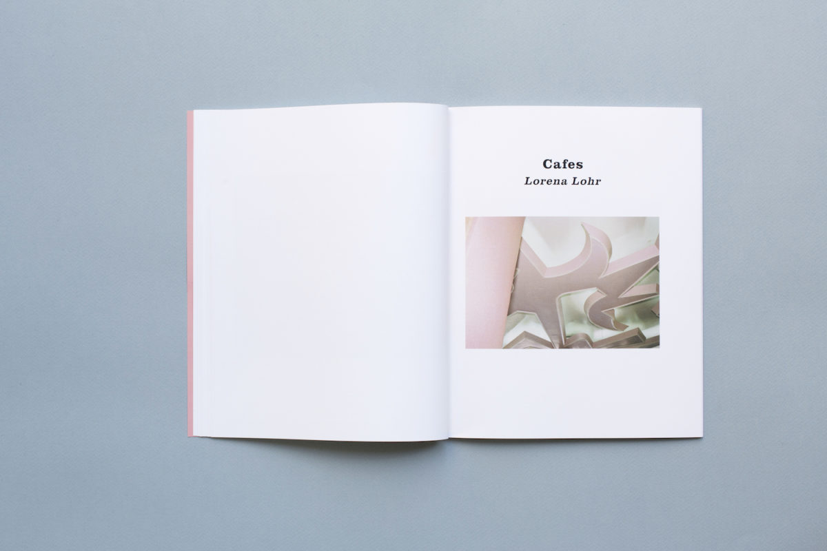
- Scenic Views, by Louise Benson and Lorena Lohr, designed by Michael Nash Associates
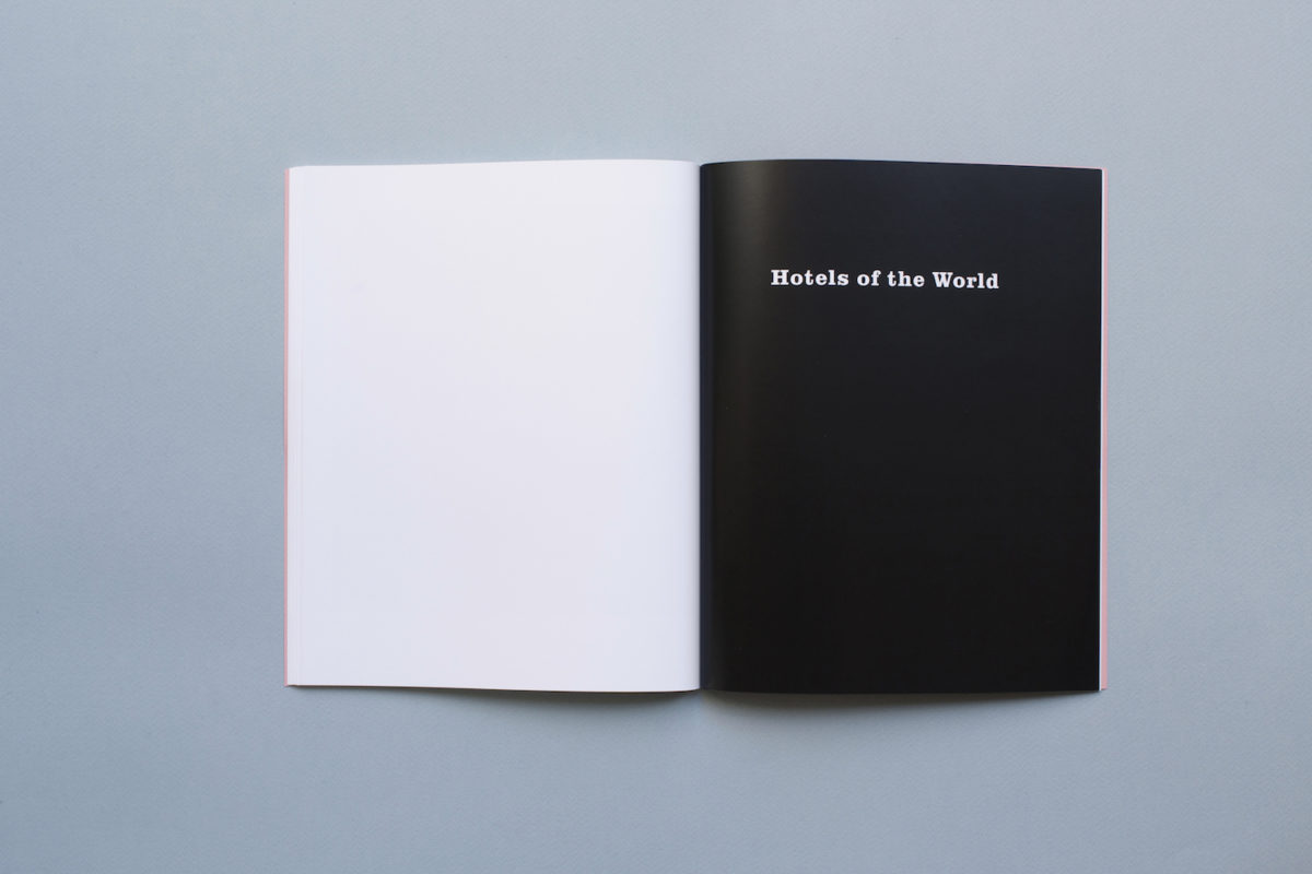
The magazine itself is pretty lovely to look at, designed by London-based studio Michael Nash Associates. The original idea was to create a “catalogue” of undocumented interiors elements rather than a magazine, and as such, older architectural catalogues were an important reference point design-wise to keep things simple and accessible.
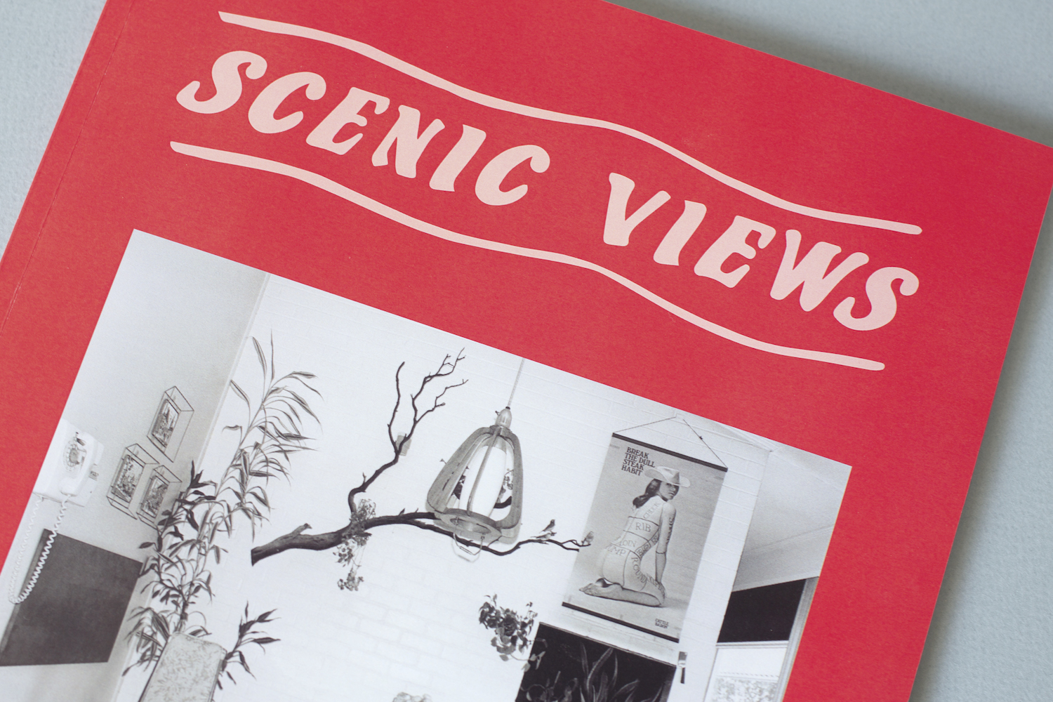
This means the design eschews both modernity and anything too retro-leaning to keep the overall aesthetic at once timeless and slightly DIY—as exemplified by the cover’s bespoke logotype, which the designers created through forming their own version of lettering first seen on shop signage. “It was about introducing some hand-drawn elements, as the magazine is all about the personal,” says Lohr.
The magazine’s body copy uses a very simple, serif font; and the cover colourways will change with each issue: the debut uses an off-red against a pink background, and the founders appear to be in an ongoing battle around using a twist on mustard yellow in the future. Whether or not that’s given the go-ahead, they do agree that fundamentally, the magazine is about people, not luxurious places and the objects in them: “We’re not interested in a sofa because it’s belonged to a celebrity—we’d be interested in it because it’s all lumpy or has stains where people have sat on it and had an amazing time,” says Benson. “That sort of thing paints a much more evocative image.”
