What better way to usher in the new millennium than with dystopian landscapes, despair and ennui; all set to jittery percussion and seething synths. Thom Yorke, you sure know how to celebrate. We’re back in the year 2000: that milestone in which we all packed our sheds full of Pasta ’n’ Sauce (maybe that was just my family?) and braced ourselves for either the Millennium Bug, the apocalypse, more old shit from Robbie Williams—or, terrifyingly—all three. Here it was, shiny and new—a future as imagined by Kubrick and lived by us, with our midriffs bare and our trousers soaking up the puddles of the former decade’s Brit Pop/Art excesses.
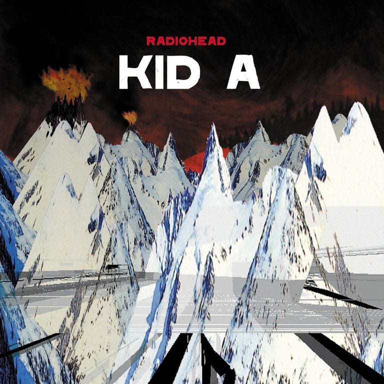
Radiohead’s Kid A couldn’t have really come at a better time, or with more suitably beguiling, plaintive artwork than that created for it by the band’s longtime collaborator Stanley Donwood. It’s a record that stays with you forever—to me, their very best—and is perhaps a reflection of the disillusionment or newness that came with its predecessor OK Computer’s runaway success and accompanying chorus-bellowing. Of course, Kid A, too, scored a number one; all the while Radiohead were pushing their listeners further than their poppier earlier records ever dared to.
“In the wake of OK Computer, Radiohead’s refusal to assume the mantle of gunslingers seemed at odds with the size of the following they’d attracted,” Nick Kent wrote in Mojo. Subsequently, Kid A was seen as a drastic attempt to downsize that following.”
Of course, it wasn’t—at least if Yorke and the gang are to be believed. What it did do was upsize the band’s already rich explorations of the relationship between sound and visual art. Promo for Kid A included a 2000 European tour inside a custom-built, advert-free tent, reportedly inspired by Naomi Klein’s anti-globalization book No Logo. And long before the concept of viral marketing was even a twinkle in some guy with a snapback’s eye, the band released short videos set to portions of certain tracks they termed “blips”, which were played on music channels and released online for people to watch for free. Donwood’s Radiohead “demon bear”—that little sharp-toothed face that was sketched in a thousand secondary school exercise books—was also thrust into the limelight with his designs for Kid A.
But for all this smart and incredibly prescient gimmickry, Donwood’s own work for the record feels perhaps disquietingly traditional. The artist, who has designed all Radiohead’s album covers and promotional materials from the get go, had already proved his chops as a man with a predilection for unusual processes and wild ideas to more than match those of Radiohead. For the cover for The Bends, Radiohead’s 1995 release—a peculiarly pallid, orange figure with mouth agape—Donwood used VCR cassettes to film a CPR mannequin, then photographed the footage; while OK Computer’s cover saw him work to the self-imposed rule that “we couldn’t erase anything”.
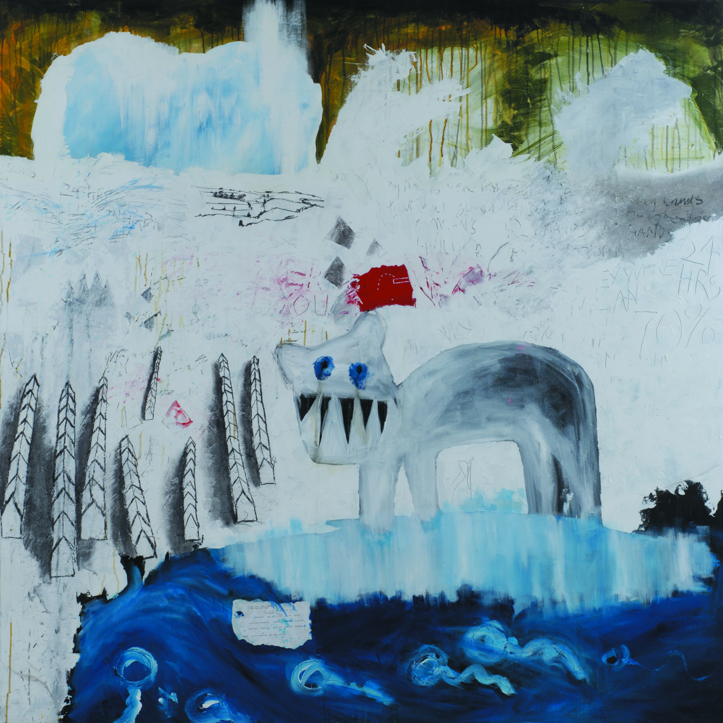
Donwood’s close and, in his terms, “harmonious” relationship with the band seem to mean there’s little in the way of a strict brief when it comes to artwork. As such, it’s perhaps all the more daring when he makes things that simply look like a painting: the work for Kid A has the feel of outsider art landscapes, almost folklorish, as seen through a cynical viewpoint that rings out with the same angry pulsations and clinical insistence of Idioteque.
The artist has spoken of the pressure he felt in making the Kid A record artwork after the success of OK Computer and with the band’s move into new sonic textures and territories. So, he got physical. “I got these huge canvases for what became ‘Kid A’ and I went mental using knives and sticks to paint with and having those photographed and then doing things to the photographs in Photoshop,” Donwood told NME.
“The overarching idea of the mountains was that they were these landscapes of power, the idea of tower blocks and pyramids. It was about some sort of cataclysmic power existing in landscape. I was really chuffed with it.”
“The work for Kid A has the feel of outsider art landscapes, almost folklorish, as seen through a cynical viewpoint that rings out with the same angry pulsations”
Donwood has said that the idea for the landscape image came from a picture he spotted in a newspaper from the Kosovo war: “… It’s taken looking straight down at the ground, and the image is of perhaps a square meter of snow. The snow is spattered with blood, engine oil, marked with bootprints, studded with cigarette ends.”
This picture, he explained, reminded him of seeing museum exhibits of war atrocities. There’s not much explicit violence here, though; just the odd fleck of red and a few cryptic symbols hinting at disaster beyond the snow. “These are hard paintings to make,” said Donwood, describing the image he was making that went on to become the Kid A artwork. “They are ostensibly for a record that is proving a hard record to make.”
His images became all the more dissonant and chilling thanks to their digitization, which further distorted Donwood’s marks; there’s a sense of things being not quite right, just as there is in the music.
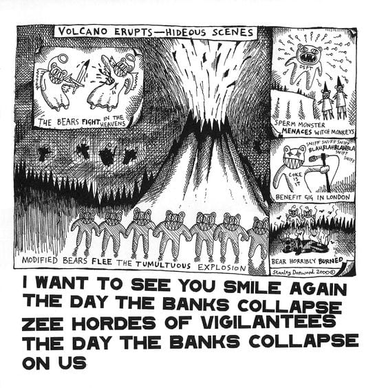
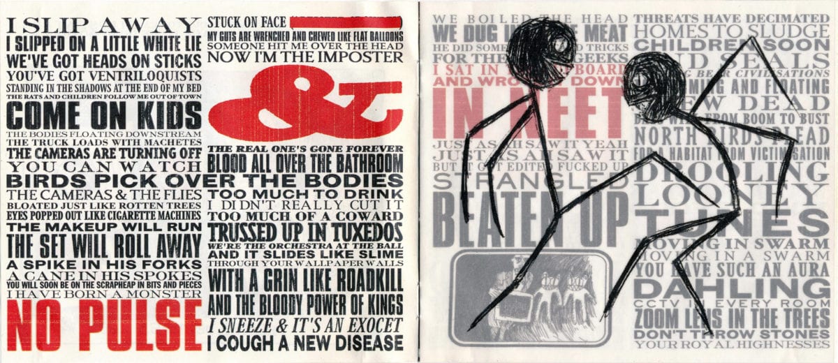
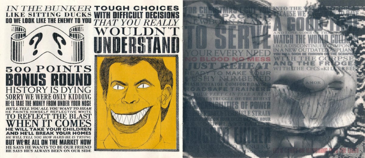
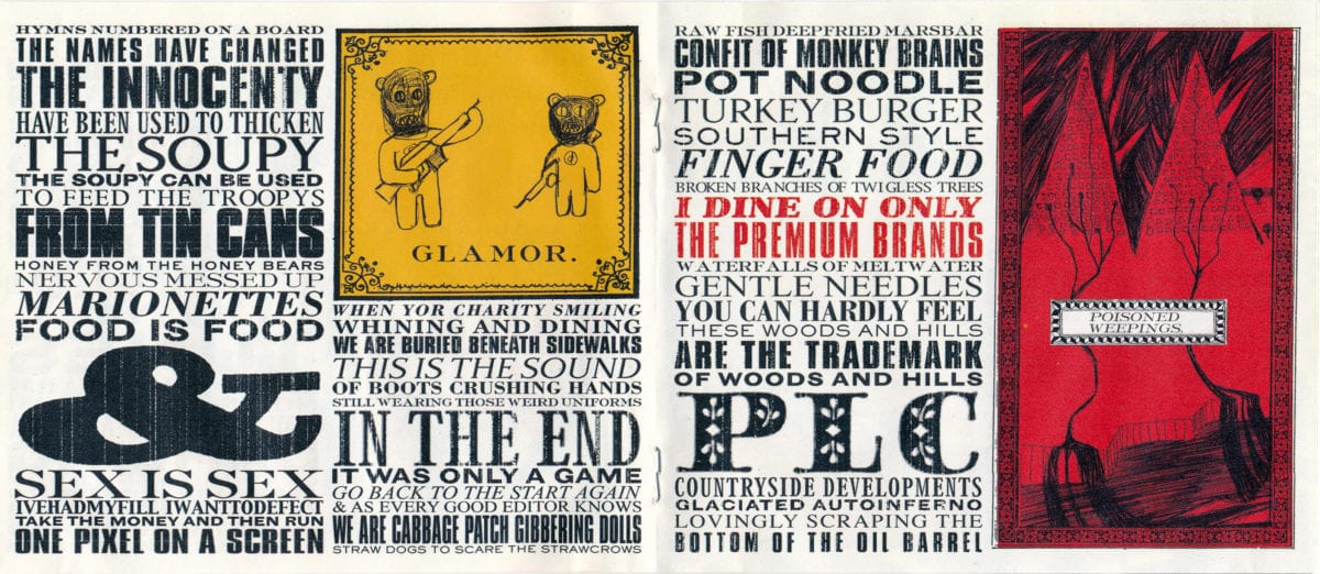
Some early CD releases of the album were accompanied with a “hidden” book of artwork beneath the disc tray. The designs are ire-laden, political diatribes—one bears an image of then-Prime Minister Tony Blair surrounded by bluster and nonsense; another patently spells out impending ecological disaster through information on melting glaciers.
The overall effect of the artwork is that pitch perfect mix of the eerie and the familiar; a bedtime story told in the cold, without a happy ending. It’s almost nonchalantly apocalyptic; somehow grandiose but whispered, like we’re all trying to make sense of something that will never truly make sense.