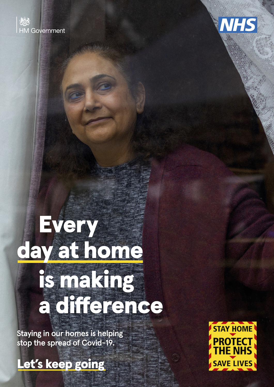
It’s difficult to pinpoint an exact start date for the pandemic. My memory becomes hazy when thinking about the week, early March in the UK, when many workplaces were scrambling to shut down and enable remote working. It wasn’t until a week later that a cohesive strategy seemed to emerge from the UK government. Baked into my memory are the subsequent daily press briefings, where officials stood behind podiums proclaiming “Stay Home. Protect the NHS. Save Lives” and asked us to trust them.
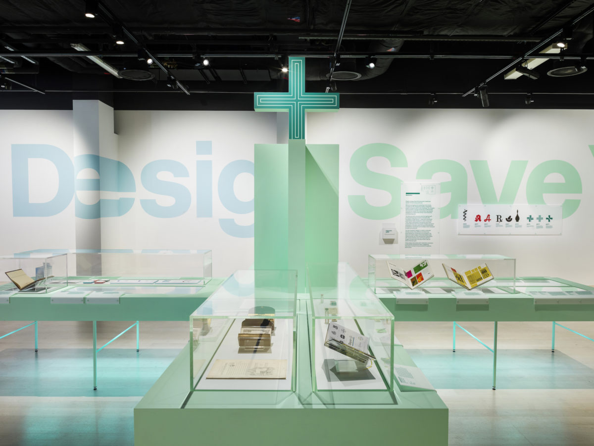
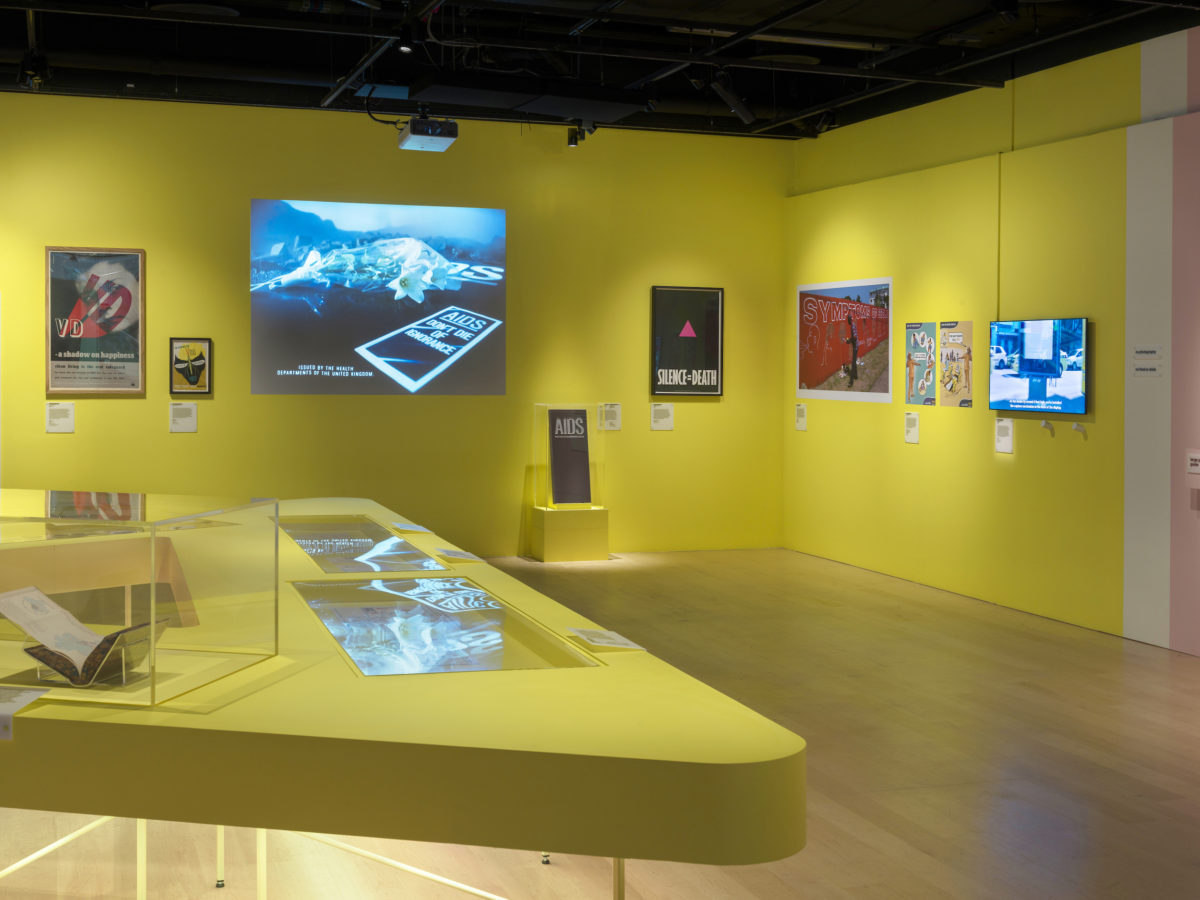
I reached out to designer Lucienne Roberts to gain insight into the British government’s public awareness campaign around coronavirus and how its impact compares to campaigns of the past. Roberts runs advocacy initiative GraphicDesign& with design educator Rebecca Wright. The pair curated the exhibition Can Graphic Design Save Your Life? at the Wellcome Collection in London in 2018, which examined how graphic design intersects with healthcare.
- Wellcome Collection, 2017–18 origination and co-curation GraphicDesign& art direction and 2d design LucienneRoberts+ 3d design Universal Design Studio
Roberts recalls the criticisms levelled at the government’s campaign following its launch last year, with commentary focused primarily on its failings. She describes the “warning chevrons in yellow and STOP red” of the earliest messaging, and compares them to the later updated message of ‘Stay alert. Control the virus. Save lives’ rendered “in green, the colour most synonymous with GO.” She argues that graphic designers have a strong understanding of how both consistency and repetition work. When it comes to public messaging, she says, ambiguity can be fatal.
Ten months later, she admits that actually the campaign design has matured well. “It’s grown to accommodate different types of photography and simple instructional line drawings—a big tick as these allow for varied learning styles,” Roberts says. She details how the core elements, such as the areas of yellow with an angled chevron for a border, have been retained. Overall, she concludes, the materials now look more “graphically confident”.
“When it comes to public messaging, ambiguity can be fatal”
Asked about campaigns that have been particularly inspirational or effective, Roberts cites New Zealand’s Unite Against Covid-19 film as an example of clear and assured messaging. It not only espoused the best course of action, she explains, but importantly assumed the best of people: “It showed restaurants, shops, sports arenas, places of worship, and described their emptiness as a mark of togetherness, of shared responsibility in the interests of the common good. I found that very effective, and moving.”
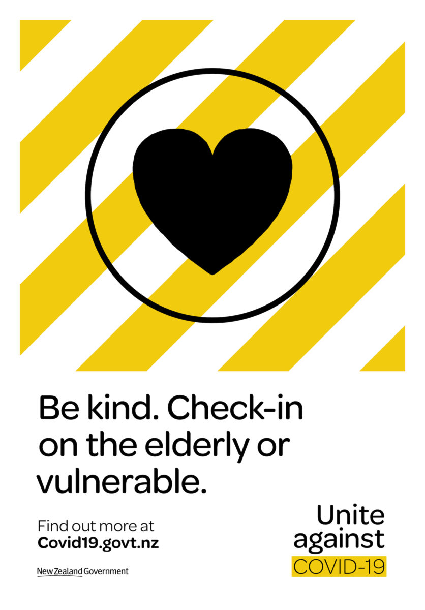
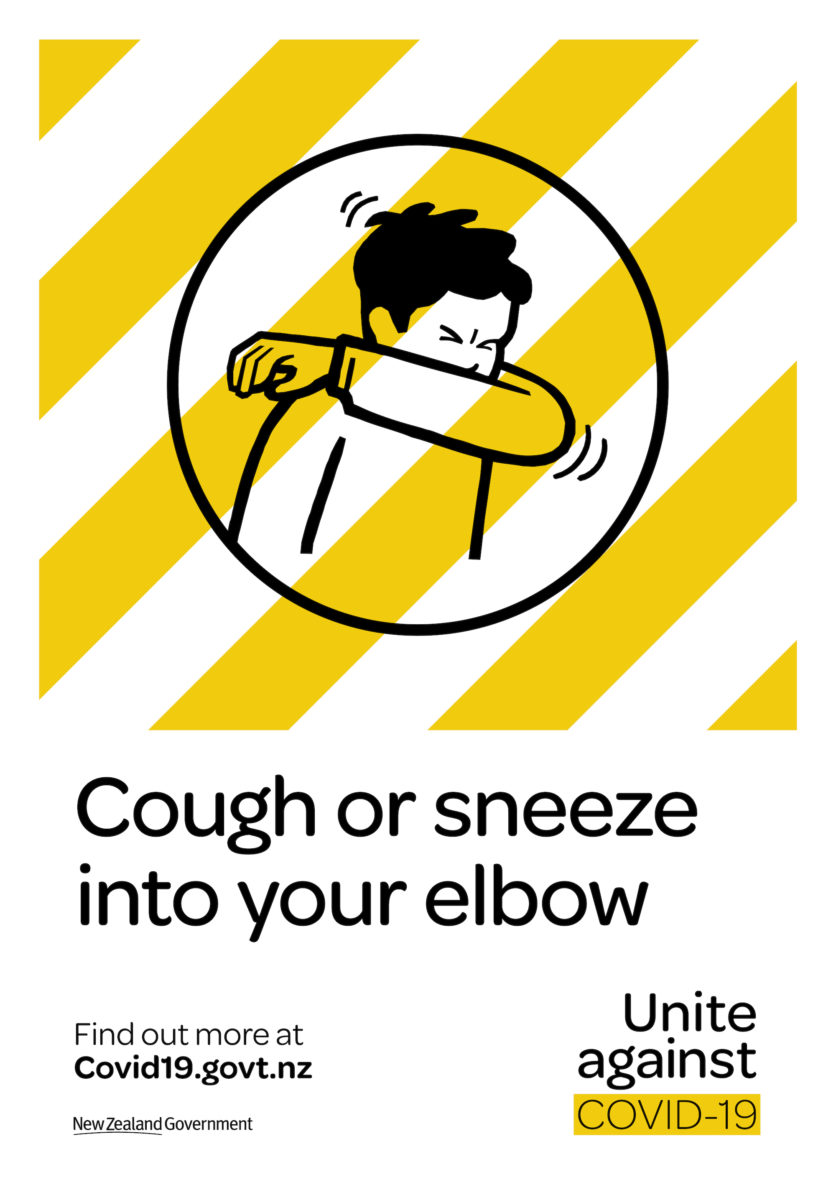
Creative director Brigid Alkema of Clemenger BBDO Wellington, the agency commissioned by the New Zealand government, reveals that the campaign was an extremely fast turnaround. They worked from a Friday morning to create a pitch before fine-tuning the strategy so that it could be approved by government. By Saturday evening they were presenting to the office of the New Zealand Prime Minister. The resulting set of films, infographics and illustrations have been described by design critic Alice Rawsthorn as “the most intelligently and sensitively designed information programme in this pandemic.”
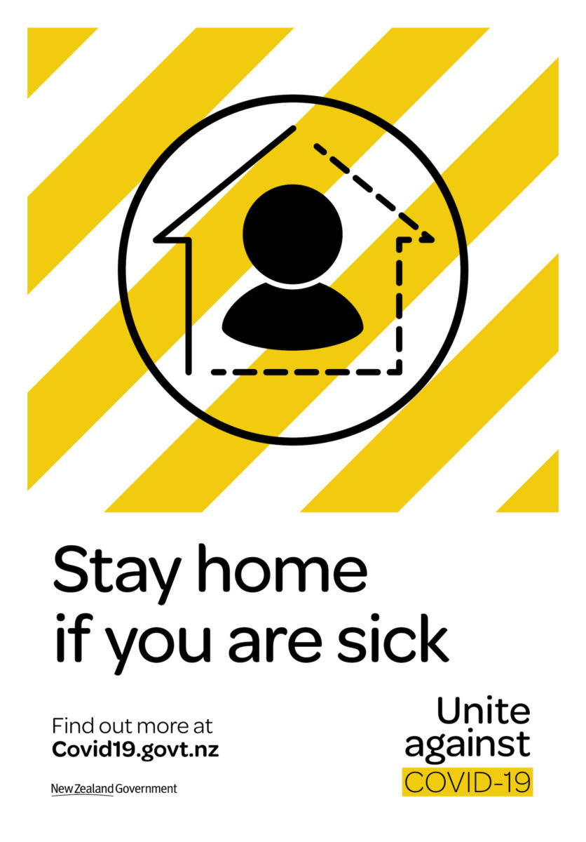
“A human tone of voice is incredibly important for helping to dissipate fear and make dense information accessible and approachable,” Alkema explains. “Our typeface and colour palette were chosen to feel informative yet non-threatening—the distinctive yellow and white chevrons immediately stood out as authoritative yet approachable, and signalled a consistent source of truth.”

They employed a psychologist to “help anticipate the emotional journey New Zealanders would likely go on throughout the course of the pandemic”, anticipating that emotion would be a key driver of human behaviour. Alkema notes that earlier films appealed to a sense of collective patriotism, while others used humour to beat boredom and frustration, describing these as different ‘levers” that kept the information fresh and momentum going. As the pandemic stretched on, the campaign evolved into a responsive system that worked in tandem with the nation’s emotions, as well as the progress of the virus.
“A human tone of voice is incredibly important for helping to dissipate fear and make dense information accessible”
The phrase ‘Unite Against Covid-19’ was key. “We explored many articulations in the beginning, but kept circling back to the need to galvanise our people and country behind a common cause,” Alkema says, adding that this centred people and gave clarity and focus at a time of confusion and misinformation. “With so many different asks—stay home, sneeze into your elbow—our simple rally to unite gave even the smallest actions bigger purpose.” This translated into the visual language through iconography: instead of the virus itself, the campaign favoured more human icons, such as representations of people at home.
Finally, Alkema praises the “strong, decisive and effective” leadership of the New Zealand Government and their “Go hard and go early” ethos. “This single-mindedness enabled us to create an overarching strategy, with the communications able to be simple and straightforward,” she says. “The government’s surety inspired trust and willingness to comply from the population.” This multifaceted approach proves that for graphic design to be effective, it has to be paired with stringent government policy.
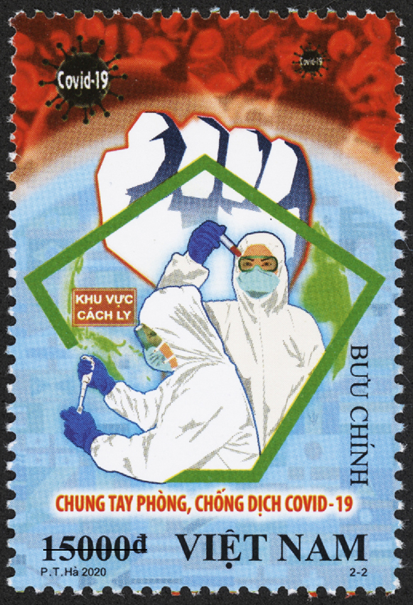
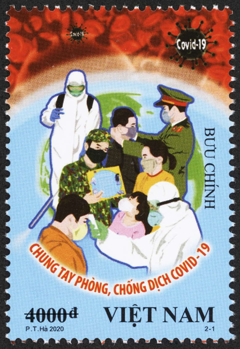
Another approach to humanising pandemic messaging came from the Vietnamese government, who called on the nation’s artists to galvanise the population. They commissioned the artist Pham Trung Ha to create a set of stamps that sent “clear messages of solidarity in the fight against Covid-19.” Two images were created: one depicted healthcare workers getting tested against the backdrop of a raised fist, a dramatic composition echoed by many of the posters created by artists across the country including Le Duc Hiep and Luu Yen The.
While this artistic response is a far cry from the sleek vector illustrations of the New Zealand campaign, both wield visuals that are familiar to their country in order to instil a sense of safety and unity in the population. Context is everything: what works in one country may not in another, and understanding a nation’s culture is key to creating a persuasive and informative campaign. In the cases of both Vietnam and New Zealand, their governments demonstrably understood the vital role that visual culture can play in shaping public behaviour.
It is important to remember that graphic design does not exist in a vacuum. Rather than evaluate the success of an individual campaign, we must assess its effect in relation to purpose, audience and its commissioners. The New Zealand response was paired with effective government leadership, and the country has suffered fewer than 30 deaths due to the virus. It’s a similar story in Vietnam. The UK, however, recently surpassed 126,000 deaths related to complications from Covid-19. It is a statistic that must call the strategy behind the campaign into question.
“It is important to remember that graphic design does not exist in a vacuum”
While the phrase “Stay Home. Save Lives” appears to have penetrated the collective consciousness of the British public, the term subtly heaps responsibility onto the individual. This is the difficulty with all public health campaigns: they can be used to build trust and solidarity within a population, but they can equally act as a smokescreen for ineffective action by a government. Many commentators have highlighted the failings of the British government’s response, from not providing adequate PPE for hospital staff to introducing widespread testing too late. Their public health campaign could be seen as being less about protecting the nation, and more about shifting responsibility away from government and onto the public’s shoulders.
Public information warnings are important, but their effect dissipates if not backed up by concrete political policy and action. Beyond the graphics and the visuals, an holistic evaluation is needed: of government leadership, of strategy, and of humanity.
