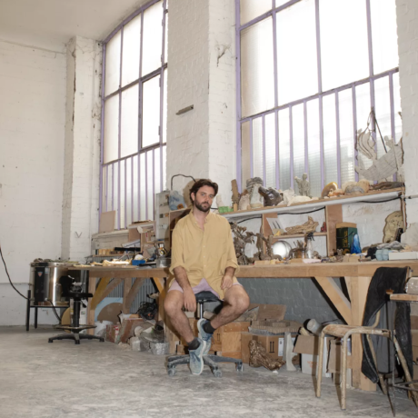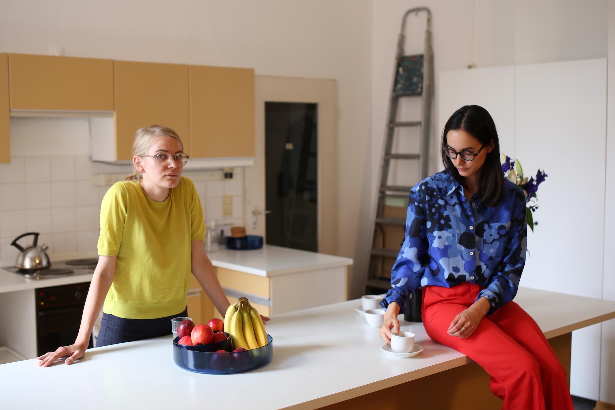
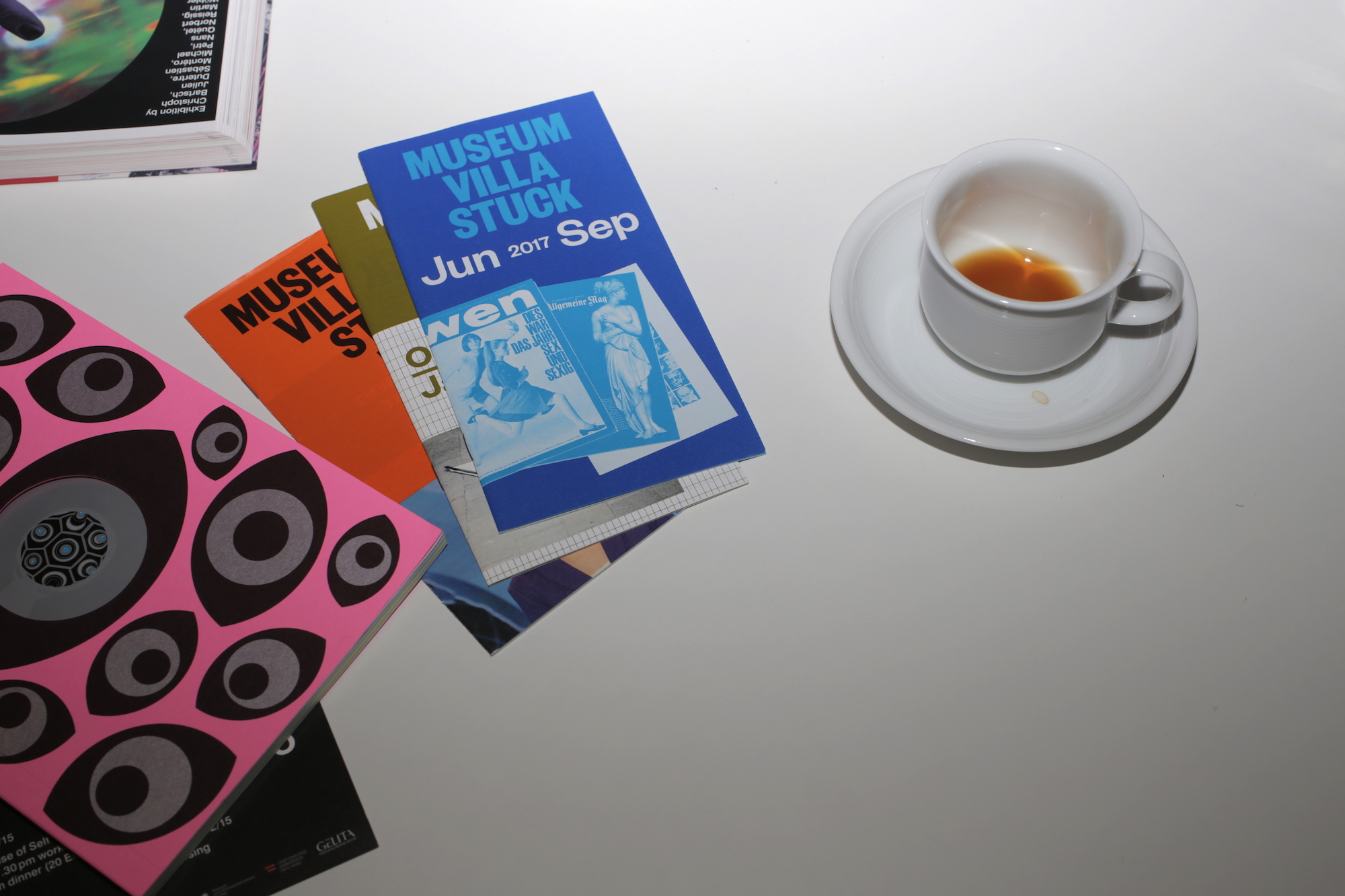
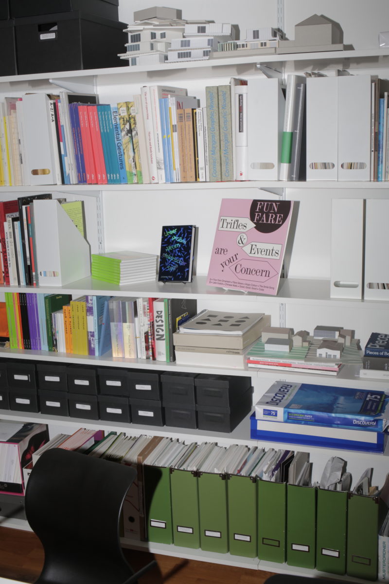
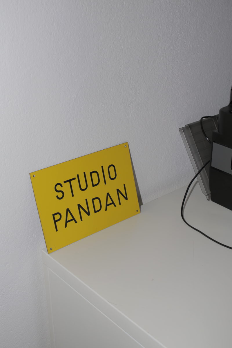
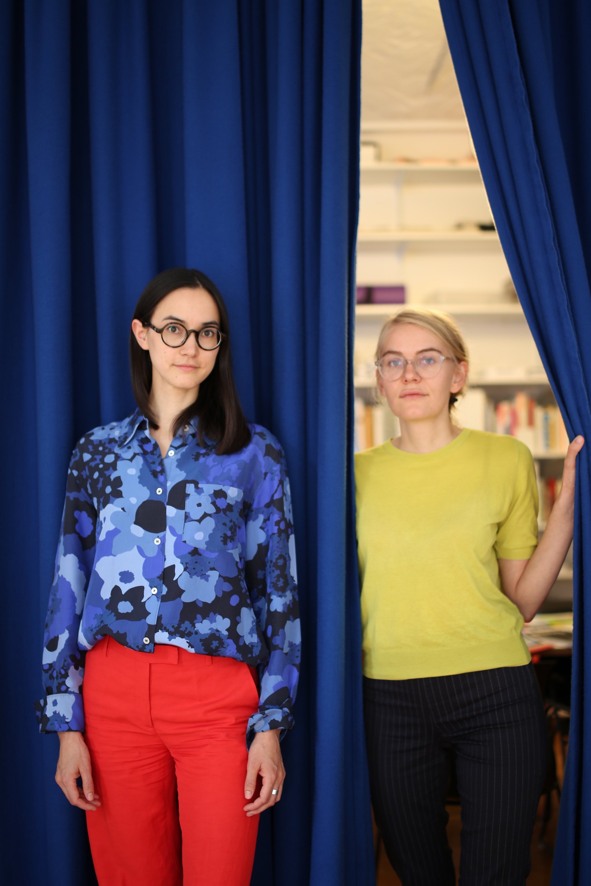
It’s a sunny afternoon in Kreuzberg, where I find myself climbing the stairs to the brightly-lit studio of Pia Christmann and Ann Richter of Studio Pandan, a young Berlin-based design duo established four years ago. The pair met while studying graphic design at Leipzig’s Hochschule für Grafik und Buchkunst, a school with a strong reputation for printed matter. It is a tradition that Christmann and Richter have upheld, with a slew of books, magazines, exhibition catalogues and other publications under their belt—often created in close collaboration with the artists involved.
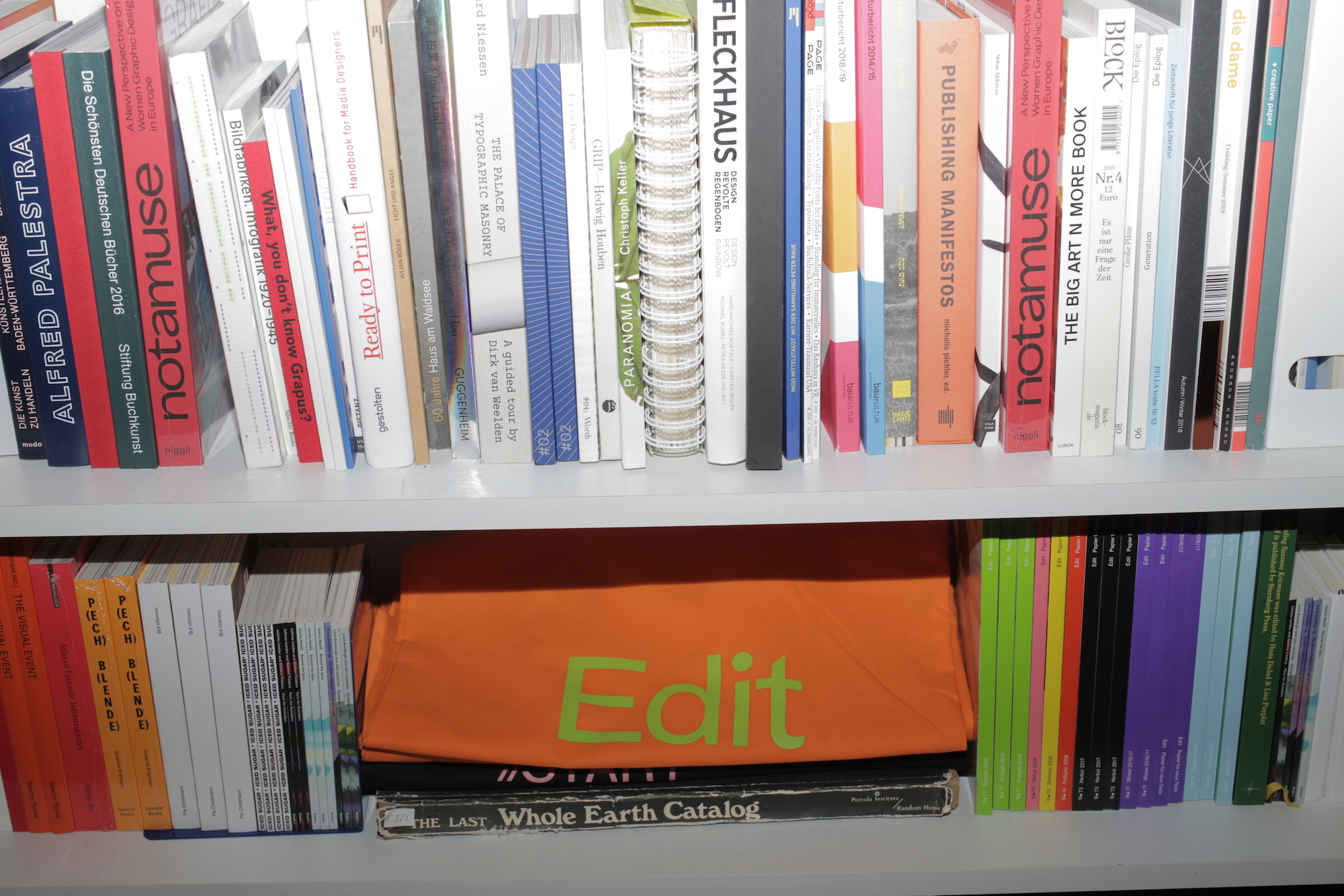
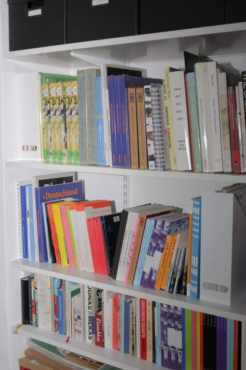
Since graduating, they have worked with everyone from Sternberg Press to Eye on Design and Edit magazine. With a strong eye for unusual, striking typography and a commitment to heavily researched, conceptual projects, they are increasingly in-demand. In a field that remains dominated by men, Christmann and Richter hope to see more female role models emerge for other young designers in the industry. Studio Pandan prove the importance of doing things differently, approaching each project as a curator might treat an exhibition, and bringing together a range of media in their intuitive, forward-looking design.
 How did you meet and then start to collaborate together to create the studio?
(P) We met during our studies in Leipzig in 2011, and we became friends. We started off doing one project together.
(A) It was a competition at the school to do the design for a whole exhibition at Bundeskunsthalle Bonn—the catalogue, the website, the invitation, the poster. Our group (us and Lysanne Bellemare, Daniel Wittner) won the competition. And, while collaborating on this project, we realised how well we work together.
(P) And we both already knew that we wanted to be self-employed long term, we wanted a kind of independence.
(A) Art schools push you into the direction of working self-employed. This desire doesn’t come as a surprise and the artistic education supports you in order to develop your own “aesthetic voice”. Besides that I think it’s helpful to get experience working for and with others to learn from them and gain knowledge outside of the university. I did a couple of internships and worked for different studios, including Project Projects in New York and Graphic Thought Facility in London, which was a great experience, I really loved them. But we knew that in the long-run, it wasn’t what we wanted to do, and we always wanted to be self-employed.
(P) We started Studio Pandan straight after my graduation; while I had done some internships, I didn’t have a huge amount of experience regarding team-work and office-structure, because I mostly worked by myself before, so it felt like such an advantage that Ann brought this broader experience with her.
How would you define the look and feel of Studio Pandan, and how did you find a style and aesthetic that appealed to both of you?
(A) In the first year, we worked very closely together, with both of us getting involved in every project. In this period, we defined our own style, but never discussed explicitly how we wanted it to turn out; it was more merging our approaches and aesthetics. I think one thing, which we had in common from the beginning, was a very strong focus on typography as a visual element: using it as a characteristic and defining atmospheres with it. Pia is a very bold illustrator of graphic language, and very intuitive. I’m more maybe the systematic conceptual designer. But then when it comes to Studio Pandan, you see both elements come together.
“The research phase is very important to us. A lot of our projects are very conceptual”
What was the appeal of Leipzig, as a school and a city, for you? And how did they influence you?
(P) I was at Leipzig from the beginning, when I started by studying classical philology. I knew I liked the city; I started out there and then discovered how much I liked the school, so I just stayed there! It’s in East Germany; there was a lot of empty space to fill with new ideas. The spirit of the city is very liberal, it’s still alternative, with a really open mind. A lot of non-established, new things are possible.
(A) It was the perfect student city, it’s cheap and open-minded. You can do anything. I started out at art school in Stuttgart, but I got tired of always being with the same teachers. I went there for a university graphic design exhibition, and it was very conceptual, the teacher [Oliver Klimpel] was young and enthusiastic. However, once we’d graduated, we felt it was too small a city. I loved it as a student, but I was looking for next steps. So, just after a stop in London and starting Studio Pandan, we decided to move it to Berlin.
From early on, you’ve been working with artists. How did that come about, and how did it come to be a large part of your work?
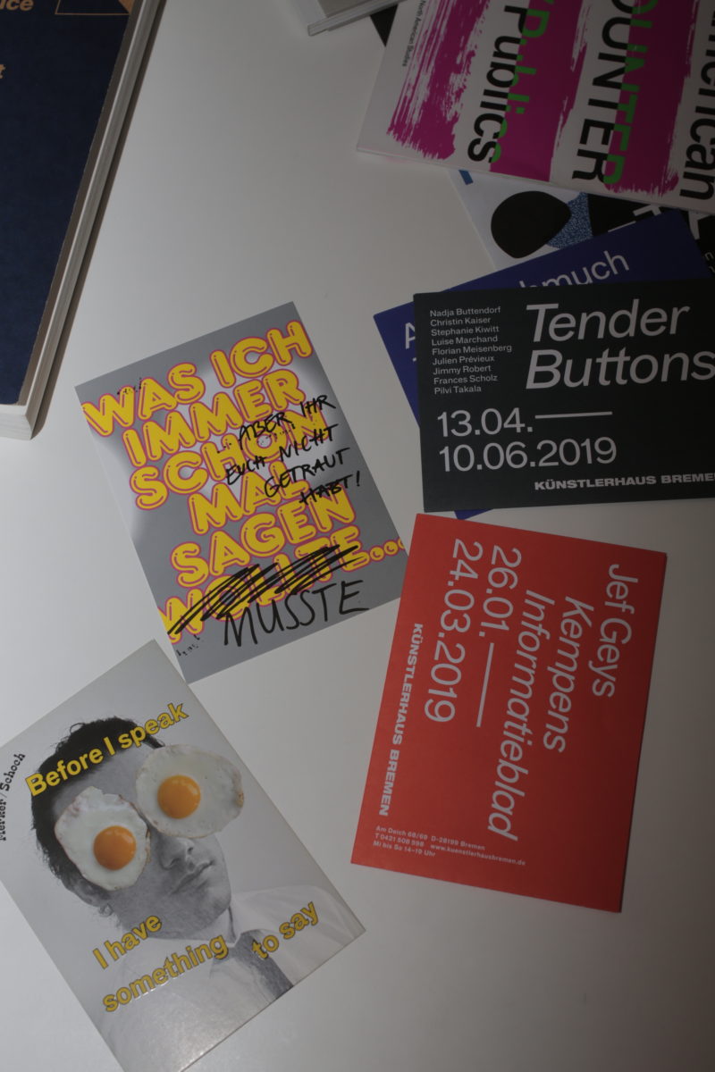
(A) Our design education was in art school, so we were collaborating with artists from the beginning, and then our first job was the design for the exhibition in W139, of Leipzig based artists in Amsterdam. And when we work with artists, it’s always a very close collaboration. For the group show here, we discussed the concepts with them, had their input in making the visuals, travelled with them to the show and put everything together as a team.
(P) A very early work of ours is the book Publishing as Artistic Practice, which is an anthology consisting of texts from artists, scientists and curators. It was super interesting for us, as it’s also a topic that touches the sphere of graphic design; it’s about the way that publishing itself can interact with and be art. For every text we designed the individual title page, which reflects one aspect of it. It was an intense project because we weren’t only designing the book, but also creating a visual contribution for it. That’s why a big part was also the research behind it.
What’s your typical process of designing, from receiving a project and conceptualizing it to the final product?
(A) The research phase is very important to us. A lot of our projects are very conceptual, and we like to start with a long discussion with the clients, and then develop and identify the most important parts we want to highlight in the visual communication. At this point we also start thinking about who we want to get in to collaborate, and it’s a very exciting part of the work.
“We look for artists who fit the mood, and then curate the visual feel of the magazine. It’s like curating a group art show”
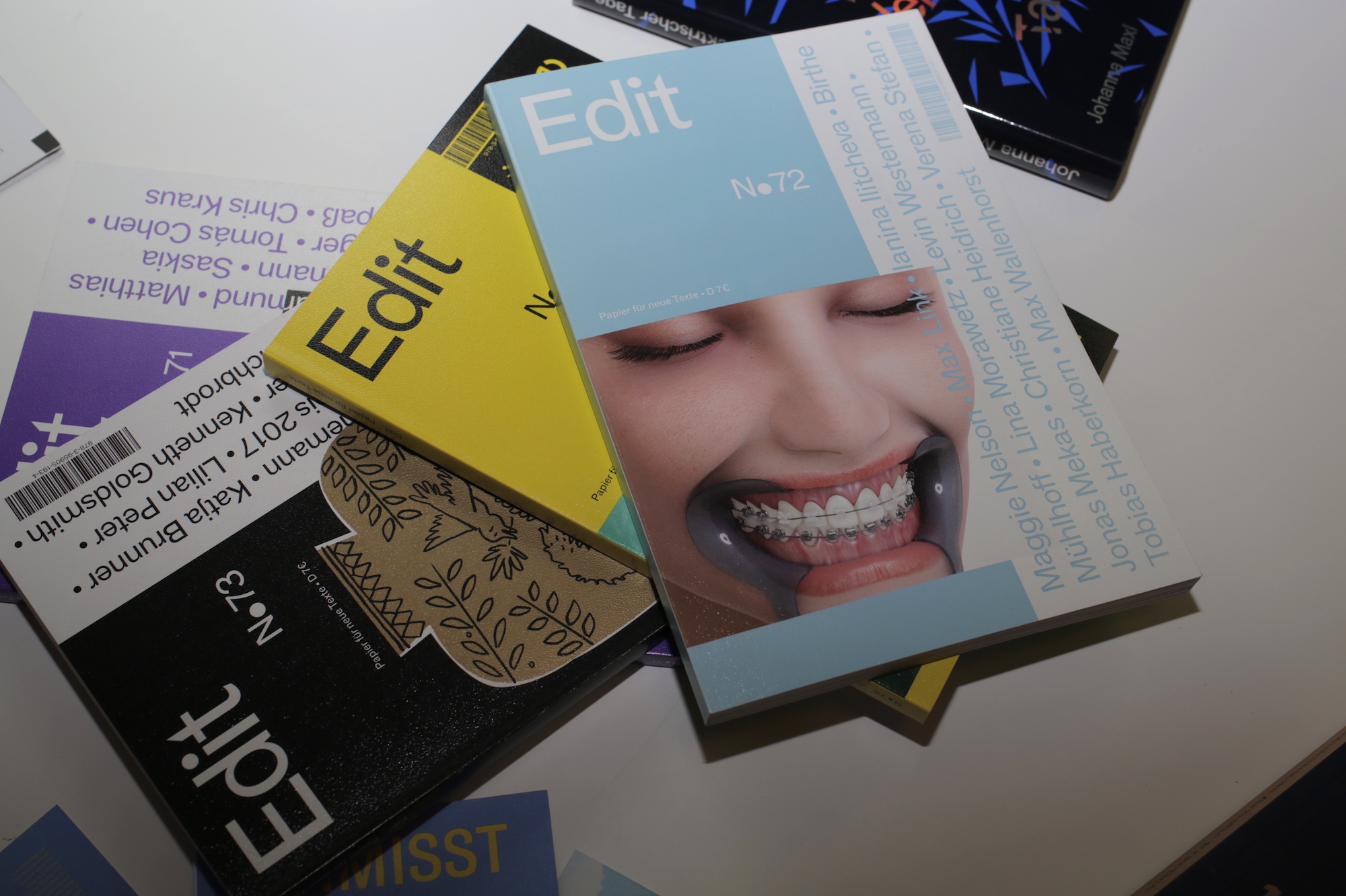
What has been your experience of working on Edit magazine?
(A) Pia has been working on Edit magazine for five years, but we’ve been doing it together for two-and-a-half years, starting out with a redesign. We recently oversaw another redesign, with a new editor-in-chief, which was revealed in October. So exciting!
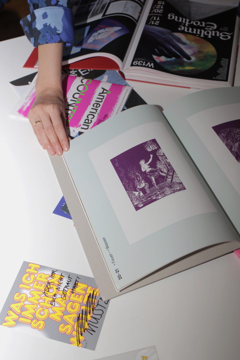
(P) For the new redesign, we are going more in a classical direction—more elegant and bookish. It’s great working with Edit magazine. Each issue revolves around a kind of mood rather than a topic. And then we look for artists who fit the mood, and then curate the visual feel of the magazine. It’s like curating a group art show. The images don’t match the text directly, it’s more about making and contributing to a particular mood or atmosphere.
(A) The images are kind of like a second story going throughout the magazine. And they have overlaps with the content of the text. But we don’t see them as illustrations, because they have their very own story. In the current Edit, we often have some funny elements, whereas the overall the tone of the new design is more serious, what will be reflected in the typography. Edit is about unpublished new German literature, and very often these are young authors, so it’s important to have a fresh and contemporary look. That’s why we wanted to push the design a little bit further, the cover will be more colourful, and there will be some deliberate clashes between the inside and the outside.
What are the benefits and challenges of working with artists and creative people?
(A) I think what’s really good is that you’re very equal on the aesthetic and visual level, which creates a good collaboration and very fruitful discussions. Because both sides are bringing in creative ideas, and thoughts for the visual translations, you can achieve something really new and surprise even yourself. My favourite kind of project is one where you have to consider different medias and how to bring them all together; it’s like creating a language that can translate across. On the other hand, a downside is that sometimes you have to reign in your own creative expressions, because otherwise it would be too much. It’s about finding a balance: neither of you wants to overshadow the other.
Tell me about your recent project with AIGA’s Eye on Design magazine.
(A) The magazine came out at the end of the summer, and the topic is distraction. It was a very fun project because we really could go wild and bold with our visual style. This magazine really embraces it when you come up with design ideas that are a bit louder than usual, and this felt especially important for the topic of distraction. We decided to use a silver colour throughout, reminiscent of technology and gadgets, because the technological side of distraction is highlighted so often. The colour is interwoven, sometimes rather subtly, and then sometimes very clearly solid for structural graphic elements. We discussed how to bring the Internet into the magazine, and we integrated these made-up pop-up ads. Advertising is deliberately distracting, so we layered the “pop-up windows” to overlap with the other content.
In Germany, there are not that many studios that are run by women. How do you feel about this as an all-female studio?
(A) It’s a big topic. I had always only worked for men and all my teachers were men; I even had one teacher who would use terms like “girly design.” It’s really strange because all your idols end up being only male back then. I think one of the problems is that women subconsciously don’t see themselves in these positions because they don’t have these role models. That was also one reason to start our own studio; we were feeling, “This must change!” Women have to start being visible, so it becomes more equal and feels more natural. It felt like there was so much to fight for. I think it’s an important topic, and it’s good to be highlighted. But we’re optimistic.
(P) I think there is definitely now a positive shift. There are more studios opening which are founded by women. It’s really a topic that is moving forward and getting greater attention. With more initiatives and new books like Not a Muse, which features lots of female European graphic designers, there’s no excuse for all the men who say things like, “There are only men talking at our conference because we didn’t know about the women.”
“I had always only worked for men and all my teachers were men; I even had one teacher who would use terms like ‘girly design'”
What would your advice be for people studying or wanting to get into graphic design? What do you wish that you’d known when you were younger and starting out?
(A) I think it’s important to get also real-life experience beside studying. It’s only through being active and proactive that you can find your own way. There are so many paths in graphic design.
Where do you typically find your references and your inspiration?
(A) Art is very inspiring for me. I prefer to look at other fields for inspiration, rather than graphic design itself, because otherwise it’s too close and too derivative. That can be dangerous sometimes. I’m also inspired by travelling to other countries and seeing their visual culture. Once, whilst snorkelling in the Philippines, I was amazed by their corals and underwater colour palette and thought, “I love that, I want to create something beautiful like that! I just need a sea project now…”
(P) I think it’s great that in graphic design you can find inspiration everywhere. Every new place is somehow super inspiring, unfamiliar. In Poland, for example, it was the post-communist colours, a lot of brown, green, purple. Brown is very undervalued, actually, there are so many great brown shades. It was my mother’s favourite colour back in the nineties.
What would be a dream project for you?
(P) I would love to explore AI tools and to reflect about how we will collaborate with artificial intelligence in the future. There will be a shift in how we work and think especially in the fields of graphic design. To use and shape all the data out there seems promising.
(A) That’s always a difficult question. I don’t have only one dream. Right now we’re very busy with applied graphic design jobs, that’s why I would pick a free project as a current dream project—maximum freedom and lots of funding for it. On the side I’m also working together with the curator and writer Agnieszka Roguski as “A.R. Practice” on curatorial projects. We’re about to finish a publication called Subjective Sceneries, it’s dealing with the digital installation view. Pia and I discuss from time to time the idea of doing a residency in a foreign country to focus for a while on a design research project. Let’s see how we can combine this with the everyday studio life.
All images © Louise Benson