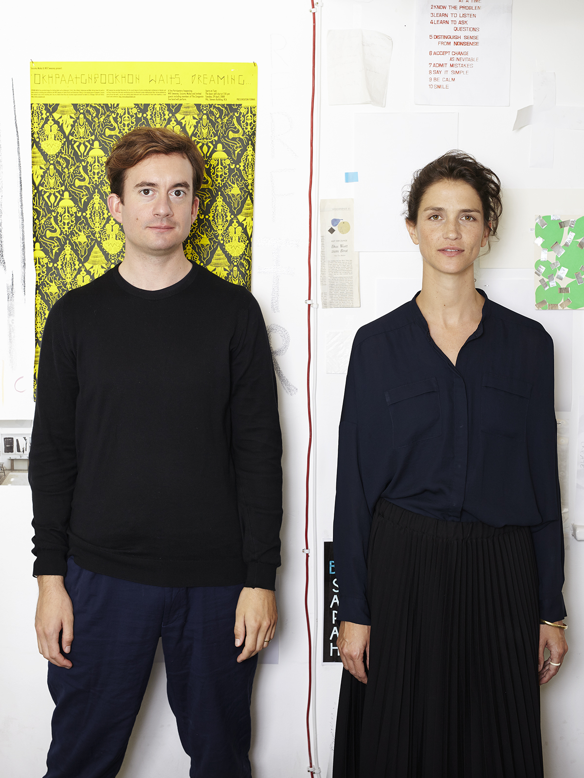
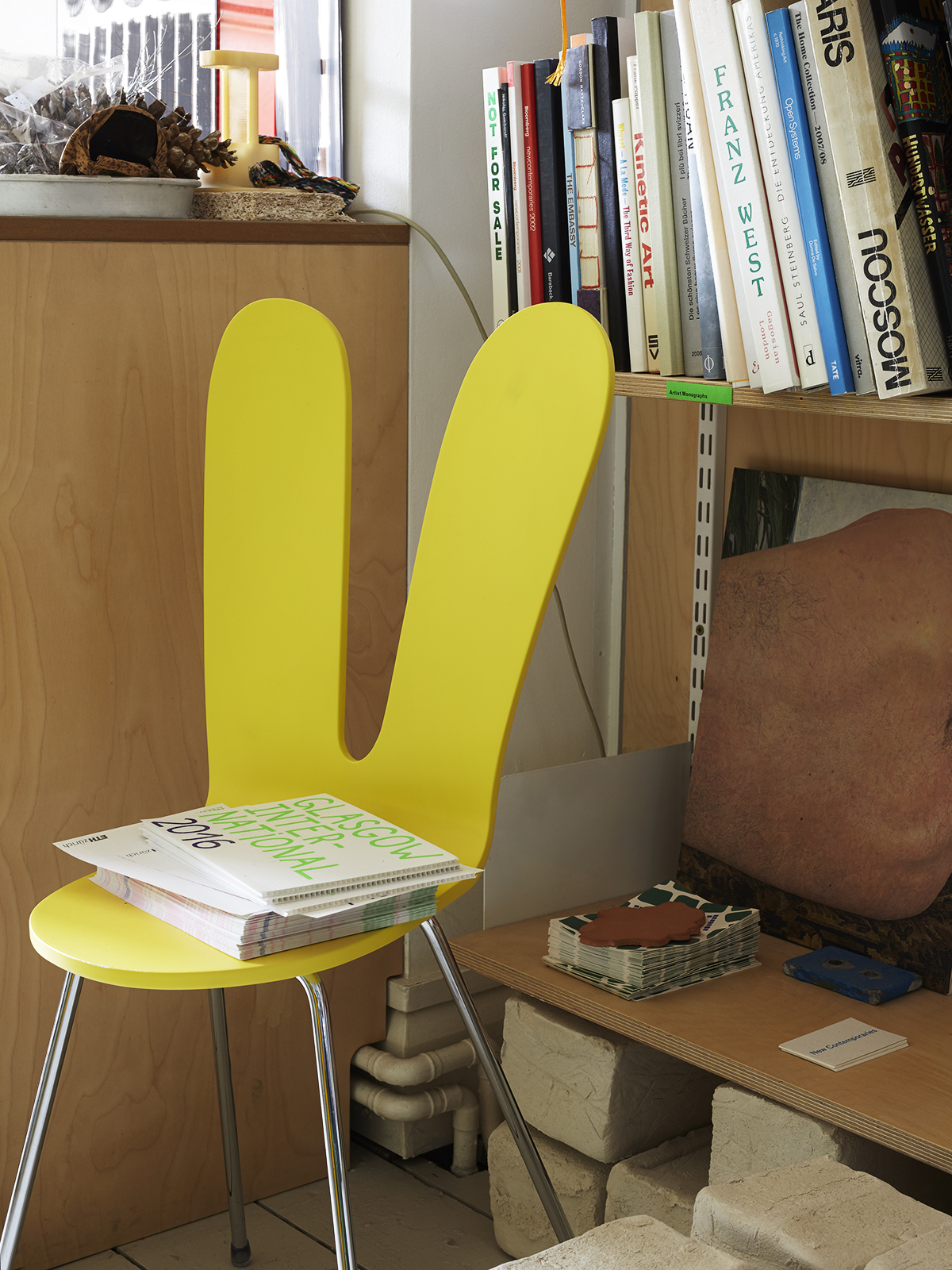
 Since founding their studio in 2009, Eva Kellenberger and Sebastian White have designed spaces for cultural institutions such as the V&A and the Barbican as well as publications for galleries like Hauser & Wirth and White Cube. Their studio sits at the very top of an East London backstreet building: a sunlit pitch-roofed nest lined with shelves of art books and crammed with unidentifiable objects and remnants of past projects (rocks, clay, is that expanding foam?). I am almost out of breath by the time I reach their front door, but upon arrival, my energy is restored as the pair are brimming with stories and design references they want to share.
You’ve worked on lots of art books and even exhibitions, but Elephant is the first magazine you’ve worked on. How did you approach it?
EK: It was actually quite a big jump. We approached it a bit like doing multiple books, but with the same ingredients: using clean modern typography and traditional font sizes, very little of the normal magazine language, but within each section making little changes.
How did you come up with the Elephant logo?
SW: When we start projects, we get given information and we do a lot of talking. Sometimes drawing or painting happens, but this time we went to the zoo. We were drawing the elephants, photographing them, seeing how they move, looking at the differences between Asian and African elephants, the characteristics of their bodies and how they play. I actually remember saying to Robert [Shore, the magazine’s editor], “We’re gonna visit a zoo and look at some elephants”, and someone in the meeting said something a bit dismissive, but I think Robert just smiled a bit, like “Let’s see how that goes…”
EK: They use their trunks as a playful tool: there was a baby elephant who was just throwing leaves over his head.
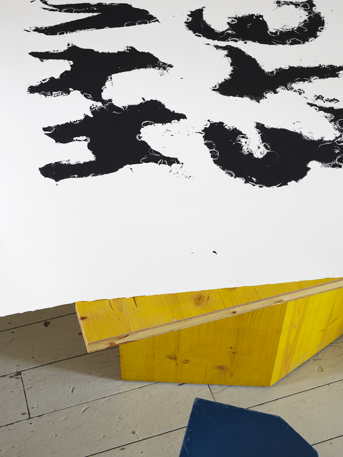
SW: There’s that mnemonic, “Naughty Elephants Squirt Water”, to remember the compass directions. Straight after that trip we went to a building site and sprayed water all over this grey paper to make big letters, one per sheet. That was fun, but a bit tricky to get a letter out of. So we had the idea to take our play from the building site to a screen print workshop, Coriander Studios, by using a hose to blast filler out of a silk screen.
“Sometimes drawing or painting happens, but this time we went to the zoo.”
EK: This was a new experiment for Coriander Studios as well, because this is how you clean a screen, not how you prepare it.
SW: When you’re spraying, there’s water going everywhere, and you think you’re dissolving the screen and it’s flooding out, and then when it dries and you pull the ink through, you do get a sharp image. The letters are made through the rhythm of the water and how you’re moving the hose.
SW: Next to us they were printing Christian Marclays, Peter Blakes, Damien Hirsts…
EK: And we were just spraying water around! Bruce McLean was there, and he was very much into what we were doing.
The first time I came to your studio I was amazed by the sheer amount of books you have. Would you say you have any particular design influences? Anyone up on those shelves you really love?
EK: We have a whole shelf for Bruno Munari, an Italian artist and kind of multi-disciplinary genius. He’s influenced a lot of our working methods. Lots of children’s books, books of useless machines, kind of Dada-influenced. His writing is very playful, you can tell when you’re reading it that he’s Italian!
SW: There’s also a Swedish designer we like called John Melin whose work is about making artefacts with graphic design, for example a poster with plant seeds in it which bloomed when the exhibition opened and died when it closed.
EK: He did a series of really great art books for the Moderna Museet. He used a metal cover for one of them, things you can’t even imagine now. If you go to the Tate it’s a Tate Book and everything looks the same, but these were so characterful and energetic, and really responded to each show.
SW: There’s another shelf of things from when we’ve gone on holiday, or trips, where we’ve found some secondhand bookshop. So we’ve got quite a large collection of graphics from Poland, Switzerland, Italy, Holland. The designers aren’t that obvious, sometimes they’re not named, but they’re full of different types of printing methods, or typography from before computers existed.
EW: We started collecting these books when we studied together, ten years ago.
You both studied in London, but then you’re also inspired by all those designers who come from all these different countries…
SW: We don’t have typical backgrounds, though.
EK: Although I did graphic design at Camberwell, I came from a much more illustrative background. Seb was at Saint Martins doing textiles, then at that time there was still a course at the RCA called Communication Art & Design that accepted people from a range of disciplines. So that was the only reason why we actually got together.
SW: Our first conversations were chatting about Bruno Munari, or architecture.
At what point did you decide to come together to work as a duo?
EK: The minute we met… no, when we were studying, we did a course with a London design practice that was very conceptual, a bit fictional, you didn’t really have to make anything. We were stuck with the first project, then we called each other and I think we were on the phone for about an hour, made the project together, had lots of fun, something about a potato with clips… We called each other over the summer break, and just firmed that up, decided to be a studio.
SW: I was on an internship, and you realize how people talk, how the founders talked and interacted and came up with ideas, and it felt similar to the way we were working, and we wanted to try and build on that.
EK: In the second year we started getting in touch with people we’d like to work with, so the second year was already in a way quite geared towards that.
SW: I’d done a dissertation about crossover practice and Eva had done something about humanism, and we were saturated with lots of things we wanted to keep studying and interact with, so we did this book called Ultra Mera Commonplace. A friend, John Morgan, came up with the idea to use “commonplace”, like a literary scrapbook where you can record things. So this book is like a little compendium of different starting points for projects.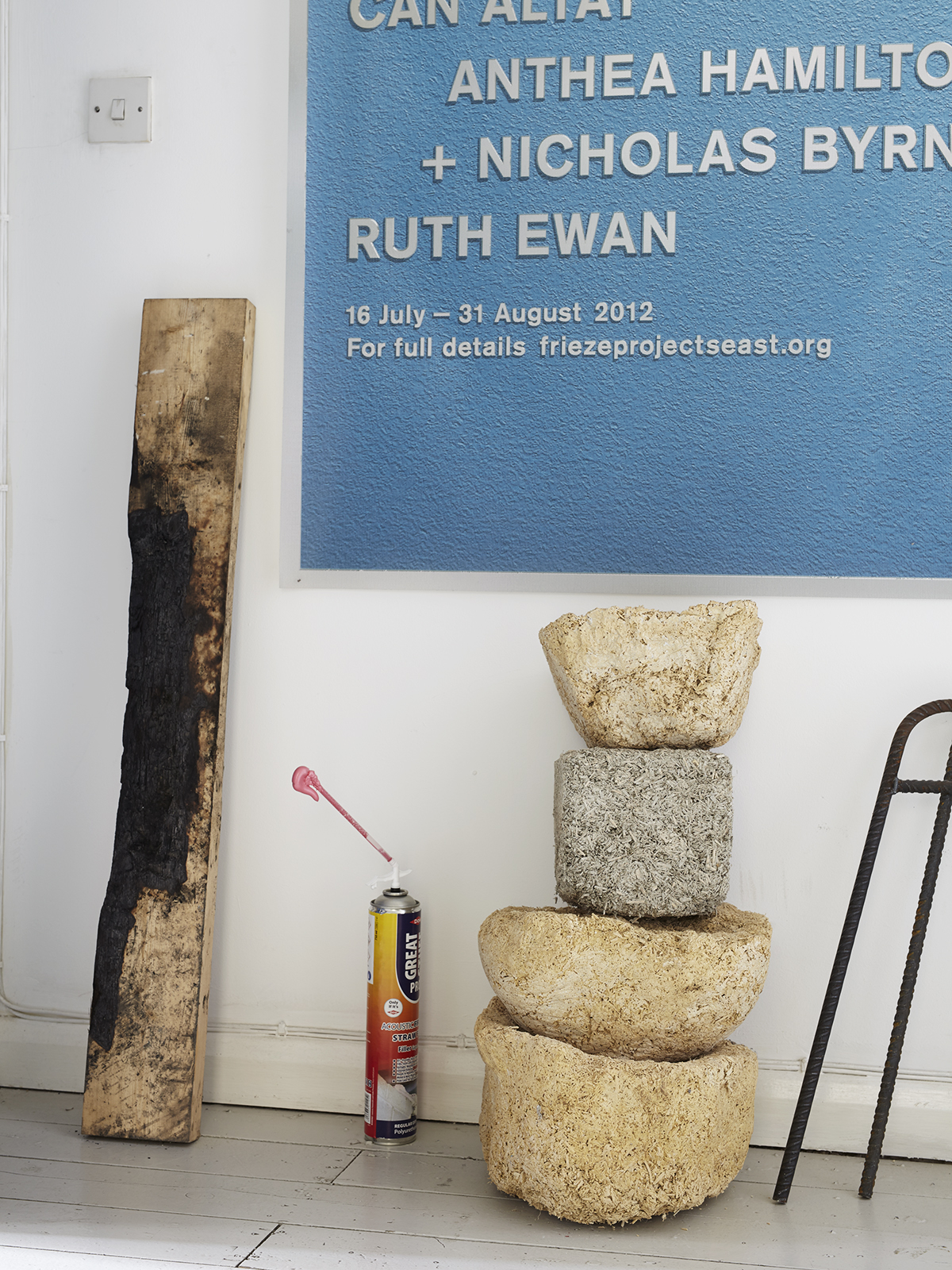
Have you ever had radically different ideas on a project, and had to work them out?
EK: No, but I remember noticing for example that you, Seb, always like larger type. In the beginning you were always saying “no, it has to be larger”, and then I start a project and suddenly I put in really large type.
SW: We influence each other, and start doing the opposite things.
EK: Seb will say “What would Eva do?” and I will say “What would Seb do?”
SW: And there are four or five of us in the studio, everyone’s involved. We’ve got a big lunch culture. We go out for lunch every day, and we talk then.
“We’ve got a big lunch culture. We go out for lunch every day, and we talk then.”
What would be a dream project?
EK: We once said an aeroplane…
SW: Well, we always try to push projects where we learn something or experiment with something. We’ve got an appetite for finding new things out.
When we graduated, the idea of doing an identity for a cultural institution was a dream project, and we’re doing those now. And we always wanted to make collaborative books, for new research or artists, and that’s something we do. We never thought we’d make typefaces and we do that. We never thought we’d make furniture and we’re doing that. We might be making a stool.
SW: We’ve got this thing about supergraphics, which are really big graphics. Like really, very big: a massive airport sign, or like all of the graphics that happen on the road.
EK: I would love to do a children’s playground, in a much more graphic way.
SW: A mural would be nice.
EK: Or a hospital! I always wanted to do a hospital.
SW: A rocket wouldn’t be bad. Or film graphics, that’d be nice. And a cookbook. We both do a lot of cooking.
OK, is there anything you don’t want to do?
SW: Can’t be bothered with a cigarette packet. We said it would be nice to do a logo on a rocket, don’t really want to work with a defence company.
EK: Just nothing we don’t agree with.
SW: No Conservative Party propaganda posters.
EK: Or Boxpark.
Photographs © Tim Smyth