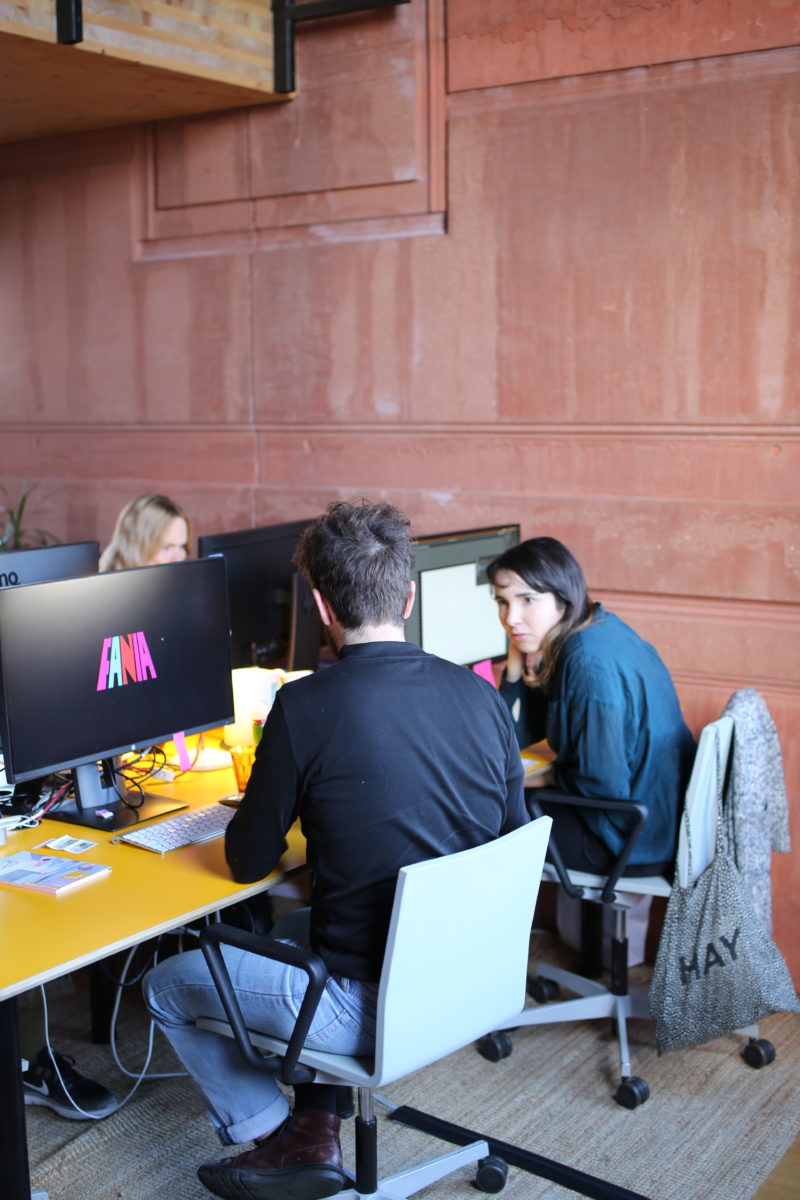
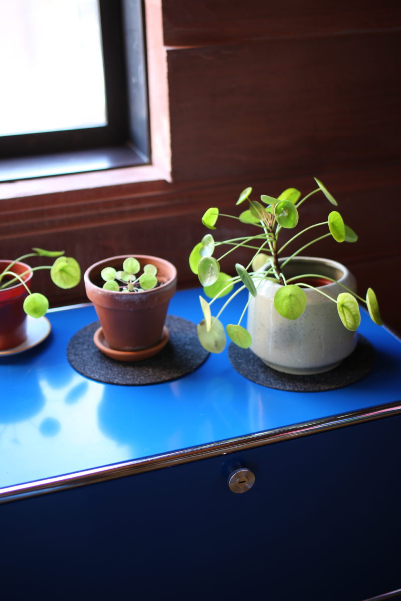
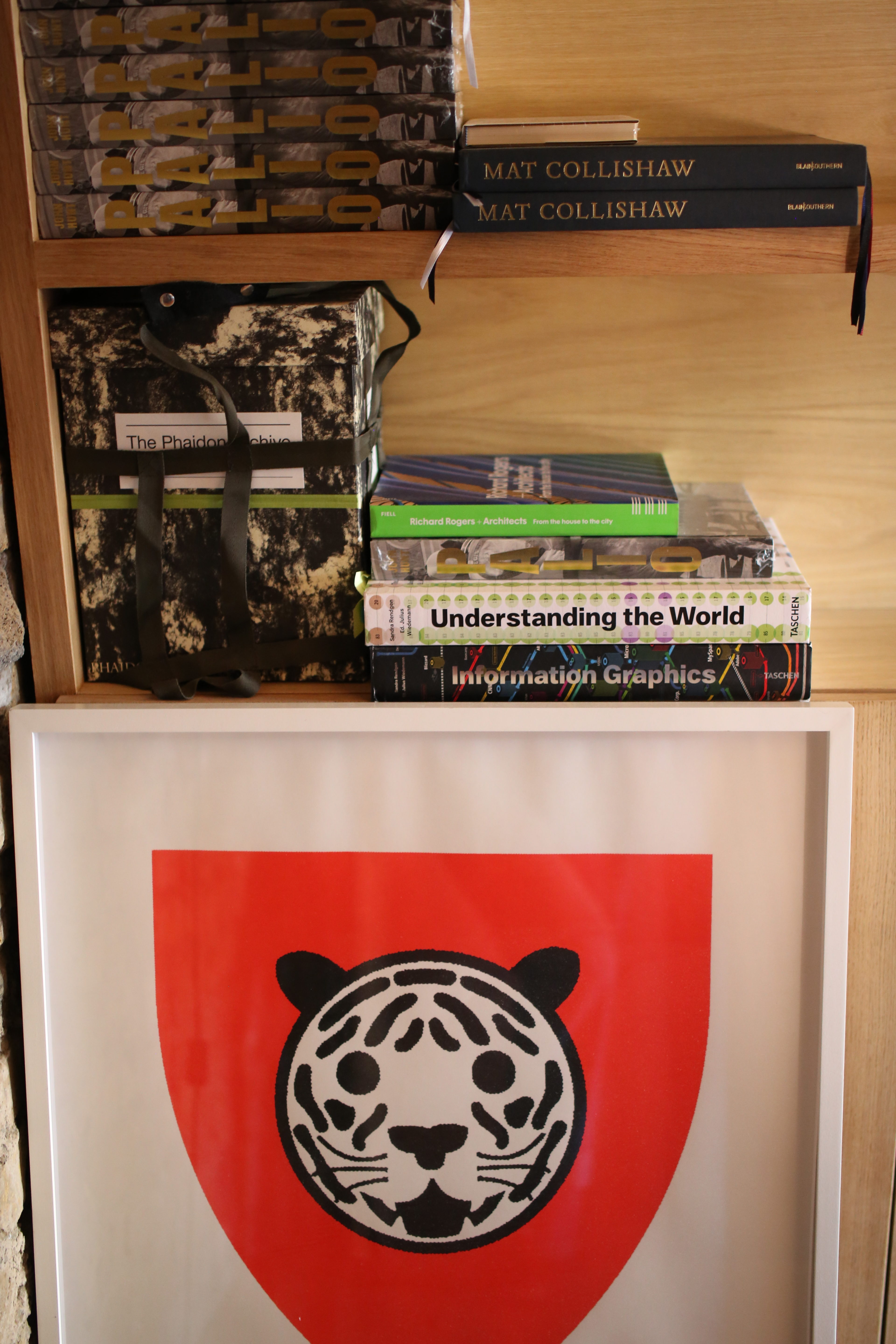
The London-based practice has a rich, vibrant and distinctive portfolio, characterized by innovative approaches to type and colour and a constant sense of pushing their craft. Part of this, perhaps, is thanks to its niche in the art world; a space that the studio clearly not just fully understands, but adores. Louise Benson and I went to Praline’s new(ish) studio in north London—sited in a bonkers Crystal Maze-like construction designed by architect Amin Taha, where windows look like walls and doors are hidden—to meet the lovely small dachshund Aristotle, and have a chat with the studio’s founder David Tanguy.
Was it always the plan since you started out to work mostly with culture and arts clients?
That’s what interested me at the very beginning when I started Praline with a friend back in 2000. We’d just graduated from Saint Martins [in graphic design], and straight after college we started having small cultural projects coming to us. They were just through connections, someone organizing a small exhibition for instance, so those were the natural things we were being offered and the sort of work we were interested in. We started to build a portfolio of cultural projects, not knowing where that would lead.
A few years later it was just me at the studio, and I was working on record covers for the label Fantastic Plastic—lots of covers for Ikara Colt, the Futureheads and some other smaller bands—and I also did the identity for the label. After that I realized that maybe I should find a job, so I moved to New York early in 2003 to work at Base Design, but I didn’t stay long as even though it was really interesting, I didn’t really enjoy working for someone else. It was a strange time in New York; everyone was looking at London as being the inspiration. I thought, “Why am I in New York if everyone’s looking at London?”
What was the first big exhibition project you landed?
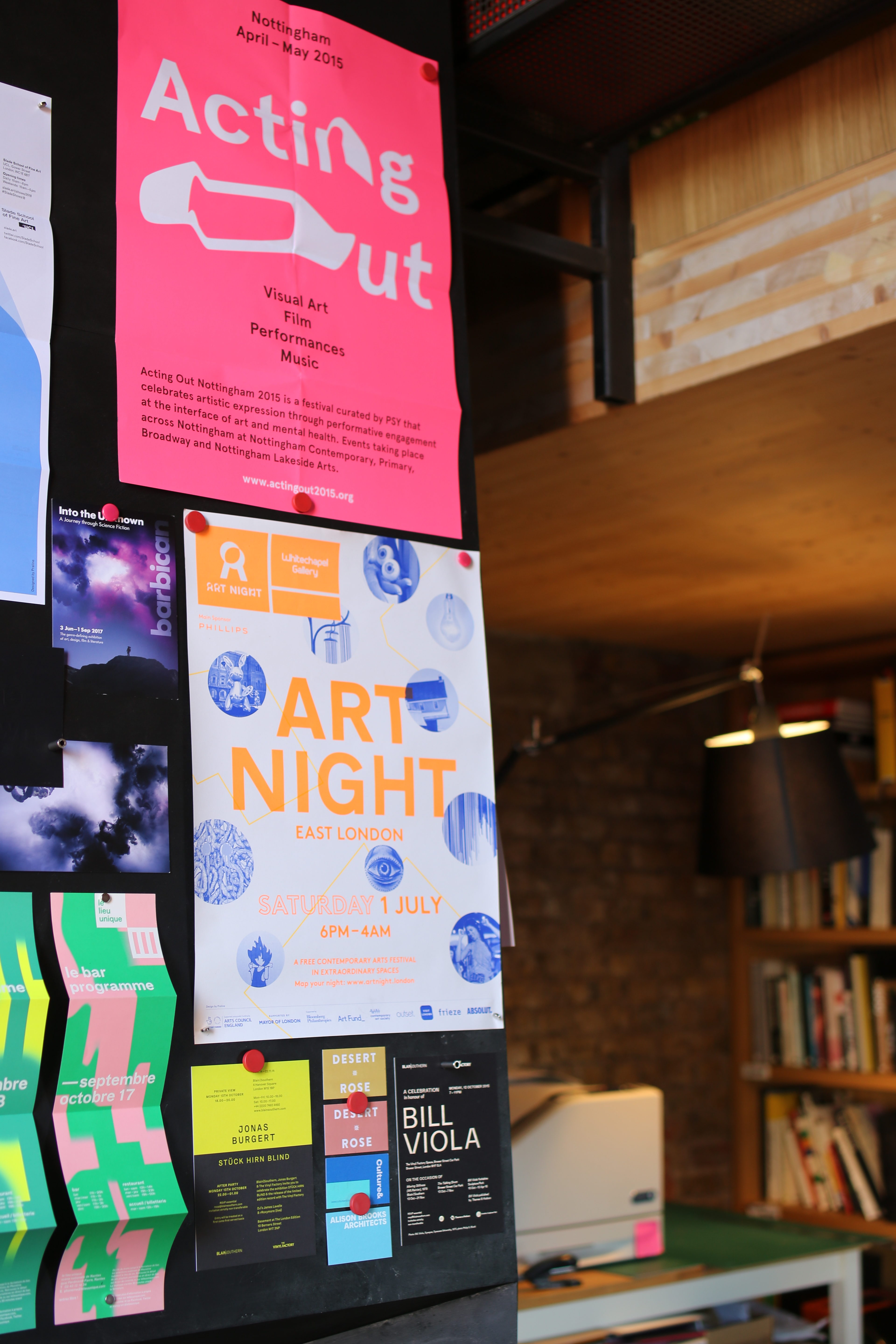
I came back with a new energy and decided to keep going, and I had some lucky encounters, as always happens: I was contacted by Ab Rogers, the son of [architect] Richard Rogers. He was looking for someone to work on a branding project and we really got on and had fun working together. Then we worked on a big retrospective exhibition about his dad in Paris in the Pompidou centre: it was the first show of that scale either of us had worked on, so it was a big learning curve. The exhibition travelled for five years on a proper world tour, and I think that made me realize I enjoy doing exhibitions. It gave me a lot of experience for that, and then Praline became known for that, so we started getting more and more of those kinds of projects. Then through the experience of doing exhibitions we also do branding, and now more and more digital, so it’s all those different things, which I find interesting.

What are the particular considerations in designing books for art or artists?
It really depends on the type of work the artist is producing. Sometimes it’s such a well-known artist—when we did a book for Peter Blake, for instance, his style is so recognizable you almost don’t need to do too much to make it shine as a book. But what you have to do is allow the story to unfold and find a good structure and narrative through it using the right materials and paper, which can convey the aesthetic or the tactility of the artist. When the artist is not so well known it needs to be a bit more packaged, so the book has to present the work in the best possible way. You show that even if you’re not familiar with it, the work’s got gravitas. Maybe when artists are more known you can push it in a more experimental direction.
Not to overshadow is key: the book is about the artist, it’s not about me or the studio. You do your research; then the design process is about creating something that has a mix of poetry and emotion, but also has to be practical so people can find out about the artist.
“Sometimes a tight budget is a blessing in disguise”
What about for exhibition graphics? Are there any major dos and don’ts?
There’s plenty. Exhibition design is all about accessibility, so you have to have typography that’s legible, and consider the sizes, the colouring, the lighting… It gets more interesting when you start to break those rules a little—not to be illegible, but to consider that it doesn’t have to just be captions and panels. Maybe the exhibition can be more of an experience—it’s more of a theatre, isn’t it? How you can get a sense of whatever the topic is about?
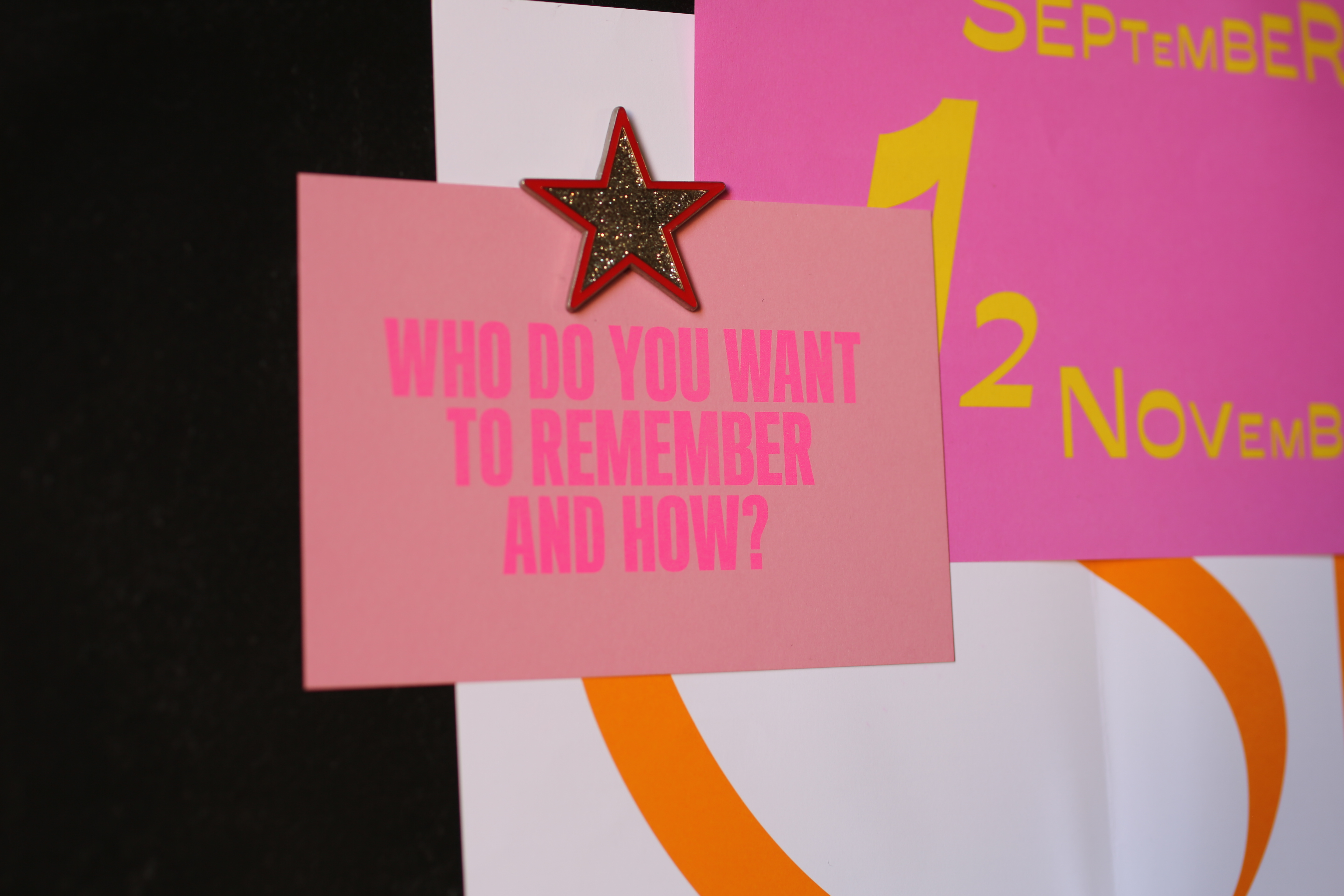
Recently we did exhibition design for Historic England, Immortalised. The budget was really low, but we could be quite expressive on the materials we were using, and go a little bit rough, so already that was conveying something interesting. As well as just considering captions, we were thinking more about how you experience it as a space. We used fly-posted graphics, a lot of pink paper… The budget was tight, but sometimes that’s a blessing in disguise because you need to find interesting ways of doing it—otherwise you just go for the fancy materials.

“Not to overshadow is key: the book is about the artist, it’s not about me or the studio”
How would you sum up your style or approach? Are there any aspects that unify your work across what’s a pretty diverse portfolio?
I think when you look at all the work we’ve done over the years there’s a common thread. I’d like to think that’s using minimum means to express something which can be quite profound: it’s not about trying to be overloaded with stuff and decoration, but it’s not about minimal for the sake of it. There’s simplicity, but trying to inject a little bit of weirdness here and there. It has to be a bit challenging sometimes, or as I say, a bit “itchy”: work that’s too polite is a bit pedestrian.
Photography by Louise Benson