Photo: Thierry Bal
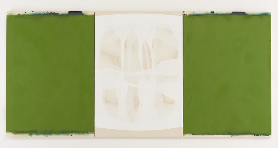
“Green is one of the most difficult colours to pull away from its natural references, to actually leave behind how it exists in the world already, to turn it into painting.” Ian McKeever’s words remind me of a conversation I was having with a friend about the colour in reference to a piece of work she was making.
The friend, Inez, had created a series of metal cutouts that featured mythical figures surrounded by shrubbery, and had the idea of activating them by shining a coloured light through the cut out spaces, but was struggling with what colour to choose. Green was suggested and suddenly that was it. She chose a strip of LEDs in an artificial, humming green—one that trys so hard to be natural, to be the plants and trees and grass in her mythical scene, but that is betrayed by its own brightness and acidity.
© Ian McKeever. All Rights Reserved, DACS/Artimage 2017
The difficulty that McKeever talks about, in pulling green away from its natural references, can be both a problem and a virtue of the colour; with the right kind of green, attempting to move away from natural associations but inevitably never quite managing it, you can tell a story of desire and failure, maybe even of man trying to recreate nature.
McKeever is one of the artists who spoke at the Art and Science of Colour event at the Royal Academy in collaboration with Winsor & Newton, bringing his talk together with (slightly less abstract) ten-minute talks from artist David Batchelor and geological scientist Dr Ruth Siddall, in a discussion around the technicalities, emotional and cultural significance of colours, or in Siddall’s case, pigments.
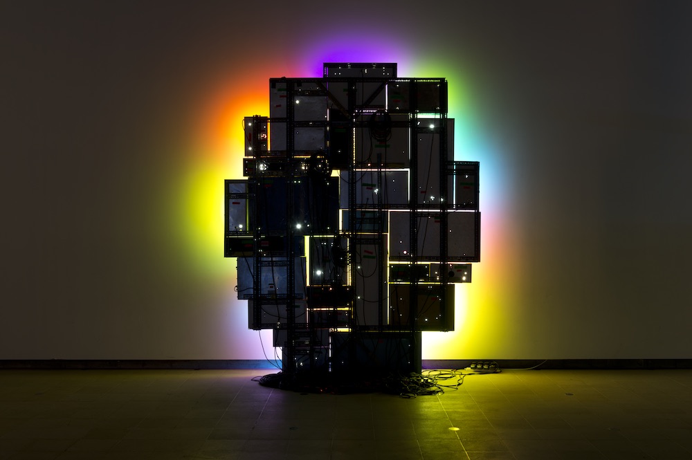
Photo: Marcus Leith
Scottish artist Batchelor is known for his acid-coloured sculptures that play with light, often much like stained glass. Though, commenting that he “spent twenty years trying to be an artist, without thinking in any way that I had to think of colour as part of the process”, he reveals that his art education had been thoroughly dismissive of colour, seeing it as “superficial, inessential and marginal” to the main event of concept. Batchelor argues that “in a great deal of western philosophical and critical writing, there is a marked resistance to and suspicion of colour, from Aristotle through to Joshua Reynolds, from architectural theory to conceptual art… and to contemporary art theory”, and in 2000 published a book on this very subject, Chromophobia.
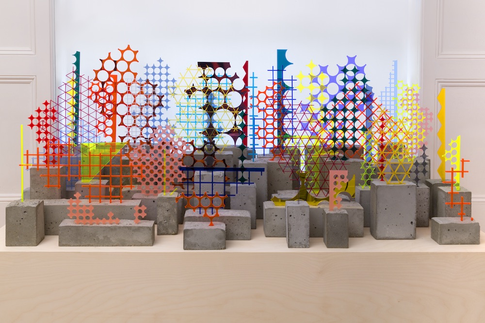
Photo: Peter White
The most stunning visuals of the evening were provided in the talk of Dr Ruth Siddall, whose work at UCL has partly involved create beautiful images of pigment particles from polarizing light microscopy, reminiscent of Gustav Metzger’s Liquid Crystal Environment at Tate Modern and that scene in Midnight Cowboy where they go to the psychedelic happening. She is the owner of a more than six-hundred-strong pigment collection that is available to the students and staff at UCL, from which they can borrow for artistic (destructive) or analytical (non-destructive) purposes.
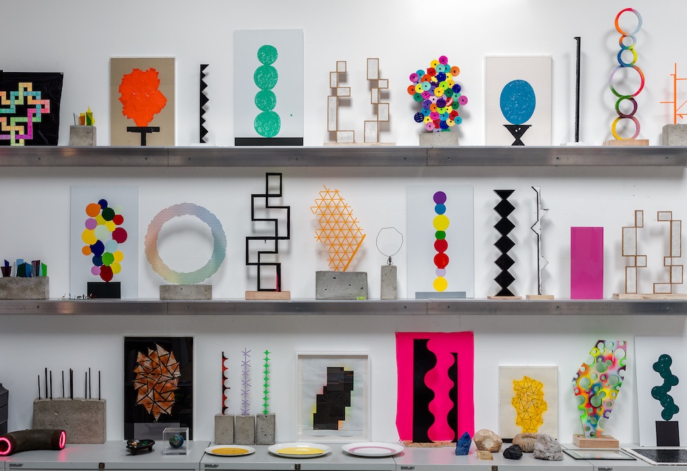
Photo: Lucy Dawkins © the artist
When the floor was opened up to questions, a woman in the audience asked McKeever and Batchelor if they ever think about the way colours are reproduced on postcards of artworks—how different they always are, and whether the artists consider these reproductions as they work. I wondered if they think about the way the colours are reproduced in people’s photographs of their work. I don’t think it’s just me who finds it difficult to make something without anticipating the image of it, imagining the Instagram post. Colours will be captured differently by a multitude of lenses and reproduced differently by a multitude of screens, and as Batchelor explained, the human eye can register about ten million different gradations of hue (“better than cats and dogs, but not a good as prawns”). The colours in one work of art, then, may be hugely proliferated by the enthusiasm of Instagram influencers.
Colour is an enormous subject for three speakers to touch on in ten minutes, and yet the event unfolded a new awareness and way of thinking about hues. Scanning images of Inez’s finished piece, I now see more than ten different incarnations of the green she finally chose, ranging from toothpaste to spring leaves.
© Ian McKeever. All Rights Reserved, DACS/Artimage 2017
Visit Winsor & Newton to view videos of the talk
winsornewton.com