When an icon becomes synonymous with an object or action, we know it is well designed. Click a button inscribed with a three-dimensional parallelogram and without thinking twice, the user knows it’s an eraser. We immediately recognise such icons and their functions because the design is flawless. Someone has painstakingly distilled these shortcuts to their core essentials, creating universal motifs that stand the test of time. In the case of Apple Macintosh’s groundbreaking symbols, that designer was Susan Kare.
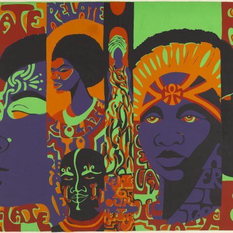
To rehash a centuries-old story, Kare’s contributions have been overlooked in design history in favour of her male contemporaries. Though we interact with the fruits of her labour pretty much every day, the New York-born designer is still little recognised within popular culture. However, a new exhibition at Lyon’s Museum of Printing and Graphic Communication is combatting this. Icons honours Kare’s pioneering digital designs, tracing the tools and techniques she coined to invent ideograms for the likes of Apple, NeXT, Microsoft, Facebook, PayPal and Pinterest.
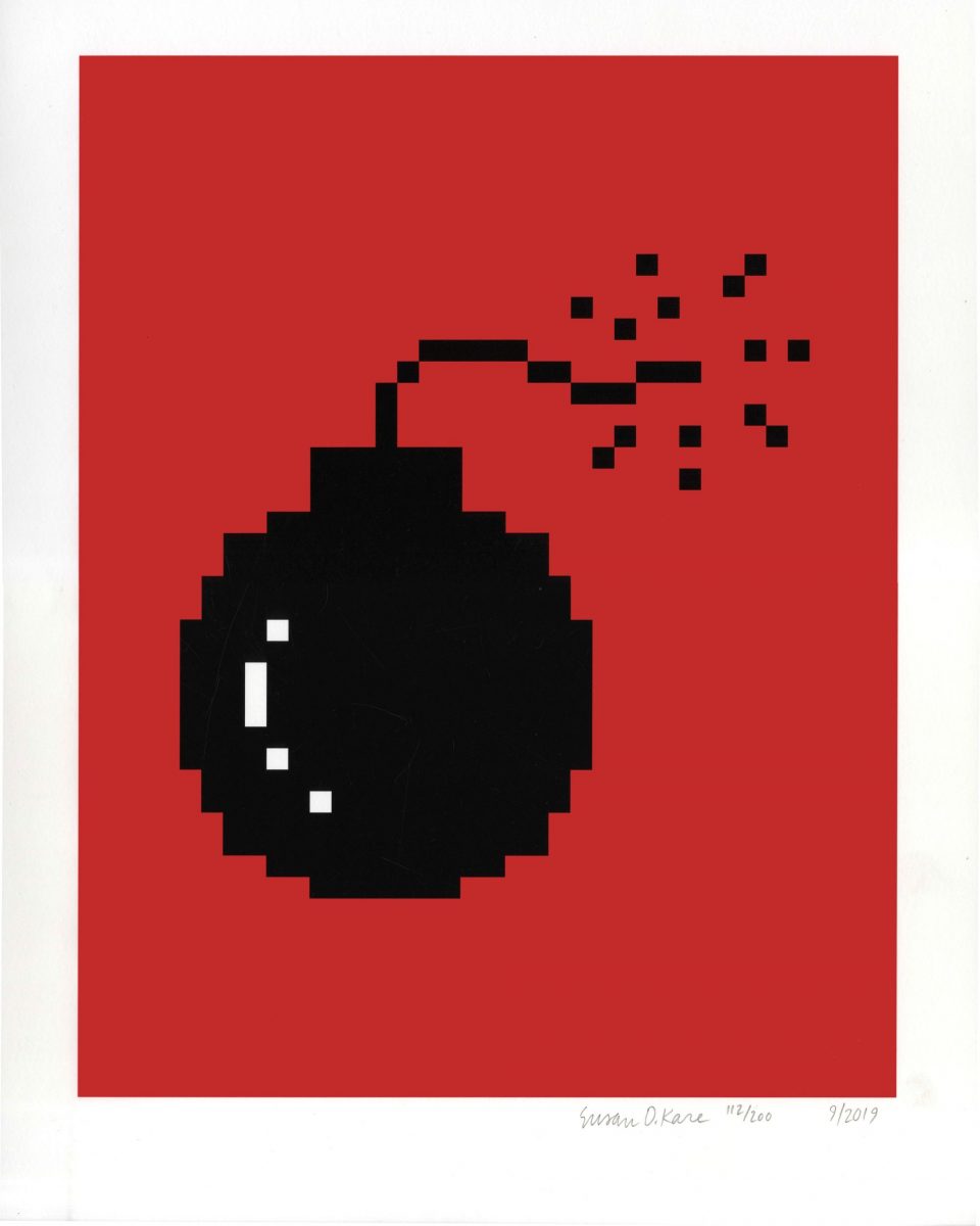
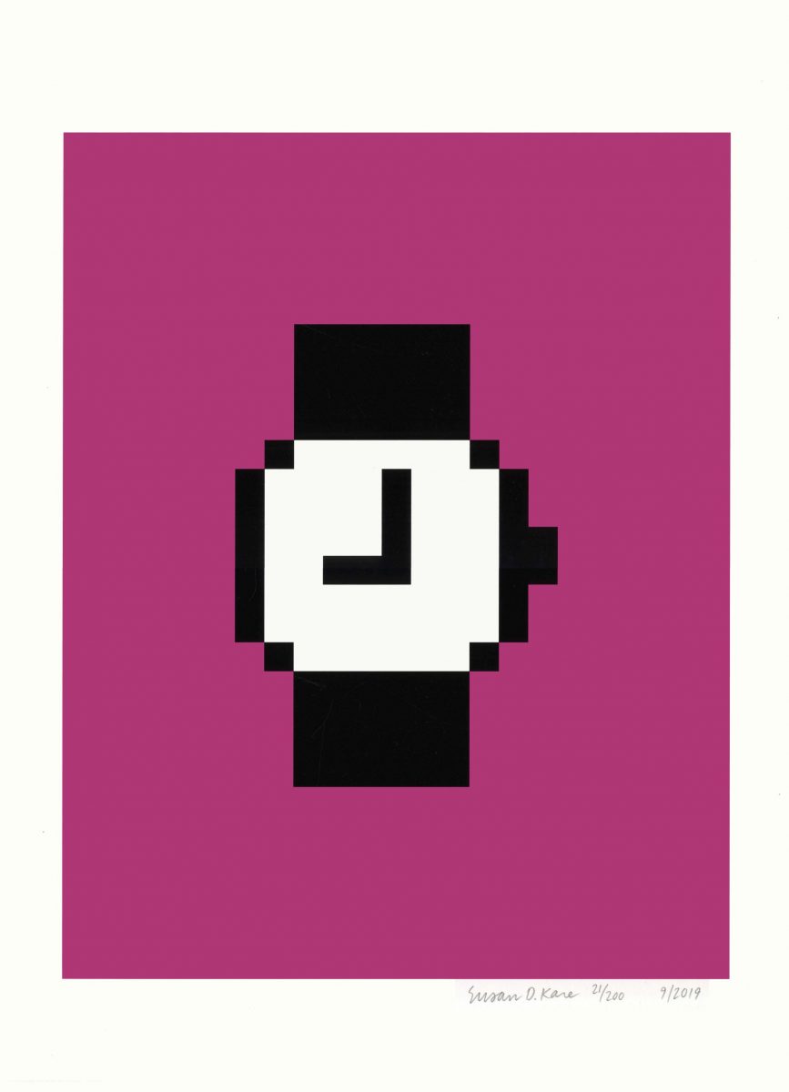
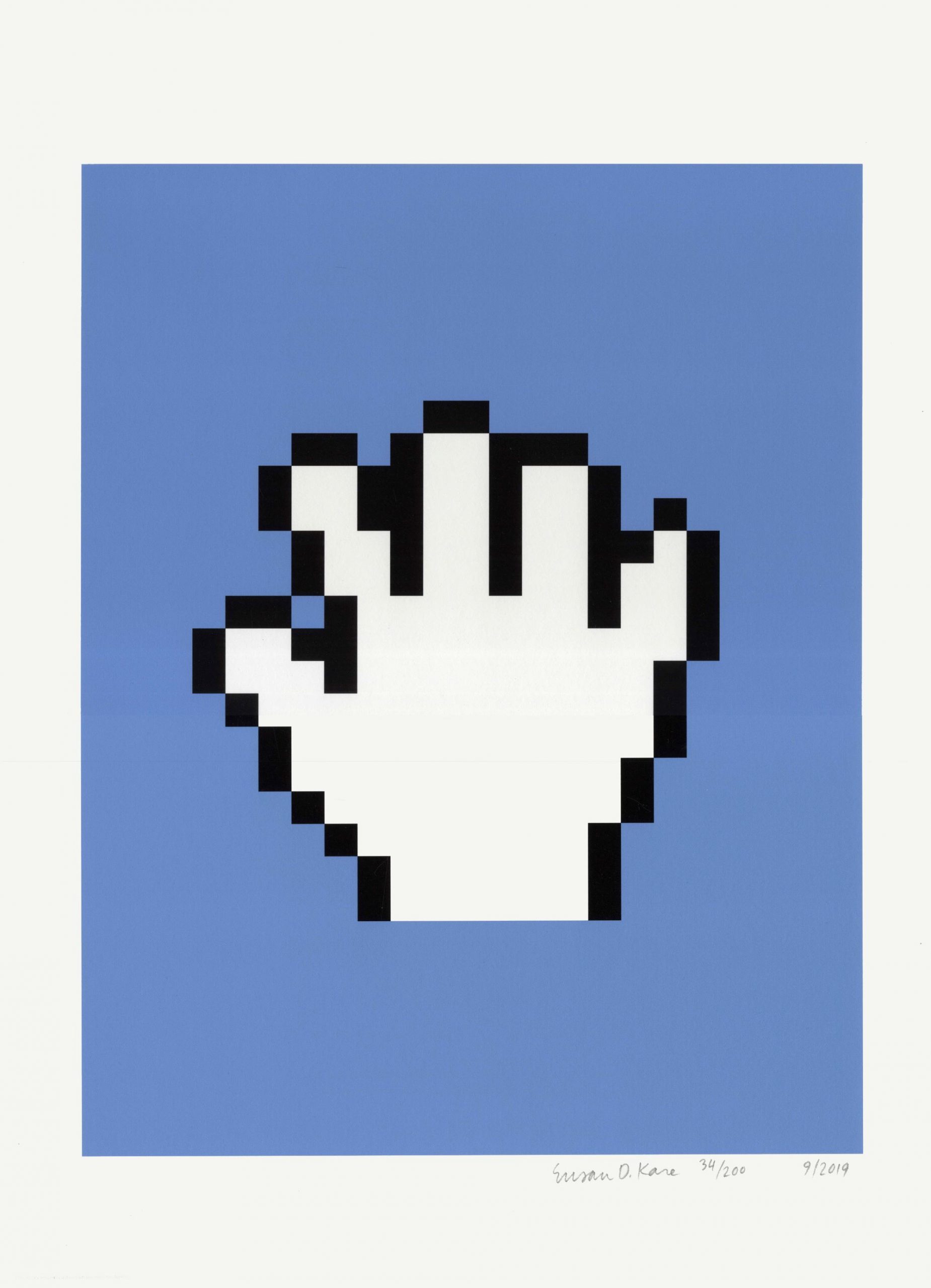
With a background in fine-art sculpture, Kare obtained a PhD and took a handful of graphic design stints (namely creating posters) before starting at Apple in 1982. The story goes that an old high school friend, Andy Hertzfeld, gave her an Apple II computer in exchange for a handful of icon sketches that could inform their user interface. Though Kare had no prior knowledge of computer arts, she drew on pixel-based mediums (embroidery, mosaics and pointillism) to master the language of icon design.
“Though we interact with the fruits of her labour pretty much every day, the New York-born designer is still little recognised within popular culture”
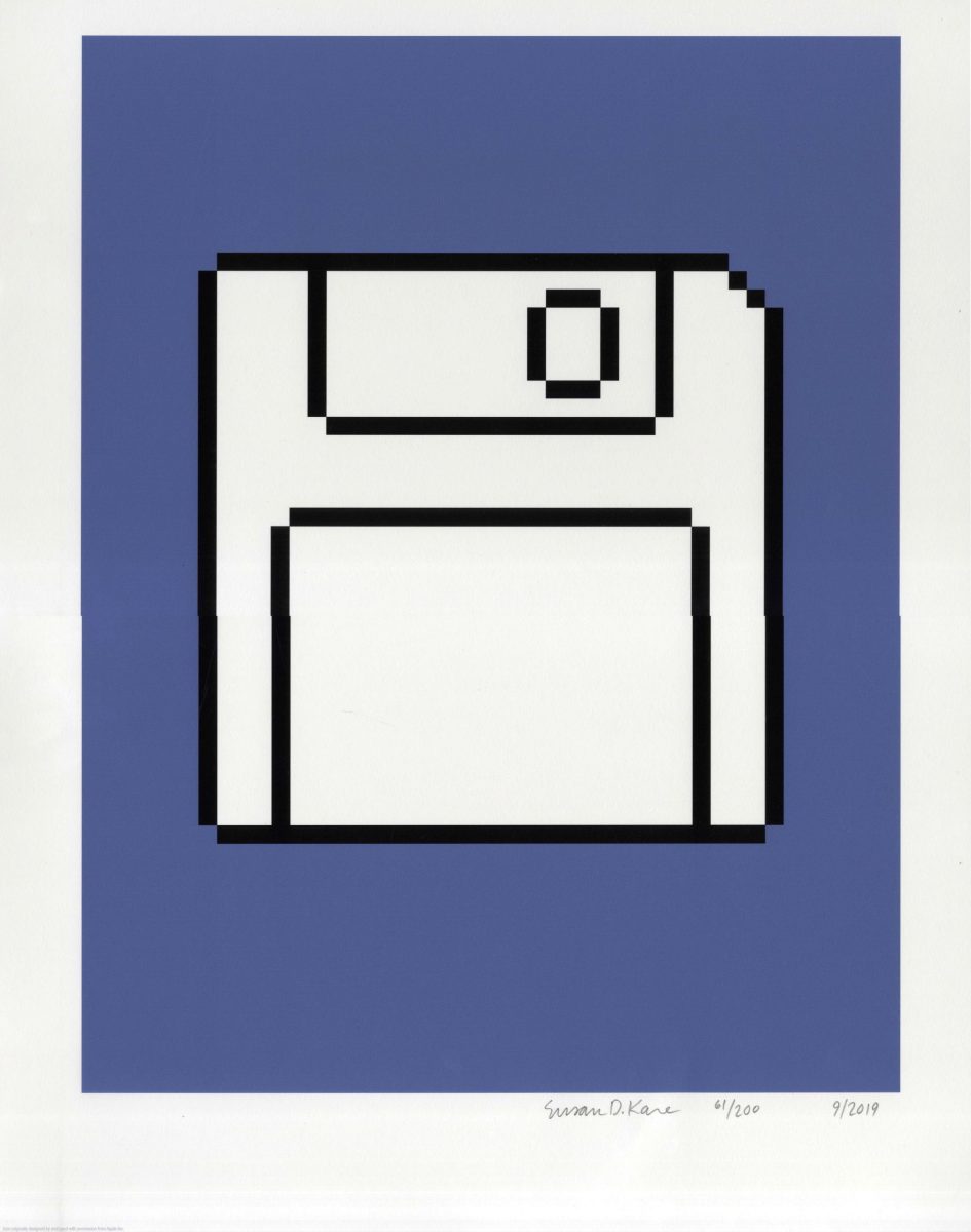
She saw the brief as a matter of problem solving. By understanding all aspects of the creative challenge, from the product’s demographic to the business landscape, she cracked the code of universal commands, creating icons unhindered by the written word. This timeless sign language (created first on gridded paper, then using a 32 x 32 pixel icon editor) survives to this day. For example, Kare’s take on the now redundant floppy disk will always be seen as the symbol for “save”. A nostalgic code for doing what humans do best: passing on information.
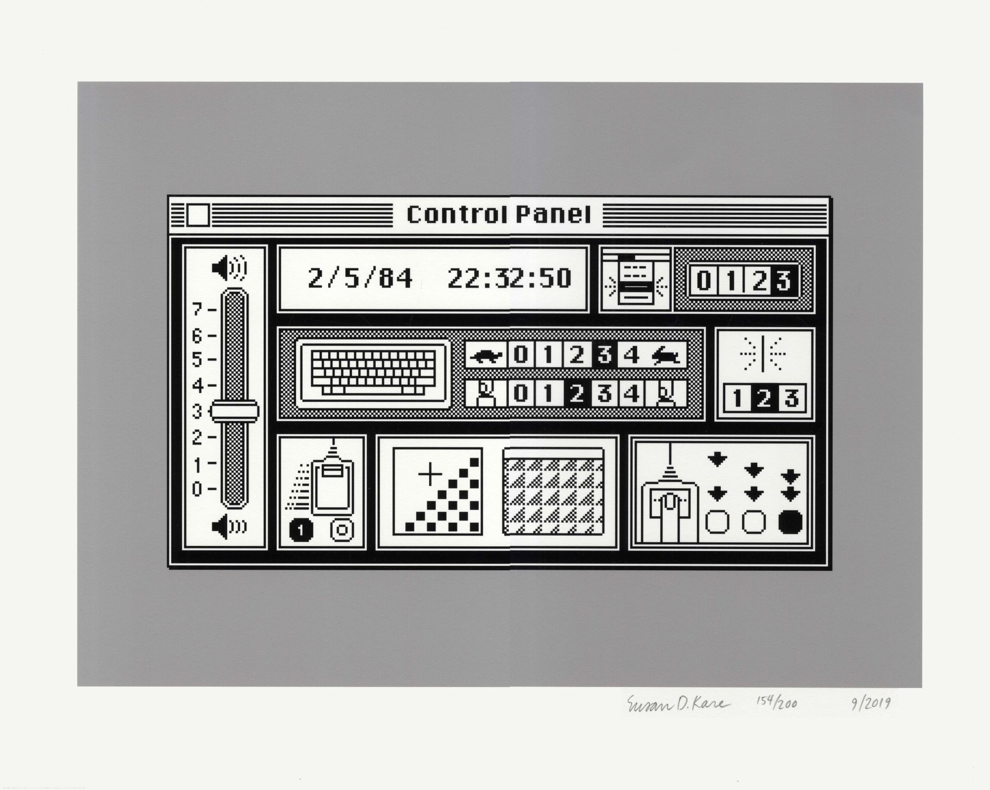
“I believe that good icons are more akin to road signs rather than illustrations, and ideally should present an idea in a clear, concise and memorable way,” Kare has said. “I am a big believer that there is a rich history of symbols from which you can draw even for concepts and icons, whether from fine art or folk art, or advertising or bottle caps.” It takes a tremendous amount of lateral thinking to create an icon that sums up the action “undo” for instance, but by drawing on her fine art background, Kare designed genius ways of understanding verbs through images, encapsulating a range of experiences through what she called “the economy of expression”.
“Kare breathed life into her icons. Her combination of utility and personality became the blueprint for emojis”
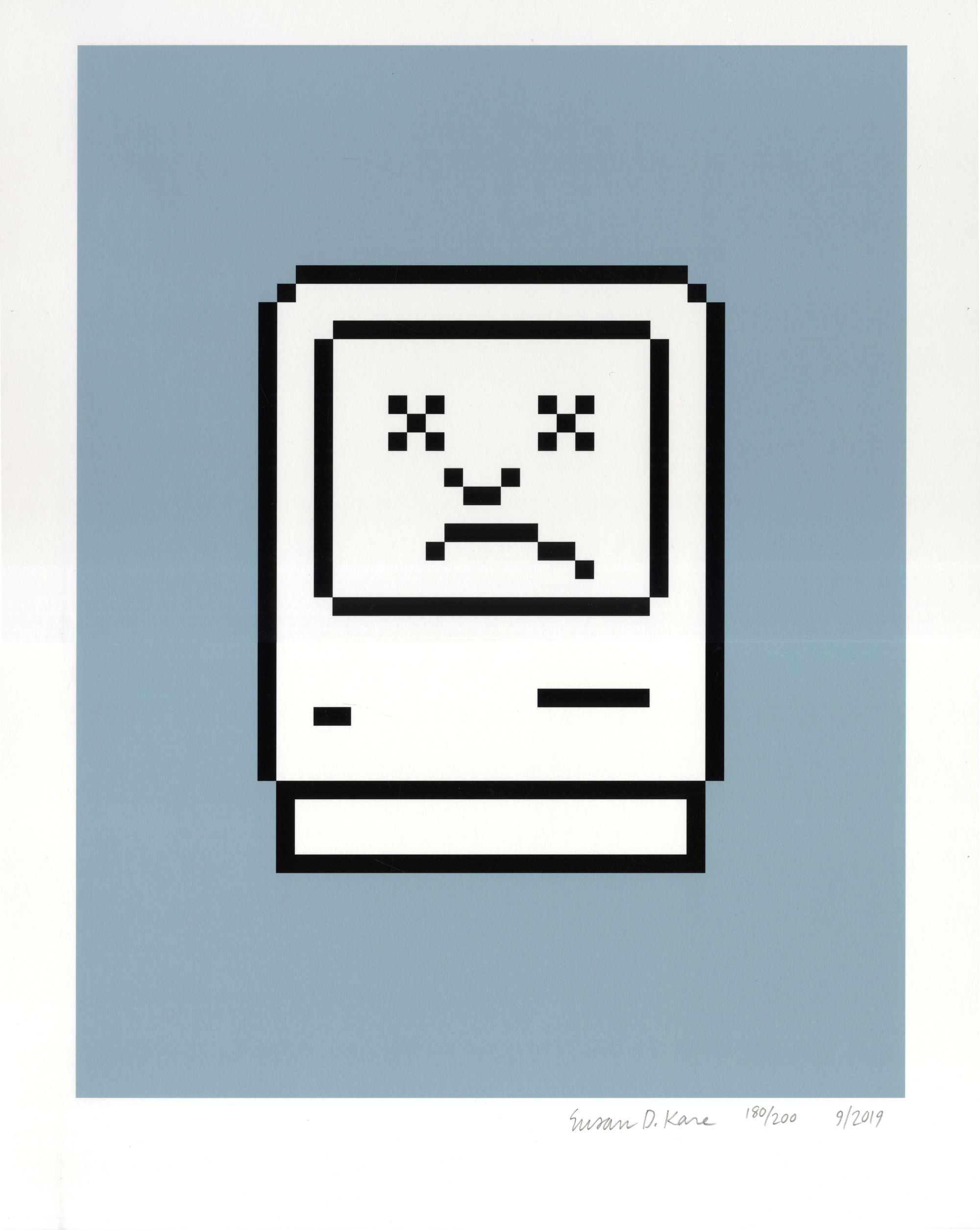
Before the age of computer ubiquity, machine-made methods of communication were intimidating and sterile (think monospaced typewriting or the binary digits of code). Kare changed that through her designs. She humanised the coldness when technology was still in its infancy, perhaps most notably in her 1984 design aptly titled Happy Macintosh. This icon appeared in the middle of the screen when the computer turned on, greeting the user with a warm smile, letting them know everything was okay. Conversely, the now-retired image of the “sad Mac” alert still has the power to send a chill down any veteran Apple user’s spine.
Kare breathed life into her icons, allowing them to become much more than flat symbols. Her combination of utility and personality became the blueprint for emojis, a universal non-verbal language that is now embedded within the linguistic landscape. Thanks to her, a formerly impenetrable technological interface has evolved into a new form of pictorial communication, full of nuance, expression and endless possibilities.
Jyni Ong is a freelance London-based writer, editor and creative
Icons: Susan Kare is at The Museum of Printing and Graphic Communication of Lyon until 18 September
This article originally appeared in Elephant #46 — Autumn Winter 2021, available to buy here
Icons originally designed by and used with permission from Apple Inc