In the summer of 2017, a fire was lit under the UK. The flame took the form of Reni Eddo-Lodge’s book Why I’m No Longer Talking to White People About Race. This debut was named after the author’s eponymous blog post of 2014, in which Eddo-Lodge lambasted the white silence that engulfed conversations around race. “I’m no longer engaging with white people on the topic of race. Not all white people, just the vast majority who refuse to accept the existence of structural racism and its symptoms. I can no longer engage with the gulf of an emotional disconnect that white people display when a person of colour articulates their experience. You can see their eyes shut down and harden. It’s like treacle is poured into their ears, blocking up their ear canals. It’s like they can no longer hear us.”
Eddo-Lodge is a careful writer—she values fact over sweeping statements or coarse generalisations. That’s what makes the title of her book even more incendiary—it’s based in truth rather than clickbait-exaggeration. People of colour, Black people and Indigenous people have all likely experienced this feeling of exhaustion—the tipping point of a conversation, where it no longer feels worth arguing with someone who fundamentally denies your lived experience. It’s this feeling of depletion, of whiteness sucking the energy out of your arguments, so debilitating that Eddo–Lodge felt compelled to pen a whole book about it.
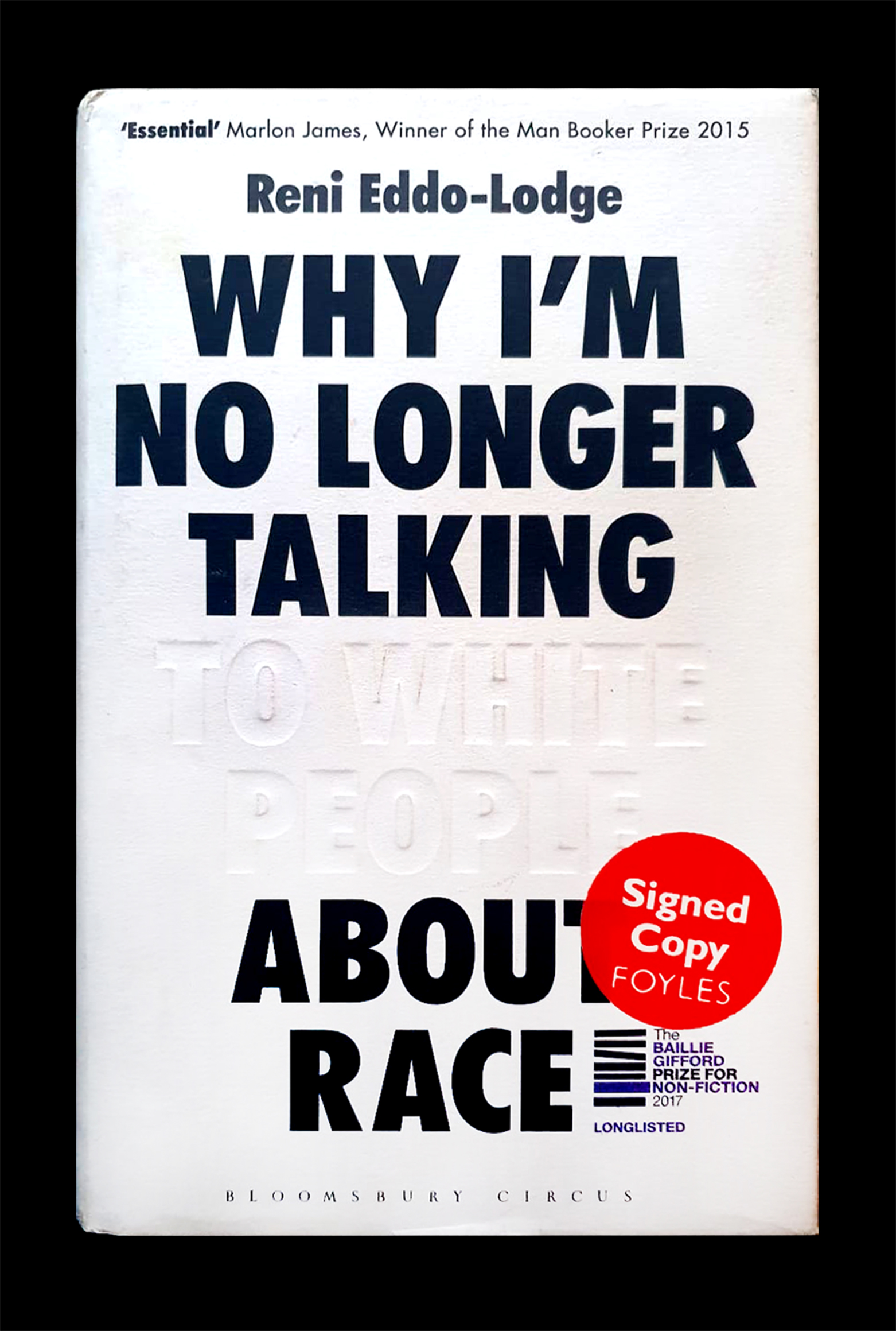
“At a first glance, the black type on a white background is conventional. On closer inspection, it operates on a level that is far from superficial”
I can understand why writing feels like the best medium through which to respond to this frustration. For me, it’s a way to take the time to sit down and properly articulate, on my own terms, what I find it so hard to vocalise. There’s something about the process of unadulterated expression, followed by subsequent editing, that enables me to collect my thoughts in a way that immediate speech doesn’t allow for. Needless to say, the book had a huge impact on my life, not least in terms of how the construction of race directly informs our society, but in how writing functions as a messenger.
It wasn’t until three years after it was first published that I really thought about the cover design as its own kind of messenger. It functions in a way that only good design can—its effects are largely invisible. At a first glance, the black type on a white background is conventional. On closer inspection, it operates on a level that is far from superficial. It is clear that Greg Heinimann, assistant art director at Bloomsbury, engaged with Eddo-Lodge’s work closely.
Crisp, condensed lines of the sans serif typeface meet sharply with background—a collision of black and white. The choice of a typographic-centred cover amplifies the strength of the book’s title, leaving Eddo-Lodge’s words to speak for themselves. The black-on-white text is interrupted only by the debossing of the words ‘to white people’, which are left blank, their outline only indicated by the creased outline of letters. Debossing is a technique which presses shapes down into the page so that they are moved back behind the rest of the paper, leaving only an indentation. Within the context of a book cover, it packs a punch—this extra design choice is difficult to communicate in the digital realm, and makes the case for owning something in print.
Tracing my fingers over the imprinted “to white people”, I thought about how the technique of debossing speaks to the invisibility of whiteness. This slippery notion has dominated our society for so long, affecting how we speak, behave, and view ourselves, as well as the world around us. For something so intangible, whose effects are of such magnitude, whiteness is surprisingly invisible, cloaked under the guise of ‘neutrality’. It’s wholly appropriate for these letters to only be slightly visible on the cover of Why I’m No Longer Talking To White People About Race; from far away, the only visible part is “Why I’m No Longer Talking About Race”, and it’s only a further glance that reveals the true meaning of the book.
“For something so intangible, whose effects are of such magnitude, whiteness is surprisingly invisible”
It is ironic how much fragility the cover itself revealed. A friend of a friend recalled how she’d had to put a fake dust jacket over the book when reading it on the train; previously, someone had approached her to demand why she was reading it—did she hate white people? Heinimann articulates in an interview with Creative Review that he wanted to create a “double take” in public. “I wanted to get across… the notion of white people trying to sweep the argument under-the-carpet by treating the text as a ghost, or as someone not present.” His decision for the text to be white was intended to “hint at the ideas in the book of purity and false virtue and show that white supremacy is a hollow, blank idea.”
Design can be a double edged sword—while it can aid the communication of a message, design that doesn’t heed the ethos of what it’s trying to convey can be accused of ‘aestheticising’ a subject, which often does more harm than good. In this instance, it acts like a chameleon, a fluid force that adapts itself to Eddo–Lodge’s message. In an age of bright Instagram tiles fighting for a user’s attention, it’s a breath of fresh air to see a pared-back book cover stay true to its ethos, and work in tandem with, rather than against, the words it wishes to convey.