When it comes to graphic design for music, names such as Stefan Sagmeister, Peter Saville or Jonathan Barnbrook spring to mind. It’s well documented that the graphic design industry favours giving men the ‘genius’ treatment, while sidelining other genders and searching for the names of women on the inserts of album covers can often seem a fruitless task.
In actuality, female designers have contributed a wealth of visuals to music history. Take Laini (Sylvia) Abernathy, who communicated the celestial vision of Afrofuturist musician Sun Ra. A wonderful article from Letterform Archive delves into Abernathy’s past as an activist as well as visual communicator. It notes that her work was featured last year in graphic designer and educator Jerome Harris’ exhibition, As, Not for: Dethroning Our Absolutes, which highlighted Black designers from the past century. This inspired the Letterform Archive to obtain Abernathy’s album covers, and delve into her work for Delmark records.
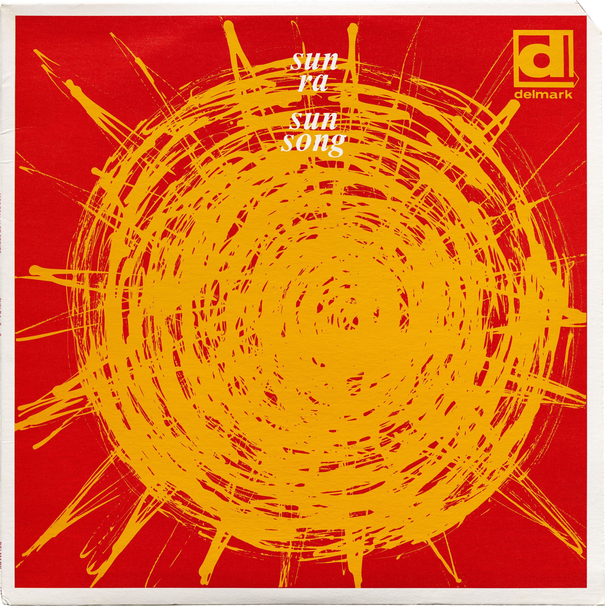
Take the artwork for Sun Ra’s Sun Song, in which a scribbled amber sun radiates warmth from the centre of the album cover. Paired with a rich red that errs towards tangerine, the colours jump out from the page, deftly illustrating the magnetic yet surprising elements of Ra’s sound. The cover is a slick continuation from Ra’s own graphic work, which borrowed from modernism, while evolving the style toward a certain deliberate imperfection, and an exploration of Black authorship.
Like Ra, Abernathy was keen to platform Black voices within her work. One of her best known works, a Chicago-based mural entitled Wall of Respect, was painted to celebrate prominent African Americans from walks of life such as music, politics, drama and literature. The poet Don L Lee, explains that “The Wall of Respect defied the modernist notion of ‘art for art’s sake’ and was instead ‘art for the people’s sake.’” This reflected a belief stemming from the Black Arts Movement, which urged creatives to define Black art on their own terms.
“Abernathy’s colours jump out from the page, deftly illustrating the magnetic yet surprising elements of Sun Ra’s sound”
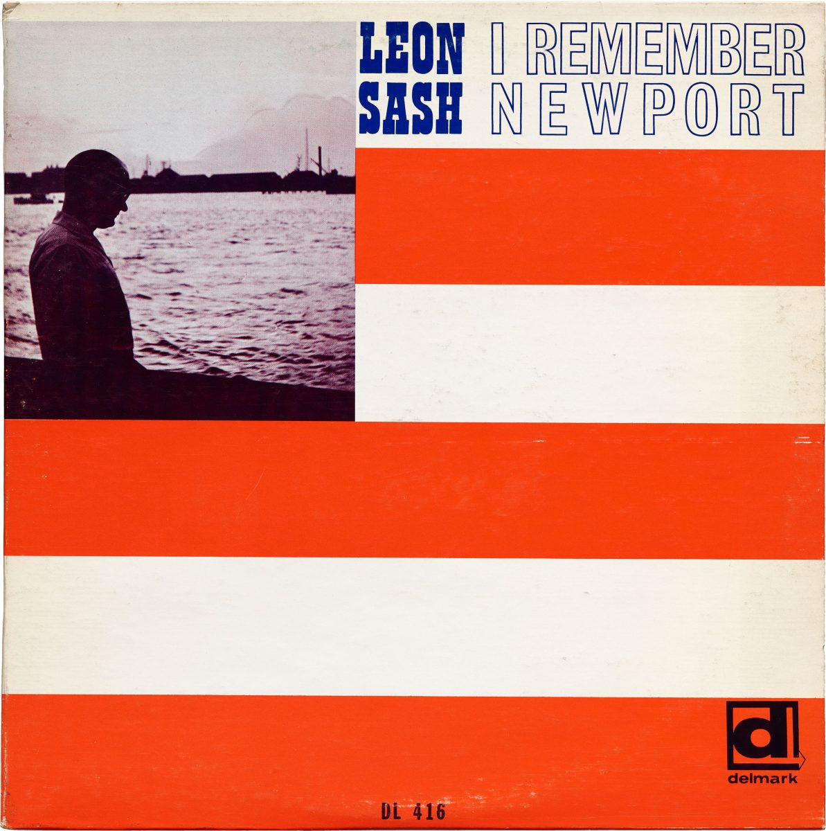
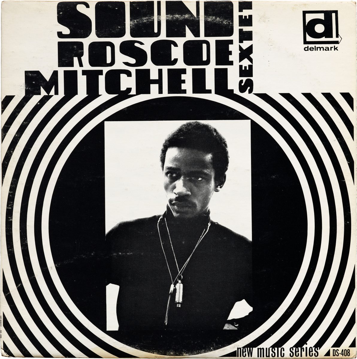
While white jazz fan Bob Koester founded Delmark records in 1958, he commissioned Abernathy to work on jazz record covers, ensuring that the ethos of the Black Arts Movement rang true. The label is known to have commissioned at least three designs from Abernathy, one of which was a collaboration with her husband Billy, whose photograph of Roscoe Mitchell is starkly illuminated by Laini’s bold concentric circles.

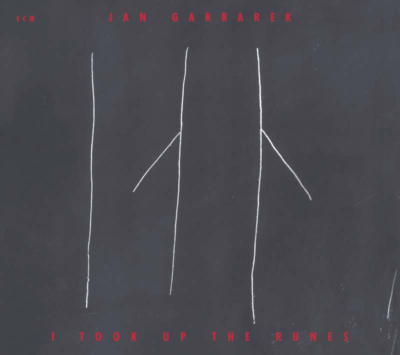
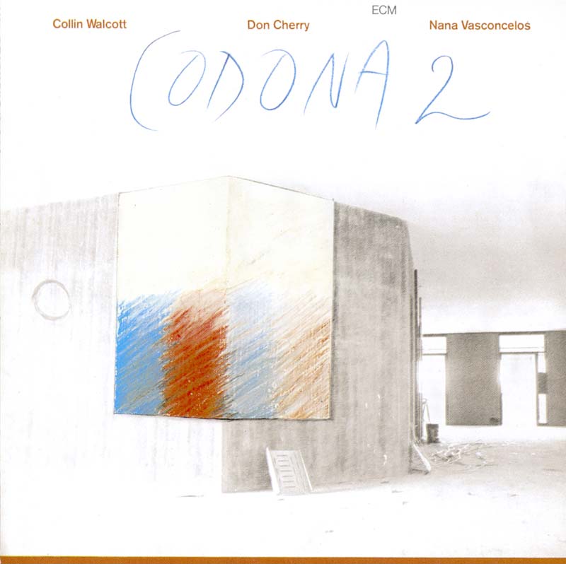
Abernathy’s work was largely visible in the 1960s, but in 1970 another female music designer slid slowly into the spotlight, through the Editions of Contemporary Music label. ECM was founded in Munich by Manfred Eicher, who loved beautiful artwork and beautiful music, often at the cost of any profit from album sales. Designer Barbara Wojirsch worked with Eicher from ECM’s inception, creating album covers that characterised the label’s output.
“Wojirsch studied the rules of composition so that she could know exactly how to break them”
Wojirsch studied the rules of composition so that she could know exactly how to break them. Her respect for the power of typography is demonstrated on artwork for Keith Jarrett’s album In The Light, where carefully set letters are imprinted onto an undulating, textured surface, which could be anything from sand to stone. The resulting dreamlike atmosphere visualises Jarrett’s musical expression in an unpretentious yet highly effective fashion, Wojirsch’s signature style. Joined by designer and photographer Dieter Rehm in 1978, they produced cover after cover of quietly mesmerising imagery.

Having initially identified as a painter, Wojirsch moved into advertising but soon realised that she could not “tell people things that aren’t true.” Working for ECM allowed her to flex her creative muscles. While moving typographically between the conservative sans serifs and painterly lettering, Wojirsch always remained fiercely loyal to her modernist roots. She once explained that the design must pay homage to the photograph it is centred around: “It’s a picture, we choose the picture to show it, not because we want to work with it.” Wojirsch’s reverence for the image did not stop her creating fiercely inventive typographic artwork, which ranged from hieroglyphic inspiration to Cy Twombly-esque abstract scribbles.

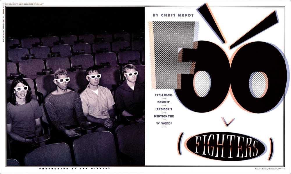
Gail Anderson’s work for Rolling Stone magazine stands in stark contrast to the hushed qualities of ECM’s visual language. Having cut her teeth at The Boston Globe Sunday Magazine and Random House’s Vintage Books, Anderson arrived at Rolling Stone in 1987, and spent 14 years expanding music design from the covers of albums to editorial pages.
“Framing male designers as genius rockstars, alongside pervasive sexism and invisible labour, is often responsible for female designers’ lack of visibility”
While working with art director Fred Woodward (both went on to be esteemed AIGA medallists), Anderson prioritised freedom of expression, working to translate the personality of a creative practitioner (whether that was a musician, actor or comedian) into visuals. The resulting covers are delectable in their visuals, and audacious in their typography.
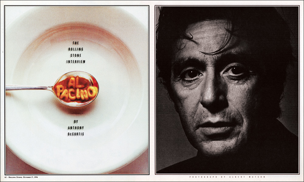
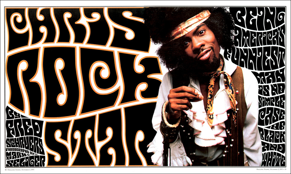
A tongue-in-cheek rendering of Al Pacino’s name in spaghetti letters, ensconced in a spoon hovering over its plate, is paired with a dramatic headshot of the actor, the serious fused with the satirical. A photograph of Chris Rock looms out of curly 1970s type, filling the page with its brash psychedelia, while a profile of Axl Rose makes the weird increasingly wonderful through letterforms that bloom into flowers. Anywhere else, this would be viewed as kitsch, yet Anderson commits so wholly to the aesthetic that she carries it off with style. Today, she chairs the BFA Design and Advertising Departments at School of Visual Arts in New York, and enjoys the fruits of a celebrated career in graphic design.
The insistence of the graphic design industry on framing male designers as genius rockstars, alongside pervasive sexism and invisible labour, is often responsible for female designers’ lack of visibility. Today, efforts are being made to shine a spotlight on those overlooked in the past by the traditional canon, including a growing number of dedicated exhibitions. However we should not forget that it’s equally important to pay homage to contemporary music designers working now as well as to their predecessors. It should not be left to future generations to discover them.