
Elephant speaks to Zazou Roddam about her anxiety-inducing current show, ‘Pop Inflection’ at Brunette Coleman. The exhibition is composed of three acts. It’s a work of theatre, or, as Roddam tells me, ‘Melodrama’. The video piece, Pop Inflection (The City), is flanked by two other pieces, Synchronous Tower and Curtain Wall – combined, they create Roddam’s interpretation of the metropolis in all its supposed glory.
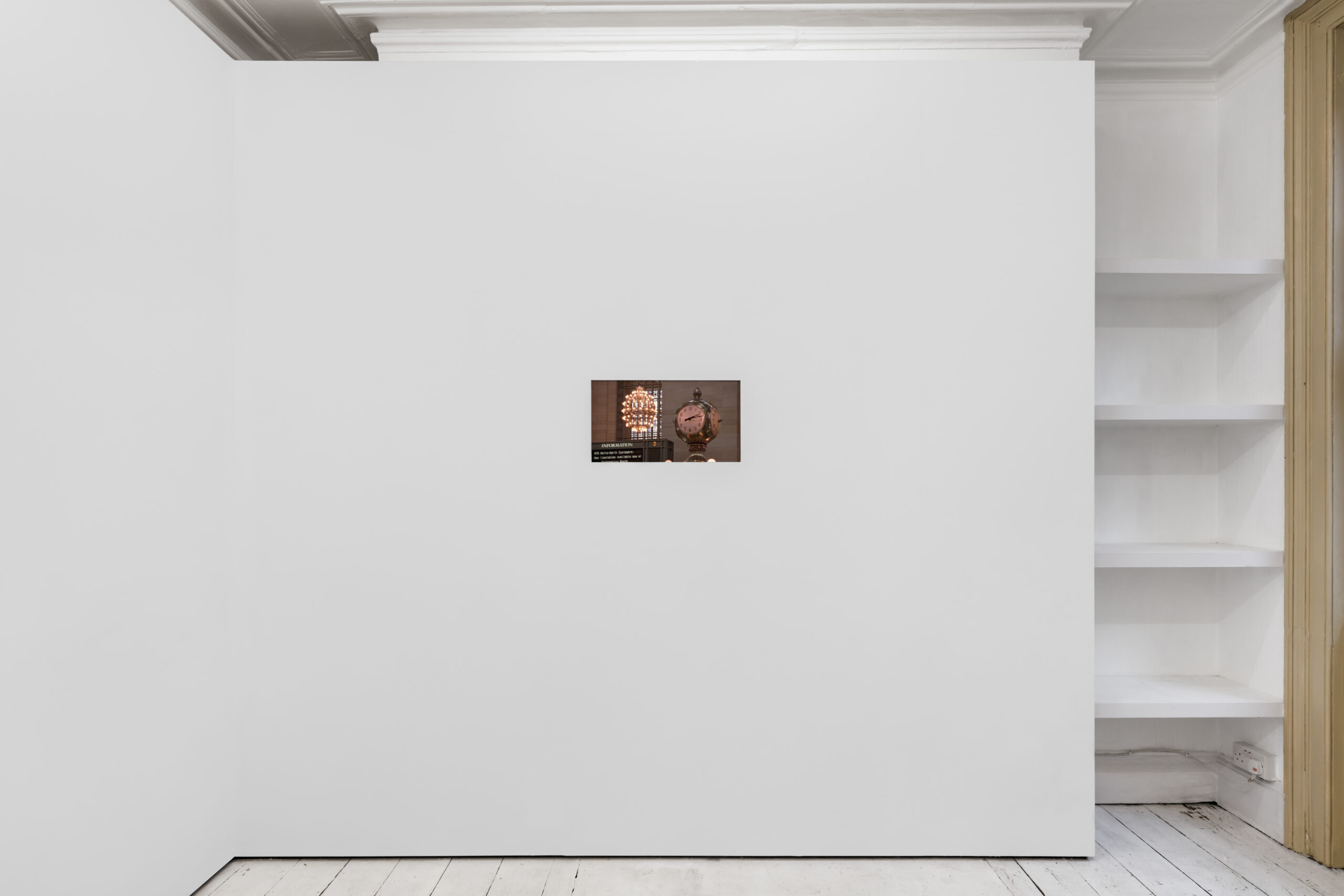
Pop Inflection (The City) considers time, space, and societal shifts through an exploration of the urban landscape. A Sex and The City phantasmagoric supercut (only featuring the B-roll) omits the well-loved cast and shows the iconic, glittering Manhattan skyline against a fast-beat soundtrack. Yes, it’s nostalgic, but tensions become increasingly palpable as the perspective tightens and the scenes are made claustrophobic. The chronological sequence spans snippets from the series from 1998 to 2004 and transits across the turn of the millennia. We witness the making of modernity through the evolving portrait of the urban metropolis and its sprawling skylines.
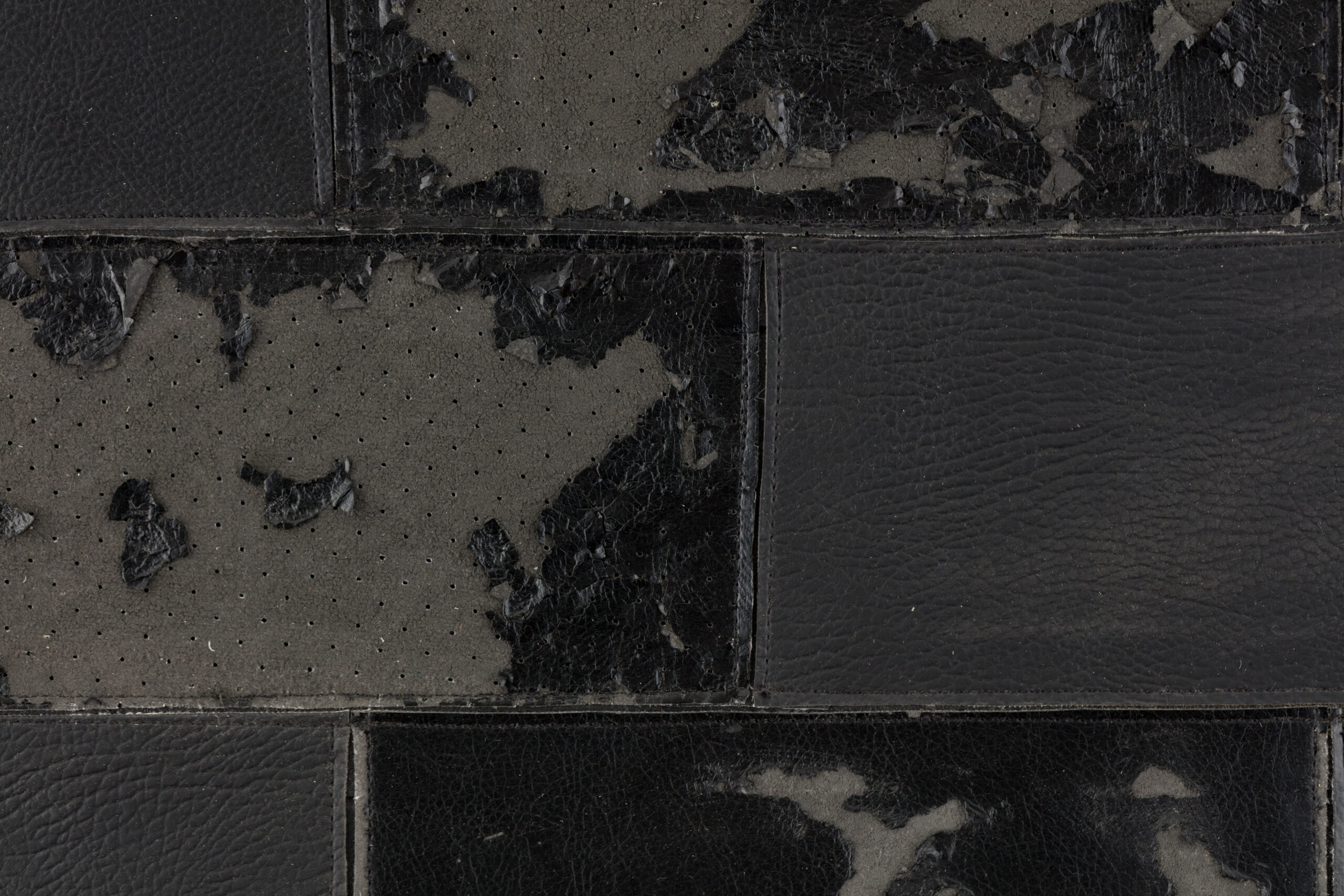
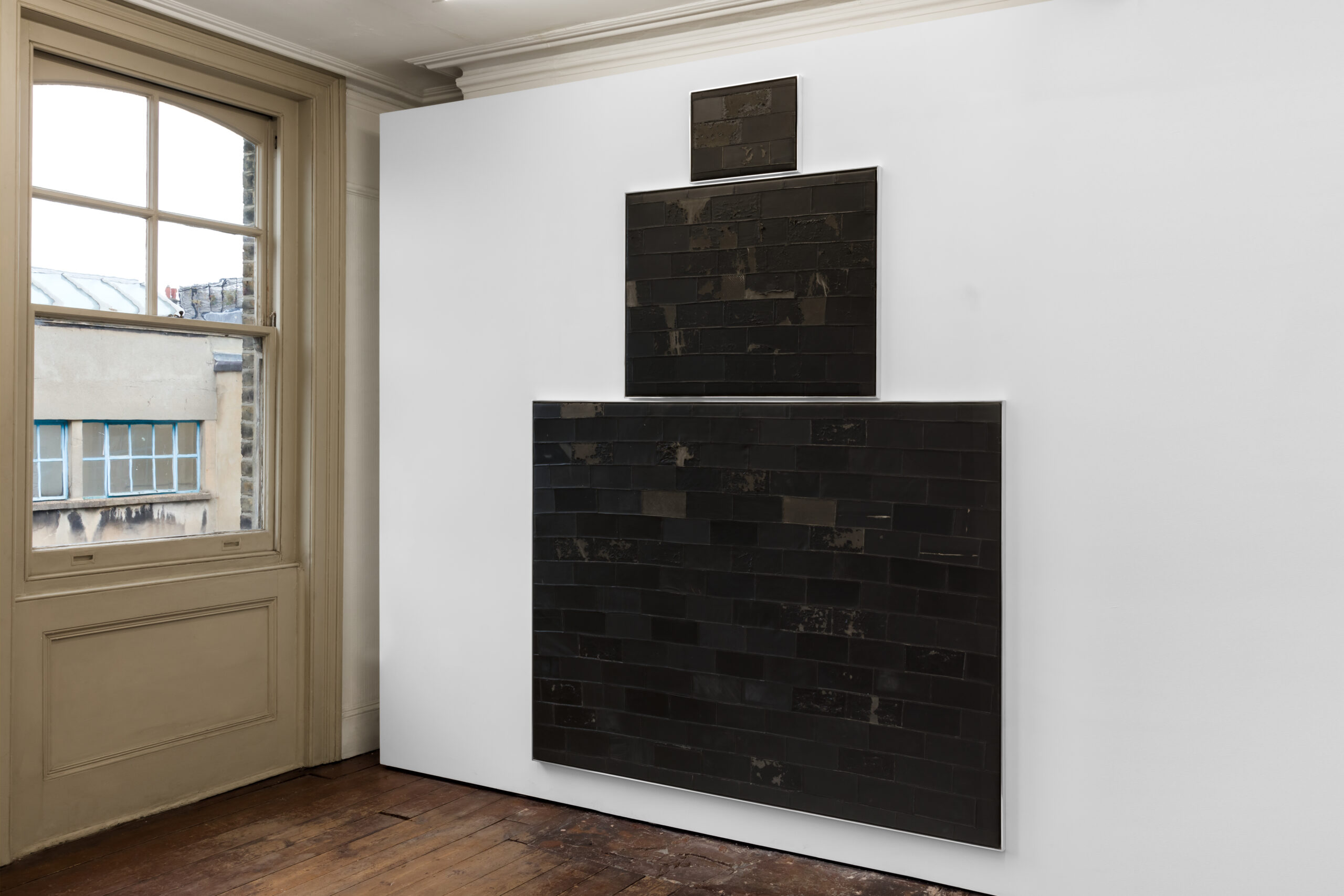
Synchronous Tower stands tall in the gallery, composed of three black rectangles with the leather from repurposed office chairs cut and sewn as laid bricks. The piece presides over the space as a silhouette of a skyscraper. Across from it Curtain Wall, made up of luridly stained glass set into a grid, sets the exhibition in a twilight space, capturing the transitional moments of dusk and the close of a working day.
The spotlight here is centred on capitalism’s enduring influence on societal structures. Surveillance, socio-political landscapes, and the evolving urban colossus contribute to the mounting anxiety in the narrative. The exhibition seeks to encapsulate the dynamic cityscape, blending both nostalgia and disquiet, offering viewers an introspective journey into urban evolution, societal structures, and the enigmatic nature of change. The city can be a state of mind, and here, it is one of apprehension and dread. The ever-looming monolithic structures are closing in.
Rosie Fitter: So, why the title, Pop Inflection?
Zazou Roddam: Pop Inflection is a meditative stab at every day of city life. Like a continuous line that has been inflected (or inflicted), the show is a break from the chaotic continuums enabled by metropolitan living. Stop, play, pause, rewind, as in a real-life sitcom, are the gestures established through the works that turn the three-act show into my very own personal and intimate theatre set.
RF: The film Pop Inflection (The City) is a supercut of Sex and the City, ‘I couldn’t help but wonder’. Why this show specifically? I was anticipating seeing Carrie running across the streets of New York in Manolos. But instead, I was left with a strange and unsettling feeling, with anxiety as to what would happen next.
ZR: Growing up watching SATC, and that being my only understanding of what New York City was essentially like (from movies/TV shows), really shaped my perception of the city as a general landscape but also from a completely Pop Cultural point of view. Re-watching it as an adult, I became really drawn and fascinated by the B-role (footage that isn’t in the main action) and its habitual voidness and underbelly of it all. The methodical repetition and rhythm of all the buildings and public spaces close-up had such consistency. As well as that subtle theme of time passing throughout the years, time through technology, and, of course, time through the urban landscapes. As I meticulously edited, it created a hyperreality of the show, but I also left behind edited hints of my love for classical cinema, like a homage in reverse. For example, a close-up of Carrie’s hand smoking out a car window or the last scene of the video with this stranger waving from a boat in Paris, breaking the third wall. I think leaving an unsettling feeling was a part of the process because it’s familiar but leads with no goal. I guess that is the outcome of being taken away from your comfort zone.
RF: What was the core concept of Pop Inflection (The City), and why did you choose to present a generic representation of the city rather than focusing on specific places or events?
ZR: The show, at its core, is a generic representation of the ‘City’. Choosing to encompass the choreography of everyday metropolitan life rather than signalling any specific place or event, its indications lead to repetition throughout the whole process of the show, even with how everything was constructed. Pop Inflection (The City) is based on a narrative version of time in New York, and its dialogue speaks on iconic buildings and spaces that we can immediately relate to in a spatial and sentimental way.
RF: Can you tell me a bit about the reasoning behind Luca Mantrero’s score as the backing to Pop Inflection (The City)? I found it to be quite ominous.
ZR: Luca and I had worked very closely together on the score, and it felt very seamless. We had a clear mutual understanding of what it was going to be. I always knew that I wanted it to be somewhat classical and dramatic, like an opera, but with a modern angle. The score really sets the stage for the rest of the show; you listen while you are looking at all three works. It was important that it didn’t impose itself, so it has this calming ambient undertone, as well as reaching a climax of drama in some moments throughout the first half of the film. The score breaks down into two parts: after the scene with the leaf floating and then landing on the pavement. The sounds become much lighter and slow down to accompany the insular change in the video.
I had been looking into more alternative operas and their set designs, especially Robert Wilson & Philip Glass’ Einstein on the Beach. This was a real source of inspiration for me; it had such apparent strength and elegance. From that, the idea of the three acts all came together, as the main sculpture works really resemble facades or theatre sets, and the score became the heart of the show for me, creating my own little melodrama.
RF: Pop Inflection places emphasis on the city’s structures, perhaps encompassing not only the physical construction of buildings but also the underlying power structures. Do you think your work addresses or communicates this?
ZR: I believe that there is much to unpack in the fact that all major cities share such homogeneity in terms of image – a fact very well implemented by the establishment and rapid deployment of the ‘International Style’. They are not only the physical manifestations of builders and, in some cases, the architects who designed them (most buildings are NOT designed by architects, ironically enough!), but rather the fully expressed fantasies of corporations and global banking powers alike. From this point, I believe you are right to perceive the underlying notion of not just the metropolis represented through building forms or their respective components but also the very obscure powers that allow them to be.
RF: What inspired the title Synchronous Tower? Could you maybe speak more about it as a fictional facade and how it represents both the individual worker and the archetypal office building?
ZR: The title itself derives from the very fact that the used chairs I had gathered were called ‘synchronous’ chairs. The work is a reappropriation of leather (some genuine, some faux) gathered from around eighteen to twenty spaces, collected both in New York and London. Offices and commercial spaces alike are sold in bulk by junk removers after the foreclosures of companies – their aged conditions are clearly marked by their daily users. The rubbings and intense tears, once again, reveal the repetitive, choreographic-like tendencies of the city and life. As a triptych, the original metal framings of the panels instantly reminded me of archetype, stepback buildings of cities like New York, you could say. From this point, the play on their assembly remixes the traditional horizontal layout onto a brick composition and becomes an ambiguous tower. This becomes a full circle with the origins of the leathers employed and the chairs from which they were stripped.
RF: What inspired you to emphasise colour theory in public spaces and offices, as shown in the tinted windows of Curtain Wall? It led me to think of elements of control and the desire to homogenise moods in work environments.
ZR: Curtain Wall is both a continuation and a foil to Synchronous Tower. It continues the play of the building theme by isolating the external component of typical buildings – their facades – while simultaneously contradicting the darkness of the leathers through the coloured grid, which is, in fact, the reflection of a sunset still gathered from the Pop Inflection (The City). Through its continued representation of office buildings, each coloured glass seemed to appear as an individual office space, with its own atmosphere or interior. This led to the colour theory association, which, as we know, is applied to office spaces’ interiors and often public spaces under the theoretical premise that it enhances productivity as much as creativity itself within the workplace. Not only so, but in Synchronous Tower, deriving from actual office chairs (through their leather), Curtain Walls acts as the chair’s counterpart by ‘rendering’ a sunset in an eight-bit idea.

RF: Regarding the title Curtain Wall—described as a non-structural exterior akin to the ‘skin’ of a building—can you elaborate on the significance of these choices?
ZR: This particular work is a continuum of the building structure that is Synchronous Tower. While emulating the archetype of curtain walls, it is also mentioned to foil the ‘darkness’ of the leatherwork by reflecting a colour grid (a sunset) onto the leather (a silhouette). The show is a chain of reflection of how each of the three works is mirrored indirectly.
RF: Can you talk more about creating this sense of a twilight period in Curtain Wall, the transitional phase between dawn and dusk? How does it relate to the close of the working day, circadian rhythms and the intention to create a tinted lens through which the outside world is perceived?
ZR: In the conception of Curtain Wall, a trilateral manifestation emerges, assertively intersecting with the gallery’s window. Embodying the theatrics and spectacles intrinsic to a fantastical realm encapsulated within the video narrative of the sunset clips orchestrating a momentary engagement with narrative participation. By fixating one’s gaze through the point of view of tinted glass onto the external backdrop, a symbiotic relationship unfolds, blurring the boundaries between internal fantasy and external reality.
Words by Rosie Fitter. Images courtesy of Brunette Coleman, London. Photography by Jack Elliot Edwards.


