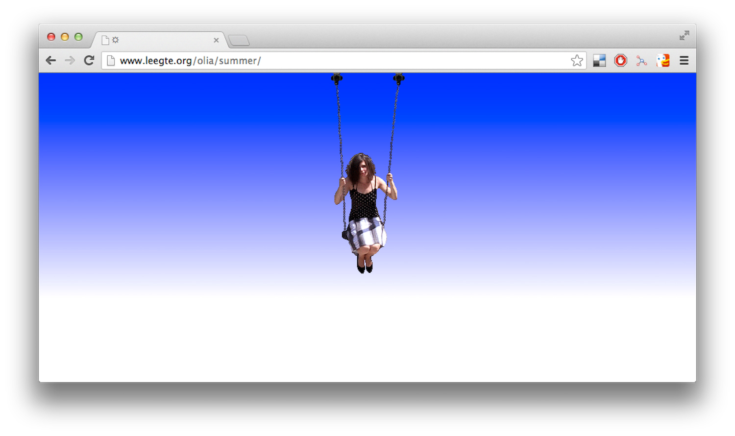
Olia Lialina is rightly recognised as one of the pioneers of Net Art. Since the 1990s, she has been creating work that has been hugely influential in the way artists have used the internet as an expressive, exploratory medium. Her early use of “vernacular” internet aesthetics have also recently boomed in popularity—namely with those born far too recently to have seen them when they were just a part of the everyday digital landscape.
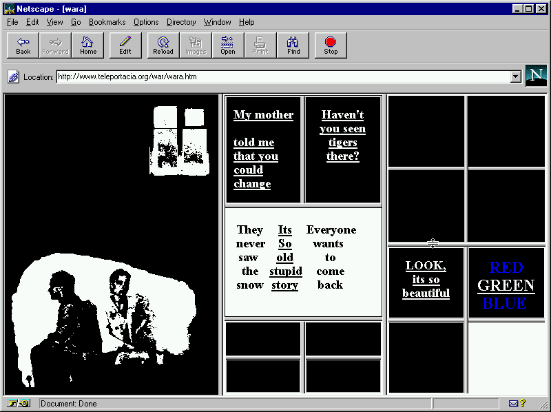
Lialina made her name with the 1996 piece My Boyfriend Came Back from the War, a browser-based work the artist desired as a “netfilm” that used interactive hypertext. The screen-based text used hyperlinks to connect the reader to subsequent texts, thus creating a non-linear narrative, and told the story of a couple struggling to reconnect when reunited after a military conflict. The piece showed how black-and-white website frames and grainy GIFs could be used to emotive and powerful effect.
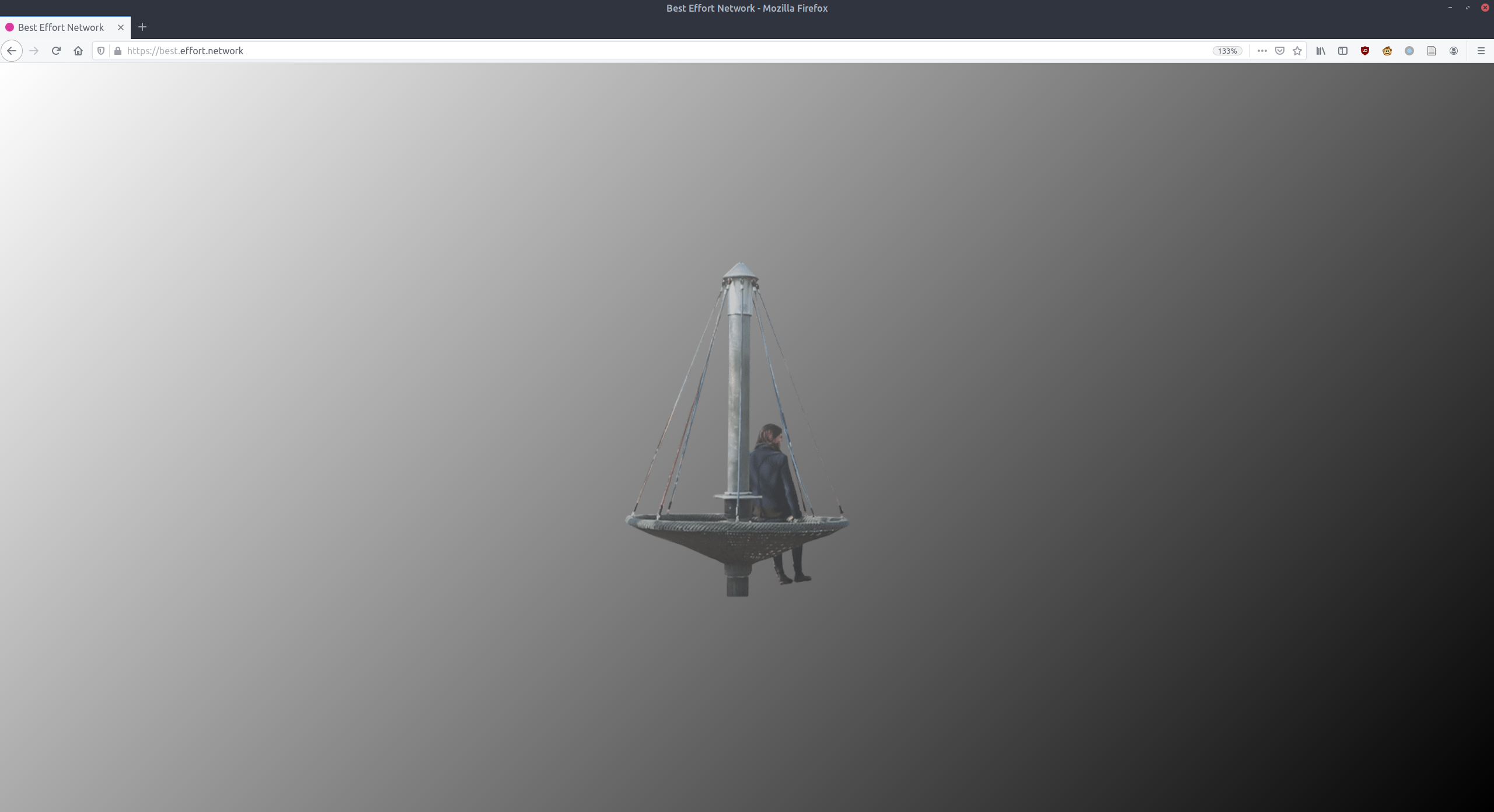
London’s Arebyte Gallery presents the digital premiere of Lialina’s new network portrait, Hosted, as well as a fittingly online exhibition of her work, titled Best Effort Network (2015/ 2020), designed to be viewed on a desktop. The title refers to the unseen way data travels to its destination, hinting at the way that data packets, thanks to being hidden, are sometimes lost, bounced back, resent and occasionally lost.
When Net Art emerged in the nineties, things were so different in terms of how we viewed and used the internet; most people barely had access to it compared to today, and it was pretty much entirely computer based. Now that the internet is such a part of the fabric of everyday life, and younger generations see no real separation of online and physical, how has the term changed?
For me, the definition hasn’t really changed over the years. But it’s interesting how my own perception of it has changed: in 1995 or 1996, if somebody called me a Web Artist I would be furious—I wanted to emphasize that I’m a Net Artist. I’m not just making something interactive, or interesting visuals for the web. All my work is about being connected—it’s about everything that happens behind the browser rather than what you can see in the window, and that can’t exist if you’re disconnected.
“All my work is about being connected—it’s about everything that happens behind the browser rather than what you can see in the window”
How have technical developments changed the way in which artists make work in the digital realm?
For one thing, the assumption that being online means being in front of your desktop computer at home is very different now. With art projects that are made for online now, everyone always talks about how they have to consider what it looks like on mobile. But what’s important for my work is having the browser visible, so you can see things like the location bar.
My new piece Hosted, for instance, can only be viewed on a desktop: there’s no way to see it on mobile. Mobile can be quite restrictive, and you’ve got everything from other apps popping up all the time. On desktop browsers, you can easily type and see full URLs. That’s important for my work, with its focus on connection.
In displaying your work, you’re very careful to show it as it was originally created. This often means modifying it to look more pixellated, for instance, as it would have in the 90s. Why is that important to you, and how you go about it?
It does matter to me. When it comes to archiving and preserving, and so prolonging the life of artworks, I keep the archives of old web pages, and put a lot of effort into preserving how they would function. But some of my own work is deliberately made in a way that’s almost impossible to archive, or to preserve a copy of and keep it somewhere.
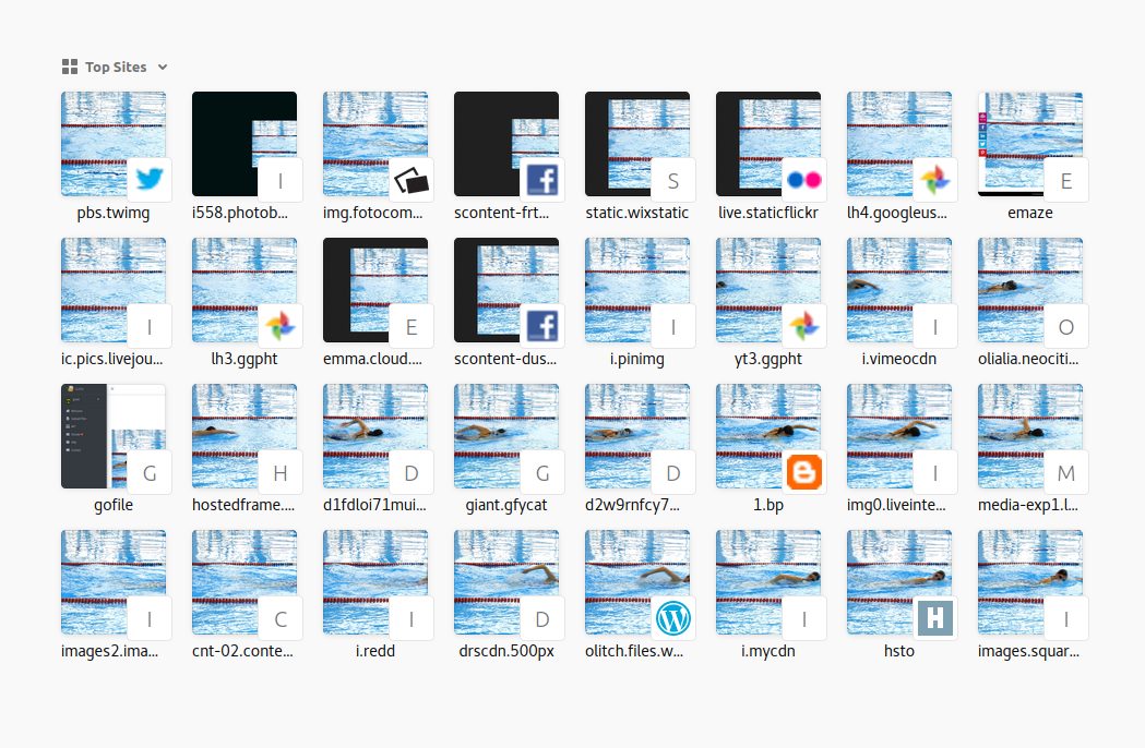
To me it’s still important to create the work in a way that shows how the internet worked at the time it was made. This means that you have to consider things like the resolution, which is much higher now, and the connection is much faster. I want to show them as slow as they would have been. When I show the work in galleries, I’ve made an emulated version of older works: they’re not just a copy, they’re shown on a computer that has its own slow internet. It connects to an old CRT monitor with a low resolution, so visitors experience a sort of time travel.
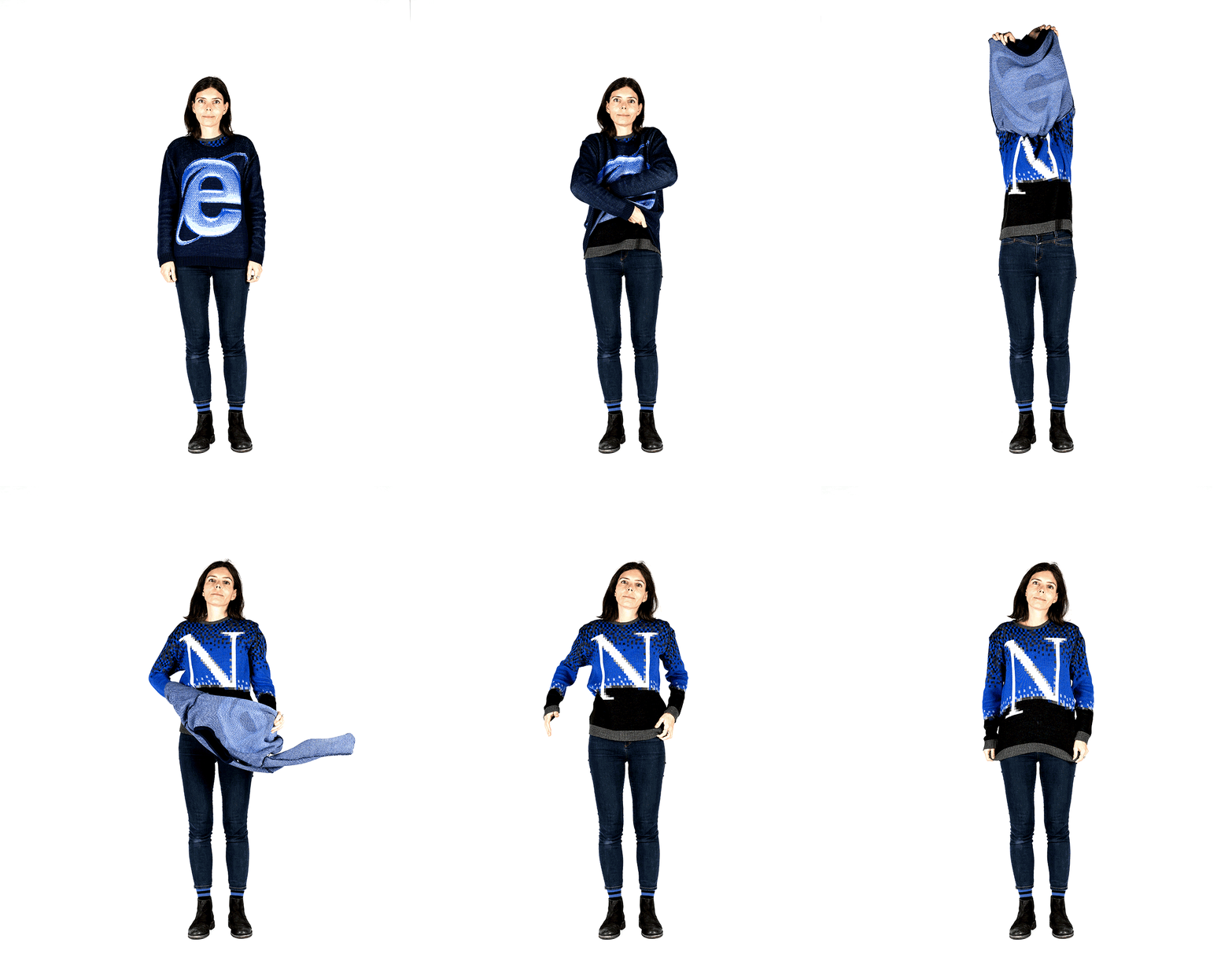
That sort of vernacular design aesthetic—I guess the sort of thing we’d see on GeoCities websites, which you worked to preserve on One Terabyte of Kilobyte Age with Dragan Espenschied—seems to have become very trendy lately. This is especially true of graphic designers, even those born well after such sites were popular. Why do you think that is?
I think maybe it’s because of what they’re seeing and getting now online—very sweet, harmless web pages. Sometimes I feel a bit guilty for this trend, but I’m also a big fan of this sort of production that you see on webpages that people made themselves—not only from the nineties, but also from the beginning of this century. The best thing I think someone can do right now is make their own personal website… maybe that can link to something people recall from their childhood or youth, maybe not.
Today website design is so much more accessible. It means you have to do less and less, but for me that’s killing the personality of websites. It makes you alienated from the design and coding part. The funny thing is, when you use hosting and webpage-making services they offer you so many templates to choose from, but in the end, it’s only really only one template—one huge image, lines in the top for the menu, big title. I don’t know how they managed to market it as so “unlimited”.
“Today website design is so much more accessible, but for me that’s killing the personality. It makes you alienated from the design and coding part”
Where do you draw the line between the quite conceptual digital design that we’re seeing a lot of now, computer science, and fine art? How do they intersect?
For me, art projects are made to exist online only as art projects. There are, of course, some designs that somebody might consider art. We see a lot of experiments with JavaScript and CSS—people with an interesting idea that you can make with code, such as making a video or grading a painting. In my teaching, my focus is digital culture, and art and design online. I do teach the conceptual basics of interface design, so that’s not just how to draw buttons or how to make a layout, but about the concepts of the invisible or visible computer.
It’s about trying to change the contemporary paradigm. That involves looking at the paradigm of contemporary user interface design, or UX, which currently dictates that everything should be so simple that the computer becomes sort of invisible. It comes from the idea that people had, from the 1960s until the end of the 1980s, that the future of computing would make interfaces invisible. And yes, people should concentrate on what they are doing, and not the computer they are doing it with—and it’s all very nice for designers—but it leads to the disaster that people are completely alienated from computers. Now , they don’t understand how even the simplest things work.
Olia Lialina, Best Effort Network
Showing online at arebyte Gallery from 26 March-30 May
VISIT WEBSITE