What is Rife?
Lockdown is not ideal for most artists and designers: no studio space; no face-to-face collaboration; art school programmes and degree shows decimated with no letup on fees. But quarantine has certainly catalysed a hell of a lot of new projects, be they smug ventures into Instagrammable baking marathons, or smart, aesthetically considered investigations into what this pandemic means for us all now, and in future. One of the very best projects we’ve seen in the latter camp is Rife, an online magazine formed impressively soon after the crisis hit, from a collective named Hiatus.
“One of the biggest ideas we wanted to bring forward was using design as a tool to enter wider debates”
Since the formation of Hiatus just a couple of months ago, Rife has followed a ludicrously ambitious schedule for its five quarantined creators—one issue every fortnight—with stories loosely based around themes (such as “exorcism” in issue one, as a way for contributors to “exorcise” the sadness and strangeness of Covid-19’s rampage, and move on to explore broader topics). The publication has explored everything from notions of hyperreality to politics to interpersonal relationships.
“We knew we couldn’t act like a regular studio or collective, so then came the idea to produce editorial content,” says one of the Hiatus founders, Beatriz Pinta. “We knew that since one of us can code, if we have a domain we can generate content. One of the biggest ideas we wanted to bring forward was using design as a tool to enter wider debates, and trying to make design more approachable.”
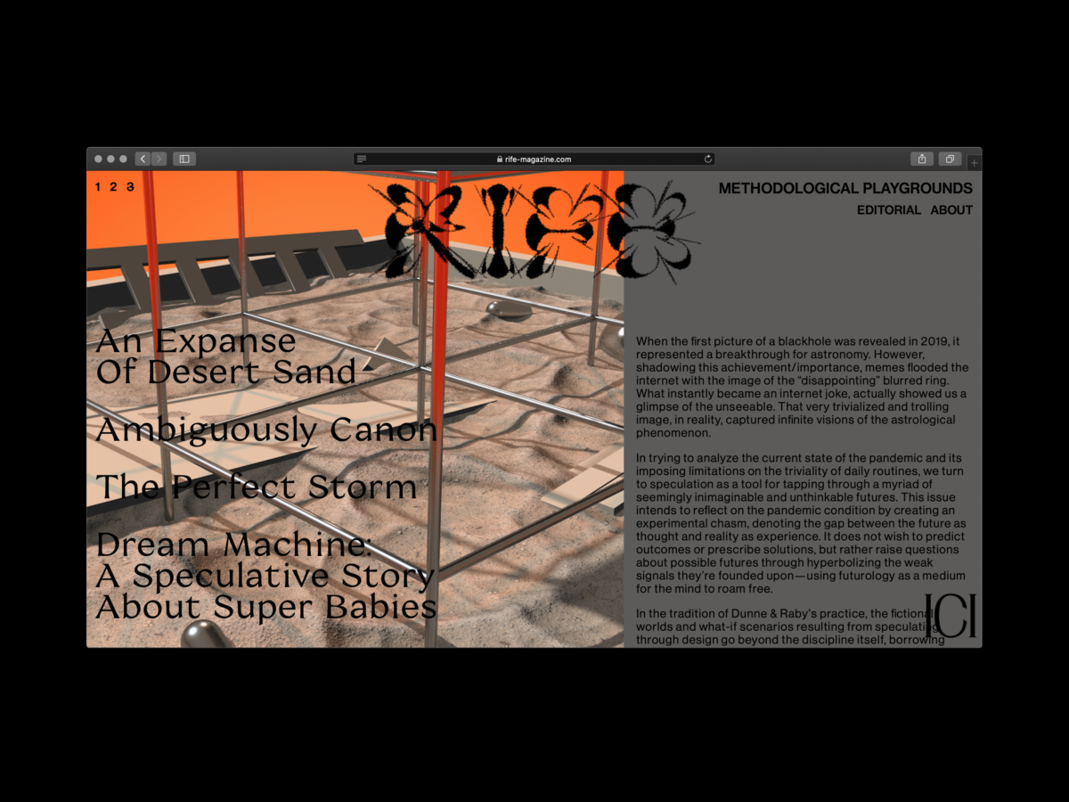
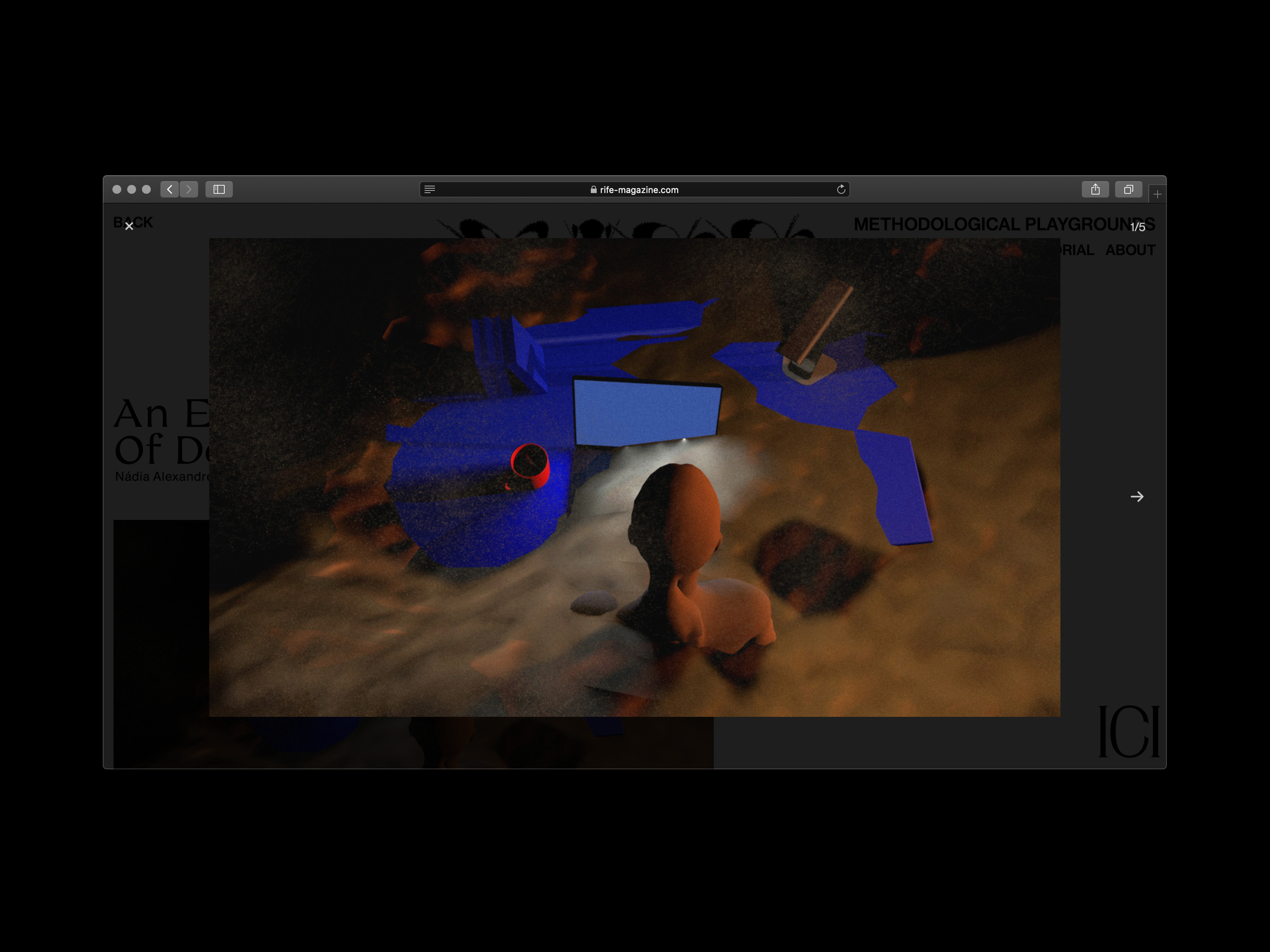
- Rife magazine issue 2, screen shot, from Hiatus Collective
Who’s behind the magazine?
The five members of the Hiatus collective—Beatriz Pinta, Mariana Cordeiro, Manuel Silva, Nádia Alexandre and Sofia Cavaquinho—met while studying communication design at the Fine-Arts Faculty of Lisbon. “We’ve always really wanted to make design more approachable to those outside of the discipline,” says Pinta.
Their uni course is known for its focus on editorial design, though pre-lockdown this had been skewed toward physical print; something that is now pretty much impossible for the students to work on without studio space and access to printing facilities. Although Hiatus are creating Rife independently of their graduation projects, the publication has been overseen by the team’s editorial design course leader Sofia Gonçalves, co-founder of independent publisher DOIS DIAS, in creating the live editorial platform.
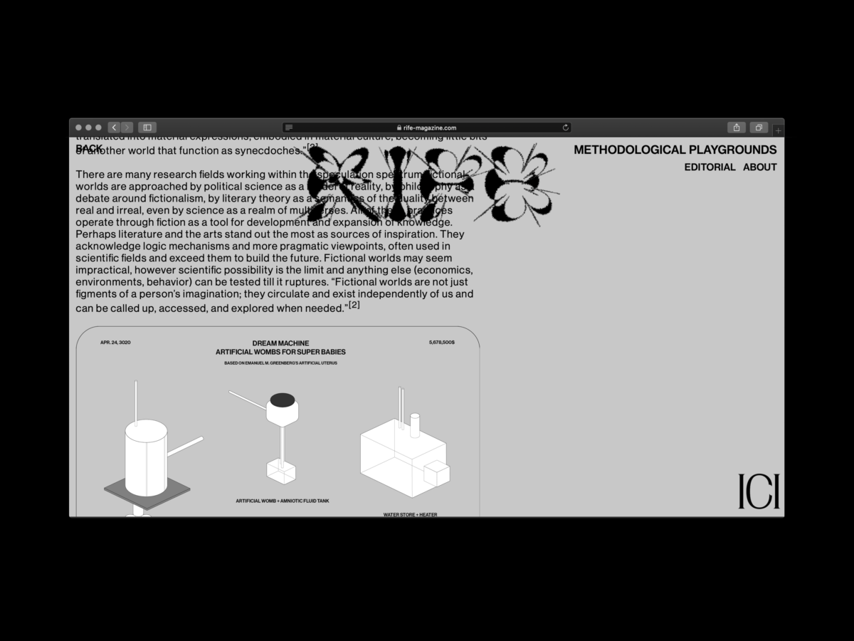
The inaugural issue’s images and texts were created entirely by Hiatus, and for subsequent issues the team is contacting some of their favourite creatives, largely those working in speculative design (the sort of work exemplified by studios like The Rodina, which mixes graphics with everything from spacial and installation design to performance art). Those contacted can submit anything they like, from journalistic text pieces, to personal essays, experimental writing, design or combinations of word and image.
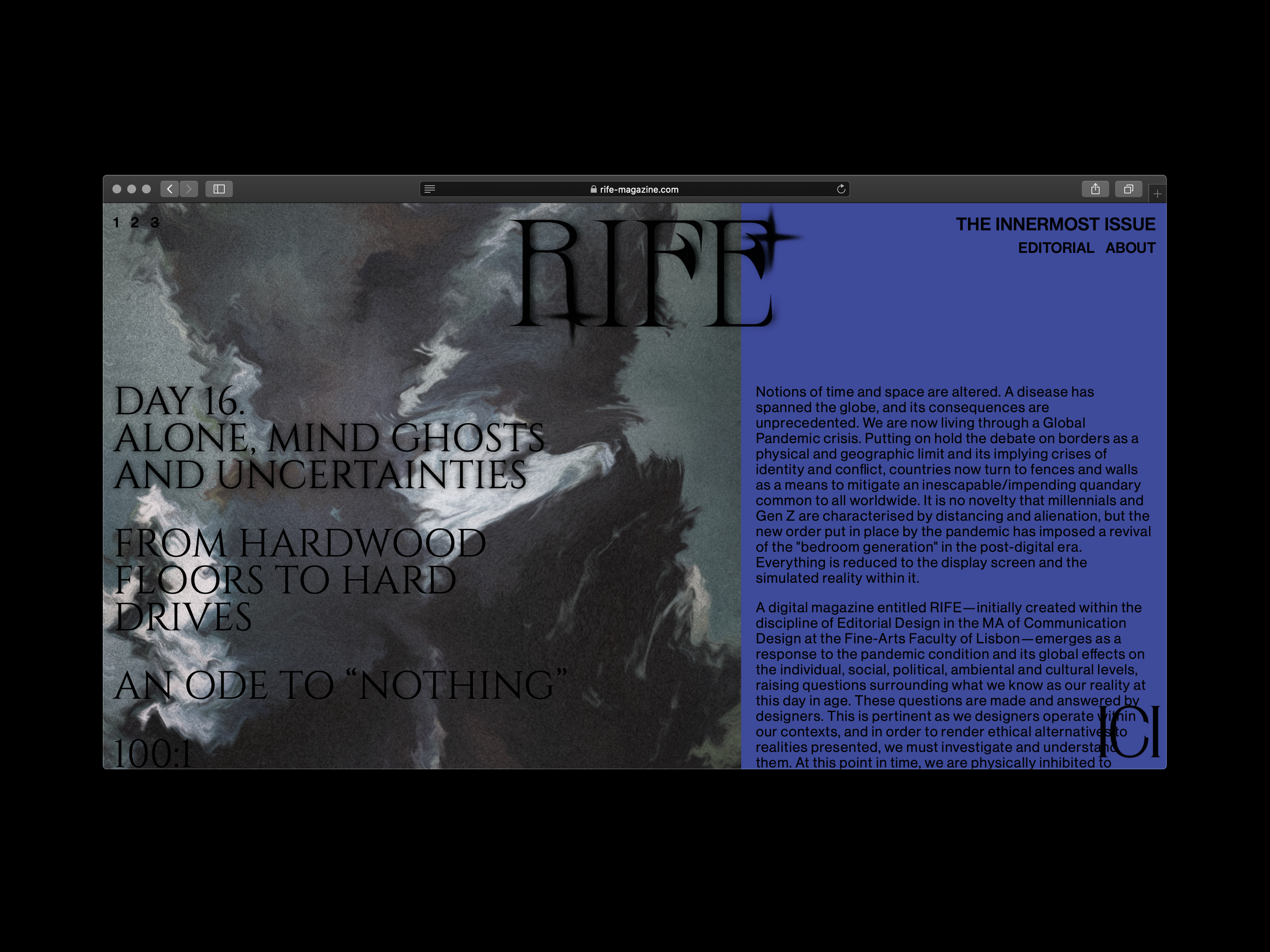
- Rife magazine issue 1, screen shot, from Hiatus Collective
Why else should you read it?
Rife looks stunning and is beautifully intuitive to navigate. The visual side of the platform feels bold and original in its layout and typographic choices, with no hierarchy between image and words. Every issue’s masthead is designed by a different member of the team, and they range from wryly humous, goth-leaning lettering with spindly capitals and almost campy occult-ish flourishes, to barely legible letterforms. The two headline fonts—Cinzel by Natanael Gama (issue 1) and Coconat by Collletttivo (issue 2), and body copy font Neue Haas Grotesk—mean there’s a level of consistency that’s maintained throughout the issues.
But the magazine doesn’t have a fixed identity design. “When it comes to the graphic expression, we wanted it to be mutable,” says Pinta. “Each issue has a different logo in line with our interests, and we wanted to play with the type and continue exploring how the image of that logo can fall in line with the content.”
“Rife is about using design as a tool to contribute to the debate”
None of the team are writers, yet they challenged themselves to each write a piece for the magazine. The result is a breath of fresh air in terms of offering up new, previously unheard viewpoints to discuss the way we interact with and navigate the world, both in light of the seismic changes catalysed by Corona and through entirely personal perspectives.
“It’s bringing so many different perspectives on the reality we live in now, and which we will come to live in very soon,” says Pinta. “The main point is the plurality of perspectives—we’re designers, not economists or people who work in specific fields [relating to Covid-19], so we don’t have any pretence or intention. Rife is about using design as a tool to contribute to the debate. We want to use design in a more palatable way—not for commercial or cultural purposes—which are the usual areas designers work in. It’s reopening design.”