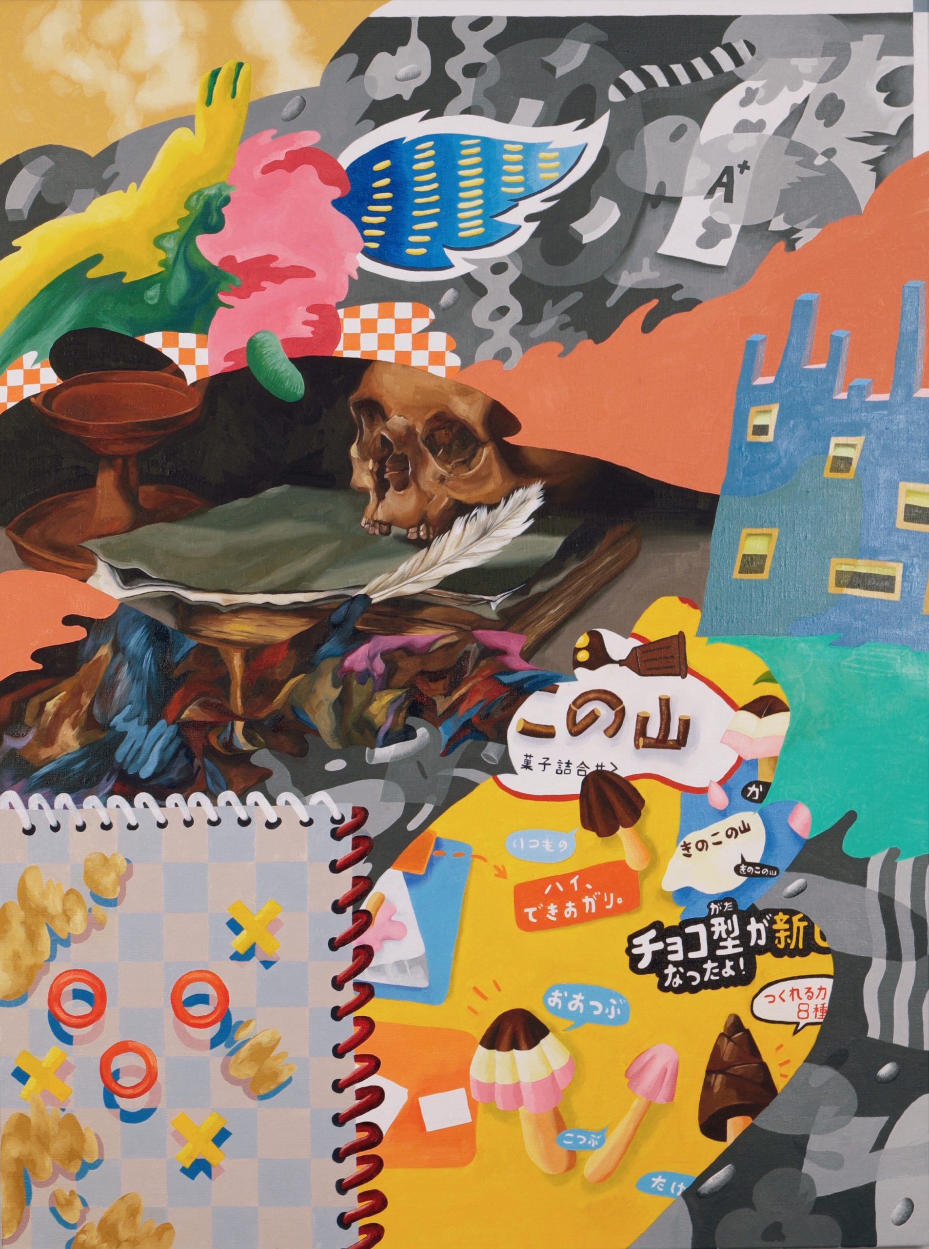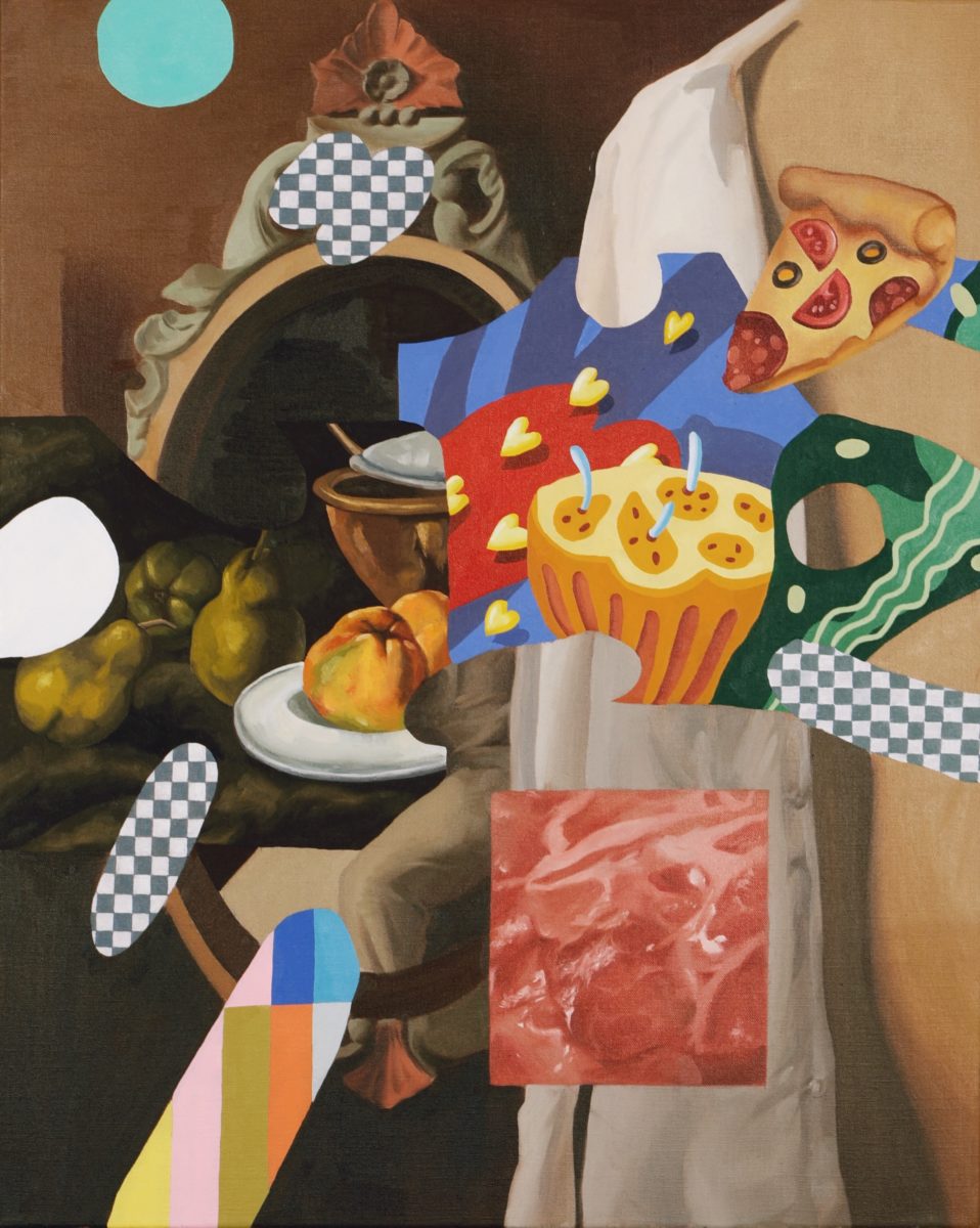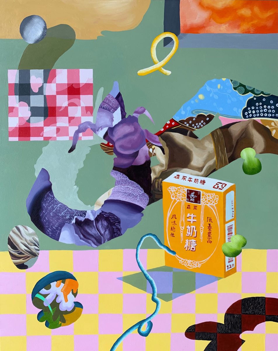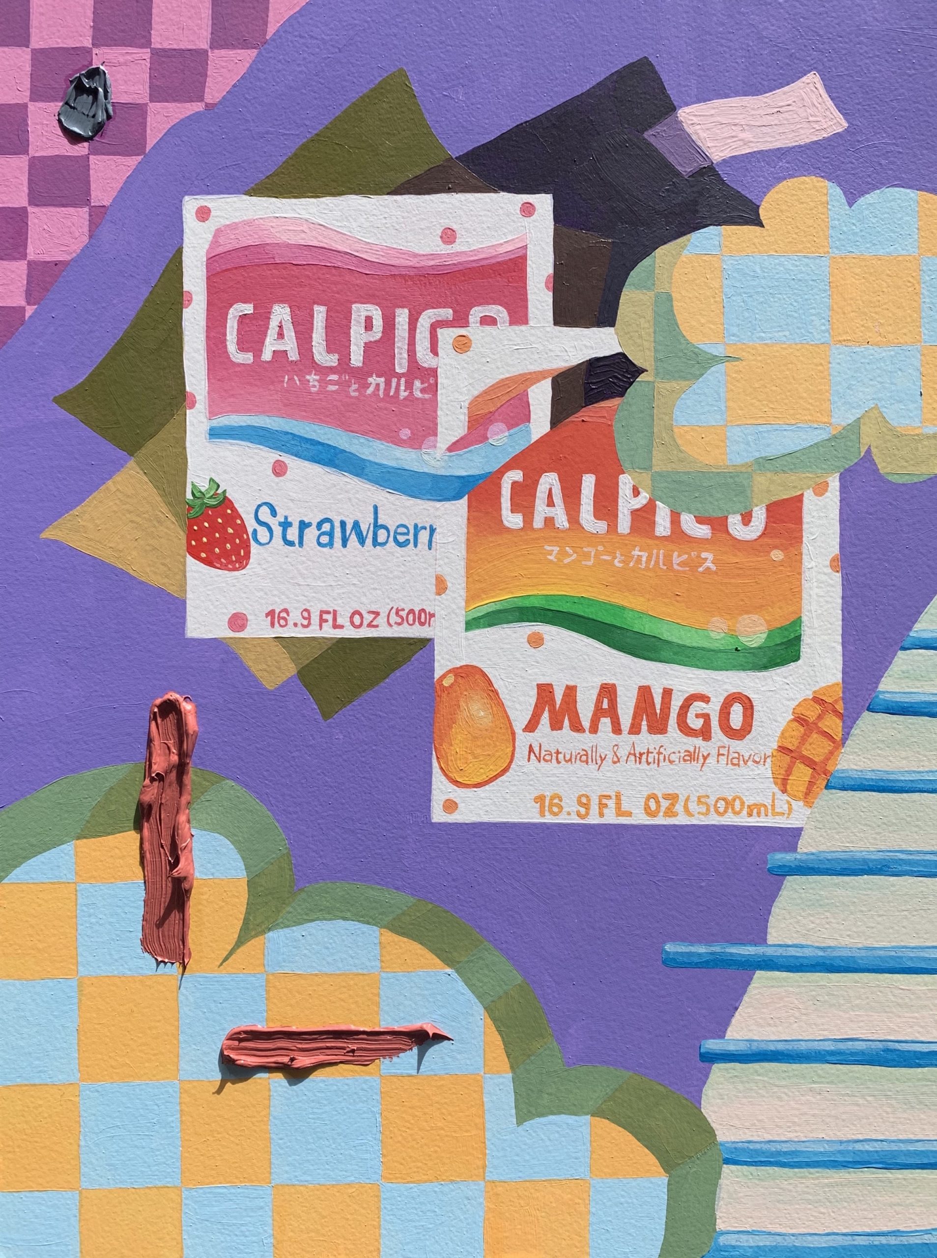
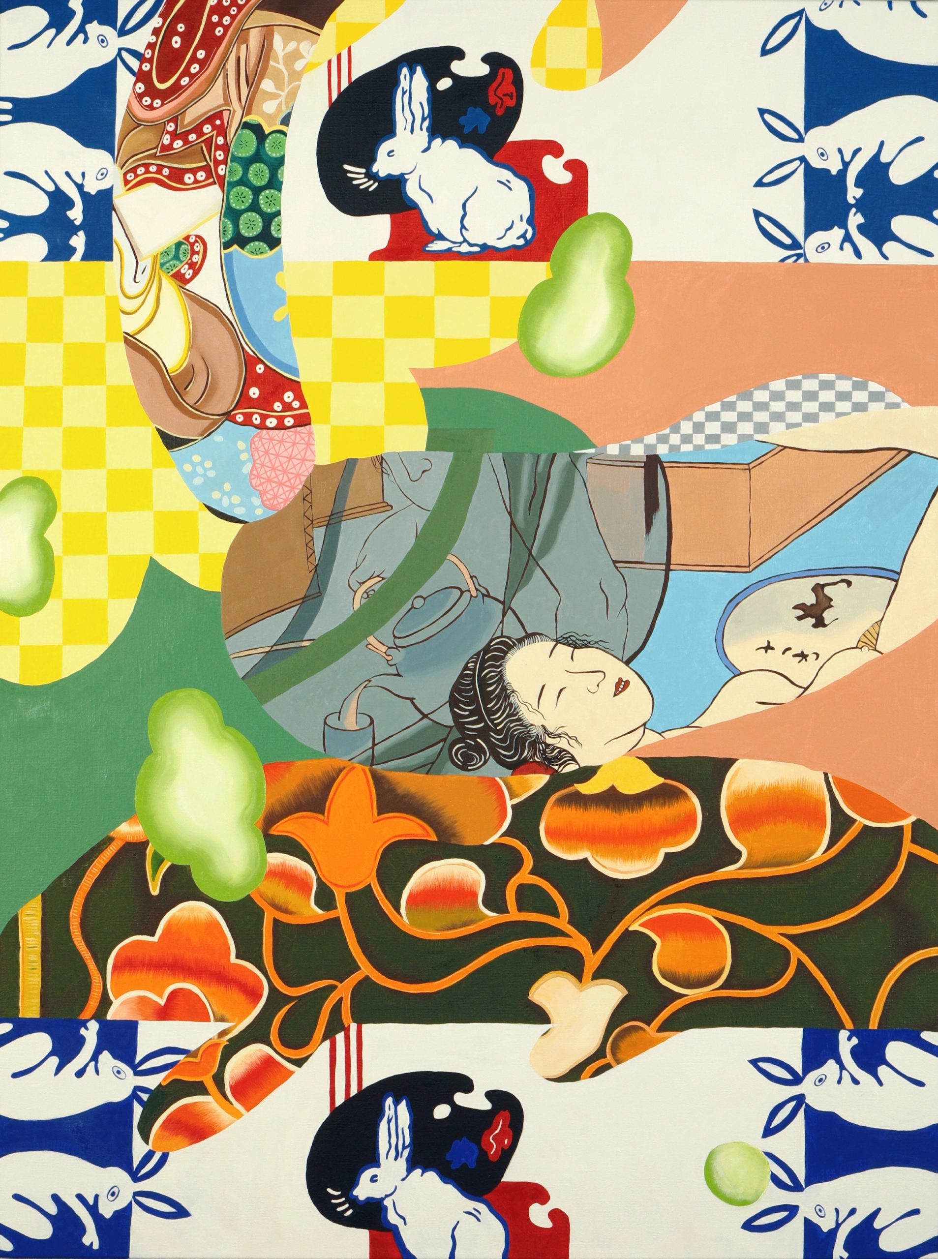
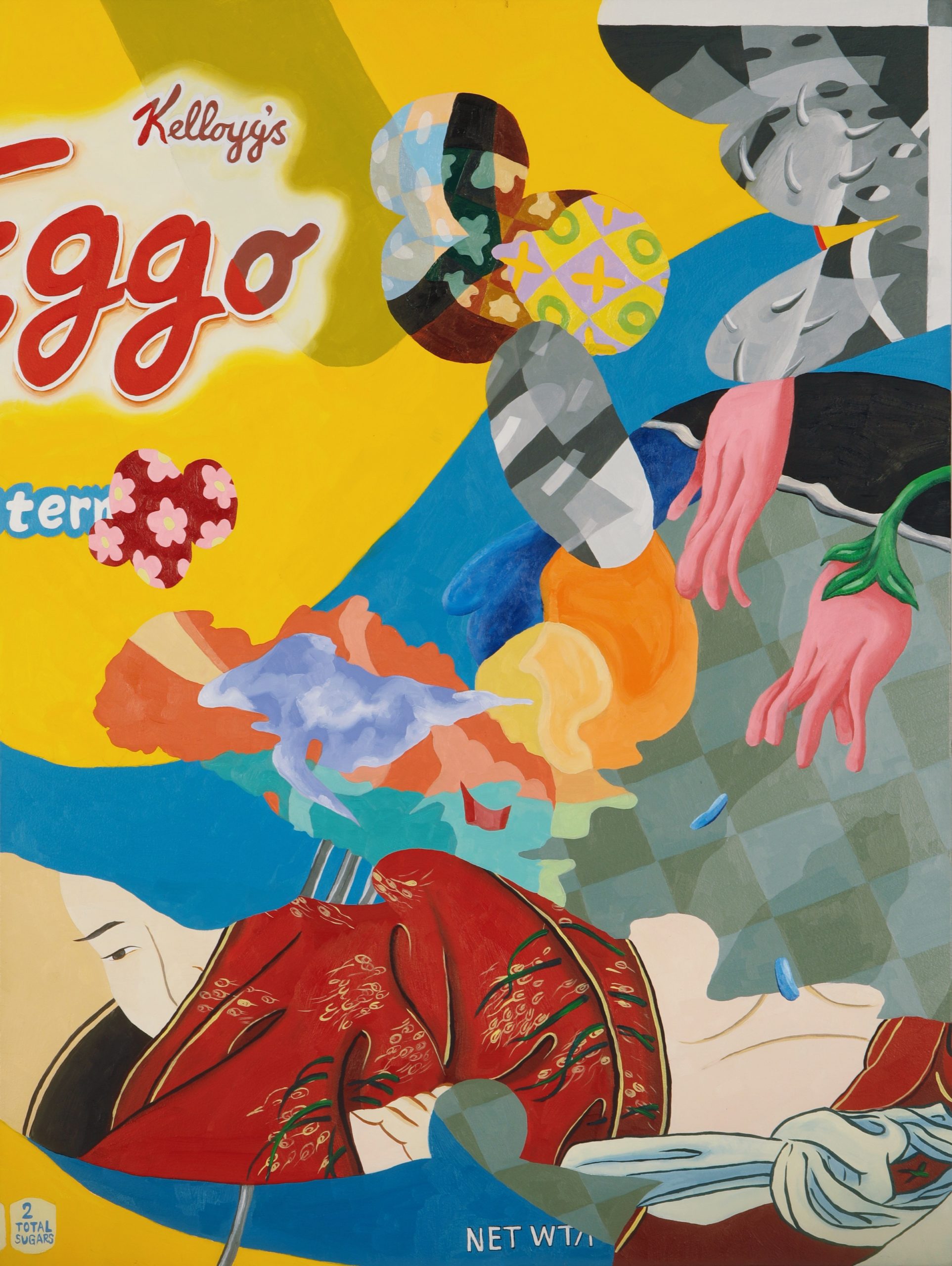
The striking bright colours of Ziping Wang’s work are instantly seductive, but beyond the seemingly cutesy depictions of snacks, food packaging, snippets of wallpaper-like patterns, traditional Chinese motifs and hints of cartoonish characters are more complex threads. The melange of seemingly disconnected fragments is a deliberate mode of subterfuge: Wang’s compositions might suggest a simple meaning on first glance, but this soon unravels into a glorious tangle of narrative threads.
She hints at the strange slipperiness between the real and unreal we experience when viewing the world through the lens of the internet: “the elusive nature of modified reality” and the anxiety generated by the “constant overload of advertisements, pop-up window browsers and catchy slogans” that form a “constructed reality so uncannily similar to the physical world,” as she puts it. The paintings quietly warn of the dangers of assuming meaning from our own narrow, individual set of reference points and experiences.
Having moved to New York from her native Shenyang, China, Wang studied illustration at Rhode Island School of Design before taking her painting MA at Pratt, and this perhaps underscores the technical rigour of the punchy, graphic sensibility of her work. While she previously dabbled in commercial illustration and comics (her comic-strip depiction of last year’s New York Frieze Week is hilarious), she now focuses on her painting practice and this year was deservedly named one of the Saatchi Art Rising Stars: 35 Under 35 list.
An online exhibition of her work on
Unit London’s viewing platform has just closed, and ahead of her London show at the gallery in 2021, I had a chat with Wang. She shared stories about finding inspiration in supermarkets, how her Chinese background informed her paintings’ indirect communication style, and why she likes playing tricks on her viewers.
The compositions of your work and the inclusion of hand-painted type from packaging has a graphic design-like sensibility. Could you tell me more about how you create that and what you’re looking to convey?
I’m really drawn to the colours and patterns of packaging; I like how they resemble this almost ultimate flatness. Sometimes I use a grid of grey or white: in Photoshop, the grid resembles the transparent layer, which is ultimately a flat surface. By using those, I feel like I can create dimension and the illusion of depth, even when the packaging seems completely flat. In classical painting, the atmosphere comes from using a focus point but making the background a little bit blurry. But for me, every edge is perfectly crisp and everything is perceived on the same flat surface: I create the illusion that the depth is missing so that there’s some push and pull between each fragment.
“I’m really drawn to the colours and patterns of packaging; I like how they resemble this almost ultimate flatness”
Your artist statement seems to tie in very closely with that idea of flatness; you talk about how the things we see online might or might not be “real”, the bombardment of images from online adverts and so on. Does that inform the way you use those grids and the selection of numerous different components?
Yes, definitely. When you’re browsing online or trying to read an article, there are a lot of popup screens and advertisements which are so punchy and overpowering. They’re trying to grab your attention and make you focus on something—they almost train you in how to be not distracted. My painting is trying to almost be the opposite of that, it gives you everything at the same time and the audience can choose what they’re trying to read.
- Ziping Wang, Skiing on the train of thoughts, 2020
- Ziping Wang, Sentimental Touch, 2020
Why do you often include so many food motifs?
When I started to put food packages onto paintings they seemed to become one of the key things people were drawn to, because often they’re the most “real” element in there that they can relate to. People start to build their narrative on tangible things; so it’s deliberately misleading, like a trick. I know people will relate to those things so I’m intentionally giving people small entry points. People are so easily distracted today, so I need something that draws people in to spend a few more seconds in front of a painting.
How do you decide on the images and paint gestures that appear in the final image?
Normally, I source my material just from grocery shopping. With the paintings, I always go to packages first and I’ll select which part I want to obscure, and paint over it. I don’t want it to be too easy to read—there shouldn’t be anything intrusive. I’m really interested in the materiality of the paint because my paintings are kind of collage-looking. Otherwise you might ask the question, why not just make a collage? Oil paint is notoriously slow and it’s a painful drying experience, but for me it gives me more flexibility, and using some really thick paint in parts gives another dimension. It moves it away from the ultimate flat surface.
Tell me more about your aim with the work to destabilise viewers’ interpretations.
I like these kinds of indirect conversations that I can create by painting in a specific way to trick people, or mislead them. From my experience of growing up in China, the way we talk there with family, teachers and even friends is never direct. Chinese parents rarely say, “I love you”; they’ll always say something like, “Oh, you cook amazing food” instead.
“I like these kinds of indirect conversations that I can create by painting in a specific way to trick people, or mislead them”
The idea of creating misleading paintings is also about censorship: if you want to talk online about politics, for instance, you might use metaphor or slang to intentionally hide the way you’re talking. It’s almost like a code: people who are in the same sort of groups as you and have the same beliefs will know what you mean, but they can hide from authorities who might be trying to censor you.
It’s also about tricking the audience into thinking they know something [about the painting’s meaning]. I want to call people’s attention to the absurdity of the deciphering experience because there are things you recognise and things you don’t. Whatever narrative you make is never going to be finished because when you think you know what it’s about, you might then notice something else that doesn’t add to your narrative. It’s fine to solve the puzzle by forming a whole narrative then walking away from it, just enjoying the visual pleasure of the image. I feel like I shouldn’t really project my feelings onto the audience: if someone just wants to enjoy what they see as a “happy” picture, they should have the right to do so.
