 I spoke to the foundations head of publications, Adeline Pelletier, to find out more.
Can you tell me a little about Hi-Nikki (Non-Diary Diary)?
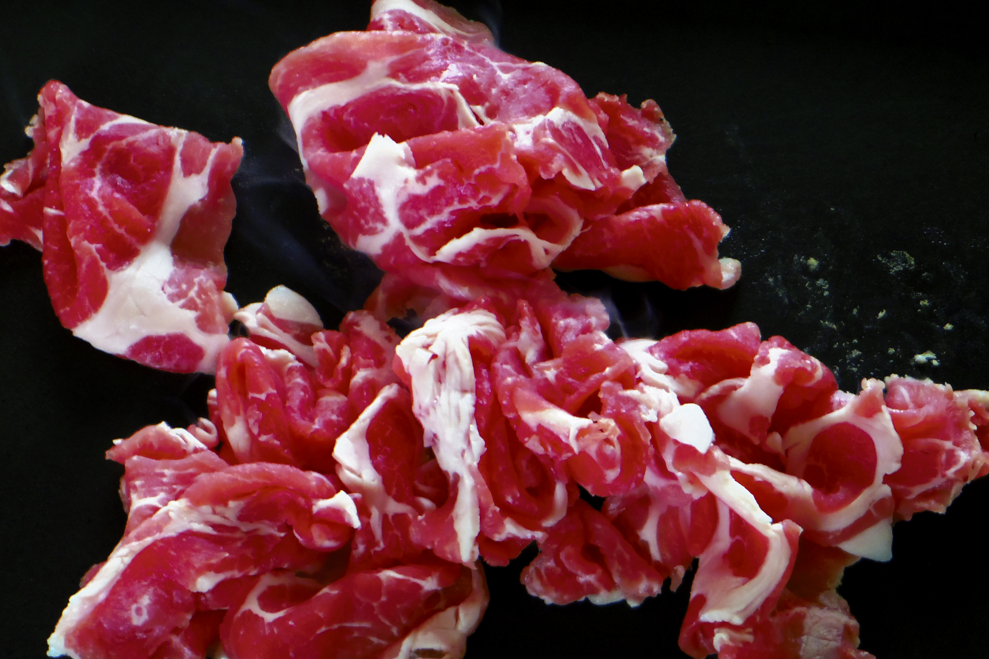
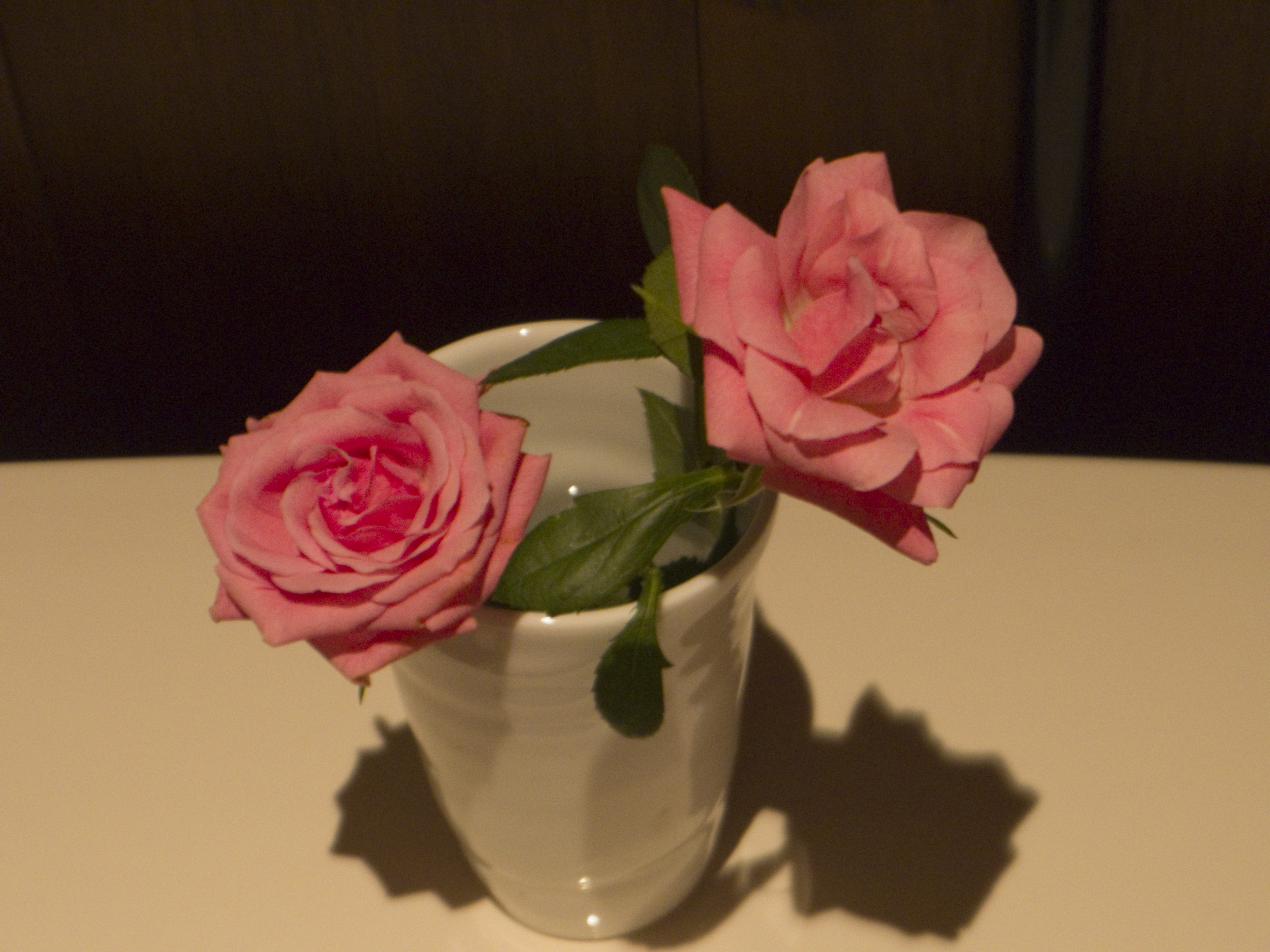
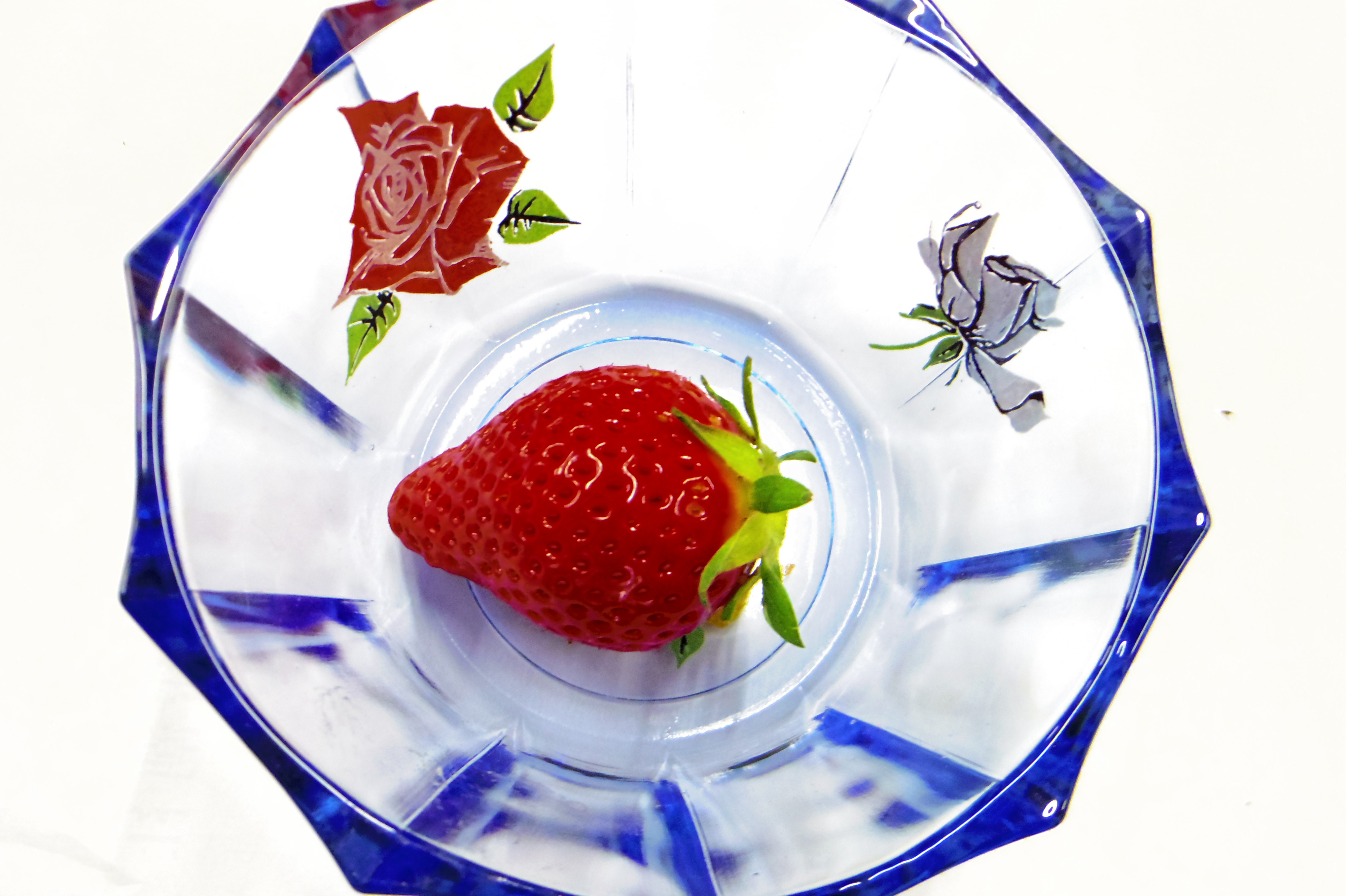
Hi-Nikki (Non-Diary Diary) is a 692-page book gathering 1,250 colour photographs taken by Nobuyoshi Araki over six weeks, starting in May 2014. Instants of his daily life in Tokyo shot with a digital camera, this flow of pictures creates a visual diary: views of the city’s streets, portraits of women, sophisticated still-lifes, and simple snapshots of food. It lets the reader dive into Araki’s world, full of visual references, humour, and an Epicurean sense of pleasure. It is also a reflection on the passing of time, a kind of memento mori.
How has the diaristic nature of the project been approached in the book?
The book’s starting point was the very short text Araki sent us to explain his Hi-Nikki (Non-Diary Diary) series: “My heart beats; I squeeze the shutter. Less a diary, more a transcript of time. This is life: when the beat stops, I’ll be dead.”
The graphic designers, the French studio Pentagon, built the concept of the book from this quotation. Given the considerable volume of photographs and their nature, the designers looked for a guideline, to make visible moments composed of multiple images, like “slices of life.” They put together a program to list the photos’ metadata so they knew the exact date and time when each image was taken. This program, which very clearly highlights moments dense in shooting and relatively long breaks, guided the layout of the images. The passing of time is regular throughout the entire book: an equal number of pages is given to each day, regardless of the number of photos taken within that twenty-four hours. The pages introducing each week give the book its rhythm.
From the exterior of the book, this regular and continuous time is made visible: a vertical strip progressively empties itself over the course of the pages, forming a regular triangle that can be seen on the right-hand edge, while the week’s sequencing is placed on the upper edge.
The binding was also designed to facilitate the fluidity of perusal. The bare spine makes the book very supple and pleasant to look through, and evokes the intimate aspect of a diary. On the grey slipcase, the cherry tomatoes—a recurrent motif in the Hi-Nikki series, conveying the routine nature of daily life—symbolize the time that has passed between the book’s beginning and end, and its inexorability.
Tokyo plays a big role in the book. Do you feel there is a slightly different side of the city shown through the photographer’s closeness with it than we are used to seeing?
The Tokyo Araki shows in this series is rough, with no aesthetic effects. It is an everyday Tokyo, sometimes with a raw light, but seen through Araki’s eyes, that is to say with humour and attention to beautiful small details: the form of a tree trunk, the colourful zigzag of a street sign, the reflection of lights in a puddle. There is no general view of Tokyo, or even of the streets. It is the kaleidoscopic vision of a man going from one place to another in a city very familiar to him. The only place in the city that is widely photographed is the sky, shot almost every day from his balcony. These photographs of the sky, which can also be found in other series made by the artist since his wife’s death, are like a daily search for the disappeared loved one.
The colour red is also very present throughout the book. Where has this come from for Araki?
The predominance of red in Araki’s series is more than the recurrence of the cherry tomatoes, strawberries, and wine glasses throughout the 696 pages. It is metaphorically linked to the fundamental purpose of the series: the heartbeat and the blood that is vital for the photographer to live and create. We decided to emphasize this aspect, using the colour on the cover and edges of the book, as well as on the binding threads.
What was the appeal for the Fondation Cartier to work with Araki?
The Fondation Cartier has a long-term relationship with Araki. Hervé Chandès, the General Director of the Fondation Cartier, organized the first major exhibition of his work in Europe in 1995. At that time Araki was almost unknown in Europe, although he was already quite popular in Japan. That exhibition was an important moment for the Fondation Cartier; it was the beginning of our strong links with Japanese photography in general and with Araki in particular. Twenty years later, on the occasion of Fondation Cartier’s 30th anniversary in 2014, we asked Araki a special favour: to take a photograph each day for six weeks, which would then be published weekly onour website, like a slide show. Araki transformed this commission into a game, and produced a total of 1,250 colour photographs, clearly many more than the initial request. To create a record of this exceptional collaboration, the Fondation Cartier decided to publish this book, which is like a mirror of his prolific and unique career.
Hi-Nikki (A Non-Diary, Diary) is out now. All images: © Nobuyoshi Araki. Courtesy Taka Ishii Gallery