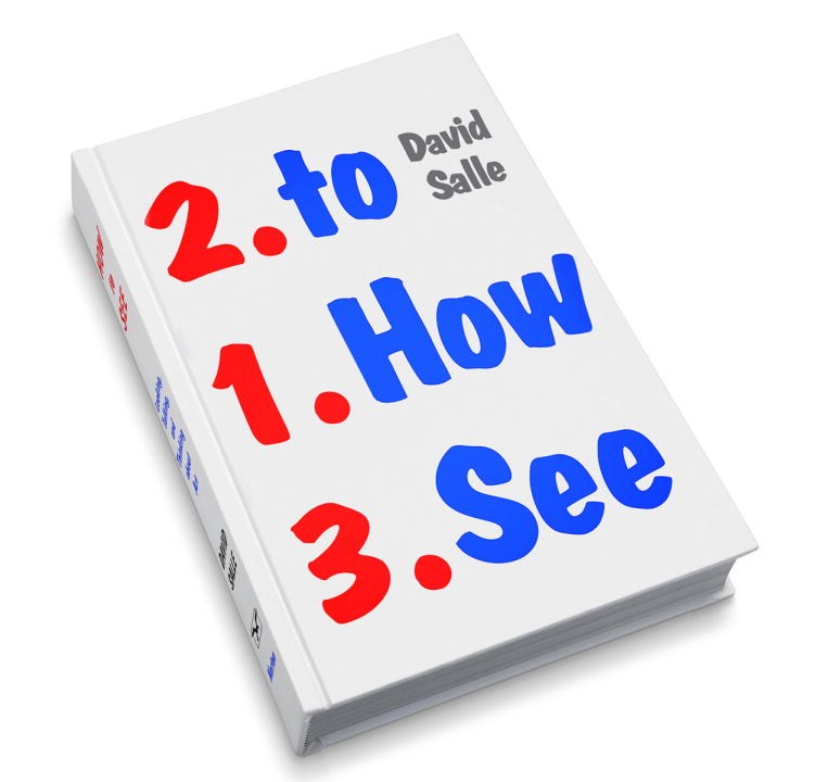
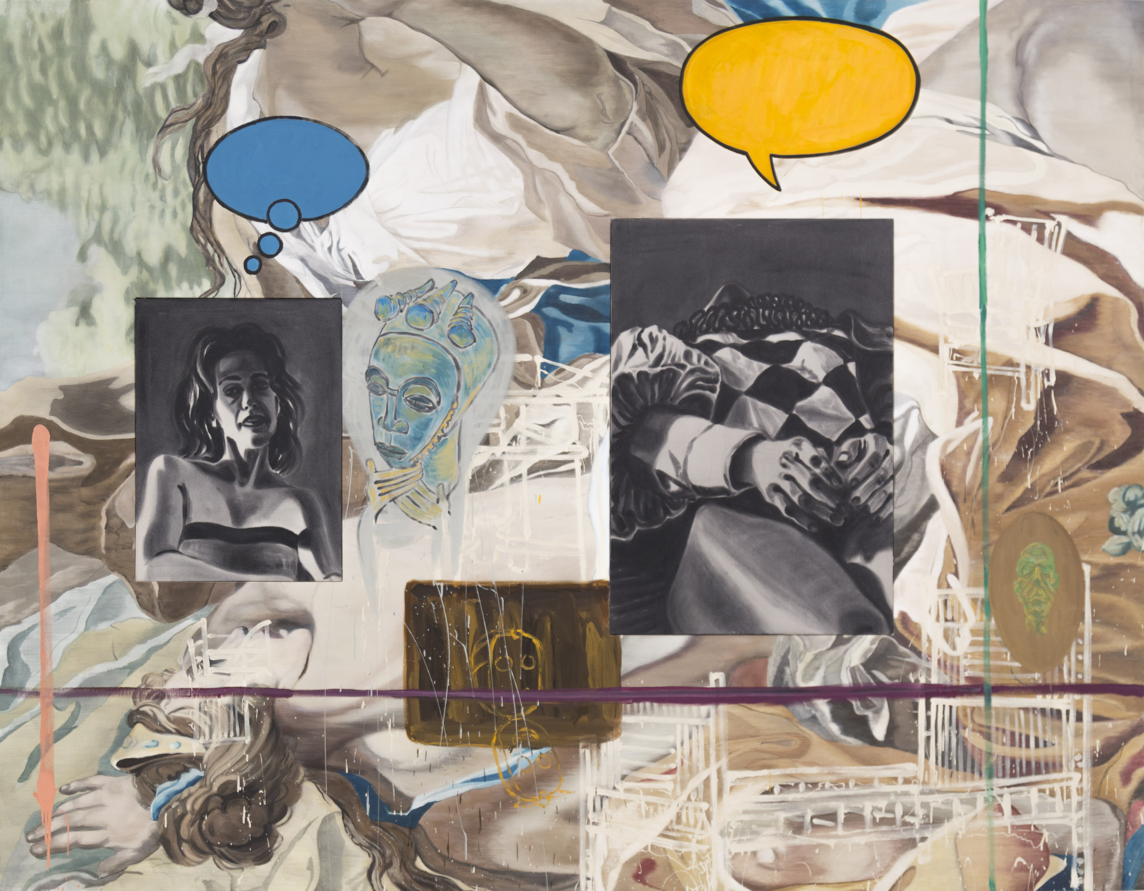
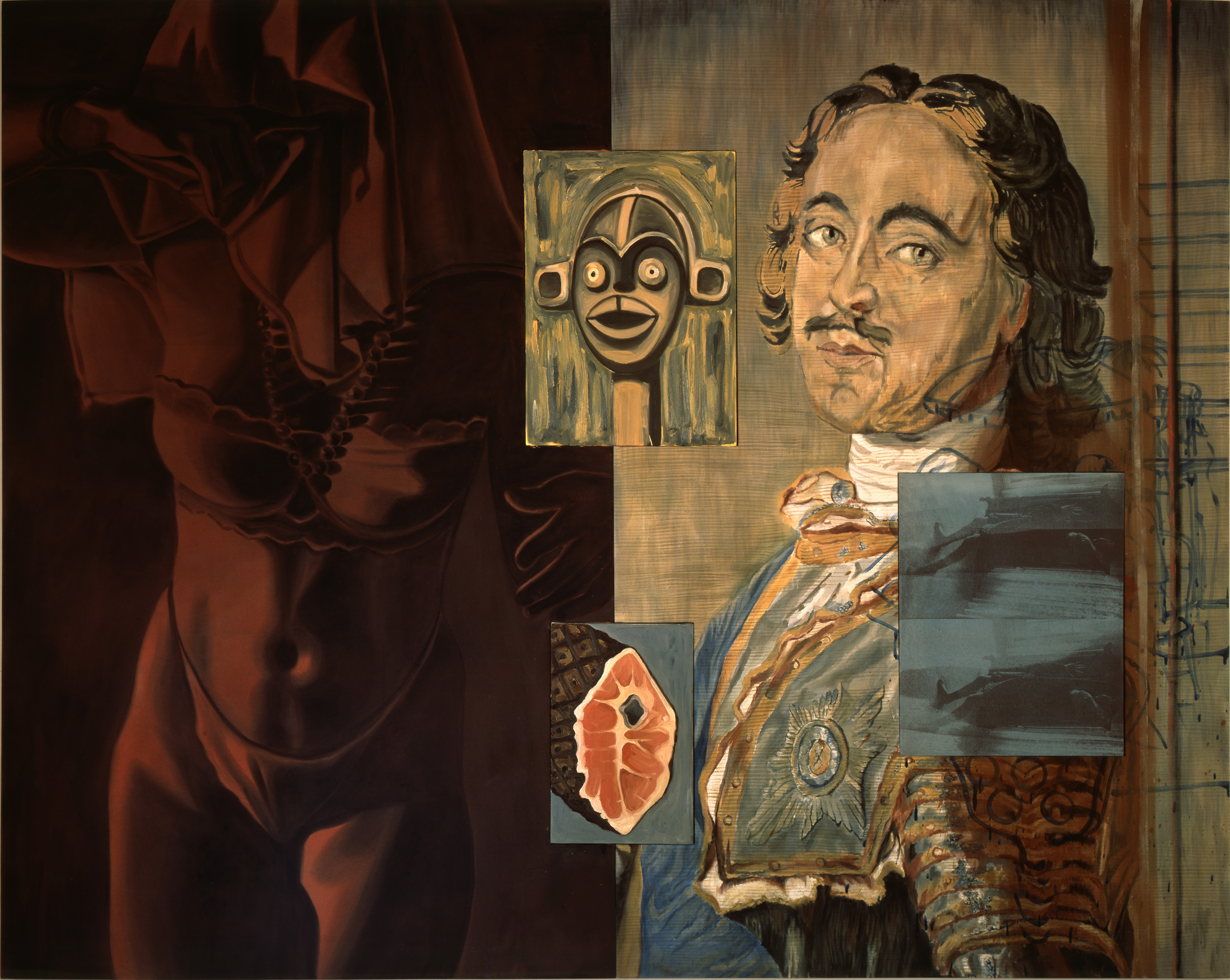
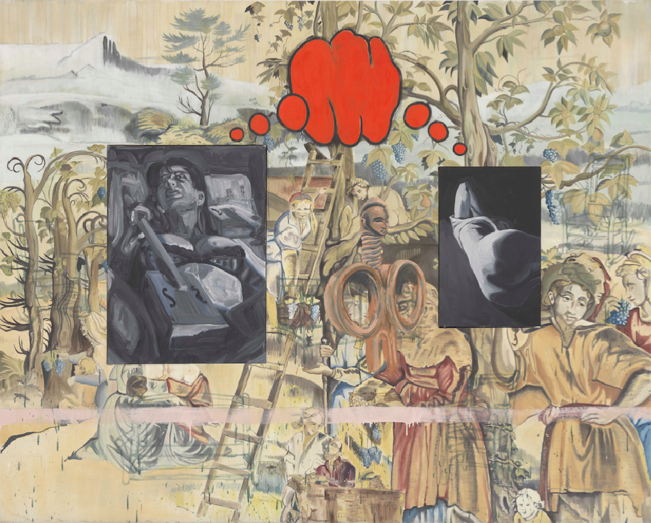
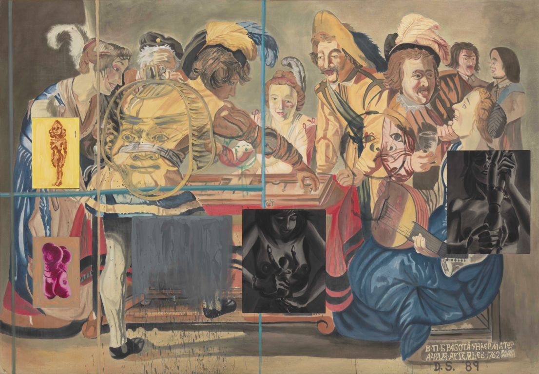
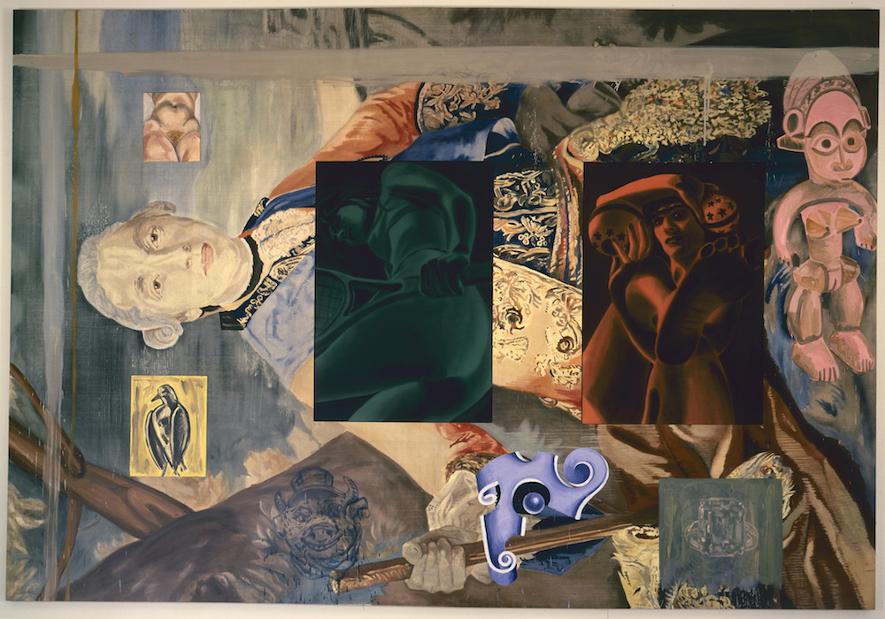
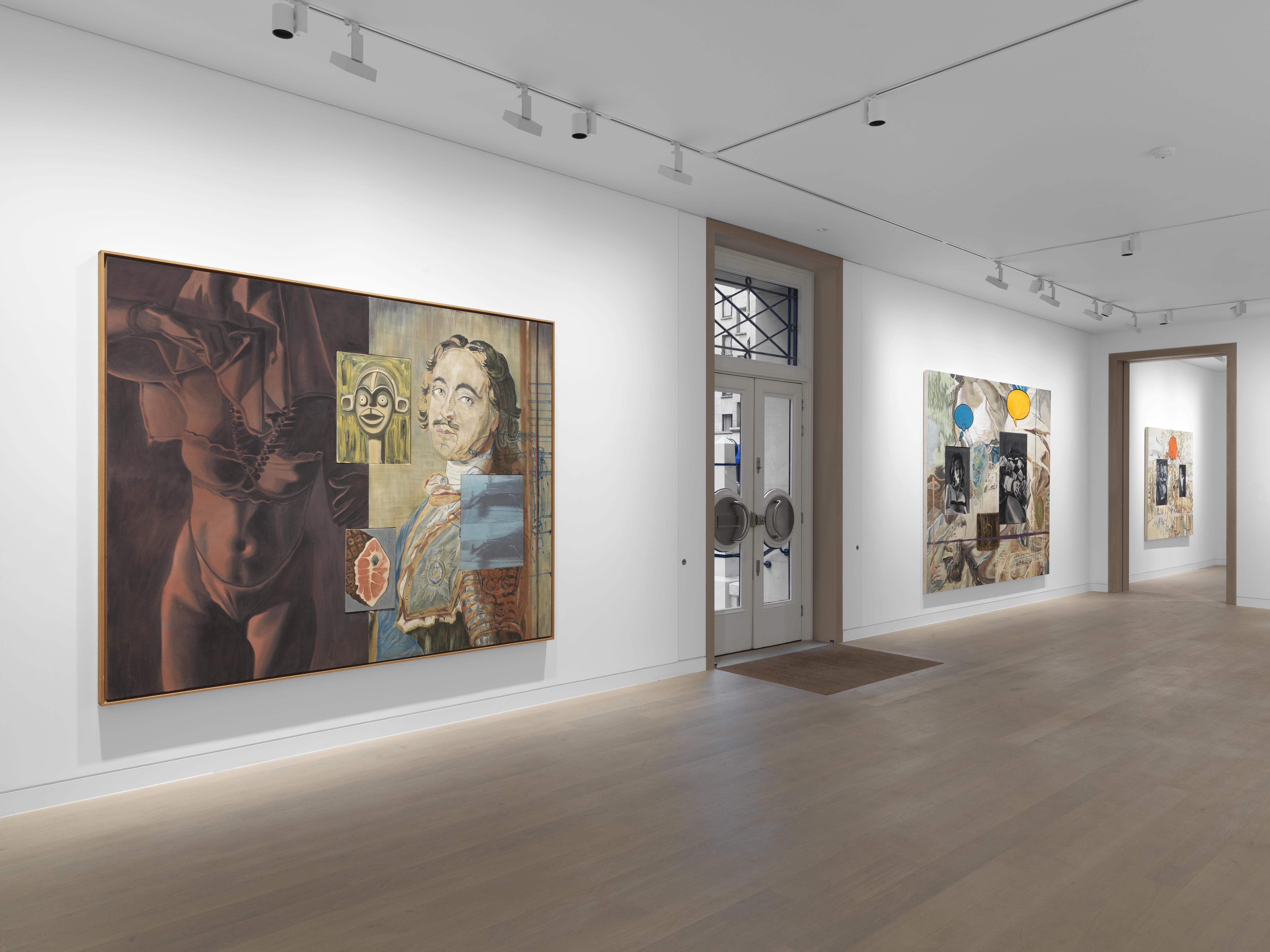
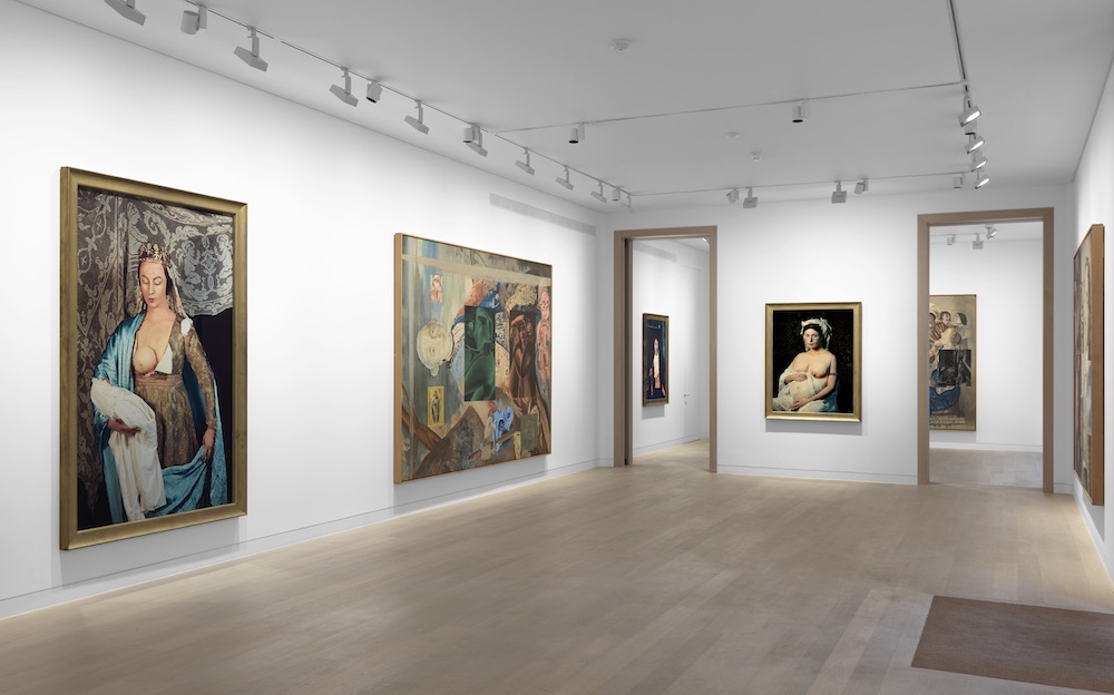
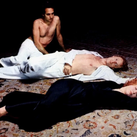
American painter and writer David Salle shares an extract from his book, How to See, as an exhibition of his Tapestry Paintings together with Cindy Sherman’s History Portraits continues at London’s Skarstedt.
Painting is one of the few things in life for which youth holds no advantage. The diminutions wrought by aging—of muscle mass, stamina, hearing, mental agility (the list goes on)—are offset among painters by fearlessness, finely honed technique, and heightened resolve. A ticking clock focuses the mind. There’s a recurring narrative about late style in painting: from Rembrandt to de Kooning to, in our own era, Agnes Martin and Cy Twombly, the trajectory of the long-lived painter in the final decade or two reaches toward a greater openness and a simplifying of form, along with efficiency of execution. Muscle memory is the last thing to go. In this reading, a painter’s late work is characterized by letting go—the older painter needs to do less. This effortlessness is also embraced by young painters, but for a different reason: they’re placing a bet on one idea and hoping it’s enough. Anyway, young people are in a hurry—there’s no time for psychological complexity. Conflict is left for the middle years.
Two shows in New York in the spring of 2015 illustrate the effect I’m talking about: Alex Katz (age eighty-eight) at Gavin Brown’s Enterprise, and Malcolm Morley (eighty-four) at Sperone Westwater. Both artists had strong and invigorating exhibitions that refocused our sense of how their painting, and painting generally, can be extended. To these shows I would add a third that happened to coincide: Georg Baselitz’s Orange Eaters and Drinkers series, from the early 1980s, at Skarstedt. Can we do that? When he made these paintings Baselitz was barely into his forties—a youth. True, but some people are never really young. Baselitz strikes me as someone for whom the sunniness of youth held no savor. Maybe it was the war—gravitas settled heavy on him from an early age. The beginning of the ’80s was an especially fruitful time for Baselitz, and the “Drinkers” and “Orange Eaters” are among the very best pictures of his robust career. There is a certitude and a clarity about them, the end point of a hard-won evolution, as well as a wiliness; it’s remarkable they were made by anyone semiyoung. I’m told that Baselitz thinks of himself as a young artist, his chronological age a mere technicality, and that he’s surprised not to be included in shows of young painters. But to paraphrase Bob Dylan, he may be younger now, but he was so much older then.
All three shows had in common a concern with the way painting takes an image and makes out of it something iconic. How is an image built out of paint? What holds it together, and to what end? For Baselitz, the starting point is a gesture—someone raising a glass to his lips—and through repetition and intensely focused observation he makes of that gesture a piece of existence; the painting holds our seeing it. At first look, the image seems to exist merely to give the paint something to do; the space is flat, the figures barely volumetric. Baselitz paints the world upside down, like a human retina in reverse; his visual field is upended and projected, one mark at a time, onto the canvas. It’s a demanding perceptual conversion, like walking backward through a crowd. The purpose of this self-imposed awkwardness has been to ensure that the visual translation natural to painting is made with maximum attention. Try it. You’ll see how exhausting it is—exhausting to do, exciting to see.
For Katz, on the other hand, the iconic image begins with scanning a scene for interlocking patterns of light and shadow, as well as overlapping objects that create scale and distance—an observed bite of reality, like a house glimpsed in some woods, say, its chimney and front door glowing pink in the sun, that forms the image in embryo. These are the ingredients from which a unity is sought and onto which it is imposed, like pieces of a puzzle that snap together. These pieces, the shapes, are given contours of such specificity as to create a sense of authenticity, of life. Sometimes the very improbability of his shapes guarantees their veracity; it could only have been thus. Painting at this level has a moral dimension: Katz’s work is permeated with an awareness of things as they are. It’s a matter of core identity. One doesn’t just paint—one merges with painting. His six-decade career reminds me of James Boswell’s view of Samuel Johnson (quoted by Andrew O’Hagan in a recent issue of the New York Review of Books), that Johnson was a “moral unity, a man who was never not knowingly himself.”
Malcolm Morley begins with something semi-iconic—a model airplane, a toy boat, or a postcard—and finds in it, through a complex and stubborn act of mimesis at the end of a brush, the image that is the painting. He doesn’t paint life per se. Rather, he crafts scenes assembled from models, mostly of his own making, and the paintings that result from this convoluted process are like a loopy costume party: everyone is masked; true identities are withheld. What we see is only the shmushy, malleable surface behind which the actual, sharp-focus world resides. And what with painting’s central paradox—that there is no world behind the painting, any painting, only the painting itself—looking at a Morley can give you the sensation of being trapped in a painterly hall of mirrors. At times, it can feel a little airless.
These three painters also have diverse approaches to the question of how to treat an edge within a nominally realist enterprise. Edges in painting are like accents—you can place where someone’s from by his or her diction. Baselitz, hewing close to the Northern European graphic tradition that runs from Dürer to Max Beckmann, uses line, or more properly marks, to corral and lay out his subject. With a slashing brush loaded with black paint, he constructs a contour for the figure, not so much to define the form but as a way to fix it in space—to get it down, as closely as possible, to the generating moment of perception. In this regard, Baselitz inhabits the same stylistic and moral universe as Giacometti, whose incessant erasure and redrawing of the model is an obvious precursor. “Image capture” indeed—it’s not only on your laptop. Painting the image upside down makes it impossible to work in any traditional figurative manner—that is, from the inside out, from bones to flesh. Baselitz applies color in the general vicinity of the form and then holds in the expanding area of color with an accumulation of black marks; the lines give the color a kind of exoskeleton.
Katz, on the other hand, eschews outlines altogether. The edge, the place where two shapes meet, is everything. The edge for Katz is like phrasing in ballet—it’s the essence of his Astaire-like painterly grace. Color is thinly brushed out to the perimeter of a shape and left to stay there. In the same way that Baselitz started out with a style rooted in the past and bent it to his own historical position and temperament, Katz began with what is essentially the classical French tradition (forms described by areas of color; where the plane changes, so does the color) and brought to it the flatness, immediacy, and graphic enlargement of pop art. It’s a good example of how a style or technique, once common but now attenuated, can be redirected—nearly a hundred years later, by a radically different historical imperative—into a completely new look. It’s what used to be called tradition—a thing one understood and, if one was ambitious and lucky, built on. Probably no one in 1860 could have predicted that Manet’s style, the simplifying of form into light and shadow, would be reborn as Katz’s, but that’s one way to think of it.
As for the edge in Morley’s melty universe, it’s all negotiable. In 1982 the artist painted Cradle of Civilization with American Woman, which remains a kind of ur-postmodern picture. I remember being struck by the painting when it was first shown at the old Xavier Fourcade Gallery uptown. A sienna-hued nude woman sunbathing on a crowded beach lies huge at the bottom of the picture plane—she looks to have been painted with the kind of wire brush used to clean barbecue grills—while crowds of people, swimmers red as tomatoes, cavort and collide in the surf. Superimposed onto this scene are a figure of vaguely Hellenistic appearance, encased in a cerulean-blue outline, and a black horse, minus rider, with a Trojan battle helmet floating over its back. The picture should come with a warning: don’t try this at home.
Morley had been working for years to find a way to translate his fracturing, shattering, and disjunctive impulses into paint. In Cradle the transgressive ID runs riot; the picture is a gas. It has neither outlines nor, strictly speaking, edges. It has instead Morley’s exploding, dissolving, at times deliquescing sense of form; you feel that his forms are made from the inside out, that each figure or tuft of hair or ocean wave is the result of a micro-explosion of paint, a kind of paintball in reverse.
The problem with Katz’s work, if it can be called a problem, is that so much flawless painting over so many decades has lulled his audience into thinking that they know everything there is to know about the old boy. People can relax into the knowledge that Katz isn’t likely to break new ground at this point in his career. The steady stream of perfectly realized paintings calls to mind one of those graphs showing a dauntingly expanding series of prime numbers, each one uniquely itself but all related, stretching to infinity, or Charlie Parker at the Five Spot—so many perfectly struck notes played in rapid succession that it’s hard to pick out the gems. But that’s the audience’s problem, not the artist’s. And for Katz (unlike Parker), the story is far from over.
Most, if not all, of the paintings in Katz’s show at Gavin Brown bring a jujitsu-like ingenuity to the familiar Katzian playing field. To see him work is like watching a seasoned master of the soccer field—the green expanse is familiar, but in tonight’s game he will introduce some new moves, some new inflection of the knee that will subtly change the game’s dynamic. Maybe a goal will be scored from an improbably long distance—the accuracy, seemingly effortless and happening in an instant, bringing the crowd to its feet. True to the late-work notion, these paintings are exceedingly open, both in their conception of what is sufficient to make a painted image and in the way they’re painted. The brushwork is loose and precise at the same time; some fairly complex shapes whose edges are cut out and into like so much cookie dough are laid down with an enormous brush using very few actual strokes. You wouldn’t think such a tight corner could be taken in such a wide vehicle, but it seems to offer no resistance; the paint appears to know exactly where it needs to go, and goes there without argument. The color intervals as well as the value pattern of these new pictures have a level of sophistication not seen in New York for a long time, if ever. Some of the color has the elegance and unexpectedness of Italian fashion design: teal blue with brown and cream, emerald green with pale yellow and brown, black with blue and cream. You want to look at, wear, and eat them all at the same time. For all their looseness (and in one or two the paint is so thin it looks like it might slide off the canvas), the paintings are held together by a firm undergirding; a rigorously delineated map keeps the painting from flying off into formlessness. Katz’s world is not all cream puffs and daisies; this understructure is made of hardened steel.
Slab City 2 (2013), titled after the unlikely name of the town in Maine where Katz has summered for nearly sixty years, revisits a familiar theme: a lone house by a road glimpsed through some woods. How is Katz able to make this image look so immediate? We have the sensation truly of coming upon it unexpectedly; it’s a hushed little surprise, painting’s secrets revealed. The picture is very tall; it puts our sight line somewhere improbably high up, so that we seem to be swooping in and down through the trees, floating over the road to arrive just short of the cabin door, which glows pink in the late-afternoon light. The huge trees are interlocking fingers of green, a quartet of greens, creating three overlapping, directional weaves, each one pulsing energy out to the edges. And the crisp sliver of pink door—one brushstroke with an angled top—is the grace note amidst so much green. The painting, along with many others in the show, is so right, and executed with such controlled abandon, that I had the sensation of someone gaining traction on air.
This individuality, this uniqueness of shape or mark, is primarily a form of attention, and it carries with it an implicit worldview. Coming in contact with it makes you realize yet again that all the arguments against painting, which are determinist, economic, and political, have little to do with the practice of painting, and have in fact had little impact on it. Questions of dominance or irrelevancy, or of the market, are of a different nature from what is most vital about painting, which is found in the realm of specific attention paid to specific visual schema.
Morley, too, has been perfecting a very specific, highly personal, idiosyncratic way of putting paint on canvas for a very long time. Besides octogenarianism, Katz and Morley don’t have much in common. Morley is mercurial and restless, experimental, literary, theoretical, and perverse. His work is squarely in the tradition of his countryman J. M. W. Turner, with its mists, tunneling light, images of combat, and outward spiraling squalls of paint, but it also has something in common with Arcimboldo and other mannerist eccentrics. He’s a windmill tilter.
While Katz uses the largest possible brush for each form, only switching to smaller, pointed brushes (called “brights,” a name I love) for details like eyelashes or buttonholes, Morley uses small-bore brushes for the whole goddamn painting. And whereas Katz uses the least number of brushstrokes to set the scene, once confiding that a lovely painting of a seagull in flight was made with “exactly 45 brushstrokes,” Morley seems intent on seeing just how many densely packed licks of the brush he can bundle into every square inch of canvas surface. It cannot be said of him, as Fairfield Porter once wrote about Roy Lichtenstein, that he “does not torture the paint.” Morley tortures it good and plenty.
Morley’s work is almost punishingly dense, demanding, uningratiating; he dares us to imagine the act of sustained concentration that goes into its making. Ship masts, airplane insignia, ocean waves, tiny flags, portraiture, battle, motion, and weather: Morley loads difficulty on top of still more difficulty; if there’s a harder, more roundabout way to make a painting, Morley has yet to discover it.
At its best, all this travail, all this surface agitation achieved at such effort, combined with the warping, sheared-off, roller-coaster-on-the-descent kind of spatial feeling, results in pictures that win our admiration. A good example is Dakota (2015), in which a WWII-era bomber, a few freight-train cars on a track to nowhere, a modern-day tanker, a Viking ship, and a turreted brick castle tower all share a Permanent Green Light sky and a similarly hued sea, the waves of which are rendered as little chicken scratches of white or darker green. And in the bravura The Island of the Day before Regained (2013)—a depiction of two Messerschmitts going after an improbably candy-striped US Army bomber that looks about to crash into a man-o’-war ship of vaguely eighteenth-century appearance—the whole kind of I don’tgive- a-fuck surface roils and boils with manufactured abandon.
One thing has changed. True to the cliché about older artists stripping away all unnecessary scaffolding, Morley has more or less deserted the grid that informed his work for decades in favor of a direct attack with the brush. The absence of the grid—the device by which the painting was broken down into small, manageable bits—has resulted in paintings even more fluid and disembodied than before. Unconventional to the core, Morley has the autodidact’s surety of self, along with a frenetic, anxious, gleeful will to please. At eighty-four, he’s like the boy who wants to be praised for blowing up his toys.
More than any other painter, Baselitz works like a boxer: he makes you lean in, but in the next instant keeps you at arm’s length; get too close and you could take one on the chin. (Compare him to Anselm Kiefer, whose work yields no advantage when viewed up close. The effect of Kiefer’s work is theatrical, akin to how images work on a proscenium stage; the best seat in the house is about row K.) Baselitz’s surfaces are a balance between raw agitation and calculation, between perceptual rigor and design. The paint is applied with insistent, overlapping brushstrokes that might get around to defining an image but are mostly just themselves. There is in his work an internal sense of when to start and when to stop; when to introduce a new color, a bigger scale of mark; when to insist and when to leave off insisting; when to feint and when to jab. Whereas Katz’s work is like being roughed up by a cloud, Baselitz aims to bruise. As a colorist, he has something in common with Brice Marden. His ’80s work is an essay into the possibilities of yellow (yellow-orange, yellow-green, yellow-black), as well as green-black, turquoise, mint, mud, and, surprisingly, white. His color is visceral, sophisticated, and mostly free of referents. It’s all art.
The show at Skarstedt, handpicked and deliberately assembled, was in large part composed of masterpieces. I was struck by what a sophisticated designer Baselitz is—something I hadn’t noticed before. And there was something else in these paintings that Baselitz is not known for: wit. In Drinker with Glass (1981), a man seen in profile, one hand up to his cheek, is gingerly sipping from a cobalt blue martini glass that is about two feet tall. His red nose and the slightly alarmed look in his eye tell the whole story. It’s a deeply poignant and funny and gorgeous picture. In Orange Eater III (1982), we see Baselitz the quirky designer. The orange eater of the title is wearing some kind of harlequin or argyle shirt. Aquamarine, turquoise, brickred, and white diamonds jostle together, floating free of their wearer, while alongside the picture’s right edge a cascade of loosely crosshatched teal blue marks declares its autonomy: sometimes paint is just paint.
Excerpted from ‘How to See’ by David Salle. Copyright © 2016 by David Salle. Used with permission of the publisher, W. W. Norton & Company, Inc. All rights reserved. ‘Cindy Sherman & David Salle: History Portraits & Tapestry Paintings’ is at Skarstedt, London, until 26th November 2016, www.skarstedt.com