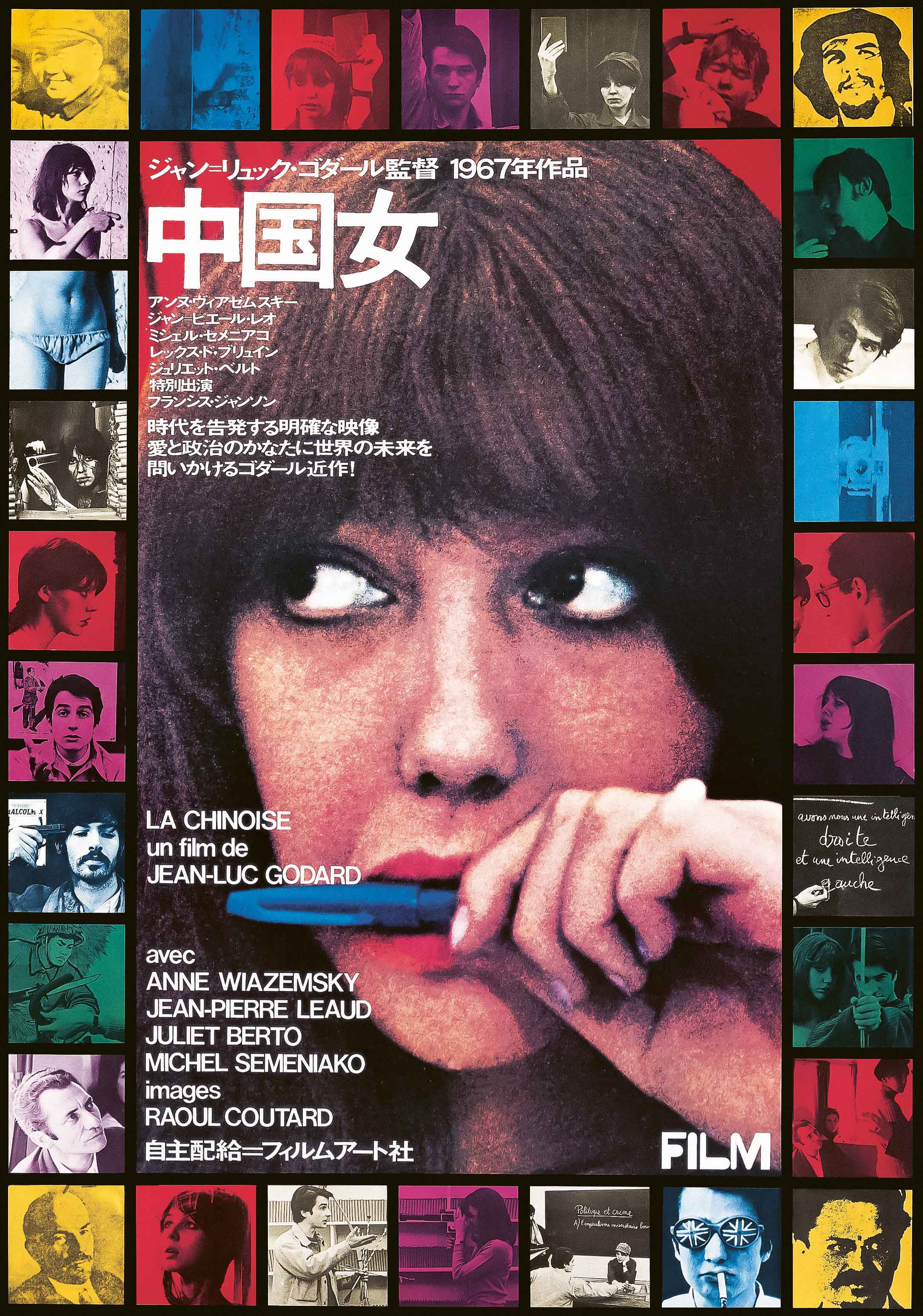
A brand new book, French New Wave: A Revolution in Design, examines the seminal movement in cinema from a firmly design-led point of view. Crucially, it showcases not only those posters created in the films’ native country, but those superb but often sadly overlooked pieces by designers from Eastern Europe. This is where some of the most vital works of graphic design cinema history can be found, created outside of the traditional Western graphic design canon—namely in Poland and former Czechoslovakia. What this book (published by Reel Art Press) does beautifully is acknowledge designers from across the world, with some interesting additions from Japan. These international posters work together to demonstrate the breadth of approaches, not just to graphic design across the world at the time, but to how artists and the public at large responded to cinema.
Edited by Tony Nourmand and art directed and designed by Graham Marsh, the cover choice for the book is an interesting one. It shows a close crop of Brigitte Bardot’s face, as seen in 1963’s Le Mépris. The image is by Polish designer Janusz Rapnicki, and reduces the still to haunting black and red tones; it feels rather sinister and, thanks to its framing, makes one of the most iconically “feminine” actors in history appear almost androgynous at first glance. It sets the tone for a book that delights in zooming in on the less explored avenues of a much-discussed era of cinema, exploring the revolutionary design work that accompanied its promotion rather than the familiar ground of narratives, cinematography, directorial stances or filmic language focused on time and time again.
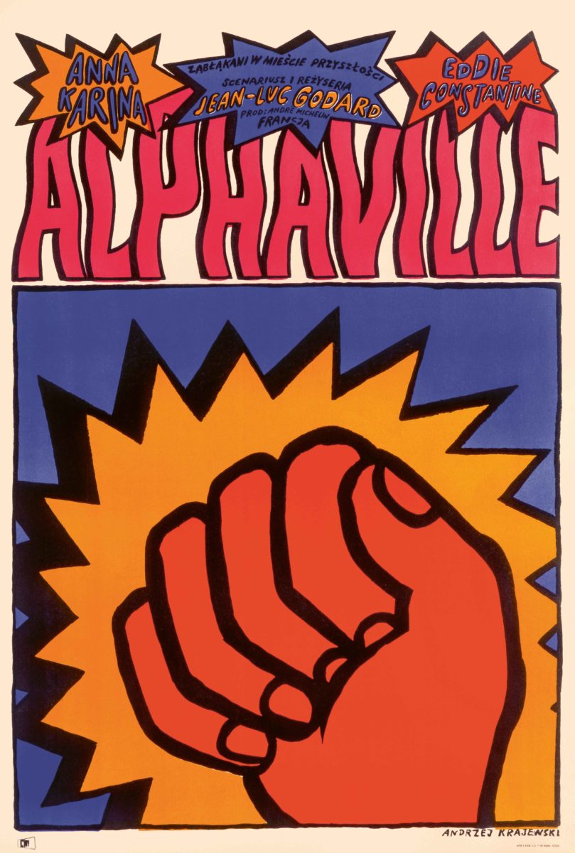

- Alphaville (1965), Polish one sheet Andrzej Krajewski
- Fahrenheit 451 (1966), Hungarian one sheet György Kemény
“This is where some of the most vital works of graphic design cinema history can be found, created outside of the traditional Western graphic design canon”
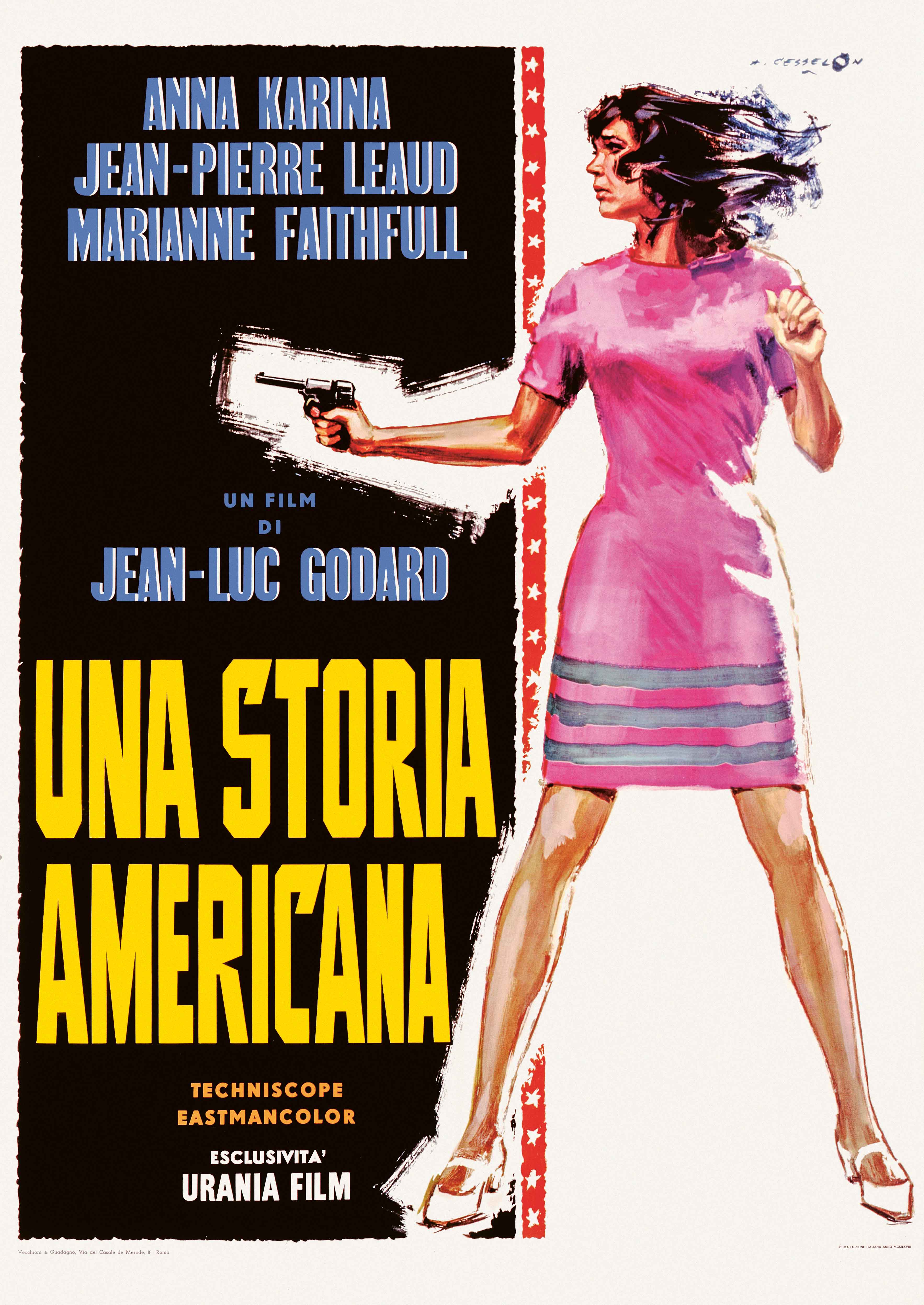
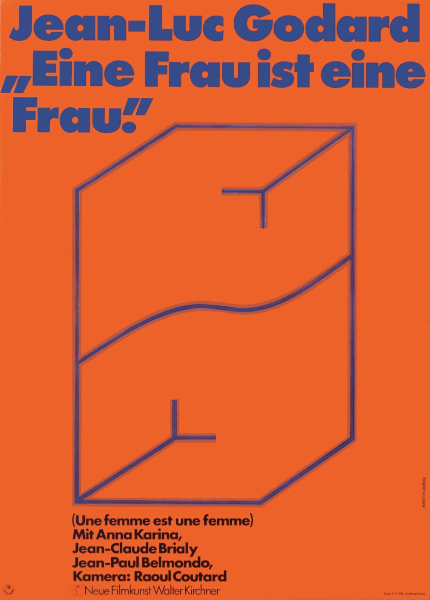
When you zoom in on posters designed by various nationalities, there’s a marked difference in their approaches. The German designs, for instance, bear the marks of Swiss Style, modernist influences that were at their peak during the 1950s and 60s (even today, they show no signs of going out of fashion); they’re simpler, work to grids, use simple layouts and bold typography alongside illustrations reduced to their most basic forms. As for the posters from France itself, these seem to veer mostly towards upping the sexier, or at least more romantic elements, of the films: it’s girls, girls, girls—boobs and cheeky winks and suggestiveness, but with a little restraint that just snatches them back from the brink of seediness. French designer Clément Hurel’s 1960 poster for Jean Luc Godard’s À Bout de Souffle aside, there’s little use of photography; with most images taking an illustrative approach that has since all-but disappeared from contemporary cinema poster design.
Over in Poland and Hungary, things take a bolder turn: numerous styles of hand-drawn type abound and palettes are brash and brilliant. The illustrations seem to lean more toward the style of comics, with their punchy, in-your-face joie de vivre, than classic advertising to draw in the crowds. After all, that’s what these designs were for—to get people into cinemas—not to be pored over by art critics or examined for their use of sans-serifs. These were impactful graphics that veered away from the discussion of the intellectualism of the Nouvelle Vague, where many of the directors had started out their career as film critics or academics, and thus ushered in a more literary mode of working with narrative and language than had been seen previously.

- À bout de souffle (1960), French half sheet, style A, first printing ‘Godart’ Clément Hurel
- Une Femme est une femme (1961), German one sheet Hans Hillmann
“As for the posters from France itself, these veer towards upping the sexier elements of the films: it’s girls, girls, girls—boobs and cheeky winks”
It was a shift that celebrated both academic rigour and a powerfully DIY spirit. Many of these directors started out using handheld Cameflex cameras on the streets and in friend’s apartments, casting those who they knew personally rather than Hollywood darlings, and offering a lot of scope for improvisation and direct diegetic sound, jump cuts, collaging of footage and unusual long takes. Though, as Christopher Frayling writes in his essay in the book, the championing of the underdog in the movement has taken something of a “critical beating”, as many of the famed directors were not in fact their own writers, while several of the movement’s best-known actors, such as Jeanne Moreau and Jean-Paul Belmondo, had already been around for some time. But then, as he points out, “The New Wave was full of contradictions.”
French New Wave: A Revolution in Design
Published by Reel Art Press. Edited by Tony Nourmand, designed by Graham Marsh
VISIT WEBSITE