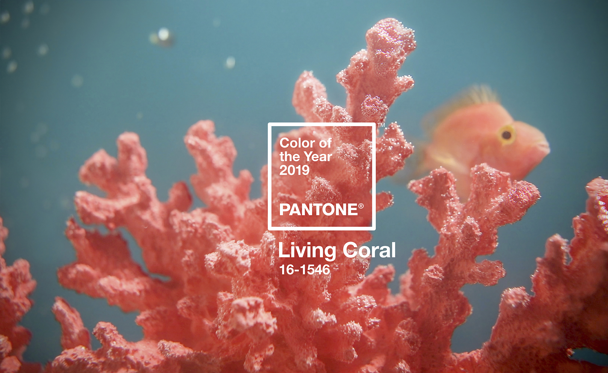
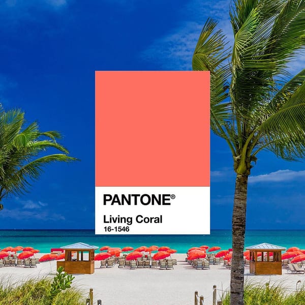
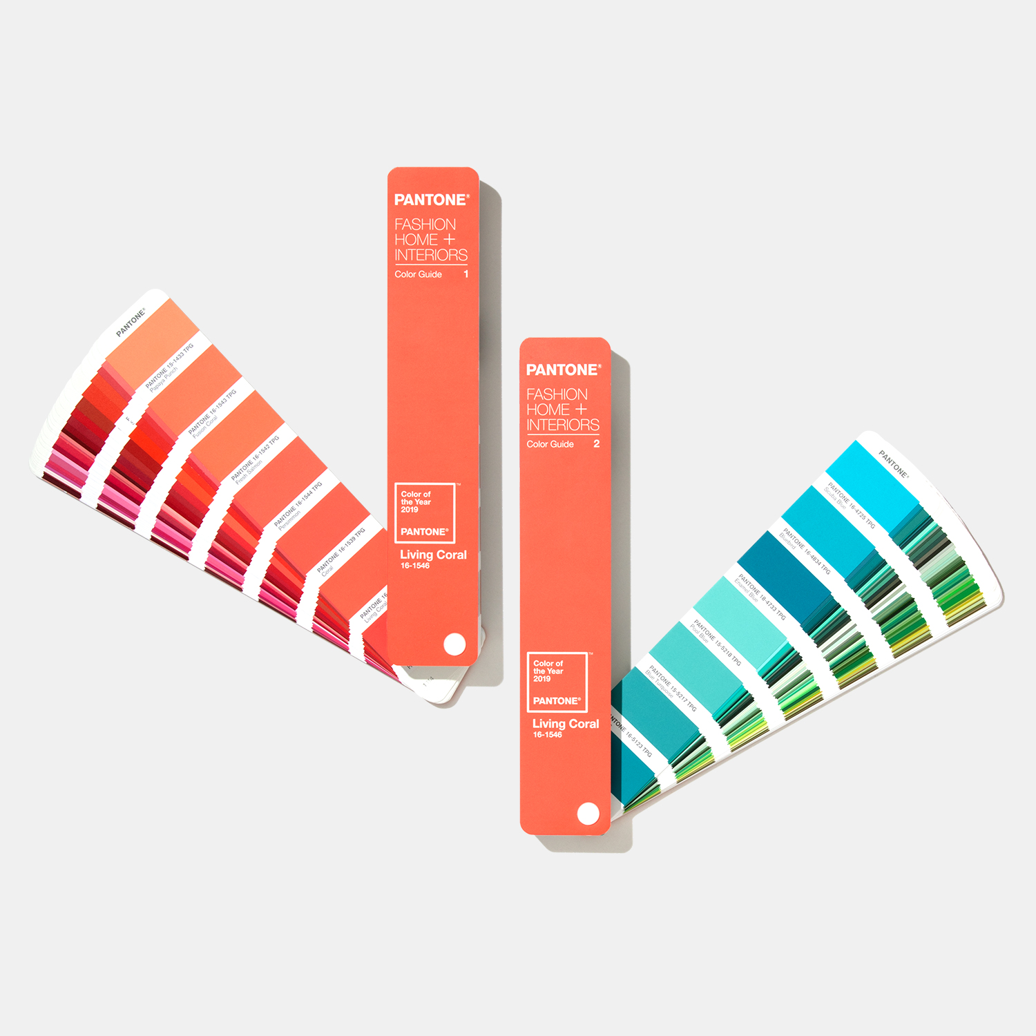
Can a single colour define the zeitgeist? It’s a question that Pantone—the ultimate authority on all things hue related—attempts to answer on an annual basis when it announces the Colour of the Year. This time round, Living Coral takes the crown. According to the official release, it is “an animating and life-affirming coral hue with a golden undertone that energizes and enlivens with a softer edge.”
Whatever that means, to most of us it will be reminiscent of the inexplicable neons that populate our summer wardrobe, to complement what we assume will be glistening tans and an endless supply of Tequila Sunrises. That might all seem a bit incongruous as we enter the depths of December, but this particular shade already seems strangely familiar. The frenzied hashtagging that has gone on since Pantone made its announcement shows that people have been decorating their homes, dying their hair and designing menus in this strange blend of bright orange and hot pink, for a while now.
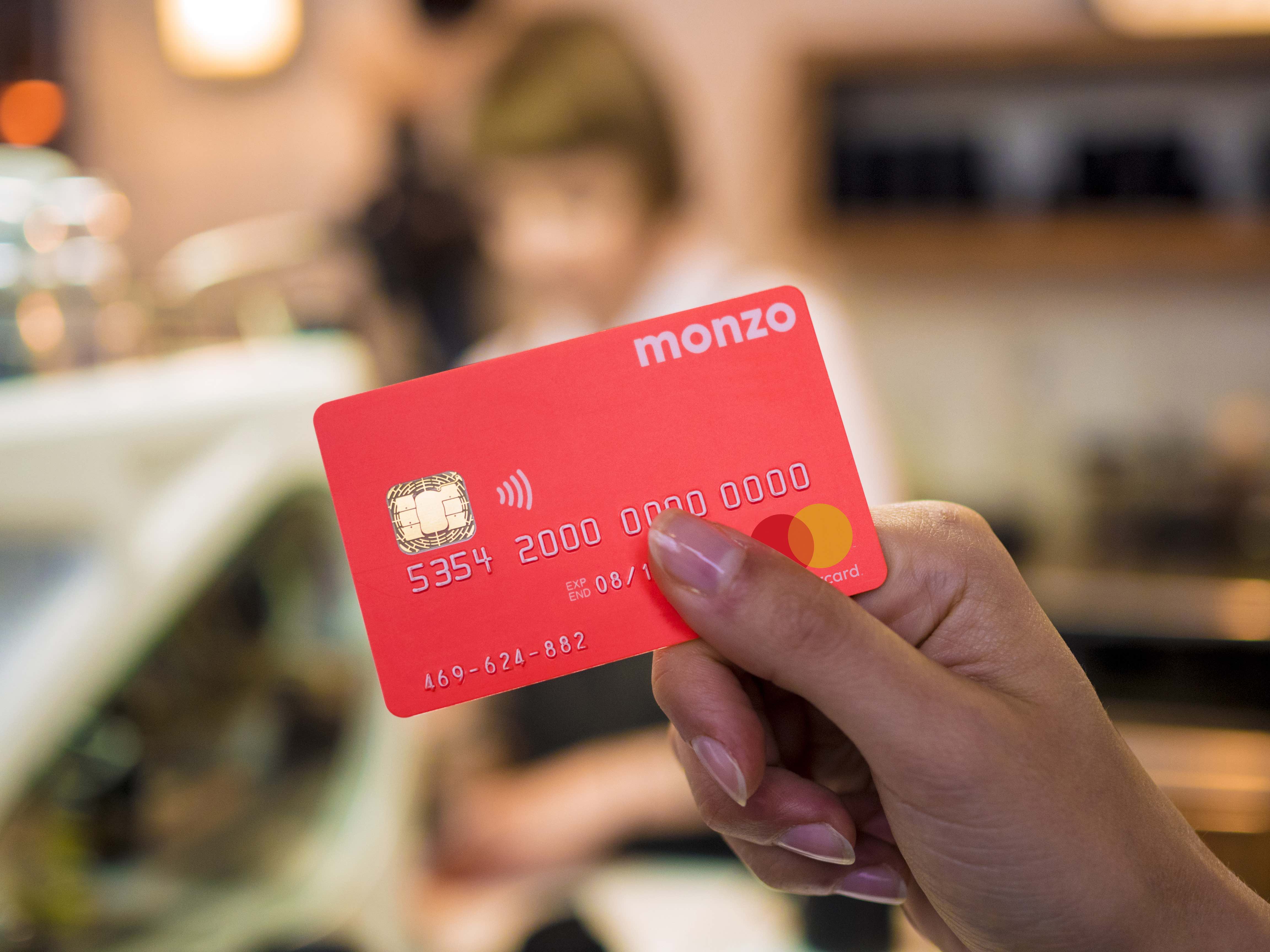
In fact, as I type this, I’m sporting a manicure in exactly this shade. It has also featured as an accent colour on the cover of Elephant’s spring issue, as well as serving as the crux of a phenomenally successful marketing campaign by Monzo, an app-only East London bank (in other words, super millennial) that sports a coral card. The fluorescent hue never fails to grab the attention of inquisitive vendors and fellow shoppers who demand to know what the hell I’m paying with.
But why exactly are we all drawn to this colour? Naturally, Pantone’s messaging is full of placatory conceptual references to “our innate need for optimism and joyful pursuits” and Living Coral’s ability to encourage “light-hearted activity” that places authentic experience over screen time. As we all crawl our way to the end of another year, the notion of rest, relaxation and digital detox is extremely appealing. Why, then, has this unabashedly bold colour has gained such traction? Of course, Pantone’s selection isn’t just about reflecting the current mood—otherwise concrete grey, or perhaps Anish Kapoor’s “blackest black” might have been more appropriate. That being said, there might be something in the inherent glow of this particular coral that adheres to our craving for a bright spot among the gloom.
“To most of us it will be reminiscent of the inexplicable neons that populate our summer wardrobe”
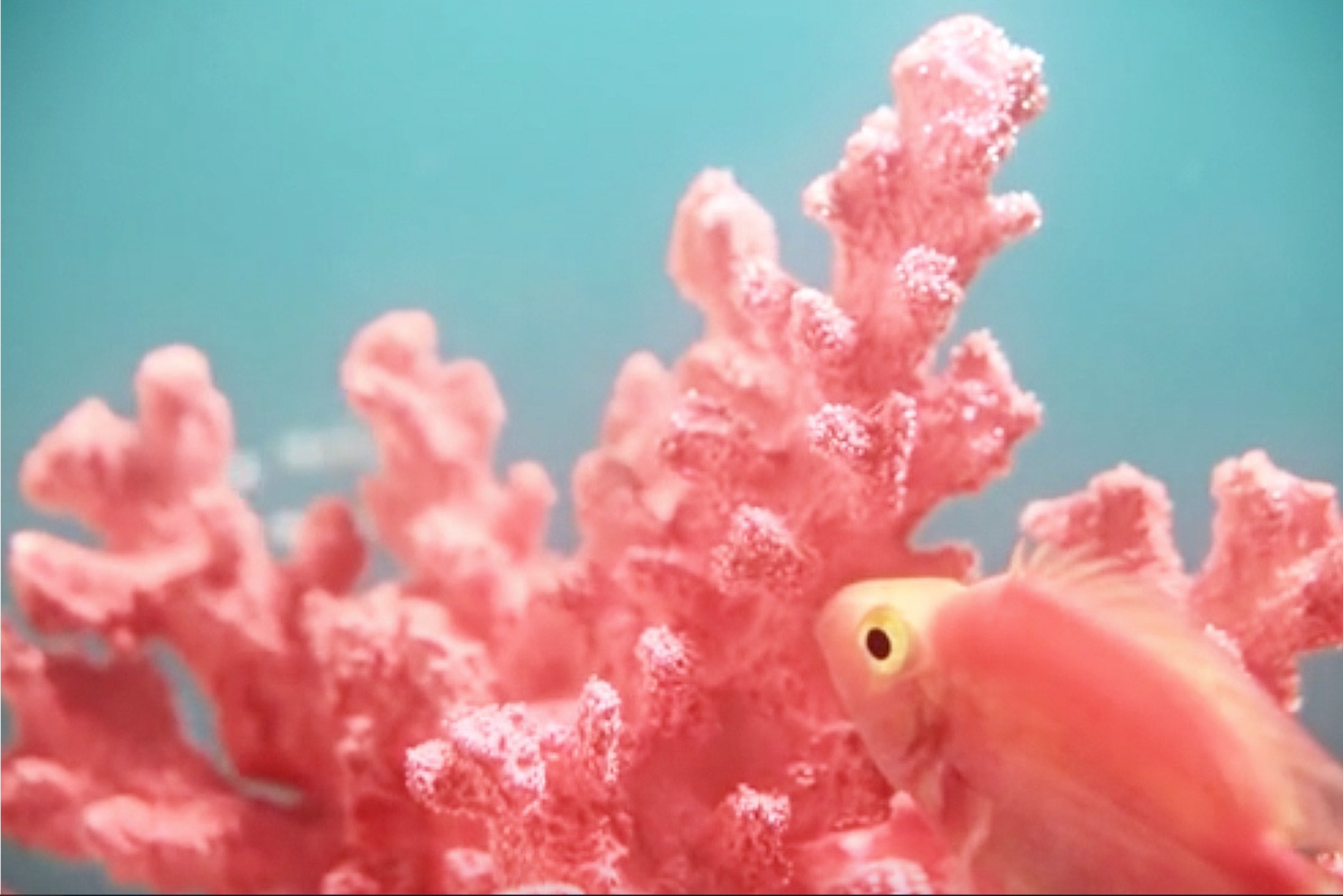
From a commercial perspective, Living Coral’s comfortable proximity to millennial pink, that pervasive colour (which was, to all intents and purposes, the Pantone 2016 Colour of the Year, though it was marketed as Rose Quartz) that has dominated everything from luxury interiors to couture fashion for what seems like a million years, will surely be welcomed by those still riding the wave of that seemingly banal, sickly sweet shade. This assured marketability is further solidified by the equally complementary shades of aqua blue and turquoise—cue a meditative tropical fish gliding through glistening waters on Pantone’s Instagram.
It is also worth considering the value of the name, too. “Living” Coral can surely be read as an explicit reference to the environmental crisis surrounding the “mass mortality” of the Great Barrier Reef, with reports claiming that around fifty per cent has died since 2016. With that in mind, perhaps this colour is the perfect embodiment of our current condition, one that is equal parts imminent disaster and light-hearted banality.