 It is hard to imagine an age when written communication was not manifested with a few swift taps or keystrokes. Typing correspondence has become the norm, even if it is a mixture of emojis, gifs and increasingly obtuse acronyms that can reach far corners of the globe in an instant. Yet there was a time when the act of penning a letter was a laborious affair, when elaborate formalities and carefully structured prose were sealed within an envelope and sent on a long (and often perilous) journey.
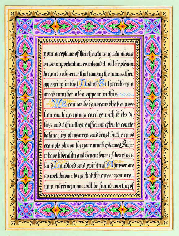
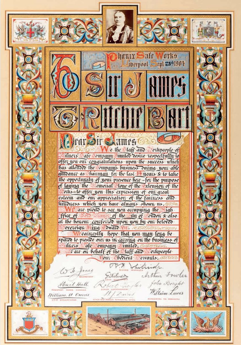
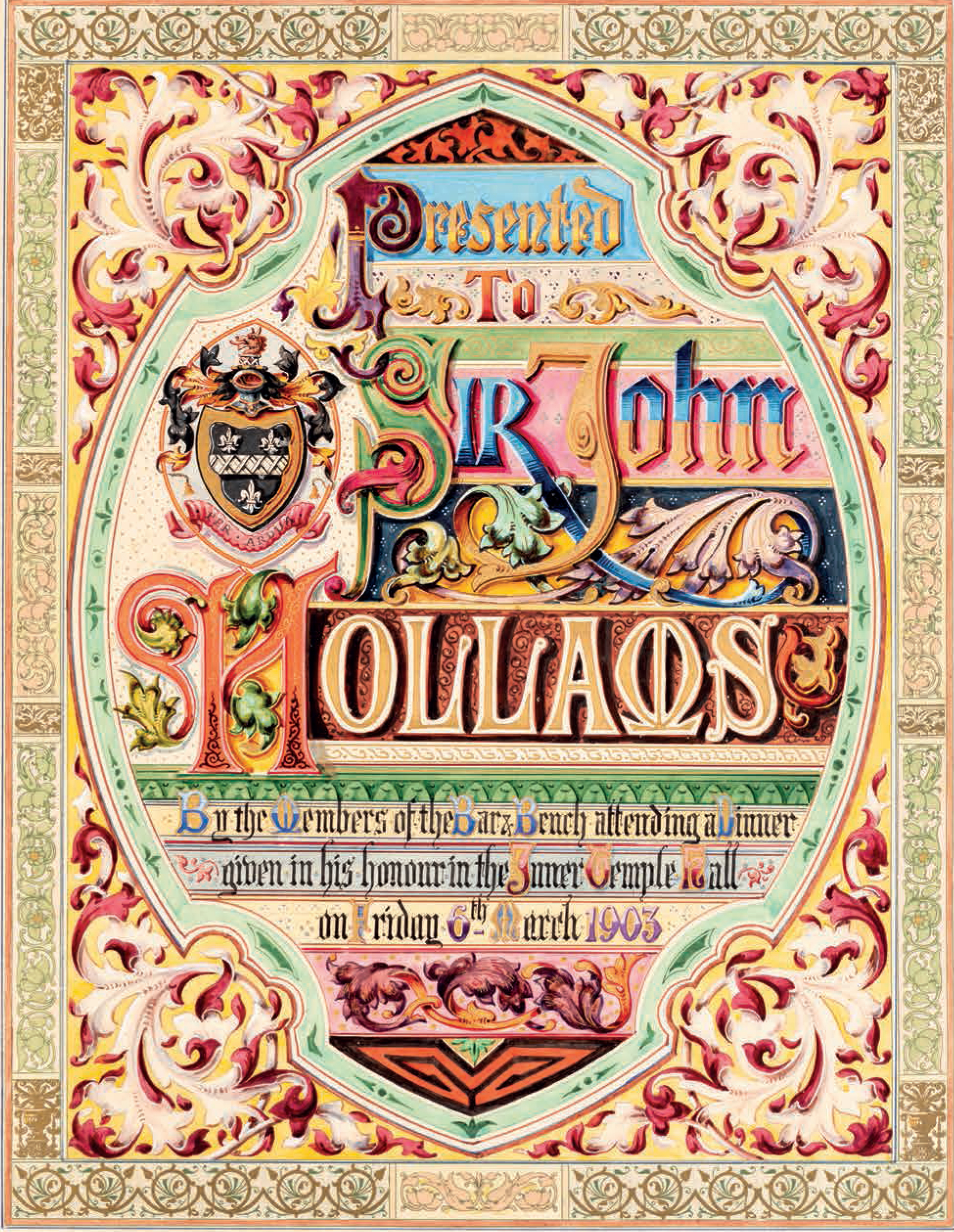
In some cases, these letters became works of art in and of themselves, designed to be cherished not as intimate messages, but as complex displays of wealth, status and power. Such objects are the subject of a new book, Beauty in Letters, which showcases a selection of “illuminated addresses” collected by John P Wilson. Spanning more than a century, they demonstrate an obsession for embellishing gothic lettering with gold, bordered by elaborate images, that began in the Victorian era. Such efforts usually involved hiring a calligrapher (at no small expense) and often marked celebratory moments in the recipients’ lives, commemorating key achievements as well as conveying expressions of gratitude from employers, local government, societies, and the like.
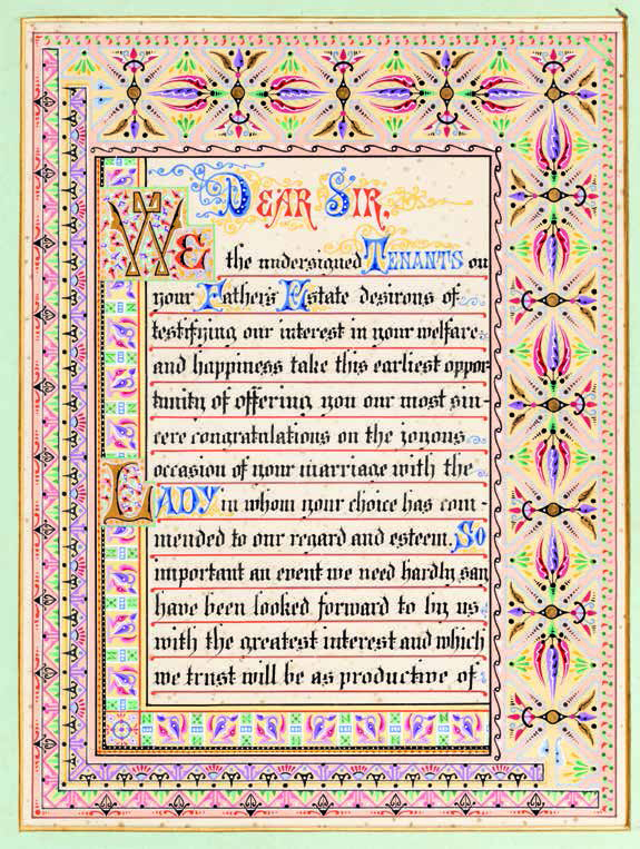
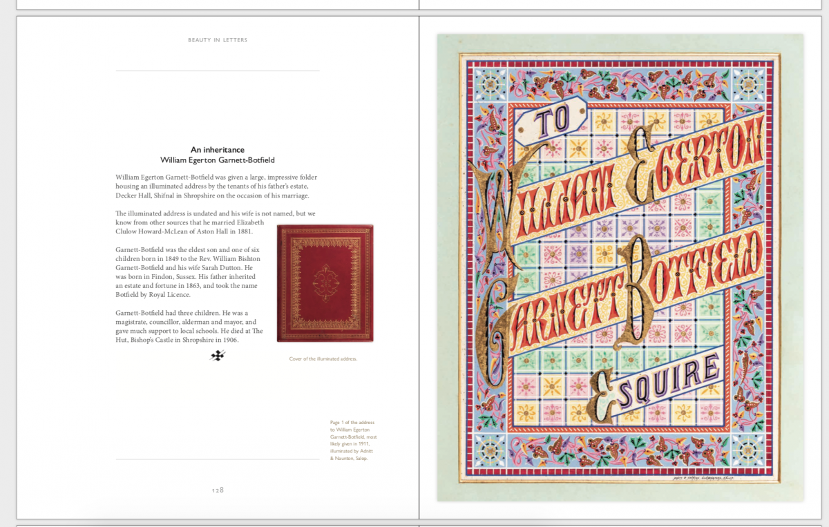
Unsurprisingly, the senders and receivers of the missives collected in this volume are almost exclusively male, with the exception of a few wives labelled ‘Mrs’. Often even a spouse fails to get a look in, as was the case with William Egerton Garnett-Botfield Esq, who received an “impressive folder housing an illuminated address by the tenants of his father’s estate, on the occasion of his marriage”. There is something curious about these heavily adorned pages, complete with equally florid prose, being shared among men. Stereotypes would have whimsical florals, painted birds and densely coloured pages marked as ‘feminine’, even if the tradition is rooted in the practices of religious illuminated manuscripts.
“The labour involved in such endeavours is unfathomable now, when receiving a birthday card is something of a novelty”
These creative expressions continued well into the 20th-century, where gothic sensibilities gave way to genteel cursive and even more detailed illustrations, as well as photographic prints. The labour involved in such endeavours is unfathomable now, when receiving a birthday card or party invitation through the post is something of a novelty. However there is a commonality. Where a contemporary offering might feature pre-printed messages or be entirely manufactured by a computer, these illuminations follow rigid formats, where the rules and measures between every gilded line are practically visible, the difference being that the weight of their labour is palpable.
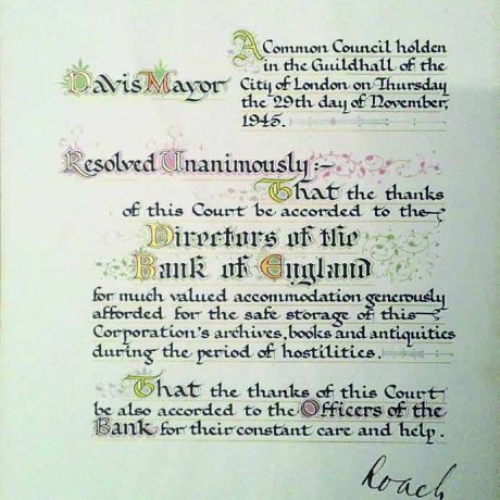
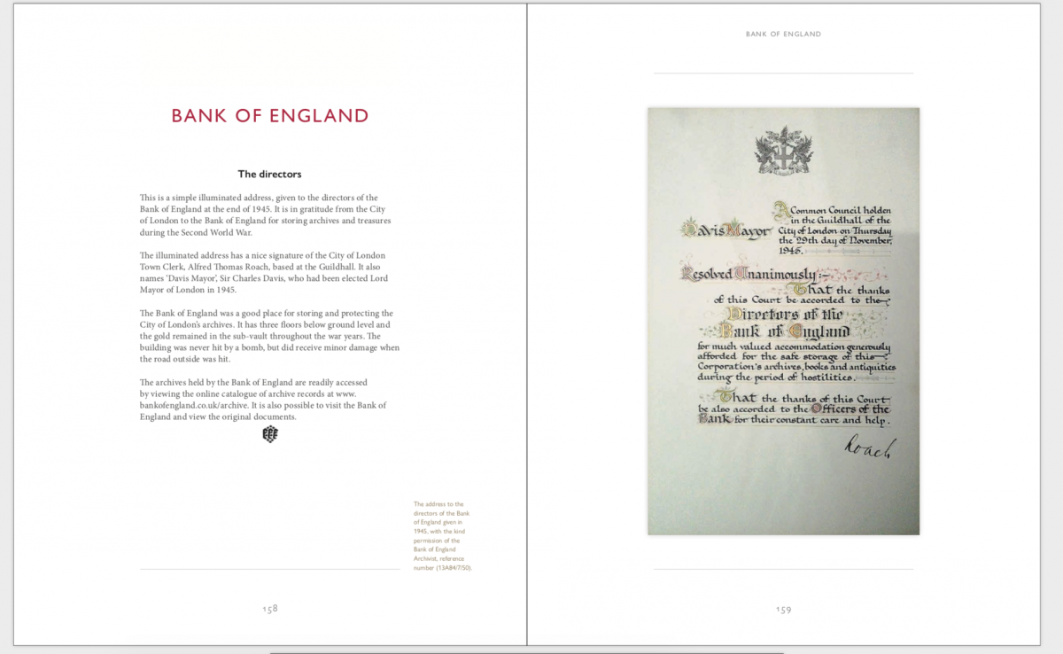
One joyous conflict comes in the form of an address from the Bank of England, where each inked word is accompanied by a spray of vines. The appropriately restrained address is, however, completed with a single scribbled signature from the town clerk, which simply reads ‘Roach’. This moment of hurried human contact highlights just how artful and painstaking the surrounding illuminations really are.
Beauty in Letters: A Selection of Illuminated Addresses
Published by Unicorn Publishing, 29 April 2021
VISIT WEBSITE