An elephant never forgets, and as we celebrate ten years (and forty issues) of our very own Elephant magazine we certainly have a great deal to look back on and remember. In print, we have featured hundreds of artists, illustrators and designers across thousands of pages. Behind the scenes, these pages have been shaped by a wealth of graphic designers, each bringing their own distinctive flair to the magazine.
A lot has happened over the years. Elephant was launched at the tail-end of 2009, on the cusp of a new decade. Less than six months later, the first iPad was launched (in April 2010), sparking an ongoing conversation around the future of print publishing. In the face of technological innovation, social media and smartphones, was print dead? The answer, it turned out, was a resounding no. Throughout the subsequent decade, magazines have undergone a renaissance and revival—despite the simultaneous rapid rise of their digital counterparts.
With print under threat, publishers and designers alike rallied and responded with wild creativity, playfully making use of custom fonts, full-bleed images, unusual paper stocks and original illustration in order to truly embrace the power of print. In doing so, they demonstrated the timeless pleasure of the page, and the potential for an ever-evolving, fluid visual language rarely offered by the rigid templates of websites and media apps.
“In the face of technological innovation, social media and smartphones, was print dead? The answer, it turned out, was a resounding no”
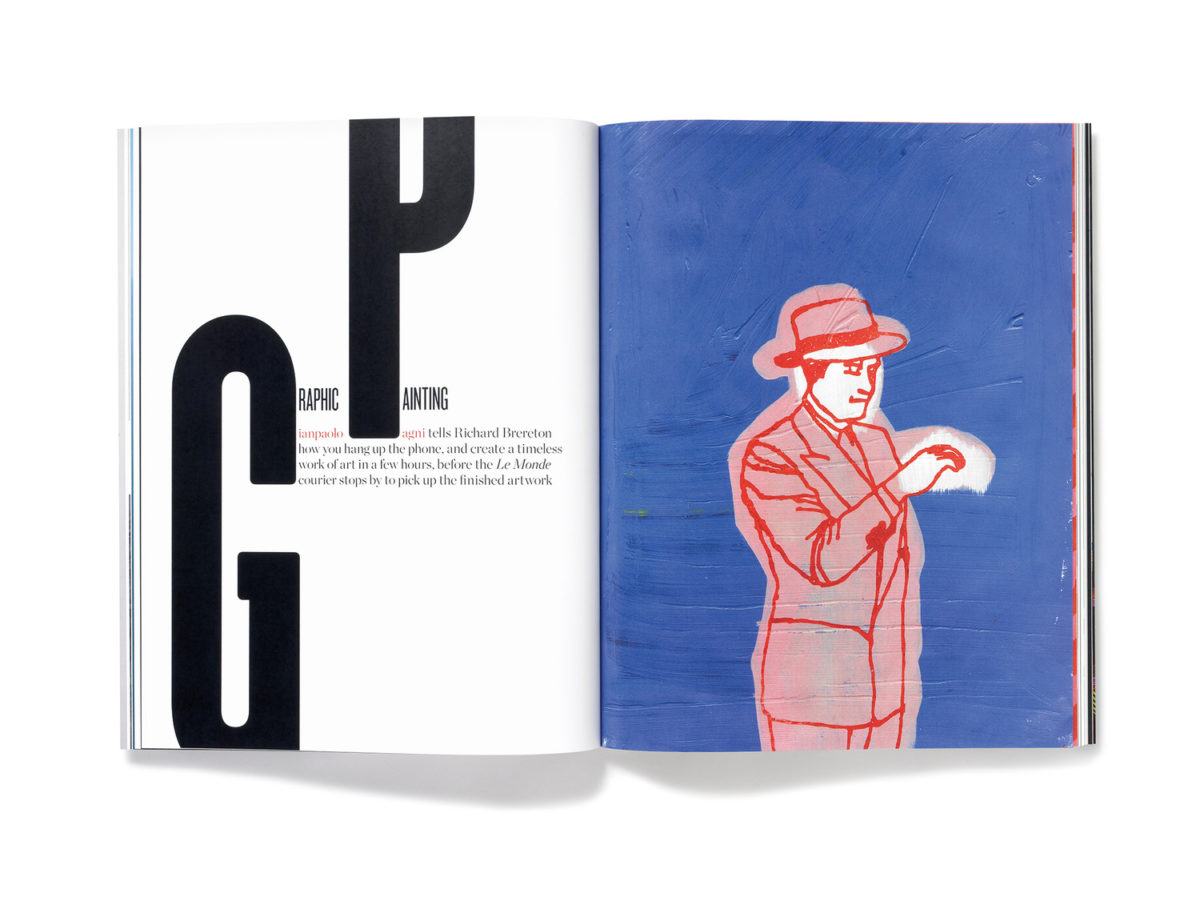
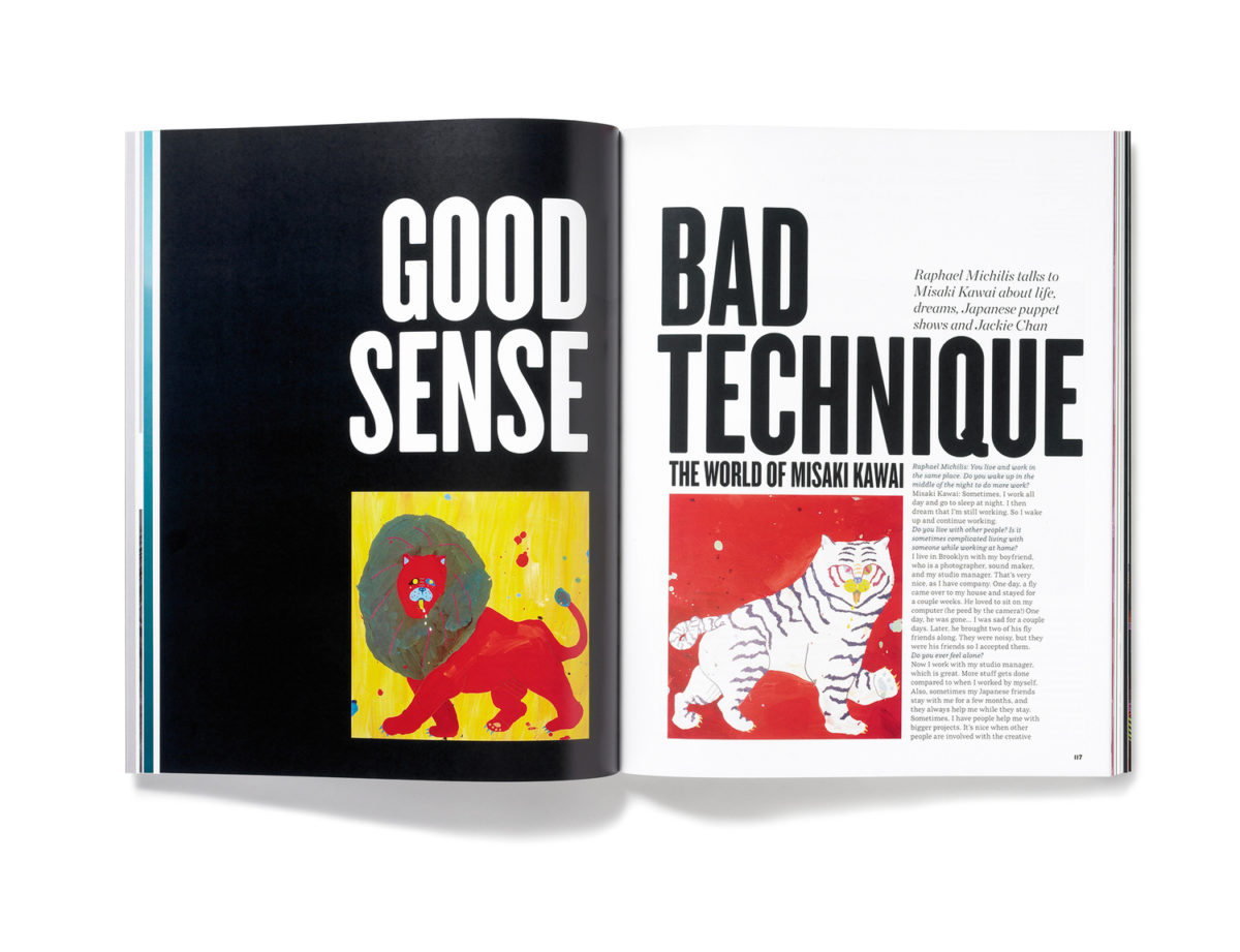
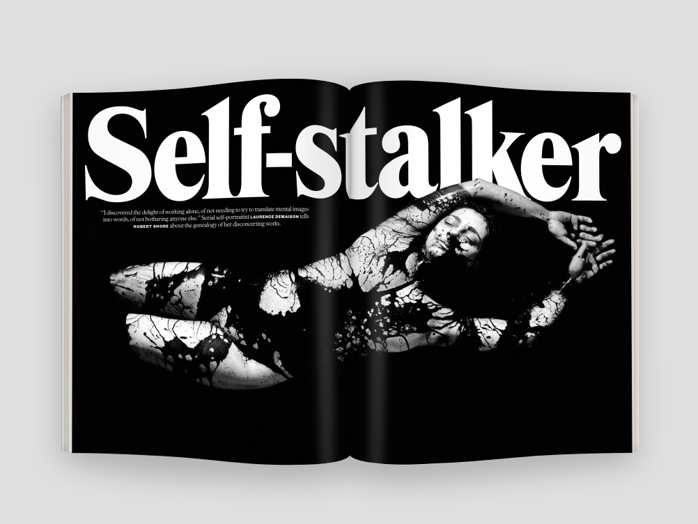
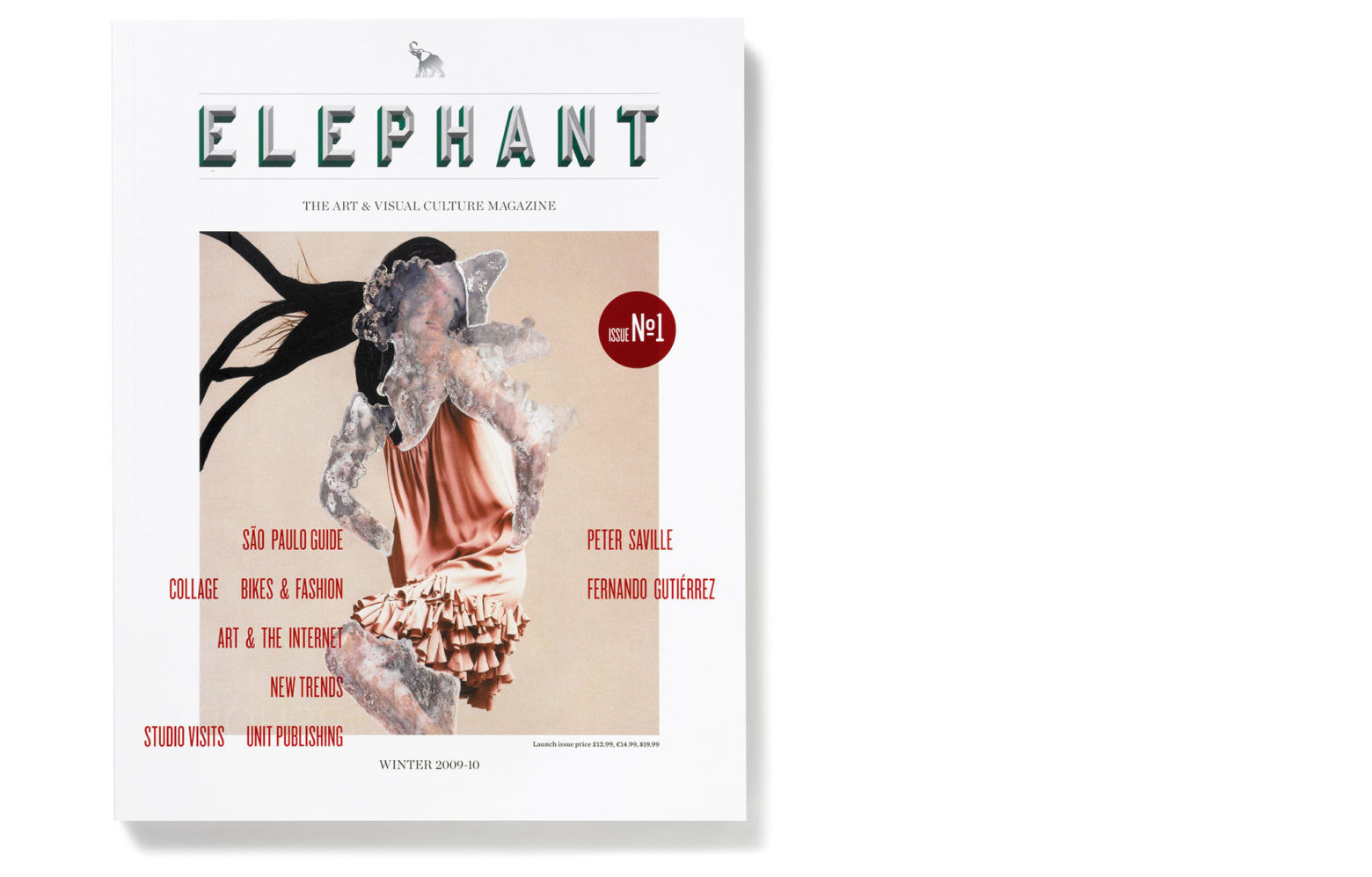
Elephant’s very first designer was none other than Matt Willey (formerly of Studio 8), who has since gone on to become the art director of the New York Times magazine. Willey’s background is firmly in print, with one foot resolutely in independent publishing, having worked with everyone from Port (he is a co-founder) to Avaunt magazine. From the beginning, custom typography has played an important role in his magazine-making, and a thread of connection can be drawn between his early work in Elephant and a number of his later projects.
Take MFred Rounded, an all-cap typeface that originally appeared in issue five of Elephant. It later found new incarnations in Port and Wired; and has since been released by Willey for sale. His love of lettering can be seen throughout the four issues that he worked on for Elephant, with prominent, large-scale text that leaves its unmistakable mark on the page. “I like type,” Willey says, simply, “I enjoy playing around with it, and I have fairly strong instincts about how it works.
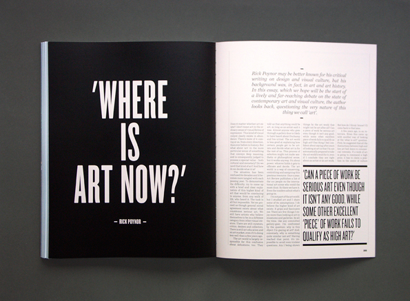
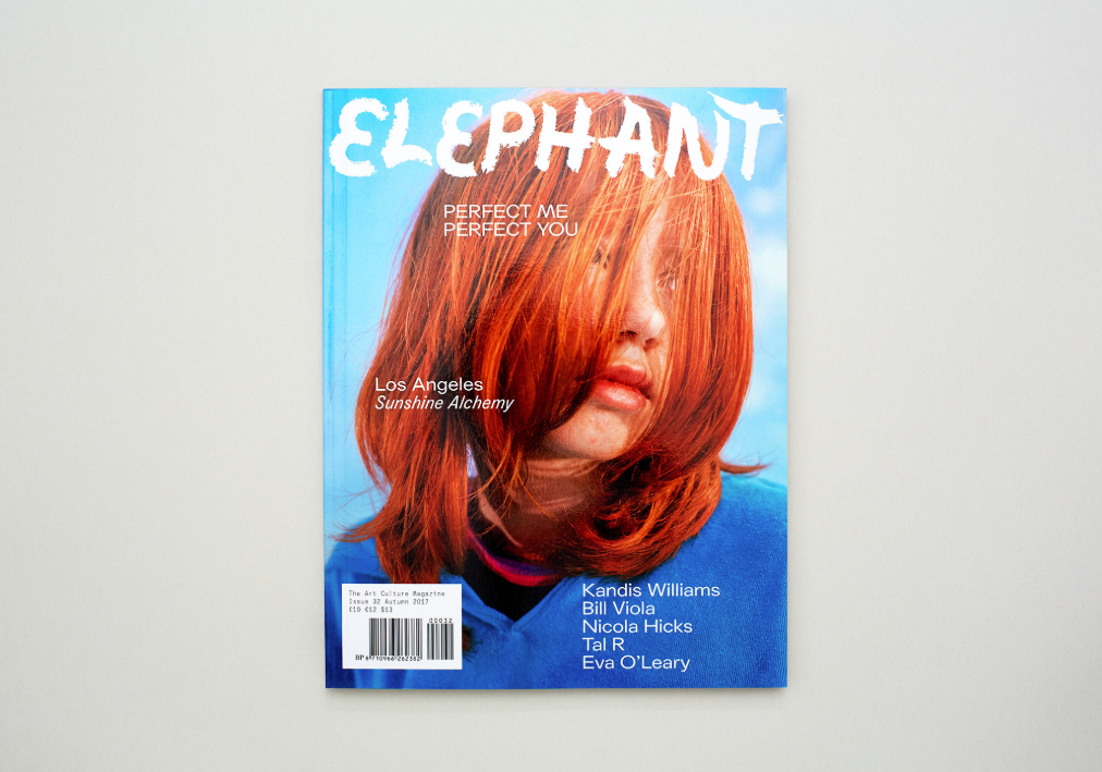
Willey may have introduced the world to Elephant’s early bold graphic identity, unafraid as he was to experiment with text that went beyond the usual confines of the page, but it was Shaz Madani who stepped in next to evolve the magazine’s look and feel. Notably, Madani has since gone on to work as the designer and creative director of Riposte, where she has continued to flex her typography muscle; the magazine is known for its unusual text-only covers. She worked on Issue 4 of Elephant as a guest designer and art director.
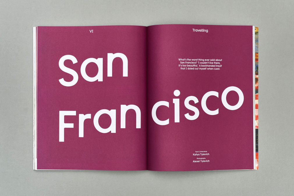
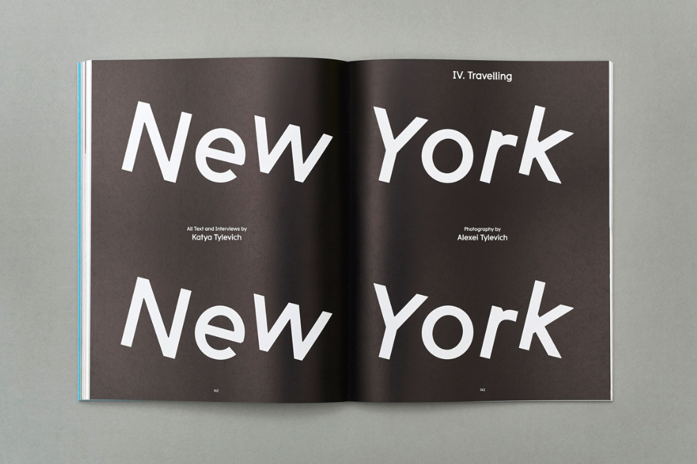
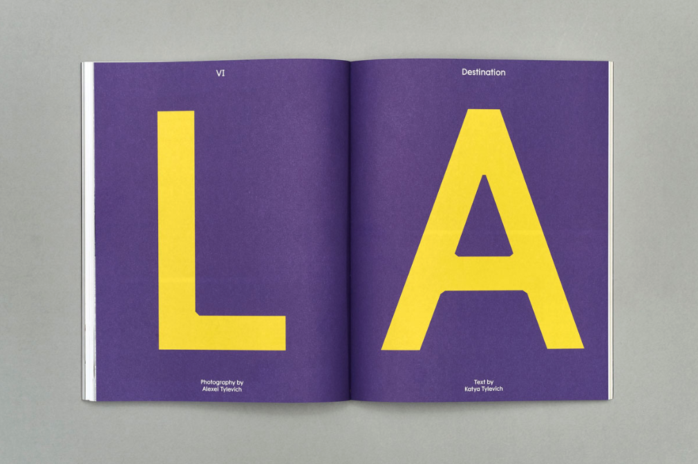
“Matt Willey had already established a very bold and typographically distinct design aesthetic for the magazine. My role wasn’t to reinvent but to build on this. I wanted to be sensitive to the existing design direction while also bringing new and unique touches to help lift the personality,” Madani recounts. “The main aim was to make the magazine more approachable and fluid to navigate. Some of the more notable changes were the redesign of the front section (for the studio visits) to give a snappier start to the magazine; the introduction of an uncoated paper to bring in textural contrast; and a bright and bolder colour treatment for the section openers designed to inject pace and energy throughout the magazine.”
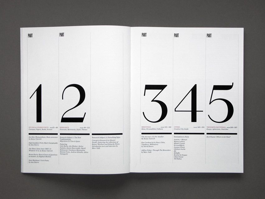
“I wanted to be sensitive to the existing design direction while also bringing new and unique touches to help lift the personality”
What was her impression of the magazine in its early days? “I already knew of Elephant—compared to today, very few worthy new titles were being published. Elephant was a really fresh and exciting kind of art magazine. It set out to transcend the widening divide between the elusive art world and the commercial areas of the visual arts scene, bringing to the forefront a middle space where some of the most innovative and exciting ideas were taking shape,” she reflects, looking back almost ten years on.
“I worked on Elephant quite early on in my career. It was a huge amount of responsibility to single handedly design the whole issue, but I was given complete freedom and trust. It was terrifying in parts but I loved the challenge of it. In many ways, it fuelled my passion to work in the editorial sector and continue to make beautiful magazines.”
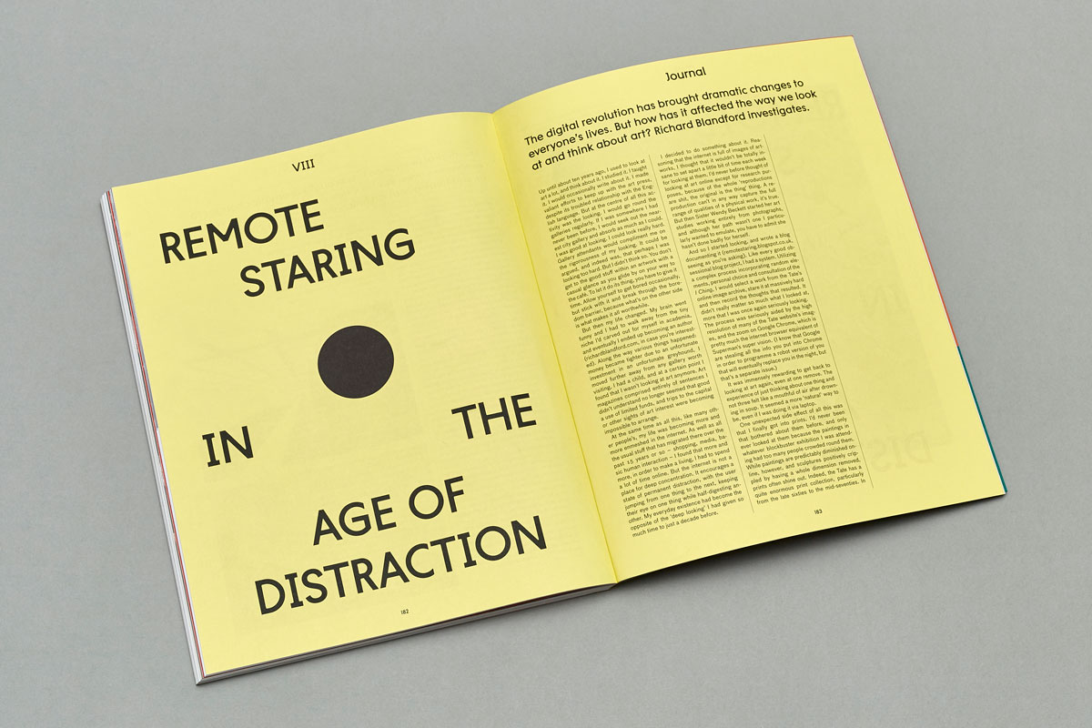
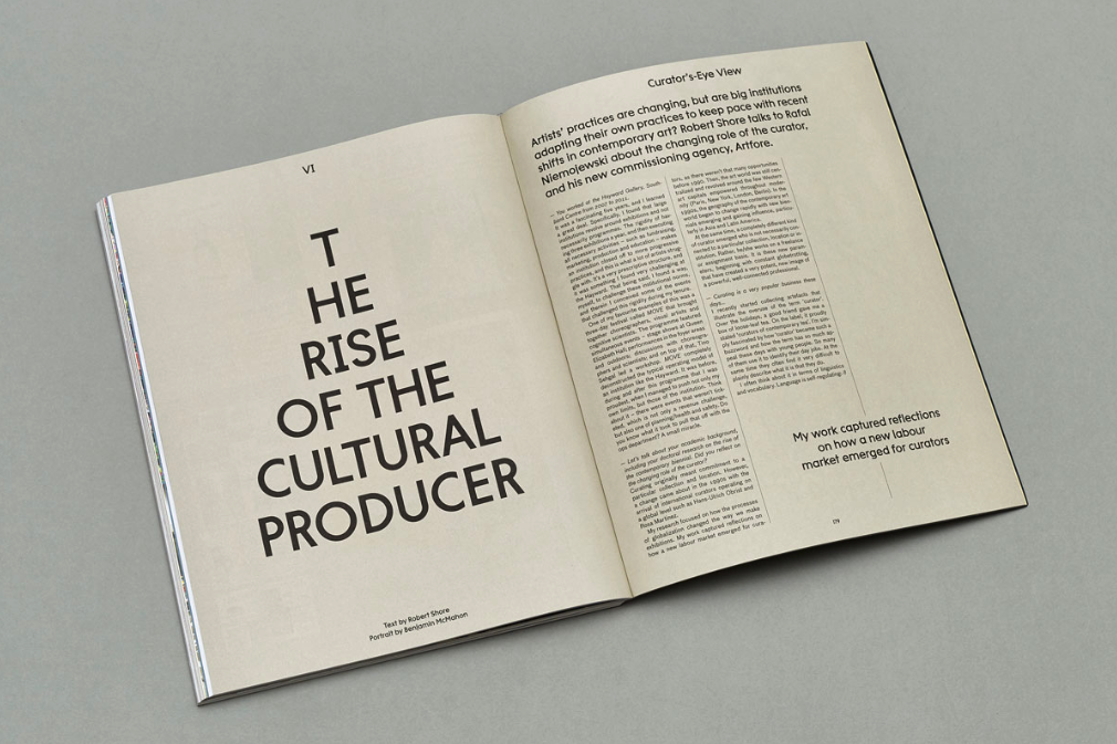
Next up was design studio Julia—Valerio Di Lucente, Erwan Lhuissier and Hugo Timm—a trio hailing from Italy, France and Brazil respectively. They met while studying at the Royal College of Art in London, and have gone on to work with everyone from the Institute of Contemporary Arts to the Whitechapel Gallery. Julia came on board as designers on Elephant from issue 7 through to issue 19, which took them from 2011 to 2014.
“From the beginning, Elephant has been a magazine on visual arts; a mix of illustration, design, art, and photography. You would have a lot of specialised magazines at the time, but none did all of it in one. It was hard to break into the art world in the beginning, as galleries were struggling a bit if you also included illustration and design. We wanted to grow as a contemporary art magazine, rather than selling as just a design or illustration magazine,” the group recall when we speak over the phone.
“The first thing that we did was to design a typeface, which would be the best way for the magazine to feel like it has its own voice; something really tailored which you couldn’t find anywhere else,” they say. “The nature of the magazine is so image-led, and we wanted something that would go along with its visual focus, something which wouldn’t compete but stand out on its own. We went for something inspired from the quality of letterpress printing for the headline cut: creating strong graphic features where you would usually have ink traps.”
“The nature of the magazine is so image-led, and we wanted something that would go along with its visual focus “
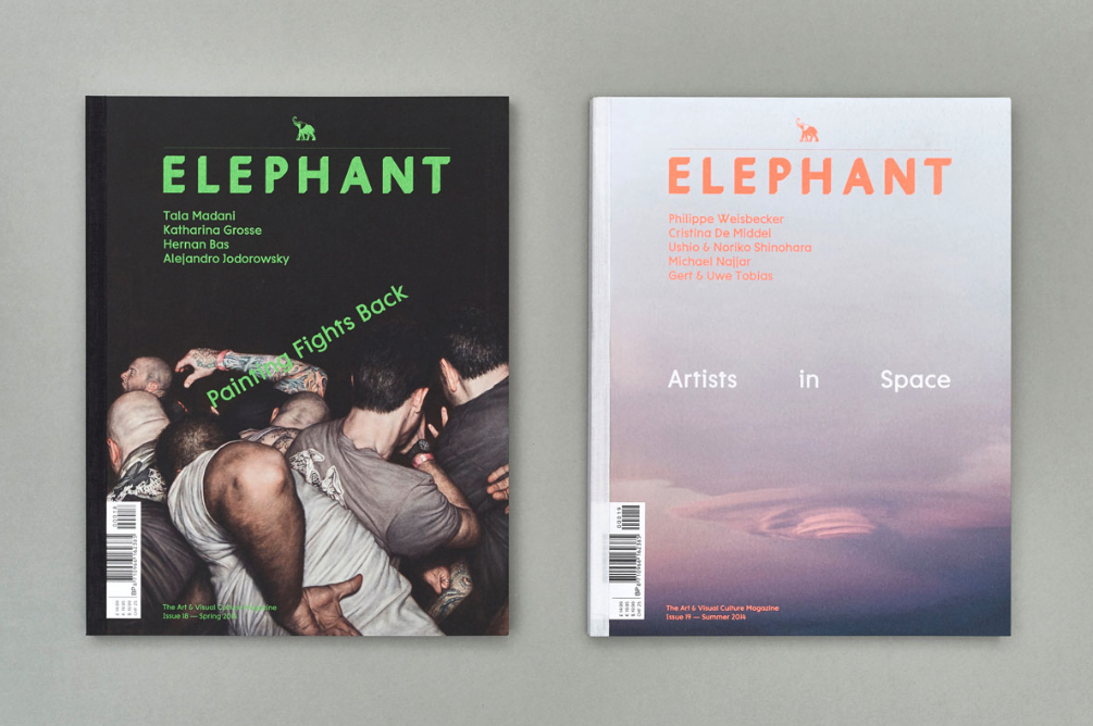
Julia were cautious about ensuring that the design would adapt to the nature of the content in Elephant, and which would ensure that each section looked distinct. “There was a real risk of the design getting lost with the visuals,” they point out.
“Magazines are living things—they can adapt and change. We could adjust it, issue by issue; some features came for one issue and then disappeared again. We love the fact that it’s never finished. It’s really exciting that the design can be constantly evolving. We would change it around, and each issue was just one step forward.”
“Magazines are living things—they can adapt and change. We could adjust it, issue by issue”
This innovative approach to design was shared by Julia’s successors, the formidable Astrid Stavro (now a partner at Pentagram) and Pablo Martin of Atlas Studio. The pair redefined the design of Elephant as part of a wider rethink of what it set out to be. As Stavro explained at the time, “From the very beginning we were commissioned to redesign the magazine making it more timely, more journalistic and lifestyle, more readable and enjoyable, getting skin-close in a way, to the lively culture that thrives in and around contemporary art. One of the overarching principles of the redesign was to make Elephant look ‘less like a design magazine’.”
It’s a difficult ask for many designers, who are often hungry to make their mark and experiment freely on the page. For Atlas, it meant keeping the visual language playful but transparent in order to let the content shine. As they put it, “Not the design, but the artwork within. It is challenging, not frustrating. The magazine is not about us (a platform to show off our design skills or creative ambitions).”
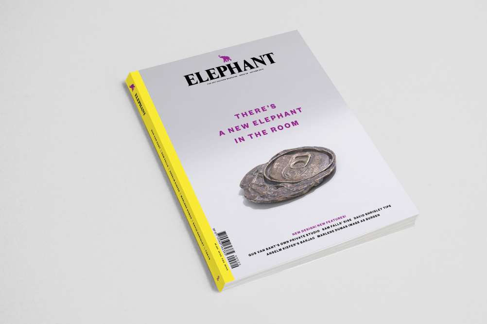
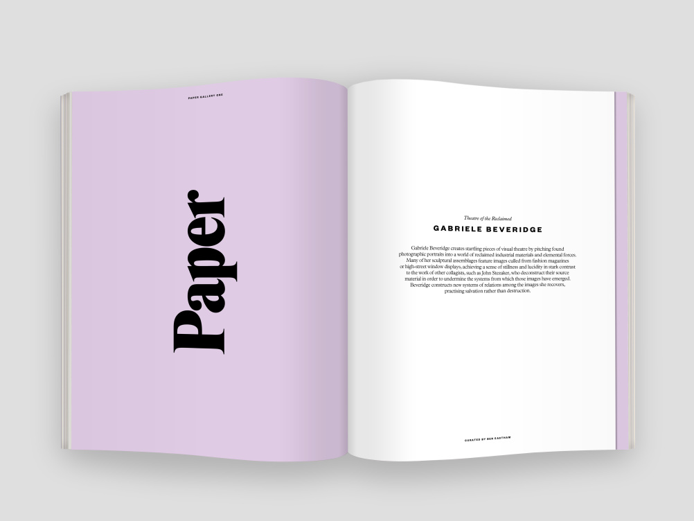
Atlas introduced a new, less serious masthead, with a more image-led opening section to the magazine. New paper stocks were introduced for the artist portfolios section (Paper Galleries), as well as a wraparound sleeve intended to act as a physical respite from the rest of the content.
Every headline was given a different typeface, in order to push the parameters of a branded design by adding in an element of surprise in every story. “This allows us to explore and experiment while maintaining a high level of consistency, spontaneity and originality in every issue,” Stavro told magCulture in 2015. “That’s where we keep our creative juices flowing (even if it also makes it twice as hard to keep on reinventing oneself)”.
“We were commissioned to redesign the magazine, getting skin-close to the lively culture that thrives in and around contemporary art”
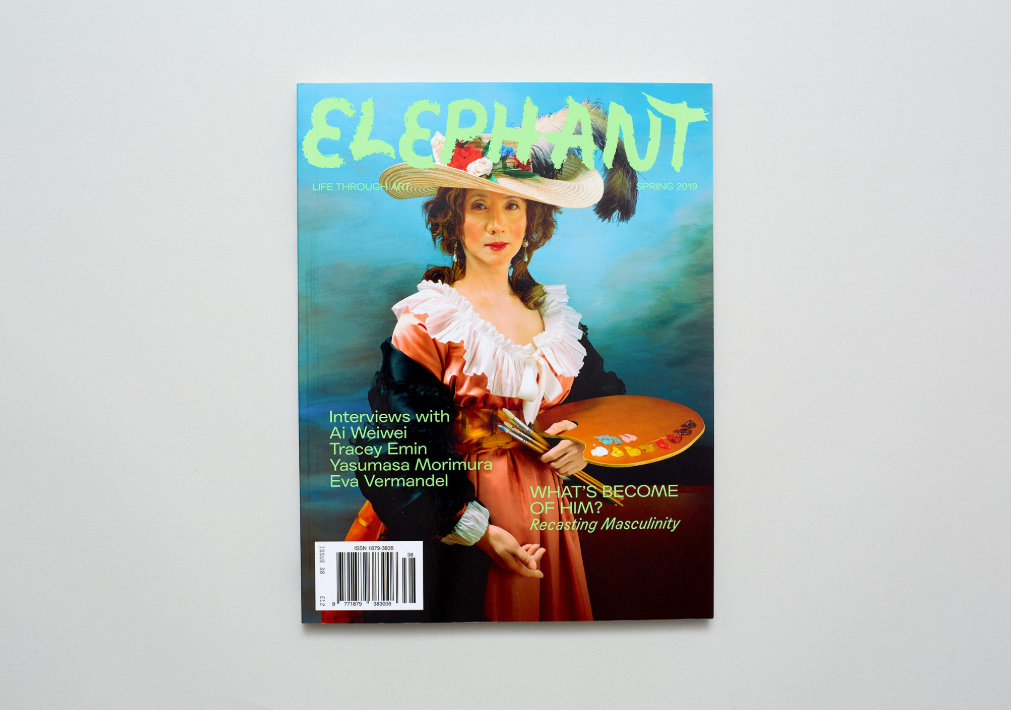
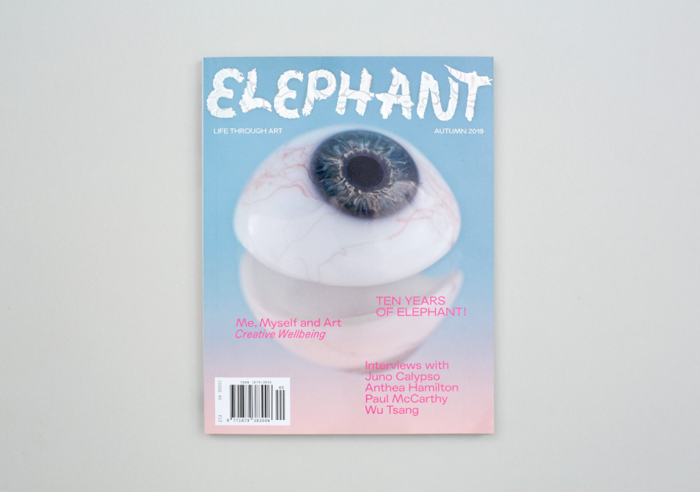
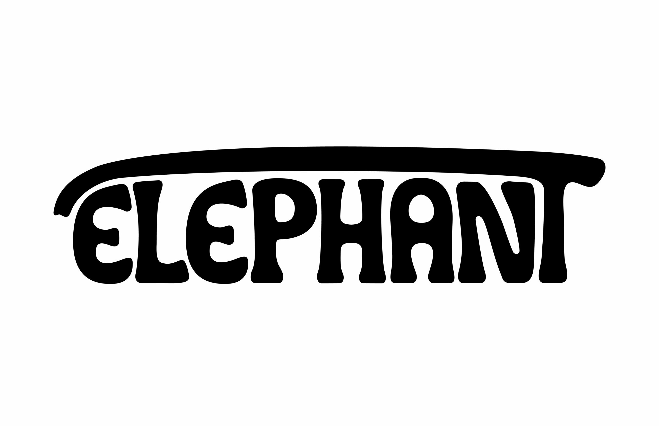
Elephant underwent reinvention of a different sort when design studio Kellenberger White (run by Eva Kellenberger and Sebastian White) came on board two years ago, taking up the baton from Atlas. “We saw the magazine as quite diverse and open and young, quite fresh and a bit more playful,” they recall. The first thing that the studio did was redesign the logo, following a day out at Whipsnade Zoo to observe the elephants. “We looked at how they use their trunks not only to get food but in order to play; a baby elephant was throwing up leaves with his trunk,” they laugh.
Following their trip, they experimented with squirting water from a hose, before trying out a number of screenprinting tests. “We went to Coriander Studios, which works with artists like Peter Blake, Bruce McLean, Christian Marclay, and we asked if we could spend the day there hosing down screens, and that’s how we created the logo,” they explain. “It’s created by water and chance. It’s not totally directed; it’s quite a fluid process that created this logo mark.”
Once they had the logo, Kellenberger White set about creating an “elementary” square column grid for the magazine, which would be easily divisible and could easily swap between two and three column grids. For the typeface, they chose Agipo, a flexible font suitable for both Cyrillic and Latin alphabets—an important consideration for an international magazine. “It speaks clearly in a diverse range of languages, and we liked that openness to different voices in the magazine.”
Kellenberger White also worked on the design for Elephant’s relaunched website, as well as marketing materials. “It was all quite digital. The website plays with colour chart and raw photoshop canvases.” Their aim was to introduce flexibility through their design, offering a rhythm throughout each issue while avoiding monotony. “It’s about creating a system, and that applies to the website too,” they reflect. “There’s a relationship between the two, and the magazine needs to be its own thing.”
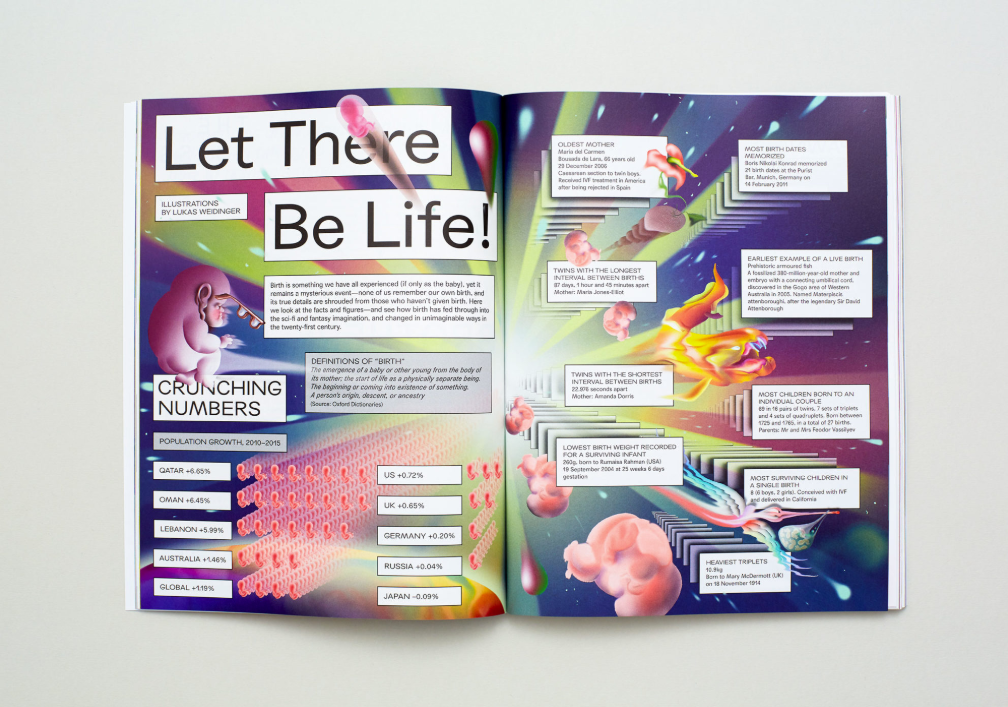
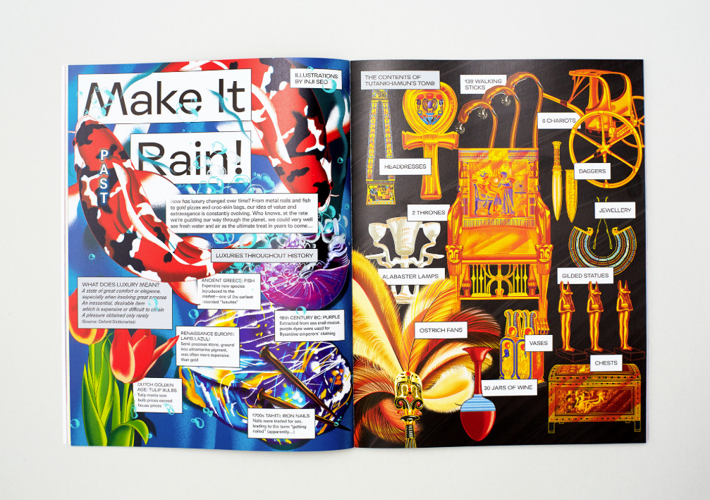
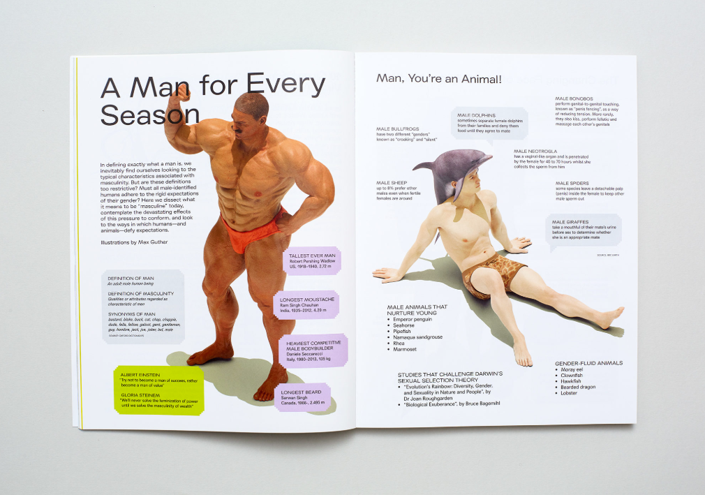
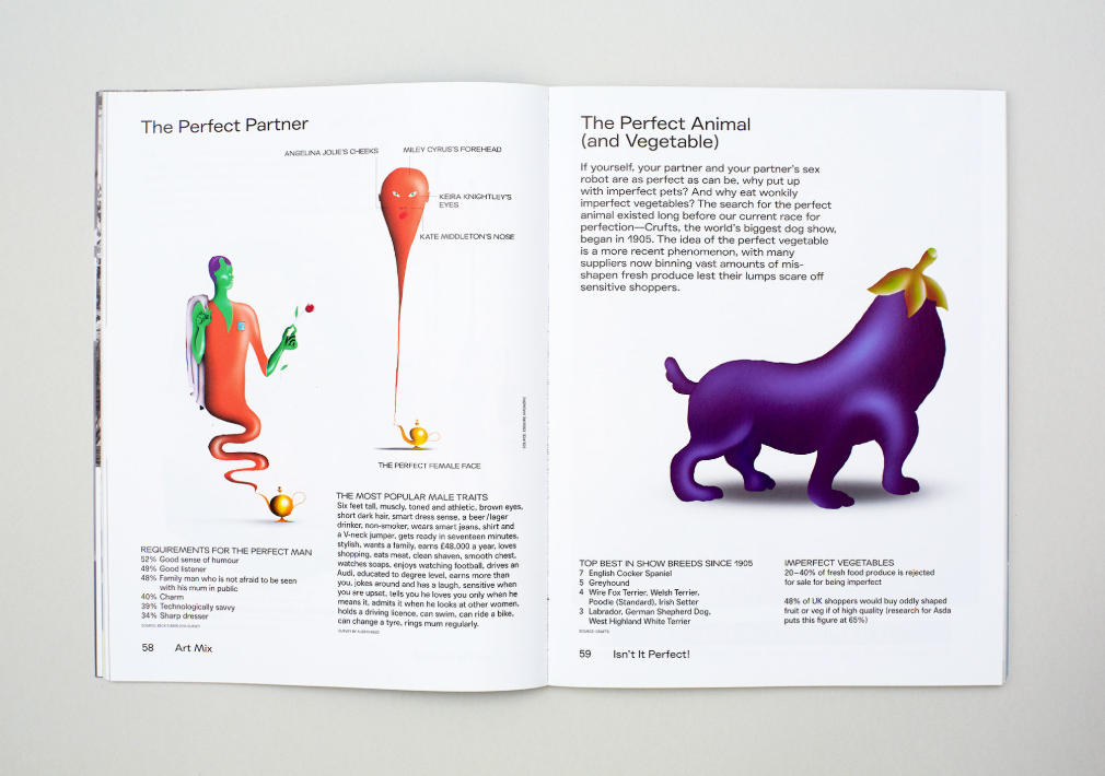
Original illustrations, commissioned by Kellenberger White for the print magazine, are often what will give each issue of Elephant its distinct graphic identity. “We wanted to find a new language within editorial illustration; we wanted to work with illustrators who had never done this type of work before—not just using data in a literal way, but working with it as a mood. The Infographics section of the magazine has evolved over the issues to become a pull out section within the magazine. It’s a complete takeover.”
“One of the highlights has been working with Inji Seo, who has an incredible airbrushed style created digitally, which makes her really easy to work with as she can easily change things,” Tom Joyes, a designer at Kellenberger White, says. “She creates a complete fantasy within Infographics, and she adapts these into her own style, comic book boxes and .. she’s really great to work with. It’s not a chart; it’s not a graph; but, how can this drawing become this canvas of information?”
“It’s created by water and chance. It’s not totally directed; it’s quite a fluid process that created this logo mark”
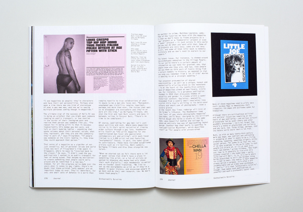
Elephant continues to evolve, ten years on from its very first issue. While some might shy away from major design overhauls, we are proud to have embraced change and bold transformation. The freedom to experiment is all part of the pleasure of print—something that is increasingly celebrated today. Elephant has paved the way for many of the great graphic designers and independent publishers who continue to transform and shape the creative landscape internationally, from Willey to Madani, Stavro to Kellenberger and White. After all, magazines are living things, and their design must reflect that.
