A newspaper’s function, alongside informing the reader of world events, is to act as a tool of persuasion. In the West, newspapers were first printed in the seventeenth century, and slowly began to amplify citizens’ perspectives over the coming decades. Newsprint, a material light in weight, heightened the accessibility of the format, which made distribution easy but increased the ‘throwaway’ nature of the news. In 1880, the first photograph was printed in the New York Graphic, and the pairing of image and text became key to engaging the audience in a particular message. Newspapers espoused differing views on which topics were worth reporting, and began to cater to different audiences. They all agreed on one thing: news is never objective.
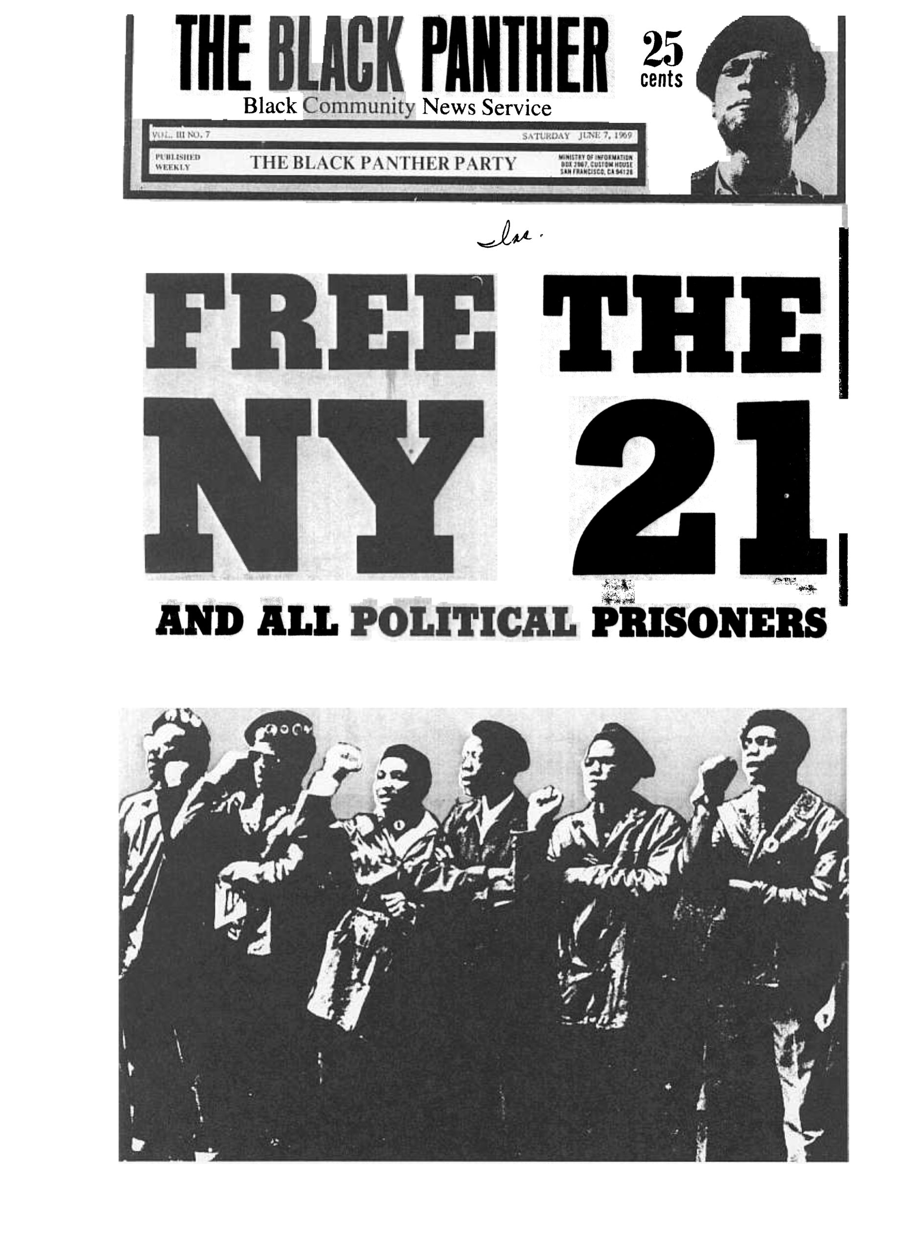
On 25 April 1967, The Black Panther went to print. The official newspaper of The Black Panther Party, founded by Huey P Newton and Bobby Seale in 1966, it began as a four page newsletter in Oakland, California. As the main publication of the party, The Black Panther served to distribute key information between members and soon grew into a national, and then international, presence. The distinctive visual language of The Black Panther began with a chance meeting between Emory Douglas, Newton and Seale. Douglas was working on props for a workshop by Amiri Baraka, a well-known poet and playwright. Newton and Seale arrived to discuss security for a visit by Malcom X’s widow, Betty Shabazz, and discovered a new recruit.
Douglas offered up his design skills at a meeting at Eldridge Cleaver’s apartment, where the first issue of the newspaper was being created. He had first been drawn to art and design via a programme in a youth detention centre, and afterwards embarked on a course at the city college to learn more about print. This sparked an interest in the Black Arts movement, and a passion for the works of Elizabeth Catlett and Aaron Douglas. The college had offered him valuable experience in building a visual language from limited materials, and this education informed the aesthetic of The Black Panther.
“They used cut-and-paste techniques, Elmer’s glue and rubber cement, and Letraset alternatives”
“We couldn’t hardly afford but one colour ink,” he explains in a video commissioned by the American Institute of Graphic Artists (AIGA). “So it was black plus one other colour to get that bold broad look. I began to mimic woodcuts with markers and pens, playing with shadows and photographs.” Douglas knew that strong visuals were key to communicating the Panther’s message to audiences of low literacy rates, and these constraints in tools created a style that became characteristic to the paper. They worked wherever they could, usually in people’s homes, and used cut-and-paste techniques, Elmer’s glue and rubber cement, and Letraset alternatives.
Douglas’ style evolved with each issue. A profile in The Letterform archive explains that his bold delineations masked “the imperfect registration of the newspaper press”, while transfer film tints “not only added texture to the artwork, [but] were an effective, low-cost alternative to multicolour printing.” Douglas explains that a lot of his techniques were derived from his experience of working in community print shops, where high-end jobs had to be completed without high-end equipment. This taught him to cut corners and use materials to his advantage.
View this post on Instagram
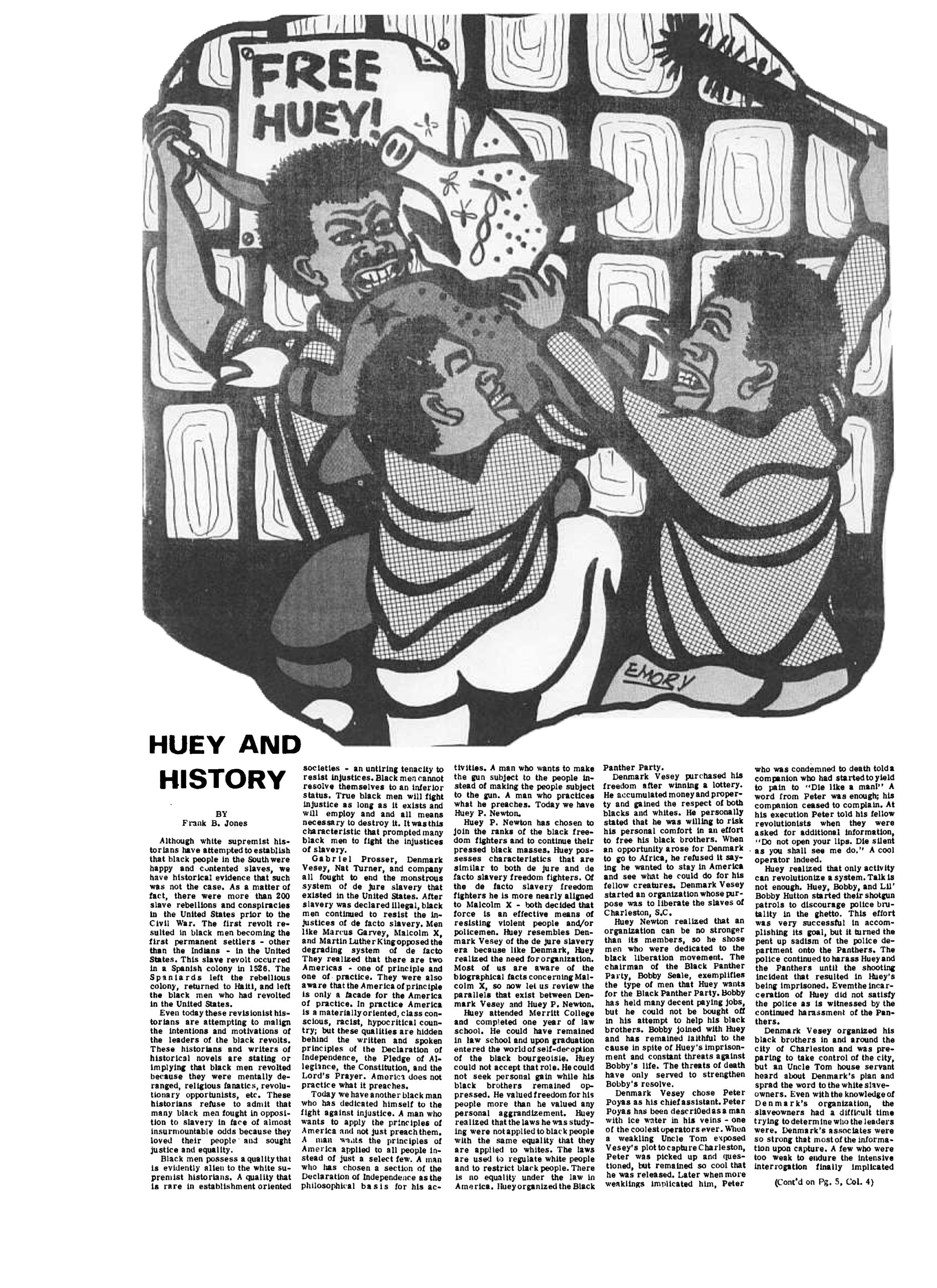
The designer’s signature blend of drawing and collage gave a visual urgency to the words of the Panthers. Recurring shapes, such as red communist stars or portraits encircled by rays of texture reminiscent of Japanese propaganda posters, subtly evoked political imagery in the audience’s mind. Douglas was able to succinctly criticise the police and empower the everyday Black man through his dexterous command of image and text. He recalls Newton asking him to create an image of a pig. “Huey wanted me to draw a pig with a belt around it, standing on two hooves, and that became a symbol of those who were abusing their power.”
Douglas explains that while some claim that his drawings are inflammatory, he maintains that they’re based on fact; while the interpretation may be provocative, it’s not distorted. A May 71 cover mourns the loss of distribution manager Sam Napier with stark rays of white set against a black backdrop that emanate from his portrait, while the word MURDERED screams atop his head. The duotone colours, paired with readable typefaces, resulted in covers that not only caught the eye but continued to draw the reader in. A 1970 cover declares Fred Hampton Murdered By Fascist Pigs, printed in the colour of blood, while layer upon layer of Hampton’s face stare out from behind the obituary. Not all the covers aimed to shock but when the moment was right, Douglas could certainly pack a punch.
View this post on Instagram
It was a tall order for Douglas to art-direct a paper that carried news between members in a low-cost yet engaging fashion, while raising awareness to inspire new recruits. He solicited the help of other Panthers, such as Joan Tarika Lewis, who was the first woman to join the organisation and illustrated under the pen name Matilaba. He also brought on board Gayle Asali Dickson, who signed off drawings with her middle name. While both remain overshadowed by Douglas in the Party pantheon, their works were equally instrumental in galvanising audiences for BPP recruitment. A 1972 work by Asali encourages readers to register to vote, via a drawing of an older woman holding a sign that declares the California deadline, surrounded by a collage of protestors. One placard reads ‘freedom is a constant struggle’.
Asali’s signature realism reflected the stark nature of inequality, and the economy was a central subject to her work. An exhibition at Cantor Fitzgerald Gallery titled If I Can’t Dance to it, It’s Not My Revolution, exhibited one of Asali’s works that makes use of the Panther colour palette and Douglas-esque rays of light. A foreground depiction of a woman with curlers in her hair takes centre stage, wearing pins in support of Bobby Seale for Mayor of Oakland and Elaine Brown for councilwoman. Behind the figure, people queue for the Panther’s free food programme, illustrating the vital importance of Black political power. A condensed typeface above reads: “We have experienced a bitter life with dark and hungry days filled with pain. Now we the people are demanding a change… Survival Survival Survival!“
“The designer’s signature blend of drawing and collage gave a visual urgency to the words of the Panthers”
Lewis joined the party at 16 as an accomplished musician and Black student union member. She put her jazz career on hold, and has said of the transition that she “put down [her] violin and picked up a gun”. After training in weaponry, dismissing any male Panthers’ cynicism of her abilities, she contributed more than 40 images to the newspaper. Matilaba’s delicate lines and subtle shading distinguished her work from that of Douglas or Asali, reinforced by her decision to centre female Panthers in prominent militant roles as a method of depatriarchising the visual culture of the newspaper.
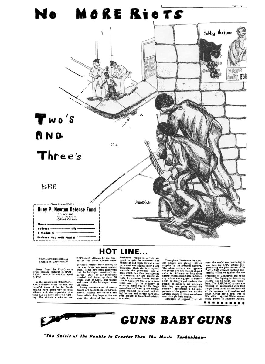
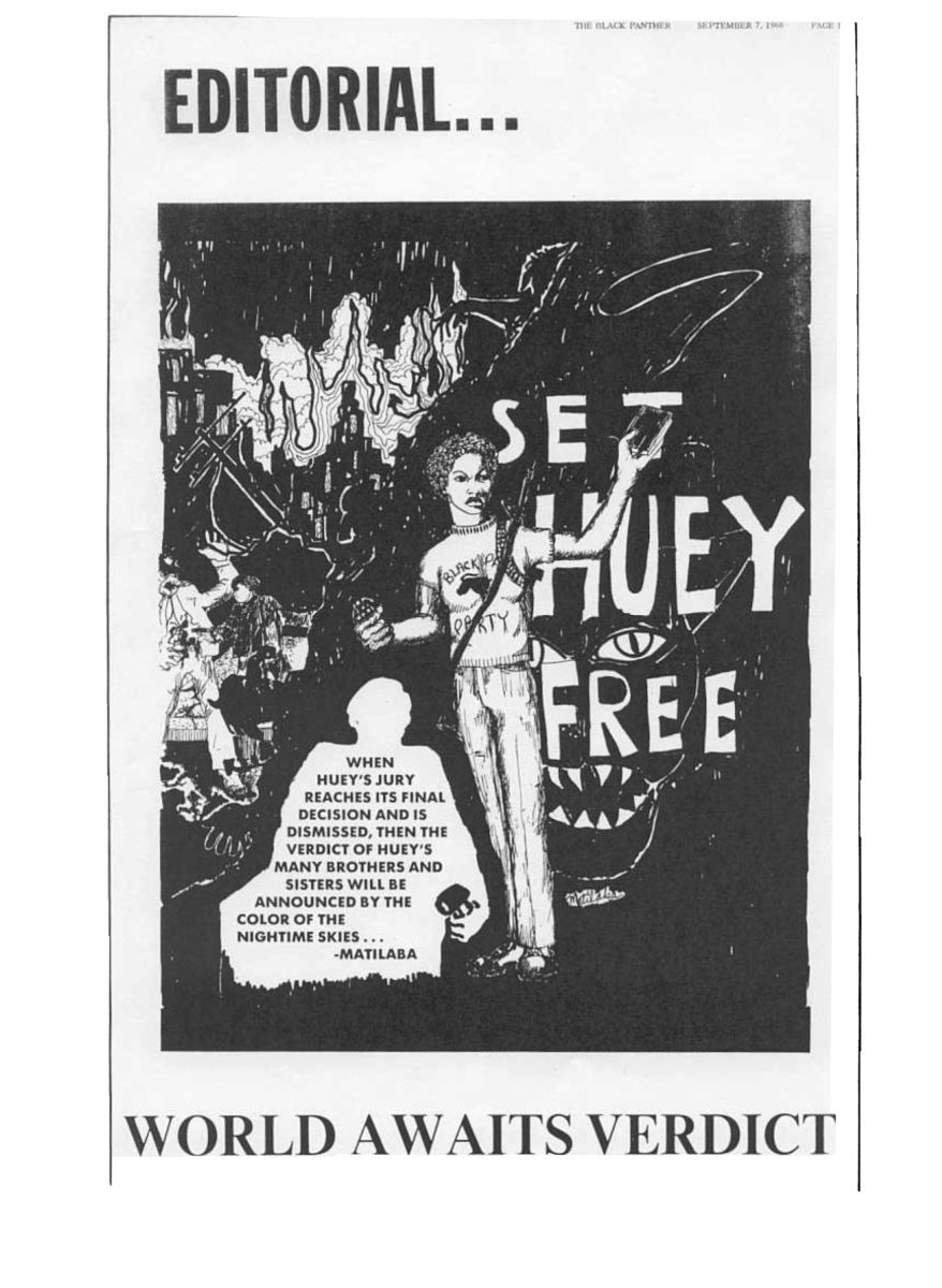
- Left: Matilaba, Two's and Three's, 1968. Right: Matilaba, Set Huey Free. Images courtesy of It's About Time BPP
A 1971 cover sets the figures of an armed Huey P Newton in the shape of a red star, while text urges the reader to “Hold high the banner of intercommunalism and the invincible thoughts of Huey P Newton.” Overleaf, a speech Newton gave at Boston College outlining the Panthers’ Ten Point Program explains that more than revolution, it was about survival. “It’s necessary for our children to grow up healthy, with minds that can be functional and creative. They cannot do this if they do not get the correct nutrition. That is why we have a breakfast program for children.”
The Panthers set out to take ownership of the wellbeing of their community, rather than fix a problem generated by the white state. That the Black community was able to find themselves represented in something as permanent as print struck a chord. As Douglas explained in an interview, “they were visual interpretations of the conditions people lived in…combined with revolutionary imagery. The people saw themselves in the artwork. They became the heroes… They could see their fathers or their brothers and sisters in the art.”