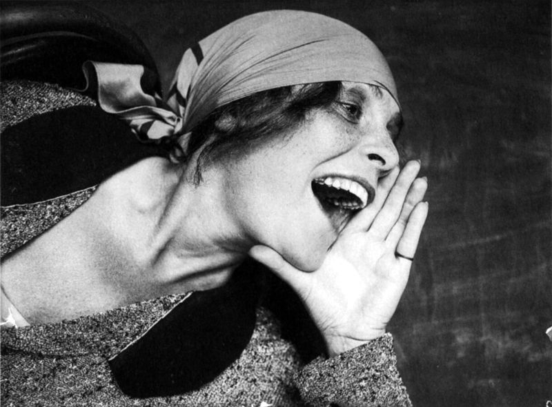
This untitled portrait of the writer and socialist socialite Lilya Brik, taken in 1924 by Aleksandr Rodchenko, may well seem familiar, even if you have no interest in early Soviet art or politics. In part that’s because it’s simply a powerful image, a strikingly simple composition, with boldly legible emotions lent extra dynamism by the tilted perspective and low angle so typical of the artist’s photography. We recognise this woman because Rodchenko has found a way of capturing what we might call her ‘essence’.
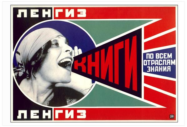
More prosaically, though, Brik’s familiarity is a result of the original photograph’s second life as an element of an iconic piece of graphic design: Rodchenko’s advertisement for Lengiz, a Leningrad-based state publishing house founded that same year. Here, Brik’s profile is embedded within the geometrics and bold colour schemes of Constructivist photocollage, her shout both amplified and concretised into the slogan: “BOOKS in all fields of knowledge”. While this was just one of many advertisements that Rodchenko produced in the early 1920s, it has proven the most durable. The basic composition—a shouting profile with cupped hand, a megaphone-style speech protruding—has in effect gone viral, and is now reproduced endlessly with only the vaguest notion of its original intention intact, a staple of political meme-making.
When we encounter these retoolings of Rodchenko’s advert, we vaguely understand that there is something ‘propagandistic’ about them, but might struggle to place our finger on why: maybe we understand that there is something Soviet or Russian or even ‘communist’ about it; maybe we intuit the art historical significance of Constructivist aesthetics to modern-day branding and advertising. Rodchenko’s portrait of Brik, then, is a photograph that we are deeply familiar with, but in a doubly decontextualised form.
“Rodchenko’s portrait of Brik is a photograph that we are deeply familiar with, but in a doubly decontextualised form”
Its memeification distances us from the advert’s original urgency; and that advert itself has long since left the actual photograph in its wake. Lilya Brik herself, whose energy and emotion made this image so suitable for propaganda in the first place, has been voided from our understanding of it. If we consider each of these layers in turn, from contemporary manipulations to the original portrait, we understand more clearly what gets left out when a photograph becomes a part of the digital commons.
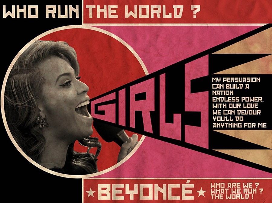
The template provided by the Lengiz advert has proven extremely malleable. Perhaps this is because the outline is so simple; perhaps because of Rodchenko’s and Constructivism’s outsized influence over twentieth-century graphic design, especially when it comes to advertising. At this point, regardless, it can be deployed in support of anything from women’s equal pay to Dogs 4 Obama. French artist David Redon can insert Beyoncé into the template and the message instantly becomes one of readily-commodified ‘girl power’.
The template has proven particularly popular with post-punk bands—Franz Ferdinand, most famously, but also the older groups they borrow from, like The Ex and Mike + The Mechanics — a result, perhaps, of that genre’s retooling of the tropes of High Modernism. When it comes to propagandistic images of female empowerment, it is probably second in viral terms only to J. Howard Miller’s 1943 ‘We Can Do It!’ poster for Westinghouse Electric: the source of a million memeified takes on the figure of ‘Rosie the Riveter’ (including, again, Beyoncé herself in her role as secular saint of corporate feminism).
Just as Miller’s poster has been repurposed in ways almost totally alien to its designer’s intent, so Lilya Brik’s cry of ‘BOOKS!’ has been repeatedly pasted over in the last 96 years. And while there is nothing inherently wrong with this, and certainly no need a century on to be too precious about as iconic a figure as Rodchenko, it would be a shame if the fascinating context in which he and other Constructivists worked were lost entirely.
The mid-1920s were a moment of both extraordinary creativity and compromise in the Soviet Union. After a bloody civil war, the victory of the revolution had been assured, but the country was left exhausted and close to bankruptcy. In an attempt to catalyse an economic recovery, Lenin embarked on the New Economic Policy, which saw the partial reintroduction of private business and speculation, understood by many in the Party as an admission of ideological defeat. At the same time, the state embarked on a titanic series of ‘enlightenment’ campaigns aimed at rapidly improving the public health, education levels, and employment rates of the population. These competing impulses—between the retreat into private enterprise and the forging forward into communism—manifested themselves in the ‘socialist adverts’ that Rodchenko produced at a prodigious rate in this period.
“Its memeification distances us from the advert’s original urgency”
Rodchenko understood that under the New Economic Policy, the Soviets would have to beat the capitalists at their own game. State-run industries were in competition with the private sector, and they needed to win. ‘[While] we understand perfectly well the power of agitation,’ wrote Vladimir Mayakovsky, a poet who contributed catchy slogans to many of Rodchenko’s ads, ‘the bourgeoisie understands the power of advertising. Advertising is industrial, commercial agitation. It is a weapon.’ The duo produced adverts for the State Rubber Trust, the Tea Directorate, the grocery cooperative Mosselprom; they promoted cooking oil, bread, biscuits, dummies.
The Lengiz advert itself was part of a wide-ranging campaign to eliminate illiteracy in under-developed, still largely agrarian Russia. In other words, this uncompromising genius of Soviet design spent some of his most prolific years trying to help sell groceries. This context allows us to appreciate the subtler ironies in the Lengiz advert’s viral afterlife. The image is so attractive because on some level we read it as conveying a pure conviction—the woman’s bold, clear cry — onto which we can attach our own captions. And yet the whole thing is an artefact of an era of compromise and desperation, an attempt to square an ideological circle.

“The image is so attractive because on some level we read it as conveying a pure conviction, onto which we can attach our own captions”
In tackling this impossible brief, Rodchenko often repurposed photographs of friends and family—which brings the focus back, finally, to Lilya Brik herself. A fulcrum of the avant-garde whose salons hosted every notable cultural figure of the 1910s and ‘20s, Brik is one of the most intriguing and controversial figures in twentieth-century Russian culture. She has too often been written off as a society beauty, a muse to great male artists: her affair with Mayakovsky inspired some of his most ardent poetry; she was married to the great aesthetic theorist Osip Brik; she modelled for Matisse and Léger amongst others. Her own talents as an essayist are seldom considered.
In this sense, it is almost fitting that her face should help launch a design legacy from which she is almost totally occluded—in the 1950s, a campaign was launched to scrub Brik’s name from Mayakovsky’s biography, to the extent that she was even airbrushed out of photographs with the poet. Her history has been one of exclusion.
The fact remains, though, that when Rodchenko needed a potent image, one of stridency and conviction, he reached for Lilya. If nothing else, her portrait is a reminder that a photograph can achieve iconic status only when the knotty private histories behind it have been displaced. Maybe the final lesson of Rodchenko’s portrait of Brik is that the personal and the political have always been closely, even painfully intertwined.
Snapshot is a weekly series that zooms in on a single photograph to explore the context of an image, the conditions it is created within and its wider cultural impact.


.png)
#/media/File:Mike_&_The_Mechanics_-_Word_of_Mouth-CD.jpg)
.jpg)