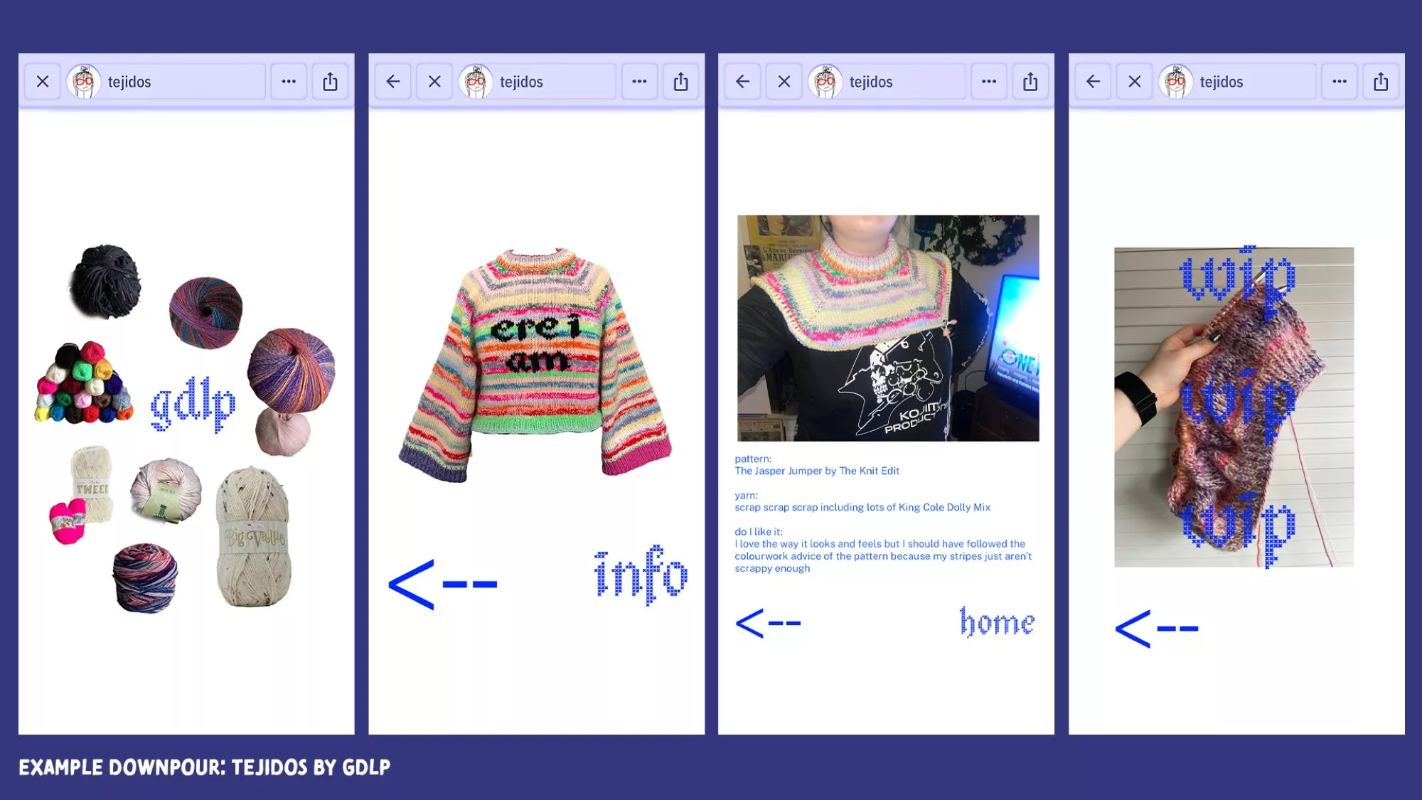
Lately, I’ve been spending a lot of time on a new app called Downpour which allows you to make games and websites quickly from your phone. These creations can then be published for others to enjoy and, god, I’m liking Downpour so much that it is putting into perspective how much I haven’t been liking my phone in recent years. Or many years, actually. Maybe not since Instagram’s launch back in 2010.
Do you remember what that app used to be like? Do you remember what you were like? I was a 16-year-old art-obsessed child. I always had a heavy DSLR camera in my bag that my Mum had bought for me after she won some money on a Smooth Radio competition. I spent a lot of time in the art room at school and at home I was always online, but the Internet had always been a creative space in my experience so one flowed into the other quite naturally. I was there for DeviantArt’s heyday in the late 00s which is actually where I learnt to use a camera because my art teacher in school had no idea. I was logging into MySpace every day around the same time, not because I was particularly interested in the social network it provided, but because the website allowed you to customise your profile page and that was endlessly fun. I would tweak the custom HTML theme almost obsessively, hunting for good images and fonts until I was satisfied the design matched my personality. DeviantArt never felt like a waste of time because it taught and inspired me, and MySpace was a place where I was always making something; a décollage profile page for my décollage teenage self.
And then Instagram came along and I was genuinely excited because it looked like a tool belt for artists; plus a way for a non-artist to become one. I liked the fixed 1:1 aspect ratio which made my phone into a toy Polaroid camera. Even if they’re not to my taste anymore, I liked the original filters that made images look coffee-stained, dreamlike, or professionally smacked with big lens flare kisses. I found myself leaving the DSLR camera at home because the quick image process that Instagram allowed for was so pleasing, making art of the most boring scenes. A carpark, a game of Scrabble, a teacup. I posted pictures, about five people liked them, and I could not have been happier. I was going to be a photographer! I was on my way! But that happiness lasted for maybe one year and then the Internet just truly went to shit.
Apps have not made me feel creative in a long time and I resent that. It’s a resentment well-documented because it is so widely felt. A user experience that swings from the enjoyment of a platform to no joy whatsoever is usually the fault of the app’s enshittification, a term coined by journalist and writer Cory Doctorow in 2023. Enshittification describes how platforms such as YouTube, TikTok, Facebook, Twitter, Amazon and even Google Search are all beneficial to the user to start with. The app does what it promises to do, and it does so efficiently in order to get in our good graces. But then the app butters up its business customers instead. Sponsored posts take centre stage and everybody else’s contributions are suppressed, that way, more casual users might become business customers who boost their posts. After that stage is complete, even business customers are squeezed with higher advertising rates that reap lower returns. The people who benefit most are the shareholders, and of course they do, and — urgh.
I resent the boring capitalism that has chewed up everything that used to be fun. When I pick up my phone, I want to see art or I want to make some. If I’m scrolling for the sake of it, I at least want to feel the relief of general content creation as a palette cleanser. However, enshittification means I’m only shown adverts. I am blocked from experiencing culture at home because these platforms aren’t interested in delivering me any. They only want to sell me stuff. Users become consumers instead of producers. The fallout is that I haven’t felt very inspired to make culture at home using these apps. I’ve deleted Twitter altogether. The Internet once felt like an extension of the art room at school, and Instagram was once a jacked camera everybody was given for free, and that all seems nostalgic now even though it’s recent history. But it’s something I am reflecting on because that original gotta-always-have-my-phone-in-reaching-distance giddiness I used to feel has come back recently thanks to a new app called Downpour.
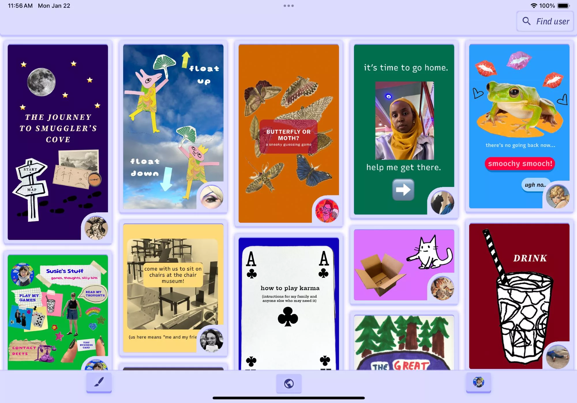
Launched on iOS and Android for free last month, Downpour is the work of artist and creative technologist v buckenham. Using the app, you can make pages, add text or images from your camera roll, and then link those pages together however you like. It’s simple, and that’s purposeful. Buckenham wanted to give people a tool so that they could make something interactive without needing a computer or any laborious training in programmes such as Unity. It’s hypertext that can be made quickly on a bus journey, without needing to know what the word hypertext even means; and the bus hasn’t travelled very far yet but the results are already vast.
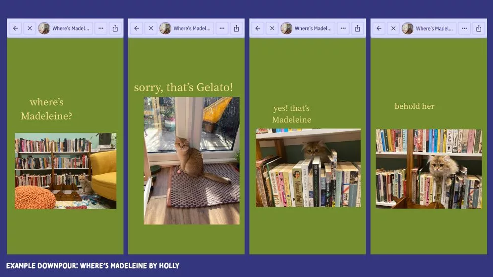
There are games: Where’s Wally except it’s a beautiful cat, and a challenge to not look at the sun during the eclipse over Ohio. There are jokes: try to make a proper cup of tea and see what happens, try to play chess and see what happens, try to play this game without becoming a gamer and see what happens there! And then there are pieces that I would categorise as interactive blog posts: about what it is like to go on a march, where home is, or an outfit and nail art diary that I’m about to copy once I’m done writing this.
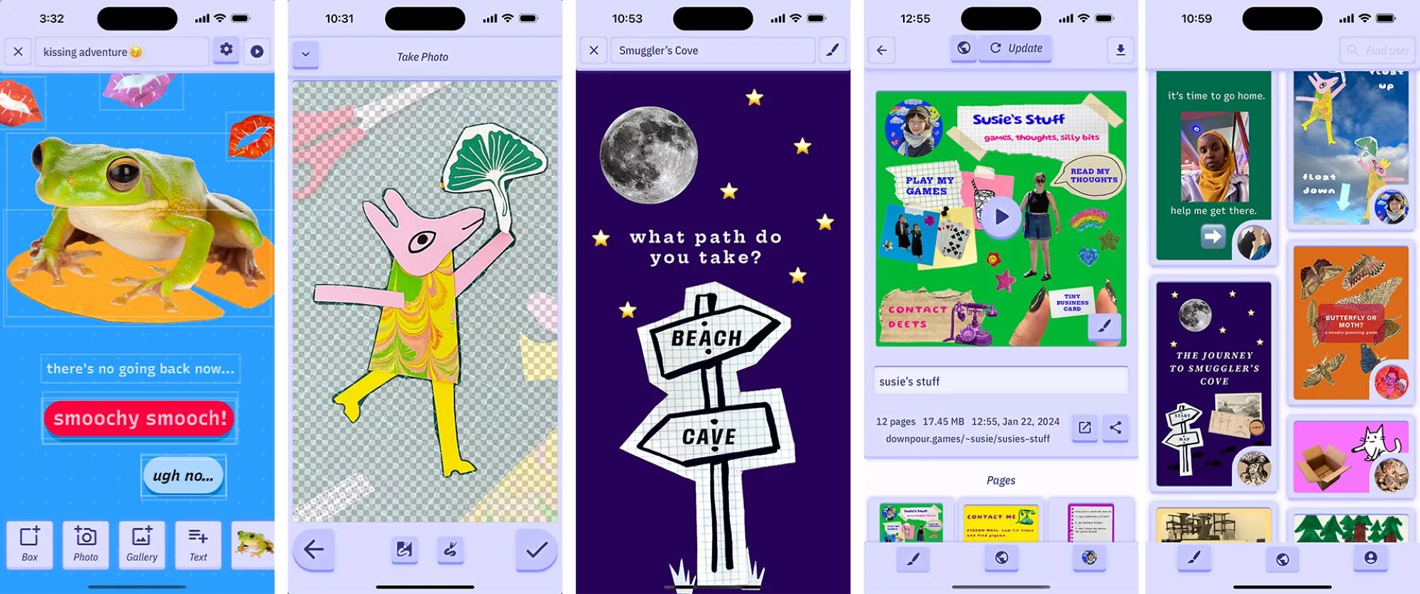
There is also plenty of art and poetry on Downpour which I’m glad to see. One of the questions I get asked most as a critic is what is the best website for an artist to sign up to. I usually don’t know what to say because ‘don’t sign up to any of them’ is a terrible reply. I think we need to fight back against subscription-only-forever costs and learn how to build this stuff from scratch. But when artists’ websites exist on their own islands, we all lose a sense of community which is why so many people rely on centralised social media platforms such as Instagram. Downpour could be a new way to pull those islands together into one big archipelago. It also might take the pressure off of people worn down by the default competition of Instagram, because there are no likes or comments which means there’s never the underlying feeling of sharing your art and then being ignored.
So far, artists have used Downpour to share drawings, link drawings together with poetry, and to record a trip around a museum in Melbourne. One example I particularly like, especially from the perspective of a critic, is user @merricat’s March Studio Visit. The artist has bundled images of recent work, what they’re reading, their inspiration, and new materials they’re trying out into one site that records their time in the studio over March 2024. As someone who writes about artist’s outcomes, I always wonder what is going on behind closed doors to get to the point of display, and so this is a gift. It’s also casual and accessible; you wouldn’t fork out on a domain and hosting, and build a website just to remember that one month in the studio. An Instagram post would get lost in the tides. But getting to click through an interactive site makes me feel like I have had some kind of interaction with this artist who is actually all the way over in Virginia. In case @merricat is reading this, I want April and May studio visits too.
There are a lot of people having fun on Downpour which says a lot about the simple invitation of the tool itself, but also about the absence of adverts and algorithms. What a relief. It’s also getting me to be creative with my phone again. So far, I’ve made one massive 100+ page Downpour that helps me deal with the symptoms of my chronic illness, gamifying my own homeostasis in a big directory with hidden stories. And then, do you remember all that knitting I spoke about in the first Culture At Home column? I’m tracking everything I make right here. It doesn’t feel so monumental that Instagram has gone to shit now that I have somewhere else to go. At the moment, Downpour is free unless you want to pay £4.99 a month to add links in your builds that take people outside of the app. I think that’s a fair business model if it means the Downpour bus keeps going and it drives straight past the enshittification that’s a buzzkill everywhere else.
Written by Gabrielle de la Puente of the White Pube

