What’s in a colour? While his contemporaries advocated minimalist white cubes, Swiss architect Le Corbusier created revolutionary colour charts organised like keyboards. In a 1931 swatch book for wallpaper manufacturer Salubra, he wrote: “Each of us, according to our own psychology, is controlled by one or more dominant colours.” He argued that, using a sliding cardboard cut-out (known as a key-hole), colour harmonies could be identified from an original purist palette that included 43 shades, and later a second collection with an additional 20 hues that were more dynamic.
Nearly a century later, Le Corbusier’s reflections on harnessing colour to create specific spatial effects resonate more than ever. During the pandemic, our domestic environments have become all-inclusive bubbles: they’ve been serving as ad hoc workspaces, gyms, schools and pubs. Our relationship with our homes, and the colours we choose for them, has shifted as we rethink the way we use colour to influence our mental health. Some have gravitated towards brighter, more saturated colours through paint, furniture and accessories to fulfil the external emotional and visual stimuli that we’ve been lacking. Others have opted for neutral colours to help manage anxiety stemming from the pandemic.
“The colour palette is a choice we have full control over, and we should take that opportunity to create spaces we feel great in”
With the focus turning to the spaces where we spend our waking lives, our bedrooms may seem more of an afterthought. However it’s an equally important space to consider. The colours we select for our bedrooms, after all, will likely be the first we see as we open our eyes. They are also the space in which conflict is most likely to occur.
I spoke to Karen Haller, a leading global expert in the field of behavioural colour and design psychology and the author of best-selling The Little Book of Colour, and Lee Chambers, an environmental psychologist and wellbeing consultant, about the effects of colour in the home and how to create a harmonious bedroom environment.

Keep an open mind
According to scientists, there are around 10 million colours in the world, so committing to a shade that you will potentially live with for years to come can be a daunting task. During her initial consultations with clients, Haller says she does not talk about colour or design. “Colour is the unspoken sensory language of emotions. l ask my clients how they want to feel in the space and more importantly, we discuss how they want to behave and what experience they are looking for,” explains Haller. “This is the start of my process that informs what the colours will be meaning.”
Avoid vibrant colours
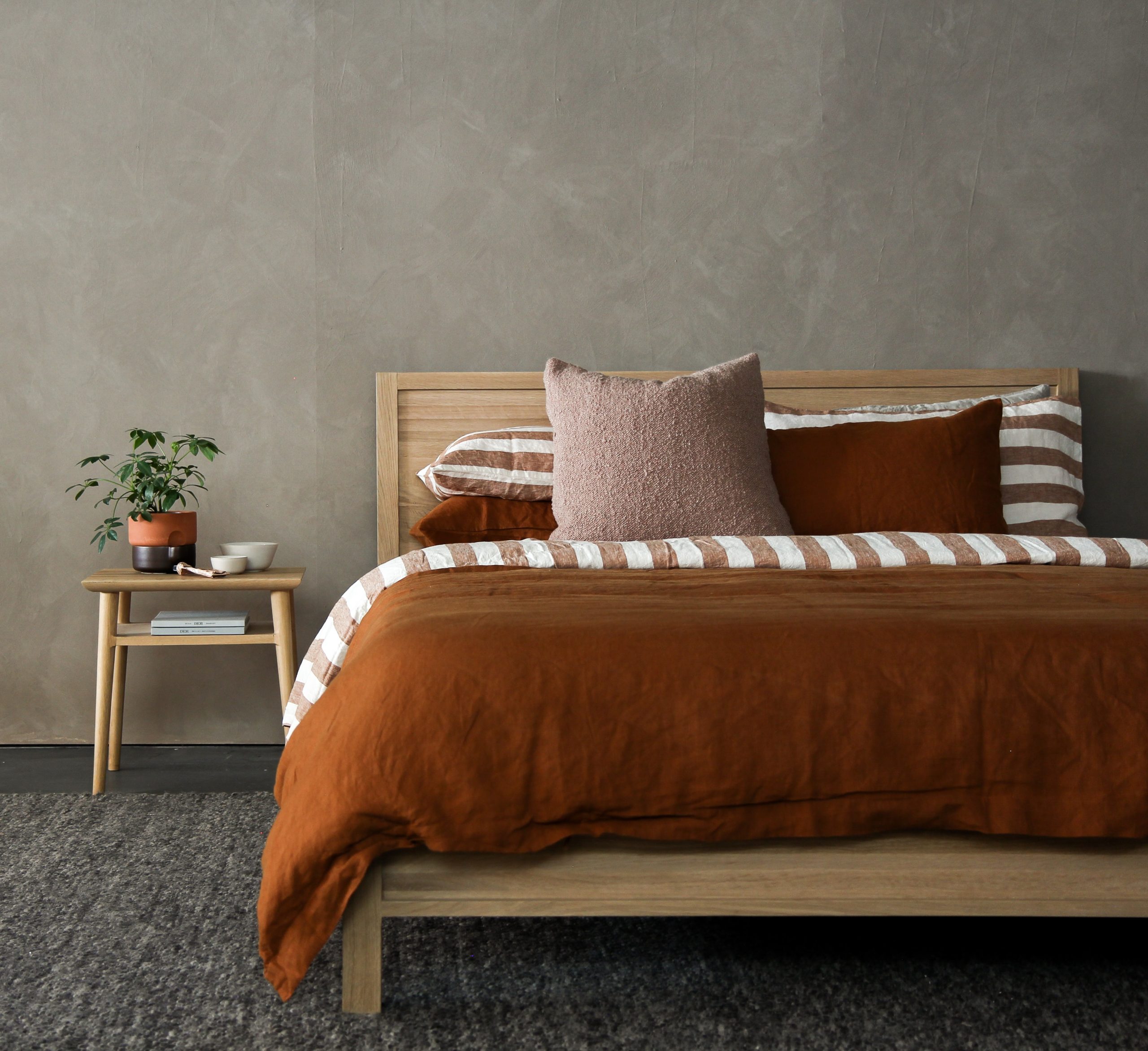
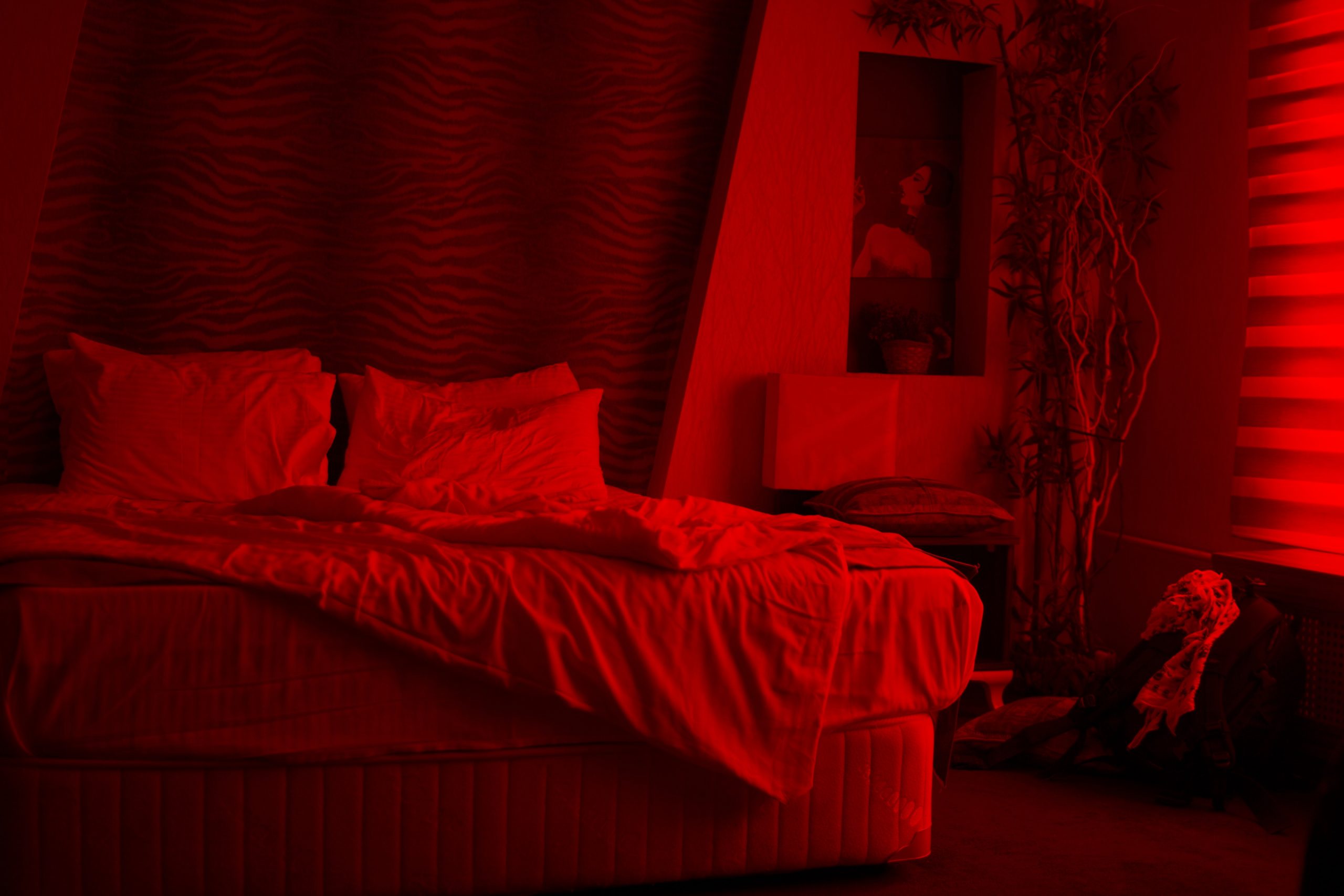
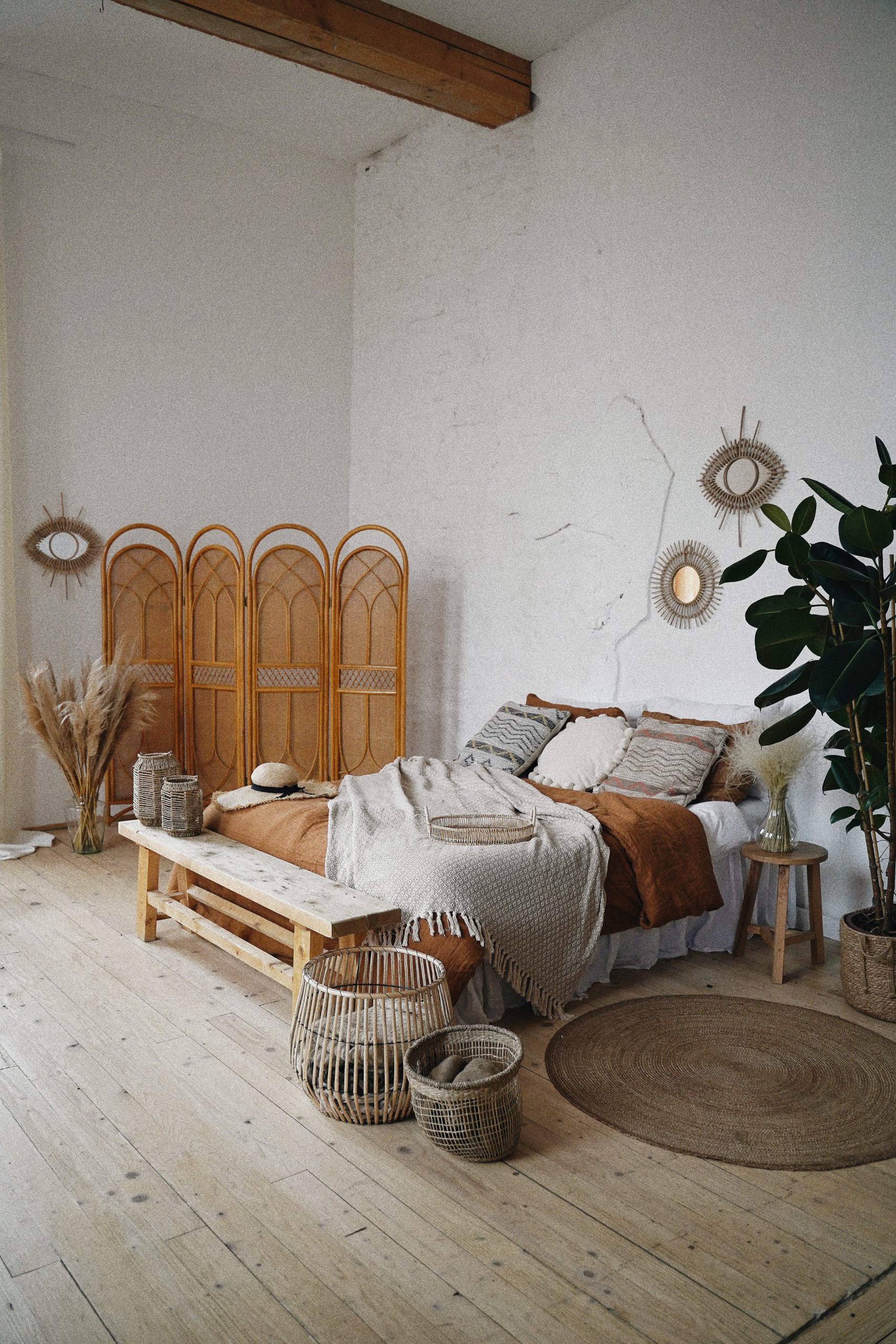
“Our bedroom is a sleep environment first and foremost,” says Chambers, “and this would suggest that a colour that is low on stimulation would likely be beneficial in promoting a place of serenity and relaxation.” Muted or darker shades are considered the most conducive to sleep and creating a calming space. Haller agrees, adding, “The colour that I suggest considering avoiding in the bedroom is yellow as this can keep the nervous system awake, and stimulating colours like lime green, turquoise, bright orange and bright red.”

Go back to nature
“My suggestions for bedroom colours are to utilise the colours of nature where possible, such as blues and greens,” offers Chambers, who was involved in a recent study that examined the correlation of marital bliss to bedroom colour. The data, taken from 4,390 couples, revealed that 89% of those surveyed with a green bedroom are happy in their marriage (on the other end of the spectrum, couples with a purple bedroom were found to be the least satisfied in their relationship). Because of the colour’s strong association to nature its symbolic properties are equally fruitful: green is thought to represent health, fertility, growth, good luck and prosperity.
“Colour is the unspoken sensory language of emotions. l ask my clients how they want to feel in the space”
It’s all in the shade
Not all colours are created equal: different shades of the same colour can evoke divergent sensations. Take orange, which comes in all manner of tantalising tones such as tangerine, cantaloupe, apricot, or marigold calendula (a personal favourite of Haller). Chances are you’ll experience them all differently physically and psychologically. “If you would like to mentally relax, soft blue can aid in soothing the mind whereas dark blue is likely to stimulate the mind,” says Haller. “Red is physically stimulating whereas a soft pink is physically soothing.”
Express yourself
Colour is a personal preference that can be influenced by a multitude of factors, including cultural symbolism (white, for example, is associated with death in many eastern cultures, and purity in western cultures). “When it comes to colour, my advice is simple: if you like it, consider how it makes you feel and don’t be afraid to express yourself in the colours you choose,” adds Chambers. “In a world where we have been restricted and limited, the whole colour palette is a choice we have full control over, and we should take that opportunity to create spaces we feel great in.” As artist and theorist Josef Albers once playfully opined: “Colour is like cooking. The cook puts in more or less salt—that’s the difference!”


