We haven’t been short of show-stopping cover stars lately. Kim Kardashian’s arse, on the cover of Paper in 2014 and shot by Jean-Paul Goude, was widely hailed for “breaking the Internet”. Last year, National Geographic’s smart shot of an iceberg/plastic bag managed to distil the issue of disposable plastic and climate crisis in a singularly memorable image; and just last month, Private Eye’s “Theresa May memorial issue” was—hilariously, brilliantly—simply a white blank page.
But it’s not always the big butts, big issues and big white spaces that make for a great cover. Sometimes, it’s little things. Like mice.
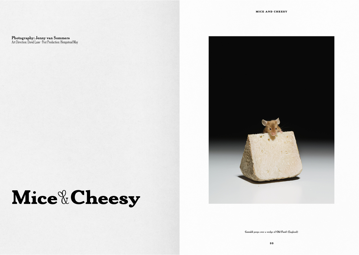
One of my favourite covers of late is that for the most recent issue of food mag The Gourmand, which bore an image that even the most hardened and rodent-averse couldn’t not love: a little mouse (his name is Jonas), peeking over a pyramid of holey cheese.
“The Gourmand uses food as a messy, multifarious frame through which to talk about wider issues, and—crucially—it always looks great”
The image was one of a series shot by Jenny van Sommers and art directed by David Lane, the co-founder and creative director of The Gourmand, and Marina Tweed. Each image showed a different “sneaky critter in the act of scaling their favourite milky wedge”, as the mag put it (in other words, a little mouse, and a big bit of cheese.)
The Gourmand is one of an established wave of independent food-based magazines that took a more outré and experimental approach to writing about, discussing and visually representing food. The Gourmand uses food as a messy, multifarious frame through which to talk about wider issues, and—crucially—it always looks great. Lane and Tweed are both from creative backgrounds, and concurrently head up the agency Lane & Associates, which takes on creative and content work for various clients to help keep the mag relatively free of ads. Lane is also the art director of Frieze magazine.
- The Gourmand, Issue 12
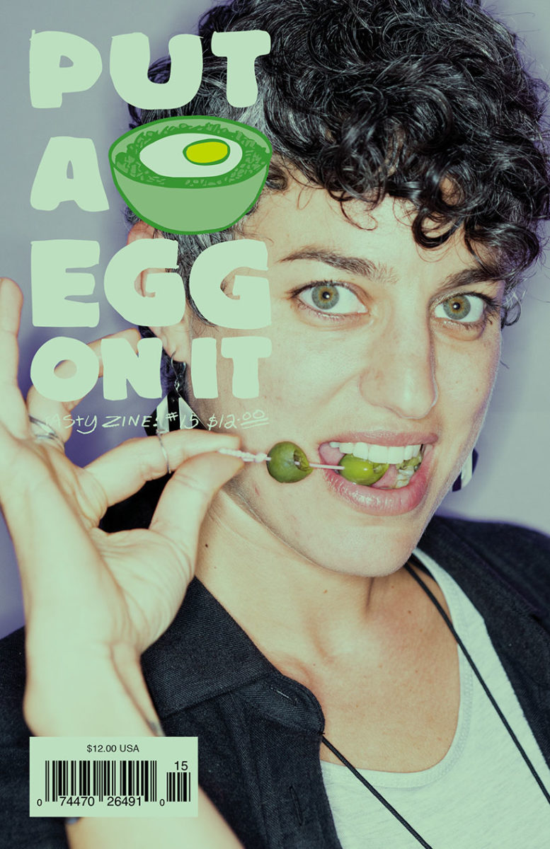
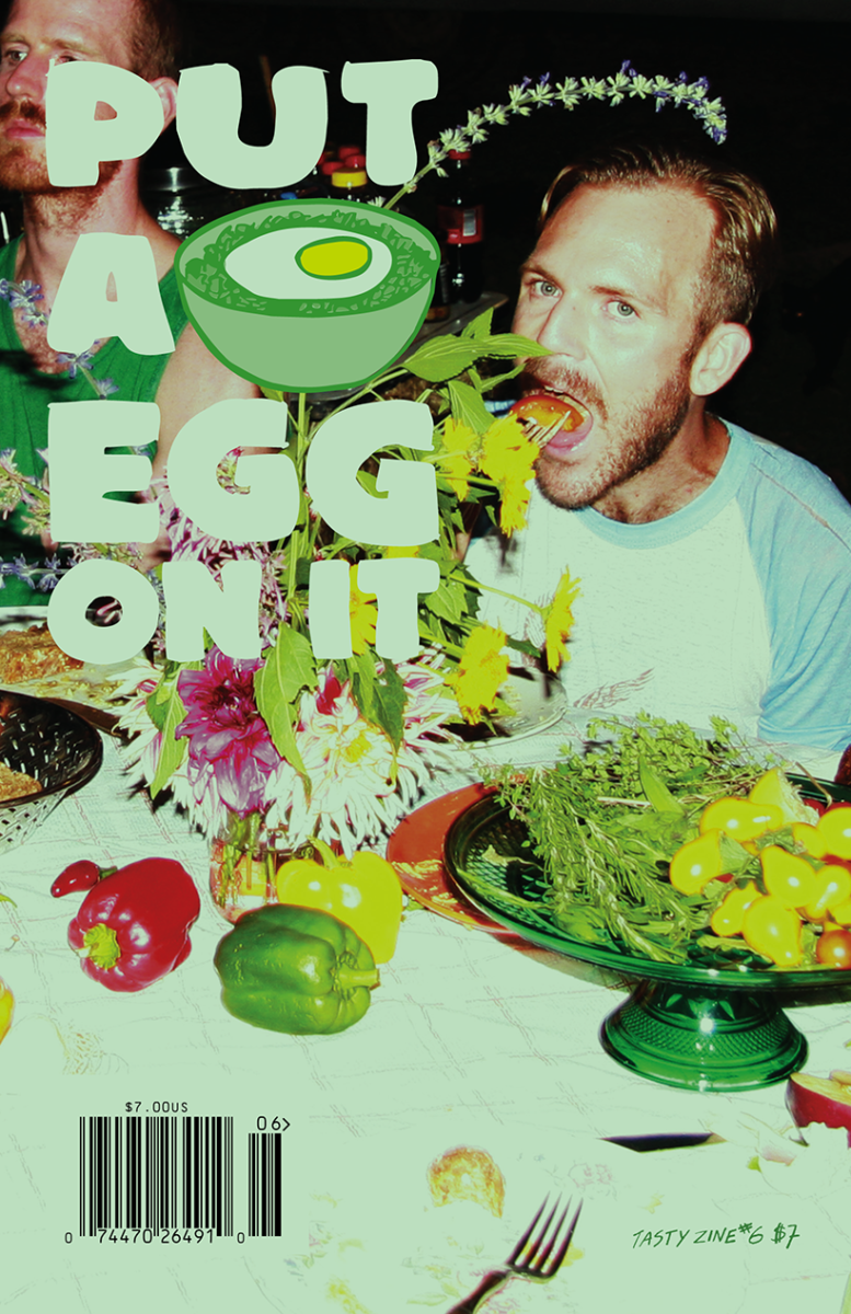
Such magazines deliberately deviate from the sanitized food photography, recipe-based banality and housewife-focused drudgery of food publications of yesteryear. Put a Egg On It preceded The Gourmand, beginning life in 2008 as a publication inspired by the DIY photocopied music fanzines of the late eighties and early nineties, eschewing tasteful, minimal layouts and glossy, serene, “aspirational” food photography or any hint of the tropes of “lifestyle” publications. Instead, as co-founder Ralph McGinnis puts it, the publication favours a “more documentarian and culturally inclusive approach”.
- Put a Egg On It
Again, the Put a Egg On It founders come from creative rather than culinary backgrounds: Ralph McGinnis is, by trade, an art director and designer, while cofounder Sarah Keough is a photographer. As well as publishing Put a Egg On It, Keough and McGinnis produce, design and print other publications through R&S Art & Publishing.
It seems common for those behind food publications (and, of course, publications with other themes) to run creative agencies either on the side; one reason being a canny way of supporting the notoriously precarious business of putting out a print magazine.
Obviously, great design is vital for any magazine; but for food magazines, there are certain more nuanced considerations: food and eating are such a ubiquitous, quotidien part of life that to present them well—which may not mean beautifully, but simply innovatively–in ways that in turns surprise, disgust, and delight is essential.
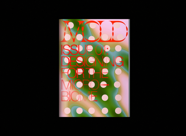
One magazine that does this brilliantly is Mold, art directed by designer Eric Hu (who incidentally, is also behind the superb cover of the recent fifth issue of Banana magazine; a publication spotlighting Asian creative talent). Having just published its fourth issue, Mold bills itself as an editorial platform about “designing the future of food”: as such, it’s not necessarily about great restaurants, or the preparation of food, but the wider contexts of edible things within the world. Things often get scientific: among the features the publication has covered so far are cellular agriculture, 3D food printing and entomophagy (eating insects). The platform started off online, entering the shiny, glossy world of print in 2017.
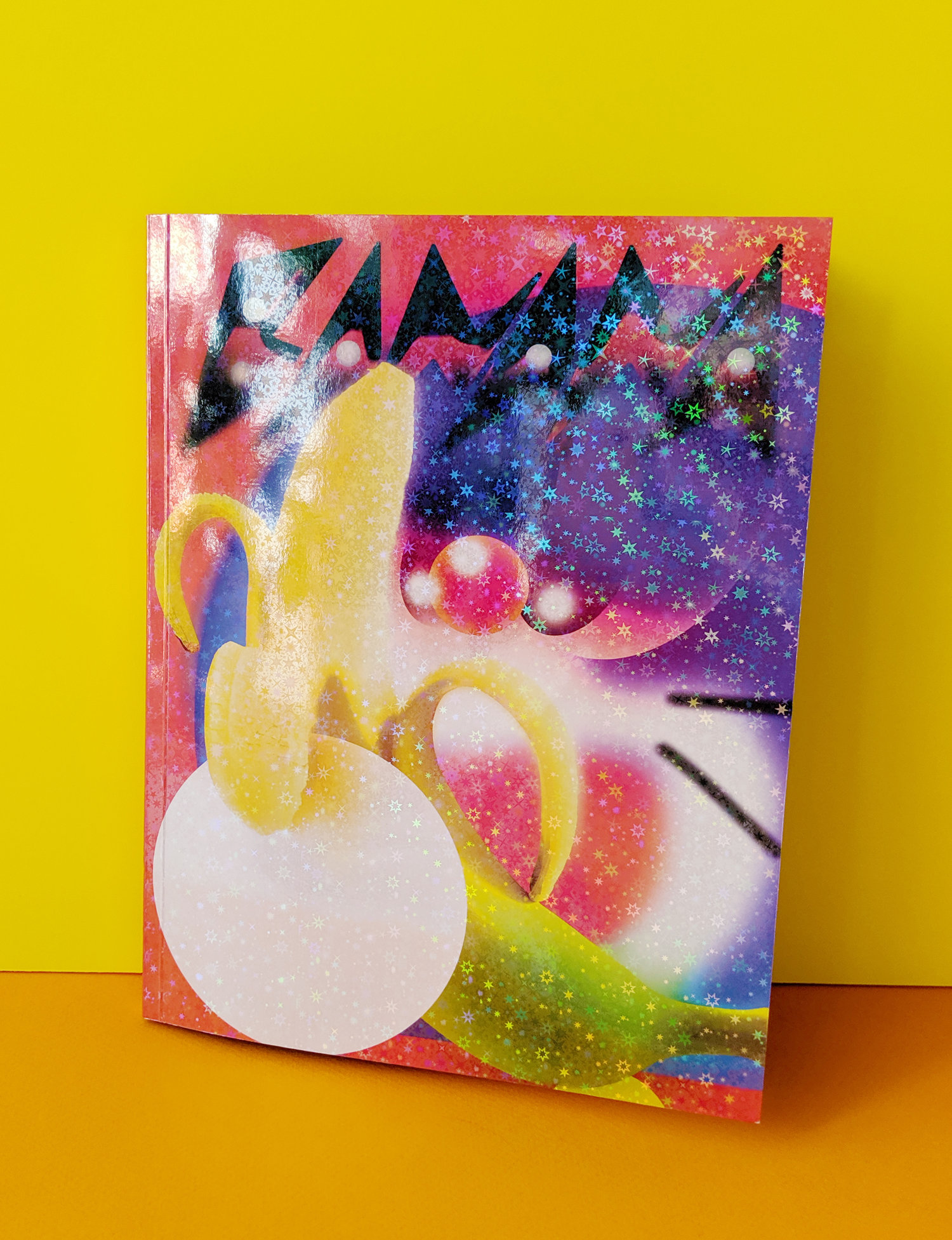
Hu described food a “sort of proxy for a lot of social interactions between people and it’s inherently very political”, speaking to Eye on Design at the time of the print launch. “I feel like our generation cares a lot more about food than people did ten years ago, or at least in the expression of it. But with more discussion comes more bullshit, and a lot of food culture has become ‘foodie’ culture: it’s more about the lifestyle of restaurants and food trends than critically examining what you eat, where food comes from, and how you engage with it.”
Indeed, the most interesting in this wave of food-not-food mags are those that shun sanitized, aspirational imagery and clean, Kinfolk-esque design minimalism in favour of the more experimental—those that value food’s role in cultural, creative and personal sphere’s over and above it’s being something to simple plate and polish off.
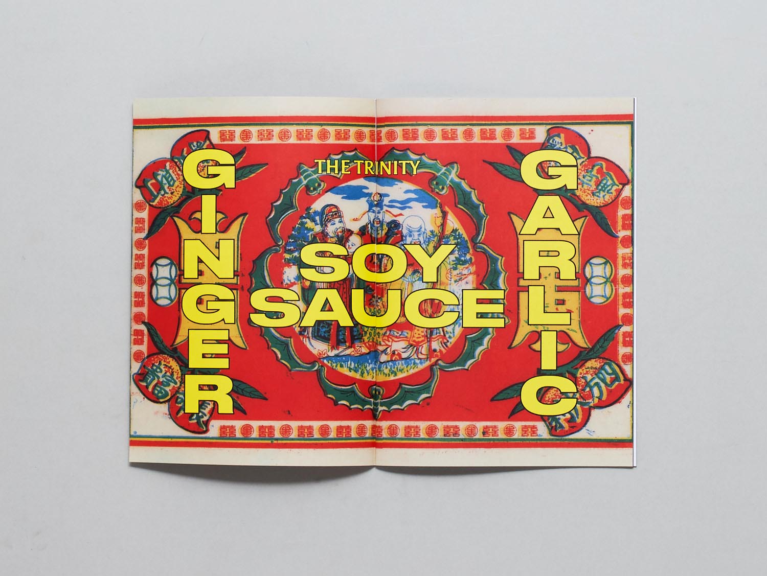
Design-wise, this leaves a delicious amount of room for experimentation and fun; as embraced by FatBoy, a magazine that launched fairly recently and another of those featured as an Elephant zine of the month. The mag is described by its founder Christopher O’Leary as “a greedy attempt to document a very small part of Asian food”—part cookbook, part personal diary—featuring recipes among a broader examination of “the connection between location and culture and how ‘fusion’ food can be a misleading term for some”, says O’leary, and how “food, culture and growing up impact on each other”.
He had initially wanted to put together a family recipe book “for fun,” since in Philippine families, “no one measures or writes things down—you just watch and figure it out”. And so he wanted a record of such dishes to recreate himself. O’Leary’s mother suddenly passed away a few months after he started the project; and he found that putting the recipe book that then evolved into FatBoy was a creative outlet for an incredibly difficult time.
Again, O’Leary’s day job is as a graphic designer; and his partner Emily Leonard, a photographer, shot the imagery for the zine, which deliberately prizes natural light instead of manicured layouts.
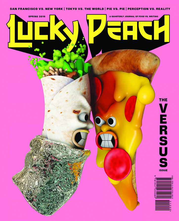
While such publications seem to attest to the vibrancy and, well, hunger for independent food mags; even some of the most-loved in that stable sometimes, sadly, come to an end. Many mourned the loss of Lucky Peach in 2017, a magazine that was renowned for not only its irreverent, smart take on food writing, but its brilliant commissioning when it came to design, illustration and photography. Founded in 2011 by Peter Meehan, a writer, and David Chang, a restaurateur; it was art directed by Rob Engvall
in its final two years (he took the reins from Walter Green, and Devin Washburn) and the mag was hailed as “pushing the envelope on food journalism and the relationship between chefs and writers—all without taking itself too seriously”. Among the illustrators who worked with the mag over its tenure were some personal favourites—the likes of Robert Beatty, Jack Sachs, Jordan Speer—and a raft of superb photographers.
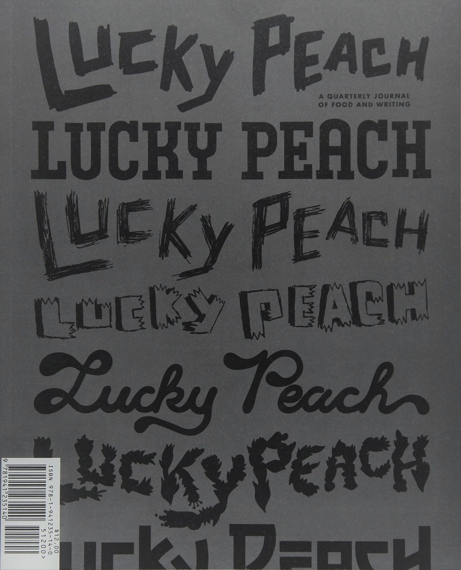
The cover for the final issue of Lucky Peach marked a dramatic shift from its usual colourful, playful dynamic; opting for a sombre grey and black purely typographic approach using lettering from previous issues’ mastheads. The double-issue acted as a sort of Best Of from the publication’s six year run, presenting a selection of its previous content alongside new features discussing the mechanics of putting Lucky Peach together. The magazine’s impact was keenly felt with the vast amounts of column inches devoted to mourning it, but as Jeremy Leslie pointed out on MagCulture, “Most magazines that fail fade away; it’s great to see a favourite go out on a high.”
It seems the key to a great food mag—both in its design and its wider editorial approach— is, as with most other themes, to see food not as consumables, objects, sustenance, luxuries and so on, but as an inescapable thread in the wider fabric of living. Just as, like Susie Orbach pointed out, “fat is a feminist issue”; food is an issue that impacts and reflects cultures, economics, technologies, sex, bodies, joy and pain.
“Merging beauty and disgust is always striking”
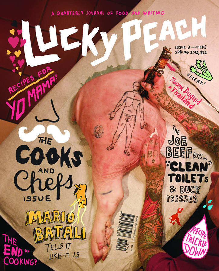
When food is shot as bland Instagram-ready aerial snapshots, we lose that resonance: when it’s shot with imagination and passion and a thoughtful conceptual standpoint, we see it as we would art: a distillation of a moment or person or culture; or a catalyst for musings on far wider issues than what gets slapped on a plate. This is exactly what the likes of FatBoy, Mold, Lucky Peach and so on are so adroit at expressing. Merging beauty and disgust (as Maisie Cousins does so brilliantly, for instance) is always striking; and learning about other people and cultures through what they consume is often more revelatory than via any other avenue. Even for those who see food just as fuel or an inconvenience or a painful battle with our own bodies, there’s no escaping that food is powerful; food is people; food is something that deserves to be given such bold and imaginative printed exploration.
