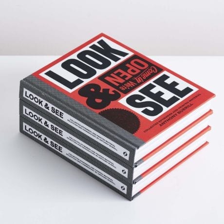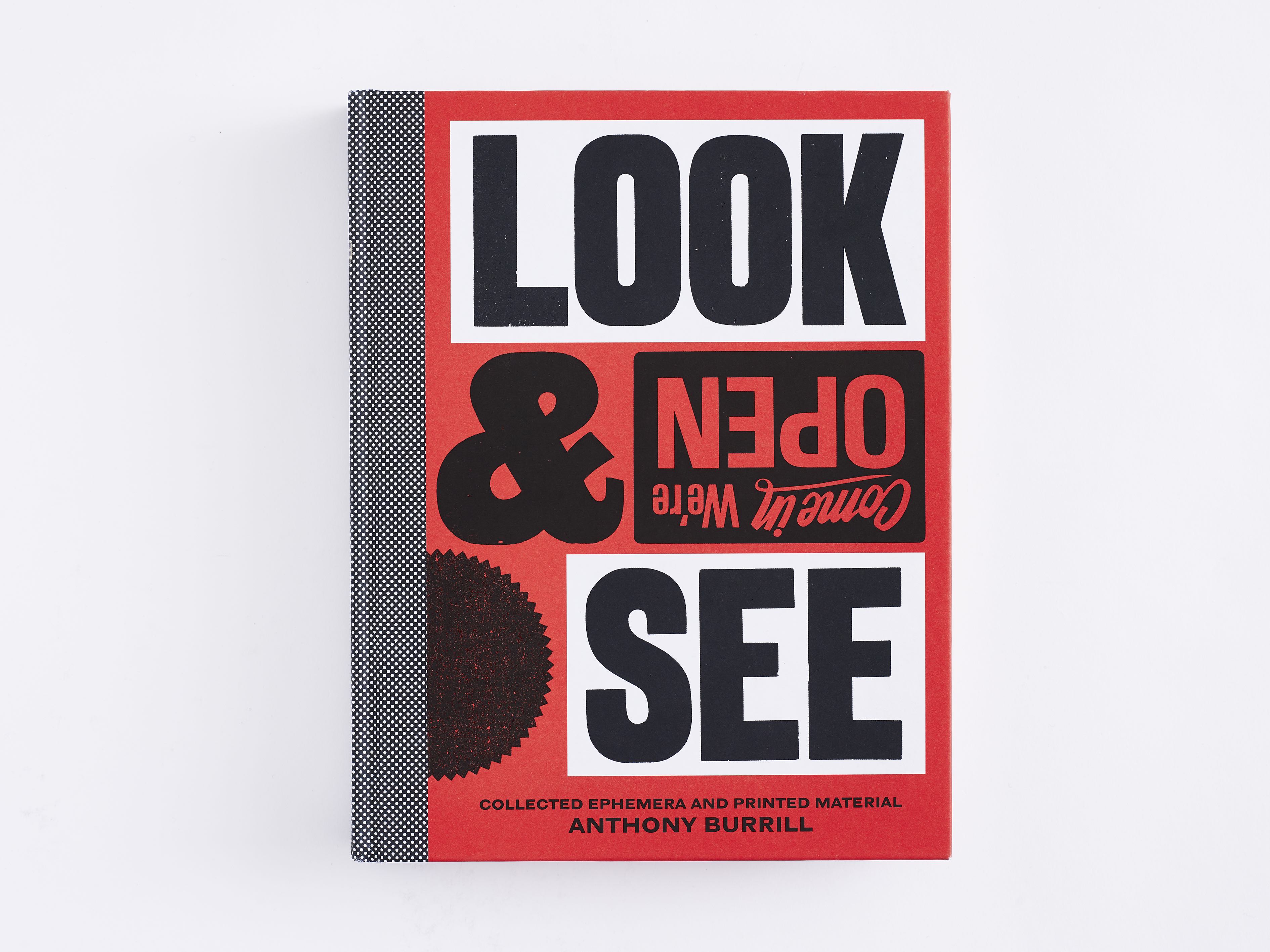
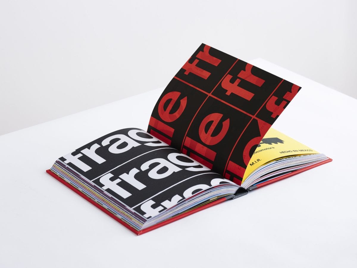
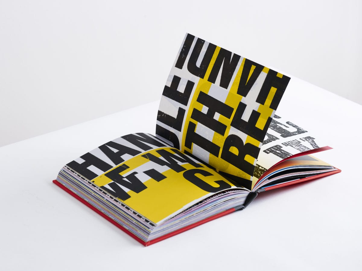
Part scrapbook, part memoir and part typographic treasure hunt, Anthony Burrill’s Look & See is a joyful celebration of all things printed ephemera. Showcasing everything from ticket stubs and wonky signage to densely packed Letraset, he takes you on a journey into a world that should, in many ways, be the antithesis of what a graphic designer strives for. There are bizarrely typeset shop signs, illegible warning messages and overly fussy business cards, all of which Burrill investigates with zeal, often pondering exactly what would compel someone to make such an unconventional design choice.
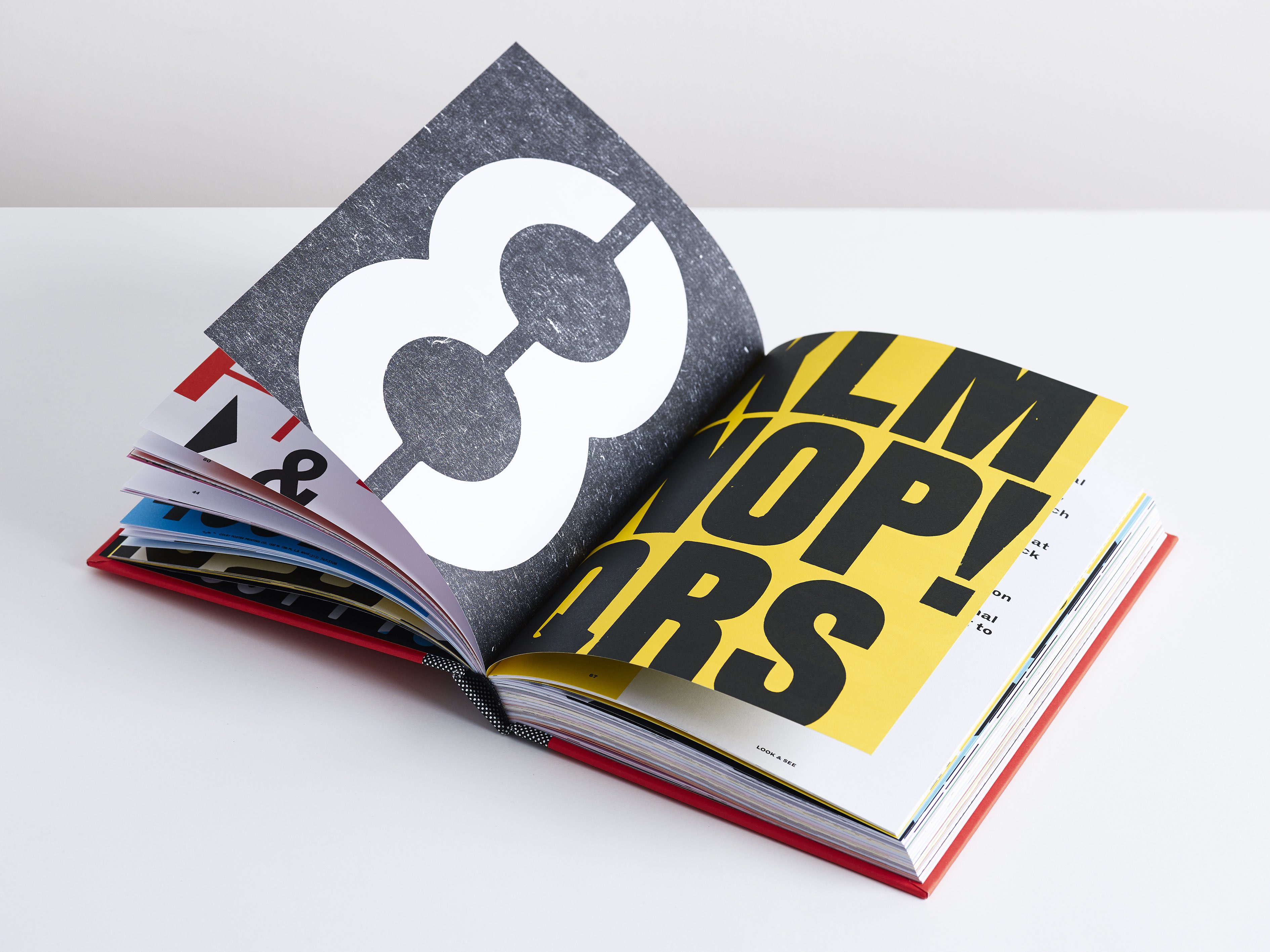
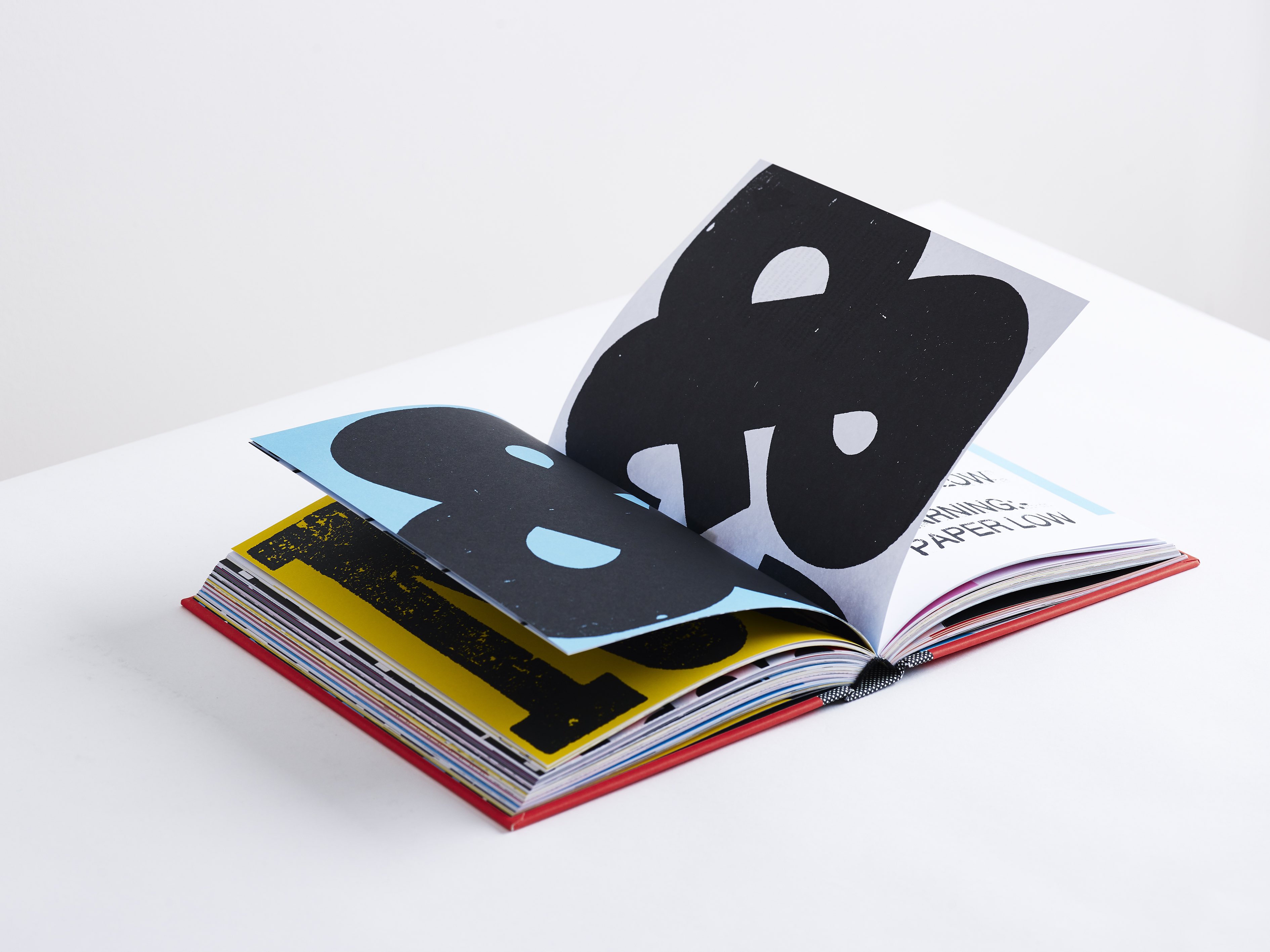
In other instances, we are invited to revel in the quotidian communications so many of us take for granted as we go about our day. The universal power of arrows is greatly praised, alongside the simple allusion to travel found in the National Rail logo, or the fascinating presence of the ampersand as both symbol and word, which is so often used to add a distinct flourish to a company’s signage.
Burrill has been collecting these scraps for decades, filing them away in sketchbooks and making notes of how and why he decided to collect or photograph them. In this sense, you are viewing a personal journey, often accompanied by anecdotes and ponderings (his time in New York is particularly fruitful); they are useful insights and, on a few occasions, even something akin to poetry. For example, he explains why the inside of a bank envelope is gridded (as a form of camouflage to break up letterforms and protect your information) and later launches into a brief refrain that joyfully relays the functionality of a packaging instruction:
Do not drop!
This way is up.
There is no up without down.
Up needs down and down needs up.
Which way is up?
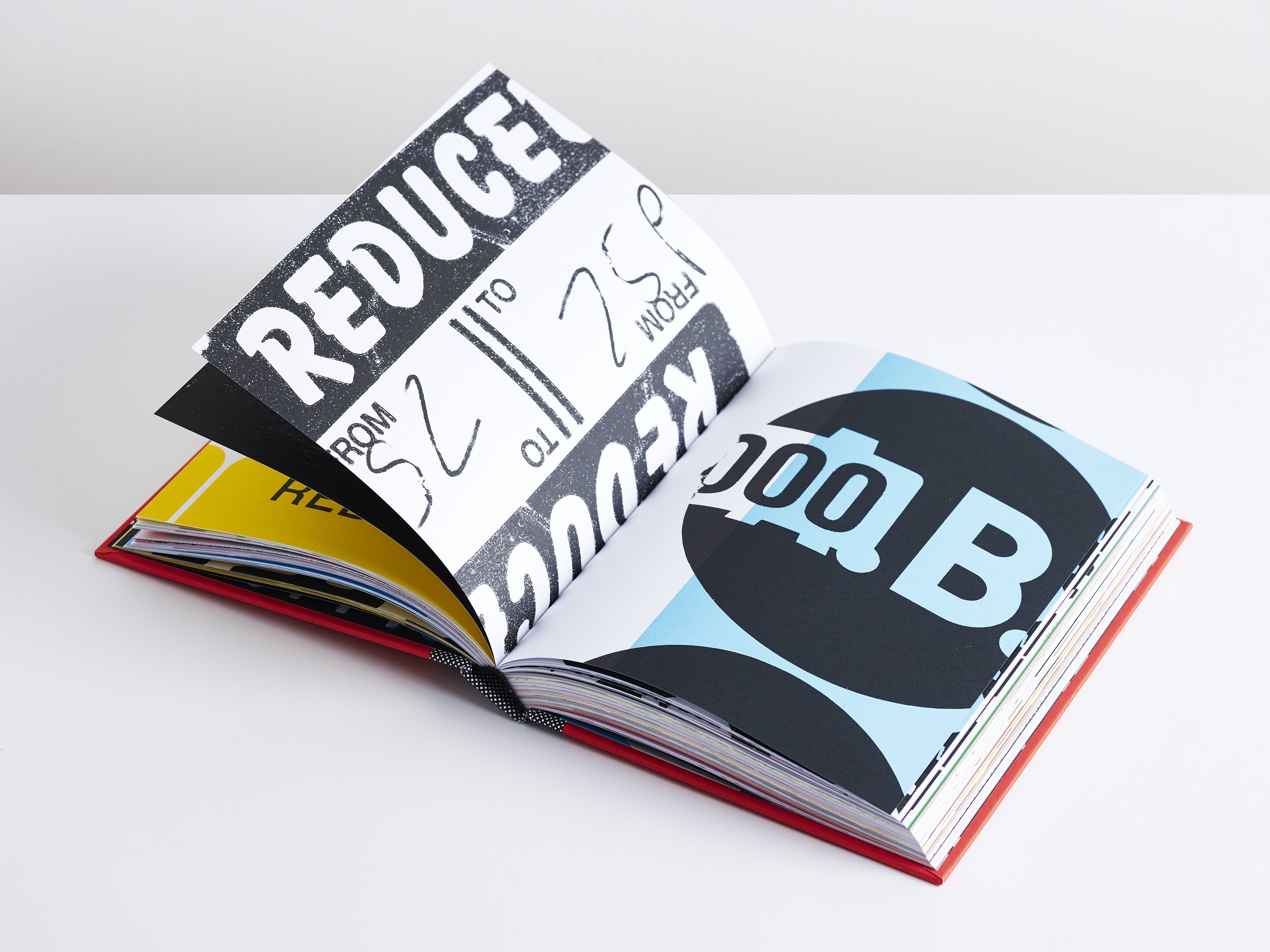
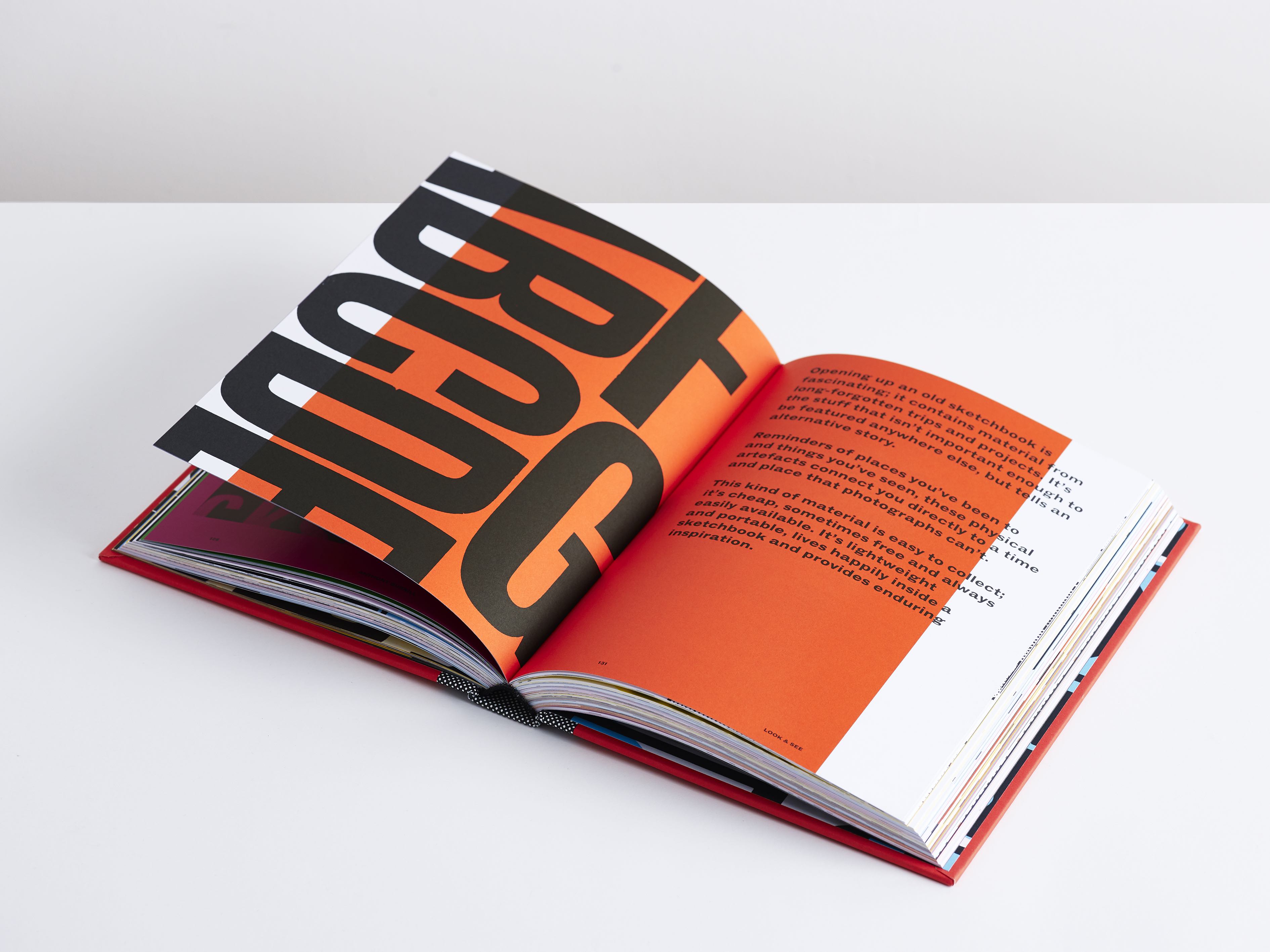
Unsurprisingly, this book is also beautifully designed. All extraneous material, such as colours, finishes and identifiable locations have been removed, with the essential information abstracted and printed in black, against a backdrop of various pigment blocks. Letterforms are often blown up, to allow us to appreciate the physicality of the print process with all its imperfections of cracks, misprints and tears, not to mention the fundamental beauty found in the relationship between a handwritten scrawl atop a deli counter ticket, or a basic sheet of utilitarian price stickers.
Burrill’s playful approach to his collection is a world away from the austere and bone-dry earnestness you will often find when an expert discusses typographic design. His unbridled joy at seeing both letters and symbols out in the wild, used with gay abandon by everyday folk, is refreshing and pretty enlightening. His outlook is shared by Erik Kessels, his collaborator and friend, who writes in the foreword: “The strongest creative minds I’ve met over the years are usually the ones who spend time rummaging around their backyard experimenting, deconstructing, reconstructing and just enjoying all the weird and wonderful things that you can derive inspiration from.”
 Whether you’re a creative mind, a designer, or just an average Joe, this book encourages you took look around (in other words, tear those eyes away from your smartphone) and truly see the wonderful things even the most mundane environment has to offer.
Photos © Kate Davis